


实现效果
初始状态
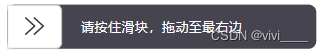
滑动中

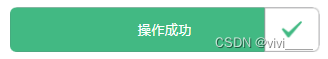
滑动完成
上代码
<template>
	<movable-area class="slide-v">
		<text class="tip-v">{{status === 'moving' ? text : successText}}</text>
		<view class="slide-bg" :style="`width:${slideWidth}px`"></view>
		<movable-view class="slide-block" :direction="status === 'moving' ? 'horizontal': 'none'" damping="50" friction="0.5" scale="1.5"
			animation="ease"
			@change="onChange">
			<u-icon class="icon" :name="status === 'moving' ? 'arrow-right-double': 'checkbox-mark'" size="30" :color="status === 'moving' ? '#333' : '#42b983'"></u-icon>
		</movable-view>
	</movable-area>
</template>

<script>
	export default {
		name: "slide-confirm",
		props: {
			text: {
				type: String,
				default: '请按住滑块,拖动至最右边'
			},
			successText: {
				type: String,
				default: '操作成功'
			},
		},
		data() {
			return {
				slideWidth: 0,
				slideTotalWidth: 0,
				slideBlockWidth: 0,
				status: 'moving'
			};
		},
		mounted() {
			// 获取滑动条总长度
			this.getSlideWidth()
			// 获取滑块长度
			this.getBlockWidth()
		},
		methods: {
			onChange(e) {
				this.slideWidth = e.detail.x
				// 当获取到总长度,且滑动距离为最大值的时候,视为成功
				if(this.slideTotalWidth > 0 && this.slideWidth === this.slideTotalWidth - this.slideBlockWidth) {
					this.slideSuccess()
				}
			},
			getSlideWidth() {
				const query = uni.createSelectorQuery()
				query.select('.slide-v').boundingClientRect()
				query.exec(res => {
					console.log(res);
					this.slideTotalWidth = res[0].width
				})
			},
			getBlockWidth() {
				const query = uni.createSelectorQuery()
				query.select('.slide-block').boundingClientRect()
				query.exec(res => {
					console.log(res);
					this.slideBlockWidth = res[0].width
				})
			},
			slideSuccess() {
				this.status = 'success'
				this.$emit('success')
			}
		}
	}
</script>

<style lang="scss" scoped>
	.slide-v {
		margin-top: 24rpx;
		width: 100%;
		background-color: #45444f;
		height: 84rpx;
		border-radius: 16rpx;
		position: relative;

		.tip-v {
			position: absolute;
			top: 50%;
			left: 50%;
			transform: translate(-50%, -50%);
			color: #fff;
			z-index: 0;
			font-size: 26rpx;
			text-wrap: nowrap;
		}

		.slide-bg {
			height: 84rpx;
			// border-radius: 12rpx;
			border-top-left-radius: 12rpx;
			border-bottom-left-radius: 12rpx;
			background-color: #42b983;
			z-index: 100;
		}

		.slide-block {
			background-color: #fff;
			height: 84rpx;
			width: 104rpx;
			border-top-right-radius: 12rpx;
			border-bottom-right-radius: 12rpx;
			position: relative;
			box-sizing: border-box;
			border: 1rpx solid #ccc;

			.icon {
				position: absolute;
				top: 50%;
				left: 50%;
				transform: translate(-50%, -50%);
				z-index: 100;
			}
		}
	}
</style>
组件引用
<SlideConfirm></SlideConfirm>


 4252
4252


 被折叠的 条评论
为什么被折叠?
被折叠的 条评论
为什么被折叠?
 到【灌水乐园】发言


