


第一部分介绍了Matplotlib基本功能,基本figure类型。
Simple Plotting example
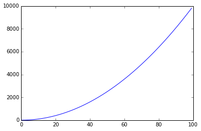
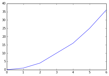
| In [113]: %matplotlib inline import matplotlib.pyplot as plt #importing matplot lib library import numpy as np x = range(100) #print x, print and check what is x y =[val**2 for val in x] #print y plt.plot(x,y) #plotting x and y Out[113]: [<matplotlib.lines.Line2D at 0x7857bb0>] |
| fig, axes = plt.subplots(nrows=1, ncols=2)
for ax in axes: |
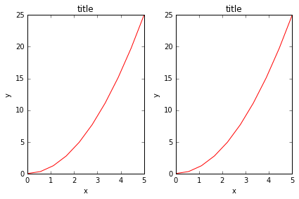
| fig, ax = plt.subplots()
ax.plot(x, x**2, label="y = x**2") |
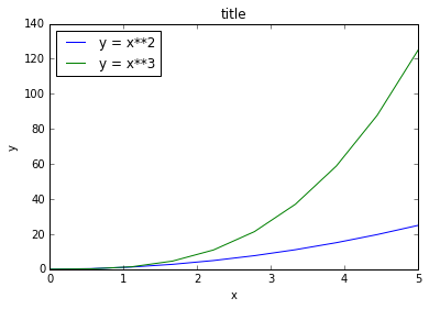
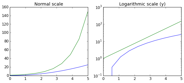
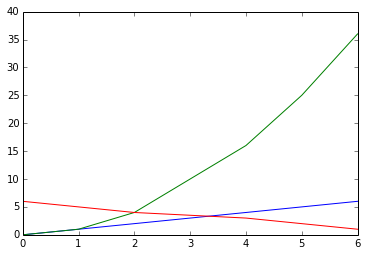
| fig, axes = plt.subplots(1, 2, figsize=(10,4)) axes[0].plot(x, x**2, x, np.exp(x)) axes[0].set_title("Normal scale") axes[1].plot(x, x**2, x, np.exp(x)) |
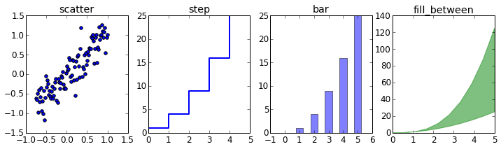
| n = np.array([0,1,2,3,4,5]) In [47]: fig, axes = plt.subplots(1, 4, figsize=(12,3)) axes[0].scatter(xx, xx + 0.25*np.random.randn(len(xx))) axes[1].step(n, n**2, lw=2) axes[2].bar(n, n**2, align="center", width=0.5, alpha=0.5) axes[3].fill_between(x, x**2, x**3, color="green", alpha=0.5); |
Using Numpy
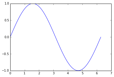
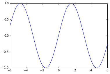
| In [17]: x = np.linspace(0, 2*np.pi, 100) y =np.sin(x) plt.plot(x,y) Out[17]: [<matplotlib.lines.Line2D at 0x579aef0>] |
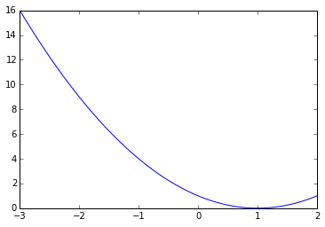
| In [24]: x= np.linspace(-3,2, 200) Y = x ** 2 - 2 * x + 1. plt.plot(x,Y) Out[24]: [<matplotlib.lines.Line2D at 0x6ffb310>] |
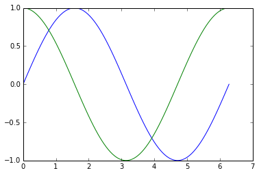
| In [32]: # plotting multiple plots x =np.linspace(0, 2 * np.pi, 100) y = np.sin(x) z = np.cos(x) plt.plot(x,y) plt.plot(x,z) plt.show() # Matplot lib picks different colors for different plot. |
| In [35]: cd C:\Users\tk\Desktop\Matplot C:\Users\tk\Desktop\Matplot In [39]: data = np.loadtxt('numpy.txt') plt.plot(data[:,0], data[:,1]) # plotting column 1 vs column 2 # The text in the numpy.txt should look like this # 0 0 # 1 1 # 2 4 # 4 16 # 5 25 # 6 36 Out[39]: [<matplotlib.lines.Line2D at 0x740f090>] |
| In [56]: data1 = np.loadtxt('scipy.txt') # load the file print data1.T for val in data1.T: #loop over each and every value in data1.T |
Scatter Plots and Bar Graphs
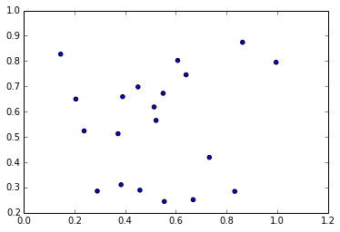
| In [64]: sct = np.random.rand(20, 2) print sct plt.scatter(sct[:,0], sct[:,1]) # I am plotting a scatter plot. [[ 0.51454542 0.61859101] [ 0.45115993 0.69774873] [ 0.29051205 0.28594808] [ 0.73240446 0.41905186] [ 0.23869394 0.5238878 ] [ 0.38422814 0.31108919] [ 0.52218967 0.56526379] [ 0.60760426 0.80247073] [ 0.37239096 0.51279078] [ 0.45864677 0.28952167] [ 0.8325996 0.28479446] [ 0.14609382 0.8275477 ] [ 0.86338279 0.87428696] [ 0.55481585 0.24481165] [ 0.99553336 0.79511137] [ 0.55025277 0.67267026] [ 0.39052024 0.65924857] [ 0.66868207 0.25186664] [ 0.64066313 0.74589812] [ 0.20587731 0.64977807]] Out[64]: <matplotlib.collections.PathCollection at 0x78a7110> |
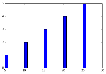
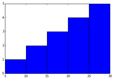
| In [65]: ghj =[5, 10 ,15, 20, 25] it =[ 1, 2, 3, 4, 5] plt.bar(ghj, it) # simple bar graph Out[65]: <Container object of 5 artists> |
| In [74]: ghj =[5, 10 ,15, 20, 25] it =[ 1, 2, 3, 4, 5] plt.bar(ghj, it, width =5)# you can change the thickness of a bar, by default the bar will have a thickness of 0.8 units Out[74]: <Container object of 5 artists> |
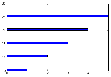
| In [75]: ghj =[5, 10 ,15, 20, 25] it =[ 1, 2, 3, 4, 5] plt.barh(ghj, it) # barh is a horizontal bar graph Out[75]: <Container object of 5 artists> |
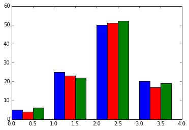
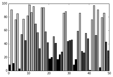
| In [95]: new_list = [[5., 25., 50., 20.], [4., 23., 51., 17.], [6., 22., 52., 19.]] x = np.arange(4) plt.bar(x + 0.00, new_list[0], color ='b', width =0.25) plt.bar(x + 0.25, new_list[1], color ='r', width =0.25) plt.bar(x + 0.50, new_list[2], color ='g', width =0.25) #plt.show() |
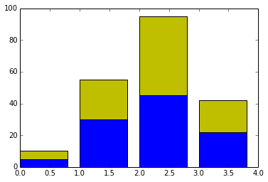
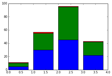
| In [100]: #Stacked Bar charts p = [5., 30., 45., 22.] q = [5., 25., 50., 20.] x =range(4) plt.bar(x, p, color ='b') plt.bar(x, q, color ='y', bottom =p) Out[100]: <Container object of 4 artists> |
| In [35]: # plotting more than 2 values A = np.array([5., 30., 45., 22.]) B = np.array([5., 25., 50., 20.]) C = np.array([1., 2., 1., 1.]) X = np.arange(4) plt.bar(X, A, color = 'b') plt.bar(X, B, color = 'g', bottom = A) plt.bar(X, C, color = 'r', bottom = A + B) # for the third argument, I use A+B plt.show() |
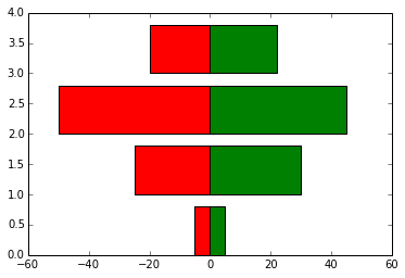
| In [94]: black_money = np.array([5., 30., 45., 22.]) white_money = np.array([5., 25., 50., 20.]) z = np.arange(4) plt.barh(z, black_money, color ='g') plt.barh(z, -white_money, color ='r')# - notation is needed for generating, back to back charts Out[94]: <Container object of 4 artists> |
Other Plots
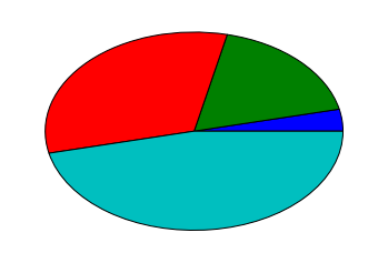
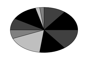
| In [114]: #Pie charts y = [5, 25, 45, 65] plt.pie(y) Out[114]: ([<matplotlib.patches.Wedge at 0x7a19d50>, <matplotlib.patches.Wedge at 0x7a252b0>, <matplotlib.patches.Wedge at 0x7a257b0>, <matplotlib.patches.Wedge at 0x7a25cb0>], [<matplotlib.text.Text at 0x7a25070>, <matplotlib.text.Text at 0x7a25550>, <matplotlib.text.Text at 0x7a25a50>, <matplotlib.text.Text at 0x7a25f50>]) |
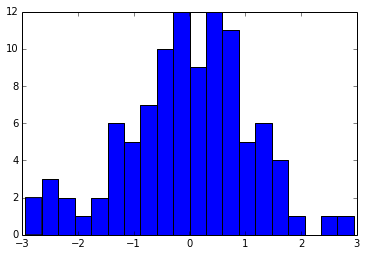
| In [115]: #Histograms d = np.random.randn(100) plt.hist(d, bins = 20) Out[115]: (array([ 2., 3., 2., 1., 2., 6., 5., 7., 10., 12., 9., 12., 11., 5., 6., 4., 1., 0., 1., 1.]), array([-2.9389701 , -2.64475645, -2.35054281, -2.05632916, -1.76211551, -1.46790186, -1.17368821, -0.87947456, -0.58526092, -0.29104727, 0.00316638, 0.29738003, 0.59159368, 0.88580733, 1.18002097, 1.47423462, 1.76844827, 2.06266192, 2.35687557, 2.65108921, 2.94530286]), <a list of 20 Patch objects>) |
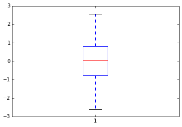
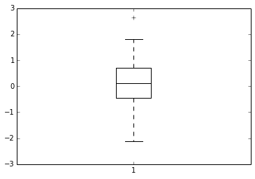
| In [116]: d = np.random.randn(100) plt.boxplot(d) #1) The red bar is the median of the distribution #2) The blue box includes 50 percent of the data from the lower quartile to the upper quartile. # Thus, the box is centered on the median of the data. Out[116]: {'boxes': [<matplotlib.lines.Line2D at 0x7cca090>], 'caps': [<matplotlib.lines.Line2D at 0x7c02d70>, <matplotlib.lines.Line2D at 0x7cc2c90>], 'fliers': [<matplotlib.lines.Line2D at 0x7cca850>, <matplotlib.lines.Line2D at 0x7ccae10>], 'medians': [<matplotlib.lines.Line2D at 0x7cca470>], 'whiskers': [<matplotlib.lines.Line2D at 0x7c02730>, <matplotlib.lines.Line2D at 0x7cc24b0>]} |
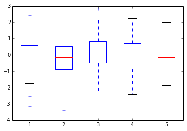
| In [118]: d = np.random.randn(100, 5) # generating multiple box plots plt.boxplot(d) Out[118]: {'boxes': [<matplotlib.lines.Line2D at 0x7f49d70>, <matplotlib.lines.Line2D at 0x7ea1c90>, <matplotlib.lines.Line2D at 0x7eafb90>, <matplotlib.lines.Line2D at 0x7ebea90>, <matplotlib.lines.Line2D at 0x7ece990>], 'caps': [<matplotlib.lines.Line2D at 0x7f2b3b0>, <matplotlib.lines.Line2D at 0x7f49990>, <matplotlib.lines.Line2D at 0x7ea14d0>, <matplotlib.lines.Line2D at 0x7ea18b0>, <matplotlib.lines.Line2D at 0x7eaf3d0>, <matplotlib.lines.Line2D at 0x7eaf7b0>, <matplotlib.lines.Line2D at 0x7ebe2d0>, <matplotlib.lines.Line2D at 0x7ebe6b0>, <matplotlib.lines.Line2D at 0x7ece1d0>, <matplotlib.lines.Line2D at 0x7ece5b0>], 'fliers': [<matplotlib.lines.Line2D at 0x7e98550>, <matplotlib.lines.Line2D at 0x7e98930>, <matplotlib.lines.Line2D at 0x7ea8470>, <matplotlib.lines.Line2D at 0x7ea8a10>, <matplotlib.lines.Line2D at 0x7eb6370>, <matplotlib.lines.Line2D at 0x7eb6730>, <matplotlib.lines.Line2D at 0x7ec6270>, <matplotlib.lines.Line2D at 0x7ec6810>, <matplotlib.lines.Line2D at 0x8030170>, <matplotlib.lines.Line2D at 0x8030710>], 'medians': [<matplotlib.lines.Line2D at 0x7e98170>, <matplotlib.lines.Line2D at 0x7ea8090>, <matplotlib.lines.Line2D at 0x7eaff70>, <matplotlib.lines.Line2D at 0x7ebee70>, <matplotlib.lines.Line2D at 0x7eced70>], 'whiskers': [<matplotlib.lines.Line2D at 0x7f2bb50>, <matplotlib.lines.Line2D at 0x7f491b0>, <matplotlib.lines.Line2D at 0x7e98cf0>, <matplotlib.lines.Line2D at 0x7ea10f0>, <matplotlib.lines.Line2D at 0x7ea8bf0>, <matplotlib.lines.Line2D at 0x7ea8fd0>, <matplotlib.lines.Line2D at 0x7eb6cd0>, <matplotlib.lines.Line2D at 0x7eb6ed0>, <matplotlib.lines.Line2D at 0x7ec6bd0>, <matplotlib.lines.Line2D at 0x7ec6dd0>]} |
2nd 部分:
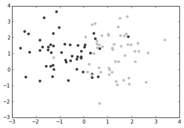
| %matplotlib inline import numpy as np import matplotlib.pyplot as plt In [22]: p =np.random.standard_normal((50,2)) p += np.array((-1,1)) # center the distribution at (-1,1) q =np.random.standard_normal((50,2))
|
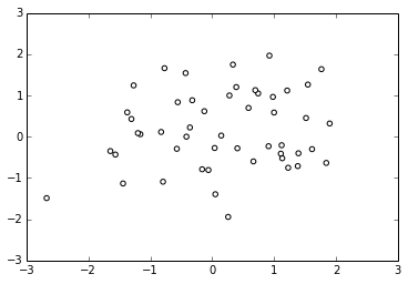
| In [34]: dd =np.random.standard_normal((50,2)) plt.scatter(dd[:,0], dd[:,1], color ='1.0', edgecolor ='0.0') # edge color controls the color of the edge Out[34]: <matplotlib.collections.PathCollection at 0x7336670> |
Custom Color for Bar charts,Pie charts and box plots:
| The below bar graph, plots x(1 to 50) (vs) y(50 random integers, within 0-100. But you need different colors for each value. For which we create a list containing four colors(color_set). The list comprehension creates 50 different color values from color_set
In [9]: |
| In [8]: hi =np.random.random_integers(8, size =10) color_set =['.00', '.25', '.50', '.75'] plt.pie(hi, colors = color_set)# colors attribute accepts a range of values plt.show() #If there are less colors than values, then pyplot.pie() will simply cycle through the color list. In the preceding #example, we gave a list of four colors to color a pie chart that consisted of eight values. Thus, each color will be used twice |
| In [27]: values = np.random.randn(100) w = plt.boxplot(values) for att, lines in w.iteritems(): for l in lines: l.set_color('k') |
Color Maps
| know more about hsv
In [34]: |
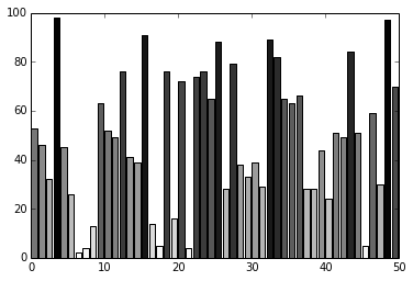
| In [44]: #Color in bar graphs import matplotlib.cm as cm vals = np.random.random_integers(99, size =50) cmap = cm.ScalarMappable(col.Normalize(0,99), cm.binary) plt.bar(np.arange(len(vals)),vals, color =cmap.to_rgba(vals)) Out[44]: <Container object of 50 artists> |
Line Styles
| In [4]: # I am creating 3 levels of gray plots, with different line shades
I =np.linspace(-6,6, 1024) plt.plot(I, pq(I, 0., 1.), color = 'k', linestyle ='solid') |
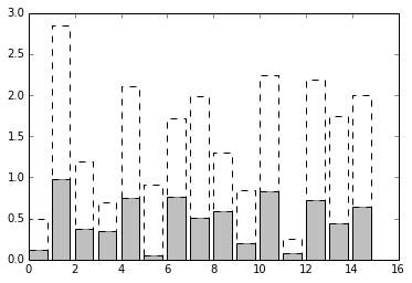
| In [12]: N = 15 A = np.random.random(N) B= np.random.random(N) X = np.arange(N) plt.bar(X, A, color ='.75') plt.bar(X, A+B , bottom = A, color ='W', linestyle ='dashed') # plot a bar graph plt.show() |
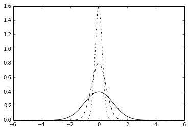
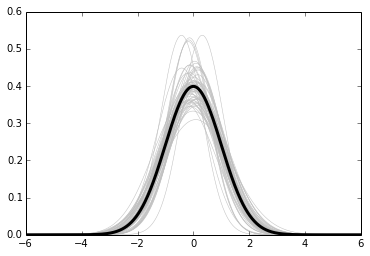
| In [20]: def gf(X, mu, sigma): a = 1. / (sigma * np.sqrt(2. * np.pi)) b = -1. / (2. * sigma ** 2) return a * np.exp(b * (X - mu) ** 2) X = np.linspace(-6, 6, 1024) plt.plot(X, gf(X, 0., 1.), color ='.00', linewidth = 3.) |
Fill surfaces with pattern
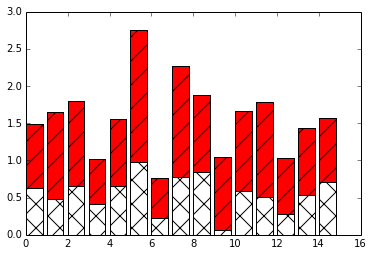
| In [27]: N = 15 A = np.random.random(N) B= np.random.random(N) X = np.arange(N) plt.bar(X, A, color ='w', hatch ='x') plt.bar(X, A+B,bottom =A, color ='r', hatch ='/') # some other hatch attributes are : |
Marker styles
| In [29]: cd C:\Users\tk\Desktop\Matplot C:\Users\tk\Desktop\Matplot |
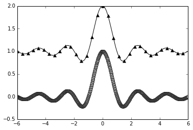
| In [14]: X= np.linspace(-6,6,1024) Ya =np.sinc(X) Yb = np.sinc(X) +1 plt.plot(X, Ya, marker ='o', color ='.75') |
Own Marker Shapes- come back to this later
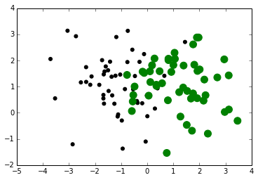
| In [31]: # Marker Size A = np.random.standard_normal((50,2)) A += np.array((-1,1)) B = np.random.standard_normal((50,2)) plt.scatter(A[:,0], A[:,1], color ='k', s =25.0) |
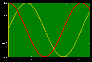
| In [20]: import matplotlib as mpl mpl.rc('lines', linewidth =3) mpl.rc('xtick', color ='w') # color of x axis numbers mpl.rc('ytick', color = 'w') # color of y axis numbers mpl.rc('axes', facecolor ='g', edgecolor ='y') # color of axes mpl.rc('figure', facecolor ='.00',edgecolor ='w') # color of figure mpl.rc('axes', color_cycle = ('y','r')) # color of plots x = np.linspace(0, 7, 1024) plt.plot(x, np.sin(x)) plt.plot(x, np.cos(x)) Out[20]: [<matplotlib.lines.Line2D at 0x7b0fb70>] |
3rd 部分:
图的注释--包含若干图,控制坐标轴范围,长款比和坐标轴。
Annotation
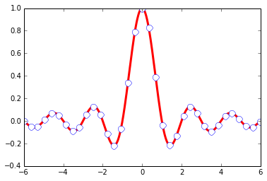
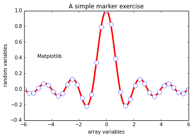
| In [1]: %matplotlib inline import numpy as np import matplotlib.pyplot as plt In [28]: X =np.linspace(-6,6, 1024) Y =np.sinc(X) plt.title('A simple marker exercise')# a title notation plt.xlabel('array variables') # adding xlabel plt.ylabel(' random variables') # adding ylabel plt.text(-5, 0.4, 'Matplotlib') # -5 is the x value and 0.4 is y value plt.plot(X,Y, color ='r', marker ='o', markersize =9, markevery = 30, markerfacecolor='w', linewidth = 3.0, markeredgecolor = 'b') Out[28]: [<matplotlib.lines.Line2D at 0x84b6430>] |
| In [39]: def pq(I, mu, sigma): a = 1. / (sigma * np.sqrt(2. * np.pi)) b = -1. / (2. * sigma ** 2) return a * np.exp(b * (I - mu) ** 2) I =np.linspace(-6,6, 1024) plt.plot(I, pq(I, 0., 1.), color = 'k', linestyle ='solid') # I have created a dictinary of styles #This sets the style of the box, which can either be 'round' or 'square' |
Alignment Control
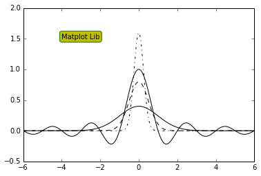
| The text is bound by a box. This box is used to relatively align the text to the coordinates passed to pyplot.text(). Using the verticalalignment and horizontalalignment parameters (respective shortcut equivalents are va and ha), we can control how the alignment is done.
The vertical alignment options are as follows: Horizontal alignment options are as follows: align ='bottom' align ='baseline' In [41]: |
| In [76]: X = np.linspace(-4, 4, 1024) Y = .25 * (X + 4.) * (X + 1.) * (X - 2.) plt.annotate('Big Data', |
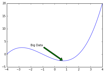
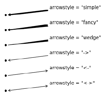
| In [74]: #arrow styles are : from IPython.display import Image |
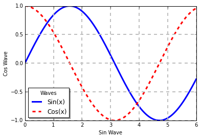
| Legend properties: 'loc': This is the location of the legend. The default value is 'best', which will place it automatically. Other valid values are 'upper left', 'lower left', 'lower right', 'right', 'center left', 'center right', 'lower center', 'upper center', and 'center'. 'shadow': This can be either True or False, and it renders the legend with a shadow effect. 'fancybox': This can be either True or False and renders the legend with a rounded box. 'title': This renders the legend with the title passed as a parameter. 'ncol': This forces the passed value to be the number of columns for the legend In [101]: |
Shapes
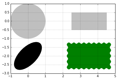
| In [4]: #Paths for several kinds of shapes are available in the matplotlib.patches module import matplotlib.patches as patches dis = patches.Circle((0,0), radius = 1.0, color ='.75' ) dis = patches.Rectangle((2.5, -.5), 2.0, 1.0, color ='.75') #patches.rectangle((x & y coordinates), length, breadth) dis = patches.Ellipse((0, -2.0), 2.0, 1.0, angle =45, color ='.00') dis = patches.FancyBboxPatch((2.5, -2.5), 2.0, 1.0, boxstyle ='roundtooth', color ='g') plt.grid(True) #FancyBox: This is like a rectangle but takes an additional boxstyle parameter |
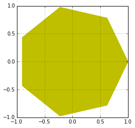
| In [22]: import matplotlib.patches as patches theta = np.linspace(0, 2 * np.pi, 8) # generates an array vertical = np.vstack((np.cos(theta), np.sin(theta))).transpose() # vertical stack clubs the two arrays. #print vertical, print and see how the array looks plt.gca().add_patch(patches.Polygon(vertical, color ='y')) plt.axis('scaled') plt.grid(True) plt.show() #The matplotlib.patches.Polygon()constructor takes a list of coordinates as the inputs, that is, the vertices of the polygon |
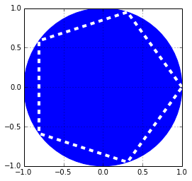
| In [34]: # a polygon can be imbided into a circle theta = np.linspace(0, 2 * np.pi, 6) # generates an array vertical = np.vstack((np.cos(theta), np.sin(theta))).transpose() # vertical stack clubs the two arrays. #print vertical, print and see how the array looks plt.gca().add_patch(plt.Circle((0,0), radius =1.0, color ='b')) plt.gca().add_patch(plt.Polygon(vertical, fill =None, lw =4.0, ls ='dashed', edgecolor ='w')) plt.axis('scaled') plt.grid(True) plt.show() |
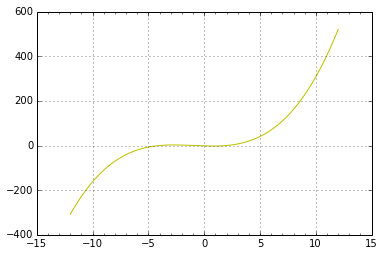
| In [54]: #In matplotlib, ticks are small marks on both the axes of a figure import matplotlib.ticker as ticker X = np.linspace(-12, 12, 1024) Y = .25 * (X + 4.) * (X + 1.) * (X - 2.) pl =plt.axes() #the object that manages the axes of a figure pl.xaxis.set_major_locator(ticker.MultipleLocator(5)) pl.xaxis.set_minor_locator(ticker.MultipleLocator(1)) plt.plot(X, Y, c = 'y') plt.grid(True, which ='major') # which can take three values: minor, major and both plt.show() |
|
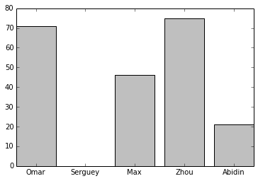
In [59]: Abidin') len(name_list)) ((pos_list))) ((name_list))) 'center') |
4th 部分:
包含了一些复杂图形。
Working with figures
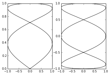
| In [4]: %matplotlib inline import numpy as np import matplotlib.pyplot as plt In [5]: T = np.linspace(-np.pi, np.pi, 1024) # fig, (ax0, ax1) = plt.subplots(ncols =2) ax0.plot(np.sin(2 * T), np.cos(0.5 * T), c = 'k') ax1.plot(np.cos(3 * T), np.sin(T), c = 'k') plt.show() |
Setting aspect ratio
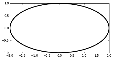
| In [7]: T = np.linspace(0, 2 * np.pi, 1024) plt.plot(2. * np.cos(T), np.sin(T), c = 'k', lw = 3.) plt.axes().set_aspect('equal') # remove this line of code and see how the figure looks plt.show() |
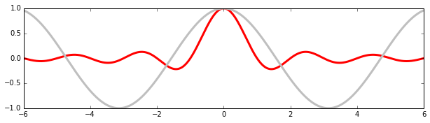
| In [12]: X = np.linspace(-6, 6, 1024) Y1, Y2 = np.sinc(X), np.cos(X) plt.figure(figsize=(10.24, 2.56)) #sets size of the figure plt.plot(X, Y1, c='r', lw = 3.) plt.plot(X, Y2, c='.75', lw = 3.) plt.show() |
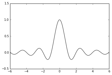
| In [8]: X = np.linspace(-6, 6, 1024) plt.ylim(-.5, 1.5) plt.plot(X, np.sinc(X), c = 'k') plt.show() |
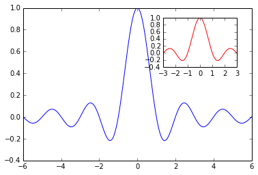
| In [16]: X = np.linspace(-6, 6, 1024) Y = np.sinc(X) X_sub = np.linspace(-3, 3, 1024)#coordinates of subplot Y_sub = np.sinc(X_sub) # coordinates of sub plot plt.plot(X, Y, c = 'b') sub_axes = plt.axes([.6, .6, .25, .25])# coordinates, length and width of the subplot frame sub_axes.plot(X_detail, Y_detail, c = 'r') plt.show() |
Log Scale
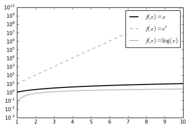
| In [20]: X = np.linspace(1, 10, 1024) plt.yscale('log') # set y scale as log. we would use plot.xscale() plt.plot(X, X, c = 'k', lw = 2., label = r'$f(x)=x$') plt.plot(X, 10 ** X, c = '.75', ls = '--', lw = 2., label = r'$f(x)=e^x$') plt.plot(X, np.log(X), c = '.75', lw = 2., label = r'$f(x)=\log(x)$') plt.legend() plt.show() #The logarithm base is 10 by default, but it can be changed with the optional parameters basex and basey. |
Polar Coordinates
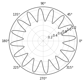
| In [23]: T = np.linspace(0 , 2 * np.pi, 1024) plt.axes(polar = True) # show polar coordinates plt.plot(T, 1. + .25 * np.sin(16 * T), c= 'k') plt.show() |
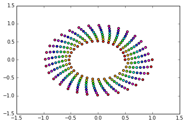
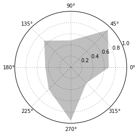
| In [25]: import matplotlib.patches as patches # import patch module from matplotlib ax = plt.axes(polar = True) theta = np.linspace(0, 2 * np.pi, 8, endpoint = False) radius = .25 + .75 * np.random.random(size = len(theta)) points = np.vstack((theta, radius)).transpose() plt.gca().add_patch(patches.Polygon(points, color = '.75')) plt.show() |
| In [2]: x = np.linspace(-6,6,1024) y= np.sin(x) plt.plot(x,y) plt.savefig('bigdata.png', c= 'y', transparent = True) #savefig function writes that data to a file # will create a file named bigdata.png. Its resolution will be 800 x 600 pixels, in 8-bit colors (24-bits per pixel) |
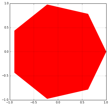
| In [3]: theta =np.linspace(0, 2 *np.pi, 8) points =np.vstack((np.cos(theta), np.sin(theta))).T plt.figure(figsize =(6.0, 6.0)) plt.gca().add_patch(plt.Polygon(points, color ='r')) plt.axis('scaled') plt.grid(True) plt.savefig('pl.png', dpi =300) # try 'pl.pdf', pl.svg' #dpi is dots per inch. 300*8 x 6*300 = 2400 x 1800 pixels |
总结
你学习Python时能犯的最简单的错误之一就是同时去尝试学习过多的库。当你努力一下子学会每样东西时,你会花费很多时间来切换这些不同概念之间,变得沮丧,最后转移到其他事情上。
所以,坚持关注这个过程:
1.理解Python基础
2.学习Numpy
3.学习Pandas
4.学习Matplolib


 383
383

 被折叠的 条评论
为什么被折叠?
被折叠的 条评论
为什么被折叠?
 到【灌水乐园】发言


