


源码在图后面
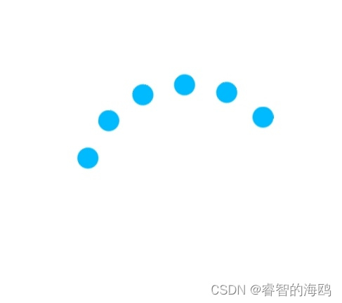
效果图(我截的不好)
源代码
<!DOCTYPE html>
<html lang="zh">
<head>
    <meta charset="UTF-8">
    <meta name="viewport" content="width=device-width, initial-scale=1.0">
    <title>Loading Animation</title>
    <style>
        html, body, div {
            margin: 0;
            padding: 0;
        }

        html, body {
            width: 100%;
            height: 100%;
        }

        .loading {
            width: 100%;
            height: 100%;
            position: relative;
        }

        .loading i {
            margin: auto;
            position: absolute;
            top: calc(50% - 40px);
            left: calc(50% - 40px);
            width: 80px;
            height: 80px;
            display: block;
        }

        .loading span {
            position: absolute;
            width: 100%;
            height: 100%;
            opacity: 0;
        }

        .loading span:after {
            content: "";
            display: block;
            position: absolute;
            left: 0px;
            top: 0px;
            width: 10px;
            height: 10px;
            background: var(--main, #00baff);
            border-radius: 50%;
        }

        .loading span:nth-child(1) { animation: i1 5.5s 0.2s infinite; }
        .loading span:nth-child(2) { animation: i2 5.5s 0.4s infinite; }
        .loading span:nth-child(3) { animation: i3 5.5s 0.6s infinite; }
        .loading span:nth-child(4) { animation: i4 5.5s 0.8s infinite; }
        .loading span:nth-child(5) { animation: i5 5.5s 1s infinite; }
        .loading span:nth-child(6) { animation: i6 5.5s 1.2s infinite; }

        @keyframes i1 {
            0% { opacity: 1; transform: rotate(190deg); animation-timing-function: cubic-bezier(0.29, 0.44, 0.32, 0.74); }
            7% { opacity: 1; transform: rotate(300deg); animation-timing-function: linear; }
            30% { opacity: 1; transform: rotate(450deg); animation-timing-function: cubic-bezier(0.53, 0.27, 0.37, 0.81); }
            39% { opacity: 1; transform: rotate(645deg); animation-timing-function: linear; }
            63% { opacity: 1; transform: rotate(800deg); animation-timing-function: cubic-bezier(0.5, 0.32, 0.82, 0.54); }
            68% { opacity: 1; transform: rotate(920deg); animation-timing-function: ease-in; }
            69% { opacity: 0; transform: rotate(930deg); }
        }

        @keyframes i2 {
            0% { opacity: 1; transform: rotate(180deg); animation-timing-function: cubic-bezier(0.29, 0.44, 0.32, 0.74); }
            7% { opacity: 1; transform: rotate(300deg); animation-timing-function: linear; }
            30% { opacity: 1; transform: rotate(450deg); animation-timing-function: cubic-bezier(0.53, 0.27, 0.37, 0.81); }
            39% { opacity: 1; transform: rotate(645deg); animation-timing-function: linear; }
            63% { opacity: 1; transform: rotate(800deg); animation-timing-function: cubic-bezier(0.5, 0.32, 0.82, 0.54); }
            68% { opacity: 1; transform: rotate(910deg); animation-timing-function: ease-in; }
            69% { opacity: 0; transform: rotate(920deg); }
        }

        @keyframes i3 {
            0% { opacity: 1; transform: rotate(170deg); animation-timing-function: cubic-bezier(0.29, 0.44, 0.32, 0.74); }
            7% { opacity: 1; transform: rotate(300deg); animation-timing-function: linear; }
            30% { opacity: 1; transform: rotate(450deg); animation-timing-function: cubic-bezier(0.53, 0.27, 0.37, 0.81); }
            39% { opacity: 1; transform: rotate(645deg); animation-timing-function: linear; }
            63% { opacity: 1; transform: rotate(800deg); animation-timing-function: cubic-bezier(0.5, 0.32, 0.82, 0.54); }
            68% { opacity: 1; transform: rotate(900deg); animation-timing-function: ease-in; }
            69% { opacity: 0; transform: rotate(910deg); }
        }

        @keyframes i4 {
            0% { opacity: 1; transform: rotate(160deg); animation-timing-function: cubic-bezier(0.29, 0.44, 0.32, 0.74); }
            7% { opacity: 1; transform: rotate(300deg); animation-timing-function: linear; }
            30% { opacity: 1; transform: rotate(450deg); animation-timing-function: cubic-bezier(0.53, 0.27, 0.37, 0.81); }
            39% { opacity: 1; transform: rotate(645deg); animation-timing-function: linear; }
            63% { opacity: 1; transform: rotate(800deg); animation-timing-function: cubic-bezier(0.5, 0.32, 0.82, 0.54); }
            68% { opacity: 1; transform: rotate(890deg); animation-timing-function: ease-in; }
            69% { opacity: 0; transform: rotate(900deg); }
        }

        @keyframes i5 {
            0% { opacity: 1; transform: rotate(150deg); animation-timing-function: cubic-bezier(0.29, 0.44, 0.32, 0.74); }
            7% { opacity: 1; transform: rotate(300deg); animation-timing-function: linear; }
            30% { opacity: 1; transform: rotate(450deg); animation-timing-function: cubic-bezier(0.53, 0.27, 0.37, 0.81); }
            39% { opacity: 1; transform: rotate(645deg); animation-timing-function: linear; }
            63% { opacity: 1; transform: rotate(800deg); animation-timing-function: cubic-bezier(0.5, 0.32, 0.82, 0.54); }
            68% { opacity: 1; transform: rotate(880deg); animation-timing-function: ease-in; }
            69% { opacity: 0; transform: rotate(880deg); }
        }

        @keyframes i6 {
            0% { opacity: 1; transform: rotate(140deg); animation-timing-function: cubic-bezier(0.29, 0.44, 0.32, 0.74); }
            7% { opacity: 1; transform: rotate(300deg); animation-timing-function: linear; }
            30% { opacity: 1; transform: rotate(450deg); animation-timing-function: cubic-bezier(0.53, 0.27, 0.37, 0.81); }
            39% { opacity: 1; transform: rotate(645deg); animation-timing-function: linear; }
            63% { opacity: 1; transform: rotate(800deg); animation-timing-function: cubic-bezier(0.5, 0.32, 0.82, 0.54); }
            68% { opacity: 1; transform: rotate(870deg); animation-timing-function: ease-in; }
            69% { opacity: 0; transform: rotate(880deg); }
        }
    </style>
</head>
<body>
    <div class="loading">
        <i>
            <span></span>
            <span></span>
            <span></span>
            <span></span>
            <span></span>
            <span></span>
        </i>
    </div>
</body>
</html>


 585
585


 被折叠的 条评论
为什么被折叠?
被折叠的 条评论
为什么被折叠?
 到【灌水乐园】发言


