


到今天为止,自定义View已经写了四篇了,平时常见的用法比如,自定义控件,自定义布局也都已经介绍的差不多了,今天来看一下通过自定义实现的组合控件,也是自定义View的最后一篇。
其实组合控件和自定义布局有时候可以达到相同的效果,我们以上一遍自定义View系列(四)中队标题栏为列,通过组合控件来实现。先上代码:
1,自定义TitlBar:
public class TitleBar extends LinearLayout{

    private String mText_content;
    private Context mContext;
    private String mText_left;
    private String mText_right;
    private boolean mShow_left;
    private boolean mShow_right;
    private TextView mTextLeft;
    private TextView mTextRight;
    private TextView mTextTitle;

    public TitleBar(Context context) {
        this(context,null);
    }

    public TitleBar(Context context, @Nullable AttributeSet attrs) {
        this(context, attrs,0);
    }

    public TitleBar(Context context, @Nullable AttributeSet attrs, int defStyleAttr) {
        super(context, attrs, defStyleAttr);
        mContext = context;
        TypedArray typedArray = context.obtainStyledAttributes(attrs,R.styleable.TitleBar);
        mText_content = typedArray.getString(R.styleable.TitleBar_text_title);
        mText_left = typedArray.getString(R.styleable.TitleBar_text_left);
        mText_right = typedArray.getString(R.styleable.TitleBar_text_right);
        mShow_left = typedArray.getBoolean(R.styleable.TitleBar_show_left,false);
        mShow_right = typedArray.getBoolean(R.styleable.TitleBar_show_right,false);
        typedArray.recycle();

        View line_layout = LayoutInflater.from(mContext).inflate(R.layout.title_layout,this,true);
        mTextLeft = line_layout.findViewById(R.id.text_left);
        mTextRight = line_layout.findViewById(R.id.text_right);
        mTextTitle = line_layout.findViewById(R.id.text_title);
        init();
    }

    private void init() {

       mTextLeft.setVisibility(mShow_left ? VISIBLE:GONE);//判断左边是否显示
        mTextRight.setVisibility(mShow_right ? VISIBLE:GONE);//判断右边是否显示

        if(mText_left != null){
            mTextLeft.setText(mText_left);
        }
        if(mText_right != null){
            mTextRight.setText(mText_right);
        }
        if(mText_content != null){
            mTextTitle.setText(mText_content);
        }
    }
    /** 中间文字大小 */
    public void setTitleSize(int size){
        mTextTitle.setTextSize(TypedValue.COMPLEX_UNIT_SP,size);
    }
    /** 左边文字大小 */
    public void setText_leftSize(int size){
        mTextLeft.setTextSize(TypedValue.COMPLEX_UNIT_PX,size);
    }
    /** 右边文字大小 */
    public void setText_rightSzie(int size){
        mTextRight.setTextSize(size);
    }

    /** 设置左边按钮图片 */
    public void setLeftResource(int resid) {
        Drawable drawable = mContext.getResources().getDrawable(resid);
        drawable.setBounds(0, 0, drawable.getMinimumWidth(), drawable.getMinimumHeight());
        mTextLeft.setCompoundDrawables(drawable, null, null, null);
    }
}
代码不多,应该非常好理解,首先是titlebar继承了ViewGroup的子类,这里我们以Linearlayout为例;再构造方法中又引入了布局文件,也就是Titlebar的格式(这点和自定义布局不同,自定义布局时,是直接在画布中画出来)。自定义属性中,声明了左边和右边按钮是否显示,和显示内容,以及中间标题的内容。通过初试画init()方法,将声明的自定义属性赋值给Titlebar中的控件,并且暴露(public)了几个方法,以便在代码中设置(这里只随便写了几个方法,只为演示效果。根据个人需要可以增加很多方法,比如点击事件,颜色设置等)。
2,自定义属性:
<!-- 标题栏 -->
<declare-styleable name="TitleBar">
    <attr name="show_left" format="boolean"/>
    <attr name="show_right" format="boolean"/>
    <attr name="text_left" format="string|reference"/>
    <attr name="text_right" format="string|reference"/>
    <attr name="text_title" format="string|reference"/>
</declare-styleable>
3.title_layout的布局:
<RelativeLayout xmlns:android="http://schemas.android.com/apk/res/android"
                android:layout_width="match_parent"
                android:layout_height="50dp">
    <TextView
        android:id="@+id/text_left"
        android:layout_width="wrap_content"
        android:layout_height="match_parent"
        android:paddingLeft="10dp"
        android:paddingRight="10dp"
        android:gravity="center_vertical"
        android:clickable="true"/>

    <TextView
        android:id="@+id/text_title"
        android:layout_width="wrap_content"
        android:layout_height="match_parent"
        android:textSize="26sp"
        android:layout_centerInParent="true"
        android:gravity="center_vertical"/>

    <TextView
        android:id="@+id/text_right"
        android:layout_width="wrap_content"
        android:layout_height="match_parent"
        android:layout_alignParentRight="true"
        android:gravity="center_vertical"
        android:clickable="true"
        android:paddingRight="10dp"
        android:paddingLeft="10dp"/>

</RelativeLayout>
从这个xml文件可以看出,标准的头部标题栏模式,两边各有一个可点击的按钮(clickable = true,这个一定要设置,如果不设置,有些华为和小米的机型是不支持TextView的点击事件的),中间是一个页面标题。
4,在看一下调用:
xml:
<LinearLayout xmlns:android="http://schemas.android.com/apk/res/android"
              xmlns:app="http://schemas.android.com/apk/res-auto"
              android:orientation="vertical"
              android:layout_width="match_parent"
              android:layout_height="match_parent">
    <com.example.administrator.myview1.TitleBar
        android:id="@+id/title_bar1"
        android:layout_width="match_parent"
        android:layout_height="wrap_content"
        app:show_left= "true"
        app:show_right="true"
        app:text_left="返回"
        app:text_right="合同"
        app:text_title="自定义标题栏"/>
    <View
        android:layout_width="match_parent"
        android:layout_height="0.5dp"
        android:background="#FF0000"/>

    <com.example.administrator.myview1.TitleBar
        android:id="@+id/title_bar2"
        android:layout_width="match_parent"
        android:layout_height="wrap_content"
        app:show_left= "true"
        app:show_right="false"
        app:text_title="自定义标题栏"/>

</LinearLayout>
这个布局文件中,调用了两个Titlebar,中间用一个横线隔开,里面app:后面的属性都已经介绍过了。
看一下在代码页面中的调用:
public class FiveActivity extends AppCompatActivity{

    private TitleBar mTitleBar1;
    private TitleBar mTitleBar2;

    @Override
    public void onCreate(@Nullable Bundle savedInstanceState) {
        super.onCreate(savedInstanceState);
        setContentView(R.layout.five_layout);
        init();
    }

    private void init() {
        mTitleBar1 = findViewById(R.id.title_bar1);
        mTitleBar1.setText_leftSize(50);//左边位子大小
        mTitleBar1.setText_rightSzie(18);//右边文字大小
        mTitleBar1.setTitleSize(18);//中间文字大小

        mTitleBar2 = findViewById(R.id.title_bar2);
        mTitleBar2.setLeftResource(R.mipmap.icon_black_back);
    }
}
在代码中可以看到,第一个titlebar我们分别设置了文字的大小,第二个titlebar中,我们把左边用图片来显示,右边设置了不显示,运行一下看效果:
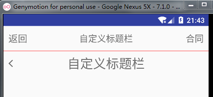
很熟悉吧,开发中经常遇见,再一个标题中,我们设置了左边的文字是50,右边和中间的是18,现在是右边和中间的一样,好像都比左边的要打那么一点。明明左边的设置的50更大啊?为什么会这样?我们回到上面的Titlebar中去看,发现
中间文字大小的设置
mTextTitle.setTextSize(TypedValue.COMPLEX_UNIT_SP,size);
左边文字大小的设置:
mTextLeft.setTextSize(TypedValue.COMPLEX_UNIT_PX,size);
右边文字大小的设置:
mTextRight.setTextSize(size);
我们发现前面连个我们都设置了一个属性TypedValue,TypedValue中提供了一些方法TypedValue.applyDimension()方法的功能就是把非标准尺寸转换成标准尺寸。代码中的TypedValue.COMPLEX_UNIT_SP和TypedValue.COMPLEX_UNIT_PX分别表示,我们设置的数值是sp类型的和px类型。不设置时,默认是TypedValue.COMPLEX_UNIT_SP。这样一来,就容易理解了,中间和右边一样,都比左边的要大。第二个titlabr中,我们没有设置中间文字的大小,它取得是title_layout中的默认值30sp。第一个设置了18就是18而不是30,可见代码中设置的优先级要高于xml。 这样子统一设置好之后,当成一个工具类,可以节省很多时间。
关于自定义View的介绍到这里也就结束了。后续可能还会有所更新,也希望有更好建议和理解的道友多多支持和指正!


 3965
3965

 被折叠的 条评论
为什么被折叠?
被折叠的 条评论
为什么被折叠?
 到【灌水乐园】发言


