


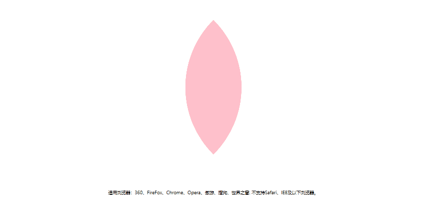
CSS3鼠标经过开花动画特效是一款当鼠标划入的时候花朵绽开,鼠标移走收起,先来看看效果:
部分核心的代码如下:
<!DOCTYPE html>
<html lang="en">
<head>
<meta charset="UTF-8">
<title>CSS3鼠标经过开花动画特效</title>
<style>
	*{margin:0;padding:0;list-style-type:none;}

	#box{
		width:1000px;
		height:550px;
		margin:0 auto;
		margin-top:50px;
		position:relative;
	}
	.box01,.box02,.box03,.box04,.box05,.box06,.box07,.box08,.box09{
		width:300px;
		height:300px;
		border-radius:300px 0;
		background:pink;
		opacity:0.6;
		position:absolute;
		bottom:100px;
		left:500px;
		transform-origin:0 300px;
		transform:rotate(-45deg);
		transition:all 8s;
	}
	#box:hover :nth-child(3){
		transform:rotate(-23deg);
	}
	#box:hover :nth-child(4){
		transform:rotate(0deg);
	}
	#box:hover :nth-child(5){
		transform:rotate(23deg);
	}
	#box:hover :nth-child(6){
		transform:rotate(45deg);
	}
	#box:hover :nth-child(7){
		transform:rotate(-68deg);
	}
	#box:hover :nth-child(8){
		transform:rotate(-90deg);
	}
	#box:hover :nth-child(9){
		transform:rotate(-113deg);
	}
	#box:hover :nth-child(10){
		transform:rotate(-135deg);
	}
</style>
</head>
<body>

<div id="box">
	<div class="box01"></div>
	<div class="box02"></div>
	<div class="box03"></div>
	<div class="box04"></div>
	<div class="box05"></div>
	<div class="box06"></div>
	<div class="box07"></div>
	<div class="box08"></div>
	<div class="box09"></div>
</div>

<div style="text-align:center;margin:10px 0; font:normal 14px/24px 'MicroSoft YaHei';">
<p>适用浏览器:360、FireFox、Chrome、Opera、傲游、搜狗、世界之窗. 不支持Safari、IE8及以下浏览器。</p>
</div>
</body>
</html>
全部代码:


 被折叠的 条评论
为什么被折叠?
被折叠的 条评论
为什么被折叠?
 到【灌水乐园】发言


