


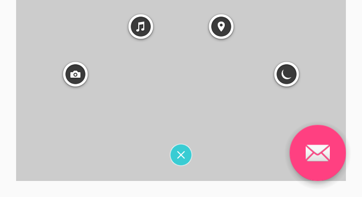
效果:

概述
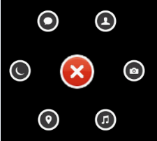
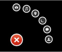
Path2.0的扇形菜单,相关开源库:ArcMenu@[Github]
ArcMenu
其原理主要就是通过自定义ViewGroup配合动画来实现的,
使用起来也非常简单
 <com.capricorn.ArcMenu
            android:id="@+id/arc_menu_2"
            android:layout_width="wrap_content"
            android:layout_height="wrap_content"
            arc:fromDegrees="@dimen/menuFromDegrees"
            arc:toDegrees="@dimen/menuToDegrees"
            arc:childSize="@dimen/menuChildSize"/>
private static final int[] ITEM_DRAWABLES = { R.drawable.composer_camera, R.drawable.composer_music,
R.drawable.composer_place, R.drawable.composer_sleep, R.drawable.composer_thought, R.drawable.composer_with };
private void initArcMenu(ArcMenu menu, int[] itemDrawables) {
final int itemCount = itemDrawables.length;
for (int i = 0; i < itemCount; i++) {
ImageView item = new ImageView(this);
item.setImageResource(itemDrawables[i]);
final int position = i;
menu.addItem(item, new OnClickListener() {
@Override
public void onClick(View v) {
Toast.makeText(MainActivity.this, "position:" + position, Toast.LENGTH_SHORT).show();
}
});
}
}这里需要注意的是它有三个属性
custom:childSize="50px"
custom:fromDegrees="0.0"
custom:toDegrees="300.0"一般如果想要实现Path 效果,是将其按钮 添加到CENTER_BOTTOM的,那么该怎么设置才能达到这种效果呢,
通过源码,我们知道ArcMenu是一个正方形的布局,我们需要设置相关margin 及 fromDegrees 和 toDegrees 即可
hongyang blog
这款扇形菜单实现的也是非常的好,提供半径 radius 设置和 位置 position设置
主要设计思路详见源blog
使用过程中也遇到一些问题,主要做了如下加强
- 新增底部居中位置控制 CENTER_BOTTOM。
- 背景根据状态改变监听 statusListener。
- 点击外部关闭 outsideClosable。
添加 CENTER_BOTTOM,MARGIN支持
    <declare-styleable name="ArcMenu">
        <attr name="position">
            <enum name="left_top" value="0" />
            <enum name="right_top" value="1" />
            <enum name="right_bottom" value="2" />
            <enum name="left_bottom" value="3" />
            <enum name="center_bottom" value="4" />
        </attr>
        <attr name="radius" format="dimension" />
        <attr name="margin" format="dimension" />
    </declare-styleable>
获取自定义属性
    public enum Position {
        LEFT_TOP, RIGHT_TOP, RIGHT_BOTTOM, LEFT_BOTTOM, CENTER_BOTTOM;
    }

    /**
         * 初始化属性
         *
         * @param context
         * @param attrs
         * @param defStyle
         */
        public ArcMenu(Context context, AttributeSet attrs, int defStyle) {

            super(context, attrs, defStyle);
            // dp convert to px
            mRadius = (int) TypedValue.applyDimension(TypedValue.COMPLEX_UNIT_DIP,
                    mRadius, getResources().getDisplayMetrics());
            TypedArray a = context.getTheme().obtainStyledAttributes(attrs,
                    R.styleable.ArcMenu, defStyle, 0);

            int n = a.getIndexCount();
            for (int i = 0; i < n; i++) {
                int attr = a.getIndex(i);
                switch (attr) {
                    case R.styleable.ArcMenu_position:
                        int val = a.getInt(attr, 0);
                        switch (val) {
                            case 0:
                                mPosition = Position.LEFT_TOP;
                                break;
                            case 1:
                                mPosition = Position.RIGHT_TOP;
                                break;
                            case 2:
                                mPosition = Position.RIGHT_BOTTOM;
                                break;
                            case 3:
                                mPosition = Position.LEFT_BOTTOM;
                                break;
                            case 4:
                                mPosition = Position.CENTER_BOTTOM;
                        }
                        break;
                    case R.styleable.ArcMenu_radius:
                        // dp convert to px
                        mRadius = a.getDimensionPixelSize(attr, mRadius);
                        break;
                    case R.styleable.ArcMenu_margin:
                        mMargin = a.getDimensionPixelSize(attr, mMargin);

                }
            }
            a.recycle();
        }
通过如上属性.我们就可以将 Path 按钮放在屏幕的 底部居中,而且 可以设置 距底部 的距离bottom_margin 属性,下面我们来看 一下 怎么将这些属性 设置到我们的 控件中
onLayout
我们都知道 onLayout方法 ,在自定义控件中 ,是给自定义控件设置位置的
首先是layoutButton() ,也就是中间 加号 按钮 位置的设定,将margin 设置进去
    /**
     * 第一个子元素为按钮,为按钮布局且初始化点击事件
     */
    private void layoutButton() {
        View cButton = getChildAt(0);

        cButton.setOnClickListener(this);

        int l = 0;
        int t = 0;
        int width = cButton.getMeasuredWidth();
        int height = cButton.getMeasuredHeight();
        switch (mPosition) {
            case LEFT_TOP:
                l = t = mMargin;
                break;
            case LEFT_BOTTOM:
                l = mMargin;
                t = getMeasuredHeight() - height - mMargin;
                break;
            case RIGHT_TOP:
                l = getMeasuredWidth() - width - mMargin;
                t = mMargin;
                break;
            case RIGHT_BOTTOM:
                l = getMeasuredWidth() - width - mMargin;
                t = getMeasuredHeight() - height - mMargin;
                break;
            case CENTER_BOTTOM:
                l = getMeasuredWidth() / 2 - width / 2;
                t = getMeasuredHeight() - height - mMargin;
                break;

        }
        Log.e(TAG, l + " , " + t + " , " + (l + width) + " , " + (t + height));
        cButton.layout(l, t, l + width, t + height);

    }
其次,其 扇形菜单 Item/这里 是从1 开始的 ,因为要去掉中间的 那个 Item
@Override
protected void onLayout(boolean changed, int l, int t, int r, int b) {
if (changed) {
layoutButton();
int count = getChildCount();
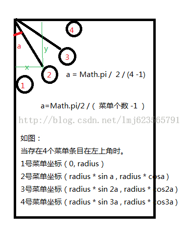
/**
* 设置所有孩子的位置 例如(第一个为按钮): 左上时,从左到右 ] 第2个:mRadius(sin0 , cos0)
* 第3个:mRadius(sina ,cosa) 注:[a = Math.PI / 2 * (cCount - 1)]
* 第4个:mRadius(sin2a ,cos2a) 第5个:mRadius(sin3a , cos3a) ...
*/
for (int i = 0; i < count - 1; i++) {
View child = getChildAt(i + 1);
child.setVisibility(View.GONE);
int cl = (int) (mRadius * Math.sin(Math.PI / 2 / (count - 2)
* i));
int ct = (int) (mRadius * Math.cos(Math.PI / 2 / (count - 2)
* i));
// childview width
int cWidth = child.getMeasuredWidth();
// childview height
int cHeight = child.getMeasuredHeight();
if (mPosition == Position.LEFT_TOP) {
cl += mMargin;
ct += mMargin;
}
if (mPosition == Position.LEFT_BOTTOM) {
ct = getMeasuredHeight() - cHeight - ct - mMargin;
cl += mMargin;
}
if (mPosition == Position.RIGHT_BOTTOM) {
ct = getMeasuredHeight() - cHeight - ct - mMargin;
cl = getMeasuredWidth() - cWidth - cl - mMargin;
}
if (mPosition == Position.RIGHT_TOP) {
cl = getMeasuredWidth() - cWidth - cl - mMargin;
ct += mMargin;
}
if (mPosition == Position.CENTER_BOTTOM) {
ct = (int) (mRadius * Math.sin(Math.PI / count * (i + 1)));
cl = (int) (mRadius * Math.cos(Math.PI / count * (i + 1)));
cl = getMeasuredWidth() / 2 - cWidth / 2 - cl;
ct = getMeasuredHeight() - cHeight - ct - mMargin;
}
child.layout(cl, ct, cl + cWidth, ct + cHeight);
}
}
}onClick
在 源blog 中.当 菜单被 完全打开的时候,显示的依然是 + 号,而我们看像 QQ 空间 或者 Path ,都会是 x ,那这个该 怎么办呢.
其实很简单的 不是吗? 这里面有个 Status,我们根据 其状态是Status.OPEN 或者 Status.CLOSE 来做不同的 处理即可
     /**
     * 为按钮添加点击事件
     */
    @Override
    public void onClick(View v) {
        if (mButton == null) {
            mButton = getChildAt(0);
        }

        rotateView(mCurrentStatus);

        toggleMenu(300);
    }
public void rotateView(Status mCurrentStatus) {
if (mCurrentStatus == Status.OPEN) {
rotateView(mButton, 135f, 0f, 300);
} else {
rotateView(mButton, 0f, 135f, 300);
}
}同时,因为中间 按钮 位置的 改变,这里的 旋转 操作的 起始 和 终止 位置 也是变化的
 if (mPosition == Position.CENTER_BOTTOM) {
                ct = (int) (mRadius * Math.sin(Math.PI / count * (i + 1)));
                cl = (int) (mRadius * Math.cos(Math.PI / count * (i + 1)));
            } else {
                // child left
                cl = (int) (mRadius * Math.sin(Math.PI / 2 / (count - 2) * i));
                // child top
                ct = (int) (mRadius * Math.cos(Math.PI / 2 / (count - 2) * i));
            }
这里需要 记住 ,当前状态是 Status.CLOSE的时候,就会 to OPEN,和 rotateView 是相同的
 private void changeStatus() {

        if (mCurrentStatus == Status.CLOSE) {
        // 在arcMenu 要被打开的时候 给整个arcMenu 设置点击事件,
            setOnClickListener(new View.OnClickListener() {
                @Override
                public void onClick(View v) {
                    ArcMenu.this.onClick(v);
                }
            });
        } else {
            setClickable(false);
        }

// 切换状态
        mCurrentStatus = (mCurrentStatus == Status.CLOSE ? Status.OPEN : Status.CLOSE);
        // 设置状态回调,给用户设置,比如可以设置背景变暗等
        if (null != statusChange) statusChange.arcMenuStatus(mCurrentStatus);

    }
StatusChange
 public interface StatusChange {
        void arcMenuStatus(Status mStatus);
    }

    public StatusChange getStatusChange() {
        return statusChange;
    }

    public void setStatusChange(StatusChange statusChange) {
        this.statusChange = statusChange;
    }
测试
布局文件
<com.bobomee.arcmenu.ArcMenu xmlns:android="http://schemas.android.com/apk/res/android"
    xmlns:app="http://schemas.android.com/apk/res-auto"
    android:id="@+id/id_arcmenu"
    android:layout_width="fill_parent"
    android:layout_height="fill_parent"
    app:margin="15dp"
    app:position="center_bottom"
    app:radius="130dp">


    <ImageView
        android:layout_width="wrap_content"
        android:layout_height="wrap_content"
        android:src="@mipmap/chooser_button" />

    <ImageView
        android:layout_width="wrap_content"
        android:layout_height="wrap_content"
        android:layout_centerInParent="true"
        android:background="@mipmap/composer_camera"
        android:tag="Camera" />

    <ImageView
        android:layout_width="wrap_content"
        android:layout_height="wrap_content"
        android:layout_centerInParent="true"
        android:src="@mipmap/composer_music"
        android:tag="Music" />

<ImageView
        android:layout_width="wrap_content"
        android:layout_height="wrap_content"
        android:layout_centerInParent="true"
        android:src="@mipmap/composer_place"
        android:tag="Place" />

</com.bobomee.arcmenu.ArcMenu>
java 代码
ImageView people = new ImageView(this);
        people.setImageResource(R.mipmap.composer_sleep);
        people.setTag("Sleep");
        mArcMenu.addView(people);


        mArcMenu.setOnMenuItemClickListener(new ArcMenu.OnMenuItemClickListener() {
            @Override
            public void onClick(View view, int pos) {

                Toast.makeText(MainActivity.this, view.getTag() + "; position :" + pos, Toast.LENGTH_LONG).show();
            }
        });

        mArcMenu.setStatusChange(new ArcMenu.StatusChange() {
            @Override
            public void arcMenuStatus(ArcMenu.Status mStatus) {

                mArcMenu.setBackgroundColor(mStatus == ArcMenu.Status.OPEN ? Color.LTGRAY : Color.TRANSPARENT);
            }
        });
相关源码:
ArcMenu@[Github]


 108
108

 被折叠的 条评论
为什么被折叠?
被折叠的 条评论
为什么被折叠?
 到【灌水乐园】发言


