@keyframes 案例
1. 先设置动画效果:
@keyframs  myframes{

from{   }

to{  transform:translate(300px);  }

}
2. 在元素的样式中调用并设置动画执行:
amimation-name:myframes;(自定义名称)调用已经设置好的动画。

amimation-duration:5s;(动画持续的时间)设置动画持续时间,单位为s。

amimation-timing-function:ease;(动画过渡的类型)设置动画的类型。

amimation-delay:0.5s;(动画延迟的时间)设置动画执行前的延迟时间。

amimation-iteration-count:infinite;(动画循环次数)设置动画循环的次数,同时注意有返回,每返算一次。

amimation-direction:alternate(往返);(循环中是否反向)设置动画是否反向执行,默认不执行反向。
example:
- html:
 <section class="banner_top box_bor" id='banner'>
        <div class="big_div">
            <div class="headerDScreen animationSpeed">
            </div>
            <div class="banner_text">
                 //文字啊,标题啊,图片啊
            </div>
        </div>
    </section>
- css:
section {
width: 100%;
min-width: 1050px;
font-size: '苹方' !important;
}
.banner_top {
height: 730px;
width: 100%;
min-width: 1050px;
position: relative;
overflow: hidden;
background-image: url('/static/weixueban/images/wxb_newindex/ban_none.png');
background-position: center;
background-size: cover;
background-repeat: no-repeat;
}
@keyframes bannerScaleChange {
50% {
transform: scale(1.08);
}
100% {
transform: scale(1);
}
}
.banner_top .big_div {
width: 1050px;
margin: 0 auto;
height: 630px;
position: relative;
margin-top: 70px;
}
.banner_top .big_div .headerDScreen {
position: absolute;
left: 0;
top: 3%;
width: 476px;
height: 642px;
background-image: url('/static/weixueban/images/wxb_newindex/hold_mobile.png');
background-position: center;
background-size: cover;
background-repeat: no-repeat;
animation: bannerScaleChange 15s infinite;
z-index: 1;
}
效果:页面加载后图片以15秒为周期放大到1.08倍,再缩小到一倍

example2:
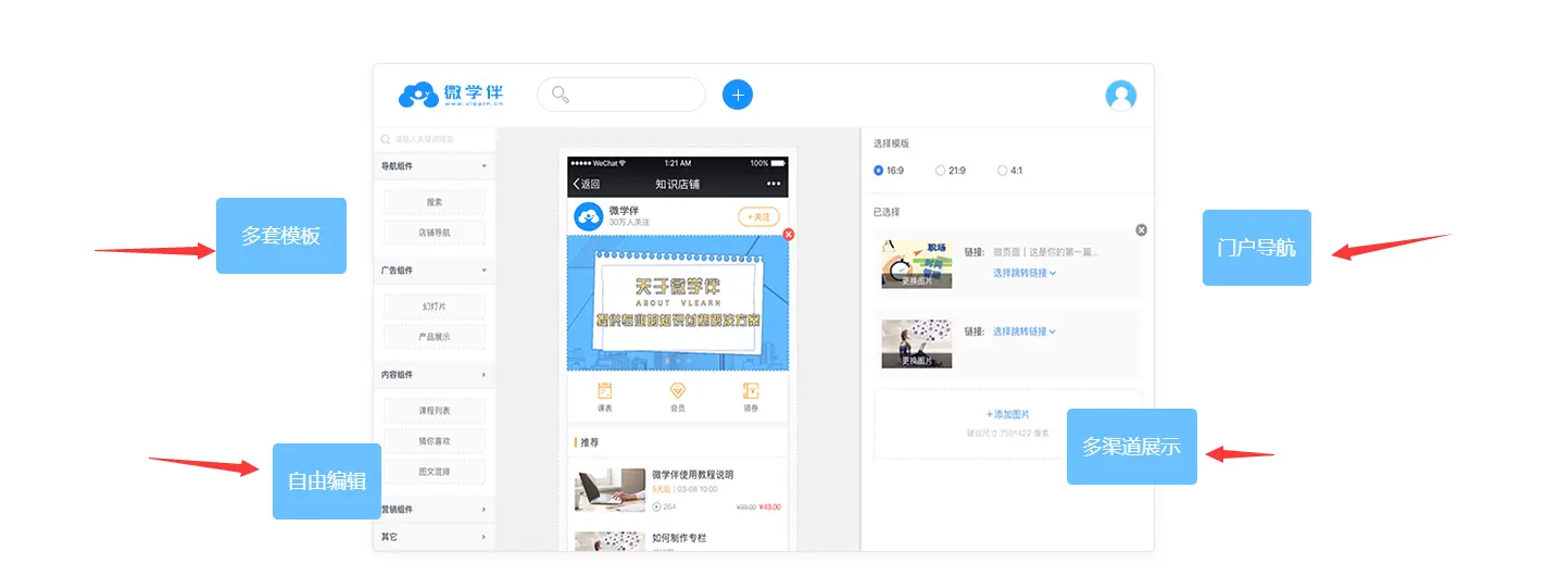
- html:
          <div class="store_img" >
            <div id="show_animate">
                    <div  id="animat_1" class="store_bule  bule_1  animat_1  animated">多套模板</div>
                    <div  id="animat_2" class="store_bule bule_2  animat_2 animated">自由编辑</div>
                    <div  id="animat_3" class="store_bule bule_3 animat_3  animated">门户导航</div>
                    <div  id="animat_4" class="store_bule bule_4 animat_4 animated">多渠道展示</div>
            </div>
            <img src="/static/weixueban/images/wxb_newindex/know_store.png" alt="">
        </div>
- css
.store_img{
padding-top: 50px;
position: relative;
width: 1050px;
margin: 0 auto;
.store_bule{
background:#69C0FF;
color:#fff;
border-radius: 5px;
text-align: center;
font-size: 18px;
}
.bule_1{
width: 120px;
height: 70px;
line-height: 70px;
position: absolute;
left: 2%;
top: 35%;
}
.bule_2{
width: 100px;
height: 70px;
line-height: 70px;
position: absolute;
left: 7%;
bottom: 8%;
}
.bule_3{
width: 100px;
height: 70px;
line-height: 70px;
position: absolute;
right: 2%;
top: 37%;
}
.bule_4{
width: 120px;
height: 70px;
line-height: 70px;
position: absolute;
right: 12%;
bottom: 14%;
}
@keyframes animat_1{
0%{opacity:0; transform:translate3d(-60px,0,0)}
to{transform:none}
}
.animat_1{ //使用动画animat_1
animation-name: animat_1;
}
@keyframes animat_2{
0%{opacity:0; transform:translate3d(-60px,0,0)}
to{transform:none}
}
.animat_2{ //使用动画animat_2
animation-name: animat_2;
}
@keyframes animat_3{
0%{opacity:0; transform:translate3d(60px,0,0)}
to{transform:none}
}
.animat_3{ //使用动画animat_3
animation-name: animat_3;
}
@keyframes animat_4{
0%{opacity:0; transform:translate3d(60px,0,0)}
to{transform:none}
}
.animat_4{ //使用动画animat_4
animation-name: animat_4;
}
.animated {
animation-duration: 2s;
animation-fill-mode: both;
animation-timing-function: ease;
}
}
- 效果: 在2秒内,左侧/右侧四个图标滑动到指定位置


 扫一扫
扫一扫
 462
462

 被折叠的 条评论
为什么被折叠?
被折叠的 条评论
为什么被折叠?
 到【灌水乐园】发言


