


在以前的开发过程中,每次标题栏都是自己布局,每次都被美工水说没有ios做的包准,因此我发烧要学学官方的东西,那就是高大上的toolbar了,虽然出来了这么久都是一直没用过,最近看到很多demo中都用到了,装逼的我也要学学了。
先说说常规的toolbar
- 在res/values/styles.xml和/res/values-v21/styles.xml中配置style
- 在 activity_main.xml 里面添加 Toolbar 控件
- MainActivity.java 中加入 Toolbar
下面说说具体的操作:
1.为了之后设定方便,我们先在 res/values/styles.xml 里增加一个名为 AppTheme.Base 的风格
<style name="AppTheme.Base" parent="Theme.AppCompat">
  <item name="windowActionBar">false</item>
  <item name="android:windowNoTitle">true</item>
</style>
因为此范例只使用 Toolbar,所以我们要将让原本的 ActionBar 隐藏起来,然后将原本 AppTheme 的 parent 属性 改为上面的AppTheme.Base,代码如下:
<resources>

  <!-- Base application theme. -->
  <style name="AppTheme" parent="AppTheme.Base">
  </style>

  <style name="AppTheme.Base" parent="Theme.AppCompat">
    <item name="windowActionBar">false</item>
    <del><item name="android:windowNoTitle">true</item></del>
    <!-- 使用 API Level 22 編譯的話,要拿掉前綴字 -->
    <item name="windowNoTitle">true</item>
  </style>

</resources>
再来调整Android 5.0的style: /res/values-v21/styles.xml,也将其 parent 属性改为 AppTheme.Base:
<?xml version="1.0" encoding="utf-8"?>
<resources>
    <style name="AppTheme" parent="AppTheme.Base">
    </style>
</resources>或者可以设置:
<!-- Base application theme. -->
<style name="AppTheme" parent="Theme.AppCompat.Light.NoActionBar">
    <!-- Customize your theme here. -->
    <item name="colorPrimary">@color/colorPrimary</item>
  <item name="colorPrimaryDark">@color/colorPrimaryDark</item>
 <item name="colorAccent">@color/colorAccent</item>
   </style>
</resources>
可以根据自己的需求来!
2.在 activity_main.xml 里面添加 Toolbar 控件:
<android.support.v7.widget.Toolbar
  android:id="@+id/toolbar"
  android:layout_height="?attr/actionBarSize"
  android:layout_width="match_parent" >

</android.support.v7.widget.Toolbar>- MainActivity.java 中加入 Toolbar
Toolbar toolbar = (Toolbar) findViewById(R.id.toolbar);
setSupportActionBar(toolbar);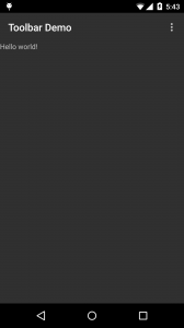
上图是将本阶段要完成的结果画面做了标示,结合下面的描述希望大家能明白。
colorPrimaryDark(状态栏底色):在风格 (styles) 或是主题 (themes) 里进行设定。
App bar 底色
这个设定分为二,若你的 android app 仍是使用 actionbar ,则直接在风格 (styles) 或是主题 (themes) 里进行设定 colorPrimary 参数即可;
可若是采用 toolbar 的话,则要在界面 (layout) 里面设定 toolbar 控件的 background 属性。
navigationBarColor(导航栏底色):
仅能在 API v21 也就是 Android 5 以后的版本中使用, 因此要将之设定在 res/values-v21/styles.xml 里面。
主视窗底色:windowBackground
也因此在这个阶段,我们需要设定的地方有三,一是 style中(res/values/styles.xml)
<style name="AppTheme.Base" parent="Theme.AppCompat">
  <item name="windowActionBar">false</item>
  <item name="android:windowNoTitle">true</item>
  <!-- Actionbar color -->
  <item name="colorPrimary">@color/accent_material_dark</item>
  <!--Status bar color-->
  <item name="colorPrimaryDark">@color/accent_material_light</item>
  <!--Window color-->
  <item name="android:windowBackground">@color/dim_foreground_material_dark</item>
</style>
再来是 v21 的style中 (res/values-v21/styles.xml)
<style name="AppTheme" parent="AppTheme.Base">
  <!--Navigation bar color-->
  <item name="android:navigationBarColor">@color/accent_material_light</item>
</style>
最后,就是为了本篇的主角 – Toolbar 的 background 进行设定。
<android.support.v7.widget.Toolbar
  android:id="@+id/toolbar"
  android:layout_height="?attr/actionBarSize"
  android:layout_width="match_parent"
  android:background="?attr/colorPrimary" >

</android.support.v7.widget.Toolbar>
大抵来说,预设常用的几个元素就如图中所示,接着就依序来说明之:
setNavigationIcon
即设定 up button 的图标,因为 Material 的介面,在 Toolbar这里的 up button样式也就有別于过去的 ActionBar 哦。
setLogo
APP 的图标。
setTitle
主标题。
setSubtitle
副标题。
setOnMenuItemClickListener
设定菜单各按鈕的动作。
好,上面的都是常规的设置,但是好像还是达不到我们的要求,比如
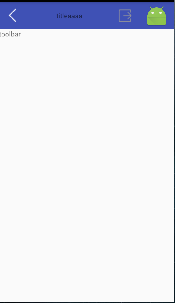
1.设置返回图标
2.设置标题居中
3.自定义右边的图标
4.自定义munu中的显示
下面就以上四个问题进行解决
1.只需要设置setNavigationIcon,并且设置点击事件就ok
          //左边的
        toolbar.setNavigationIcon(R.mipmap.back);
        //加载toolbar
        setSupportActionBar(toolbar);
        toolbar.setNavigationOnClickListener(new View.OnClickListener() {
            @Override
            public void onClick(View v) {
                Toast.makeText(MainActivity.this, "back", Toast.LENGTH_LONG).show();
            }
        });
2.不设置title,直接在toolbar的xml文件配置
<?xml version="1.0" encoding="utf-8"?>
<RelativeLayout xmlns:android="http://schemas.android.com/apk/res/android"
    xmlns:tools="http://schemas.android.com/tools"
    android:layout_width="match_parent"
    android:layout_height="match_parent"
>
    <android.support.v7.widget.Toolbar
        android:id="@+id/id_toolbar"
        android:layout_height="wrap_content"
        android:background="?attr/colorPrimary"
        android:gravity="center"
        android:layout_width="match_parent" >
    <LinearLayout
    android:layout_width="match_parent"
    android:layout_height="wrap_content"
    android:gravity="center"
     >
        <TextView
        android:layout_width="match_parent"
        android:layout_height="wrap_content"
          android:layout_gravity="center"
            android:gravity="center"
        android:text="titleaaaa"/>
</LinearLayout>
    </android.support.v7.widget.Toolbar>
    <TextView
        android:layout_below="@+id/id_toolbar"
        android:layout_width="match_parent"
        android:layout_height="wrap_content"
        android:text="toolbar"
        />

</RelativeLayout>
3.
在你自己的Theme定义中加入@style/OverflowButtonStyle,然后
<style name="OverflowButtonStyle" parent="@android:style/Widget.ActionButton.Overflow">    <item name="android:src">@drawable/float_button</item>
</style>
具体代码:
<resources>

    <!-- Base application theme. -->
    <style name="AppTheme" parent="Theme.AppCompat.Light.NoActionBar">
        <!-- Customize your theme here. -->
        <item name="colorPrimary">@color/colorPrimary</item>
      <item name="colorPrimaryDark">@color/colorPrimaryDark</item>
     <item name="colorAccent">@color/colorAccent</item>
        <!--//修改右边的图案-->
        <item name="actionOverflowButtonStyle">@style/OverflowButtonStyle</item>
    </style>
    <style name="OverflowButtonStyle" parent="@android:style/Widget.ActionButton.Overflow">    <item name="android:src">@mipmap/ic_launcher</item></style>
    </resources>
那个ic_launcher 就是我现在设置的右边的图标
4.首先自定义munu_main.xml
<?xml version="1.0" encoding="utf-8"?>
<menu xmlns:android="http://schemas.android.com/apk/res/android"
    xmlns:app="http://schemas.android.com/apk/res-auto"
    xmlns:tools="http://schemas.android.com/tools"
    tools:context=".MainActivity"
    >
    <item android:id="@+id/action_edit"
        android:title="111"
        android:orderInCategory="80"
        android:icon="@mipmap/edit"
        app:showAsAction="never" />

    <item android:id="@+id/action_share"
        android:title="222"
        android:orderInCategory="90"
        android:icon="@mipmap/exit"
        app:showAsAction="ifRoom" />

    <!--<item android:id="@+id/action_settings"-->
        <!--android:title="333"-->
        <!--android:orderInCategory="100"-->
        <!--app:showAsAction="always"/>-->
    <!--<item android:id="@+id/ssss"-->
        <!--android:title="444"-->
        <!--android:orderInCategory="100"-->
        <!--app:showAsAction="always"/>-->
    <item android:id="@+id/rrr"
        android:title="555"
        android:orderInCategory="100"
        app:showAsAction="never"/>
</menu>
    <!--orderInCategory actionbar里每个item的优先级,值越大优先级越低,actionbar地方不够就会放到overflow中
    showAsAction : ifRoom  如果空间不足就放入overflow
                    always 总是会显示出来
                    never 不管怎么样都放入overflow

    -->
代码中已经说的很清楚,其次就是重写onCreateOptionsMenu加载布局,然后设置点击事件即可
package com.example.administrator.toolbardemo;

import android.os.Bundle;
import android.support.v7.app.AppCompatActivity;
import android.support.v7.widget.Toolbar;
import android.view.Menu;
import android.view.MenuItem;
import android.view.View;
import android.widget.Toast;

public class MainActivity extends AppCompatActivity {

    @Override
    protected void onCreate(Bundle savedInstanceState) {
        super.onCreate(savedInstanceState);
        setContentView(R.layout.activity_main);
        Toolbar toolbar = (Toolbar) findViewById(R.id.id_toolbar);
        // App Logo
//        toolbar.setLogo(R.mipmap.back);
        // Title
        //toolbar.setTitle("");
        // Sub Title
       // toolbar.setSubtitle("Sub title");
        //左边的
        toolbar.setNavigationIcon(R.mipmap.back);
        //加载toolbar
        setSupportActionBar(toolbar);
//        toolbar.setNavigationContentDescription("aaaaa");
        toolbar.setNavigationOnClickListener(new View.OnClickListener() {
            @Override
            public void onClick(View v) {
                Toast.makeText(MainActivity.this, "back", Toast.LENGTH_LONG).show();
            }
        });
        //点击事件
        toolbar.setOnMenuItemClickListener(new Toolbar.OnMenuItemClickListener() {
            @Override
            public boolean onMenuItemClick(MenuItem item) {
                String msg = "";
                switch (item.getItemId()) {
                    case R.id.action_edit:
                        msg += "nav_home";
                        break;
                    case R.id.action_share:
                        msg += "nav_messages share";
                        break;
//                    case R.id.action_settings:
//                        msg += "Click nav_friends";
//                        break;
                }

                if(!msg.equals("")) {
                    Toast.makeText(MainActivity.this, msg, Toast.LENGTH_SHORT).show();
                }
                return true;
            }
        });
    }
    @Override
    public boolean onCreateOptionsMenu(Menu menu) {
        // 為了讓 Toolbar 的 Menu 有作用,這邊的程式不可以拿掉
        getMenuInflater().inflate(R.menu.menu_main, menu);
        return true;
    }

}
好,装逼结束
丑是丑了点,但是效果还是出来了!
如果有需要可以去下载哦
http://download.csdn.net/detail/wei8023hzp/9450725


 8527
8527


 被折叠的 条评论
为什么被折叠?
被折叠的 条评论
为什么被折叠?
 到【灌水乐园】发言


