


一 Echarts制作散点图
Echarts的使用:首先需要设定一个div用来承载图表,然后初始化echarts实例。将所有的数据与配置写在option中,需要设置的几部分内容为:
一)backgroundColor:背景颜色,可设置为某一个固定的背景颜色,也可设置为渐变的背景颜色,如下:(参数为x轴,y轴,z轴位置)
backgroundColor: new echarts. graphic.RadialGradient(0.3, 0.3, 0.8, [{ offset:0, color:'#f7f8fa'}, {offset:1 , color:'#cdd0d5'}])
offset是指偏移,0即为0%,1即为100%。
二)title:设置标题内容:如title:{ text: 'this is title'} 。
三)legend:图例声明,如legend:{right:10, data:['1990','2015']}。
四)xAxis, yAxis:x轴与y轴设置,可设置splitline等参数。
五)series:数据设置。
最后要使用指定的配置项和数据显示图表:myChart.setOption(option);
其中series的设置较为复杂,可分为如下的几部分:
1⃣️ name:要对应于图例的名称。
2⃣️ type:散点图的type为scatter。
3⃣️ data:引入这一name对应的数据。
4⃣️ symbolSize:显示大小,若不设置此项,则散点图的点的大小都相同,根据所给数据设置可有不同。
symbolSize:function(data){ return Math.sqrt(data[2])/5e2; }
5⃣️ label:鼠标移入时的显示标签。
6⃣️ itemStyle:设计每项的样式,本图中是设计每个散点的样式,可设置其阴影,颜色等。
二 代码实现
<!-- 为ECharts准备一个具备大小(宽高)的Dom -->
<div id="main" style="width: 600px;height:400px;"></div>
<script type="text/javascript">
// 基于准备好的dom,初始化echarts实例
var myChart = echarts.init(document.getElementById('main'));
// 指定图表的配置项和数据
var data = [
[[28604,77,17096869,'Australia',1990],[31163,77.4,27662440,'Canada',1990],[1516,68,1154605773,'China',1990],[13670,74.7,10582082,'Cuba',1990],[28599,75,4986705,'Finland',1990],[29476,77.1,56943299,'France',1990],[31476,75.4,78958237,'Germany',1990],[28666,78.1,254830,'Iceland',1990],[1777,57.7,870601776,'India',1990],[29550,79.1,122249285,'Japan',1990],[2076,67.9,20194354,'North Korea',1990],[12087,72,42972254,'South Korea',1990],[24021,75.4,3397534,'New Zealand',1990],[43296,76.8,4240375,'Norway',1990],[10088,70.8,38195258,'Poland',1990],[19349,69.6,147568552,'Russia',1990],[10670,67.3,53994605,'Turkey',1990],[26424,75.7,57110117,'United Kingdom',1990],[37062,75.4,252847810,'United States',1990]],
[[44056,81.8,23968973,'Australia',2015],[43294,81.7,35939927,'Canada',2015],[13334,76.9,1376048943,'China',2015],[21291,78.5,11389562,'Cuba',2015],[38923,80.8,5503457,'Finland',2015],[37599,81.9,64395345,'France',2015],[44053,81.1,80688545,'Germany',2015],[42182,82.8,329425,'Iceland',2015],[5903,66.8,1311050527,'India',2015],[36162,83.5,126573481,'Japan',2015],[1390,71.4,25155317,'North Korea',2015],[34644,80.7,50293439,'South Korea',2015],[34186,80.6,4528526,'New Zealand',2015],[64304,81.6,5210967,'Norway',2015],[24787,77.3,38611794,'Poland',2015],[23038,73.13,143456918,'Russia',2015],[19360,76.5,78665830,'Turkey',2015],[38225,81.4,64715810,'United Kingdom',2015],[53354,79.1,321773631,'United States',2015]]
];
option = {
backgroundColor: new echarts.graphic.RadialGradient(0.3, 0.3, 0.8, [{
offset: 0,
color: '#f7f8fa'
}, {
offset: 1,
color: '#cdd0d5'
}]),
title: {
text: '1990 与 2015 年各国家人均寿命与 GDP'
},
legend: {
right: 10,
data: ['1990', '2015']
},
xAxis: {
splitLine: {
lineStyle: {
type: 'dashed'
}
}
},
yAxis: {
splitLine: {
lineStyle: {
type: 'dashed'
}
},
scale: true
},
series: [{
name: '1990',
data: data[0],
type: 'scatter',
symbolSize: function (data) {
return Math.sqrt(data[2]) / 5e2;
},
label: {
emphasis: {
show: true,
formatter: function (param) {
return param.data[3];
},
position: 'top'
}
},
itemStyle: {
normal: {
shadowBlur: 10,
shadowColor: 'rgba(120, 36, 50, 0.5)',
shadowOffsetY: 5,
color: new echarts.graphic.RadialGradient(0.4, 0.3, 1, [{
offset: 0,
color: 'rgb(251, 118, 123)'
}, {
offset: 1,
color: 'rgb(204, 46, 72)'
}])
}
}
}, {
name: '2015',
data: data[1],
type: 'scatter',
symbolSize: function (data) {
return Math.sqrt(data[2]) / 5e2;
},
label: {
emphasis: {
show: true,
formatter: function (param) {
return param.data[3];
},
position: 'top'
}
},
itemStyle: {
normal: {
shadowBlur: 10,
shadowColor: 'rgba(25, 100, 150, 0.5)',
shadowOffsetY: 5,
color: new echarts.graphic.RadialGradient(0.4, 0.3, 1, [{
offset: 0,
color: 'rgb(129, 227, 238)'
}, {
offset: 1,
color: 'rgb(25, 183, 207)'
}])
}
}
}]
};
// 使用刚指定的配置项和数据显示图表。
myChart.setOption(option);
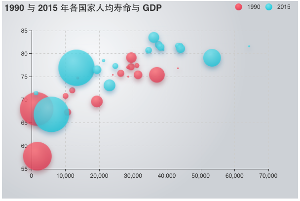
</script>三 效果图


 5694
5694


 被折叠的 条评论
为什么被折叠?
被折叠的 条评论
为什么被折叠?
 到【灌水乐园】发言


