


netflix
In a previous post, we explored the interaction of the Netflix Play button and how it morphs between play/pause states. In this post we will examine what Netflix refers to as the forward 10 seconds button, we will then proceed to develop it with SwiftUI.
在上一篇文章中 ,我们探讨了Netflix Play按钮的交互作用以及它在播放/暂停状态之间如何变形。 在本文中,我们将研究Netflix所指的“前进10秒”按钮,然后继续使用SwiftUI进行开发。
什么是“前进10秒”按钮? (What is a Forward 10 Seconds Button?)
The forward 10 seconds button, which we will refer to as the Forward button from now on, allows a user watching video to move the video ahead by 10 seconds (forward seek), if a user repeatedly taps it within a short time since the previous tap, the time duration of the seek will increase.
向前10秒按钮(从现在开始,我们将其称为“向前”按钮)允许观看视频的用户将视频向前移动10秒(向前搜索),前提是用户在自上一个按钮开始的短时间内反复点击它点击,搜索的持续时间将增加。
The animation sequence for the seek operation is a very long for an interaction on mobile, yet in my opinion it works perfectly. It manages to convey all the necessary information in a really playful way, it also makes the actual seek operation feel shorter, and it surprisingly never gets boring.
搜索操作的动画序列对于在移动设备上进行交互非常耗时,但我认为它的效果很好。 它设法以一种非常有趣的方式传达所有必要的信息,也使实际的查找操作感觉更短,而且令人惊讶的是它永远不会感到无聊。
After experiencing Netflix’s implementation of the seek button, all other seek buttons on competing apps are just really dull and unrewarding experiences. A true testament to Netflix’s UX chops. I hear you say, but the content is king! I agree however I would also like to have a joyful experience consuming that content.
经历了Netflix对“搜索”按钮的实施后,竞争应用程序上的所有其他“搜索”按钮都是非常沉闷和无聊的体验。 Netflix UX排行榜的真实证明。 我听你说,但内容为王! 我同意,但是我也希望有一个愉快的使用该内容的经验。
按钮的编排 (The Choreography of the Button)
The Forward button view can be broken down into 4 separate animatable views.
前进按钮视图可以分为4个单独的动画视图。
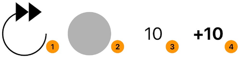
- The rounded arrow view. 圆形的箭头视图。
- The background of the rounded arrow view. 圆形箭头视图的背景。
- The duration label, hinting at the time it will seek. 持续时间标签,提示要寻找的时间。
- The accumulation label indicating the actual time that it will seek. 累积标签,指示它将搜索的实际时间。
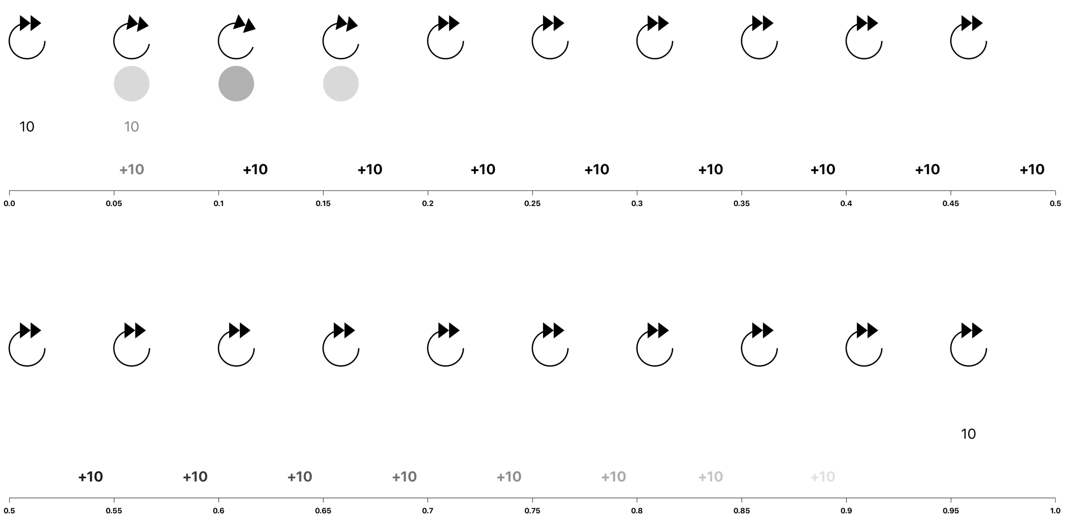
The animation timeline for these views can be seem below.
这些视图的动画时间表可以在下面看到。
圆形箭头查看动画 (Rounded Arrow View Animation)
From the image above, we can see that the rounded arrow view’s animation duration is 0.2 seconds. It rotates itself clockwise by a finite amount (We will be using 20 degrees) and then rotates back. The animation is way too short to worry about its animation curve, hence we will be using the system’s default animation curve.
从上图可以看到,圆角箭头视图的动画持续时间为0.2秒。 它会自己顺时针旋转一个有限的量(我们将使用20度),然后向后旋转。 动画太短了,不必担心其动画曲线,因此我们将使用系统的默认动画曲线。
圆形箭头背景视图动画 (Rounded Arrow Background View Animation)
The arrow’s background animation has the same animation duration as the arrow view, 0.2 seconds. It changes its opacity from completely transparent to a finite amount of opacity (we will be using 0.3) and then goes back to being completely transparent. We will be using the default animation curve here as well.
箭头的背景动画具有与箭头视图相同的动画持续时间,即0.2秒。 它将其不透明度从完全透明更改为有限的不透明度(我们将使用0.3),然后又恢复为完全透明。 我们还将在此处使用默认的动画曲线。
持续时间标签视图动画 (The Duration Label View Animation)
The label’s animation duration spans the entire duration of the whole composite animation. At the start of the animation it quickly fades out at the initiation of a tap, it does not fade in until all the other animations have completed. We will make our label fade out within 0.1 seconds and start to fade back in at 0.9 seconds. As with the other two animations, we will use the default animation curve.
标签的动画持续时间跨整个合成动画的整个持续时间。 在动画开始时,它会在轻按开始时快速淡出,直到所有其他动画都完成后才淡入。 我们将使标签在0.1秒内淡出,并在0.9秒内开始淡出。 与其他两个动画一样,我们将使用默认动画曲线。
累积标签视图动画 (The Accumulation Label View Animation)
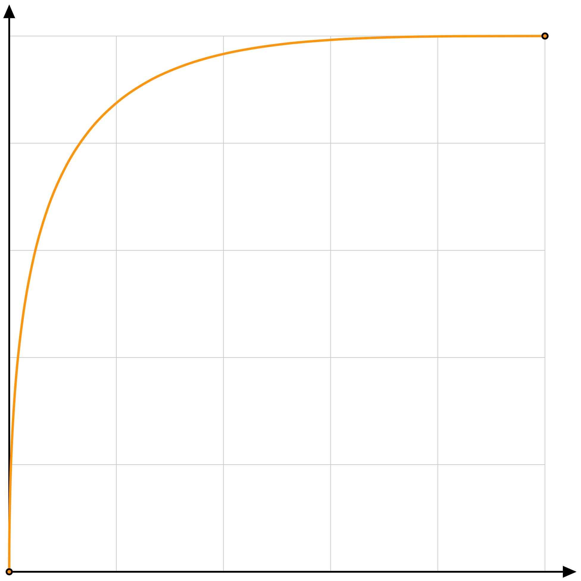
This label performs the most sophisticated animation of the bunch. At the start it fades in within 0.1 second duration, and at the same time it starts moving out, by translating along the x axis out of the rounded arrow view. The duration of the translation is around 0.5 seconds. Once the label reaches its final destination it fades out. The duration of the fade-out seems to be 0.45 seconds. The translation’s animation curve does not match any of the [ease in, ease out, ease in out] animation curves. After much experimentation, this curve seems to be the closest animation curve.
该标签执行了最复杂的动画。 在开始时,它会在0.1秒的时间内淡入,并同时通过沿x轴平移出圆形箭头视图而开始移出。 翻译的持续时间约为0.5秒。 标签到达其最终目的地后,它就会淡出。 淡出的持续时间似乎为0.45秒。 翻译的动画曲线与任何[缓入,缓入,缓入]动画曲线都不匹配。 经过大量实验后,该曲线似乎是最接近的动画曲线。
Finally, if the button is tapped while the animation is ongoing, the button will read the current value of the accumulation label and add the value of the duration label then replay the animation accordingly.
最后,如果在动画进行过程中轻按了按钮,则按钮将读取累积标签的当前值并添加持续时间标签的值,然后相应地重播动画。
SeekButton.swift (SeekButton.swift)
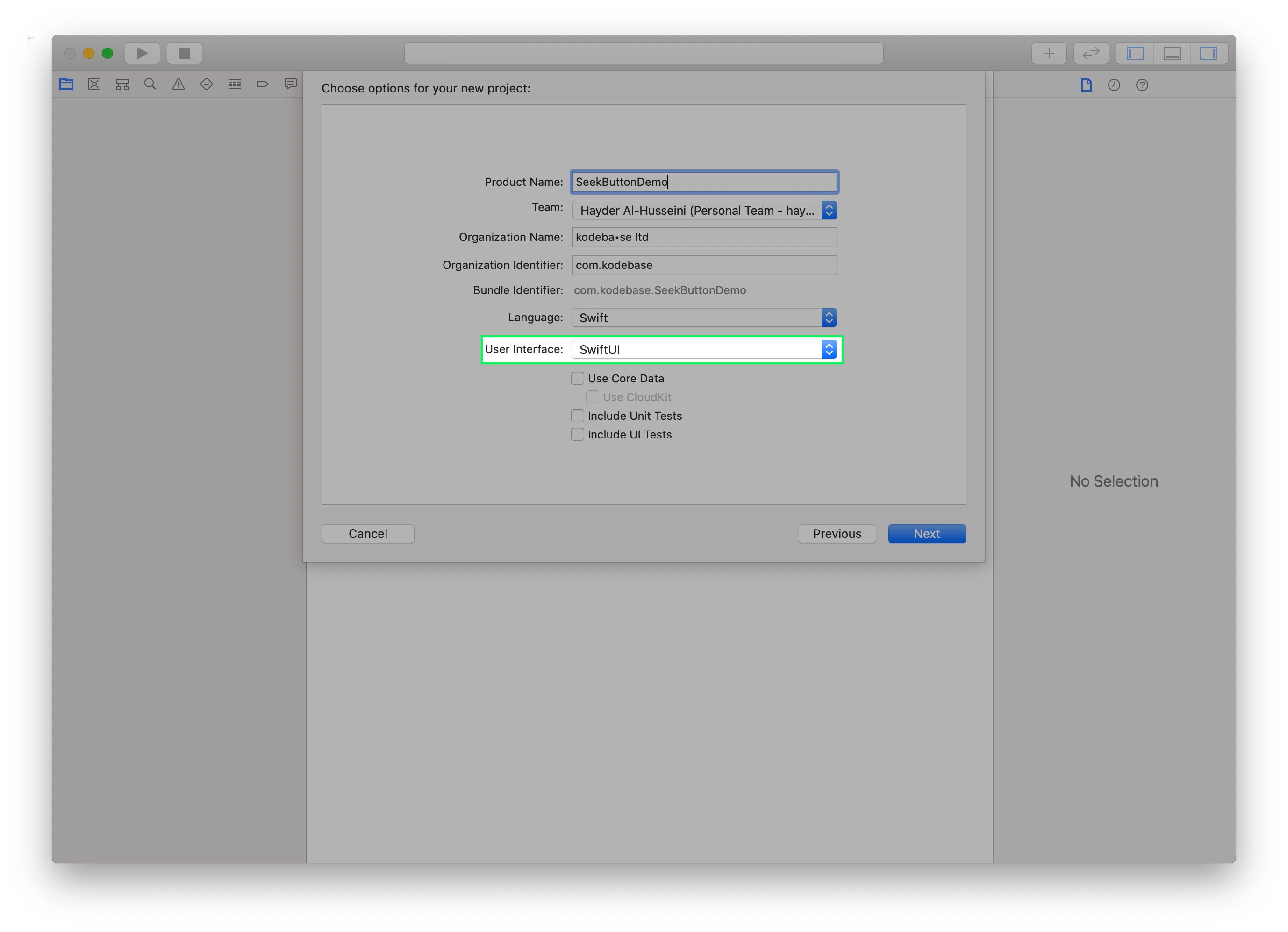
Create a new Xcode project, using the iOS Single View Application template. Let’s call it SeekButtonDemo. In the next screen, make sure to select SwiftUI in the drop-down menu titled User Interface.
使用iOS Single View Application模板创建一个新的Xcode项目。 我们称之为SeekButtonDemo 。 在下一个屏幕中,确保在标题为用户界面的下拉菜单中选择SwiftUI 。
Create a new User Interface file, select the SwiftUI View option. Call it SeekButton.
创建一个新的用户界面文件,选择SwiftUI View选项。 称之为SeekButton 。
In SeekButton.swift add an action property to the SeekButton struct, that takes a closure as it's value. This will be the action the button performs when tapped.
在SeekButton.swift中 ,向SeekButton结构中添加一个action属性,该属性将闭包作为其值。 这是轻按按钮时按钮执行的操作 。
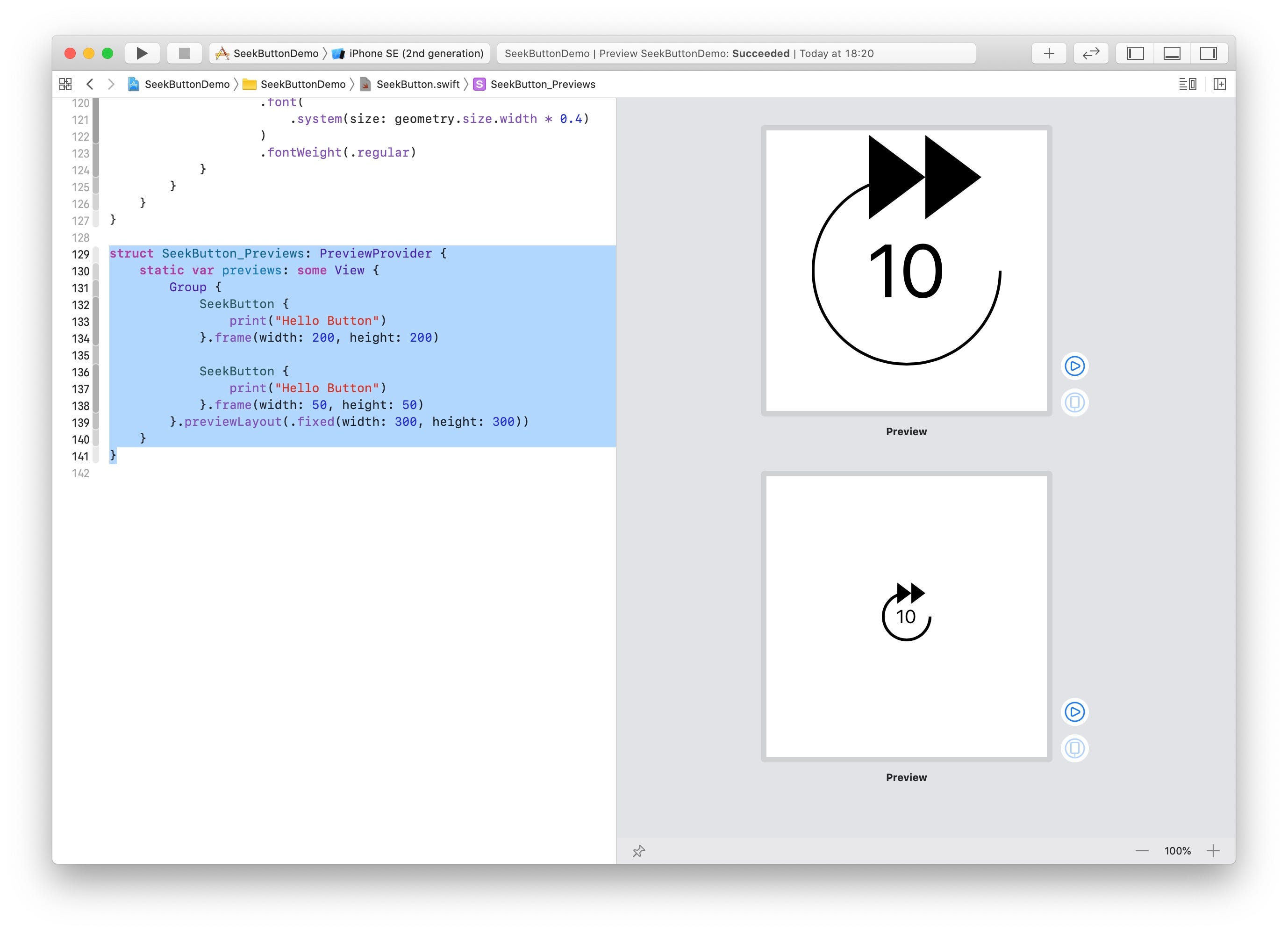
var action: (Int) -> VoidSeekButton_Preview will throw a "Missing Argument…" error. Fix it by supplying the action argument. We will set a simple action that prints Hello World!. Finally want to limit the size of the button in our preview, add a frame modifier to our SeekButton.
SeekButton_Preview将引发“ Missing Argument…”错误。 通过提供action参数对其进行修复。 我们将设置一个简单的动作来打印Hello World! 。 最后,要限制预览中按钮的大小,请向SeekButton添加一个frame修改器。
圆箭头 (RoundArrow)
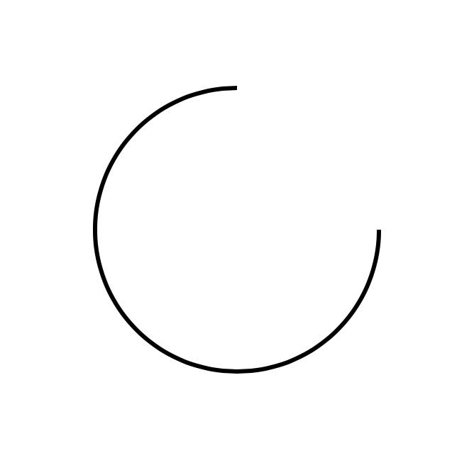
At the bottom of the SeekButton struct, create an extension to SeekButton and create a new Shape struct called RoundArrow.
在底部SeekButton结构,创建一个扩展SeekButton并创建一个新的Shape叫做结构RoundArrow 。
The RoundArrow struct is simply a path with an arc that start from the 0 angles up to 270 degrees angle counterclockwise.Back in SeekButton's body the property, replace the default Text("Hello, World!") with the following:
RoundArrow结构只是一条从0角到逆时针270度角的弧线路径。 SeekButton的body属性,将默认Text("Hello, World!")替换为以下内容:
var body: some View {
    RoundArrow()
        .stroke(lineWidth: 3)
}
Xcode’s Canvas should look like the image above.
Xcode的Canvas应该看起来像上面的图像。
If you don’t see the live preview of the button, goto to the Editor menu and make sure Canvas is selected.
如果看不到该按钮的实时预览,请转到“ 编辑器”菜单,并确保选择了“ 画布” 。
圆头箭头 (RoundArrowHead)
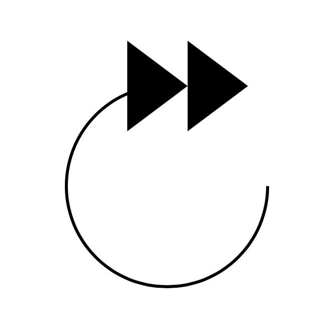
Inside our SeekButton extension, create a new Shape struct called RoundArrowHead.
在我们的SeekButton扩展中,创建一个名为RoundArrowHead的新Shape结构。
RoundArrowHead creates two equilateral triangles that are center-aligned to the end of the arrow's arc at the angle 270.0 degrees, pointing to the right. The triangles are in fact two subpaths in the same path. To add the RoundArrowHead shape in SeekButton's body property, we will need to add it to a ZStack.
RoundArrowHead创建两个等边三角形 ,它们以270.0度的角度指向箭头的圆弧的中心,并指向右侧。 三角形实际上是同一路径中的两个子路径。 要在SeekButton的body属性中添加RoundArrowHead形状,我们需要将其添加到ZStack 。
This should result in the image above.
这应该导致上面的图像。
圆形箭头背景 (RoundedArrowBackground)
Back to our SeekButton extension, create a new Shape struct called RoundedArrowBackground.
回到我们的SeekButton扩展,创建一个名为RoundedArrowBackground的新Shape结构。
RoundedArrowBackground simply adds an arc to the path, creating a circle. The width and height will match RoundArrow.The body property of SeekButton will become like this.
RoundedArrowBackground只是在路径上添加了一条弧,从而创建了一个圆。 宽度和高度将匹配RoundArrow .The body的属性SeekButton将变成这样。
The canvas shouldn’t change from before, since we have set the RoundArrowBackground opacity() modifier to 0.
画布不应更改,因为我们已将RoundArrowBackground opacity()修改器设置为0。
可缩放文字 (ScalableText)
Let’s create a new extension to SeekButton, in it we will create a new view called ScalableText.
让我们为SeekButton创建一个新的扩展,在其中我们将创建一个新的ScalableText SeekButton视图。
We have wrapped a Text view inside a GeometryReader. GeometryReader has its own size, which we will use here to make the Text's font size a multiple of the width, allowing our SeekButton to render it's content at all sizes clearly without having to define the font size for different button sizes.
我们已经将Text视图包装在GeometryReader 。 GeometryReader有其自己的大小,在这里我们将使用它来使Text的字体大小变成宽度的倍数,从而使我们的SeekButton可以SeekButton地呈现所有大小的内容,而不必为不同的按钮大小定义字体大小。
Now let’s add ScalableText to the body property of SeekButton.
现在让我们添加ScalableText到body的财产SeekButton 。
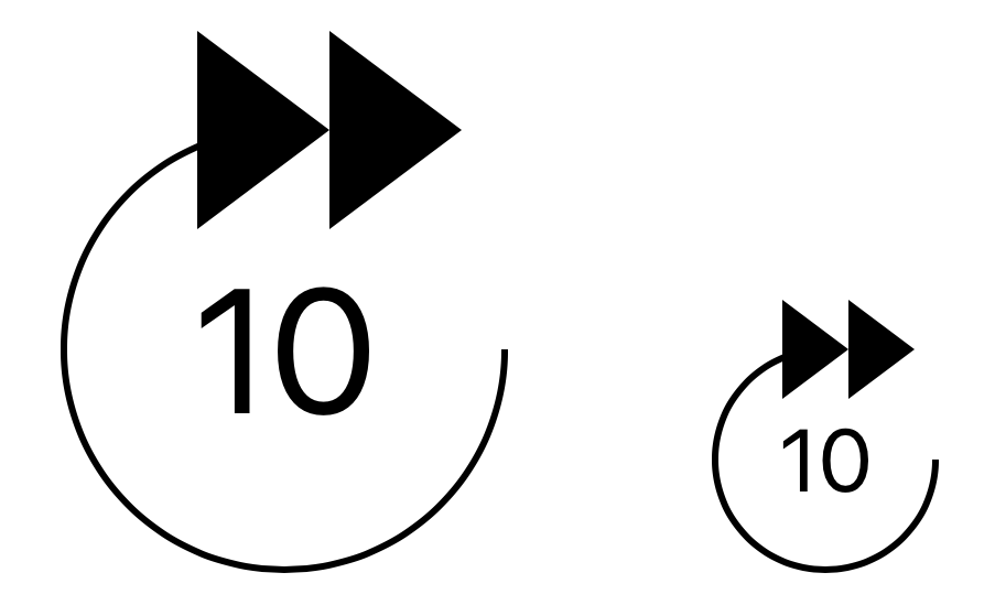
To see ScalableText in action, let's update SeekButton_Previews buy adding two buttons to preview.
要查看ScalableText SeekButton_Previews实际效果,让我们更新SeekButton_Previews购买两个按钮进行预览。
The above change should update Xcode’s canvas as below.
上面的更改将更新Xcode的画布,如下所示。
According to our earlier analysis of the seek button’s animation, there is a second label, the accumulation label. We will be using a ScalableText view for it as well, however, the string and the font-weight differ from the duration label. Let's refactor ScalableText.
根据我们之前对“搜索”按钮动画的分析,有第二个标签,即累积标签。 我们还将为其使用一个ScalableText视图,但是,字符串和字体粗细与持续时间标签不同。 让我们重构ScalableText 。
Add two variable to ScalableText, fontWeight and string.
将两个变量添加到ScalableText , fontWeight和string 。
We update the body property of SeekButton to pass in the duration, that we will make customizable by allowing the user to provide a seek interval.
我们更新SeekButton的body属性以传递持续时间,我们将通过允许用户提供查找间隔来使该属性可自定义。
Finally, we will add a ContentShape() modifier and TapGesture() modifier onto the ZStack to make our button interactive.
最后,我们将在ZStack上添加ContentShape()修饰符和TapGesture()修饰符以使按钮具有交互性。
    .contentShape(Rectangle())
    .onTapGesture {
        self.action(interval)
    }
The ContentShape() modifier tells the SwiftUI that the view's hit area, is a rectangle covering the whole view.
ContentShape()修饰符告诉SwiftUI该视图的点击区域是覆盖整个视图的矩形。
With all our views ready, let’s animate.
准备好所有视图后,让我们动画。
动画圆形箭头 (Animating the Rounded Arrow)
From our animation breakdown above, we want the arrow to rotate by 20 degrees, clockwise. The arrow in our view, is composed of 3 shapes, we will rotate all three together by embeding them into a Group and adding a rotationEffect() modifier.Additionally we want the background to fade into a maximum opacity of 0.3. We achieve these effects by adding two state properties to our view rotation and backgroundOpacity.
从上面的动画细分中,我们希望箭头顺时针旋转20度。 我们视图中的箭头由3个形状组成,我们将这三个形状嵌入到一个Group并添加rotationEffect()修饰符来旋转所有三个形状,此外我们还希望背景淡入最大不透明度0.3。 通过在视图rotation和backgroundOpacity添加两个状态属性来实现这些效果。
The function animateArrowAndBackground() looks like this:
函数animateArrowAndBackground()如下所示:
The function has two animations, one to animate out and one to reverse the animation after the other one has completed.
该功能有两个动画,一个动画,另一个在完成后反转动画。
动画持续时间标签 (Animating the Duration Label)
To animate the duration label, we will add a new state property durationLabelOpacity, add an opacity() modifier to the duration label and update our body property and tap gesture.
为了给持续时间标签添加动画效果,我们将添加一个新的状态属性durationLabelOpacity ,向持续时间标签添加opacity()修饰符,并更新我们的body属性并点击手势。
The function animateDurationLabel() is very simple.
animateDurationLabel()函数非常简单。
Netflix’s button flashes the duration label with every tap. We reset the animation value so that we can achieve the flash as well. We will not reverse the animation here, we will tackle that shortly.
Netflix的按钮每次轻触都会闪烁持续时间标签。 我们重置动画值,以便我们也可以实现闪光。 我们不会在这里反转动画,我们会尽快解决。
动画累积标签 (Animating the Accumulation Label)
This label is more involved. We will animate the label out by offseting the TextView inside ScalableText. Let's extend ScalableText.
该标签涉及更多。 我们将通过抵减动画标签出来TextView里面ScalableText 。 让我们扩展ScalableText 。
We’ve added a new property xOffset, we will scale the value passed in based on the size of the button, so that the offset animation will always be proportional to the size of the button. We've informed SwiftUI that we want to animate this value by providing it as our animatableData property.
我们添加了一个新的属性xOffset ,我们将根据按钮的大小缩放传入的值,以便偏移动画将始终与按钮的大小成比例。 我们已通知SwiftUI,我们希望通过将其值设置为animatableData属性来对其进行animatableData 。
For a great write up on SwiftUI animation, checkout out this post.
有关SwiftUI动画的出色文章,请查看这篇文章 。
In SeekButton we've added two new state variables accumulationLabelOpacity and xOffset.
在SeekButton我们添加了两个新的状态变量accumulationLabelOpacity和xOffset 。
The function animateAccumulationLabel() looks like this.
函数animateAccumulationLabel()看起来像这样。
Here we reset the animation values, so that when a user taps multiple times, the animation restarts from the beginning. We then fade in the label and offset it’s x coordinate by 80.0. We provide the animation curve here as well, the curve’s control points are (0.0, 0.0)and (0.2, 1.0).
在这里,我们重置动画值,以便用户多次点击时,动画将从头开始重新播放。 然后,我们淡入标签,并将其x坐标偏移80.0。 我们也在这里提供了动画曲线,曲线的控制点是(0.0, 0.0)和(0.2, 1.0) 。
For a better understanding of these timing functions check Apple’s Documentation.
要更好地了解这些计时功能,请查阅Apple文档 。
After the label has reached its final destination, we fade it out.
标签到达其最终目的地后,我们将其淡出。
积累标签 (Accumulating the Label)
To increment the value of the accumulation label, we will keep track of the number of ongoing animations by using an animation counter. When the user taps and if an animation is ongoing, we add the interval to the current value of the accumulation label and restart the animation. Once an animation is complete we reduce our counter. When the counter reaches zero, we will fade in the duration label. With that the SeekButton's body becomes.
为了增加累积标签的值,我们将使用动画计数器来跟踪正在进行的动画的数量。 当用户点击并且动画正在进行时,我们将间隔添加到累积标签的当前值,然后重新启动动画。 动画制作完成后,我们将减少计数器。 当计数器达到零时,我们将在持续时间标签中淡入淡出。 这样, SeekButton的body就变成了。
The incrementSeekValue() is where we add the interval to the current value displayed by the accumulation label.
incrementSeekValue()是我们将间隔添加到累积标签显示的当前值的地方。
And the popAnimation() function is where we reduce our animation counter and check if we should fade in the duration label.
在popAnimation()函数中,我们减少了动画计数器,并检查是否应在工期标签中淡入淡出。
The button will be sending multiple seek request to the player. To achieve a smooth seek experience follow this technical note from Apple.
该按钮将向播放器发送多个搜索请求。 要获得顺畅的搜索体验,请遵循Apple的技术说明 。
辅助功能 (Accessibility)
To make the button accessible, we will add the following Accessibility modifiers, accessibility(label:), accessibility(addTraits:) and accessibilityAction().The accessibility(label:) modifier will provide VoiceOver with a description of what the button does. We will report "Forward 10 seconds".The accessibility(addTraits:) will be set to .isButton. The .isButton accessibility trait, informs VoiceOver that it should report this UI element as a button.And finally, we need to factor out the tap gesture's code into a separate function, so that we can perform an accessibility action with the accessibilityAction() modifier.
为了使按钮可访问,我们将添加以下辅助功能修饰符, accessibility(label:) , accessibility(addTraits:)和accessibilityAction() 。 accessibility(label:)修饰符将为VoiceOver提供按钮功能的描述。 我们将报告“前进10秒”。 accessibility(addTraits:)将设置为.isButton 。 .isButton可访问性特征通知VoiceOver它应将此UI元素报告为按钮。最后,我们需要将点击手势的代码分解为一个单独的函数,以便我们可以使用accessibilityAction()修饰符执行可访问性操作。
That completes our forward 10 seconds button. What about rewind 10 seconds you ask? I’ll leave that in your capable hands.
这样就完成了我们的前进10秒按钮。 您问倒带10秒怎么办? 我会把它交给你有能力的人。
Thanks for reading. You can download the code from github.
谢谢阅读。 您可以从github下载代码。
翻译自: https://uxdesign.cc/anatomy-of-the-netflix-forward-10s-button-c0f32a3d3774
netflix


 扫一扫
扫一扫


 被折叠的 条评论
为什么被折叠?
被折叠的 条评论
为什么被折叠?
 到【灌水乐园】发言


