


spotify使用教程
Hello and welcome!
你好,欢迎光临!
This is the first article of my ‘Building with SwiftUI’ series where I write about replicating some of my favourite parts of apps I use on my phone natively in SwiftUI.
这是我的“用SwiftUI构建”系列的第一篇文章,我在其中写到关于如何在SwiftUI中本机复制我在手机上使用的某些我最喜欢的应用程序。
I’m using this as way to learn more about UI design, deepen my understanding of the framework and share with anyone who cares along the way 🙂 The series will not focus on any backend implementation and all the code will be available on my Github.
我将以此为基础来学习有关UI设计的更多信息,加深我对框架的了解,并与所有在途的人分享🙂该系列将不关注任何后端实现,并且所有代码都可以在我的Github上找到 。
This week I have been looking into implementing Spotify. In particular, the animation of the Your Library view with drag gestures. Below is what I managed to achieve.
本周,我一直在研究实施Spotify。 特别是带有拖动手势的“您的媒体库”视图的动画。 以下是我设法实现的目标。
So as you can see, I managed to get the gestures pretty close to the official app. I never expected it to be quite as fluid as Spotify’s, but I hope this article will give you some idea of how to implement it. Anyway, lets get into it …
如您所见,我设法使手势非常接近官方应用程序。 我从没想到它会像Spotify一样流畅,但是我希望本文能使您对如何实现它有所了解。 无论如何,让我们开始吧……
分解 (Breaking it down)
The core of these gestures really boils down to two things. You have a pager view which enables you to swipe between the various sub categories, such as Playlists, Artists and Albums. And once you get to the boundaries of both sub categories, you have another pager view which lets you swipe between the two categories, Music and Podcasts.
这些手势的核心实际上可以归结为两点。 您可以使用寻呼机视图在各种子类别(例如,播放列表,艺术家和专辑)之间滑动。 到达两个子类别的边界后,您将拥有另一个寻呼机视图,该视图可让您在两个类别(音乐和播客)之间滑动。
At first glance, implementing the two can seem relatively simple. Using two horizontal scroll views, a combination of each child view’s .onAppear() function and a drag gesture together. However, I quickly realised that this was ambitious and not possible. Compared to a List (which we can’t use because of the divders), using a ScrollView means the .onAppear() methods of all child views get triggered when the view is first shown even if they are not first visible on the screen. Meaning there is no easy way to find out what child view is bieng shown. So scratch that …
乍一看,实现这两者似乎相对简单。 使用两个水平滚动视图,将每个子视图的.onAppear()函数和拖动手势组合在一起。 但是,我很快意识到这是雄心勃勃的,是不可能的。 与List(由于存在分隔符而无法使用)相比,使用ScrollView意味着所有子视图的.onAppear()方法在首次显示视图时都会被触发,即使它们首先在屏幕上不可见。 这意味着没有简单的方法来找出显示了哪些子视图。 如此……
Taking a closer look, having two seperate pager views is not a viable solution. You need the category to be linked to the subcategories, so they can share data, that seems obvious right? So you need some sort of nested pager view with which you could track when pages change and have access to the drag gesture for extra customisability. This led me to a deep search on the web and finally came across something that turned out to be the solution.
仔细研究一下,拥有两个单独的寻呼机视图不是可行的解决方案。 您需要将类别链接到子类别,以便它们可以共享数据,这似乎很明显吗? 因此,您需要某种嵌套的寻呼机视图,通过它可以跟踪页面更改的时间,并可以使用拖动手势来实现额外的可自定义性。 这导致我在网络上进行了深入的搜索,最后发现了最终成为解决方案的内容。
Introducing SwiftUIPager (creds to Fernando Moya de Rivas)…
介绍SwiftUIPager(向Fernando Moya de Rivas致敬)…
I’m always a bit hesitant to use third party tools, but this seems to be really well maintained and I like the level of detail it brings. Plus, theres a nested pager view example. Bingo!
我总是对使用第三方工具有些犹豫,但这似乎维护得很好,我喜欢它带来的细节水平。 另外,还有一个嵌套的寻呼机视图示例 。 答对了!
高层概述 (High-level Overview)
组件 (Components)
To start, let's look at the individual components and then we can piece them together.
首先,让我们看一下各个组件,然后将它们组合在一起。
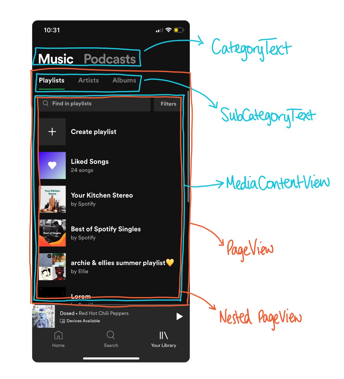
分类文字 (CategoryText)
This View will show the two categories we need, Music and Podcasts, and handle highlighting the selected one.
该视图将显示我们需要的两个类别,即音乐和播客,并突出显示所选的类别。
Using a binding which stores the current category index we can update the foreground colour dynamically and using .primary and .secondary means we can handle light and dark mode.
使用存储当前类别索引的绑定,我们可以动态更新前景色,而使用.primary和.secondary意味着我们可以处理亮和暗模式。
Then to trigger the change when we tap on a category, we use an .onTapGesture for both Text views.
然后,当我们点击类别时触发更改,我们为两个Text视图都使用.onTapGesture 。
The binding to nestedPages is to keep track of the current subcategory index for each category. We reset both when we tap on a category so that we always show the first sub category. This will become clearer later.
与nestedPages的绑定是为了跟踪每个类别的当前子类别索引。 当我们点击一个类别时,我们会同时重置两者,以便始终显示第一个子类别。 稍后将变得更加清楚。
SubCategoryText (SubCategoryText)
This view will show the sub categories depending on the category. It will use the same logic as the CategoryText view to highlight the selected sub category, and additonally will show the green indicator bar underneath the selected subcategory.
此视图将显示子类别,具体取决于类别。 它将使用与CategoryText视图相同的逻辑来突出显示选定的子类别,并且还将在选定的子类别下方显示绿色的指示条。
The indicator bar has two important features.
指示器栏具有两个重要功能。
Firstly, it needs to be able to dynamically change its width to the size of the sub category. We can achieve this by using a VStack and the .fixedSize() modifier. This way the width of the VStack is the exact amount we need, in this case the length of the sub category.
首先,它需要能够动态地将其宽度更改为子类别的大小。 我们可以使用VStack和.fixedSize()修饰符来实现。 这样, VStack的宽度就是我们需要的确切数量,在这种情况下,就是子类别的长度。
Secondly, it needs to be able to slide from one sub category to the other when we swipe between views. We can achieve this by using the .offset(x:) modifier. This way we can just move the indicator along the x-axis when we catch the drag gesture later on.
其次,当我们在视图之间滑动时,它需要能够从一个子类别滑到另一子类别。 我们可以通过使用.offset(x :)修饰符来实现。 这样,当我们稍后捕获拖动手势时,我们就可以沿x轴移动指示器。
MediaContentView (MediaContentView)
Since we are just focussing on gestures, rather than content, we can create a common view that can be used for all our sub categories. If we were doing this for real, we would need different behaviour depending on the sub category selected. For our purpose, a ScrollView with rectangles of random colours, to simulate album/playlist covers, will suffice.
由于我们仅关注手势而不是内容,因此我们可以创建可用于所有子类别的通用视图。 如果我们确实进行此操作,则根据选择的子类别,我们将需要不同的行为。 为了我们的目的,一个带有随机颜色矩形的ScrollView足以模拟专辑/播放列表的封面。
We need the .fixedSize(horizontal: true, vertical: false) modifer for later when we embed this in a pager view. This is because the pager view will need a GeometryReader which will cut off the text. This is a known SwiftUI solution as stated here.
我们稍后需要将.fixedSize(horizontal:true,vertical:false)修饰符嵌入页面视图中时使用。 这是因为寻呼机视图将需要GeometryReader ,它将截断文本。 这是一个已知SwiftUI解决方案说明这里 。
YourLibraryView (YourLibraryView)
Now we have created all the individual components we need we can combine them all together in a single view. This view will need to handle the nested pager view to get the interactions we want.
现在,我们已经创建了所需的所有单个组件,我们可以将它们全部组合到一个视图中。 该视图将需要处理嵌套的寻呼机视图,以获取所需的交互。
基础结构 (Base Structure)
Before we implement the logic with the drag gesture, we can create a base view which will allow us to swipe between sub categories and switch categories.
在使用拖动手势实现逻辑之前,我们可以创建一个基本视图,该视图将允许我们在子类别和切换类别之间滑动。
To do this we can take the nested pager example I mentioned earlier as a template, and encorporate the components we created above.
为此,我们可以将前面提到的嵌套寻呼机示例作为模板,并结合上面创建的组件。
There are some things to do with SwiftUIPager that I will leave you to understand by looking at the examples available and the README of the repo, but it’s fairly straightforward.
SwiftUIPager有一些事情要做,我将通过查看可用的示例和回购的README让您理解,但这非常简单。
A @State variable needed which isn’t in the example is indicatorOffsets. This will store the current value of each sub category’s offset for their indicator bar. Although we are not altering them anywhere at the moment, they are needed for the SubCategoryText view we created earlier.
在示例中不需要的@State变量是indicatorOffsets 。 这将为每个子类别的指示器栏存储当前偏移量的值。 尽管我们暂时不更改它们,但是我们之前创建的SubCategoryText视图需要它们。
When the nestedPager is invoked via the Pager, we need to do some trickery to create the Binding variables needed. The current sub category index, and the correct indicator offset for the current category. These can then be used to create the view for each sub category. Which also contains a Pager view with the content of our MediaContextView we created.
当通过Pager调用nestedPager时 ,我们需要做一些技巧来创建所需的Binding变量。 当前子类别索引,以及当前类别的正确指示器偏移量。 然后可以使用这些为每个子类别创建视图。 该页面还包含一个分页器视图,其中包含我们创建的MediaContextView的内容。
滑动到下一个类别 (Swipe to next category)
Now we have the base structure, we can look at adding the functionality to switch categories when we swipe on the boundary of the subcategory views.
现在我们有了基本结构,我们可以看看添加功能以在子类别视图的边界上滑动时切换类别。
To handle changing category we will not want our nested pager to react when we swipe as normal, but instead the pager connected to the category. For us to do this, we can make use of one of the SwiftUIPager modifiers: .allowsDragging(value: Bool) and add it to our nested pager. This allows us to temporarily disable the pager whenever we are swiping at the boundary, allowing us to swipe to the next category instead. This is ideal, we just need to figure out when to change the bool …
为了处理不断变化的类别,我们不希望嵌套的寻呼机在正常滑动时做出React,而是希望寻呼机连接到该类别。 为此,我们可以使用SwiftUIPager修饰符之一: .allowsDragging(value:Bool)并将其添加到嵌套的分页器中。 这样,无论何时在边界处滑动,我们都可以临时禁用寻呼机,从而可以滑动至下一个类别。 这是理想的,我们只需要弄清楚何时更改布尔值即可。
Under the hood SwiftUIPager will already be catching DragGesture’s, therefore we can make use of the .simultaneousGesture() view modifier to catch when the user swipes, and not break the gestures pre-existing.
SwiftUIPager在后台已经可以捕捉DragGesture的内容,因此我们可以利用.simultaneousGesture()视图修饰符在用户滑动时捕捉到它,而不会破坏现有的手势。
We can add the below view modifiers to our top level Pager.
我们可以将以下视图修饰符添加到顶级Pager中。
We only want to disable the sub category dragging when we are swiping in the right direction on the boundary of a subcategory view. Therefore, to catch the direction of the DragGesture we use the .onChanged() modifier and use value.translation.width.If its positive then we are swiping right, else left. We can then add a conditional for the two possible cases. Either we are at Artists and swiping left to get from Music to Podcasts, or we are at Episodes and swiping right to get back to Music.
当我们在子类别视图的边界上向右滑动时,我们只想禁用子类别拖动。 因此,为了捕捉DragGesture的方向,我们使用。 onChanged()修饰符并使用value.translation.width。 如果它是积极的,那么我们向右滑动,否则向左滑动。 然后我们可以 为这两种可能的情况添加一个条件。 我们是在Artists处向左滑动以从Music到Podcasts ,或者在Episodes处向右滑动以回到Music。
Now all we need is to set the sub category dragging back to true when we catch a change in the category page index. This can be done by using the .onPageChanged() modifier which is also supplied by the SwiftUIPager package.
现在,我们所需要的只是在类别页面索引发生变化时将子类别拖回true。 这可以通过使用.onPageChanged()修饰符来完成,该修饰符也由SwiftUIPager包提供。
更新指标偏移 (Updating indicator offset)
The last thing needed is to add the animation to the green indicator bars when we change sub category.
最后需要做的是在更改子类别时将动画添加到绿色指示条中。
This can be achieved pretty easily by using value.translation.width again in the .onChanged modifier. However this time, we want the indicator bar to move in the opposite direction of the direction we swipe in, and we only need to move it in a proportionate amount. I set it to be divided by 10 as a rough ratio for the change in width but I’m sure you could make it more accurate. We also need to set the indicator offset back to 0 when the DragGesture has ended by using the .onEnded modifier. If we were using a @GestureState variable we could skip this, but we wouldn’t be able to pass the variable into other views like we need to do.
通过再次在.onChanged修饰符中使用value.translation.width ,可以很容易地实现这一点 。 但是这一次,我们希望指示条沿与滑入方向相反的方向移动,并且只需要按比例移动它即可。 我将其设置为除以10作为宽度变化的大致比率,但我敢肯定您可以使其更准确。 当DragGesture已结束时,我们还需要使用来将指标偏移设置回0。 onEnded修饰符。 如果我们使用@GestureState变量,则可以跳过此操作,但无法像需要那样将变量传递到其他视图中。
There are two cases we still need to think about. When we are at Playlists and swipe right we are unable to go anywhere, therefore don’t want the indicator bar to move. This is the same for when we are at Shows and swipe left. To handle this, we can check the category index, sub category index and direction of the drag gesture. Similar to what we used before swipe between categories. See the complete gesture below:
我们仍然需要考虑两种情况。 当我们进入播放列表并向右滑动时,我们将无处可去,因此不希望指示器栏移动。 这与我们在演出并向左滑动时的情况相同。 为了解决这个问题,我们可以检查类别索引,子类别索引和拖动手势的方向。 与我们在类别之间滑动之前使用的类似。 请参阅下面的完整手势:
This should mean we now have a fully working Your Library view! To see the full code checkout my Github.
这意味着我们现在可以完全使用“您的媒体库”视图了! 要查看完整的代码,请查看我的Github 。
事后思考 (After-thoughts)
As mentioned at the start of the article, there are a few aspects which make this solution slightly inferior to Spotify. Firstly, the indicator bar sliding is not quite as smooth, but I expect an animation could fix this. I also noticed that sometimes when tapping to switch category, the MediaContentView is offset by a small amount. As we don’t configure this offset, I assume its a bug with SwiftUIPager but its not that noticeable.
如本文开头所述,有一些方面使该解决方案略逊于Spotify。 首先,指示器栏的滑动不那么平滑,但是我希望动画可以解决此问题。 我还注意到,有时在点击以切换类别时,MediaContentView会偏移少量。 由于我们没有配置此偏移量,因此我假设它是SwiftUIPager的一个错误,但它并不那么引人注目。
If you enjoyed the article give me a follow (Archie Edwards)! Or if you have any questions please leave a comment down below! Thanks for reading 🙂
如果您喜欢这篇文章,请跟随我( Archie Edwards )! 或者,如果您有任何疑问,请在下面留下评论! 感谢您阅读🙂
I also have a newsletter which is completely free where I write about swift related topics. Feel free to sign up using the link below! 👇
我也有一个通讯,它是免费的,我在其中撰写有关快速相关主题的文章。 欢迎使用下面的链接进行注册! 👇
翻译自: https://medium.com/swlh/building-spotifys-ui-with-swiftui-5f8be5c2bdd4
spotify使用教程


 2339
2339

 被折叠的 条评论
为什么被折叠?
被折叠的 条评论
为什么被折叠?
 到【灌水乐园】发言


