


T
Ť
It is not uncommon in research, to start down one road, with the kernel of an idea, only to take a detour that leads to a much more interesting destination, usually after a few wrong-turns and dead-ends. This was the case for this work, and what began as narrow investigation of virus transmission rates, led to a new way to visualise, analyse and compare how countries have responded to the pandemic. I’d like to describe the results of this journey in this article, and the key points can be summaries as follows:
在研究中,以一个想法的核心开始一条道路,然后绕道而行,通常会经过一些错误的转折和死胡同,然后绕开一个更有趣的目的地,这种情况并不少见。 这项工作就是这种情况,最初是对病毒传播率的狭窄调查,导致了一种可视化,分析和比较各国对大流行病应对方式的新方法。 我想在本文中描述此旅程的结果,关键点可以概括如下:
I describe a new metric to measure transmission rates, which is related to the well-known R number, but is more straightforward to calculate.
我描述了一种测量传输速率的新指标,该指标与众所周知的R数有关,但更易于计算。
- I present a novel way to visualise the response of countries to the pandemic, and the effect of their response on key outcomes such as prevalence, transmission, and fatalities. 我提出了一种新颖的方式来可视化国家对大流行的React以及它们的React对主要结果(如流行,传播和死亡)的影响。
- I argue that these visualisations reveal two distinctive response patterns, which are associated with very different outcomes across a sample of 36 countries. 我认为这些可视化揭示了两种独特的响应模式,这些响应模式在36个国家的样本中与非常不同的结果相关。
流行与传播 (On Prevalence & Transmission)
Prevalence refers to the number of currently active cases — strictly speaking, it’s the number of current infections but we are working with data about confirmed cases rather than true infections — which, in the case of COVID-19, is estimated to be the sum of new cases over the previous 14 days. This prevalence metric has been used in recent reporting on COVID numbers because it is well suited to the current situation, where daily cases are much lower than previous highs.
患病率是指当前活跃病例的数量-严格来说,这是当前感染的数量,但我们正在使用有关确诊病例的数据,而不是真实感染的数据-在COVID-19的情况下,估计为前14天的新病例。 此流行度度量标准已用于最近的COVID编号报告中,因为它非常适合当前情况,即每日病例远低于以前的高点。
As I was thinking about the relationship between new cases and prevalence it occurred to me that the ratio between new cases today, and prevalence from a few days ago, was an interesting and informative measure. Today’s new cases are the result of an infection event from a few days previously – let’s assume an average of 7 days previously – and therefore, the number of new cases today, as a fraction of prevalence 7 days ago, is a rough approximation for the average number of transmissions per case from that time. For example, if there were 1,000 cases 7 days ago and 100 new cases today, then this fraction, which we call the transmission ratio, is 0.1; in other words, 10% of cases from a week ago led to new confirmed cases today. In retrospect, I think this estimate of a 7-day lag is probably too short and 10–12 days might be more accurate. However, the results presenetd here do not materially change when the lag is increased in this way.
当我思考新病例与患病率之间的关系时,我发现今天的新病例与几天前患病率之间的比率是一种有趣且有益的方法。 今天的新病例是几天前发生的感染事件的结果–假设平均之前为7天–因此,今天的新病例数(大约是7天前的患病率)大致是从那时起每个案例的平均传输次数。 例如,如果7天前有1,000例病例,而今天有100例新病例,则该比率(我们称为传播比率)为0.1; 换句话说,一周前有10%的病例今天导致了新的确诊病例。 回想起来,我认为对7天滞后的估计可能太短了,而10-12天可能更准确。 但是,当以这种方式增加滞后时,此处预设的结果不会发生实质性变化。
If this sounds familiar, it’s probably because it is: the transmission ratio is related to the now well-known reproduction number (the R number) of the virus, which is defined as the average number of new people that an infected person goes on to infect.
如果听起来很熟悉,可能是因为:传播比率与病毒的已知复制数 ( R数)有关,该数字被定义为感染者继续感染的新人的平均人数。感染。
So why do we need a new measure? Why not just use R? Simply put, one of the problems with R is that it is complicated to calculate, as least for me, whereas the transmission ratio is more straightforward to compute and intuitive, which makes it a more agile metric for gaining early insights into transmission.
那么,为什么我们需要一项新的措施? 为什么不只使用R ? 简而言之, R的问题之一是,至少对于我来说,它的计算很复杂,而传动比却更易于计算和直观,这使它成为了一种更敏捷的度量标准,可以更早地了解传动。
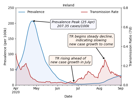
The chart above shows an example of prevalence and the transmission ratio for Ireland, from April 1st to the time of writing. We can see how prevalence peaked around April 25th at just over 207 cases per 100,000 people, before declining steadily in the months that followed, at least until cases began to grow again in late July and August. Notice how the transmission ratio was in decline through most of April: even though case numbers were still growing, their rate of growth was slowing, and the transmission ratio captures this. The transmission ratio declined steadily until early May and prevalence followed suit. In late June the transmission ratio started to increase again, and by late July prevalence was also on the rise. More recently, the transmission ratio peaked in early August and has been falling since; this should mean that prevalence is beginning to stabilise in Ireland.
上表显示了从4月1日至撰写本文期间爱尔兰的流行率和传播比率的示例。 我们可以看到流行率如何在4月25日左右达到峰值,每10万人中只有207例,然后在随后的几个月中稳步下降,至少直到7月下旬和8月再次开始增长。 请注意,在整个4月的大部分时间里,传动比是如何下降的:即使病例数仍在增加,但其增长率却在放缓,而传动比却抓住了这一点。 传播率一直稳定下降,直到5月初,流行率也随之下降。 6月下旬,传播比率再次开始增加,到7月下旬,流行率也在上升。 最近,传动比在8月初达到峰值,此后一直在下降。 这应该意味着爱尔兰的流行率开始趋于稳定。

The proposal is that the transmission ratio is useful as a leading indicator of changes in daily cases and prevalence. This relationship is evident above in EU countries. For example, in Belgium, the Netherlands, the Czech Republic, and Luxembourg, the transmission ratio spiked during the summer before a period of prevalence growth, and then declined ahead of falling prevalence. This is the type of behaviour expected from an R-like metric, but with the advantage that the transmission ratio is more straightforward to calculate from confirmed cases.
建议将传动比用作每日病例和患病率变化的主要指标。 这种关系在欧盟国家中显而易见。 例如,在比利时,荷兰,捷克共和国和卢森堡,传播率在流行率增长之前的夏季达到峰值,然后在流行率下降之前下降。 这是类R度量所期望的行为类型,但具有的优点是,从确定的案例中计算出传动比更直接。
As is the case with R, the transmission ratio is sensitive to low numbers of cases, and in such situations, its direction of movement may be a more useful guide than its point value. For example, there was a very large transmission spike in Malta in late July, as cases grew from a near-zero baseline, and we can see a similar effect in Croatia in June. Still, for both countries, the transmission ratio spike preceded a spike in prevalence.
与R一样,传动比对少量情况敏感,在这种情况下,其运动方向可能比其点值更有用。 例如,随着病例从接近零的基线增长,7月下旬马耳他的传播高峰非常大,我们可以在6月的克罗地亚看到类似的影响。 尽管如此,对于这两个国家来说,传播率的上升先于流行率的上升。
追踪爆发的演变 (Tracing the Evolution of an Outbreak)
This relationship between prevalence and transmission is an interesting one to explore further. The animation below shows how the prevalence and transmission ratio values change over time for a selection of 36 countries. The size of the country marker is proportional to the sum of the last two weeks of deaths per 100,000 of population in that country (recent deaths). A larger, interactive version of this visualisation is available here if you wish to explore it in more depth.
患病率与传播之间的这种关系是值得进一步探讨的有趣问题。 下面的动画显示了针对36个国家/地区的流行率和传播比率值随时间的变化。 国家标记的大小与该国每10万人的最近两周死亡总数( 最近的死亡人数 )成正比。 如果您想更深入地探索它,可以在这里找到此可视化的更大的交互式版本。
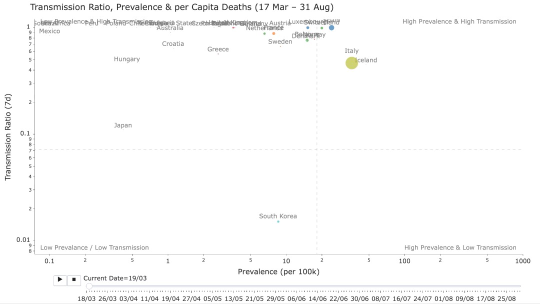
For now, there are a few initial takeaways, which may be clear after watching the animation for a few moments:
目前,有一些初步的收获,在观看动画片刻之后可能会很清楚:
- Many countries appear to follow a similar clockwise trajectory as they move from the high transmission/low prevalence quadrant (top-left) through to high transmission/high prevalence (top-right), before transmission begins to drop (low transmission/high prevalence, lower-right) and until prevalence also starts to fall (low transmission/low prevalence, lower-left). 许多国家/地区似乎遵循相似的顺时针轨迹,即从高传播/低流行象限(左上)到高传播/高流行象限(右上),然后开始降低传播(低传播/高流行,右下),直到流行率也开始下降(低传播/低流行,左下)。
- For many countries this trajectory repeats. Most European countries begin a second cycle in July, while someothers (e.g. the US, Brazil, Peru, Mexico) appear to be stuck in a region of high prevalence, at least for now. 对于许多国家来说,这种轨迹是重复的。 大多数欧洲国家/地区在7月开始第二个周期,而其他国家(例如,美国,巴西,秘鲁,墨西哥)似乎一直陷于高流行地区,至少目前如此。
- The death rates peak in most countries during April and May and then fall significantly during the summer; we can see thuis in the way that the markers grow and then shrink for most countries. And even when these countries return to a high transmission/high prevalence state, their death rates remain low. 大多数国家的死亡率在4月和5月达到峰值,然后在夏季显着下降。 我们可以看到,在大多数国家,标记的增长方式是先变后缩。 即使这些国家返回高传播/高流行状态,其死亡率仍然很低。
- There are other countries however — such as those that are stuck in high prevalence limbo — where death rates have remained high throughout their outbreak (e.g., the US) or where deaths have been steadily increasing during the summer (e.g., Brazil, Peru, Mexico). 但是,还有其他一些国家(例如陷入高流行边缘的国家)在整个疫情暴发期间死亡率一直很高(例如美国),或者在夏季死亡率不断上升的国家(例如巴西,秘鲁,墨西哥) )。
爆发模式的类型 (Types of Outbreak Patterns)
The chart below illustrates the path traced by Ireland through its outbreak, as per the above animation. Beginning in March (1) unchecked transmission led to rapidly growing prevalence. As prevalence increased and lockdown was imposed, then the transmission ratio began to fall (2), and the prevalence of the virus stabilised (3) in May. Sustained reductions in transmission gradually led to a falling cases and prevalence reduced significantly (4) in June. As lockdown measures were eased transmission rates began to grow again in July (5), and soon prevalence also started to increase (6), leading to the beginning of a new (tighter) cycle.
下图根据上述动画说明了爱尔兰通过其爆发所追踪的路径。 从3月(1)开始,不受控制的传播导致患病率Swift上升。 随着流行率的提高和锁定的实施,传播率开始下降(2),5月份病毒的流行率趋于稳定(3)。 传播的持续减少逐渐导致病例下降,6月的患病率大大降低(4)。 随着锁定措施的放松,传输速率在7月再次开始增长(5),不久之后患病率也开始增加(6),从而开始了新的(更严格的)周期。

We refer to the shape of this trace as a spiral or S-type pattern. It turns out to be a common outbreak pattern, indicative of an initial strong and sustained intervention that reverses the course of the virus, at least for a time, followed by a gradual easing of restrictions.
我们将此迹线的形状称为螺旋形或S型图案。 事实证明,这是一种常见的暴发模式,表明最初的强而持续的干预至少在一段时间内逆转了病毒的进程,然后逐渐放宽了限制。
The charts below show a modified version of this visualisation for Ireland and Germany — Germany also experienced an S-type outbreak — and the trace has been enhanced to show the recent deaths (total deaths per 100k over the previous 14 days) as colour-coded markers. The size and colour of these markers are proportional to this recent death rate, and it is clear how, in Ireland and Germany, the majority of deaths occurred during April and May, with Ireland suffering a significantly higher death toll than Germany (36 deaths per 100k vs Germany’s 11 deaths per 100k).
下图显示了该可视化的爱尔兰和德国的修改版本-德国也经历了S型爆发-并且跟踪得到了增强,以彩色显示最近的死亡人数 (过去14天每10万的总死亡人数)标记。 这些标记的大小和颜色与最近的死亡率成正比,很明显,在爱尔兰和德国,大多数死亡是在4月和5月发生的,爱尔兰的死亡人数比德国高得多(每人36例死亡) 10万与德国每10万的11人死亡)。
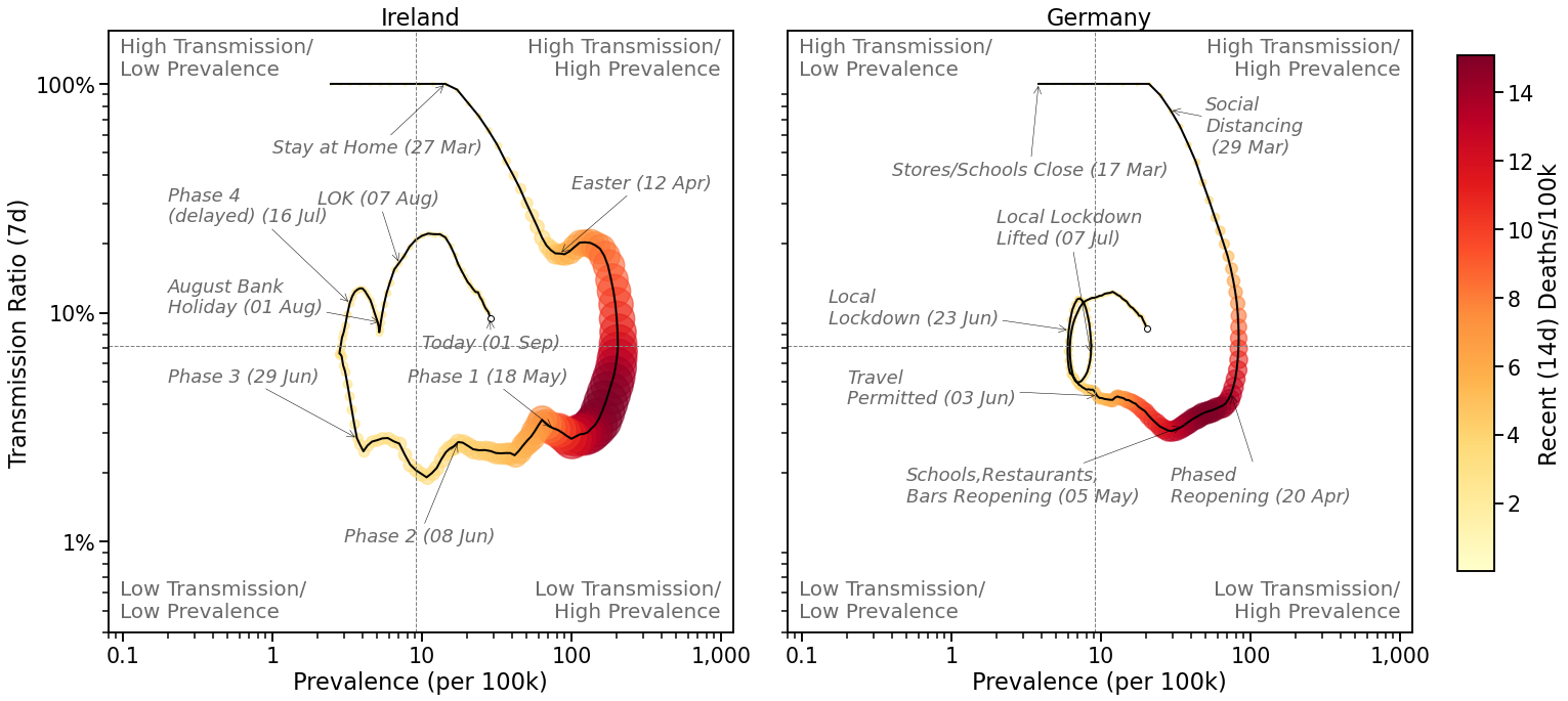
These visualisations are also annotated with some key events for each outbreak — closures, holidays, re-openings etc. — and we can see the impact of these events on the outbreak trace. For example, in Ireland, the Easter holiday weekend and the August holiday weekend were associated with increases in transmission, while Germany’s local lockdown in late June/early July can bee seen as a tight spiral as transmission rates declined, temporarily arresting prevalence growth.
这些可视化效果还标注了每次爆发的一些关键事件,例如关闭,节假日,重新开业等。我们可以看到这些事件对爆发轨迹的影响。 例如,在爱尔兰,复活节假期周末和八月假期周末与传播增加有关,而德国当地6月下旬/ 7月上旬的封锁可能被视为随着传播率下降的紧缩螺旋,暂时阻止了流行率的增长。
This S-type is not the only type of outbreak pattern. Some countries exhibit a diagonal or D-type pattern, which is indicative of a more diffuse, or less well-coordinated, response to the virus. The outbreaks in Brazil and the US, shown below, are examples of this. Instead of a large outer spiral, we see increasing prevalence for most of the outbreak, with both countries spending a majority of their time in the high transmission/high prevalence quadrant of the graph. These traces show limited evidence of containment— there are much smaller, tighter transmission/prevalence loops, which are more indicative of a short-lived, localised lockdown, than a coordinated national effort — and neither country managed to change the course of its outbreak in any material way.
S型不是唯一的暴发类型。 一些国家表现出对角线或D型模式,表明对该病毒的React更加分散或协调性较差。 如下所示,巴西和美国的暴发就是例子。 我们看到疫情在大多数爆发中没有发生大的外部螺旋上升,而是在图表的高传播/高流行象限中花费了大部分时间。 这些痕迹显示了有限的遏制证据-与国家协调一致的努力相比,存在更小的更紧密的传播/流行循环,这更表明是短暂的,局部的封锁,而不是国家的协调努力。任何实质的方式。
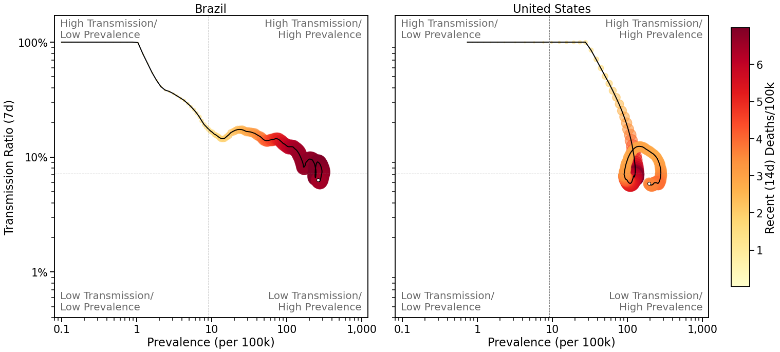
It is interesting to note too how the death rates remain high in both countries. Death rates have been growing steadily throughout Brazil’s outbreak and, while they have fallen off their earlier highs in the US, deaths remain significant there, and are far higher than in most other countries. Indeed, this greater, sustained death rate turns out to be a common feature of D-type outbreaks, compared with S-types.
有趣的是,这两个国家的死亡率仍然很高。 在巴西爆发期间,死亡率一直在稳定增长,尽管已经从美国的历史高位回落,但那里的死亡人数仍然很高,远高于其他大多数国家。 的确,与S型相比,这种更高的持续死亡率是D型爆发的共同特征。
编录COVID爆发 (Cataloging COVID Outbreaks)
The graphs below show the outbreaks for the 36 different countries used in the earlier animation. They are arranged in descending order of population size and colour-coded based on their outbreak type (pale yellow for S-type and pale blue for D-type); the outbreak type is also indicated in the graph title. Each graph also includes data on the total number of cases and deaths, the maximum number of daily cases, and the maximum 14-day total of deaths, for each country, all per 100k of population.
下图显示了早期动画中使用的36个不同国家的疫情。 它们按种群大小的降序排列,并根据其暴发类型(S型为淡黄色,D型为淡蓝色)进行颜色编码; 爆发类型也显示在图表标题中。 每个图还包括每10万人口中每个国家/地区的病例总数和死亡人数,每日最大病例数以及14天最大死亡总数的数据。
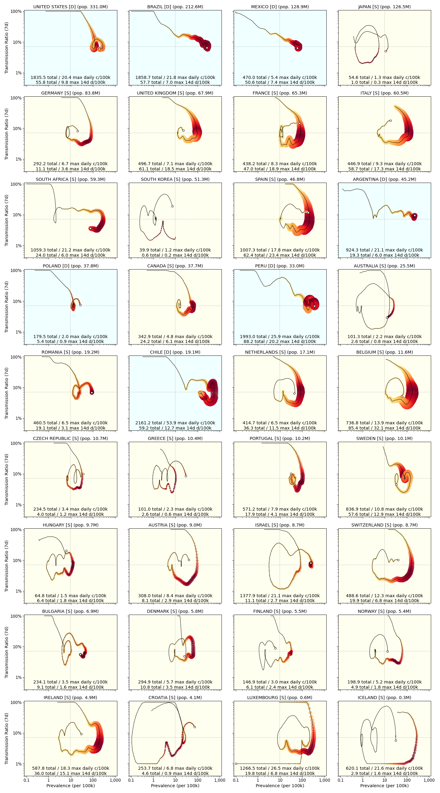
This classification into S and D-type is currently based on a visual inspection: 29 of the outbreaks are classified as S-type and the remaining 7 are D-type. In the vast majority of cases, the classification is straightforward , but there are a small number of of exceptions. For example, Poland and the US are less clear-cut as D-type outbreaks. Although both present with a small spiral/loop, suggesting some degree of modest containment, neither produced any significant reduction in prevalence, suggesting a greater affinity with other D-type patterns
目前,根据目视检查将其分为S型和D型:29起暴发被归类为S型,其余7起为D型。 在绝大多数情况下,分类很简单,但也有少数例外。 例如,波兰和美国不如D型爆发那么明确。 尽管两者都有小的螺旋/环,表明一定程度的适度围堵,但都没有使患病率显着降低,这表明与其他D型图案的亲和力更大
It is interesting to note that Sweden’s contrarian approach to the pandemic — Sweden abstained from a full lockdown but social distancing and some other restrictions were introduced — resulted in an S-type pattern, although it can be argued that its spiral emerged only more recently during the warmer summer months.
有趣的是,瑞典对大流行采取的逆势方法-瑞典完全封锁,但引入了社会疏远和其他一些限制-导致了S型模式,尽管可以说,这种螺旋式上升只是在最近期间夏季温暖。
Of course, in the future it may become necessary to re-classify some countries, if their approach changes. Chile, for example, seems to be moving in the direction of an S-type outbreak, after spending the majority of the last 8 or 9 months on a D-type trajectory.
当然,将来如果某些国家的方法发生变化,可能有必要对它们进行重新分类。 例如,智利在过去8个月或9个月的大部分时间都沿着D型轨迹飞行之后,似乎正朝着S型爆发的方向发展。
比较爆发类型 (Comparing Outbreak Types)
This classification makes it possible to compare and contrast the different approaches to managing COVID-19, by comparing S and D-type outbreaks, based on their overall and recent case and fatality numbers.
通过对S型和D型暴发的总体和近期病例数和死亡人数进行比较,这种分类可以比较和对比管理COVID-19的不同方法。
For example, the average number of confirmed cases per 100k of population in a D-type outbreak is 1,346 compared to 457 for S-type outbreaks; in other words, D-type outbreaks are associated with almost three times as many confirmed cases, on a per capita basis, as S-type outbreaks. The average number of deaths is 48 per 100k of population for D-type outbreaks, compared to just 22 for S-types. And both of these differences are statistically significant based on a t test (p<0.05), notwithstanding the small number of D-type countries in this sample.
例如,D型暴发中每10万人口中确诊病例的平均数为1,346,而S型暴发中为457。 换句话说,按人均计算,D型暴发的确诊病例几乎是S型暴发的三倍。 D型暴发的平均死亡人数为每100k人口48人,而S型暴发的平均死亡人数仅为22。 尽管样本中D型国家的数量很少,但基于t检验,这两个差异在统计学上均具有统计学意义(p <0.05)。
A similar, and statistically significant, benefit accrues to S-type outbreaks in terms of current prevalence (the latest 14-day case totals per 100k) and recent deaths (the latest 14-day deaths per 100k). The mean prevalence of S-type outbreaks is currently 25 cases per 100k, compared with more than 83 cases per 100k for D-type outbreaks. And the mean of recent deaths for S-types is 1.3 deaths per 100k versus 3 deaths per 100k for D-type outbreaks.
就目前的流行率(每10万的最新14天病例总数)和最近的死亡(每10万的最新14天死亡人数)而言,S型暴发也具有类似且具有统计意义的收益。 目前,S型暴发的平均患病率为每100k 25例,而D型暴发的平均发病率为每100k超过83例。 最近,S型死亡的平均值为每10万例死亡1.3例,而D型暴发则为每10万例3例。
结论 (Conclusions)
In this work, we have described a novel way to visualise the evolution of a SARS-CoV-2 outbreak, in terms of how the prevalence and transmission of the virus changes over time as countries attempt to contain its spread.
在这项工作中,我们描述了一种可视化SARS-CoV-2疫情演变的新颖方法,涉及随着各国试图遏制其传播,病毒的流行和传播随时间变化的方式。
Two distinctive patterns, S and D, are observed. The former occurs when a country materially changes the course of its outbreak, by significantly lowering transmission rates and prevalence for a sustained period, usually as a result of a coordinated national lockdown followed by a careful easing of restrictions. For S-type countries the spring lockdowns appear to have worked well and, although transmission rates and prevalence have increased during summer rebounds, the evidence suggests that the next cycle will be more contained and better controlled. At the very least the fatality rate has dropped precipitously and continues to remain low in S-type countries.
观察到两个不同的模式S和D。 前者发生在一个国家通过在一个持续的时期内大幅降低传播速度和流行率而实质性改变其爆发过程的时候,这通常是由于协调一致的国家封锁和谨慎放宽限制所致。 对于S型国家,Spring封锁似乎运作良好,尽管夏季反弹期间的传播率和患病率有所增加,但有证据表明,下一个周期将受到更多的控制。 至少,死亡率在S型国家中急剧下降,并继续保持较低水平。
In contrast, countries that failed to change the course of their outbreak, usually because of weak or short-lived restrictions and accelerated re-openings, are associated with the D-type pattern. For these countries, the spring lockdowns, such as they were, did not suceed to the same extent as they did in the S-type pattern. Prevalence rates have remained high, as have transmission rates, and fatalities.
相比之下,通常由于限制薄弱或期限短以及重新开放加快而未能改变其爆发过程的国家与D型模式相关。 对于这些国家,Spring封锁的成功程度没有达到S型格局的程度。 患病率一直很高,传播率和死亡率也很高。
In summary, an analysis of the data from 36 countries shows S-type outbreaks to be associated with lower numbers of confirmed cases and fewer deaths, per capita, compared with D-type outbreaks. This approach may be helpful in determining and monitoring the efficacy of different strategies for controlling outbreaks while balancing social and economic activity, particularly in the future, as countries focus on more targeted restrictions and lockdowns.
总而言之,对36个国家/地区的数据进行的分析显示,与D型暴发相比,S型暴发与确诊病例数减少,人均死亡人数少相关。 这种方法可能有助于确定和监控控制疫情爆发的各种策略的有效性,同时平衡社会和经济活动,尤其是在将来,因为各国将重点放在更具针对性的限制和封锁上。
翻译自: https://medium.com/data-in-the-time-of-corona/the-shape-of-covid-2a9ceffde32e


 385
385

 被折叠的 条评论
为什么被折叠?
被折叠的 条评论
为什么被折叠?
 到【灌水乐园】发言


