


 本教程介绍了如何在没有jQuery的情况下使用Bootstrap 5,包括设置Sass和Gulp环境,创建博客页面,使用Vanilla JS替代jQuery,以及探索新的Utility API。通过实例展示了如何创建导航栏、博客卡片和模态,并利用Sass自定义项目。
About one month ago we found out that the first version of Bootstrap 5 alpha has been officially released with some of the most important changes being removing jQuery as a dependency, dropping support for IE 10 and 11, and generally improving the markup and stylesheets for the most popular CSS framework in the world.
大约一个月前,我们发现Bootstrap 5 alpha的第一个版本已正式发布 ,其中一些最重要的更改是删除jQuery作为依赖项,放弃了对IE 10和11的支持,并总体上改进了该版本的标记和样式表世界上最流行CSS框架。
Although it’s still just an alpha version and using Bootstrap 5 in production may be risky due to unforeseen bugs it might be a good idea to start working around with the new version of the framework and more importantly if you’ve been accustomed to using jQuery this change may make you consider using Vanilla JS by default.
尽管它仍然只是一个Alpha版本,但由于无法预见的错误,在生产中使用Bootstrap 5可能会有风险,但开始使用新版本的框架可能是一个好主意,更重要的是,如果您已经习惯于使用jQuery,更改可能会让您考虑默认使用Vanilla JS。
In this Bootstrap 5 tutorial we will show you how to set up a working environment with Sass and Gulp, create a simple blog page and see how to use the framework using Vanilla JS. Here’s the table of contents:
在这个Bootstrap 5教程中,我们将向您展示如何使用Sass和Gulp设置工作环境,创建一个简单的博客页面,以及如何使用Vanilla JS使用该框架。 这是目录:
- Building tools: set up Bootstrap 5 with Sass, Gulp 4 and BrowserSync 构建工具:使用Sass,Gulp 4和BrowserSync设置Bootstrap 5
- Creating a simple blog page with the new markup 使用新标记创建一个简单的博客页面
- Changing some colors, sizings and fonts in the new Sass variables file 在新的Sass变量文件中更改一些颜色,大小和字体
- Working with Vanilla JS instead of jQuery 使用Vanilla JS而不是jQuery
- Exploring the new Utility API 探索新的Utility API
具有Sass,Gulp 4和BrowserSync的Bootstrap 5 (Bootstrap 5 with Sass, Gulp 4 and BrowserSync)
Although you can quickly get started using Bootstrap 5 by including the stylesheet and scripts via CDN, we recommend using Sass to make use of all of the features of the new version of the CSS framework.
尽管您可以通过CDN包含样式表和脚本来快速开始使用Bootstrap 5,但我们建议您使用Sass来利用CSS框架新版本的所有功能。
About a month ago we wrote a tutorial on how you can set up Bootstrap, Sass, Gulp and BrowerSync, so if you want a more detailed walkthrough of process you can read that guide.
大约一个月前,我们写了一个教程你如何设置引导,萨斯,咕嘟咕嘟和BrowerSync,所以如果你要处理的更详细的演练中,您可以阅读该手册。
Prerequisites:
先决条件:
Node — make sure you have Node.js installed and that it is accessible via the terminal
节点 -确保已安装Node.js ,并且可以通过终端对其进行访问
Gulp — after you have Node successfully installed, make sure you also install Gulp’s CLI.
Gulp-成功安装Node后,请确保还安装Gulp的CLI 。
After you have installed Node on your machine, run the following command in your terminal to globally install the Gulp CLI (command line interface):
在计算机上安装Node之后,在终端中运行以下命令以全局安装Gulp CLI(命令行界面):
npm install --global gulp-cli
npm install --global gulp-cli
This is how the folder structure will look at the end of this tutorial:
这是本教程结尾处文件夹结构的外观:
.
├── app
│   ├── css
│   │   └── themesberg.css
│   ├── index.html
│   ├── js
│   │   └── themesberg.js
│   └── scss
│       ├── _utilities.scss
│       ├── _variables.scss
│       └── themesberg.scss
├── gulpfile.js
├── package-lock.json
└── package.json
Note: get the files from the public Github repository.
注意:从公共Github存储库获取文件。
安装NPM依赖项 (Installing NPM dependencies)
We’re going to need to pull in Gulp, BrowserSync, Gulp Sass and Bootstrap 5 Alpha as a dependency through NPM. But first, we need to create a local package.json file by running the following command:
我们将需要通过NPM引入Gulp,BrowserSync,Gulp Sass和Bootstrap 5 Alpha作为依赖项。 但是首先,我们需要通过运行以下命令来创建本地package.json文件:
npm init
npm init
You will be asked to give the project a name, description and so on. Most of the details are optional and you can just “enter your way through”. After you have finished the process a new package.json file will be created.
系统将要求您为项目提供名称,描述等。 大多数细节都是可选的,您可以“直接输入”。 完成此过程后,将创建一个新的package.json文件。
Afterwards you will need to run the following command to actually install the dev dependencies:
之后,您将需要运行以下命令以实际安装dev依赖项:
npm install browser-sync gulp gulp-sass --save-dev
npm install browser-sync gulp gulp-sass --save-dev
Make sure to also run the following command to install the latest version of Bootstrap 5:
确保还运行以下命令来安装最新版本的Bootstrap 5:
npm install bootstrap@next --save
npm install bootstrap@next --save
Note: if the above command does not install Bootstrap 5 anymore (this will happen if it becomes the stable default version) make sure to visit the official NPM versioning page to see how to include it via the package manager system.
注意 :如果以上命令不再安装Bootstrap 5(如果它成为稳定的默认版本,则会发生),请确保访问官方的NPM版本控制页面,以了解如何通过软件包管理器系统将其包括在内。
创建一个gulpfile来编译Sass文件,并通过BrowserSync创建本地服务器 (Create a gulpfile to compile Sass files and create a local server via BrowserSync)
First of all you will need to create a local “gulpfile.js” at the root folder of your project where package.json is also located. Then add the following code into the file:
首先,您需要在您的项目的根文件夹中也创建package.json的位置创建本地“ gulpfile.js”。 然后将以下代码添加到文件中:
var gulp        = require('gulp');
var browserSync = require('browser-sync').create();
var sass        = require('gulp-sass');// Compile sass into CSS & auto-inject into browsers
gulp.task('sass', function() {
    return gulp.src("app/scss/*.scss")
        .pipe(sass())
        .pipe(gulp.dest("app/css"))
        .pipe(browserSync.stream());
});// Static Server + watching scss/html files
gulp.task('serve', gulp.series('sass', function() {    browserSync.init({
        server: "./app/"
    });    gulp.watch("app/scss/*.scss", gulp.series('sass'));
    gulp.watch("app/*.html").on('change', browserSync.reload);
}));gulp.task('default', gulp.series('serve'));
The first part of the file is about including the dependencies that you have installed via NPM in the previous step. Next is our first Gulp command called serve which essentially starts a new local server based on the files within the app/ folder and watches for any changes (ie. file saves that you make when writing code) inside the app folder for *.scss and *.html files.
该文件的第一部分是关于包括在上一步中通过NPM安装的依赖项。 接下来是我们的第一个Gulp命令,称为serve ,它实际上基于app/文件夹中的文件启动一个新的本地服务器,并*.scss和以下内容在app文件夹中的所有更改(即,编写代码时文件保存的位置)。 *.html文件。
The second command is called sass which takes all *.scss files (Sass files) inside the app/scss/ folder and compiles them into a singe CSS file called themesberg.css. You will include this in your HTML templates.
第二个命令称为sass ,它获取app/scss/文件夹中的所有*.scss文件(Sass文件),并将它们编译成一个名为themesberg.css CSS文件。 您将在HTML模板中添加它。
Finally, the last line gulp.task('default', ['serve']); enables you to start the local server and watch for SASS file changes and compile them by only writing gulp in the command line. That’s what “default” refers to.
最后,最后一行gulp.task('default', ['serve']); 使您能够启动本地服务器,并仅通过在命令行中编写gulp来监视SASS文件更改并进行编译。 这就是“默认”的含义。
将Bootstrap Sass文件包括到您的工作流程中 (Include the Bootstrap Sass files into your workflow)
Next you need to create a scss/ folder inside the main app/ folder and create a new file called themesberg.scss. After that you need to add the following line inside it:
接下来,您需要在主app /文件夹中创建一个scss /文件夹,并创建一个名为themesberg.scss的新文件。 之后,您需要在其中添加以下行:
@import '../../node_modules/bootstrap/scss/bootstrap.scss';
@import '../../node_modules/bootstrap/scss/bootstrap.scss';
What this does is that it includes the Bootstrap Sass files from the node_modules/ folder. This will help you be able to overwrite the default variable values of the colors, sizes, spacings and so on.
这是因为它包括来自node_modules /文件夹的Bootstrap Sass文件。 这将帮助您覆盖颜色,尺寸,间距等的默认变量值。
Create a new index.html file inside the app/ folder and add the following markup and buttons inside:
在app /文件夹中创建一个新的index.html文件,并在其中添加以下标记和按钮:
<!DOCTYPE html>
<html lang="en">
    <head>
        <meta charset="UTF-8">
        <meta name="viewport" content="width=device-width, initial-scale=1.0">
        <title>Bootstrap 5 tutorial by Themesberg</title>
        <link rel="stylesheet" href="css/themesberg.css">
    </head>
    <body>
        <button class="btn btn-primary">Primary</button>
        <button class="btn btn-secondary">Secondary</button>
        <script src="https://cdn.jsdelivr.net/npm/popper.js@1.16.0/dist/umd/popper.min.js" integrity="sha384-Q6E9RHvbIyZFJoft+2mJbHaEWldlvI9IOYy5n3zV9zzTtmI3UksdQRVvoxMfooAo" crossorigin="anonymous"></script>
    <script src="https://stackpath.bootstrapcdn.com/bootstrap/5.0.0-alpha1/js/bootstrap.min.js" integrity="sha384-oesi62hOLfzrys4LxRF63OJCXdXDipiYWBnvTl9Y9/TRlw5xlKIEHpNyvvDShgf/" crossorigin="anonymous"></script>
    </body>
</html>
To test the whole thing out, just run gulp in your terminal in the folder where gulpfile.js is located (ie. the root folder). Shortly after, a new tab should pop up in your browser with the url http://localhost:3000/ showing you two nicely styled Bootstrap buttons.
要测试整个过程,只需在终端中的gulpfile.js所在的文件夹(即根文件夹)中运行gulpfile.js 。 不久之后,浏览器中将弹出一个新选项卡,其URL为http://localhost:3000/向您显示两个样式精美的Bootstrap按钮。
If this didn’t happen, make sure you have downloaded all of the dependencies via NPM and that the structure of the folders and files is the same as in the article.
如果没有发生,请确保已通过NPM下载了所有依赖项,并且文件夹和文件的结构与本文中的相同。
Now try changing the text of one of the buttons to Themesberg. If you save the file and go back to your browser you will see that the change has been made without needing to refresh the browser. Awesome! This will save you a lot of time and manual refreshing from now on 🥳
现在尝试将其中一个按钮的文本更改为Themesberg。 如果您保存文件并返回浏览器,则将看到所做的更改,而无需刷新浏览器。 太棒了! 从现在开始,这将为您节省大量时间和手动刷新
使用新标记创建一个简单的博客页面 (Creating a simple blog page with the new markup)
Great job so far! You have successfully set up a pretty cool working environment to compile the Sass files from Bootstrap 5 and also create a local server that takes your changes immediately as you write code.
到目前为止做得好! 您已经成功设置了一个非常酷的工作环境,可以从Bootstrap 5编译Sass文件,还可以创建本地服务器,该本地服务器在编写代码时会立即进行更改。
That’s a lot of work for just a page showing two buttons though, isn’t it? Don’t worry, in this section we will create a page with a navigation bar, a list of blog cards, pagination and a footer with the newest Bootstrap 5 components!
只是一个显示两个按钮的页面需要很多工作,不是吗? 不用担心,在本节中,我们将创建一个带有导航栏,博客卡列表,分页和页脚的页面,其中包含最新的Bootstrap 5组件!
添加导航栏 (Adding the navigation bar)
Because Bootstrap 5 has such a great documentation with all of the components, we will simply take the markup for a navigation bar from the official navbar component page. After removing some of the element, add the following code right after the opening of the body tag:
因为Bootstrap 5的所有组件都有如此出色的文档,所以我们只需要从官方navbar组件页面上获取导航栏的标记即可。 删除某些元素后,在body标签打开后立即添加以下代码:
<nav class="navbar navbar-expand-lg navbar-light bg-light">
<div class="container-fluid">
<a class="navbar-brand" href="#">Bootstrap 5 tutorial</a>
<button class="navbar-toggler" type="button" data-toggle="collapse" data-target="#navbarSupportedContent" aria-controls="navbarSupportedContent" aria-expanded="false" aria-label="Toggle navigation">
<span class="navbar-toggler-icon"></span>
</button>
<div class="collapse navbar-collapse" id="navbarSupportedContent">
<ul class="navbar-nav mr-auto mb-2 mb-lg-0">
<li class="nav-item">
<a class="nav-link active" aria-current="page" href="#">Home</a>
</li>
<li class="nav-item">
<a class="nav-link" href="#">Blog</a>
</li>
</ul>
<form class="d-flex">
<input class="form-control mr-2" type="search" placeholder="Search" aria-label="Search">
<button class="btn btn-outline-success" type="submit">Search</button>
</form>
</div>
</div>
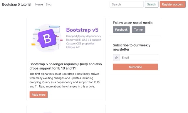
</nav>主要内容,博客卡和侧边栏 (Main content, blog card and sidebar)
Now that we have the navigation bar in order we should start building the main content part of the page. The first element will be a container and inside we will create two main rows: the blog cards section and the sidebar. Here’s the markup that we used right after the <nav> element:
现在我们有了导航栏,我们应该开始构建页面的主要内容部分。 第一个元素是一个容器,在内部我们将创建两个主要行:博客卡片部分和侧边栏。 这是我们在<nav>元素之后使用的标记:
<div class="container my-5">
    <div class="row d-flex justify-content-center">
        <!-- Main row for blog posts -->
        <div class="col-12 col-lg-6">
        <div class="card">
            <img src="https://themesberg.s3.us-east-2.amazonaws.com/public/posts/bootstrap-version-5-alpha-launched.jpg" class="card-img-top" alt="...">
            <div class="card-body">
                <h5 class="card-title">Bootstrap 5 no longer requires jQuery and also drops support for IE 10 and 11</h5>
                <p class="card-text">The first alpha version of Bootstrap 5 has finally arrived with many exciting changes and updates including dropping jQuery as a dependency and support for IE 10 and 11\. Read more about the changes in this article.</p>
                <a href="#" class="btn btn-primary">Read more</a>
            </div>
            </div>
        </div>
        <!-- Sidebar (related articles, newsletter signup etc) -->
        <div class="col-12 col-lg-4">
      <!-- Sidebar content goes here -->
        </div>
    </div>
</div>
Pretty cool, right? But that blog card seems quite lonely there, so let’s add a few more. Don’t forget to add the mb-4 utility class to the first blog card though to create good spacing between the cards.
很酷吧? 但是那里的博客卡似乎很寂寞,所以让我们再添加一些。 不要忘记将mb-4实用程序类添加到第一张博客卡中,尽管它们可以在两张博客卡之间创建良好的间距。
But what happens when you will have more than 10 blog entries on the page? You can’t show too many items since the loading time for the page will increase too much. That’s why we will need a pagination section right at the bottom of the last blog card. Add the following code:
但是,如果页面上有10个以上的博客条目,会发生什么? 您不能显示太多项目,因为页面的加载时间会增加太多。 这就是为什么我们在最后一张博客卡的底部需要一个分页部分的原因。 添加以下代码:
<nav aria-label="Page navigation example">
  <ul class="pagination">
    <li class="page-item"><a class="page-link" href="#">Previous</a></li>
    <li class="page-item"><a class="page-link" href="#">1</a></li>
    <li class="page-item"><a class="page-link" href="#">2</a></li>
    <li class="page-item"><a class="page-link" href="#">3</a></li>
    <li class="page-item"><a class="page-link" href="#">Next</a></li>
  </ul>
</nav>
Now that we have taken care of the left side of the page, the sidebar looks quite empty. Let’s add a section to sign up for a newsletter as it is very common nowadays to have a newsletter coupled with a blog. Add the following code inside the sidebar:
现在我们已经处理了页面的左侧,侧边栏看起来很空白。 让我们添加一个部分来注册新闻简报,因为如今将新闻简报与博客结合起来非常普遍。 在边栏中添加以下代码:
<div class="card" >
    <div class="card-body">
        <h5>Subscribe to our weekly newsletter</h5>
        <form action="#">
            <div class="input-group my-3">
                <span class="input-group-text" id="email-at">@</span>
                <input type="email" class="form-control" placeholder="Email" aria-label="Email" aria-describedby="email-at" required>
            </div>
            <button type="submit" class="btn btn-block btn-primary">Subscribe</button>
        </form>
    </div>
</div>
Of course that’s just one item for the sidebar, but you can also add related articles, social media or other featured posts sections as well.
当然,这只是侧边栏的一项,但是您也可以添加相关文章,社交媒体或其他特色文章部分。
通过Bootstrap 5 Sass变量自定义项目 (Customize the project via the Bootstrap 5 Sass variables)
Looks pretty good, but it’s just the default Bootstrap styles and colors. Let’s make it a bit more unique! This is where Sass shows its true powers by making customization so much easier via the Bootstrap 5 variables. Let’s change the primary color to our favourite one from Themesberg.
看起来不错,但这只是默认的Bootstrap样式和颜色。 让我们使其更加独特! Sass通过Bootstrap 5变量使自定义变得非常容易,从而在这里展示了Sass的真正力量。 让我们将原色更改为Themesberg最喜欢的一种。
First of all you need to create a new _variables.scss file inside the scss/ folder and import this file in the themesberg.scss file like this:
首先,您需要在scss /文件夹中创建一个新的_variables.scss文件,并将该文件导入themesberg.scss文件中,如下所示:
@import 'variables';@import '../../node_modules/bootstrap/scss/bootstrap.scss';Inside the variables.scss file just add the following variable which will override the default $primary variable color which is blue by default:
在variables.scss文件内,只需添加以下变量,它将覆盖默认的$ primary变量颜色,默认为蓝色:
$primary: #e06b54;
$primary: #e06b54;
That’s just one variable! But how do you find out about the other variable names which change the font family, sizing, spacings and so on? It’s simple! Just search for the _variables.scss file inside the Bootstrap folder from the node_modules/ folder.
那只是一个变量! 但是,如何找到其他会更改字体系列,大小,间距等的变量名呢? 这很简单! 只要搜索的_variables.scss从node_modules /文件夹中的引导程序文件夹内的文件。
Here’s the full path: node_modules/bootstrap/scss/_variables.scss. Essentially you can take any variable from there and override it in your local _variables.scss file and it will change the styles for your project. Awesome, right?
这是完整的路径: node_modules/bootstrap/scss/_variables.scss 。 本质上,您可以从此处获取任何变量,然后在本地_variables.scss文件中覆盖它,它将更改项目的样式。 太好了吧?
使用Vanilla JS而不是jQuery (Working with Vanilla JS instead of jQuery)
Although you will still be able to use jQuery with Bootstrap 5 according to the official documentation we actually recommend using Vanilla JS because you will be saving some loading time by not including another dependency and making your project faster and leaner. The document.querySelector will do just fine instead of the popular $ selector.
尽管根据官方文档您仍然可以将jQuery与Bootstrap 5结合使用,但我们实际上建议使用Vanilla JS,因为这样可以节省一些加载时间,因为不包括其他依赖项,可以使您的项目更快,更精简。 document.querySelector会很好地代替流行的$选择器。
We’ll go through some of the Vanilla JS Bootstrap 5 use cases for elements such as tooltips and modals.
我们将介绍一些Vanilla JS Bootstrap 5用例,以了解诸如工具提示和模态之类的元素。
通过Vanilla JS引导5条工具提示 (Bootstrap 5 tooltips via Vanilla JS)
Let’s add another card to the sidebar with some social media links for those who want to join the community after reading a blog post. We used the following markup and also added tooltips when hovering over the buttons:
让我们在侧栏中添加另一张卡片,其中包含一些社交媒体链接,供那些在阅读博文后希望加入社区的人使用。 将鼠标悬停在按钮上时,我们使用了以下标记,并添加了工具提示:
<div class="card mb-4">
    <div class="card-body">
        <h5>Follow us on social media</h5>
        <a href="https://www.facebook.com/themesberg/" class="btn btn-secondary mr-2" data-toggle="tooltip" data-placement="top" title="Like us on Facebook">
            Facebook
        </a>
        <a href="https://twitter.com/themesberg" class="btn btn-secondary" data-toggle="tooltip" data-placement="top" title="Follow us on Twitter">
            Twitter
        </a>
    </div>
</div>
But the tooltips aren’t working! Why? Because they are opt-in and the need to be initialized via Javascript. Here’s how you can do that for every tooltip on the page via Vanilla JS:
但是工具提示不起作用! 为什么? 因为它们是选择加入的,并且需要通过Javascript进行初始化。 您可以通过Vanilla JS在页面上的每个工具提示中执行以下操作:
var tooltipTriggerList = [].slice.call(document.querySelectorAll('[data-toggle="tooltip"]'))
var tooltipList = tooltipTriggerList.map(function (tooltipTriggerEl) {
  return new bootstrap.Tooltip(tooltipTriggerEl)
})
We created a themesberg.js file within the js folder and added the code there. Make sure to include this file in your index.html as well. The code above takes all of the elements on the page that have the attribute data-toggle=”tooltip” and then initializes each and every one of them. You’ll also have the full list of elements available in the tooltipList variable.
我们在js文件夹中创建了themesberg.js文件,并在其中添加了代码。 确保也将此文件包含在index.html中。 上面的代码获取页面上所有具有data-toggle=”tooltip”属性的元素,然后初始化每个元素。 您还将在tooltipList变量中具有可用元素的完整列表。
通过Vanilla JS引导5模态 (Bootstrap 5 modals via Vanilla JS)
In order to showcase the usage of modal with Bootstrap 5 we will create a register account feature via modal toggling. The first would be to add a button after the search element in the navigation bar:
为了展示Bootstrap 5中模式的用法,我们将通过模式切换创建一个注册帐户功能。 第一种是在导航栏中的搜索元素之后添加一个按钮:
<button class="btn btn-primary" id="registerAccountButton">Register account</button>Then add the following modal before the script tags start at the end of the body tag:
然后在script标签从body标签的末尾开始之前添加以下模式:
<div class="modal" tabindex="-1" id="registerAccountModal">
<div class="modal-dialog">
<form action="#" class="modal-content">
<div class="modal-header">
<h5 class="modal-title">Register account</h5>
<button type="button" class="close" data-dismiss="modal" aria-label="Close">
<span aria-hidden="true">×</span>
</button>
</div>
<div class="modal-body">
<div class="mb-3">
<label for="email" class="form-label">Email address</label>
<input type="email" class="form-control" id="email" placeholder="name@example.com" required>
</div>
<div class="mb-3">
<label for="password" class="form-label">Password</label>
<input type="password" class="form-control" id="password" required>
</div>
<div class="mb-3">
<label for="confirmPassword" class="form-label">Confirm password</label>
<input type="password" class="form-control" id="confirmPassword" required>
</div>
</div>
<div class="modal-footer">
<button type="button" class="btn btn-secondary" data-dismiss="modal">Close</button>
<button type="submit" class="btn btn-primary">Save changes</button>
</div>
</form>
</div>
</div>`
`
After that markup has been added you will need to toggle the modal when the register button has been pressed. Add the following code to the themesberg.js file:
添加该标记后,您需要在按下注册按钮后切换模式。 将以下代码添加到themesberg.js文件:
var registerAccountButton = document.getElementById('registerAccountButton');var registerAccountModal = new bootstrap.Modal(document.getElementById('registerAccountModal'), {keyboard: false})registerAccountButton.addEventListener('click', function () {registerAccountModal.toggle();})
var registerAccountButton = document.getElementById('registerAccountButton');var registerAccountModal = new bootstrap.Modal(document.getElementById('registerAccountModal'), {keyboard: false})registerAccountButton.addEventListener('click', function () {registerAccountModal.toggle();})
The code above selects the button and the modal, creates a Bootstrap 5 modal object and then when the button is pressed the modal will be toggled.
上面的代码选择按钮和模态,创建一个Bootstrap 5模态对象,然后在按下按钮时将切换模态。
Of course you can do all of this via the data attributes method, however this way you will have the modal as an object in your Javascript code and manipulating it programmatically will be much easier.
当然,您可以通过数据属性方法来完成所有这些操作,但是通过这种方式,您可以将模式作为Javascript代码中的对象,并且以编程方式对其进行操作将更加容易。
探索新的Utility API (Exploring the new Utility API)
The new Utility API comes as a response to the growing adoption of utility first front-end development, specifically Tailwind CSS. We wrote an article a few months ago comparing Tailwind CSS with Bootstrap 4 if you’d like to learn more about the differences.
新的实用程序API是对实用程序第一个前端开发(尤其是Tailwind CSS)的越来越多采用的一种回应。 如果您想了解更多有关这些差异的信息,我们几个月前写了一篇文章, 将Tailwind CSS与Bootstrap 4进行了比较 。
The new Utility API is basically a way to easily create new custom utility classes to change properties such as opacity, width, colors, sizing, spacing… anything really. What is really cool is that it takes some parameters and it will automatically generate the CSS classes for you. Just create a file called _utilities.scss inside the scss folder, import it in the themesberg.scss file and add the following code:
新的Utility API基本上是一种轻松创建新的自定义实用程序类以更改属性(例如不透明度,宽度,颜色,大小,间距等)的方法。 真正很酷的是,它带有一些参数,它将自动为您生成CSS类。 只需在scss文件夹中创建一个名为_utilities.scss的文件,将其导入themesberg.scss文件中,然后添加以下代码:
$utilities: ("opacity": (property: opacity,values: (0: 0,25: .25,50: .5,100: 1,)));
$utilities: ("opacity": (property: opacity,values: (0: 0,25: .25,50: .5,100: 1,)));
This will generate the following output:
这将生成以下输出:
.opacity-0 {opacity: 0;}.opacity-25 {opacity: .25;}.opacity-75 {opacity: .75;}.opacity-100 {opacity: 1;}
.opacity-0 {opacity: 0;}.opacity-25 {opacity: .25;}.opacity-75 {opacity: .75;}.opacity-100 {opacity: 1;}
So let’s take a step back and see what happened. First of all, the “opacity” part of the code will set the name the first part of the class will have (ie. “.name-value”). Then you need to set the actual property for the class (in this case it’s opacity, but it could be box-shadow, width, height etc) and then the actual values.
因此,让我们退后一步,看看发生了什么。 首先,代码的“不透明”部分将设置类的第一部分将具有的名称(即“ .name-value”)。 然后,您需要为该类设置实际属性(在这种情况下,它是不透明的,但是可以是盒子阴影,宽度,高度等),然后是实际值。
In this case we added four values ranging from 0 to 100 for the opacity. Not that the first part (ie. the key) is what will be used in the class name and the value will be the actual value used for the opacity.
在这种情况下,我们为不透明度添加了四个值,范围从0到100。 并不是说第一部分(即键)是将在类名中使用的值,而是该值将是用于不透明度的实际值。
Here’s another cool thing that you can do. Add the responsive: true flag and it will generate responsive class (sm, md, lg) for all of the utility classes:
这是您可以做的另一件事。 添加响应:true标志,它将为所有实用程序类生成响应类(sm,md,lg):
$utilities: ("opacity": (property: opacity,responsive: true,values: (0: 0,25: .25,50: .5,100: 1,)));
$utilities: ("opacity": (property: opacity,responsive: true,values: (0: 0,25: .25,50: .5,100: 1,)));
This will generate the following output:
这将生成以下输出:
.opacity-0 {opacity: 0;}.opacity-25 {opacity: .25;}.opacity-75 {opacity: .75;}.opacity-100 {opacity: 1;}@media (min-width: 576px) {.opacity-sm-0 {opacity: 0;}.opacity-sm-25 {opacity: .25;}.opacity-sm-75 {opacity: .75;}.opacity-sm-100 {opacity: 1;}}@media (min-width: 768px) {.opacity-md-0 {opacity: 0;}.opacity-md-25 {opacity: .25;}.opacity-md-75 {opacity: .75;}.opacity-md-100 {opacity: 1;}}@media (min-width: 992px) {.opacity-lg-0 {opacity: 0;}.opacity-lg-25 {opacity: .25;}.opacity-lg-75 {opacity: .75;}.opacity-lg-100 {opacity: 1;}}@media (min-width: 1200px) {.opacity-xl-0 {opacity: 0;}.opacity-xl-25 {opacity: .25;}.opacity-xl-75 {opacity: .75;}.opacity-xl-100 {opacity: 1;}}
.opacity-0 {opacity: 0;}.opacity-25 {opacity: .25;}.opacity-75 {opacity: .75;}.opacity-100 {opacity: 1;}@media (min-width: 576px) {.opacity-sm-0 {opacity: 0;}.opacity-sm-25 {opacity: .25;}.opacity-sm-75 {opacity: .75;}.opacity-sm-100 {opacity: 1;}}@media (min-width: 768px) {.opacity-md-0 {opacity: 0;}.opacity-md-25 {opacity: .25;}.opacity-md-75 {opacity: .75;}.opacity-md-100 {opacity: 1;}}@media (min-width: 992px) {.opacity-lg-0 {opacity: 0;}.opacity-lg-25 {opacity: .25;}.opacity-lg-75 {opacity: .75;}.opacity-lg-100 {opacity: 1;}}@media (min-width: 1200px) {.opacity-xl-0 {opacity: 0;}.opacity-xl-25 {opacity: .25;}.opacity-xl-75 {opacity: .75;}.opacity-xl-100 {opacity: 1;}}
Quite amazing, right? These are just a few examples of the Utility API that you can use to make your job easier when coding user interfaces. Check out the whole official Utility API documentation for this section.
太神奇了吧? 这些只是实用程序API的几个示例,可在编写用户界面时使您的工作更轻松。 查看本节的完整官方Utility API文档 。
Alright, that’s about it for this tutorial! You learned how to set up a working dev environment using Gulp 4, Sass, and BrowserSync created a blog page, learned some use cases of vanilla JS with Bootstrap 5, and explored the new Utility API. We created a public repository on Github with the project files here. Give it a lucky star if you appreciate this tutorial ⭐️
好了,本教程就这样! 您学习了如何使用Gulp 4,Sass和BrowserSync来建立工作的开发环境,并创建了一个博客页面,学习了带有Bootstrap 5的Vanilla JS的一些用例,并探索了新的Utility API。 我们在Github上创建了带有项目文件的公共存储库 。 如果您喜欢本教程,请给它一个幸运星⭐️
If you want to save time and money developing websites, you can check out some of our Free and Premium Bootstrap 5 Themes, Templates, and UI Kits on our dedicated page.
如果您想节省开发网站的时间和金钱,可以在我们的专用页面上查看一些免费和高级Bootstrap 5主题,模板和UI套件 。


 扫一扫
扫一扫


 被折叠的 条评论
为什么被折叠?
被折叠的 条评论
为什么被折叠?
 到【灌水乐园】发言


