


css盒子模型
How not knowing this concept may cost you a job!
不知道这个概念怎么可能会让您丧命!
Despite being a fundamental concept in web development, a great number of software engineers have no clue as to what the box model is or how it works. One hiring manager once revealed that they purposely like to ask applicants to define it on interviews and make it one of the determining factors for hiring front-end engineers. Not understanding this concept may cost many developers a job that they could’ve landed otherwise. The good news is that it is quite a simple topic that doesn’t take much to understand.
d espite是在Web开发中的一个基本概念,软件工程师的大量毫无线索的盒子模型是什么,或者它是如何工作。 一位招聘经理曾经透露过,他们有意让求职者在面试中对其进行定义,并使之成为雇用前端工程师的决定因素之一。 如果不了解这个概念,可能会使许多开发人员付出本来可以免去的工作。 好消息是,这是一个非常简单的主题,不需要太多了解。
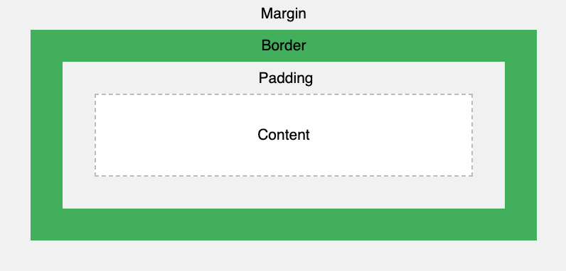
The box model defines the structure of HTML elements on webpages
框模型定义网页上HTML元素的结构
The box model describes the structure of webpages. Every webpage has different parts or boxes that form the skeleton of that page and every HTML element on it. These boxes are commonly used to define the layout of those elements. Essentially, four boxes wrap around every HTML element: margin, border, padding, and content.
盒子模型描述了网页的结构。 每个网页都有不同的部分或框 ,这些部分或框构成了该页面及其上每个HTML元素的框架。 这些框通常用于定义这些元素的布局。 本质上,每个HTML元素都用四个框围起来:边距,边框,填充和内容。
The margin is the outermost box of the box model. It wraps around the border and is transparent by default.
边距是盒子模型的最外面的盒子。 它环绕边框,默认情况下是透明的。
The border is the next layer, after the margin, that wraps around the padding of HTML elements. Some elements have visible borders and others don’t.
边框是边界之后的下一层,环绕HTML元素的填充。 有些元素具有可见的边框,而另一些则没有。
The padding is the box that wraps around the content and is also transparent by default.
填充是环绕内容的框,默认情况下也是透明的。
The content is the innermost box. It is where elements like pictures, texts appear.
内容是最里面的盒子。 它是图片,文本等元素出现的地方。
This model is particularly useful for adding styling and spaces around and between HTML elements.
该模型对于在HTML元素周围和之间添加样式和空格特别有用。
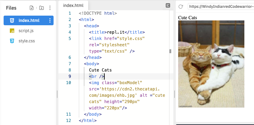
Let’s code together! You can go over to repl.it, click on “Start coding” at the upper right corner of the page, type “HTML”, and then select “HTML, CSS, JS” from the dropdown menu. This will open up a window where you can test out HTML code. On the left, you’ll see the text editor with the skeleton of a basic HTML page; on the right, is how it looks in the browser after you click on the green ‘Run’ button at the top of that page. Let’s erase and paste the following code:
让我们一起编码! 您可以转到repl.it ,单击页面右上角的“开始编码”,键入“ HTML”,然后从下拉菜单中选择“ HTML,CSS,JS”。 这将打开一个窗口,您可以在其中测试HTML代码。 在左侧,您将看到带有基本HTML页面框架的文本编辑器。 右边是单击页面顶部绿色的“运行”按钮后在浏览器中的外观。 让我们擦除并粘贴以下代码:
<!DOCTYPE html> <html> <head> <title>repl.it</title> <link href="style.css" rel="stylesheet" type="text/css" /> </head> <body> Cute Cats <br /> <img class="boxModel" src='https://cdn2.thecatapi.com/images/ehb.jpg' alt ="cute cats" height="300px" width="220px"/> </body> </html>Click the green “Run” button at the top and you should get the following:
单击顶部的绿色“运行”按钮,您将获得以下内容:
By default, any HTML element will have a padding, margin, and border of 0 pixels. This can be seen by the fact that the picture is flush against the left side. The <img> tag has height and width attributes.
默认情况下,任何HTML元素的填充,边距和边框均为0像素。 通过图片与左侧齐平的事实可以看出这一点。 <img>标签具有height和width属性。
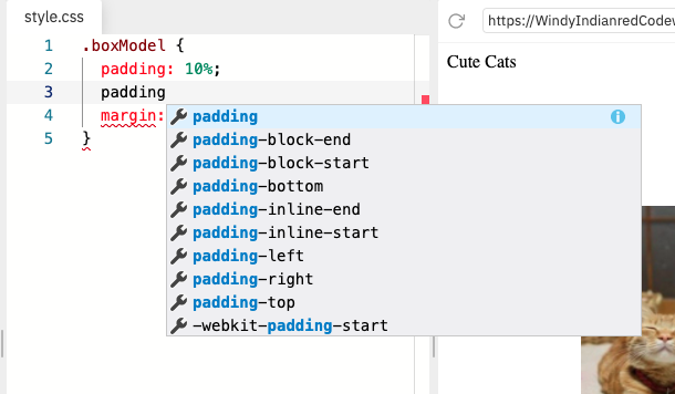
Notice that we have a class called “boxModel” inside the <img> tag. On the far left side, there are 3 files, click on style.css. Let’s define that class:
注意,我们在<img>标记内有一个名为“ boxModel”的类。 在最左侧,有3个文件,单击style.css。 让我们定义该类:
.boxModel { padding: 10%; margin: 10%;}We now get the following:
现在,我们得到以下内容:

Using the ‘padding’ and ‘margin’ CSS attributes, we’re able to shift the picture down and right. Play with it a little to see how the picture changes position as you change those values.
使用'padding'和'margin'CSS属性,我们可以左右移动图片。 稍微玩一下,看看图片在更改这些值时如何改变位置。
When you set a value for each one of those attributes, it will be set for both the top, bottom, right, and left sides of that element. If you go back to the stylessheet and type ‘padding’, a dropdown with autocomplete suggestions will appear. Those are modifiers for the ‘padding’ attribute.
为这些属性中的每个属性设置值时,将同时为该元素的顶部,底部,右侧和左侧设置该值。 如果返回样式表并键入“ padding”,则会出现一个包含自动完成建议的下拉列表。 这些是“填充”属性的修饰符。
Let’s replace ‘padding’ with ‘padding-left’.
让我们用“ padding-left”替换“ padding”。
.boxModel { padding-left: 10%; margin: 10%;}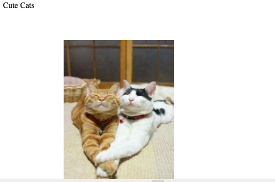
Notice that the picture is shifted up but retains its padding position on the left. You can use ‘-right’, ‘-left’, ‘-top’, ‘-bottom’ to modify the margin, padding, and border attributes.
请注意,图片向上移动,但保留了其填充位置在左侧。 您可以使用'-right','-left','-top','-bottom'来修改边距,填充和边框属性。
了解盒子模型如何影响您的元素 (Understanding how the box model affects your elements)
The box model is particularly important in making sure that the correct height and width of elements are consistent across all browsers. Remember that the content area of the box model, our <img> tag, in this case, has its own width and height, apart from its margin, border, and padding. To calculate the full size of any given element, you have to define its margin, border, and padding. For example, if we change our tag to have a height of 100px and given the following CSS attributes for our class:
盒子模型对于确保所有浏览器中元素的正确高度和宽度一致是特别重要的。 请记住,盒子模型的内容区域(在这种情况下,我们的<img>标签具有其自身的宽度和高度),除了其边距,边框和填充。 要计算任何给定元素的完整大小 ,必须定义其边距,边框和填充。 例如,如果我们将标签更改为100px的高度,并为我们的类指定了以下CSS属性:
.boxModel {
  margin: 10px;
  border: 10px;
  padding: 10px;
}
then that element would have a total height of 160px. We arrive at that height as follows:
那么该元素的总高度将为160px。 我们达到如下高度:
Total height =
100 (height of the content) +
10 + 10 (height of the top and bottom margin) +
10 + 10 (height of the top and bottom border) +
10 + 10 (height of the top and bottom padding)
-------
160 px
Therefore, we calculate the total height and width of an element using the following formulas:
因此,我们使用以下公式计算元素的总高度和宽度:
Total height of an element = height + top padding + bottom padding + top border + bottom border + top margin + bottom marginTotal width of an element = width + left padding + right padding + left border + right border + left margin + right margin带走 (Takeaway)
Let’s summarize what we’ve learned.
让我们总结一下我们学到的东西。
- The box model describes the structure of elements on a page. 盒模型描述页面上元素的结构。
- Every element is wrapped around 4 boxes: margin, border, padding, and content. 每个元素都围绕4个框:边距,边框,填充和内容。
- By default, those attributes are set to 0. 默认情况下,这些属性设置为0。
- Each one of those attributes has a set of modifiers that can be used to change specific details (right, left, color, etc) of that attribute. 这些属性中的每个属性都有一组修饰符,可用于更改该属性的特定详细信息(右,左,颜色等)。
- The total height and width of an element are calculated by adding its own content area dimensions to the values of its box model attributes. 元素的总高度和宽度是通过将其自己的内容区域尺寸添加到其盒模型属性的值来计算的。
Thanks for reading! Happy coding! :)
谢谢阅读! 编码愉快! :)
css盒子模型


 扫一扫
扫一扫
 1290
1290

 被折叠的 条评论
为什么被折叠?
被折叠的 条评论
为什么被折叠?
 到【灌水乐园】发言


