


 这篇博客介绍了如何在Python中定义一个用于绘制简单点图的函数,参考自Medium上的一篇文章。
python函数中定义函数
AP Statistics seems to love dotplots. They’re easy to make by hand, they quickly give you an idea of what your distribution looks like, and they don’t require any real planning or number-crunching before diving in––compare this to histograms, which require you to know how high the bar is going to be before you draw it, and how many bins you want to use. There’s a simple one-to-one correspondence with observations and dots on the plot, so they’re easy to understand and easy to produce by hand in a testing environment.
AP Statistics似乎很喜欢dotplots。 他们很容易手工制作,可以快速让您了解您的分布情况,而且在深入研究之前不需要任何实际的规划或数字运算–将其与直方图进行比较,这需要您知道在绘制之前,条形将达到多高,以及要使用多少个垃圾箱。 与图中的观察点和点之间存在简单的一对一对应关系,因此它们易于理解,并且易于在测试环境中手动生成。
When I was teaching the early units in AP Statistics, I got sick of making dot plots by hand, and I wound up turning to a variety of online tools that simply weren’t giving me exactly what I was wanting, which was a no-frills, minimal, straightforward plot like this one:
当我在AP Statistics中教授早期的单元时,我厌倦了手工制作点图,然后我开始转向各种在线工具,这些工具并不能完全满足我的需求。如此简单,简洁的情节:
Although there are plenty of online tools out there for making dot plots for tests, quizzes, or lecture slides, I was generally put off by what they required of me. They frequently added in chartjunk like multiple colors or awkward label sizes, or they required me to jump through a ton of hoops in order to get what I was going for.
尽管有很多在线工具可以用来绘制测试,测验或演讲幻灯片的点线图,但我通常对他们的需求感到失望。 他们经常添加图表垃圾,例如多种颜色或笨拙的标签大小,或者他们要求我跳很多圈才能得到想要的东西。
To address this issue, here is a simple script for generating dotplots. All it does is provide a simple wrapper for matplotlib.pyplot.scatter, in addition to a handful of functions for computing the coordinates of the dots. Because I was also teaching AP Computer Science (both A and Principles) while teaching AP Statistics, I was always on the lookout for activities that could blur the lines between courses, injecting some computer science into statistics, and vice-versa. If you are an AP Statistics or AP Computer Science teacher, feel free to adapt this code into a classroom activity, or to use it simply as a tool. The code is available on my github, and I have also created a repl where you can run it online.
为了解决此问题,这是一个用于生成点图的简单脚本。 它的作用是为matplotlib.pyplot.scatter提供一个简单的包装器,以及一些用于计算点坐标的函数。 因为我在教授AP Statistics的同时也在教授AP Computer Science(A和Principles),所以我一直在寻找活动,这些活动可能会使课程之间的界线变得模糊,将一些计算机科学注入统计学,反之亦然。 如果您是AP Statistics或AP Computer Science的老师,请随时将此代码改编为课堂活动,或仅将其用作工具。 该代码在我的github上可用,并且我还创建了一个repl ,您可以在其中在线运行它。
I aimed to keep the Python as accessible to students and beginners as possible, so these are the concepts needed to prep the data for plotting:
我的目标是使Python尽可能地为学生和初学者所用,因此以下是为绘图准备数据所需的概念:
basic list operations, including indexing or using
max,min, orlen基本列表操作,包括索引或使用
max,min或len- list comprehensions 清单理解
- dictionary operations字典操作
Admittedly, the code for calling plt.scatter is more complex and requires a more knowledge of matplotlib architecture, but that comes down more to me aiming for a specific aesthetic than necessary algorithmic thinking.
诚然,调用plt.scatter的代码更加复杂,并且需要对matplotlib架构有更多的了解,但是对于我来说,针对特定的美学目标而不是必要的算法思考更多。
Problem Statement: We have a one-dimensional list of numerical observations, and a known function matplotlib.pyplot.scatter , and want to create a new function, dotplot , which will employ scatter to create a dotplot.
问题陈述:我们有一个一维的数字观测值列表,以及一个已知的函数matplotlib.pyplot.scatter ,并且想要创建一个新函数dotplot ,它将使用scatter创建一个点图。
Approach: We need to take each observation and convert it into a set of coordinates. The x-coordinate will be a stack_key , meaning a real number on a number line where we will stack our points. The y-coordinate will need to be computed, and will correspond to the number of points that will be placed on that stack.
方法:我们需要进行每个观察并将其转换为一组坐标。 x坐标将是stack_key ,表示在数字线上我们将要堆叠点的实数。 y坐标将需要计算,并且将对应于将放置在该堆栈上的点数。
算法 (The Algorithm)
This is the general algorithm for accomplishing this task, followed by the code required to actually produce the dotplot.
这是完成此任务的通用算法,其后是实际生成点图所需的代码。
Specify the values on the number line where we want to put the stacks of dots. This can be done by calling
get_stack_keys, which will create a specified number (passed to thenum_stacksparameter) of evenly-spaced values between the minimum and maximum values observed, or by passing a list ofstack_keysdirectly (which generally results in a cleaner plot, because the values are not computed).在要放置点叠的数字线上指定值。 这可以通过调用
get_stack_keys来完成,该方法将在观察到的最小值和最大值之间创建指定数量(传递给num_stacks参数的值)的均匀间隔值,或者直接传递一个stack_keys列表(通常可以得出更清晰的图) ,因为未计算值)。Assigning observations to the corresponding key. An observation is assigned to a
stack_keyif it is greater than or equal to thatstack_key, but less than the nextstack_key. In other words, binning the values. This is accomplished by creating a dictionary whose keys are the elements in thestack_keylist, and whose values are a list of observations that fall into that bin. This is done by callingget_stack_dict.将观察值分配给相应的键。 如果观察值大于或等于该
stack_key但小于下一个stack_key则将其分配给stack_key。 换句话说,对值进行装仓。 这是通过创建一个字典来实现的,该字典的键是stack_key列表中的元素,其值是属于该bin的观察值的列表。 这是通过调用get_stack_dict.完成的get_stack_dict.Computing the coordinates for the points on our scatterplot. If a given
stack_key, say,5, has three observations in its list, then we want to compute a list of points,[(5,1), (5,2), and (5,3)]. We do this for eachstack_key, which creates the list of all points we need to put on our scatterplot.计算散点图上各点的坐标。 如果给定的
stack_key(例如5在其列表中具有三个观察值,则我们要计算点列表[(5,1), (5,2), and (5,3)]。 我们对每个stack_key进行此stack_key,这将创建我们需要放在散点图中的所有点的列表。Use these coordinates to plot the points. Note that for
plt.scatter, we’ll need to separate thexandycoordinates into separate lists.使用这些坐标绘制点。 请注意,对于
plt.scatter,我们需要将x和y坐标分成单独的列表。Customize the scatterplot by adjusting the window size, font size for the
xticks, marker size (size of the dots), and hiding the box that is plotted around anAxesobject by default.通过调整窗口大小,
xticks字体大小,标记大小(点的大小)并隐藏默认情况下围绕Axes对象绘制的框来自定义散点图。
All of this is handled by the dotplot function, as can be seen below:
所有这些都由dotplot函数处理,如下所示:
import ap_stat# some arbitrary data
data = [1,3,6,7,7,7,7,3,8,2,4,6,8,2,3,4,5,6,9,1,4,4,8]# we can see the values are between 1 and 9,
# so we'll specify keys explicitly
keys = [1, 2, 3, 4, 5, 6, 7, 8, 9]ap_stat.dotplot(data=data, keys=keys)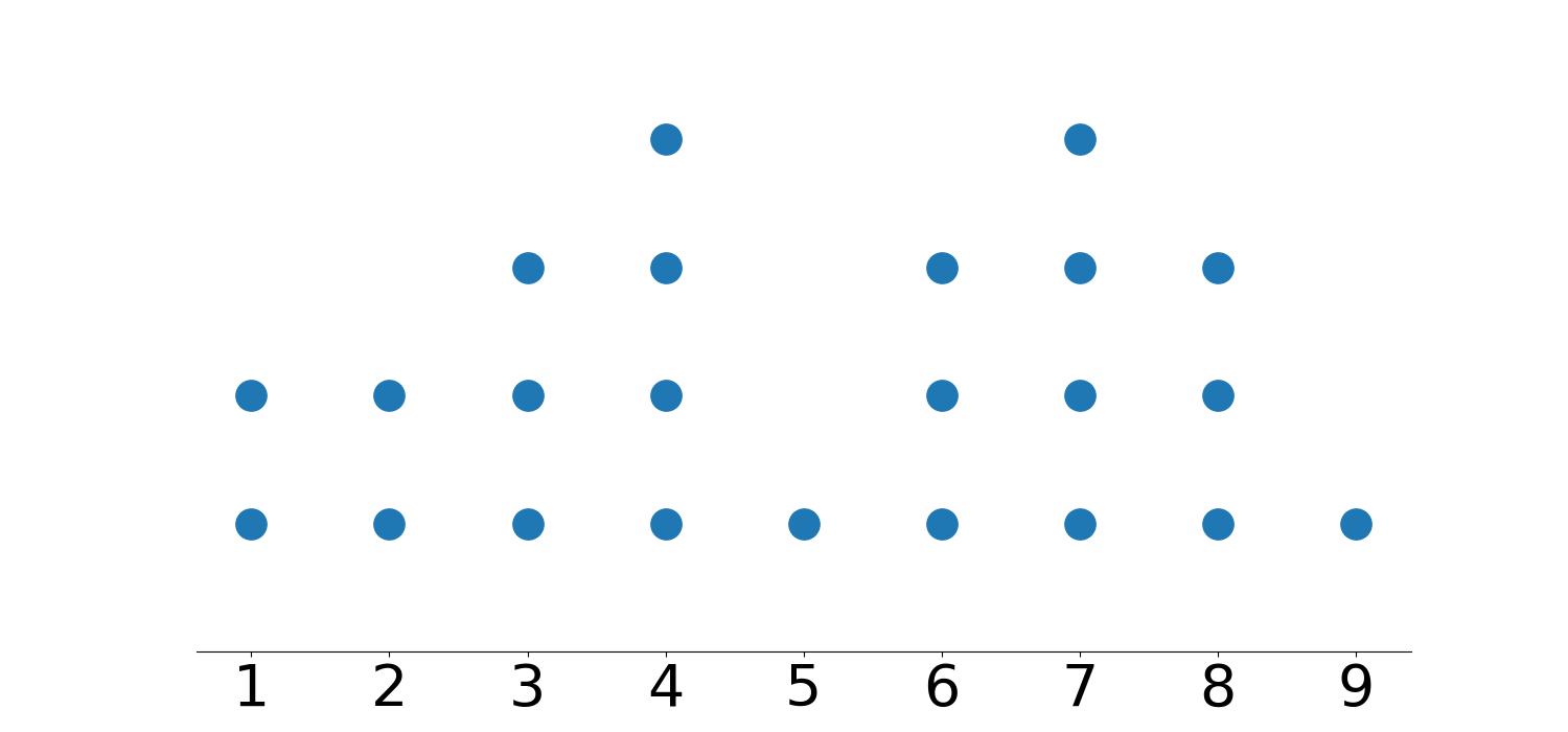
The graph itself is in a fixed size of (16,7), and the spacing and font size on the axis are determined programmatically. If you’re interested in seeing the details of how I implemented this (and to see what other options you can use), feel free to check out the the notebook on my github.
图形本身的固定大小为(16,7),并且轴上的间距和字体大小是通过编程确定的。 如果您有兴趣查看有关实现此方法的详细信息(并查看可以使用的其他选项),请随时在github上查看笔记本。
Hopefully this code is more straightforward than some other options! Although I don’t use dotplots at all in my day-to-day data science (opting for histograms), they’re great tools for exploring distributions of small data sets in the classroom, so hopefully this code can lighten your prep work a little bit as you get together slides, activities, or assessments.
希望这段代码比其他一些选项更简单! 尽管我在日常数据科学中根本不使用点图(选择直方图),但它们是探索教室中小数据集分布的绝佳工具,因此希望这段代码可以减轻您的准备工作。幻灯片,活动或评估汇聚在一起。
普通英语的Python (Python In Plain English)
Did you know that we have three publications and a YouTube channel? Find links to everything at plainenglish.io!
您知道我们有三个出版物和一个YouTube频道吗? 在plainenglish.io上找到所有内容的链接!
翻译自: https://medium.com/python-in-plain-english/a-simple-dot-plot-function-in-python-1c5958fac96f
python函数中定义函数


 2920
2920

 被折叠的 条评论
为什么被折叠?
被折叠的 条评论
为什么被折叠?
 到【灌水乐园】发言


