


同质化和差异化
重点 (Top highlight)
Ok I admit it — it was fun to co-create a name for this “exciting new trend” but I never imagined it will go that far.
好的,我承认-为这个“令人兴奋的新趋势” 共同创建一个名字很有趣,但是我从未想过它会走那么远。
Many blogs and twitter posts are calling it the “next great thing for 2020” already. Let me pop that little bubble before it outgrows us all.
许多博客和Twitter帖子已经将其称为“ 2020年的下一件大事”。 让我在不给我们所有人带来麻烦之前就把它冒出来。

Neumorphism is not versatile enough to be a popular design style. Especially in real, coded products.
神经形态的通用性不足以成为流行的设计风格。 特别是在真实的编码产品中。
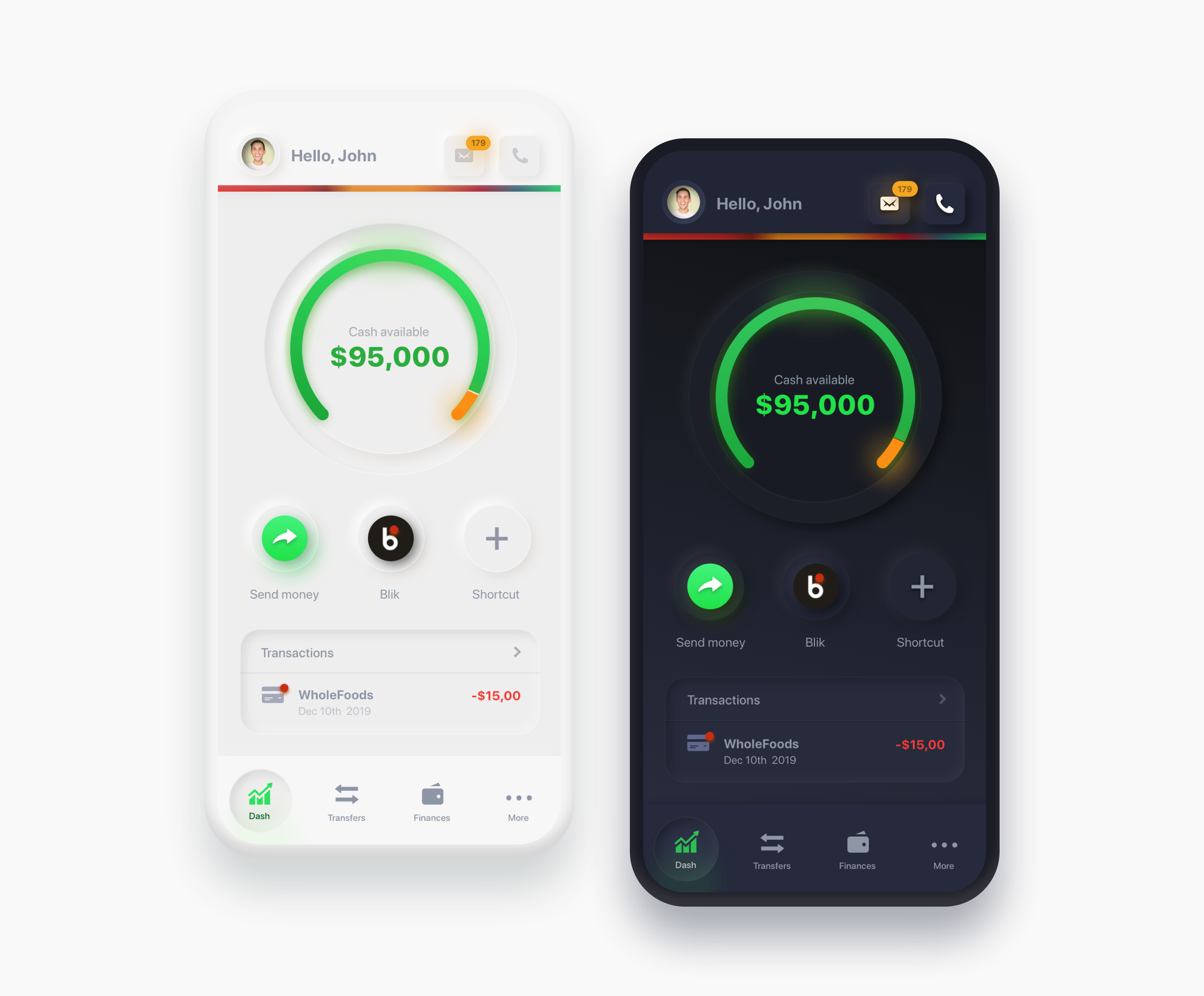
Sure you can do it in Dark Mode and you can choose from a variety of a couple different off-white background colors. That gives us six possible styles but the differences between them are too small.
当然,您可以在黑暗模式下进行操作,并且可以从多种不同的灰白色背景颜色中进行选择。 这给了我们六种可能的样式,但是它们之间的差异太小了。

不要做按钮! (Don’t do buttons!)
Currently the style is being overused to create anything from cards to buttons, often breaking the rules I tried to outline here. I know it looks nice as a pressed state but for many people it’s not visible enough as the change is too subtle.
目前,该样式已被过度使用,无法创建从卡片到按钮的任何东西,通常会破坏我在此处试图概述的规则。 我知道它看起来像一个紧迫的状态,但是对于很多人来说,由于变化太细微,它还不够明显。
And by many people I don’t only mean the ones having vision impairments but also people with lower quality screens / lower screen contrasts etc.
在很多人中,我不仅是指视力受损的人,还包括屏幕质量较低/屏幕对比度较低的人。

Comparing the neumorphic buttons to either Skeuomorphic or flat ones that have any contrast is also a good example. Those shapes simply don’t work well as actual buttons and are TERRIBLE as Call To Action.
将神经变形按钮与具有任何对比度的Skeuomorphic或扁平按钮进行比较也是一个很好的例子。 这些形状不能像实际的按钮那样很好地工作,并且像号召性用语那样可怕。

将它们用作卡怎么样? (How about using them as cards?)
Cards and sliders are probably the best use-cases of this trend. But this is all given the structure of the card is done right. The hierarchies between images, icons and fonts need to be clear and the spacings well defined. The best way to test if a card works is by removing that neumorphic background.
卡和滑条可能是这种趋势的最佳用例。 但这一切都假设卡的结构正确完成了。 图像,图标和字体之间的层次结构必须清楚,间距必须明确定义。 测试卡是否有效的最佳方法是消除该亚态背景。
If it works on it’s own (especially next to other cards) it’s good!
如果它可以单独使用(特别是在其他卡片旁边),那就太好了!

For it to work well you need to make sure that even blockframes of your objects with the background removed can be all identified as part of the same group. ⬜️ ⬜️ ⬜️
为了使其正常工作,您需要确保即使删除背景的对象的块框架也可以全部识别为同一组的一部分。 ⬜️⬜️⬜️
So in short — those cards will work if the interface can be just as good without them. Now that’s an awesome recommendation, is it? Especially when we take that Dieter Rams point about removing the “unnecessary” 😂
简而言之,如果没有它们,接口也可以正常工作,那么这些卡就可以工作。 现在,这是一个很棒的建议,对吗? 特别是当我们认为Dieter Rams指出要删除“不必要的””
If you want a pre-made Sketch / Figma files with those shapes to play around go to www.Neumorphism.com
如果要播放带有这些形状的预制Sketch / Figma文件,请访问www.Neumorphism.com。
但是真新鲜! (But it’s so fresh!)
Remember Pantone Color of the year 2019? Let me refresh your memory on that amazing “new design trend of 2019” as it was proclaimed in January.
还记得2019年的Pantone Color吗? 让我对一月份宣布的令人惊叹的“ 2019年新设计趋势”记忆犹新。

While of course there were initial examples of that “living coral” most of them were not relevant anymore by early February 2019.
当然,虽然有一些最初的例子表明,“活珊瑚”到2019年2月上旬已不再相关。
I think by the same time we will exhaust all possible neumorphic combinations and come back to what worked well before.
我认为,与此同时,我们将穷尽所有可能的亚纯合体组合,然后再回到以前效果良好的地方。
2020年的方向🔥 (Directions for 2020 🔥)
That doesn’t mean Neumorphism is dead in the water though.
但这并不意味着神经同质性已经死了。
It just means that on it’s own it won’t be able to carry an entire product to success. Sure — a couple initial products done this way can be successful, but this will get more tiresome than even material design.
这仅意味着,单靠它自己将无法使整个产品成功。 当然-用这种方法完成的一些初始产品可以成功,但是即使是材料设计,也要使工作更累人。
However mixing parts of this style with parts of other styles will definitely be a trend in 2020 and beyond.
但是,将这种样式的部分与其他样式的部分混合在一起绝对是2020年及以后的趋势。
Making a product that is both beautiful and functional means not going over the top in any direction. Even the currently popular soft-colorful shadow only works well if it’s done on buttons and/or icons. Imagine applying it to the entire product — exactly!
制作既美观又实用的产品意味着不要从任何方向超越。 如果仅在按钮和/或图标上完成操作,则即使是当前流行的柔和的彩色阴影也只能正常工作。 想象一下,将其应用于整个产品吧!
暗模式 (Dark mode)
Dark mode is going to be a thing whether we like it or not. But not necessarily the desaturated grey-blue dark mode we’re seeing everywhere.
无论我们喜欢与否,暗模式都将成为一件事情。 但不一定是我们到处都看到的去饱和的灰蓝色暗模式。
Since the introduction of OLED screens it’s obvious that pure-black doesn’t use much energy (if at all). So if the goal of a dark mode is to save battery we should start seeing more minimal, functional interfaces that are primarily black. Not dark-grey.
自从OLED屏幕问世以来,很明显纯黑色不会消耗太多能量(如果有的话)。 因此,如果暗模式的目的是节省电池,我们应该开始看到更多的最小的,功能性的界面,这些界面主要是黑色的。 不是深灰色。
Eye-strain can be another reason for dark modes and if that’s the case those soft dark-modes definitely look better.
眼睛疲劳可能是黑暗模式的另一个原因,如果是这样的话,那些柔和的黑暗模式肯定看起来更好。
插图和3D (Illustration and 3D)
We definitely need a more diverse illustration landscape. Currently the most popular style with those slightly unproportional bodyparts and loose-lines is showing up everywhere. This gets boring quickly.
我们当然需要更多样化的插图。 目前最受欢迎的款式是那些比例不成比例的身体部位和松散的线条,随处可见。 这变得很无聊。

However illustration is one of the best ways to stand out — but we need to experiment with it more not to fall into the trap of sameness.
但是,插图是脱颖而出的最佳方法之一-但我们需要更多地尝试一下,以免落入同一性的陷阱。
3d on the other hand is a bit easier to make in a way that’s different. It’s also significantly harder to make, requiring more effort. That means that if that time was spent making a 3d render it’s likely to be better quality and on-brand.
另一方面,以不同的方式制作3d有点容易。 这也很难制造,需要更多的努力。 这意味着,如果花费时间进行3d渲染,则质量和品牌形象可能会更好。

动画 (Animation)
Transitions and scene-builds will raise even more this year. One of the accellerants of it is the new, exciting JS libraries that allow for complex 2d and 3d transitions with relative ease.
过渡和场景构建将在今年进一步提高。 它的加速器之一是令人兴奋的新JS库,它允许相对轻松地进行复杂的2d和3d转换。
👨🏻💻 Yes you can now code “cool stuff” much easier. Don’t overdo it!
💻💻是的,您现在可以轻松编写“很酷的东西”的代码。 不要过度!
We’re going to put that flat-design on surfaces and turn them around. Kind of like in that FEZ game ;)
我们将把平面设计放到表面上并转过来。 有点像那个FEZ游戏;)
等轴测图? (Isometry?)
In 2019 while building our cryptocurrency analytics platform I took the time to analyse the design of over 2000 crypto related websites (a long article on it is coming in the new year). That literally means I went to 2000 websites and gave each one a score based on quality, originality and consistency.
2019年,在构建我们的加密货币分析平台时,我花时间分析了2000多个与加密货币相关的网站的设计(有关这一内容的新文章将在新的一年发布)。 从字面上看,这意味着我去了2000个网站,并根据质量,原创性和一致性给每个网站打分。

One thing that struck me the most is that almost 1/4 of them had some sort of isometric images on them. All done in different yet so familiar style that after a while I wasn’t sure they weren’t all from the same free library.
让我印象最深的一件事是,其中近1/4的物体上都有某种等距的图像。 所有这些都是以不同但又熟悉的风格完成的,以至于过了一会儿我不确定它们是否来自同一个免费图书馆。
This trend can be done well, but if you plan to just replicate the popular ones in your designs — just don’t. Please. It’s been one of the most overused design things this year (right after colorful shadows).
这种趋势可以很好地实现,但是如果您打算只复制设计中的流行趋势,那就不要这样做。 请。 这是今年最被过度使用的设计之一(紧接在五颜六色的阴影之后)。
超极简主义让您充实? (Ultra minimalism for mindfullness?)
This trend is just starting so it may not go outside a small niche. I jumped into digital-detox and using more minimal products this year and so did many people I know.
这种趋势才刚刚开始,因此它可能不会超出一个小众市场。 今年,我跳入了数码排毒行业,并使用了最少的产品,我认识的很多人也是如此。

Devices like the Mudita Pure or the Light Phone 2 deliver simple, black&white, super-minimal interfaces. If we consider the apps we use as tools that must serve a specific function, a minimal interface makes some sense. Of course not apps will work in that style (imagine a text-only Instagram 🤣)
诸如Mudita Pure或Light Phone 2之类的设备可提供简单的黑白超最小接口。 如果我们考虑用作必须具有特定功能的工具的应用程序,则最小的界面是有意义的。 当然,应用程序无法以这种风格运行(想象一个纯文本的Instagram🤣)
语音接口? (Voice interfaces?)
On one of the conferences I attended (and lectured at) this year I’ve heard this quote:
在今年我参加(并在其中演讲)的一个会议上,我听到了这句话:
Don’t learn UI. We will be using mostly voice recognition in the near future — talking to our devices.
不学习UI。 在不久的将来,我们将主要使用语音识别-与我们的设备通话。
While this seems futuristic and makes sense in some scenarios (while driving or exercising) there are two main problems that I think won’t push voice UI’s into a dominant position (yet).
尽管这看起来是未来派的,并且在某些情况下(驾车或锻炼时)是有道理的,但我认为有两个主要问题仍无法将语音UI推向主导地位(尚未)。
- There are huge concerns about privacy and “creepy” AI. Not long ago Alexa advised its user to kill themselves as it’s the best way to stop global warming and save the planet. While this may logically be true it’s definitely a clickbait-y headline that will make many people scratch their heads and say — yeah I don’t like those smart speakers listening to our every word and secretly building the next skynet. 隐私和“令人毛骨悚然”的AI引起了人们的极大关注。 不久前,Alexa建议其用户自杀,因为这是阻止全球变暖和拯救地球的最佳方法。 尽管从逻辑上讲这可能是正确的,但绝对是一个点击诱饵的标题,它将使许多人挠头说:—是的,我不喜欢那些聪明的演讲者听我们讲的每个字并暗中建立下一个天网。
- In many cases it’s really weird to talk to your phone (especially in public). A few quick taps are more private and faster. So until we get those brain-computer interfaces talking to your phone to write a text message on a bus won’t be a thing. 在许多情况下,与您的电话通话(特别是在公共场合)真的很奇怪。 快速点击几下会变得更加私密和快捷。 因此,直到我们让那些脑机接口与您的电话交谈以在公交车上写短信之前,这才是真正的事情。
那会是什么呢? (So what’s it gonna be?)
The only right answer here can be — I don’t know. I may be wrong and we’ll be living in the extruded soft plastic future, or we may get extruding glass on phones and make it even more real.
唯一正确的答案可能是-我不知道。 我可能是错的,我们将生活在挤压软塑料的未来中,或者我们可能会在手机上挤压玻璃并将其变得更真实。

But what’s likely to happen is that no one trend will dominate this year.
但是很可能会发生的是,今年没有任何一种趋势能成为主流。
The best designs — as it has always been — will come from the right mix of all the trends with good typography. Because you can cast a different type of shadow on your card, but if the text on it looks all misplaced and weird, no amount of extruded plastic will make that design good.
一如既往,最好的设计将来自所有趋势的正确组合和良好的排版。 因为您可以在卡上投射不同类型的阴影,但是如果卡上的文字看起来都错位且怪异,则没有任何挤压塑料可以使该设计更好。
Readable IS beautiful. Remember that in 2020!
可读就是美丽 。 记得在2020年!
Get MY UI DESIGN BOOK 📘 or subscribe on YOUTUBE 📺
I fight design crime at night, and I work at HYPE4 during the day.
翻译自: https://uxdesign.cc/neumorphism-will-not-be-a-huge-trend-in-2020-67a8c35e52cc
同质化和差异化


 3138
3138

 被折叠的 条评论
为什么被折叠?
被折叠的 条评论
为什么被折叠?
 到【灌水乐园】发言


