


figma button
重点 (Top highlight)
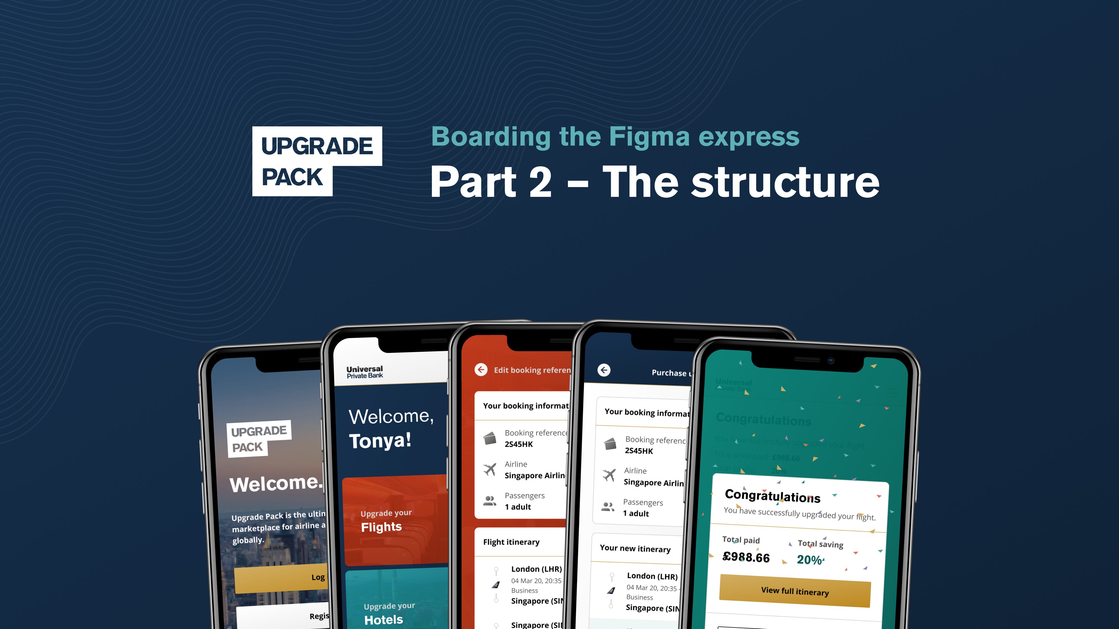
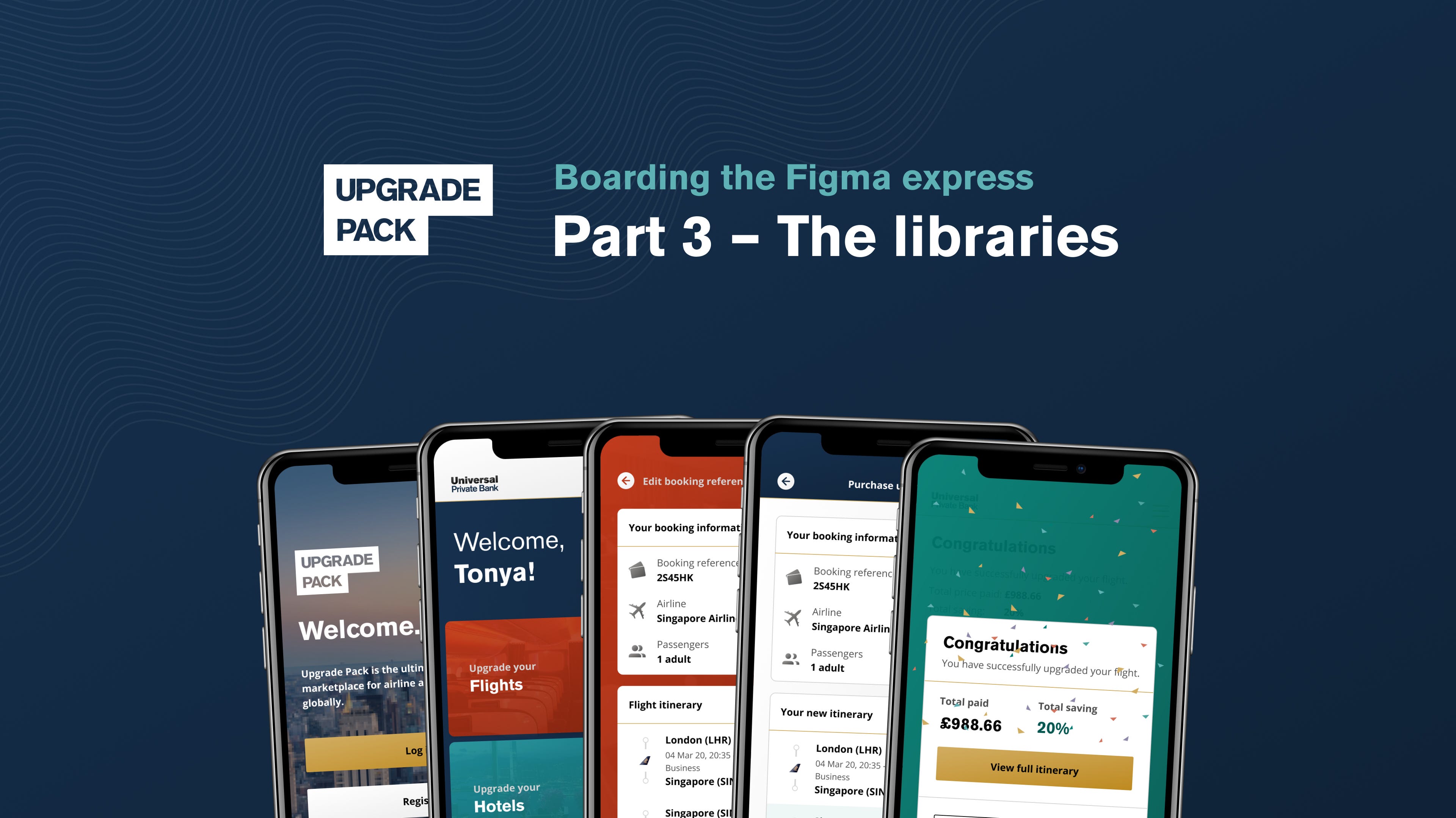
Upgrade Pack is a market-first flight and hotel upgrade app. Available to mass affluent banking customers, or as a unique employee benefit, Upgrade Pack provides users the opportunity to upgrade their flights or hotels — with a discount — via a simple to use iOS and Android app.
升级包是市场上第一个航班和酒店升级应用程序。 面向大量富裕的银行客户,或作为一项独特的员工福利,升级包为用户提供了通过简单易用的iOS和Android应用程序(有折扣)升级其航班或酒店的机会。
Over the course of Q4 2019, we decided to migrate our design tool suite over to Figma for myriad reasons. I’ve documented the process and decided to write up a transparent trio of articles for you all.
在2019年第四季度期间,出于各种原因,我们决定将设计工具套件迁移到Figma。 我已经记录了该过程,并决定为大家编写透明的三篇文章。
I’ve broken down our migration process into three stages. Put your seatbelt on, this is going to be a fun ride.
我将迁移过程分为三个阶段。 系好安全带,这将是一个有趣的旅程。
Figma,背景故事 (Figma, a backstory)
Starting with a blank slate is every designer’s dream. Being given free reign to decide on the appropriate tooling to build a brand new product is a challenge, but provides an opportunity to experiment and find what works for the project at hand.
从空白开始是每个设计师的梦想。 拥有自由统治权来决定使用合适的工具来构建全新产品的挑战是一个挑战,但同时也提供了进行实验并找到适合当前项目的机会。
Joining Upgrade Pack as the first visual designer in September 2018 landed me in this position and I was excited to test the waters of what was possible on the design tool landscape. During my interview process I decided to give InVision Studio a run for its money, and upon starting the position I decided to try and stretch it in-house. Unfortunately, at this point our engineers just didn’t find the hand off process as slick as it could be, so that was struck off. I was also testing a Sketch plus Zeplin workflow at the same time, and it just felt a lot more complete. Bye, bye InVision Studio. Our UX designer and VP of Product still found immense value in the InVision prototyping and Freehand products, so those were kept in our suite.
我于2018年9月以第一位视觉设计师的身份加入Upgrade Pack,使我进入了这一职位,我很兴奋地测试了设计工具领域的潜力。 在面试过程中,我决定让InVision Studio赚钱,当开始这个职位时,我决定尝试在内部进行扩展。 不幸的是,在这一点上,我们的工程师并没有发现交接过程会像它那样光滑,因此被取消了。 我同时也在测试Sketch plus Zeplin工作流程,感觉更加完善了。 再见,InVision Studio,再见。 我们的用户体验设计师和产品副总裁仍然在InVision原型设计和Freehand产品中发现了巨大的价值,因此将它们保留在我们的套件中。
Having had little exposure to Figma in the past, and the library feature not being quite as sophisticated as Sketch’s at this point in time, I made a snap decision to run with my old trusty Sketch.
过去很少接触Figma,并且库功能在此时还不如Sketch复杂,因此我做出了一个明智的决定,决定使用我以前可靠的Sketch。
We needed to start building yesterday, and I knew that I could deliver with Sketch.
我们需要昨天开始构建,我知道我可以使用Sketch交付。
快进6个月 (Fast forward 6 months)
With our growth as a business skyrocketing, we were in a position to double both the product and engineering teams. I’d been keeping tabs on the design tool landscape since making the decision to go all in on a Sketch plus Zeplin plus InVision stack, and given we were bringing a few more designers on board, I spotted an opportunity for us to run a test to see if Figma could fit into our workflow. This was a great opportunity to test the collaboration features with the plan to operate on a more paired-designer workflow going forward.
随着业务的迅猛发展,我们能够将产品和工程团队增加一倍。 自从决定全权使用Sketch,Zeplin和InVision堆栈以来,我一直在关注设计工具的领域,考虑到我们要招募更多的设计师,我发现了一个机会进行测试看看Figma是否适合我们的工作流程。 这是一个很好的机会,可以通过计划对协作功能进行测试,以在以后的更配对的设计师工作流程中进行操作。
I decided to bite the bullet and introduced Figma to our UI and UX designers, and we operated with a free license for them both for a few months to get a proper feel for the tool; a migration was not going to happen with just a day or two to test the platform.
我决定忍无可忍,并向我们的UI和UX设计师介绍了Figma,我们为他们使用了免费许可证,为期两个月,以使他们对该工具有适当的了解。 仅一两天的时间就不会迁移到测试平台。
We caught up frequently about their happiness within the tool and we tried to treat it as if we were using it full time — components, file structure etc. The conclusion? Figma was faster, more transparent, and easier to plan, find and — thanks to project structure — organise files. I was reluctant because of how much work had gone into structuring our system pre-Figma, but decided to investigate a business case for a migration.
我们经常在工具中了解他们的快乐,并试图将其视为我们正在全职使用它-组件,文件结构等。结论? Figma更快,更透明,并且更易于计划,查找和(由于项目结构)组织文件。 我很不情愿,因为在Figma之前构建我们的系统需要花费大量的精力,但我决定调查一个用于迁移的业务案例。
商业案例 (The business case)
One of my aims as lead designer is to provide the business with the most cost-efficient approach to equiping out the design team. With the team expanding, I predicted that our costs and tool management could get way out of control very quickly.
作为首席设计师,我的目标之一是为企业提供最具成本效益的方法来配备设计团队。 随着团队的扩大,我预测我们的成本和工具管理将很快摆脱控制。
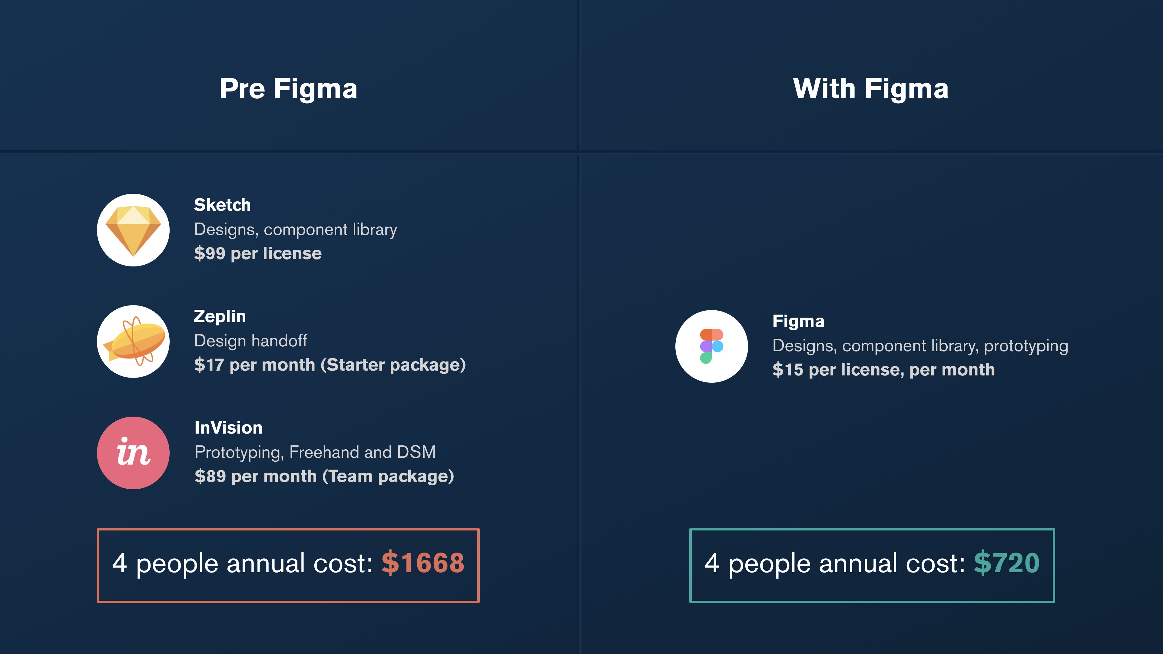
I jumped into a spreadsheet to do some quick maths on our landscape going forward and quickly realised that our costs could spiral with even marginal team growth It was time to act — we are a startup after all.
我跳进了一个电子表格,对未来的形势进行了一些快速数学运算,并很快意识到,即使团队的边际增长,我们的成本也可能上升。现在该采取行动了—我们毕竟是一家初创企业。
Having run the numbers and been given a firm thumbs up from our UI and UX designer that Figma was indeed as powerful as we had hoped for, I pitched the idea and we started to consider a formal migration process.
计算了数字,并得到UI和UX设计师的坚定支持,认为Figma确实如我们所希望的那样强大,我提出了这个想法,并开始考虑正式的迁移过程。
I needed to anticipate the potential destruction of shifting our entire app, design system / UI kit, and handover process over to something new. And this meant carrying out a proper analysis of the migration and what was required.
我需要预料到将整个应用程序,设计系统/ UI套件以及移交过程转移到新事物上可能造成的破坏。 这意味着要对迁移及其要求进行适当的分析。
With the numbers crunched, and our team on board, we were in a great position to put pedal to the metal and make this thing happen.
随着数字的紧缩,加上我们的团队加入,我们处于非常有利的位置,可以踩踏一切,实现这一目标。
结构 (The structure)
How did we do it?
我们是怎么做的?
With blood sweat and tears. No, I jest. The process was long, but taking an incremental approach allowed us to be systematic about the migration and also run an analytical comb over our existing approach to design management.
带有血汗和眼泪。 不,我开玩笑。 这个过程很长,但是采用增量方法可以使我们对迁移进行系统化,并且可以对我们现有的设计管理方法进行分析梳理。
I started with Trello, listing out everything I could think of that needed migrating over. This wasn’t a granular list, because we quickly realised that with so many interlinked aspects within our design ecosystem it just wasn’t possible to deliver a lot of the project on a micro level.
我从Trello开始,列出了我可能需要迁移的所有内容。 这不是一份详尽的清单,因为我们很快意识到,在设计生态系统中,由于存在许多相互联系的方面,因此无法在微观水平上交付大量项目。
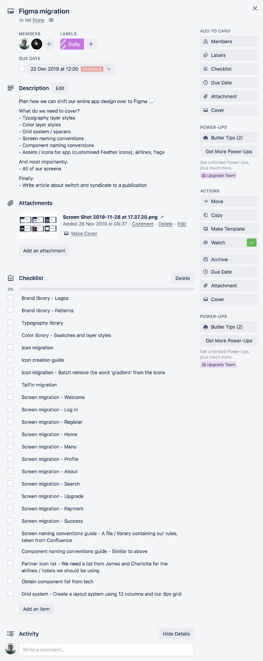
The Trello ticket included some broad stroke tasks (individual flows) and some smaller, fundamental libraries (typography, colour etc). Our priority order was to first tackle the library items, and then take each user flow one by one across and create individual components from each screen on an individual basis.
Trello凭单包括一些广泛的笔划任务(个人流程)和一些较小的基本库(印刷术,颜色等)。 我们的优先顺序是首先处理库项目,然后使每个用户流一个接一个地流,并在每个屏幕上分别创建单个组件。
But wait! With us having an opportunity to gain some perspective on existing document and library structure, it would’ve been a big opportunity missed if we didn’t complete a component and screen audit.
可是等等! 随着我们有机会对现有文档和库结构有一些了解,如果我们不完成组件和筛选审核,这将是一个很大的机会。
This was mainly done with printouts, marker pens and a healthy, robust discussion about what was and wasn’t working.
这主要是通过打印输出,记号笔以及关于什么是有效和无效的健康,健壮的讨论来完成的。
We took a look over our:
我们看了看我们的:
- Typography layer styles 版式图层样式
- Color layer styles 颜色层样式
- Screen naming conventions 屏幕命名约定
- Component naming conventions 组件命名约定
- Assets / icons for the core app, airlines, hotels, and flags 核心应用,航空公司,酒店和旗帜的资产/图标
Having previously created an atomic naming system in our Sketch libraries, we were in a position to debate whether this was indeed the best approach going forward.
先前已经在我们的Sketch库中创建了一个原子命名系统,我们现在可以辩论这是否确实是最好的方法。
Project structure
项目结构
Buckle up.
系好安全带。
This was the biggest struggle for us when migrating, because we were used to a Finder structure that split everything up by folders by user flow.
对于我们来说,这是迁移时最大的麻烦,因为我们习惯了Finder结构,该结构按用户流按文件夹将所有内容拆分。
With Figma preferring a Project approach to how you structure files, we settled on the following system after much deliberation.
由于Figma倾向于使用Project方法来构建文件,因此,经过大量的讨论,我们选择了以下系统。
- Create a Project for each department of the business and major project that require designs 为需要设计的业务部门和主要项目的每个部门创建一个项目
- Split our product design work into 将我们的产品设计工作分为
- A Core file for approved and built user flows that are standard across the app experience (user profile, settings, payment management) 用于批准和构建的用户流的核心文件,这些文件是整个应用程序体验(用户配置文件,设置,付款管理)的标准配置
- A specific file for each specific platform vertical (flights, hotels) 每个特定平台行业(机票,酒店)的特定文件
- A Features file, for each new User Story or task that needs to be developed 针对每个需要开发的新用户故事或任务的功能文件
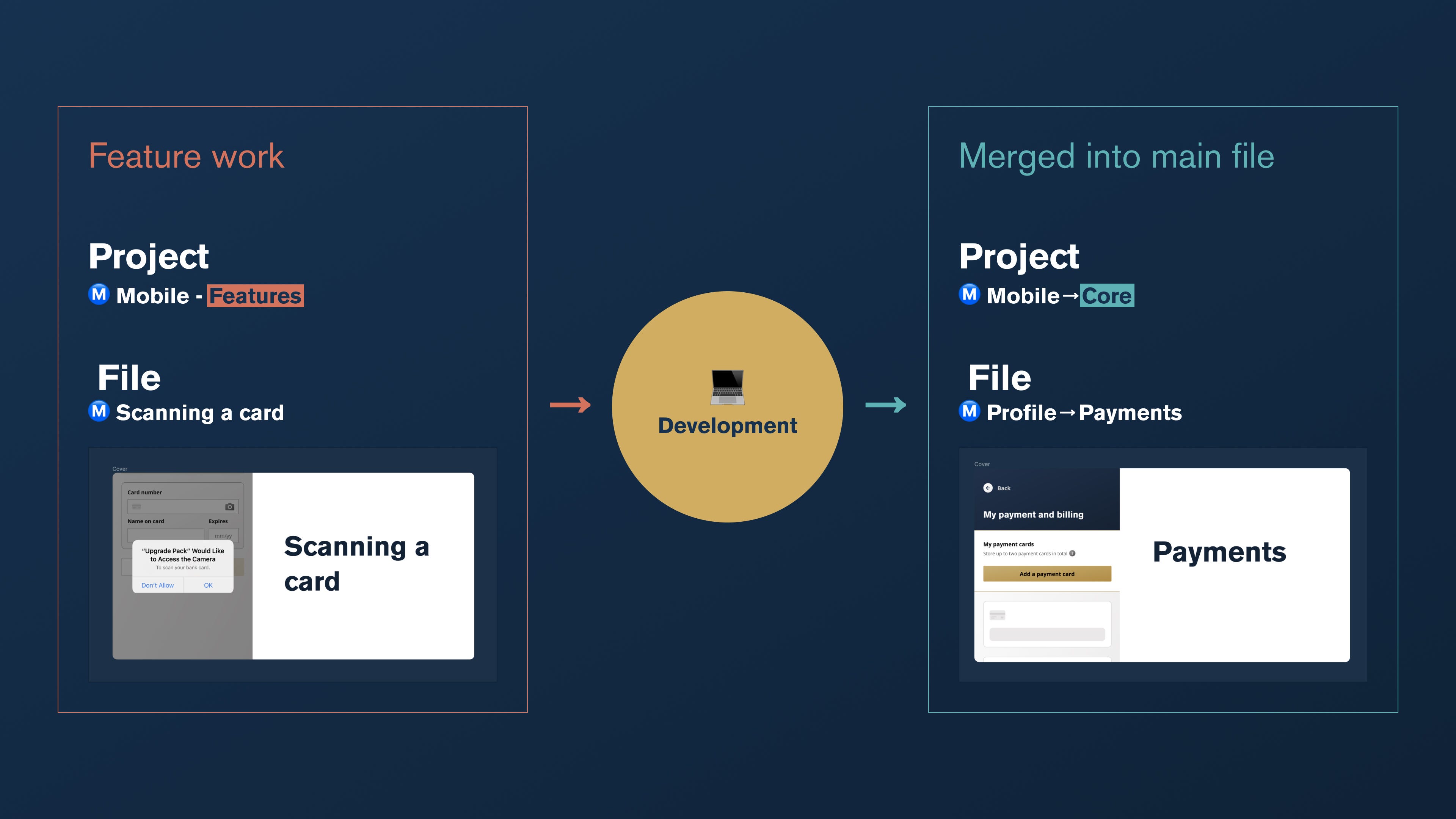
Once our Feature files have been prioritised, added to a sprint and shipped, we merge the work into the corresponding main file and archive the previous file.
确定功能文件的优先级,添加到冲刺并发送后,我们会将工作合并到相应的主文件中并存档先前的文件。
This will be easier if I show you.
如果我告诉你,这会更容易。
File naming
文件命名
You may have noticed a little emoji in the above image. Whilst working with files in the initial stages of our migration, we were getting confused about which file belonged to which project when flipping between Figma’s tabs.
您可能已经在上图中注意到了一个表情符号。 在迁移的初始阶段使用文件时,当在Figma的选项卡之间切换时,我们对于哪个文件属于哪个项目感到困惑。
We decided that we needed a symbol for each project so that when skimming through files we can quickly associate them. The easiest way for us to implement this was by using emojis, given that they take little space and are cross-platform.
我们决定为每个项目都需要一个符号,以便在浏览文件时可以快速将它们关联。 对于我们来说,最简单的实现方法是使用表情符号,因为它们占用的空间很小并且是跨平台的。
Firstly, we tried to use colours to represent each project, but that would require a deeper cognitive association between projects and files which we just didn’t have. Why should the mobile app be green, for example.
首先,我们尝试使用颜色来表示每个项目,但这需要项目与文件之间更深入的认知关联,而我们只是没有。 例如,为什么移动应用程序应该是绿色的。
We then tried shapes — circles, triangles, squares etc. This also led us to think that it was just too far a stretch to associate a shape with a project; is marketing a triangle or a square?
然后,我们尝试了形状-圆形,三角形,正方形等。这也使我们认为,将形状与项目关联起来实在太繁琐了。 营销是三角形还是正方形?
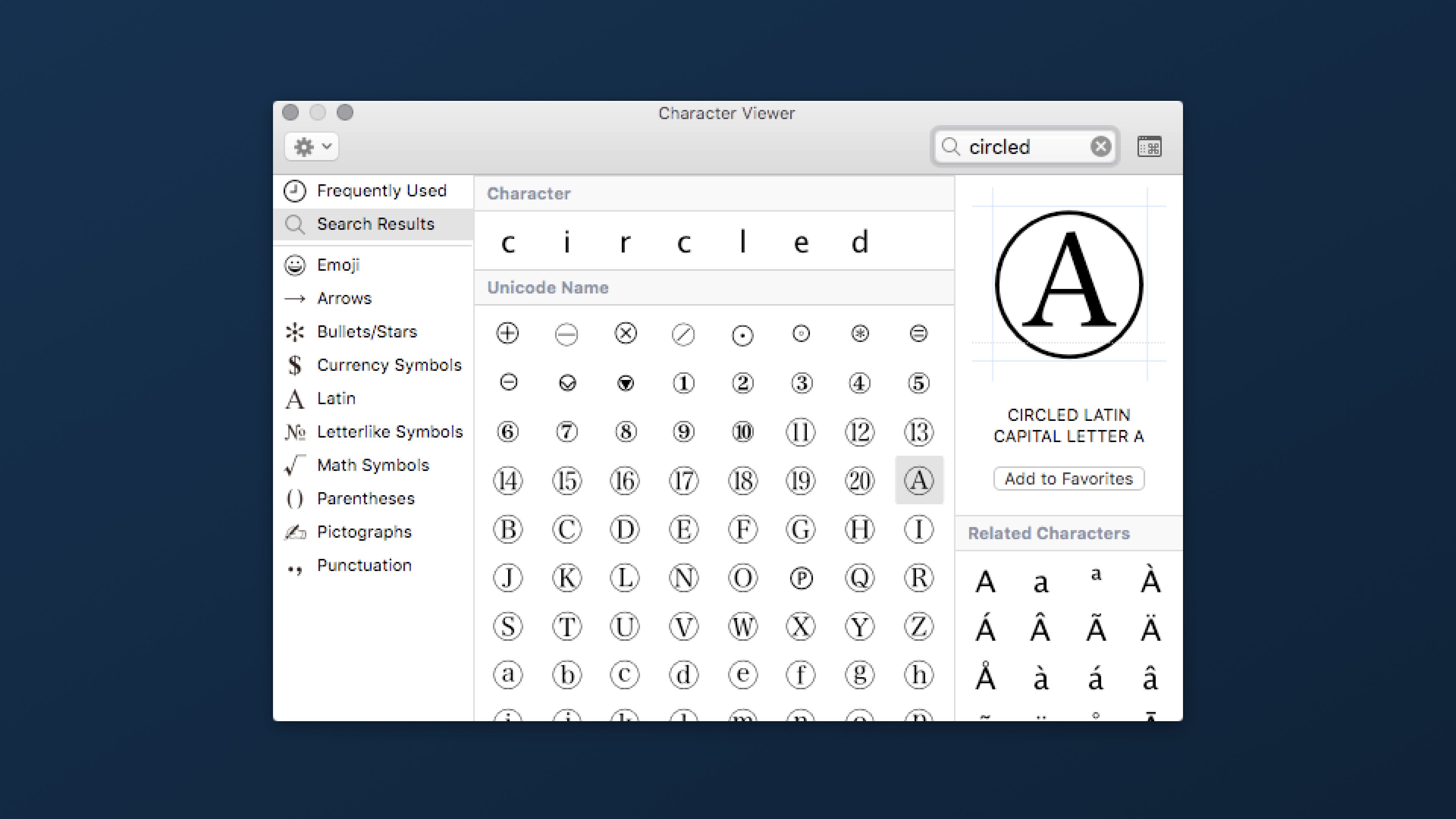
After scanning through the Mac emoji list, we discovered our answer. The emoji / glyph style we used is the CIRCLED LATIN CAPITAL LETTER, and we have matched it to the first letter of each project.
浏览Mac表情符号列表后,我们找到了答案。 我们使用的表情符号/字形样式是CIRCLED LATIN CAPITAL LETTER ,我们已经将其匹配到每个项目的首字母。
See below for the letter A example.
参见下面的字母A示例。
And here’s the full project listing alongside their respective project.
这是完整的项目清单以及它们各自的项目。
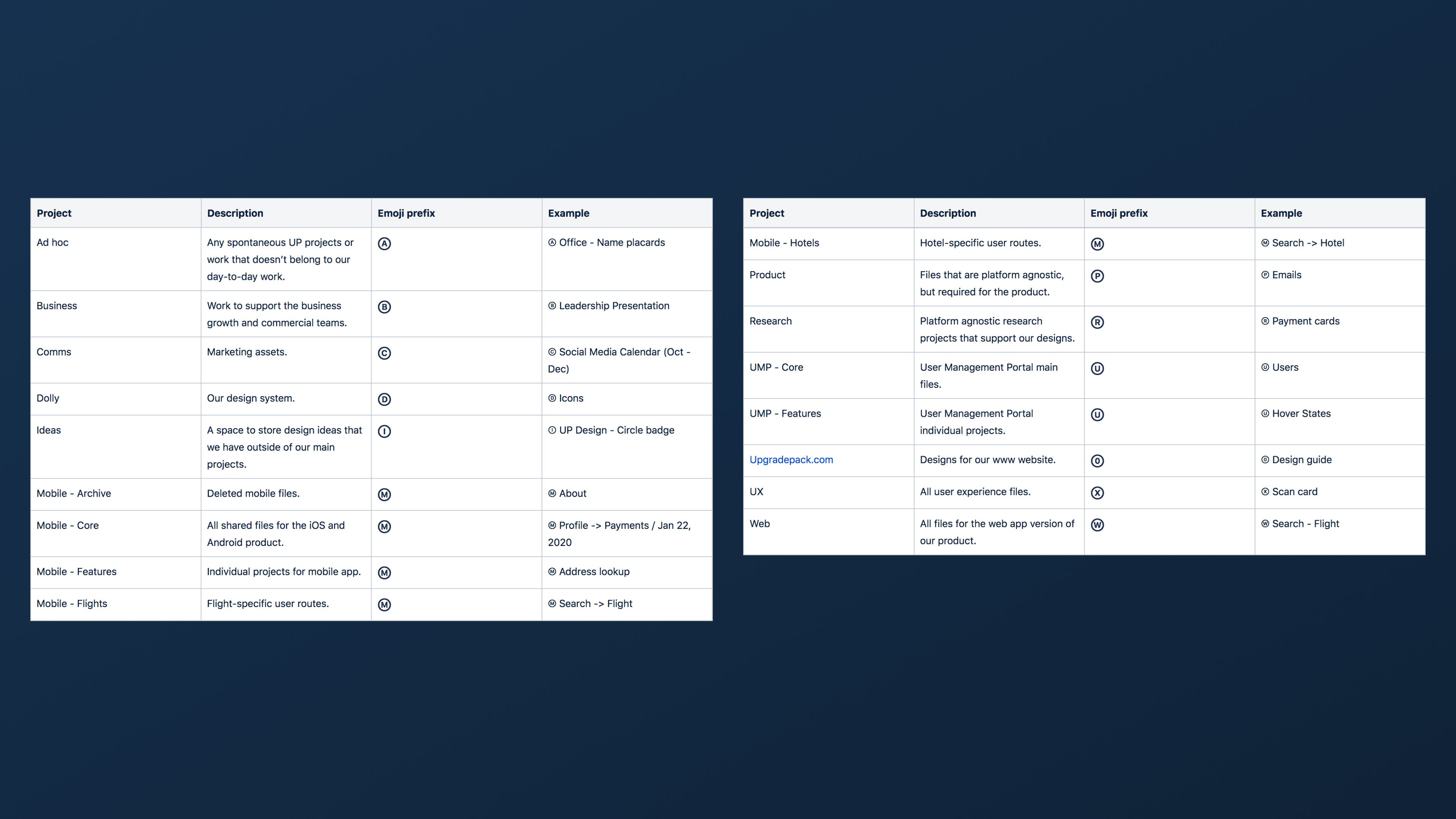
People have asked why the Upgradepack.com project is marked with a ⓪. I opted to use the 0 because our website is the digital storefront and, well, the foundation of digital is 0s and 1s.
人们问为什么在Upgradepack.com项目中标有⓪。 我之所以选择使用0,是因为我们的网站是数字商店,而且,数字的基础是0和1。
File structure
档案结构
Things are about to get aligned.
事情将要统一。
I like to keep our files prim and proper, which means going to the nth degree when it comes down to the naming of pages, layers and components. Some might say you don’t need to go that far, but my goal is always to allow a smooth transition between designers, product managers and engineers, and having clean files is a surefire way to limit confusion when looking over someone else’s work.
我喜欢保持文件的原始性和正确性,这意味着当涉及页面,层和组件的命名时,要达到n级。 有人可能说您不需要走那么远,但我的目标始终是允许设计师,产品经理和工程师之间的平稳过渡,并且拥有清晰的文件是一种在查看别人的工作时减少混乱的可靠方法。
File cover images
文件封面图片
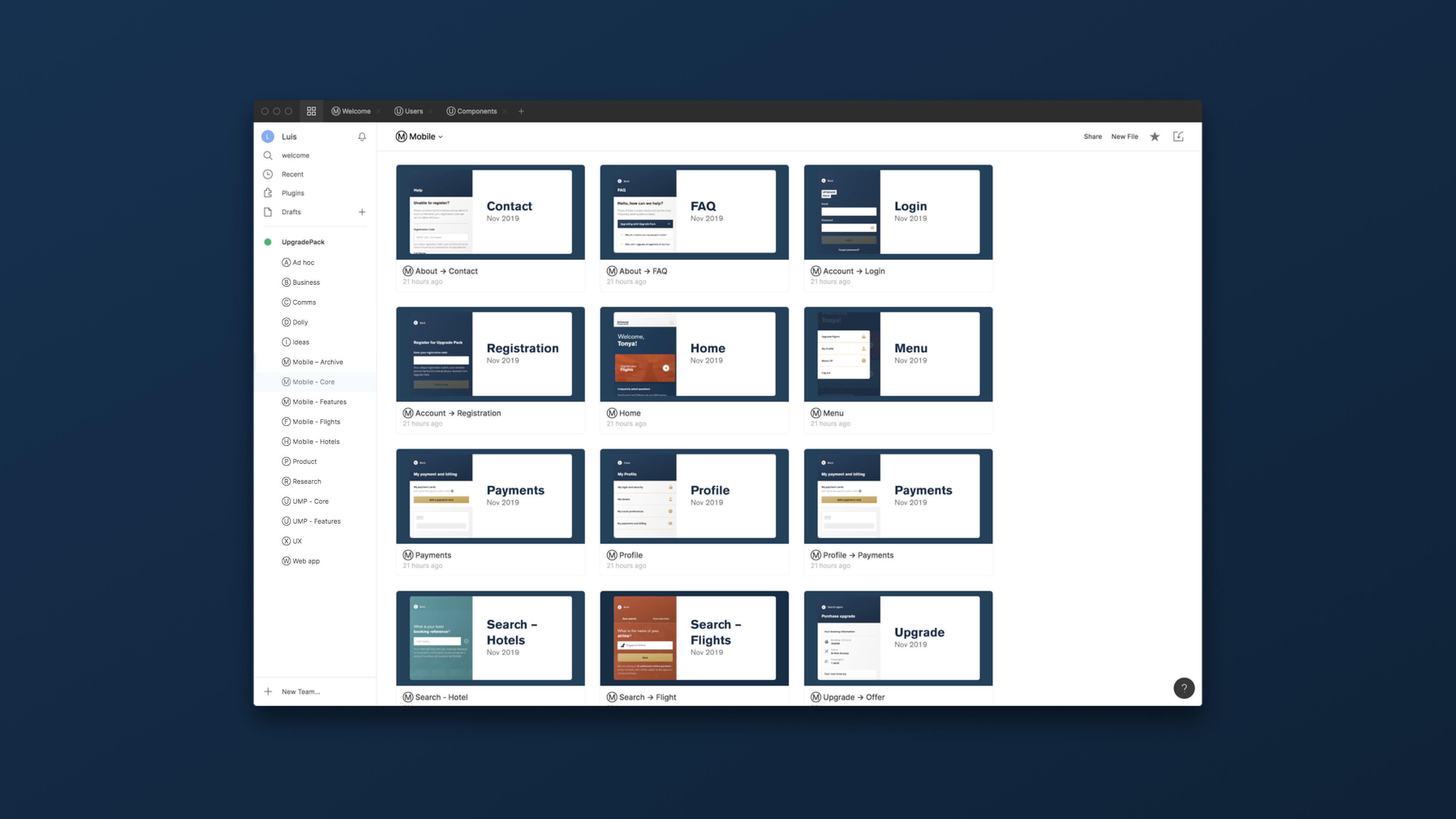
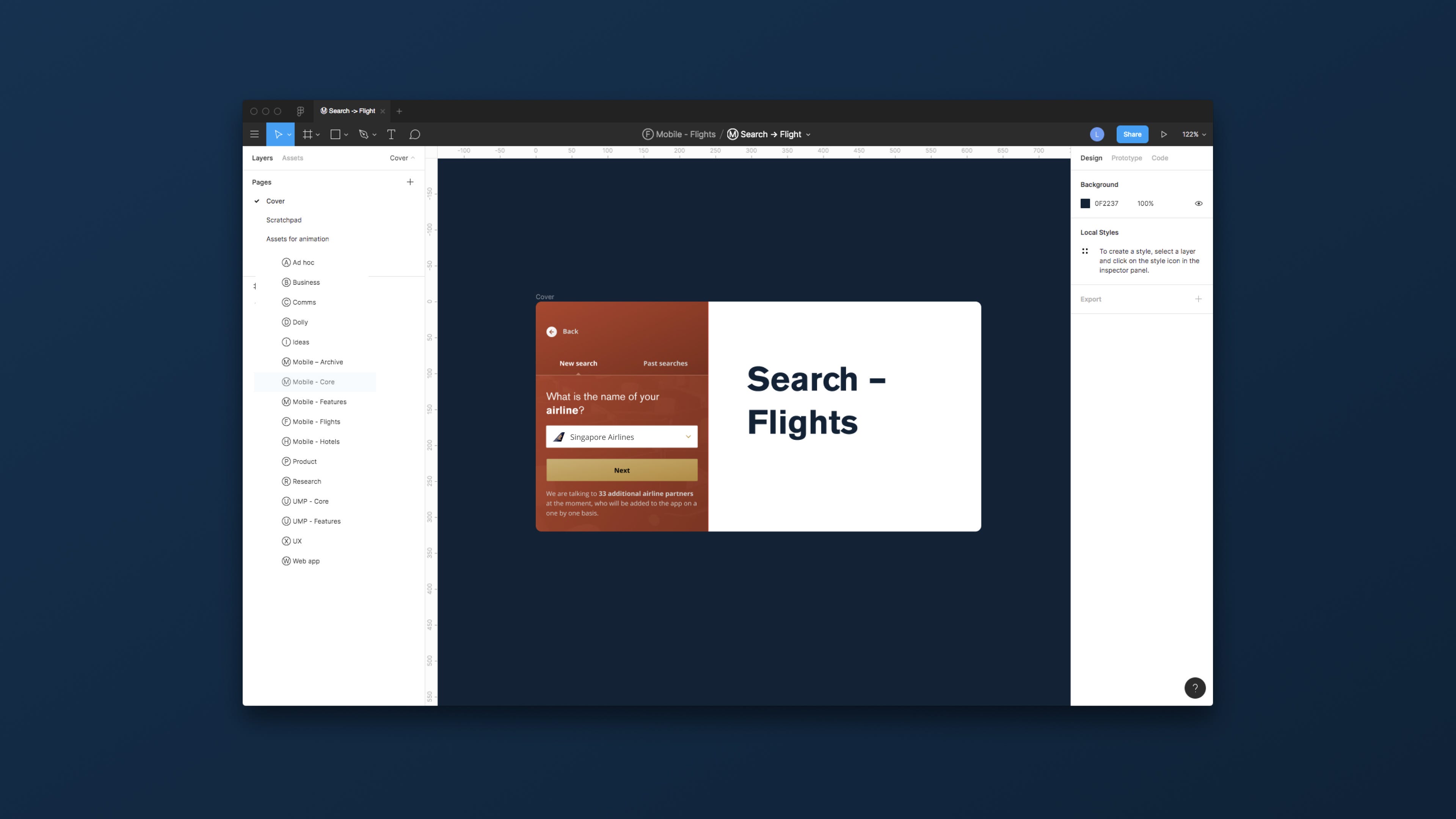
Every file has a page for its ‘cover’ — what we see when viewing a list of all our files, seen below.
每个文件都有一个“封面”页面-我们在查看所有文件列表时所看到的内容,如下所示。
On the cover, each file has:
在封面上,每个文件都有:
- Screenshot of the screen / element in question 屏幕/相关屏幕截图
- Name of the file, one word (two words if a subsection) 文件名,一个词(如果是子节,两个词)
Pages
页数
Every file contains the following:
每个文件包含以下内容:
- Cover — The image that we see when in the main file list 封面-我们在主文件列表中看到的图像
- _research — Competitor analyses, design ideas etc _research —竞争对手的分析,设计思路等
- Scratchpad — Where our initial and unused design ideas live Scratchpad-我们最初的和未使用的设计思想存在的地方
- User flow — An optional page should a prototype or extended user flow be required 用户流程-如果需要原型或扩展的用户流程,则为可选页面
- Ready for development — A page for the signed off designs to live. Once designs are here, they are essentially at a point where editing is no longer required for this iteration. If we want to make changes, they need to be mandated by product lead, with tech made aware 准备好进行开发-可以使已签名设计生效的页面。 设计到位后,它们基本上处于不再需要进行此迭代编辑的地步。 如果我们要进行更改,则必须由产品负责人进行授权,并让技术人员意识到
Now onto how we structure our Frames within files.
现在介绍如何在文件中构造框架。
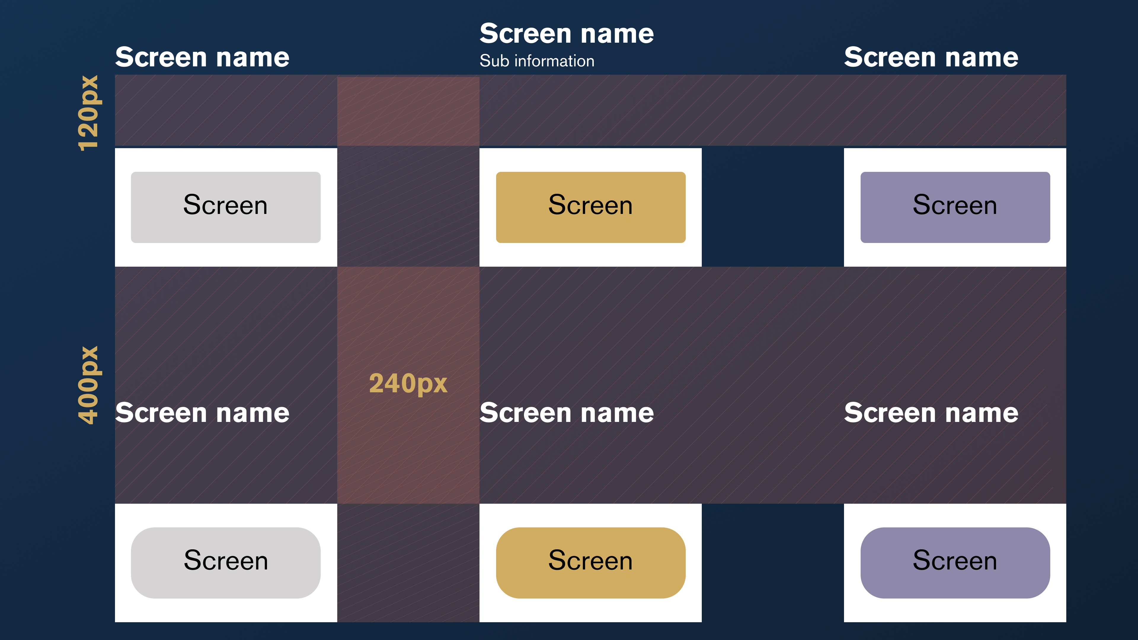
Here are the rules:
规则如下:
- Each Frame has a label above it, with a margin of 120px 每个框架上方都有一个标签,边距为120px
- Each Frame is spaced 240px horizontally from one another 每个框架彼此水平间隔240像素
- Each Frame is spaced 400px vertically from one another 每个框架彼此垂直间隔400像素
And the naming?
和命名?
- Frames are named to match the coded template name in the app 框架的名称与应用程序中的编码模板名称匹配
- Frames are grouped by flow 框架按流分组
- We use a four digit naming convention to allow for up to 10 variations on a single flow, and 100 individual variations on each Frame (ideally not). 我们使用四位数的命名约定,以允许单个流上最多10个变体,并且每个Frame上最多100个单个变体(理想情况下不是)。
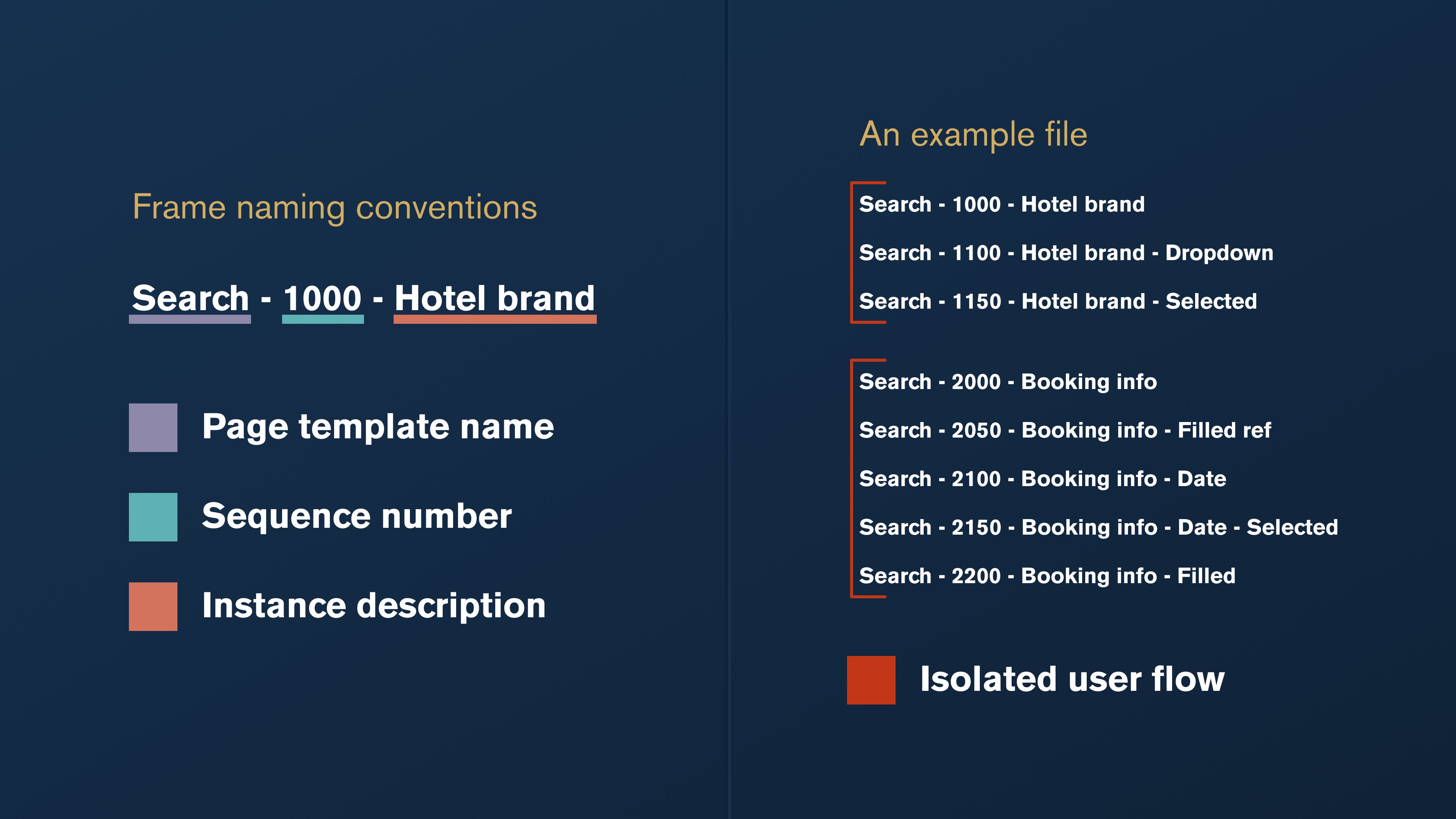
You’ll notice in the above image that we have a mixture of full numbers in the 00’s and some with a 50 (Search — 1150 — Hotel brand — selected). We use 50 variations for when a state change occurs. This may be when an input field is focussed for example.
您会在上图中注意到,我们混合使用00的全数字和一些50的全数字(已选择搜索-1150-酒店品牌)。 当状态发生变化时,我们使用50种变化。 例如,这可能是在输入字段被聚焦时。
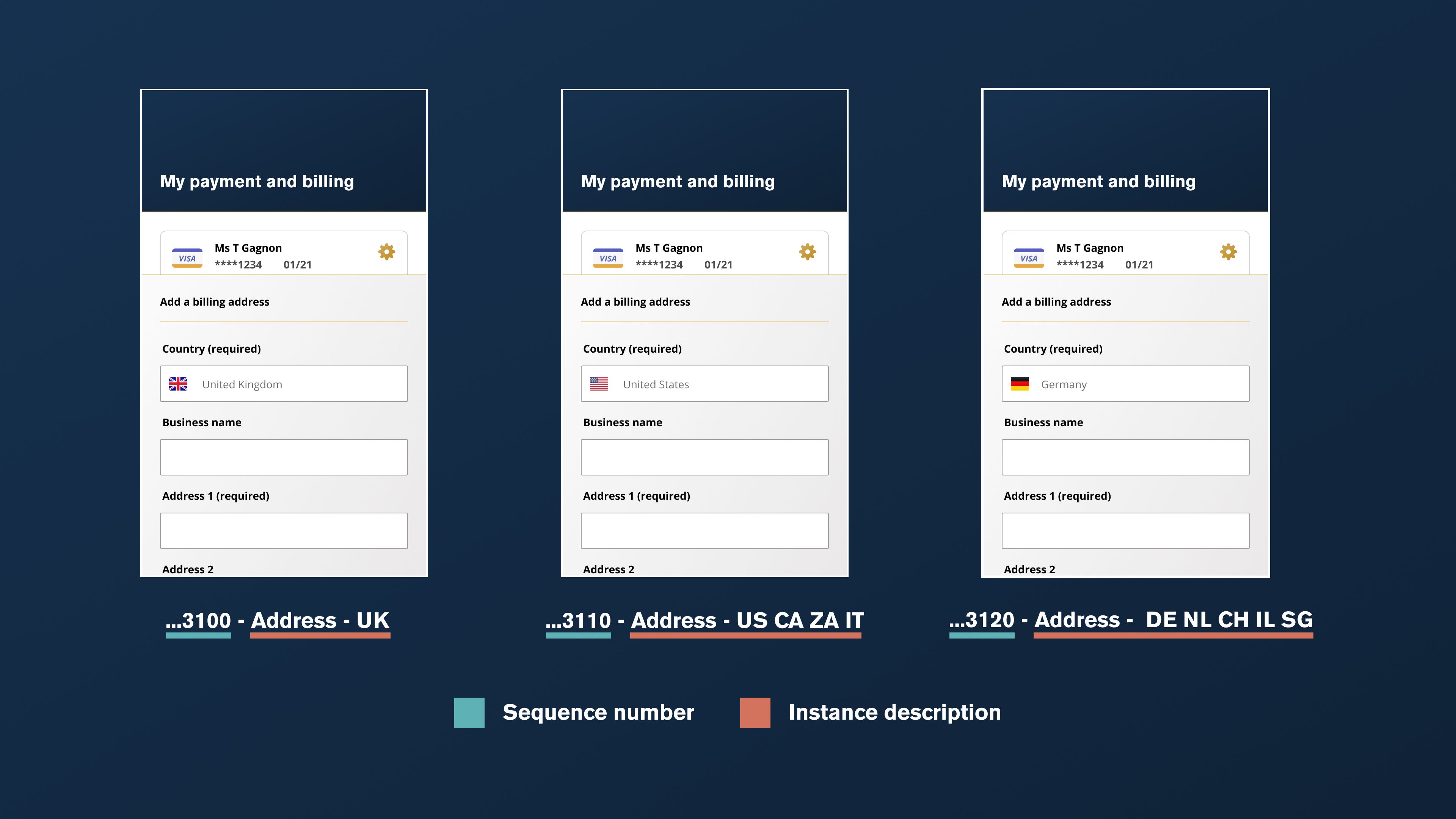
So what about the numbers in between 00 and 50? Well, we use 10s for when there are micro differences in screens. For example, we may show content variations across a single screen. An example of this may be for different address standards across the world, demonstrated below.
那么,00和50之间的数字呢? 好吧,当屏幕有微小差异时,我们使用10s。 例如,我们可能会在单个屏幕上显示内容变化。 一个例子可能是针对世界各地的不同地址标准,如下所示。
Ooft, that was a long one. I hope you’ve seen how deep a dive we took into our process and structure with the Figma migration.
Ooft,那是一个很长的时间。 希望您已经看到我们通过Figma迁移对我们的流程和结构进行了深入研究。
It took its time, but we’re really happy with how robust our system is; it has set us up for a really efficient and scalable product process going forward.
花了很多时间,但是我们对系统的强大功能感到非常满意。 它为我们建立了一个非常有效且可扩展的产品流程。
图书馆 (The libraries)
In this final section, I’ll be running you through how we structured our shared libraries and components. We had originally used a different setup before the migration, so it was a great opportunity to experiment with a simpler solution now that we were putting a lens to everything.
在最后一部分中,我将向您介绍如何构造共享库和组件。 在迁移之前,我们最初使用了不同的设置,因此,现在我们为所有事物都配备了一个镜头,这是一个尝试使用更简单的解决方案的绝好机会。
我们的图书馆 (Our libraries)
Our design system is called Dolly. Why call it Dolly? Given we’re in the travel business, and you can obtain everything you want on a flight from the ‘Dolly trolley’, I felt the name would be perfect for a holistic system.
我们的设计系统称为Dolly。 为什么叫多莉 ? 鉴于我们从事旅游业务,并且您可以从“多莉手推车”上乘飞机获得所需的一切,所以我觉得这个名称对于整体系统而言是完美的。
We split the files in this project up by assets / icons and tokens.
我们按资产/图标和令牌将此项目中的文件拆分。
组件命名 (Component naming)
We realised that the use of forward slashes in component names, although offering a useful filtering tool, was not the best approach for readability and exporting. Trying to export a single button to your computer and it being embedded in multiple folders is a real pain.
我们意识到,在组件名称中使用正斜杠虽然提供了有用的过滤工具,但并不是可读性和导出的最佳方法。 尝试将单个按钮导出到您的计算机并将其嵌入到多个文件夹中确实很痛苦。
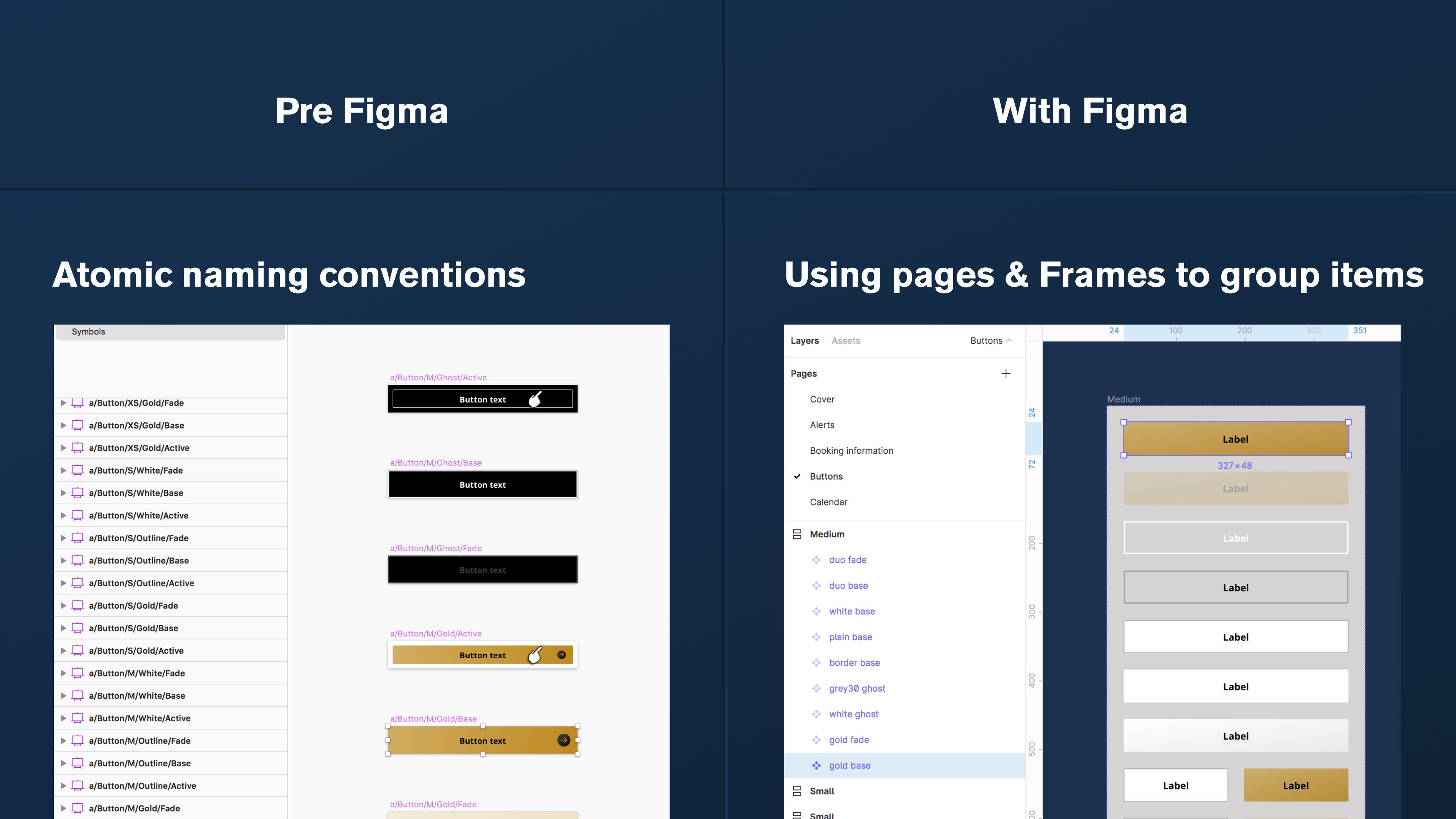
Figma’s Frame grouping is brilliant for grouping similar components and removing the need for long names to describe something. We’re shooting for bonus points by using Autolayout on our Frames.
Figma的“框架”分组非常出色,可以将相似的组件进行分组,并且不需要长名称来描述某些内容。 我们正在通过在框架上使用自动布局来争取加分。
This means that (with a button, for example) we transitioned from this:
这意味着(例如,使用按钮)我们从此过渡:
a/Button/M/Gold/Basea = atomButton = componentM = Medium sizeGold = ColourBase = State
a / Button / M / Gold / Base a =原子按钮=组件M =中等大小Gold = ColourBase =状态
To this:
对此:
Figma file: Ⓜ︎_ComponentsFigma Page: ButtonsFrame: MediumComponent name: gold base
Figma文件: Ⓜ︎_ComponentsFigma 页面:按钮框架:中型组件名称:金色底座
And here it is visually.
这里是视觉上的。
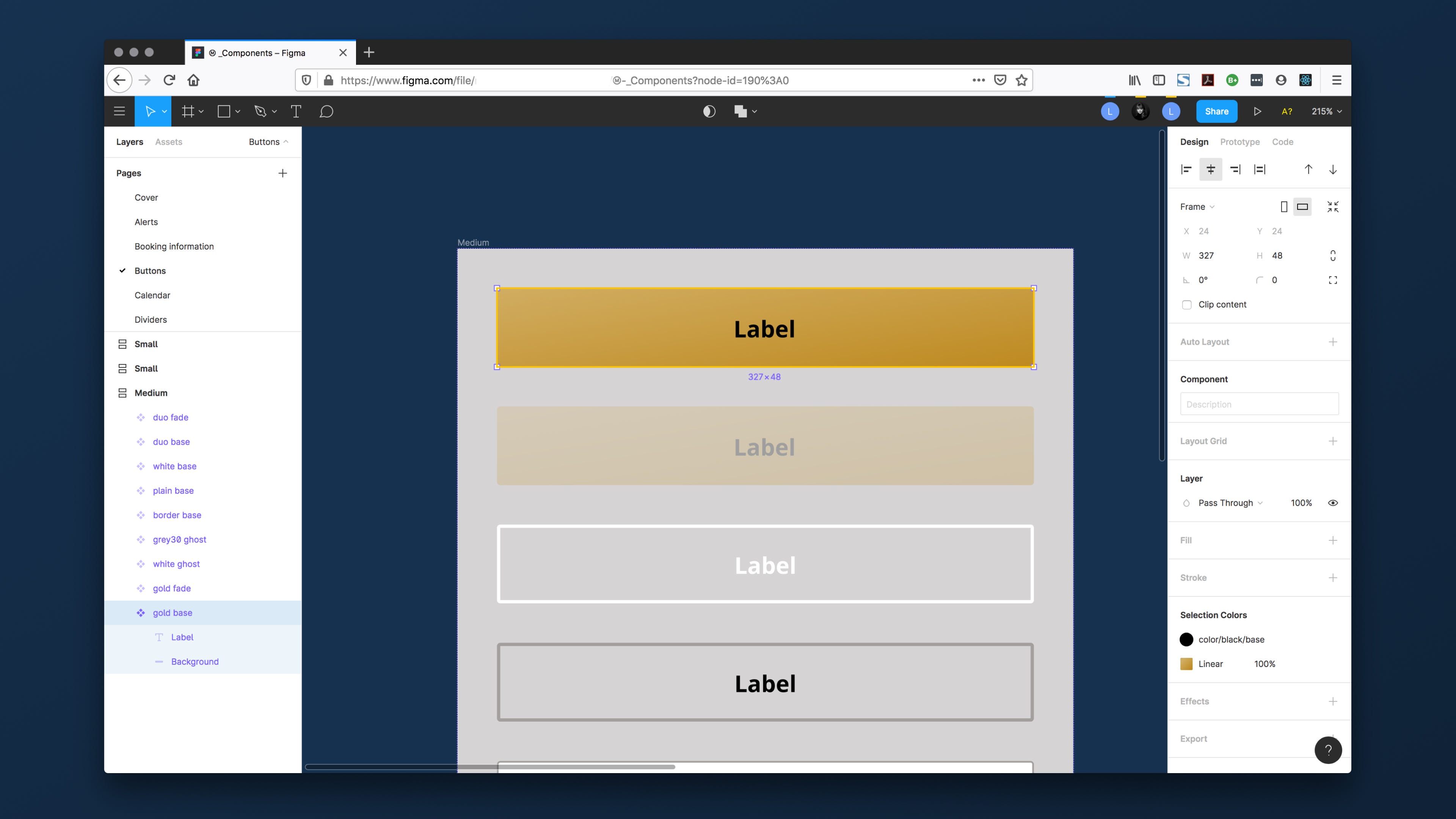
Breaking things down this way makes file names look so much more attractive, and we can remove the atomic naming conventions now that the whole team are on board with the process conceptually.
以这种方式进行分解可以使文件名看起来更具吸引力,并且现在整个团队都在概念上参与流程,因此我们可以删除原子命名约定。
This isn’t just used on things like buttons either. We’ve employed a more descriptive approach to all of our components, including the booking itinerary cards shown below.
这也不仅用于按钮之类的东西。 我们对所有组件采用了更具描述性的方法,包括下面显示的预订行程卡。
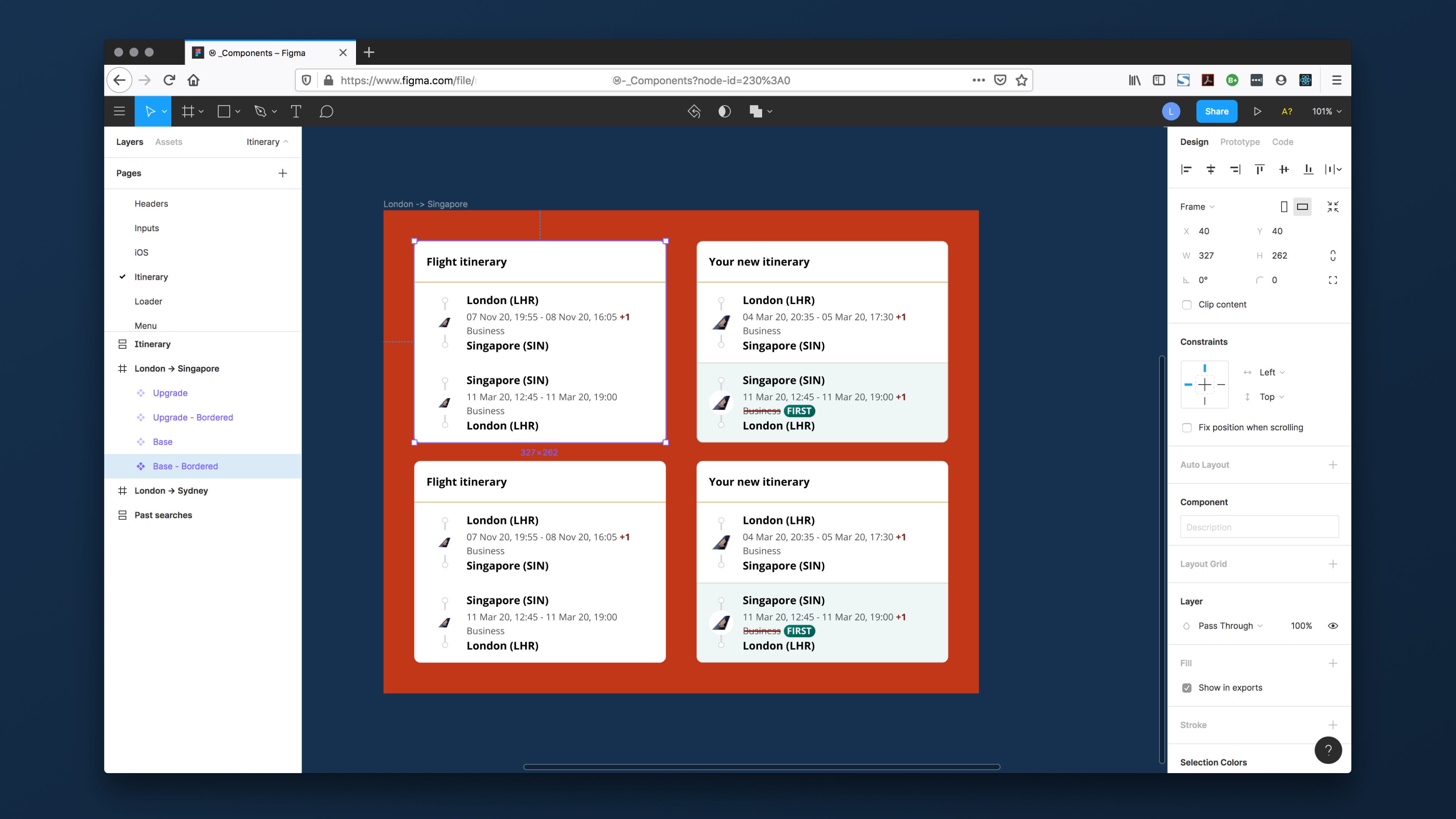
You can see that the component naming is in plain English. Removing the atomic structure from our names has made discovery a lot easier.
您可以看到该组件的命名是纯英文。 从我们的名字中删除原子结构使发现变得容易得多。
资产 (Assets)
Our assets are managed within our Dolly design system Figma project. We split assets into the following files:
我们的资产在Dolly设计系统Figma项目中进行管理。 我们将资产分为以下文件:
- Icons — For assets that are used across all of our products. This is split down into pages: 图标-适用于我们所有产品中使用的资产。 这分为几页:
- Core — Functional icons that are not tied to a campaign, partner or platform 核心-与广告活动,合作伙伴或平台无关的功能图标
- Partners — Our airline and hotel partners 合作伙伴—我们的航空公司和酒店合作伙伴
- Marketing — Social media icons and featured PR logos 市场营销—社交媒体图标和特色公关徽标
- Utilities — Cursors and OS icons 实用程序—光标和操作系统图标
- Scratchpad — Ideas or abandoned icons Scratchpad —想法或被遗弃的图标
- Flags — Selected country flags, cross referenced to a Github library that our developers user 标志-选定的国家标志,交叉引用我们的开发人员用户使用的Github库
制作图标 (Making the icons)
We base our icons off the feathericons.com library, but modify them ever so slightly if required. For example, filling them with our brand gradients, or creating solid shapes rather than outlines to match our style.
我们将图标基于feathericons.com库,但如果需要的话,请稍加修改。 例如,用我们的品牌渐变填充它们,或者创建实心形状而不是轮廓以匹配我们的样式。
图标是如何构造的? (How are the icons constructed?)
There’s a guide for that.
有一个指南。
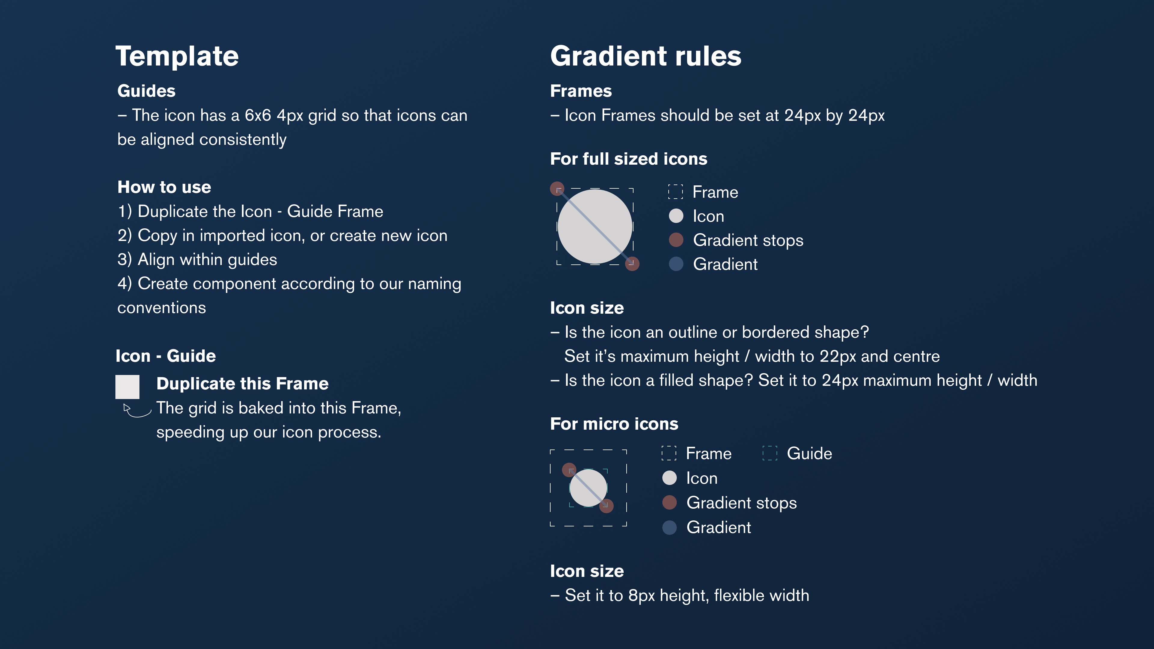
We work to an icon size of 24x24px, with an internal 4px grid system. This builds a 6x6 grid within each Frame, giving us finite control over each part of the icon.
我们使用内部4px网格系统将图标大小设为24x24px。 这会在每个Frame中建立一个6x6的网格,从而使我们可以对图标的每个部分进行有限的控制。
I created a starter Frame for us to duplicate when making new icons which speeds up the workflow a little bit.
我创建了一个初学者框架,以便在制作新图标时进行复制,从而稍微加快了工作流程。
代币 (Tokens)
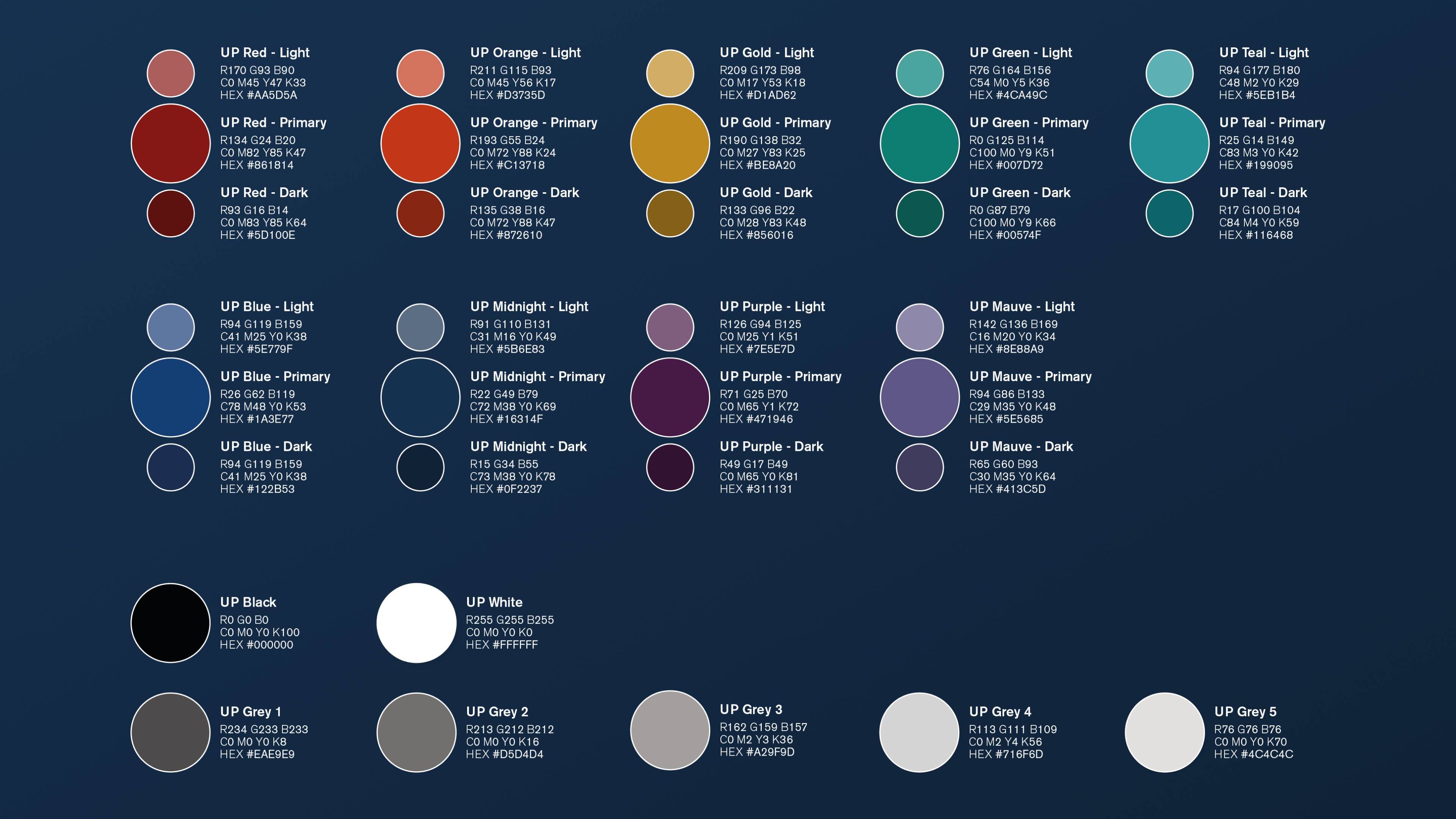
Tokens form the basis of all our designs. They are the bible of our brand colour palette and typography hierarchy. We’ve kept this pretty simple, as we haven’t had a need to include things like spacers just yet, but who knows.
代币是我们所有设计的基础。 它们是我们品牌调色板和版式层次结构的圣经。 我们将其保持非常简单,因为我们现在还不需要包含诸如spacer之类的东西,但是谁知道呢。
- Colours 色彩
- Stores our core 9 brand colours, their light and dark tints and our black to white colour scale 存储我们的9种核心颜色,浅色和深色以及黑色到白色的色标
- Typography 版式
- Stores our mobile and web typography systems 存储我们的移动和网络排版系统
- We run from XS up to XL, using the golden ratio (1:1.618) to scale each step 我们使用黄金比例(1:1.618)从XS扩展到XL,以扩展每个步骤
- We use 1.5 for line height across our body text, and 1.1 for our headings 我们在正文中使用1.5表示行高,在标题上使用1.1
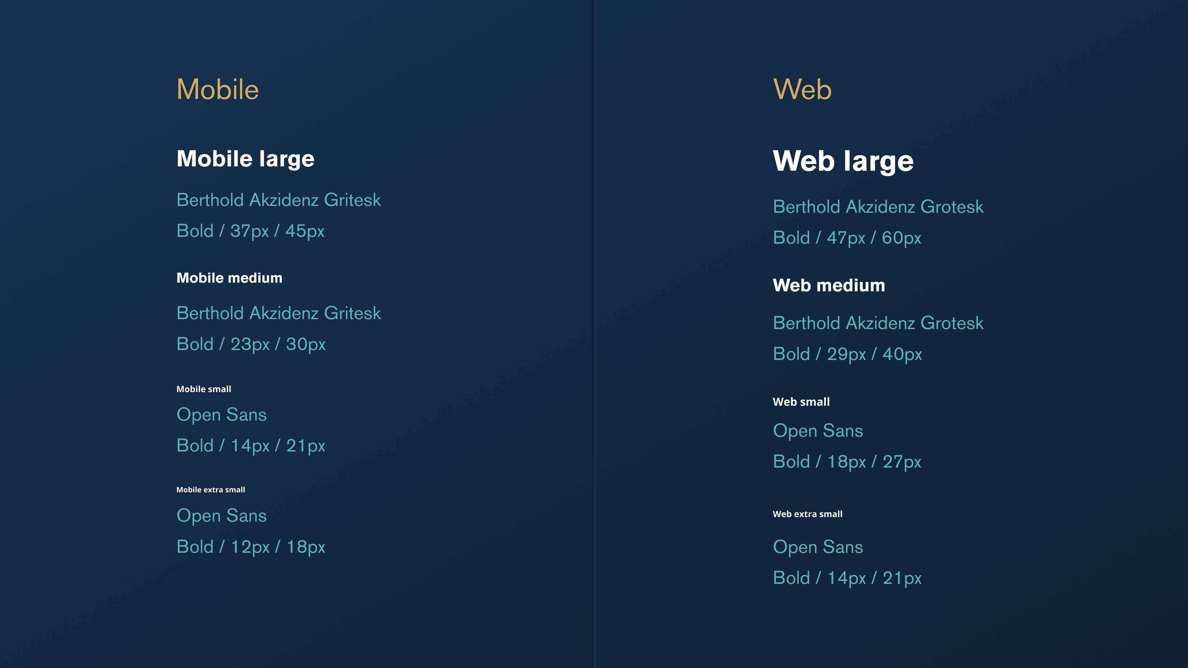
I’m sure those of you that code are looking at those hard coded pixel values and getting a headache, but as design tools are limited by pixel values, we have been explicit in this way. I also provided our developers with a CSS file that has the calculated font sizes in REM format.
我敢肯定,您的代码正在查看那些硬编码的像素值并感到头疼,但是由于设计工具受到像素值的限制,因此我们已经明确地采用了这种方式。 我还为我们的开发人员提供了一个CSS文件,该文件具有REM格式的计算字体大小。
一些技巧 (Some tips)
- When creating your components, make sure you rename the text label. If you don’t, the text you override in your instance will be reset when the component is changed in the library. Save yourself a headache 创建组件时,请确保重命名文本标签。 如果不这样做,则在库中更改组件时,将重置在实例中覆盖的文本。 减轻头痛
- Don’t try to predict the future. It’s easier to design for the now and change later, rather than creating lots of work that you probably won’t ever need or use going forward. This is particularly the case for things like buttons. You don’t need ten colour variants just now, so don’t waste time building them 不要试图预测未来。 现在进行设计并稍后进行更改比创建很多您可能永远不需要或不使用的工作要容易得多。 对于按钮之类的东西尤其如此。 您现在不需要十种颜色,所以不要浪费时间构建它们
Try to keep all relevant work within the same file. Research, user flows, and the final work for development is going to be easier to track as individual pages rather than separate files.
尝试将所有相关工作保留在同一文件中。 研究,用户流程以及开发的最终工作将更容易作为单独的页面而不是单独的文件进行跟踪。
- You don’t always have to be right. A flexible mindset will allow your design system / UI kit to grow the way it needs to. If something needs changing, plan and adjust accordingly. After all, we’re working in an agile space 您不一定总是正确的。 灵活的心态将使您的设计系统/ UI套件能够按需增长。 如果需要更改,请进行计划和调整。 毕竟,我们在敏捷的空间中工作
大功告成! (We’re done!)
Congratulations for making it through, I think we all need a drink after that. I hope I’ve managed to share some deep insight into how we shifted over to Figma and the structure we employ to ensure our files are easy to find, structured and set up with collaboration in mind.
祝贺您取得成功,我认为之后我们都需要喝一杯。 我希望我已经成功分享了一些深刻的见解,以了解我们如何过渡到Figma以及我们采用的结构来确保我们的文件易于查找,结构化和设置,并牢记合作精神。
If you have any questions about how we work as a design team at Upgrade Pack, drop me a message on Twitter @disco_lu.
如果您对我们在Upgrade Pack中作为设计团队的工作方式有任何疑问,请在Twitter @disco_lu上给我留言。
I’d like to thank Merve Guneyhan for putting up with my pernickety requests during this migration, she did some incredible work on it all.
我要感谢Merve Guneyhan在迁移过程中忍受了我的苛刻要求,她在这方面做了一些令人难以置信的工作。
figma button


 扫一扫
扫一扫


 被折叠的 条评论
为什么被折叠?
被折叠的 条评论
为什么被折叠?
 到【灌水乐园】发言


