


 本文介绍了Sparklines,这是一种历史悠久但功能强大的微型数据可视化形式。Sparklines可在有限空间内传达大量信息,适用于各种数据分析和机器学习场景。
sparklines
Sparklines are part of what’s considered the “first wave of data viz,” centered around the work of Edward Tufte, who emphasized clarity, simplicity, and direct one-to-one mapping of data points through the six principles outlined in his book The Visual Display of Quantitative Information. They are as follows:
迷你图是所谓的“第一波数据可视化”的一部分,围绕着Edward Tufte的工作, Edward Tufte强调清晰度,简单性,并通过他的《视觉》一书中概述的六项原则直接对数据点进行了一对一映射。 定量信息显示 。 它们如下:
- The representation of numbers, as physically measured on the surface of the graphic itself, should be directly proportional to the numerical quantities measured. 在图形本身的表面上物理测量的数字表示形式,应与测量的数值直接成比例。
- Clear, detailed, and thorough labeling beat graphical distortion and ambiguity. Write out explanations of the data on the graphic itself. Label important events in the data. 清晰,详细和彻底的标签消除了图形失真和歧义。 在图形本身上写出数据说明。 在数据中标记重要事件。
- Show data variation, not design variation. 显示数据变化,而不是设计变化。
- In time-series displays of money, deflated and standardized units of monetary measurement are nearly always better than nominal units. 在货币的时间序列显示中,紧缩和标准化的货币计量单位几乎总是比名义单位好。
- The amount of information-carrying (variable) dimensions depicted should not exceed the amount of dimensions in the data. 所描述的信息承载(可变)维的数量不应超过数据中维的数量。
- Graphics must not quote data out of context. 图形不得引用上下文之外的数据。

什么是迷你图? (What is a Sparkline viz?)
It’s all about showing trends of multiple values over time by shrinking the viz to fit inside roughly the same space as a sentence. According to Edward Tufte:
这是通过缩小可视化以使其适合与句子大致相同的空间来显示随时间变化的多个值的趋势。 根据爱德华·塔夫特所说:
Sparklines are small, intense, word-sized graphics with typographic resolution. Sparklines can be placed anywhere ‘words’ or ‘numbers’ or ‘graphics’ can be placed: in sentences, maps, graphics, tables. Sparklines often get their quantitative scaling context from nearby words, numbers and graphics; sparklines are directly quantified by numbers on or near the sparkline itself.
迷你图是具有印刷分辨率的小巧,密集,字大小的图形。 可以将迷你图放置在可以放置“单词”,“数字”或“图形”的任何位置:句子,地图,图形,表格中。 迷你图通常从附近的文字,数字和图形中获得量化的缩放比例上下文; 迷你图直接由迷你图本身上或附近的数字量化。
According to The Data School (where Andy Kriebel, a member of the Tableau Zen Master Hall of Fame is the Head Coach), sparklines are a great way to show trends of multiple values over time embedded into other graphics and juxtapose them against other data. It’s basically a tiny little line chart, which enables you to quickly and easily compare trends over different values.
根据数据学校 (Tableau Zen大师名人堂成员安迪·克里贝尔 ( Andy Kriebel )是总教练 )的说法,迷你图是一种很好的方式来显示随时间推移嵌入到其他图形中的多个值的趋势,并将它们与其他数据并置。 它基本上是一个很小的折线图,使您可以快速轻松地比较不同值上的趋势。

启发迷你图 (Inspiring Sparklines)
The history of sparklines as a form of data viz dates back a few hundred centuries when Laurence Sterne, in 1762, used typographical devices in his sixth volume of The Life and Opinions of Tristram Shandy, Gentleman to illustrate his narrative proceeding.
迷你图作为数据形式的历史可以追溯到几百个世纪,当时劳伦斯·斯特恩 ( Laurence Sterne )1762年在他的第六卷《 绅士的特里斯特拉姆·香迪的生活和观点》中使用印刷设备来说明他的叙述过程。

Over a century later, according to Wikipedia, in 1983, Edward Tufte had formally documented (through his book ‘The Visual Display of Quantitative Information’) a graphical style, then called “intense continuous time-series,” encouraging extreme compaction of visual information, another of the early usages of sparklines.
根据Wikipedia的说法,一个多世纪之后的1983年, 爱德华·塔夫特 ( Edward Tufte )正式记录了图形样式(通过他的《 定量信息的视觉显示》) ,然后称为“连续连续时间序列”,以鼓励极端压缩视觉信息,是迷你图的另一种早期用法。

Above is one of the best (and my personal favourite) applications of this form. This was created and used by Gramener’s CEO Anand S during his talk on ‘Visualizing Machine Learning Models’ at DataHack Summit 2017.
上面是这种形式的最好的(也是我个人最喜欢的)应用程序之一。 它是由Gramener的首席执行官Anand S在2017年DataHack峰会上有关“ 可视化机器学习模型 ”的演讲中创建和使用的。
To enable consumption of raw data which had N number of rows (where each row comprised of 3 data points: currency name, exchange rate, and date), Anand had utilised sparklines to show the currency trends and create the first level of abstraction on top of the raw data. He talks about how we could create further levels of abstraction adjacent to the data using scatter plots, correlation matrices, clustering on top of correlations and so on, so forth. Excited yet? Then watch the complete video here.
为了使用具有N行数的原始数据(其中每行包含3个数据点:货币名称,汇率和日期),Anand利用迷你图显示货币趋势并在顶部创建第一层抽象原始数据。 他讨论了如何使用散点图,相关矩阵,在相关之上的聚类等等如何在数据附近创建更多的抽象级别。 激动了吗? 然后在这里观看完整的视频。
So before proceeding, I have to say thanks to Anand S for inspiring me to come up with this how-to article on creating a sparkline visualisation using a similar dataset to showcase the effective use of sparklines to build inspiring and actionable stories from data.
因此,在继续之前,我必须感谢Anand S启发我提出了这篇使用类似的数据集来创建迷你图可视化方法的方法文章,以展示迷你图的有效使用,以便根据数据构建鼓舞人心且可行的故事。
为什么创建我的第一个Sparkline Viz? (Why did I create my first Sparkline viz?)

I have always wanted to travel abroad, especially to places like the United States, England, Australia, New Zealand, Europe, and Hong Kong. Well, I did manage to go to Sri Lanka recently, but I’ve been ruminating about which country I could plan to visit next this year. The twist is that I’ve been contemplating this based on the foreign exchange rates. Though I admit that I might just have wanted to feel less guilty because I have been postponing this travel for almost five years.
我一直想出国旅行,尤其是去美国,英国,澳大利亚,新西兰,欧洲和香港等地。 好吧,我最近确实设法去了斯里兰卡,但是我一直在思考明年我计划去哪个国家。 所不同的是,我一直在根据外汇汇率来考虑这一点。 尽管我承认我可能只是想减少内gui感,因为我将这次旅行推迟了将近五年。
Are you excited to plan your vacation ??? Let’s do it right away!As such, I built the above sparkline table in Tableau to figure out the answer. And voila, to my surprise, I was excited to figure out that I could travel to either England, Australia, or New Zealand since the Indian rupee has appreciated with respect to these countries’ currencies!
您为计划假期感到兴奋吗??? 因此,我们马上就做!因此,我在Tableau中构建了上面的迷你图,以找出答案。 瞧,令我惊讶的是,我很高兴得知我可以前往英国,澳大利亚或新西兰旅行,因为印度卢比对这些国家的货币升值了!
在Tableau中创建自己的迷你图图表 (Create your very own sparklines chart in Tableau)
Feel free to have a look at my Tableau interactive sparklines viz (or) download the complete workbook: Trend of Indian Rupee(INR) Exchange rates. In the below steps, I have used gif-format images so that you can have a look at how to exactly repeat each step.
随时查看我的Tableau交互式迷你图,也可以下载完整的工作簿: 印度卢比(INR)汇率趋势 。 在下面的步骤中,我使用了gif格式的图像,以便您了解如何精确地重复每个步骤。
Let’s try to build the below basic sparklines dashboard along with the currency of a country, exchange rate on the selected ‘to’ date, exchange rate on the selected ‘from’ date, and the percentage change between that date range.
让我们尝试构建下面的基本迷你图仪表盘以及一个国家的货币,所选“到达”日期的汇率,所选“开始”日期的汇率以及该日期范围之间的百分比变化。

The schema of the data is set up as follows, with date, country currency, and exchange rate as the three columns:
数据的架构设置如下,日期,国家/地区货币和汇率为三列:
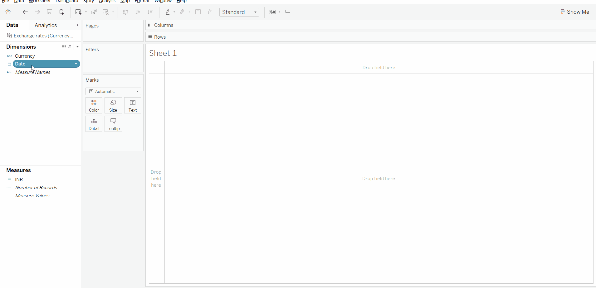
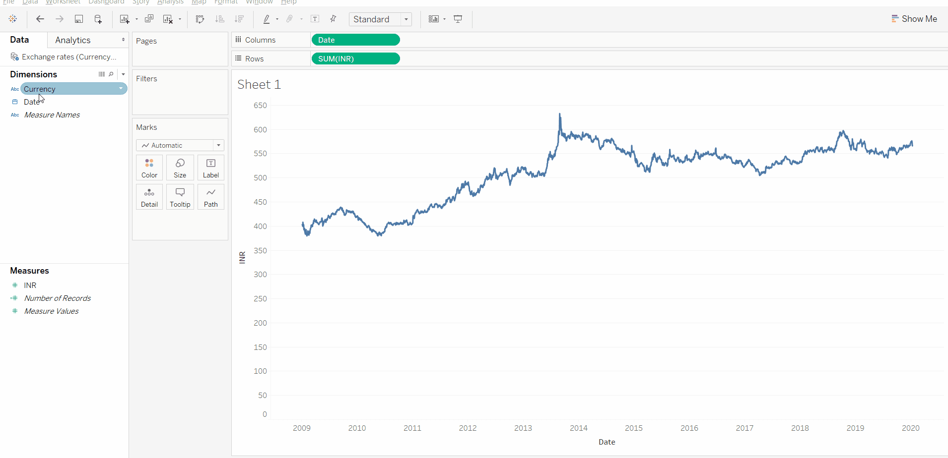
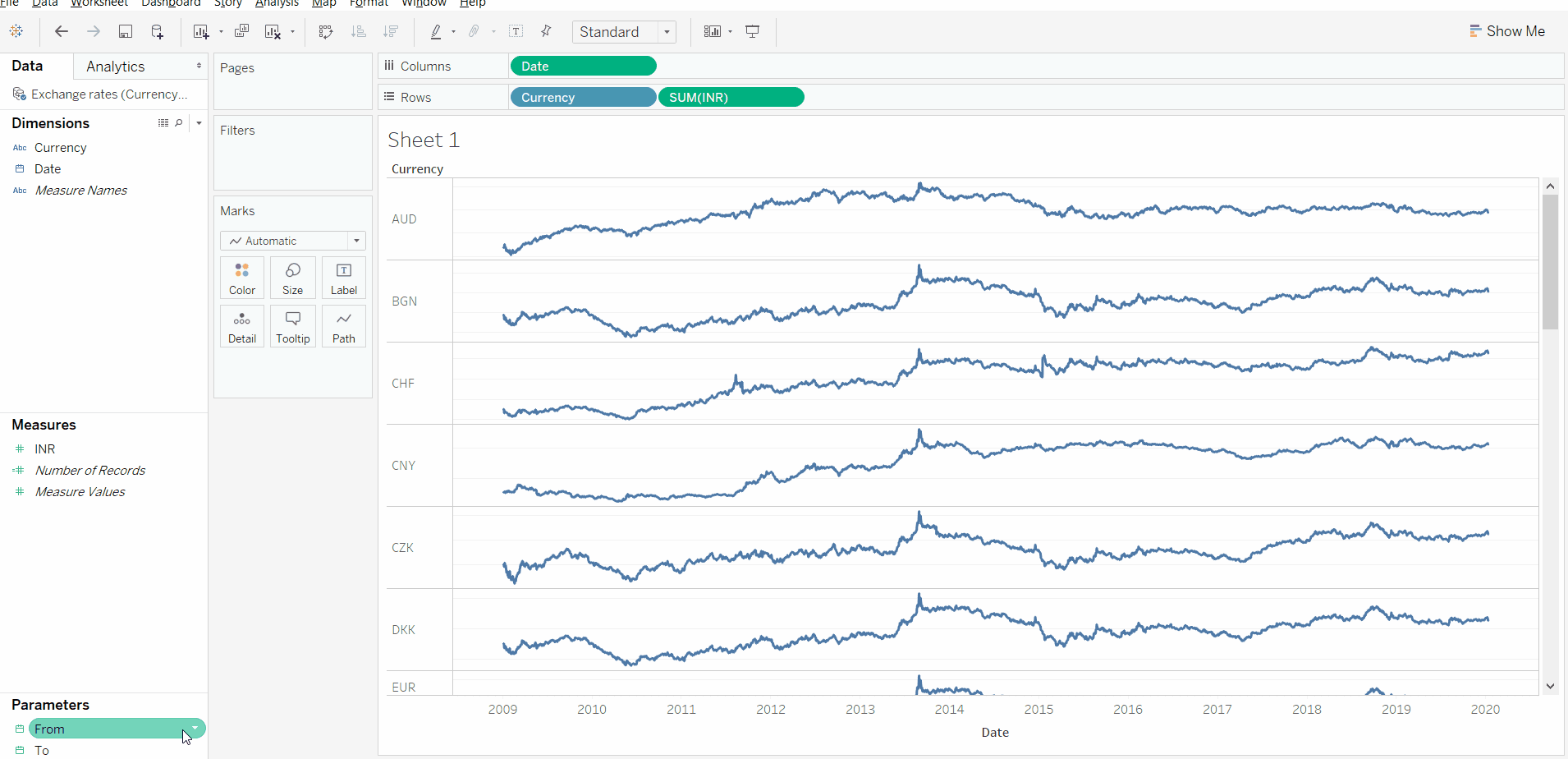
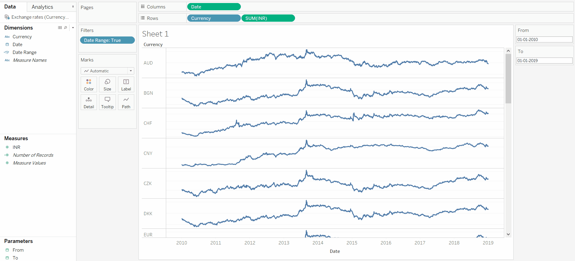
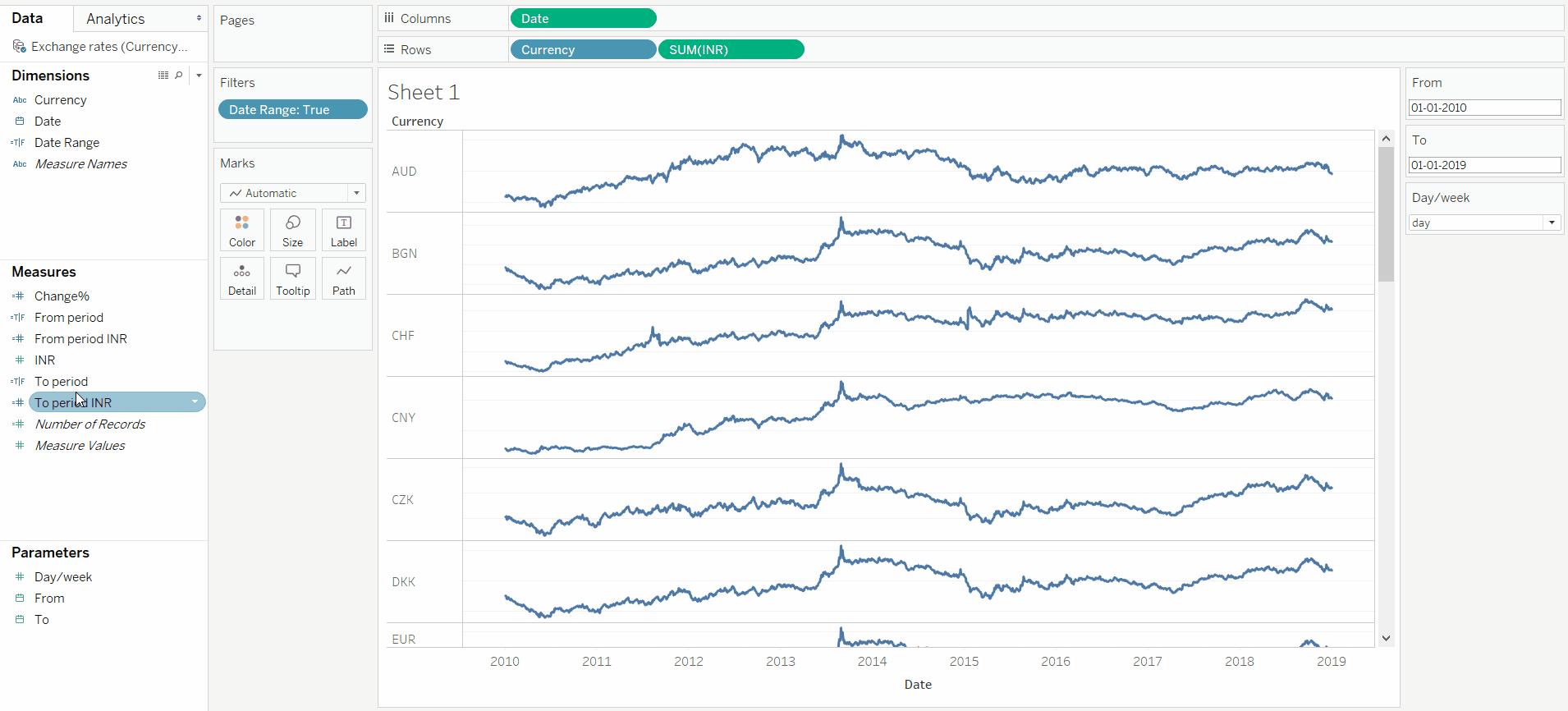
We will start by creating a basic line chart (we want the plot of exchange rate for every day). 1. Drag the ‘Date’ dimension on to ‘Columns’ and ‘INR’ measure on to ‘Rows.’
我们将从创建一个基本折线图开始(我们想要每天的汇率图)。 1.将“日期”维度拖到“列”上,将“ INR”度量拖到“行”上。
2. Right-click on the ‘Date’ dimension to make it continuous and display the ‘Exact date.’
2.右键单击“日期”维,使其连续,并显示“确切日期”。
With the line chart set up, we can create the basic version of the sparklines.
通过设置折线图,我们可以创建迷你图的基本版本。
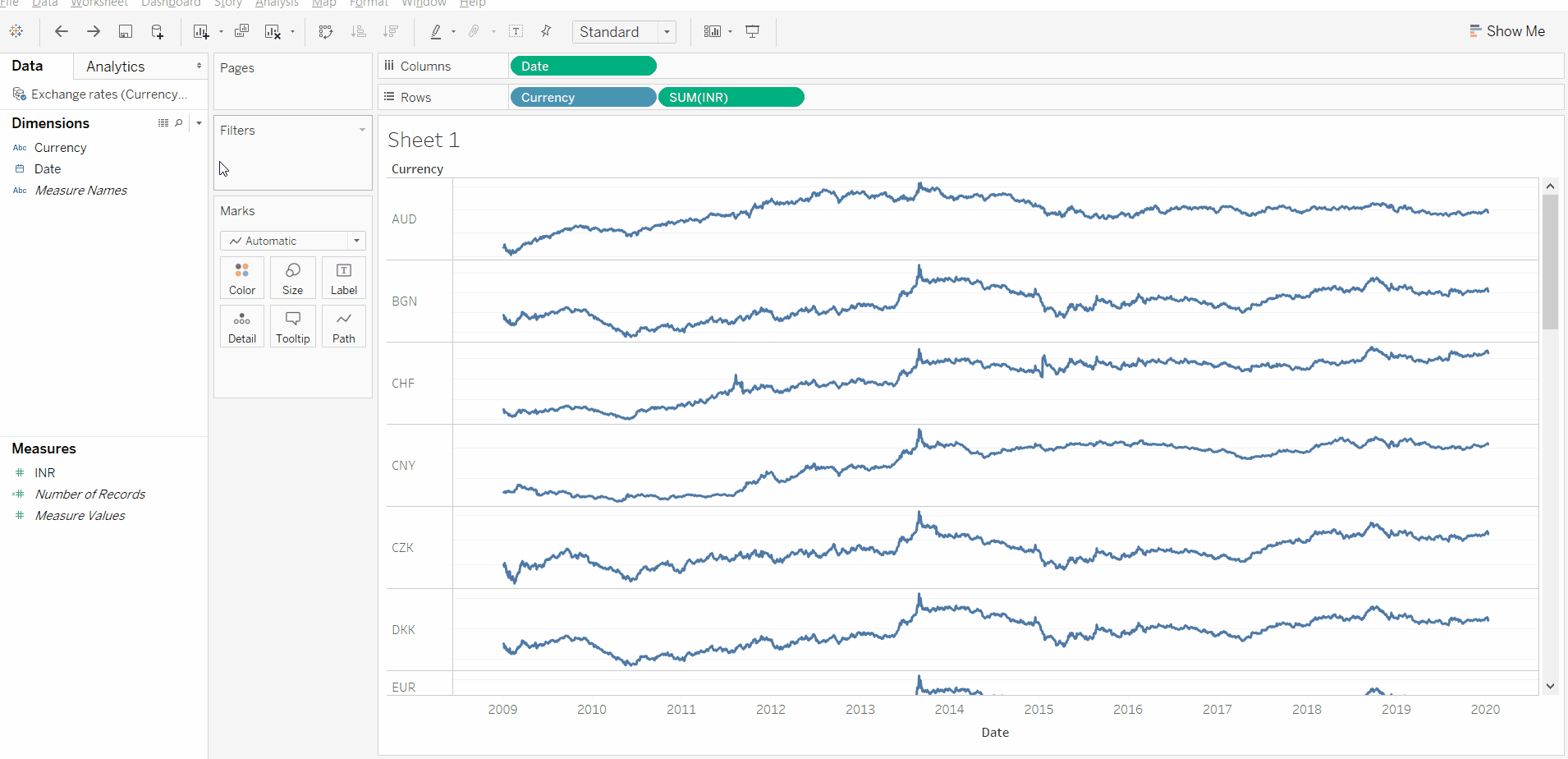
1. Drag the ‘Currency’ dimension on to ‘Rows,’ and place it before ‘SUM(INR)’ [Note: SUM or AVG or any other aggregation doesn’t matter here as we are displaying all the data points of INR on a daily basis by plotting ‘Exact dates’]
1.将“货币”维度拖到“行”上,并将其放置在“ SUM(INR)”之前[注意:这里,SUM或AVG或任何其他聚合都无关紧要,因为我们在INR上显示所有数据点通过绘制“确切日期”来每天
2. Right-click on the Y-axis of any Sparkline and click ‘edit axis’ to allow the axis to have independent axis ranges for each row or column, then uncheck the ‘Include zero’ option.
2.右键单击任意迷你图的Y轴,然后单击“编辑轴”以使该轴的每一行或每一列具有独立的轴范围,然后取消选中“包括零”选项。
3. Finally, right-click again on the Y-axis of any Sparkline and de-select the ‘Show Header’ option to hide the Y-axis headers so that the sparklines blend seamlessly with other columns.
3.最后,再次在任意迷你图的Y轴上单击鼠标右键,然后取消选择“显示标题”选项以隐藏Y轴标题,以便迷你图与其他列无缝融合。
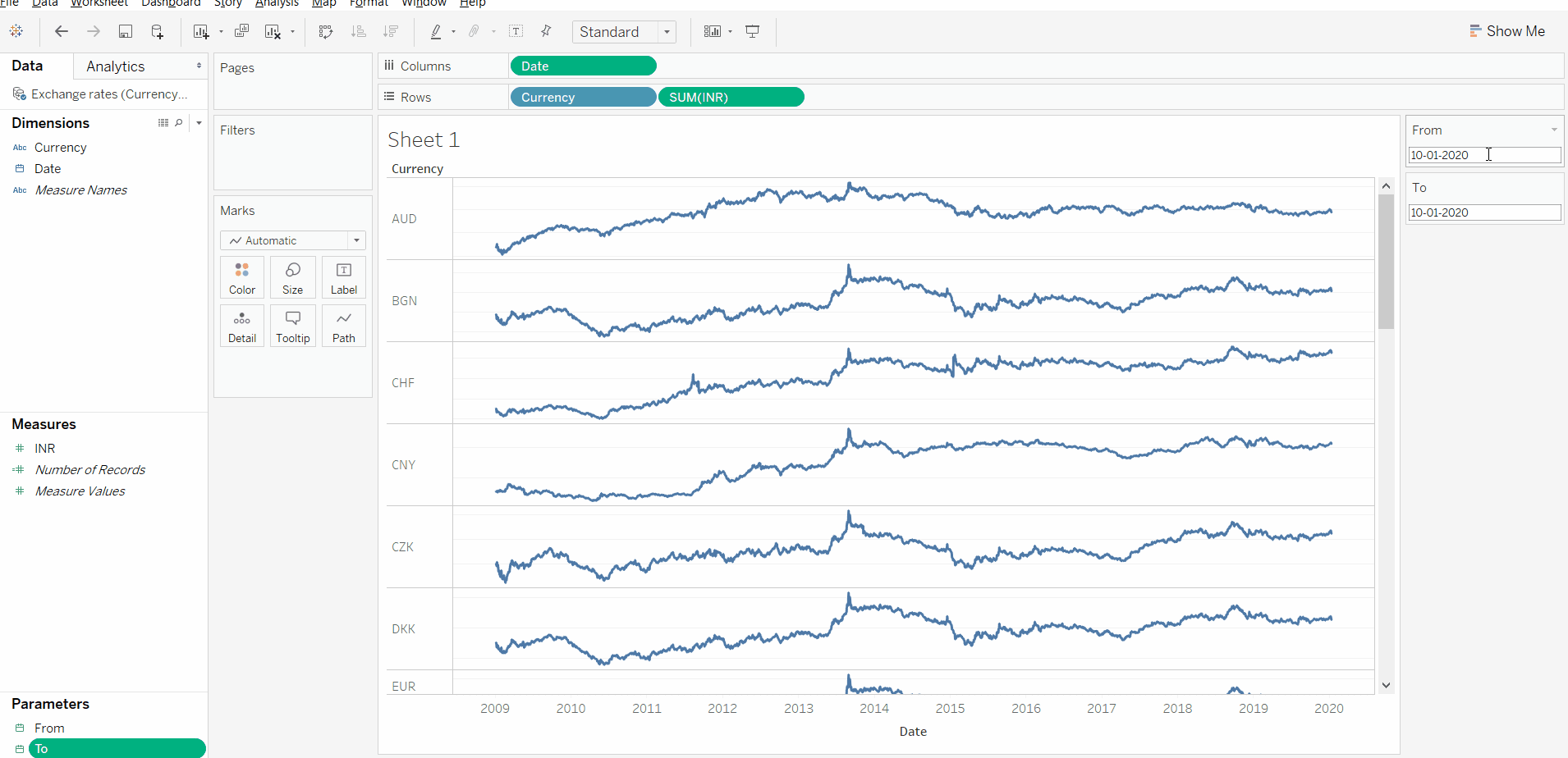
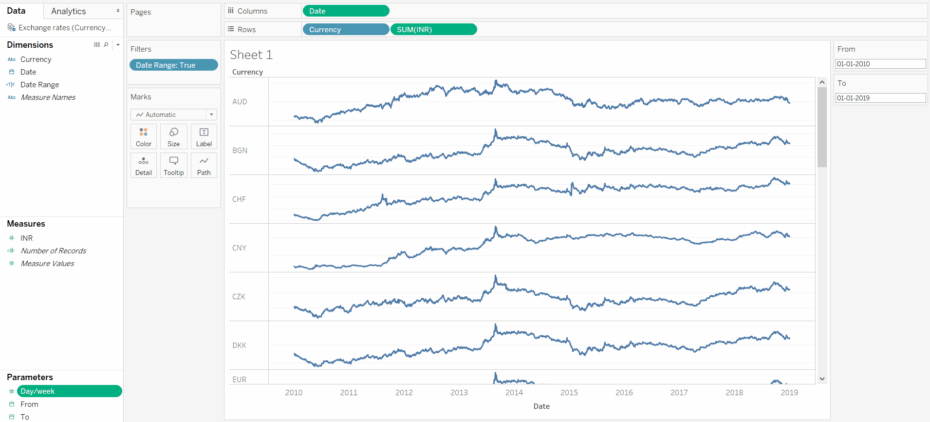
With the sparklines ready, here is how to create ‘From’ and ‘To’ date filters using the ‘Parameter’ function.
准备好迷你图之后,以下是使用“参数”功能创建“开始”和“结束”日期过滤器的方法。
- Create a new parameter. 创建一个新参数。
2. Name it as ‘From.’
2.将其命名为“发件人”。
3. Change the Data type to ‘date.’
3.将数据类型更改为“日期”。
4. Make the allowable values to be a ‘Range,’ and set the range to be picked from the ‘Date’ dimension.
4.将允许值设为“范围”,然后设置要从“日期”维度中选取的范围。
To set up the ‘To’ parameter, just duplicate the ‘From’ parameter and edit it to change the name as necessary.
要设置“ To”参数,只需复制“ From”参数并对其进行编辑以根据需要更改名称。

Right-click on ‘From’ and ‘To’ parameters to select ‘Show the parameters’ so that we can use them as a filter.
右键单击“从”和“至”参数以选择“显示参数”,以便我们可以将它们用作过滤器。
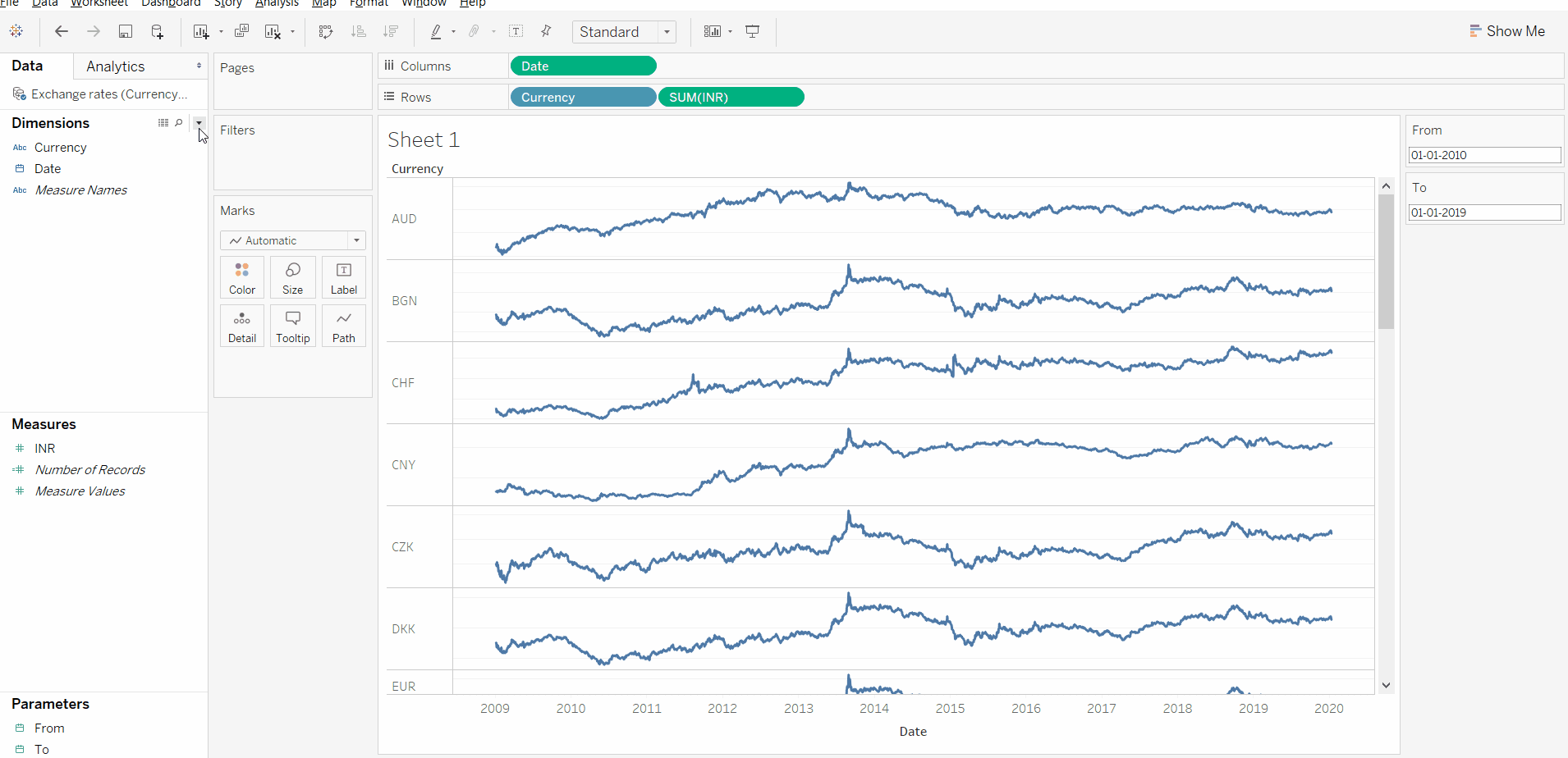
In the ‘From’ and ‘To’ parameter filters which is visible on the right-hand side of the screen, let’s change the ‘From’ date to January 1st, 2010 and ‘To’ date to January 1st, 2019 (so that we can compare the exchange rates in 2010 with the exchange rates in 2019).
在屏幕右侧可见的“从”和“至”参数过滤器中,让我们将“自”日期更改为2010年1月1日,将“至”日期更改为2019年1月1日 (以便我们可以将2010年的汇率与2019年的汇率进行比较)。
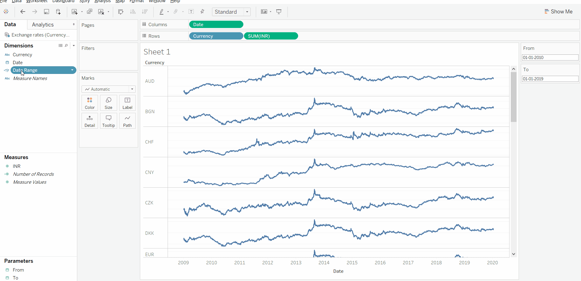
In order to populate charts based on ‘From’ and ‘To’ selections, let’s create a ‘Date Range’ calculated field with the below formula:
为了基于“从”和“到”选择填充图表,让我们使用以下公式创建一个“日期范围”计算字段:
[Date]>=[From] and [Date]<=([To]+7)[Note: [Date] <=[To]+7 is used instead of [To] to handle the ‘week’ based comparison which is discussed in the further steps below.]
[注意:[日期] <= [收件人] +7代替[收件人]用于处理基于“周”的比较,这将在下面的其他步骤中进行讨论。]
Let’s drag the ‘Date Range’ calculated field onto the Filters card to enable us to filter the data based on ‘From’ and ‘To’ selections.
让我们将“日期范围”计算字段拖到“过滤器”卡上,以使我们能够基于“从”和“到”选择来过滤数据。
Now it’s time to add certain key performance indicators (KPI’s — in this case defined data points about the ‘From Period’ INR and ‘To Period’ INR) to help add context to our sparklines onto our dashboard. We would like to compare the exchange rates of currencies with two options to compare: day-vs-day and week-vs-week.
现在是时候添加某些关键绩效指标(KPI了,在本例中为“ From Period” INR和“ To Period” INR定义的数据点),以帮助将迷你图的上下文添加到仪表板上。 我们想将货币汇率与两个比较选项进行比较:日对日和周对周。
E.g. We wish to compare the exchange rate:1. on 1–Jan–2019 vs on 1–Jan–2010, and2. 2nd week of 2019 (6-Jan-2019 to 12-Jan-2019) vs 2nd week of 2010 (3-Jan-2010 to 9-Jan-2010)
例如,我们希望比较汇率: 1. 2019年1月1日与2010年1月1日的汇率,以及2。 2019年第二周(2019年1月6日至2019年1月12日)vs 2010年第二周(2010年1月3日至2010年1月9日)
Let’s start by creating a filter (using parameters) to show the ‘day’ or ‘week’ option.
让我们首先创建一个过滤器(使用参数)以显示“天”或“周”选项。
- Create a new parameter called ‘Day/week.’ 创建一个名为“天/周”的新参数。
2. Make the available values as a list, and give two values: ‘0’ for day and ‘7’ for week. ( ‘0’ for picking up only the selected day, ‘7’ to pick up seven days, which would of course constitute a whole week)
2.将可用值作为列表,并提供两个值:“ 0”代表一天,“ 7”代表一周。 (“ 0”仅代表选定的日期,“ 7”代表仅7天,这当然将构成一个整周)
Right-click on the ‘Day/week’ parameter and select ‘Show parameter control’ to make it visible.
右键单击“日/周”参数,然后选择“显示参数控件”以使其可见。
Let’s pick up the ‘From’ and ‘To’ selection (from the filter section). This is needed to build our KPIs. Create a new ‘Calculated Field’ called ‘To period’ with the below formula:
让我们选择“从”和“到”选择(来自过滤器部分)。 这是构建我们的KPI所必需的。 使用以下公式创建一个新的“计算字段”,称为“至期间”:
if [Day/week]=7
THEN (
DATEDIFF(‘day’,ATTR([Date]),[To])<=0 and DATEDIFF(‘day’,ATTR([Date]),[To]) >-7
)
ELSE
(
DATEDIFF(‘day’,ATTR([Date]),[To])=0
)
END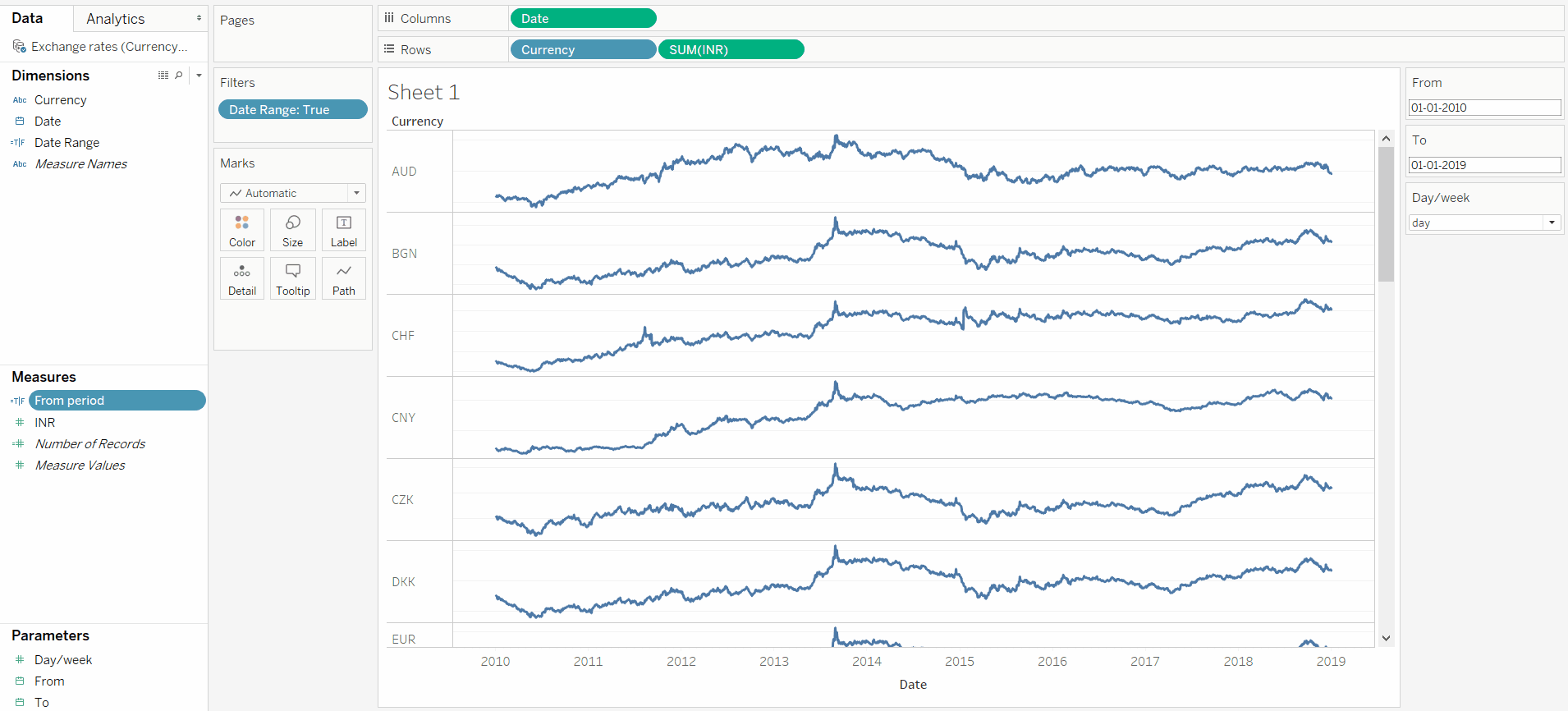
Next, create a new ‘Calculated Field’ called ‘From period’ with the below formula
接下来,使用以下公式创建一个新的“计算字段”,称为“自期间”
if [Day/week]=7
THEN (
DATEDIFF(‘day’,ATTR([Date]),[From])<=0 and DATEDIFF(‘day’,ATTR([Date]),[From]) >-7
)
ELSE
(
DATEDIFF(‘day’,ATTR([Date]),[From])=0
)
END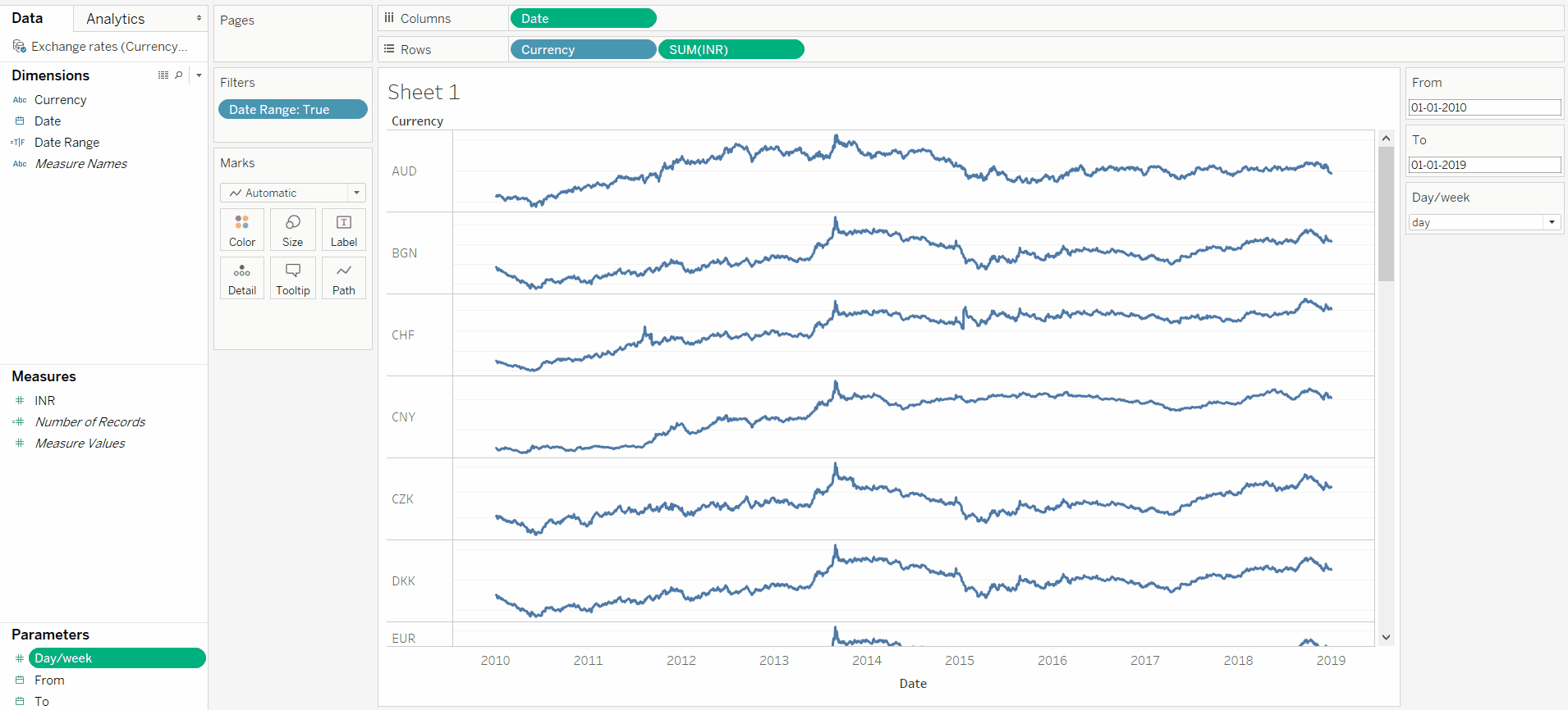
Now with the inputs set up, we can actually create the KPIs (‘From period INR,’ ‘To period INR,’ and the delta between ‘from’ and ‘to’ period INR). Create the ‘From period INR’ calculated field with the below formula:
现在,在设置好输入之后,我们实际上可以创建KPI(“从期间INR”,“到期间INR”以及“从”到“至”期间INR之间的差异)。 创建 使用以下公式计算“从期间INR”字段:
ZN(LOOKUP(WINDOW_AVG(IIF([From period], ZN(AVG([INR])), NULL)), 0))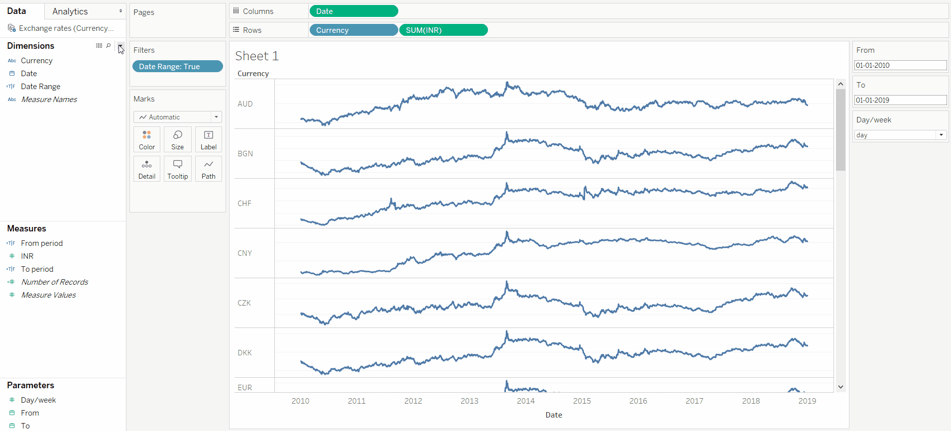
Create the ‘To period INR’ calculated field with the below formula:
使用以下公式创建“至期间INR”计算字段:
ZN(LOOKUP(WINDOW_AVG(IIF([To period], ZN(AVG([INR])), NULL)), 0))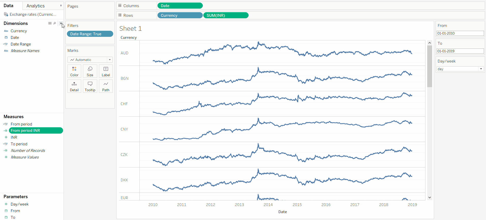
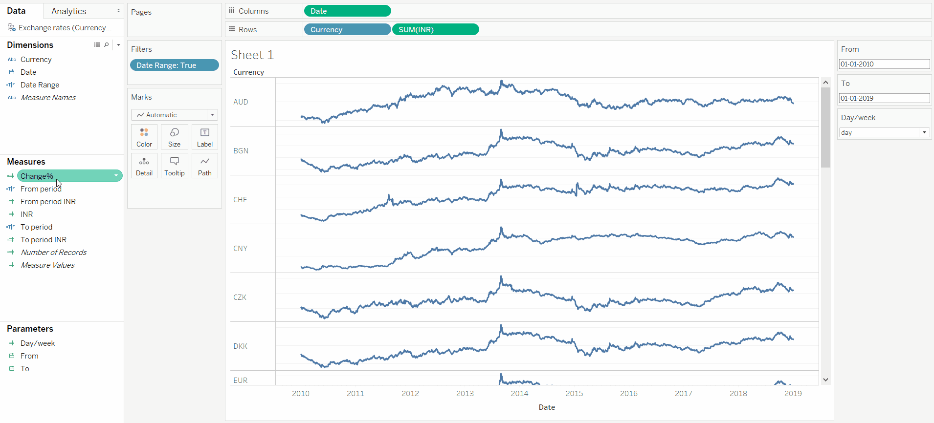
Create the ‘Change %’ calculated field with the below formula:
创建“更改%” 具有以下公式的计算字段:
ZN(([To period INR]-[From period INR])/[From period INR])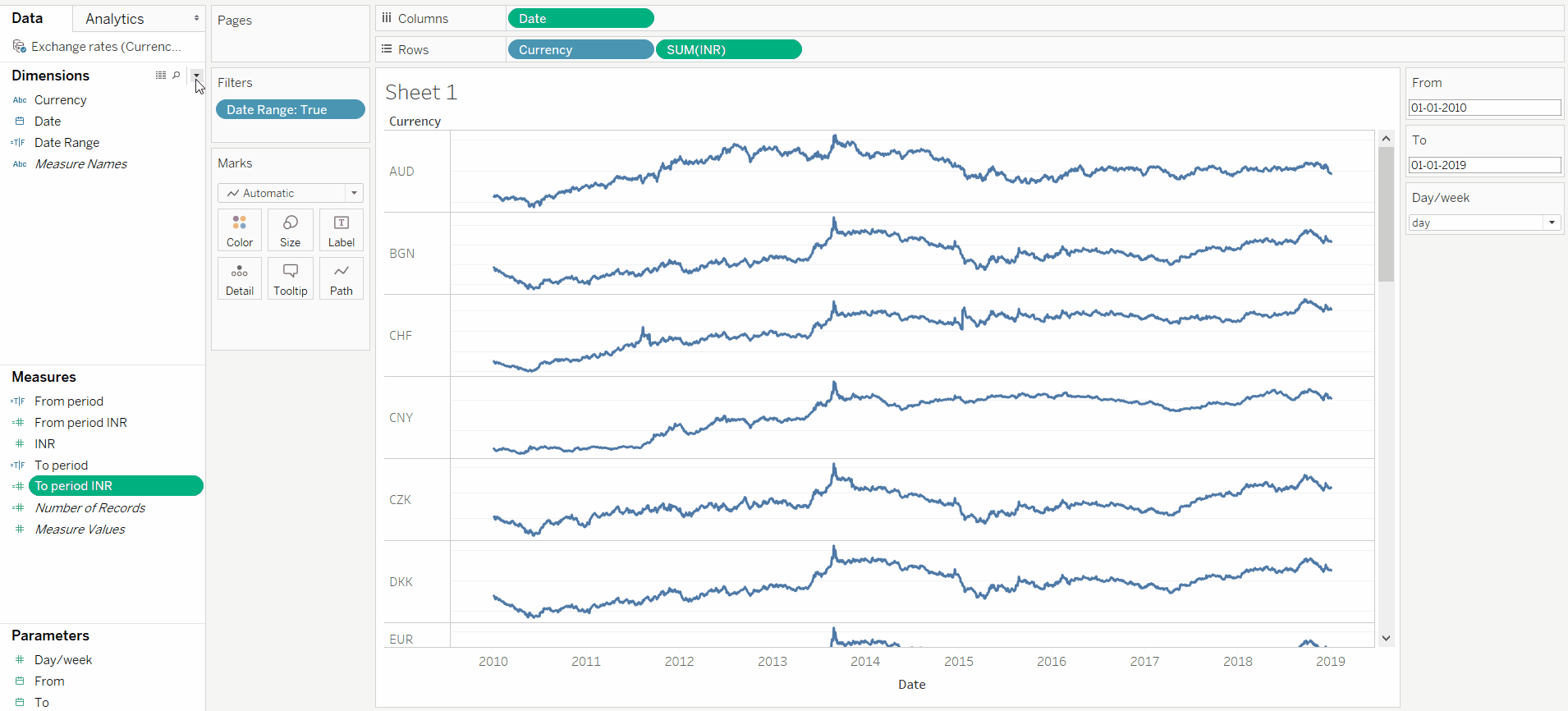
And voila, we have built our sparklines dashboard that you can turn into your own template!
瞧,我们已经建立了迷你图仪表板,您可以将其变成自己的模板!
In the next how-to article, we will dive into picking a chart and trying to improve it by applying the spartan design ethics for storytelling, which often focuses on neutral or desaturated colours with one standout colour, the importance of labels and natural language titles, and a sort of idealization of the perfect chart that is defined as being immediately readable, accessible, and actionable (part of the first wave of data visualisation).
在下一个how-to文章中,我们将深入探讨如何选择图表并通过运用斯巴达式的设计伦理来讲述故事 , 哪一个 通常侧重于具有一种出色颜色的中性或不饱和颜色,标签和自然语言标题的重要性以及对理想图表的某种理想化,理想图表被定义为可立即读取,可访问且可操作(第一波数据的一部分)可视化)。
sparklines


 239
239

 被折叠的 条评论
为什么被折叠?
被折叠的 条评论
为什么被折叠?
 到【灌水乐园】发言


