


In this 2.5 week project, assigned by Ironhack — Amsterdam, I worked solo to design a festival website with a one-year life cycle. The one-year cycle included three stages: pre-event, during event, and post-event. My primary focus was on the pre-event (hype and ticket sales) stage. Relating my design to the existing brand identity and site history was a key requirement of the final design.
在这个由Ironhack(阿姆斯特丹)进行的为期2.5周的项目中,我独自工作,设计了一个生命周期为一年的节日网站。 一年周期包括三个阶段:赛前,赛中和赛后。 我的主要重点是事前(炒作和门票销售)阶段。 将我的设计与现有品牌标识和网站历史联系起来是最终设计的关键要求。
什么是Bonnaroo? (What is Bonnaroo?)
Bonnaroo is a camping music festival located in Manchester, Tennessee. Started in 2002, it runs over four days and hosts an average of 80,000 people annually. Musical acts run the gamut, from jam bands, to rap, to EDM. Activities run 24/7, and the community and culture around the festival is overwhelmingly free-spirited and welcoming. Bonnaroo prides itself on owning its festival grounds (known as The Farm) and the high number of repeat ‘Bonnaroovians’.
Bonnaroo是位于田纳西州曼彻斯特的露营音乐节。 它始于2002年,历时四天,平均每年接待80,000人。 从果酱乐队到说唱音乐到EDM,音乐表演无处不在。 活动全天24/7进行,音乐节周围的社区和文化极为自由热情。 Bonnaroo以拥有自己的节日场地(被称为农场)和大量重复的“ Bonnaroovians”而自豪。
节日观众 (Festival Audience)
Who are Bonnaroovians?
谁是Bonnaroovian人?
“A community of people celebrating the fact that positivity matters.”
“一群人庆祝积极性这一事实。”
— Chad Issaq, EVP of Business Development and Partnerships for Superfly, the live events and marketing firm behind Bonnaroo
— Bonflyoo背后的现场活动和营销公司Superfly业务开发和合作伙伴关系执行副总裁Chad Issaq
I chose to forgo developing a formal user persona in this project, as I could already predict a time crunch on the back end of this 2.5 week project. Instead, I drew on secondary research online, and my personal experiences attending the festival during 2014 and 2016. A number of my friends who went with me functioned nicely as a user group.
我选择放弃在此项目中开发正式的用户角色,因为我已经可以预测到这个2.5周的项目的后端会出现时间紧缩的情况。 取而代之的是,我在网上进行了二次研究,并在2014年和2016年期间参加了我的音乐节。与我同行的许多朋友在用户组中表现良好。
According to Skyhook’s foot traffic analysis, the festival attendees are 80% white, 60% college educated, and have an average age of 32. The majority live in Southeast USA, but attendees come from around the world.
根据Skyhook的步行流量分析,节日的参加者是80%的白人,60%的大学学历,平均年龄为32岁。大多数人居住在美国东南部,但与会者来自世界各地。


竞争分析 (Competitive Analysis)
After absorbing the Bonnaroo data, I conducted a Competitive Visual Analysis of three competing festivals.
吸收Bonnaroo数据后,我对三个相互竞争的节日进行了竞争性视觉分析。
Hangout Fest is a three-day beachfront festival also located in SE USA, with a comparable lineup but different setting.
Hangout Fest是一个为期三天的海滨节,同样位于美国东南部,阵容相当,但设置却有所不同。
Firefly Festival is a three-day camping festival in head-to-head competition with Bonnaroo. It is held on the same weekend as Bonnaroo, in Delaware (within driving distance for most potential Bonnaroo attendees). The first year Firefly was held, Bonnaroo’s attendance dropped by 20,000.
萤火虫节是与Bonnaroo展开的为期三天的野营节。 它与特拉华州Bonnaroo在同一周末举行(大多数Bonnaroo潜在参与者的开车距离都在此范围内)。 Firefly举办的第一年,Bonnaroo的出席人数下降了20,000。
Electric Forest is a four-day camping festival with a strong emphasis on EDM and jam bands. It is held in Rothbury, Michigan. Like Bonnaroo, it has a permanent festival grounds of its own.
Electric Forest是一个为期四天的野营节,其重点是EDM和果酱乐队。 它在密歇根州罗斯伯里举行。 像Bonnaroo一样,它拥有自己的永久节日场地。
After analysis, I noticed some trends. The Hangout Fest and Firefly websites shared a lot of UI patterns: a large banner-style header, followed by a poster-style line-up, ticket sales call-to-action, and additional information all on the homepage. Electric Forest was more unique in its styling, and the layout followed a grid pattern that I would later notice repeated on the old Bonnaroo sites. Across the board, illustrations were dominant. All three had similar navigation menus and site names.
经过分析,我注意到了一些趋势。 Hangouts Fest和Firefly网站共享许多UI模式:大型横幅样式的标题,海报样式的阵容,门票销售号召性用语以及其他所有信息都在首页上显示。 Electric Forest的样式更为独特,其布局遵循网格模式,后来我注意到在Bonnaroo的旧站点上反复出现。 总体而言,插图占主导地位。 这三个都具有相似的导航菜单和站点名称。


历史分析 (Historical Analysis)
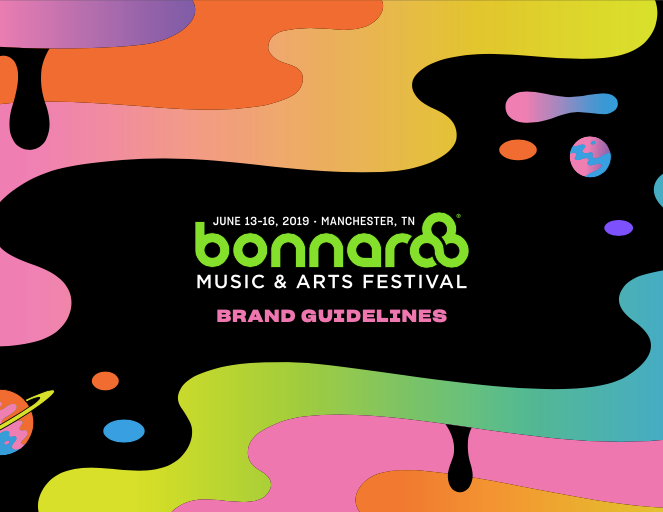
Bonnaroo began in 2002, leaving me with a lot of history to uncover. The earliest site still loadable on The waybackmachine was 2009. At this point, the brand colors are identifiable as magenta, teal, lime green, and purple. This color palette subtly evolves over the years, but holds true today. The logo is well defined at this stage as well.
Bonnaroo于2002年开始,给我留下了很多历史。 最早可在Waybackmachine上加载的站点是2009年。在这一点上,可以将品牌颜色标识为洋红色,蓝绿色,青绿色和紫色。 多年以来,这种调色板一直在微妙地发展,但在今天仍然适用。 该徽标在此阶段也已明确定义。
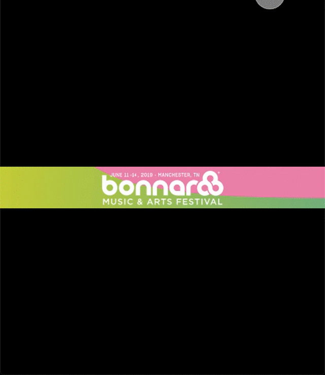
Continuing forward through time, a strong two-column grid appears in 2018 and continues to present day. In 2019, the site ‘goes dark’ and remains dark into 2020. A shift from primarily photo-based UI towards an illustrated style is perceptible between 2018 and 2020.
随着时间的推移,一个强大的两列网格在2018年出现并一直延续至今。 在2019年,该网站“一片漆黑”,直到2020年仍然漆黑。在2018年至2020年之间,可以从主要基于照片的UI转向插图风格。
During my research efforts, I came across a beautiful case study by Charles Williams of Made Up. In the introduction of this write-up, he notes that the brief provided by the festival was to focus on the ‘magic’ of the festival. I kept this note in the back of my mind when aesthetic choices arose later in the project.
在我的研究工作中,我遇到了Made Up的Charles Williams进行的一个美丽的案例研究 。 在介绍这篇文章时,他指出,电影节提供的简要信息着重于电影节的“魔术”。 当项目后期出现美学选择时,我把这句话留在脑海中。
现场审核 (Site Audit)
aka Legacy Troubles
又名传统麻烦
So, you’ve made it through the happy look down memory lane. Now for the ugly truth… Bonnaroo’s site has been growing and evolving organically since 2002. During my site audit, I found many areas in dire need of a pruning.
因此,您已经通过了愉快的向下存储通道。 现在,从丑陋的事实开始……Bonnaroo的站点自2002年以来一直在不断发展和有机发展。在我的站点审核期间,我发现许多领域急需修剪。
Below, you can see a site map I made based on the 2020 pre-event site. At this moment of the project, I was holding on to the Happy Flow for dear life. Each red flag you see in the site map is a page I either wouldn’t get to during the scope of the project, or thought could be cut from the map entirely. The yellow flags represent pages that deserved to see another day, but I likely wouldn’t have time for. The green pages were to be included, perhaps in a condensed form, in the Happy Flow of my prototype.
在下面,您可以看到我根据2020会前活动站点制作的站点地图。 在项目的这一刻,我一直坚持着快乐之流来度过宝贵的生命。 您在站点地图中看到的每个红色标志都是我在项目范围内无法访问的页面,或者认为可以完全从地图上删除。 黄旗表示值得再见的页面,但我可能没有时间。 绿页将以压缩的形式包含在我的原型的“快乐流”中。
Although this was a UI-focused project, I knew I needed to improve the UX of buying a ticket. During user interviews I was reminded how confusing the ticket buying process gets, because each individual requires a festival ticket, but only one person per group needs to buy a camping pass and vehicle parking permit. This leads the users to a lot of outside communication and general confusion about which tickets are necessary for which person.
尽管这是一个注重UI的项目,但我知道我需要改善购买机票的用户体验。 在用户访问期间,我被提醒购买机票的过程会令人困惑,因为每个人都需要一张节日门票,但是每组只有一个人需要购买露营证和停车证。 这导致用户与外界进行大量交流,并且对于哪些门票对于哪个人是必需的感到困惑。
This confusion is compounded by the intimidating layout of the ticket information and purchasing interface. As you can see for yourself below, the page of ticket information goes on so long I had to crop it in two. And, all of the accordion sections are closed in this screengrab… Users find themselves lost, and overwhelmed by options that may not apply to their experience.
票务信息和购买界面的令人生畏的布局加剧了这种混乱。 正如您在下面自己看到的那样,故障单信息页面持续运行很长时间,因此我不得不将其分成两部分。 而且,所有的手风琴部分都在此屏幕抓屏中关闭了……用户发现自己迷失了方向,选择的方法可能不适用于他们的体验。
构想 (Ideation)
With the research phase complete, I had the information needed to begin brainstorming UI decisions. I co-opted the old ‘magic’ brief that was mentioned in the Historical Analysis section of this case study, and mind-mapped a few directions that could go in. At this point, I made three quick moodboards — ‘Magic Forest’, ‘Tarot Mysticism’, and ‘Neon Nostalgia’ — and showed them to testers that fell into the Bonnaroo demographic.
在研究阶段完成之后,我掌握了开始集体讨论UI决策所需的信息。 我选择了本案例研究的“历史分析”部分中提到的旧的“魔术”简介,并牢记了一些可能进入的方向。在这一点上,我制作了三个快速的情绪板-“魔术森林”, “塔罗牌神秘主义”和“霓虹怀旧”,并向属于Bonnaroo人群的测试人员展示了它们。

The users voted for the Neon Nostalgia moodboard, seen below. This theme riffs off of the stage and tent signage seen on the festival grounds — a subtle callback for returning customers.
用户投票支持Neon Nostalgia情绪板,如下所示。 这个主题从节日现场看到的舞台和帐篷标牌中散发出来-回头客的微妙回音。

一段神奇的Bonnaroovian时刻的插曲… (An interlude for a magical Bonnaroovian moment…)
Did you notice that style guide on moodboard?
您是否注意到了情绪板上的样式指南?
Before getting into the wireframing phase, I was looking at the press photos available online to use in my future design. The file of photos was hosted on Google Drive, and being a busy-body, I checked who had originally uploaded them. A gentleman named Ben had posted them… and there was his email address! I immediately sent him a friendly email, letting him know that a former festival attendee was now doing a site redesign for a school project — and was there any chance I could get a look at their official style guide?
在进入线框设计阶段之前,我正在查看在线可用的新闻图片,这些照片可用于我的未来设计。 照片文件托管在Google云端硬盘上,作为一个忙碌的人,我检查了最初上传照片的人。 一位名叫本的绅士发布了他们……还有他的电子邮件地址! 我立即给他发送了一封友好的电子邮件,让他知道以前的节日参加者现在正在为学校项目进行网站重新设计-我是否有机会查看他们的官方风格指南?
Ben did more than that. He made my dreams come true! Within a couple hours he delivered the entire brand asset folder for 2019.
本做的不止于此。 他使我的梦想成真! 在几个小时内,他交付了2019年整个品牌资产文件夹。
Thanks again, Ben.
再次感谢,本。

低保真草图 (Low Fidelity Sketches)
With my spirits high, I moved on to the prototyping phase.
昂首阔步,我进入了原型设计阶段。
Based on the competitive analysis, it was clear what layout patterns users would be expecting from a festival website. Those patterns were followed, while the historical ticketing process was purposefully broken. Much of my time during this stage was spent hashing out the ticketing process, and working to condense the amount of information the user was presented with at one time. User testing and iterations cycled many times over the course of a long Saturday.
根据竞争分析,很清楚用户会从节日网站上期待什么布局模式。 遵循了这些模式,同时故意破坏了历史票务流程。 在此阶段,我大部分时间都花在了票务处理上,并致力于压缩一次向用户展示的信息量。 在一个漫长的星期六中,用户测试和迭代多次循环。


中保真线框 (Mid-Fidelity Wireframes)
Having a good idea of the layout and information needed on each page, I moved the work to Sketch. I carefully built each element as a symbol for fast interactions in the future.
在对每个页面上所需的布局和信息有了很好的了解之后,我将工作移至了Sketch。 我精心构建了每个元素,将其作为将来进行快速交互的符号。


高保真屏幕 (High Fidelity Screens)
时尚指南 (Style Guide)
The official style guide of the 2019 festival set the logos, primary color palette, and typeface. I expanded the guide to include neon-effect colors, a new icon set, and fresh buttons.
2019年音乐节的官方样式指南设置了徽标,原色调色板和字体。 我对该指南进行了扩展,以包括霓虹灯效果的颜色,新的图标集和新鲜的按钮。

定制现有品牌资产 (Customizing Existing Brand Assets)
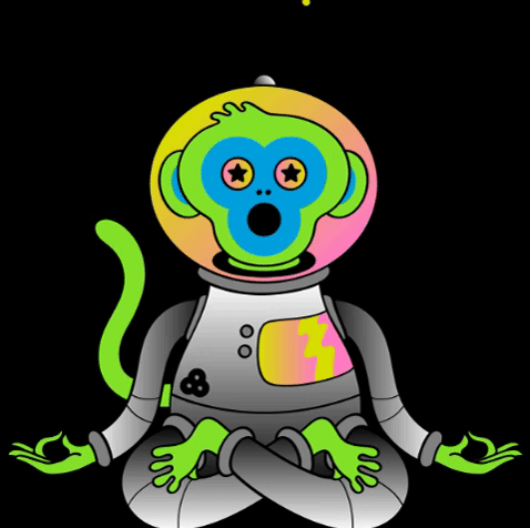
One of the many gifts included in the official style guide were custom full-color illustrations. These files were (sadly) PNG format, so editing them provided its own challenge. I found an online tool called Online-Convert.com that transforms PNG files into SVG files with moderate success. High-contrast line designs turned out the best results. In the GIF below, you can see how the full color image is rendered as a black graphic on a white background. From there, I brought the newly SVG file into Sketch and adjusted the mistakes by hand.
官方样式指南中包含的许多礼物之一是定制的全彩插图。 这些文件是(非常糟糕的)PNG格式,因此对其进行编辑提出了自己的挑战。 我找到了一个名为Online-Convert.com的在线工具,该工具可将PNG文件转换为SVG文件并取得一定的成功。 高对比度的线条设计带来了最佳效果。 在下面的GIF中,您可以看到全色图像如何在白色背景上呈现为黑色图形。 从那里,我将新的SVG文件带入Sketch并手动调整了错误。
Some of the illustrations made a further evolution into their final neon forms, in keeping with my Neon Nostalgia moodboard, while others remained as simple line drawings. I also updated the color scheme and layout of the 2020 line-up poster through this method.
与我的Neon Nostalgia情绪板保持一致,有些插图进一步演变为最终的霓虹灯形式,而另一些则保留为简单的线条图。 我还通过这种方法更新了2020年阵容海报的配色方案和布局。

迭代 (Iterations)
At the end of the project, there were 9 digital versions before the final, 10th prototype. Below you can see a sampling of the homepage’s progress.
在项目结束时,在最终的第10个原型之前有9个数字版本。 在下面,您可以查看首页进度的示例。

Not just the pages, but also the cards inside them underwent many iterations. In this GIF, you can see me struggle through the ticket design. User feedback was invaluable in deciding how much information to include on the ticket card, and what to hide inside each card’s ‘information’ menu.
不仅页面,而且页面中的卡片都经历了多次迭代。 在此GIF中,您可以看到我在票证设计方面遇到了困难。 用户反馈对于决定要在票证卡中包含多少信息以及每张证卡的“信息”菜单中隐藏的内容非常有用。

Below are some example iterations of the ticketing process. User feedback informed me that my first step was actually redundant to the way you enter the page from the main screen. After cutting that out, I still needed to minimize how much information was presented at each stage of the checkout process. The white frame visible in V9 and 10 is my solution to that problem — the screen is intended to autoscroll through the frame as the form is filled out. You can see it for yourself in the prototype video in the next section.
以下是票务流程的一些示例迭代。 用户反馈告诉我,我的第一步实际上与您从主屏幕进入页面的方式无关。 删除这些内容后,我仍然需要尽量减少在结帐过程的每个阶段提供多少信息。 在V9和10中可见的白色框架是我解决该问题的方法-屏幕旨在在填写表格时自动滚动浏览该框架。 您可以在下一部分的原型视频中亲自看到它。
Adding site-wide color coding for General Admission, VIP, and Super VIP information was also inspired by user testing feedback. The name ‘Platinum’ was exchanged for ‘Super VIP’ when users reported the title was unfamiliar to them. Instead I chose to follow the existing pattern of ‘Super VIP’ that was unearthed during the Competitive Analysis.
用户测试反馈也启发了为一般入场,VIP和超级VIP信息添加站点范围的颜色编码。 当用户报告称他们不熟悉时,名称“白金”被换成“超级VIP”。 相反,我选择遵循竞争分析中发现的现有“超级VIP”模式。

原型之旅 (Prototype Tour)
When the design was finalized in Sketch, I imported it to Xd to create the clickable prototype. At this moment the animations were implemented, including hover effects, a sticky navigation bar, swipeable cards, and auto-scrolling through the ticket sales process.
当设计在Sketch中完成后,我将其导入Xd以创建可点击的原型。 此时,实现了动画,包括悬停效果,粘性导航栏,可滑动的卡片以及在票务销售过程中的自动滚动。
Don’t forget, the scope of this project was a one-year cycle for the brand. I created a During Event site that was aimed at an audience unable to attend the festival in-person. (Phones and internet connection are popularly left behind when you are attending the festival, so creating a mobile calendar of events was not a top priority).
别忘了,这个项目的范围是该品牌的一年周期。 我创建了一个活动期间网站,专门针对无法亲自参加音乐节的观众。 (参加节庆活动时,通常会留下电话和互联网连接,因此创建活动的移动日历并不是最重要的)。
Finally, there was the Post Event cycle to consider. In the past, Bonnaroo used a simple homepage immediately following the conclusion of the festival. Shortly after, they begin hyping up the next year’s events with a new site design. I chose to follow this pattern.
最后,需要考虑事件后周期。 过去,Bonnaroo在节日结束后立即使用了一个简单的主页。 此后不久,他们开始使用新的网站设计来宣传明年的活动。 我选择遵循这种模式。

你有没有留甜点的空间? (Did you save room for dessert?)
There were a couple additional requirements for this Ironhack assignment. One was to create a banner ad that fit the site identity to help drive traffic.
Ironhack任务还有一些其他要求。 一种是制作适合网站身份的横幅广告,以帮助吸引流量。
The final requirement to complete the project was compiling the assets into a developer-ready Zeplin file.
完成项目的最终要求是将资产编译到可用于开发人员的Zeplin文件中。
下一步 (Next Steps)
The scope of this project was complete, but the work is never over! Given more time, the next steps beyond the Happy Flow would be:
该项目的范围已完成,但工作从未结束! 如果有更多的时间,那么快乐流之后的下一步将是:
- An interactive line-up page for the pre-event site, which allows users to sample music without leaving the site. 活动前网站的交互式节目单页面,允许用户在不离开网站的情况下欣赏音乐。
- A page dedicated to Bonnaroo’s Campground Plazas, a new festival feature. 专门介绍Bonnaroo的营地广场的页面,这是节日的新功能。
学问 (Learnings)
- Don’t underestimate the additional work and confusion a legacy project brings. This project was a great lesson for me in discovering how much work I can reasonably produce in 2.5 weeks. 不要小看遗留项目带来的额外工作和混乱。 这个项目对我来说是一个很棒的课程,让我发现我在2.5周内可以合理地完成多少工作。
- Be brave and reach out to the community around you. Getting my hands on the brand asset folder was totally unexpected, but all I had to do was ask! 勇敢并与周围的社区建立联系。 接触品牌资产文件夹是完全出乎意料的,但是我要做的只是问问!
- My work in Xd is becoming more efficient, but is nowhere near my proficiency in Sketch. Keeping in mind that my struggle there will pay off in the end was important to my mental health. :) 我在Xd中的工作效率越来越高,但远远不如我对Sketch的熟练程度。 请记住,我的奋斗最终将获得回报,这对我的心理健康很重要。 :)
Wow, thanks for hanging in there until the end! This project was a big one, and it shows in the length of the case study. If you found my work interesting, feel free to follow my Medium account — one month from now, I’ll be publishing my capstone UX/UI project for my six month Ironhack course.
哇,谢谢你一直呆在那里! 这个项目是一个很大的项目,它在案例研究的长度中显示出来。 如果您发现我的工作很有趣,请随时关注我的Medium帐户-从现在开始的一个月,我将为我六个月的Ironhack课程发布我的基本UX / UI项目。
翻译自: https://uxplanet.org/bonnaroo-music-arts-festival-site-redesign-7deac38e1617


 2670
2670

 被折叠的 条评论
为什么被折叠?
被折叠的 条评论
为什么被折叠?
 到【灌水乐园】发言


