


pc应用设计指南
重点 (Top highlight)
As per Material Design, top app bars “display information and actions relating to the current screen”. With these components usually on every page of an app, it is paramount they are designed effectively 💪.
根据Material Design的规定 ,顶部的应用栏“显示与当前屏幕有关的信息和动作”。 这些组件通常位于应用程序的每个页面上,因此有效地设计它们至关重要。
TLDR (TLDR)
You can choose to just trust me on this and duplicate my file on Figma (referenced in the diagram below):

Or…you can read the WHY in the next section 💪
或者...您可以在下一节中阅读为什么
说明 (Explanation)
1.让酒吧呼吸 (1. Let the bar breathe)
The top bar contains a lot of important info and will be a mainstay throughout the user’s experience. Cluttering this area can make the whole app feel overwhelming. Therefore, give it a suitable height so that things do not look squished. In my example, the bar is 70px (the ubiquitous phone details area is 14px, so the amount of room we can play with is really 56px).
顶部栏包含许多重要信息,并将成为整个用户体验的中流tay柱。 杂乱无章的区域会使整个应用感到不知所措。 因此,给它一个合适的高度,以使东西看起来不被挤压。 在我的例子中 酒吧是70px(无处不在 电话详细信息 区域是14像素,因此我们可以玩的空间实际上是56像素)。

One other aspect to consider is the ease of selection at the top of mobile phones. Unless you have an iPhone 3, the top fourth of your screen is hard to reach, thus touch accuracy will be negatively affected. If the top bar is crowded, it further compounds the difficulty level 😤.
要考虑的另一方面是在手机顶部的轻松选择。 除非您拥有iPhone 3,否则屏幕的顶部四分之一很难触及,因此触摸精度会受到负面影响。 如果顶部栏很拥挤,则会进一步增加难度等级😤。

2.后退按钮应显示上一页名称 (2. Back button should show previous page name)

This is definitely a “nice-to-have”, but should not be too hard to implement. Plus, it’s like breadcrumbs, without the breadcrumbs, which I think is super cool 😎.
这绝对是“不错”的做法,但实施起来并不难。 另外,就像面包屑一样,没有面包屑,我认为这很酷。
In order to avoid too much text between the actual page name and the previous page name I fixed the width of both text boxes. If the name can not fit in the available space then maybe you should consider skipping this step.
为了避免实际页面名称和上一个页面名称之间的文本过多,我固定了两个文本框的宽度。 如果名称不能容纳在可用空间中,那么您可能应该考虑跳过此步骤。
p.s. I completely stole this idea from Strava
ps我完全从Strava偷走了这个主意

3.栏中间应包含页面名称或徽标 (3. Middle of bar should contain page name or logo)

or..
要么..

This one should be obvious. Users should always know what page they are on and you don’t need to waste another ~48px of space below the bar showcasing this.
这一点应该很明显。 用户应该始终知道他们在哪个页面上,并且您无需在显示此内容的栏下方浪费大约48px的空间。
The Home section can be an area to rep your logo as this area is usually self-explanatory. Medium, for example, does this.
主页部分可以是代表徽标的区域,因为该区域通常是不言自明的。 例如,Medium会这样做。

4.所有其他动作应以图标形式右对齐 (4. All other actions should be right-aligned in the form of icons)
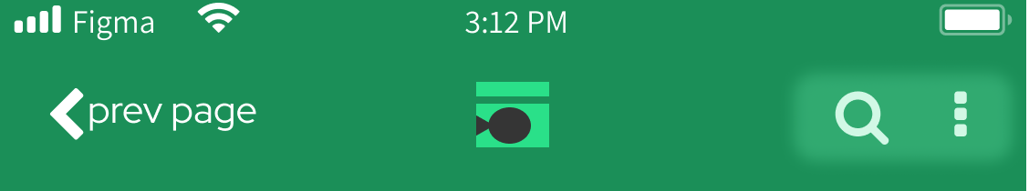
There can be a whole host of additional actions you’d want on a single page, but try to limit 3 per page. Having more than that will make the bar too busy (see #1) and is also probably a good indicator that the page is offering too much functionality.
您可能希望在单个页面上执行大量其他操作,但是请尝试限制每页3个。 拥有更多的资源将使工具栏太忙(请参阅#1),也可能很好地指示该页面提供了太多的功能。
My component makes it very easy to show 1–3 icons 💪
我的组件使显示1-3个图标非常容易💪

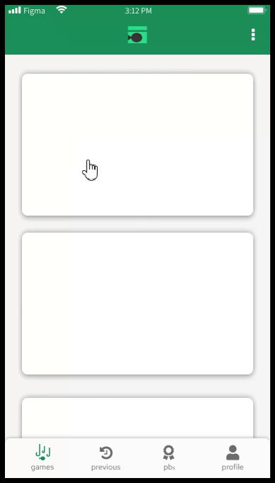
5.顶部栏不应具有拐角半径或阴影-底部栏也不应看起来像 (5. Top bar should not have corner radius or drop shadow — it should also not look like the bottom bar)
As seen in the examples above, the top (navigation) bar is anything but static, so do not style it in a way that would make it appear static, or on top of the page.
从上面的示例中可以看到,顶部(导航)栏不是静态的,因此不要以使其看起来是静态的或在页面顶部的方式对其进行样式设置。
With that being said I feel that it should be styled differently to the bottom (static) bar in every way possible, including color. Using the example from above, you can see the bars differ in corner radius, shadow (or lack thereof) and color.
话虽如此,我觉得应该以各种可能的方式(包括颜色)与底部(静态)栏的样式不同。 使用上面的示例,您可以看到这些条在拐角半径,阴影(或缺少阴影)和颜色方面有所不同。
And here is a short gif to get a better feel for it..
这是一个简短的gif,可以使您感觉更好。
Now the top feels liquid and the bottom static.
现在顶部感觉液体,而底部感觉静止。
That’s it! I would love to hear any and all thoughts on what I consider “best practices”!
而已! 我很想听听关于我认为“最佳做法”的所有想法!
翻译自: https://blog.prototypr.io/design-guide-top-app-bar-11d372675f6f
pc应用设计指南


 634
634


 被折叠的 条评论
为什么被折叠?
被折叠的 条评论
为什么被折叠?
 到【灌水乐园】发言


