


css动画属性控制单个边框
Last year I started teaching basic Front-End Development courses (HTML/CSS) in a few Design Schools, I also gave a talk in a few meetups to an audience of more seasoned JavaScript developers.
去年,我开始在一些设计学校教授基本的前端开发课程(HTML / CSS),并且在一些聚会中与经验丰富JavaScript开发人员进行了演讲。
These experiences were awesome and it was really fun to see the differences between JavaScript developers and Designers taking their first steps in the world of HTML and CSS.
这些经历很棒,看到JavaScript开发人员和设计人员在HTML和CSS领域迈出第一步时的差异真的很有趣。
One of the things these both groups had trouble with was the notion of typing multiple values into one CSS property, so that’s what we’ll learn in this article.
这两个小组都遇到的问题之一是在一个CSS属性中键入多个值的概念,因此我们将在本文中学习。
为什么在CSS中使用多个值 (Why Use Multiple Values in CSS)
Every CSS rule consists of at least 3 parts: Selector, property and value(s), as you can see in the image below.
每个CSS规则至少包含3个部分:选择器,属性和值,如下图所示。

The values are the red stuff, they’re the content of this property, think of a property like border, the whole point is the value, how thick should this border be? what color? what style?
值是红色的东西,它们是此属性的内容,想到一个类似于border的属性,整个点就是该值,该边框应该有多厚? 什么颜色? 什么风格
It would be great if we could fit all that border content into one property, well we can and we can even fit much more than that.
如果我们可以将所有边界内容都适合到一个属性中,那将是非常好的,我们可以而且甚至可以容纳更多。
边框,填充和边距 (Borders, Paddings and Margins)
As I already mentioned border, we’ll start with this one, you probably know that borders in CSS can be defined by trait, like those in the example code below.
正如我已经提到border ,我们将从这一点开始,您可能知道CSS中的border可以由trait定义,就像下面的示例代码中的一样。
div{
    border-width: 10px;
    border-style: solid;
    border-color: blue;
}
However, it can get much more complicated than that if you need different borders to different facets of your element, you can add top, left, right, bottom as I did in this code example, but I gave up after two facets.
但是,它要复杂得多,如果您需要为元素的不同构面使用不同的边界,则可以像在此代码示例中所做的那样添加顶部,左侧,右侧,底部,但是我放弃了两个构面。
div{
    border-top-width: 10px;
    border-top-style: solid;
    border-top-color: blue;
    border-left-width: 2px;
    border-left-style: solid;
    border-left-color: red;
}
We can definitely make this code shorter.
我们绝对可以使这段代码更短。
We can definitely make this code shorter by just implementing our agenda of multiple values per property and make all the sides appear in the border properties from our first example.
通过仅实现每个属性多个值的议程,并使我们的第一个示例中的所有边都出现在border属性中,我们绝对可以缩短此代码。
div{
 border-width: 10px 2px 5px 8px;
 border-style: solid dashed dotted solid;
 border-color: blue red purple green;
}
Notice that in the above example the order of the values are: top, right, bottom, left. No commas needed for borders at this time.
请注意,在上面的示例中,值的顺序为:上,右,下,左。 目前,边界不需要逗号。
If you don’t need the different sides, you can also just type your border in one line as in the example below, no separate border-style or border-color property needed.
如果不需要不同的面,也可以像下面的示例一样在一行中键入边框 ,不需要单独的border-style或border-color属性。
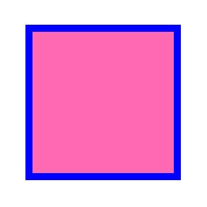
div{
border: 10px solid blue;
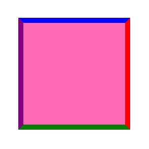
}Of course, if we only need the change of color between borders you can have one property for the border property and another just changing what needs to be changed, use the cascading nature of CSS in your favor.
当然,如果我们只需要更改边框之间的颜色,则可以为border属性设置一个属性,而仅更改需要更改的属性,请使用CSS的级联性质。
div{
    border: 10px solid blue;
    border-color: blue red green purple;
}
We can also just have 2 values in our code, the first value will indicate our top and bottom border, the second value will indicate our sides borders, both left and right.
我们的代码中也可以有2个值,第一个值将指示我们的顶部和底部边框 ,第二个值将指示我们的侧边框,包括左侧和右侧。
div{
    border: 10px solid blue;
    border-color: blue red;
}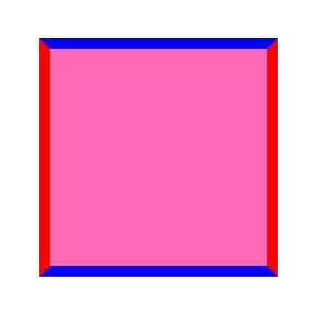
If we have one value it will indicate all four sides, if we have 2 values it will treat them as vertical and horizontal values
如果我们有一个值,它将指示所有四个面,如果我们有2个值,则将它们视为垂直和水平值
Everything we saw with borders can also be applied to margin and padding, if we have one value it will indicate all four sides, if we have 2 values it will treat them as vertical and horizontal values, that’s very useful for buttons padding for example.
我们用边框看到的所有内容也可以应用于边距和填充 ,如果我们有一个值,它将指示所有四个面,如果我们有2个值,则将它们视为垂直和水平值,这对于按钮填充非常有用。
If we type 4 values, it will treat them as the four sides of our element, in this order: top, right, bottom, left. Just as we saw in the border property.
如果我们输入4个值,它将按以下顺序将它们视为元素的四个面:顶部,右侧,底部,左侧。 就像我们在border属性中看到的一样。
.div1{
    padding: 10px; /*same all around*/
}
.div2{
    padding: 10px 60px; /*vertical and horizontal*/
}
.div3{
    padding: 10px 100px 60px 200px; /*top,right,bottom,left*/
}
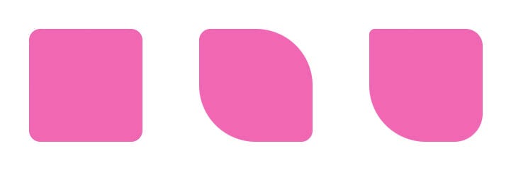
Border-radius works very much in the same way, we can type in one value and all our corners will curve the same way, if we’ll type 2 values then the first value will affect the top-left and bottom-right corners and the second value will affect the remaining two corners.
Border-radius的工作原理非常相似,我们可以输入一个值,并且所有拐角都将以相同的方式弯曲,如果我们输入2个值,则第一个值将影响左上角和右下角,第二个值将影响其余两个角。
Just like the border property itself, if we’ll type in 4 values we’ll see the corners get affected in the following order: top-left, top-right, bottom-right, bottom-left.
就像border属性本身一样,如果我们输入4个值,我们将看到角按照以下顺序受到影响:左上,右上,右下,左下。
.div1{
    border-radius: 20px; /*all corners will curve by 20px*/
}
.div2{
    border-radius: 20px 100px; /*a leaf effect*/
}
.div3{
    border-radius: 10px 30px 50px 100px; /*every corner is unique*/
}
However border-radius can get even more values to create more complex shapes like an egg, see the example below.
但是, 边界半径可以获得更多的值来创建更复杂的形状,例如鸡蛋,请参见下面的示例。
div{
    border-radius: 40% 60% 25% 75% / 35% 75% 25% 60%; /*egg*/
}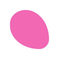
In those 8 values border-radius, the first 4 values are just like before, top-left, top-right, bottom-right, bottom-left. The last 4 values (separated by a “/”) are the same corners in the same order, only now the radius isn’t by “x” amount but it’s from point to point.
在这8个值border-radius中 ,前4个值与之前一样,即左上,右上,右下,左下。 最后4个值(用“ /”分隔)是相同角的顺序相同,只是现在半径不是“ x”的数量,而是点到点的距离。
This way we can create more kinds of shapes since any corner can be manipulated and scaled, not only proportionally, to fit our needs, we gain full control of the curves, not just a simple numeric indicator.
通过这种方式,我们可以创建更多种形状,因为不仅可以按比例操作和缩放任意角,以适应我们的需求,还可以完全控制曲线,而不仅仅是简单的数字指示器。
框阴影和滤镜 (Box-Shadows and Filters)
Everything we saw up until now was just a shorthand, a shortcut for us to write the same rules with less amount of code, but not all multiple values are just shorthand.
到目前为止,我们所看到的一切只是速记,这是我们用更少的代码编写相同规则的捷径,但并非所有多个值都只是速记。
Some properties cannot be used in any other way, this makes this trick of adding multiple values not only clever but necessary, otherwise you’ll end up giving up on good ideas or worse, tweaking your HTML and adding unnecessary elements to compensate on your CSS.
某些属性无法以其他任何方式使用,这使得添加多个值不仅巧妙而且很有必要,但是您最终将放弃好主意或更差的结果,调整HTML并添加不必要的元素来补偿CSS 。
For the sake of clarity I kept all the values in this order: offset-x, offset-y, blur amount, offset-size, color.
为了清楚起见,我按以下顺序保留所有值:offset-x,offset-y,模糊量,offset-size,颜色。
Box-shadows are typed here with 5 values, some of them can be omitted since it’s zero but for the sake of clarity I kept all the values in this order: offset-x, offset-y, blur amount, offset-size, color.
在此处输入框阴影的值有5个,其中一些值可以为零,因此可以省略,但为清楚起见,我将所有值按以下顺序排列:offset-x,offset-y,模糊量,offset-size,颜色。
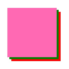
One of the most interesting properties is box-shadow, we can’t add multiple box-shadows because they’ll end up rewrite each other during the cascade (the “C” in CSS, remember?)
最有趣的属性之一是box-shadow ,我们不能添加多个box-shadow,因为它们最终会在级联期间相互重写(记住CSS中的“ C”吗?)
div {
    box-shadow: 12px 12px 0 0 red;
    box-shadow: 8px 8px 0 0 green;
}
The shadows should be separated by a comma.
阴影应以逗号分隔。
In the example above the div will end up with the green box-shadow with no red shadow to be found, but we can use our “trick” of typing multiple values in the same property and none of them will get overwritten, the shadows should be separated by a comma.
在上面的示例中,div最终将带有绿色框阴影 ,没有找到红色阴影,但是我们可以使用“技巧”在同一属性中键入多个值,并且这些值都不会被覆盖,阴影应该用逗号隔开。
div {
    box-shadow: 8px 8px 0 0 green, 12px 12px 0 0 red;
}
The example above will leave us with both shadows, the green with 8px and the red below it with 12px, so we’ll only see it popup in the remaining 4px but we can tweak the blur or the opacity to make sure it’s there, and it is.
上面的示例将为我们留下两个阴影,绿色为8px,下面的红色为12px,因此我们只会在剩余的4px中看到它的弹出窗口,但是我们可以调整模糊或不透明度以确保它在那里,并且它是。
The shadows are typed in the opposite order of which we render them.
阴影以与渲染它们相反的顺序键入。
Notice that the shadows are typed in the opposite order of which we render them, the red gets rendered first and then the green is rendered on top of it, if we flip the order of the shadows, we’ll only see the red one as it will be on top of the smaller green shadow, blocking our view.
请注意,阴影的键入顺序与渲染顺序相反,先渲染红色,然后在其顶部渲染绿色,如果我们反转阴影的顺序,我们只会看到红色它会在较小的绿色阴影之上,从而遮挡我们的视线。
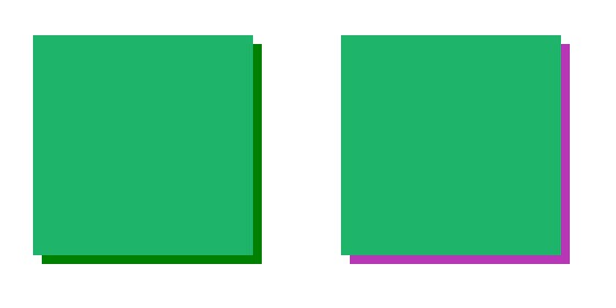
If we want our shadows to be inside our element (inner-shadow, as it’s called in most graphic software), we can use the inset parameter, notice that even though our axis is now flipped, and we’ll need to use negative values to target the same shadow position as before, our typing order stays the same, we don’t need to modify it at all.
如果我们希望阴影位于元素内(内部阴影,在大多数图形软件中称为“内部阴影”),则可以使用inset参数,请注意,即使现在轴已翻转,也需要使用负值为了与以前相同的阴影位置,我们的打字顺序保持不变,我们根本不需要修改它。
div {
    box-shadow: -8px -8px green inset, -12px -12px red inset;
}
Everything said here about box-shadow is also true for text-shadow, they’re rendered in the same way and they can be layered in the same way, just remember the commas and the backwards rendering order.
这里所说的关于盒子阴影的所有内容对于文本 阴影也适用,它们以相同的方式渲染,可以以相同的方式分层,只需要记住逗号和向后的渲染顺序即可。
CSS also offers us another way of rendering shadows on elements, we can use the filter property as another kind of shadow, drop-shadow as seen in the example below.
CSS还为我们提供了另一种在元素上渲染阴影的方法,我们可以将filter属性用作另一种阴影, 即阴影 ,如下面的示例所示。
div {
    filter: drop-shadow(8px 8px 0 green) drop-shadow(8px 8px 0 red);
}
Just like the box-shadow, if we type these shadows in different filter properties, our property will get overwritten, but this time we don’t need the comma, as these values are already contained within their own brackets.
就像盒子阴影一样,如果我们在不同的滤镜属性中键入这些阴影,我们的属性将被覆盖,但是这一次我们不需要逗号,因为这些值已经包含在它们自己的括号中。
These shadows will render in the expected order, as the green shadow will appear first and then the red one, notice that with drop-shadow these will add up on top of each other instead of blocking each other as we saw with box-shadow.
这些阴影将按预期的顺序渲染,因为绿色阴影将首先出现,然后是红色阴影 ,请注意,使用下拉阴影时,这些阴影将叠加在一起,而不是像我们用box-shadow看到的那样相互阻塞。
Notice that with drop-shadow these will add up on top of each other instead of blocking each other as we saw with box-shadow.
请注意,使用阴影阴影时,它们将彼此叠加在一起,而不是像我们在框阴影中看到的那样相互阻塞。
The filter property is much more than drop-shadow, we can use any value of this property to layer our filters on top of each other.
filter属性远不止是drop-shadow ,我们可以使用此属性的任何值将过滤器彼此叠加。
.div1{
    /*this will render a green shadow:*/
    filter: hue-rotate(180deg) drop-shadow(8px 8px 0 green);
}
.div2{
    /*this will render a purple shadow:*/
    filter: drop-shadow(8px 8px 0 green) hue-rotate(180deg);
}
The order of the values will determine how they’re rendered, first typed is the first to be rendered, this way you can layer any filter you want: blur, grayscale, contrast, the sky is the limit.
值的顺序将确定它们的呈现方式,首先输入的是第一个要呈现的,这样您可以对所需的任何滤镜进行分层: 模糊,灰度,对比度 ,天空是极限。
转换与过渡 (Transforms and Transitions)
In my lectures I frequently hear students hitting themselves for “wasting” transform on translate or scale and than they find out they need also to rotate the element and they’re stuck.
在我的讲座中,我经常听到学生因翻译或缩放而“浪费” 转换而自食其果,然后发现他们还需要旋转元素,并且被卡住了。
Good News! You can layer multiple transform values, and yes, you can do it in one CSS property as well.
好消息! 您可以对多个变换值进行分层,是的,您也可以在一个CSS属性中进行操作。
Transform works a lot like box-shadow as it renders backwards, but it also looks like filter as it doesn’t need commas between values as those are contained in their own brackets.
变换的工作原理很像盒子阴影,因为它向后渲染,但是它也像过滤器一样,因为它们之间不需要逗号,因为它们包含在自己的括号中。
div1:hover {
    /*this will render the ROTATE first*/
    transform: translate(0, 100px) rotate(45deg);
}
.div2:hover {
    /*this will render the TRANSLATE first*/
    transform: rotate(45deg) translate(0, 100px);
}
Transform works a lot like box-shadow as it renders backwards.
变换的工作原理很像盒子阴影,因为它向后渲染。
Notice that I specifically used translate with two values and not translateY to show that inside the brackets the syntax didn’t change and all of the regular transform rules still apply.
请注意,我专门使用带有两个值的translate ,而不是translateY来表明括号内的语法没有改变,并且所有常规变换规则仍然适用。
Between the two translate values you still need the comma, this means you don’t need a comma between the transform values themselves, in this case, the translate and rotate values.
在两个转换值之间,您仍然需要逗号,这意味着在转换值本身(在本例中为转换值和旋转值)之间不需要逗号。
Transform-origin can also get more than one value, it can get one per axis, so two in 2d elements, these values can be defined as pixels, percents etc. These values can also be set with keywords like “center”, “top”, left”. By the way, those keywords cannot be added to a z-axis in a 3d element.
转换原点也可以获取多个值,每个轴可以获取一个,因此在2d元素中有两个,这些值可以定义为像素,百分比等。这些值还可以使用诸如“ center ”,“ top ”,“ 左 ”。 顺便说一下,这些关键字不能添加到3d元素的z轴上。
When typing just one value it will indicate both axis, unless this value doesn’t exist on the other axis, like “left” or “top” for obvious reasons. When typing two values the first one will indicate the x axis and the second the y axis, unless those keywords are reserved for a certain axis, in that case there’s no difference between typing “top left” and “left top”.
当仅键入一个值时,它将指示两个轴,除非该值在另一个轴上不存在,例如出于明显的原因,例如“ left ”或“ top ”。 当键入两个值时,第一个将指示x轴,第二个将指示y轴,除非为特定轴保留了这些关键字,否则在这种情况下键入“ top left ”和“ left top ”之间没有区别。
div{
    transform-origin: center center; /*x:50%, y:50%*/
    transform-origin: right bottom; /*right+bottom*/
    transform-origin: 50% 10%; /*x:50%, y:10%*/
    transform-origin: 10%; /*10% on both axis*/
}
CSS transition is probably the most fun example of this, as we can’t get more than one transition at a time unless we use multiple values, and any one transition by itself can also be typed in shorthand values, so it might look confusing at first.
CSS 过渡可能是最有趣的例子,因为除非我们使用多个值,否则一次不能获得一个以上的过渡 ,并且任何一个过渡本身也可以用简写值键入,因此它可能会使您感到困惑第一。
Let’s start with the more simple shorthand typing of this transition property, you can see in the example below we have our transition in 4 different properties.
让我们从此过渡属性的更简单的速记类型开始,您可以在下面的示例中看到我们在4个不同的属性中进行了过渡 。
div{
   transition-property: background-color;
   transition-duration: 300ms;
   transition-timing-function: linear;
   transition-delay: 0s;
}
Of course we can shorten it into only one property called simply transition, similar to what we did with the border property.
当然,我们可以将其缩短为仅一个称为简单过渡的属性,类似于我们对border属性所做的操作。
div{
   transition: background-color 300ms linear 0s;
}
This will produce the exact same transition effect on the div element, only with less code typed, but what if we want more than just one transition?
这将对div元素产生完全相同的过渡效果,只需要输入较少的代码,但是如果我们想要多个过渡,该怎么办?
We can type as many as we want giving we separate them with a comma, just like we saw earlier with box-shadow. Keep in mind that every transition will have its own duration, timing-function and delay.
我们可以输入任意数量的文本,就像我们之前用box-shadow看到的那样,用逗号分隔它们。 请记住,每个过渡都会有自己的持续时间 , 计时功能和延迟 。
div{
   transition: background-color 300ms linear 0s, transform 500ms ease-in-out 300ms;
}
The example above shows a div with 2 transitions, once the background-color is done, the transform starts because of its transition delay, of course we can make them work simultaneously by removing that delay, like in the example code below.
上面的示例显示了一个具有2个过渡的div,一旦完成了背景色 , 转换就会因为其过渡延迟而开始,当然,我们可以通过消除该延迟使它们同时工作,如下面的示例代码所示。
div{
   transition: background-color 300ms linear 0s, transform 300ms ease-in-out 0s;
}
We can also use our transition with “all” instead of the specific property we need to change. It’s a great way to type fast for testing purposes and not to have to stop typing and count your transitions, it is really liberating sometimes.
我们还可以将过渡使用“ all ”,而不是需要更改的特定属性。 这是一种快速输入以进行测试的好方法,而不必停止输入并计算转换次数,这确实是一种解放。
div{   /*transition every property change:*/
   transition: all 300ms linear 0s;
}
There are problems with an “all” transition, it’s not meant for production-ready code.
“ 全部 ” 过渡存在问题,这并不意味着可用于生产的代码。
There are problems with an “all” transition, it’s not meant for production-ready code, and here are those problems:
“ 全部 ” 过渡存在问题,这并不意味着可用于生产的代码,以下是这些问题:
Performance: this “all” transition is telling the browser to expect a change in every CSS property. Every single rule we type (and the browser defaults) are now checking if something has changed or not, and most of them will not change so it’s really a waste of resources.
性能:这种“ 全部 ”的过渡是告诉浏览器每个CSS属性都会发生变化。 我们键入的每条规则(以及浏览器的默认值)现在都在检查某些内容是否已更改,并且大多数规则都不会更改,因此这实际上是在浪费资源。
Artistic: once you use “all” in your transition, you can’t separate them to different timing-functions and different durations (and delays, of course) so I can almost guarantee your transitions will look worse than it could.
艺术性:一旦在过渡中使用“ 全部 ”,就无法将它们分为不同的计时功能和不同的持续时间 (当然还有延迟 ),因此我几乎可以保证您的过渡看起来会比实际情况更糟。
Teamwork: when we use “all” on an element every property that changes will display an animation between those states, even properties we don’t need them to, even properties we (or our team) change in JavaScript later on, are we sure that won’t happen in this project? even a year from now when the team might refresh it.
团队合作:当我们在元素上使用“ all ”时,每个更改的属性都会在这些状态之间显示动画,甚至是我们不需要它们的属性,甚至我们(或我们的团队)以后在JavaScript中更改的属性,我们都可以确定在这个项目中不会发生? 甚至从现在开始的一年后,团队可能都会对其进行刷新。
what I usually end up doing is just typing “all” while I’m typing fast and productively, when the transition is done I replace it with the properties I actually change to separate them and giving the animation more detail with different durations, delays and timing-functions.
我通常最终要做的是在快速高效地键入内容时键入“ all ”,完成转换后,我将其替换为我实际更改的属性以分隔它们,并提供了具有不同持续时间 , 延迟和计时功能 。
What I usually end up doing is just typing “all” while I’m typing fast and productively, when the transition is done I replace it with the properties I actually change.
我通常最终要做的只是在快速高效地键入内容时键入“ all ”,完成转换后,我将其替换为实际更改的属性。
摘要 (Summary)
We saw how we can type multiple values into a single CSS property, some of them were shorthand in the name of productivity and some were really the only way to make it happen.
我们看到了如何在单个CSS属性中键入多个值,其中一些是生产力的简称,而某些实际上是实现它的唯一方法。
Multiple box-shadows and transitions are especially useful, in my opinion, as they really are open-ended and you’re only limited by your own imagination. Some people use multiple box-shadows to enable a completely new design trend like neumorphism, for example.
在我看来,多个框阴影和过渡效果特别有用,因为它们确实是开放式的,并且您仅受自己的想象力限制。 有些人使用多个箱的阴影 ,使一个全新的设计潮流一样neumorphism ,例如。

There are a lot more examples of multiple values in CSS and I couldn’t cover all of them. If you’re interested in learning more I advise you to start with the background property as it’s grown to cover gradients, which is also quite open ended and fascinating.
CSS中有更多有关多个值的示例,我无法涵盖所有示例。 如果您有兴趣了解更多信息,我建议您从背景属性开始,因为它已逐渐覆盖渐变,它也是开放式且引人入胜的。
I hope you enjoyed reading this article, I’ll appreciate claps and sharing on social media, you can find me at Twitter, let me know what you thought of it.
希望您喜欢阅读本文,同时也感谢您在社交媒体上的掌声和分享,您可以在Twitter上找到我,让我知道您的想法。
You also might enjoy to check out my codePen page and you’re welcome to follow me on my quite new Dribbble acount.
翻译自: https://uxdesign.cc/how-to-add-multiple-values-in-a-single-css-property-4e31e37f7f34
css动画属性控制单个边框


 扫一扫
扫一扫
 2623
2623

 被折叠的 条评论
为什么被折叠?
被折叠的 条评论
为什么被折叠?
 到【灌水乐园】发言


