


熊猫图表 连接mysql
Perhaps you are a data journalist putting a new story together, or a data scientist preparing a paper or presentation. You’ve got a nice set of charts that are looking good but a bit of tweaking would be helpful. Maybe you want to give them all titles. Maybe some would be improved with a grid, or the ticks are in the wrong places or too small to easily read.
也许您是将新故事放在一起的数据记者,还是准备论文或演示文稿的数据科学家。 您有一组不错的图表,看起来不错,但是进行一些调整将很有帮助。 也许您想给他们所有的头衔。 也许可以使用网格来改进某些地方,或者刻度线放置在错误的位置或太小而难以阅读。
You know how to produce line plots, bar charts, scatter diagrams, and so on but are not an expert in all of the ins and outs of the Pandas plot function (if not see the link below).
您知道如何生成折线图,条形图,散点图等,但不是熊猫图函数的所有来龙去脉的专家(如果看不到下面的链接)。
You don’t have to stick with what you are given. There are quite a lot of parameters that allow you to change various aspects of your diagrams. You can change labels, add grids, change colors and so on.
您不必坚持自己所得到的。 有很多参数可让您更改图表的各个方面。 您可以更改标签,添加网格,更改颜色等。
Using the underlying matplotlib library you can change just about every aspect of what your plots look like and it can get complicated. However, we are going to look at some of the easier things we can do just with Pandas.
使用底层的matplotlib库,您几乎可以更改绘图外观的各个方面,并且可能会变得很复杂。 但是,我们将研究使用熊猫可以做的一些简单的事情。
Before we start you’ll need to import the appropriate libraries and get some data.
在开始之前,您需要导入适当的库并获取一些数据。
Let’s start by importing all of the libraries that you’ll need to run the examples
让我们首先导入运行示例所需的所有库
# The first line is only required if you are using a Jupyter Notebook
%matplotlib inline import numpy as npimport pandas as pdimport matplotlib.pyplot as plt
This is all pretty standard stuff which should be familiar from my previous article. One thing to note though is the first line — if, like me, you are using a Jupyter Notebook then you may need to include this. If you are using a normal Python program, or the Python console, then you should not include it.
这些都是非常标准的东西,应该从我之前的文章中熟悉。 但是要注意的是第一行-如果像我一样,您正在使用Jupyter笔记本,则可能需要包括这一行。 如果您使用的是普通的Python程序,或Python的控制台,那么你不应该包括它。
获取一些数据 (Getting some data)
You need some data to work with, so we’ll use the same data set as previously: weather data from London, UK, for 2008.
您需要处理一些数据,因此我们将使用与以前相同的数据集:来自英国伦敦的2008年天气数据。
Load the data like this:
像这样加载数据:
weather = pd.read_csv(‘https://raw.githubusercontent.com/alanjones2/dataviz/master/london2018.csv')print(weather[:2])Year Month Tmax Tmin Rain Sun
 0 2018 1 9.7 3.8 58.0 46.5
 1 2018 2 6.7 0.6 29.0 92.0
The print statement prints out the first couple of lines of the table, representing January and February. You can see that there are four pieces of data (apart from the year and month), Tmax is the maximum temperature for that month, Tmin is the minimum temperature, Rain is the rainfall in millimeters and Sun is the total hours of sunshine for the month.
打印语句打印出表的前几行,分别代表一月和二月。 您可以看到有四个数据(除了年份和月份之外), Tmax是该月的最高温度, Tmin是最低温度, Rain是以毫米为单位的降雨量, Sun是该月份的总日照时间。月。
So let’s just draw a simple plot of how the maximum temperature changed over the year
因此,让我们简单绘制一下一年中最高温度的变化情况
weather.plot(x=’Month’, y=’Tmax’)plt.show()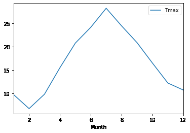
This is the default chart and it is quite acceptable. But we can change a few things to make it more so.
这是默认图表,完全可以接受。 但是我们可以更改一些内容以使其更加完善。
1.更改大小和颜色 (1. Change the size and color)
The first thing that you might want to do is change the size. To do this we add the figsize parameter and give it the sizes of x, and y (in inches). The values are given a a tuple, as below.
您可能要做的第一件事是更改大小。 为此,我们添加figsize参数,并为其指定x和y的大小(以英寸为单位)。 值以一个元组给出,如下所示。
To change the color we set the color parameter. The easiest way to do this is with a string that represents a valid web color such as ‘Red’, ‘Black’ or ‘Teal’. (Note: you can find a list of web colors in Wikipedia.)
要更改颜色,我们设置了color参数。 最简单的方法是使用代表有效网页颜色的字符串,例如“红色”,“黑色”或“蓝绿色”。 (注意:您可以在Wikipedia中找到网页颜色的列表。)
weather.plot(x='Month', y='Tmax', figsize=(8,5), color='Red')plt.show()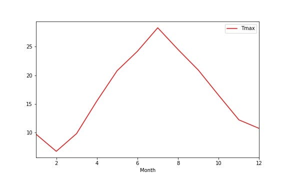
2.设置标题 (2. Setting a title)
It’s very likely that for and article, paper or presentation, you will want to set a title for your chart. As you’ve probably gathered, much of this is knowing what the correct parameters are and setting them properly. The parameter to set a title is title. Of course! Here’s the code:
对于文章,论文或演示文稿,您很有可能要为图表设置标题。 正如您可能已经收集到的那样,其中大部分是知道什么是正确的参数并正确设置它们。 设置标题的参数是title 。 当然! 这是代码:
weather.plot(x=’Month’, y=’Tmax’, title=”Maximum temperatures”)plt.show()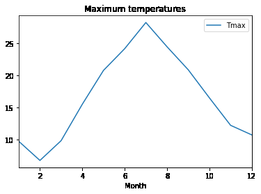
3.显示网格 (3. Display a grid)
While the default charts are fine, sometimes you want your audience to more easily see what certain values in your chart. Drawing gridlines on your plot can help.
尽管默认图表很好,但是有时您希望您的听众更轻松地查看图表中的某些值。 在绘图上绘制网格线会有所帮助。
To draw the grid, simply set the grid parameter to True. Pandas defaults to False.
要绘制网格,只需将grid参数设置为True即可 。 熊猫默认为False 。
weather.plot(x=’Month’, y=’Tmax’, grid=True)plt.show()
4.更改图例 (4. Changing the legend)
The legend is given the name of the column that represents the y axis. If this is not a acceptably descriptive name, you can change it. Or, indeed, you can eliminate it altogether!
为图例指定了代表y轴的列的名称。 如果这不是可接受的描述性名称,则可以更改它。 或者,实际上,您可以完全消除它!
If we want to remove it we set the parameter legend to False. If we want to change the label we incorporate the label parameter and set it to the string that we want displayed.
如果要删除它,请将参数图例设置为False 。 如果要更改标签,我们将合并label参数并将其设置为我们要显示的字符串。
weather.plot(x=’Month’, y=’Tmax’, legend=False)plt.show()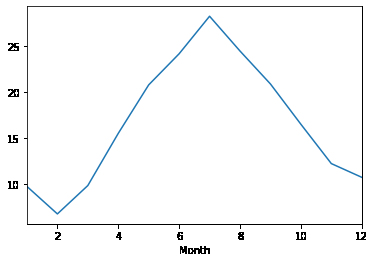
weather.plot(x=’Month’, y=’Tmax’, label=’Max Temp’)plt.show()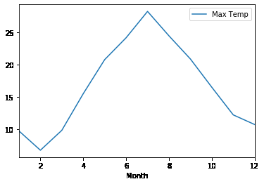
5.自定义刻度线 (5. Customizing the ticks)
Ticks are the divisions on the x and y axes. You can see that on our charts they are labelled from 10 to 25 on the y axis and 2 to 12 on the y axis. Given that the bottom set are supposed to represent the months, it would be better if they went from 1 to 12. We can set the tick labels with tuples. If we want to display all twelve months we would set the parameter xticks to (1,2,3,4,5,6,7,8,9,10,11,12). You can do a similar thing with the yticks parameter. Take a look at this code:
刻度是x和y轴上的分度。 你可以看到,在我们的图表他们从10标到25 y轴和2至12 y轴上。 假定底数应该代表月份,那么最好将它们从1改为12。我们可以使用元组设置刻度标签。 如果要显示所有十二个月,则将参数xticks设置为(1,2,3,4,5,6,7,8,9,10,11,12)。 您可以使用yticks参数执行类似的操作 。 看一下这段代码:
weather.plot(x=’Month’, y=’Tmax’, xticks=range(1,13), yticks=(0,10,20,30))plt.show()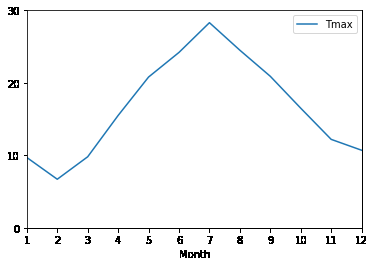
As you can see I’ve set both sets of ticks explicitly. The y ticks now start at 0 and go up in tens to 30, and the x ticks show every month. But I’ve been a bit sneaky here, rather than use the tuple I showed you, above, I’ve used the Python range function to generate a list from 1 to 12 (less typing!).
如您所见,我已经明确设置了两组刻度。 y刻度现在从0开始,以数十为单位上升到30, x刻度每个月显示一次。 但是我在这里有点偷偷摸摸,而不是使用上面显示的元组,而是使用Python range函数生成一个从1到12的列表(键入更少!)。
If you wanted to remove the ticks altogether, it would be a simple matter to set either parameter to an empty tuple, e.g. xticks=().
如果要完全删除刻度线,则将一个参数设置为空元组是简单的事情,例如xticks =()。
weather.plot(x=’Month’, y=’Tmax’, xticks=())plt.show()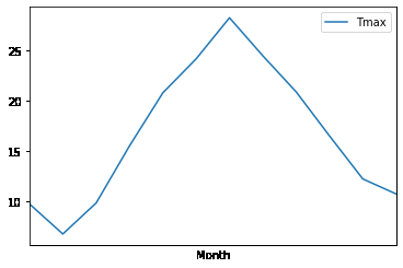
I you want to emphasize the ticks even more you can change the font size. In the example below, you can see how.
我想进一步强调刻度线,您可以更改字体大小。 在下面的示例中,您可以看到操作方法。
plot = weather.plot(x=’Month’, y=’Tmax’, xticks=range(1,13), fontsize=18)plt.show()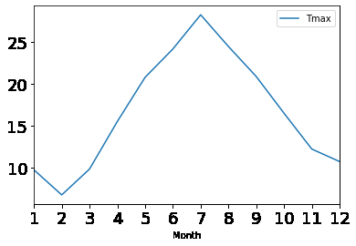
可能会变得凌乱 (It could get messy)
I mean your code could get messy. What if you wanted to set the ticks, a title, labels, a grid and so on. First, the line of code to do the plot would be very long and, second, if you have several plots to make you find yourself repeating it.
我的意思是您的代码可能会变得凌乱。 如果您想设置刻度,标题,标签,网格等,该怎么办。 首先,进行绘图的代码行会很长;其次,如果您要绘制多个绘图,您会发现自己在重复它。
Here’s a solution.
这是一个解决方案。
Assume that you want all of you plots to look the same. What you do is define a dictionary of all of the parameters that you want to apply to all of your charts, like this:
假设您希望所有图看起来都一样。 您要做的是定义一个字典,其中包含要应用于所有图表的所有参数,如下所示:
plot_kwargs={‘xticks’:range(1,13),
 ‘yticks’:(0,10,20,30),
 ‘grid’:True,
 ‘fontsize’:12}
then instead of typing in all of the parameters explicitly, you can take advantage of Python’s ** operator which will expand a dictionary into a list of keyword arguments. I’ve called the variable plot_kwargs as kwargs is the conventional name given to a variable containing keyword parameters (which is what these are).
然后您可以利用Python的**运算符,而不是显式地键入所有参数,它将字典扩展为关键字参数列表。 我将变量plot_kwargs称为kwargs是给包含关键字参数(即它们)的变量的常规名称。
Use them like this:
像这样使用它们:
weather.plot(y=’Tmax’,x=’Month’, **plot_kwargs)plt.show()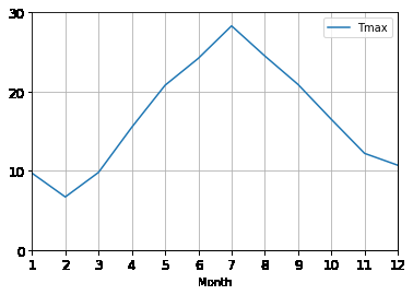
Now, you can use the same dictionary for other plots, too, for example:
现在,您也可以将相同的词典用于其他绘图,例如:
weather.plot.scatter(y=’Tmax’,x=’Month’, legend=True, label=”Min Temperature”, **plot_kwargs)plt.show()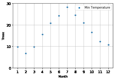
Here, I’ve used the plot_kwargs parameter to set the default parameters but explicitly set the ones for the individual plot.
在这里,我使用plot_kwargs参数设置默认参数,但为各个图显式设置参数。
而已 (That’s it)
Well, no. It isn’t really. There is a lot you can do to customize your plots more both with Pandas and matplotlib. You can also make changes when you save the plots to a file. There is just far too much to cover in a single article.
好吧,不。 不是真的 通过Pandas和matplotlib,您可以做很多事情来自定义图。 将图保存到文件中时,也可以进行更改。 一篇文章中介绍的内容太多了。
Thanks, for getting to the end of the article, I hope you have found it useful.
谢谢,到本文的结尾,希望您发现它有用。
A quick postscript about the format. All of the code is very short but some lines are little long and wrap around — so I’ve put a blank line after each line so you can see what is supposed to be on one line. The only exception in the dictionary assignment towards the end of the article, which is fine the way it looks.
关于格式的快速后记。 所有的代码都很短,但是有些行却很长并且环绕-所以我在每一行之后都放了一个空白行,这样您就可以看到应该在一行上的内容。 到文章结尾的词典分配中唯一的例外,这看起来很好。
翻译自: https://towardsdatascience.com/5-easy-ways-of-customizing-pandas-plots-and-charts-7aefa73ff18b
熊猫图表 连接mysql


 1611
1611

 被折叠的 条评论
为什么被折叠?
被折叠的 条评论
为什么被折叠?
 到【灌水乐园】发言


