


css边框
CSS border property is used to set the border of an HTML element.
CSS border属性用于设置HTML元素的边框。
The border property is shorthand for three sub-properties that define the style, color, and width of a border.
border属性是三个子属性的简写,它们定义了边框的样式,颜色和宽度。
Example:
例:
border: 1px solid red;Syntax:
句法:
border: border-width border-style color;边框宽度👻 (border-width 👻)
Sets the thickness of the border. Defaults to medium if absent.
设置边框的粗细。 如果不存在,默认为中。
border-width: thin | medium | thick;OR
要么
border-width: border-top-width border-right-width border-bottom-width border-right-width;
border-width: 0 4px 8px 12px;边框样式🙅♀️ (border-style 🙅♀️)
Sets the style of the border. Defaults to none if absent.
设置边框的样式。 如果不存在,则默认为无。
border-style: none | hidden | dotted | dashed | solid | double | groove | ridge | inset | outset颜色🎨 (color 🎨)
Sets the color of the border. Defaults to currentcolor if absent.
设置边框的颜色。 如果不存在,则默认为currentcolor。
border-color: red;
border-color: border-top-color border-right-color border-bottom-color border-right-color
border-color: red yellow green pink;
CSS个人边框 (CSS Individual Borders)
The border sub-properties and property can also be applied to an individual side of a web element.
边框子属性和属性也可以应用于Web元素的单独一侧。
Syntax:
句法:
border-left: green;
border-top: pink;
border-right: blue;
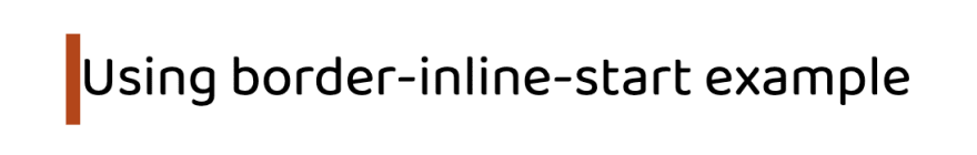
border-bottom: skyblue;边界内联✣ (border-inline ✣)
This maps to a physical border style depending on the element’s writing mode, directionality, and text orientation
这将根据元素的书写模式,方向性和文本方向映射为物理边框样式
border-inline-start: 8px solid red;Output:
输出:
border-inline-end: 8px solid red;Output:
输出:

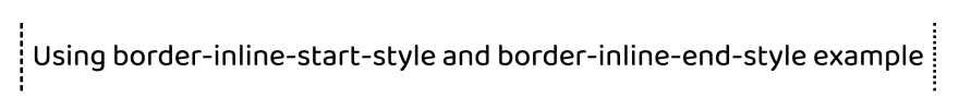
边框内联开始样式/边框内联结束样式✣ (border-inline-start-style/border-inline-end-style ✣)
The border-inline-start-style CSS property defines the style of the logical inline start/end border of an element, which maps to a physical border style depending on the element's writing mode, directionality, and text orientation.
border-inline-start-style CSS属性定义元素的逻辑内联开始/结束边框的样式,该样式根据元素的书写方式,方向性和文本方向映射为物理边框样式。
Syntax:
句法:
border-inline-start-style: dotted | dashed | groove;Example:
例:
border-inline-start-style: dashed;
writing-mode: horizontal-tb;
border-inline-end-style: dotted;
Output:
输出:
边界块▀ (border-block ▀)
The border-block-end CSS property is a shorthand property for setting the individual logical block-end border property values in a single place in the style sheet.
border-block-end CSS属性是一种简写属性,用于在样式表的单个位置设置各个逻辑块末端border属性值。
Syntax:
句法:
border-block-end: border-block-end-width border-block-end-style border-block-end-color;Example:
例:
border-block-start: 1px solid red;Output:
输出:

border-block-end: 1px solid red;Output:
输出:

边框图像🏙 (border-image 🏙)
The border-image CSS property draws an image around a given element. It replaces the element’s regular border.
border-image CSS属性在给定元素周围绘制图像。 它替换了元素的常规边框。
Syntax:
句法:
border-image: source || slice / width / outset || repeat;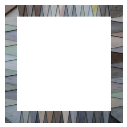
- border-image-outset 边框图像开始
- border-image-repeat边框图像重复
- border-image-slice边界图像切片
- border-image-source边框图像源
- border-image-width边框图像宽度
1️。 边框图像开始 (1️. border-image-outset)
The border-image-outset CSS property sets the distance by which an element's border image is set out from its border box.
border-image-outset CSS属性设置元素从边框框border-image-outset显示border-image-outset的距离。
The distance of the border image from the element’s outside edge. Up to four values may be specified.
边框图像与元素外部边缘的距离。 最多可以指定四个值。
The parts of the border image that are rendered outside the element’s border box with border-image-outset do not trigger overflow scrollbars and don't capture mouse events.
用border-image-outset呈现在元素边界框外部的边界图像部分不会触发溢出滚动条,也不会捕获鼠标事件。
// this will be inside
border-image-outset: 0;// this will be outside of div 30px
border-image-outset: 30px;
The border-image-outset property may be specified as one, two, three, or four values.
border-image-outset属性可以指定为一个,两个,三个或四个值。
Each value is a length/number. Negative values are invalid and will cause the border-image-outset declaration to be ignored.
每个值都是一个长度/数字。 负值无效,并且将导致border-image-outset声明被忽略。
border-image-outset: 1px 3px 4px 10px;2️。 边框图像重复 (2️. border-image-repeat)
The border-image-repeat CSS property defines how the edge regions of a source image are adjusted to fit the dimensions of an element’s border image.
border-image-repeat CSS属性定义了如何调整源图像的边缘区域以适合元素的边界图像的尺寸。
border-image-repeat: stretch | round | repeat | space;/* vertical | horizontal */
border-image-repeat: round stretch;
stretch
stretch
The source image’s edge regions are stretched to fill the gap between each border.
源图像的边缘区域被拉伸以填充每个边框之间的间隙。
repeat
repeat
The source image’s edge regions are tiled (repeated) to fill the gap between each border. Tiles may be clipped to achieve the proper fit.
源图像的边缘区域被平铺(重复)以填充每个边框之间的间隙。 可能会修剪瓷砖以达到适当的贴合度。
round
round
The source image’s edge regions are tiled (repeated) to fill the gap between each border. Tiles may be stretched to achieve the proper fit.
源图像的边缘区域被平铺(重复)以填充每个边框之间的间隙。 可以拉伸瓷砖以达到适当的配合。
space
space
The source image’s edge regions are tiled (repeated) to fill the gap between each border. Extra space will be distributed in between tiles to achieve the proper fit.
源图像的边缘区域被平铺(重复)以填充每个边框之间的间隙。 瓷砖之间会分配额外的空间,以实现适当的配合。
3️ 边界图像切片 (3️. border-image-slice)
The border-image-slice CSS property divides the image specified by border-image-source into regions. These regions form the components of an element’s border image.
border-image-slice CSS属性将border-image-source指定的图像划分为多个区域。 这些区域构成元素边框图像的组成部分。
/* All sides */
border-image-slice: 30;/* vertical | horizontal */
border-image-slice: 10% 30%;/* top | right | bottom | left */
border-image-slice: 7 12 14 5;
The slicing process creates nine regions in total: four corners, four edges, and a middle region. Four slice lines, set a given distance from their respective sides, control the size of the regions.
切片过程总共创建了九个区域:四个角,四个边缘和一个中间区域。 四个切片线,从其各自的侧面设置了给定的距离,以控制区域的大小。
- Zones 1–4 are corner regions. Each one is used a single time to form the corners of the final border image. 区域1-4是拐角区域。 每个图像都使用一次以形成最终边框图像的角。
Zones 5–8 are edge regions. These are repeated, scaled, or otherwise modified in the final border image to match the dimensions of the element.
5-8区是边缘区域。 在最终的边框图像中对这些元素进行重复,缩放或其他修改,以匹配元素的尺寸。
Zone 9 is the middle region. It is discarded by default, but is used like a background image if the keyword
fillis set.9区是中间区域。 默认情况下将其丢弃,但如果设置了关键字
fill则它将用作背景图像。
The border-image-repeat, border-image-width, and border-image-outset properties determine how these regions are used to form the final border image.
border-image-repeat,border-image-width和border-image-outset属性确定如何使用这些区域形成最终的边框图像。
4️。 边框图像源 (4️. border-image-source)
The border-image-source CSS property sets the source image used to create an element’s border image.
border-image-source CSS属性设置用于创建元素的边框图像的源图像。
border-image-source: url('/media/examples/border-diamonds.png');border-image-source: linear-gradient(to top, red, yellow);border-image-source: repeating-linear-gradient(45deg, transparent, #4d9f0c 20px);5️。 边框图像宽度 (5️. border-image-width)
The border-image-width CSS property sets the width of an element’s border image.
border-image-width CSS属性设置元素的边框图像的宽度。
/* top | right | bottom | left */
border-image-width: 5% 2em 10% auto;
Created few border & border-image example, Checkout the link in @codepen:
创建了一些边框和边框图像示例,在@codepen中签出链接:
参考🧐(Reference 🧐)
🌟 Twitter | 👩🏻💻 Suprabha.me | 🌟 Instagram
🌟微博| 👩🏻💻 Suprabha.me | 🌟的Instagram
翻译自: https://medium.com/@suprabhasupi/css-border-40609484360f
css边框


 146
146


 被折叠的 条评论
为什么被折叠?
被折叠的 条评论
为什么被折叠?
 到【灌水乐园】发言


