


Machine learning and tools for data science are more available than ever. But it’s just as important to learn how to explore data effectively and find out its weaknesses before you feed the data into your modelling tools, along with learning the tools themselves.
机器学习和数据科学工具比以往任何时候都可用。 但是,在将数据输入建模工具之前,还应学习如何有效地探索数据并找出其弱点,这同样重要。
You’d be shocked how many people, without looking at the details, leap into building models. That’s one error. You need to understand how the data was gathered and where it has holes in order to construct successful models. This is equally relevant when you work in an Excel spreadsheet with a few hundred rows of data or a terabyte-sized data set for the classification of images.
有这么多人不看细节而跳入构建模型,您会感到震惊。 那是一个错误。 您需要了解如何收集数据以及在何处存在漏洞才能构建成功的模型。 当您使用具有几百行数据或TB级数据集的Excel电子表格进行图像分类时,这同样重要。
Since data is collected in the real world and the real world is weird, any real-world data set would be full of weirdness. This is certainly true of all the details that we see published every day during the latest epidemic of COVID-19. It’s hard to gather and correct statistics from around the world on a regular basis, so the figures you see published reflect the same gaps and problems you might expect to see any other real-world data collection.
由于数据是在现实世界中收集的,并且现实世界很怪异,因此任何现实世界的数据集都会充满怪异。 在我们最近一次流行的COVID-19期间每天看到的所有细节中,确实如此。 很难定期收集和更正来自世界各地的统计信息,因此您看到的数据反映了您可能希望看到的任何其他实际数据收集中存在的空白和问题。
Let‘s look at some of the COVID data being published and see how we’d go wrong if we were trying to create a model on top of it without first looking at it.
让我们看一下一些已发布的COVID数据,看看如果我们试图在不首先查看的情况下在其之上创建模型的话,会出错。
Lesson 1: How the data has been obtained will produce clear data trends:
第1课:如何获取数据将产生清晰的数据趋势:
The international COVID reporting requirement is for each country to record on a regular basis the number of deaths occurring in hospitals. This allows analysis of how the disease affects various countries.
国际COVID报告要求是每个国家/地区定期记录医院发生的死亡人数。 这可以分析该疾病如何影响各个国家。
Let’s take a look at the daily numbers the United Kingdom reports:
让我们看看英国的每日报道:
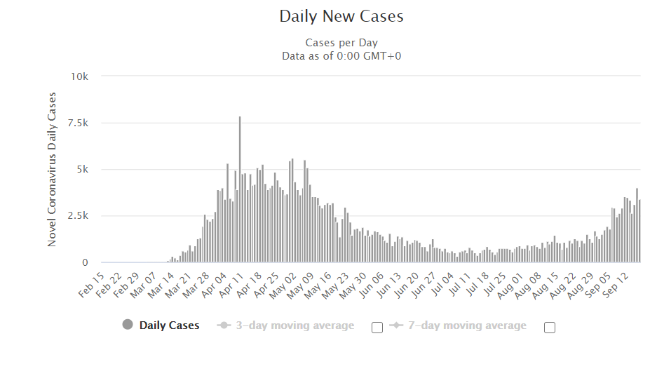
Note that the recorded deaths follow a perfect weekly pattern. They drop dramatically each Sunday and Monday at the beginning of each week. This is a truly fascinating result in a model that could have major consequences. Perhaps there is something different about staffing, equipment or care at certain days leading to different results?
请注意,记录的死亡人数遵循完美的每周模式。 它们在每个星期初的每个星期日和星期一急剧下降。 在可能产生重大后果的模型中,这确实是一个令人着迷的结果。 也许某些天的人员配备,设备或护理有所不同,从而导致不同的结果?
The issue is, this weekly loop is fake. It’s an artefact of how information is gathered and recorded.
问题是,这个每周循环是假的。 这是有关如何收集和记录信息的人工制品。
Once a day each medical facility reports to a central authority their total number of deaths. The UK‘s recorded total increase in deaths is the sum of those numbers minus the sum of yesterday’s.
每个医疗机构每天一次向中央机构报告死亡总数。 英国记录的死亡总数增加数是这些数字的总和减去昨天的数字。
This causes two side effects that are important:
这会导致两个非常重要的副作用:
The sum can (and typically will) be incomplete for a single day. When any medical facility fails to record a number of time or under-reports, those casualties will be absent from the overall total of the UK and will ultimately be lumped into the total of a future day when that facility catches up.
这笔款项在一天之内(可能通常)是不完整的。 当任何医疗机构未能记录时间或漏报时,这些人员伤亡将不在英国的整体中,最终将被汇总到该机构追赶的未来一天的总数中。
For each facility reporting and the UK-wide amounts being reported to the media, there is a 1-day lag.
对于每个设施报告以及向媒体报告的英国范围内的金额,都有1天的滞后时间。
For the weekly period, the answer is clear. On weekends, hospitals do not all have full staffing, so they do not have the bandwidth to disclose their numbers perfectly in time. A reduction over the weekend and then a subsequent increase after the weekend is triggered by slow reporting. And due to the one-day reporting lag, that appears in the data as a drop on Sunday and Monday instead of Saturday and Sunday.
对于每周,答案很明确。 在周末,医院并没有全部配备足够的人员,因此它们没有足够的带宽及时披露其人数。 缓慢的报告触发了周末减少,然后周末增加。 并且由于一日报告滞后,因此在数据中显示为星期日和星期一(而不是星期六和星期日)的下降。
With data sets, this is a common problem: how they are obtained may produce patterns in the data that are much greater than the data itself. For instance, several publicly accessible image data sets are generated by graders working on their doctorates. But if you grab a random data set of photos of cars off the web, you’ll probably get plenty of pictures of small cars in campus parking lots and not many pictures of big trucks. Yet pickup trucks outsell cars almost 3-to-1 in the US!
对于数据集,这是一个普遍的问题:如何获取数据集可能会在数据中产生比数据本身大得多的模式。 例如,由从事博士学位工作的分级人员生成了几个可公开访问的图像数据集。 但是,如果您从网络上随机获取汽车照片数据集,则可能会在校园停车场中获得大量小型车的照片,而大型卡车的照片却不多。 然而,皮卡车在美国的汽车销量几乎是3比1!

第2课:调查异常值: (Lesson 2: Investigate the Outliers:)
Almost always, data sets can have outlier values (points that are substantially beyond the range of the rest of the data), but you don’t want to include them in your review. This is because outliers can be the product of a simple typo or the consequence of an exceptional case. To understand whether you should include or remove these outliers in your study, it is important to look at outliers.
数据集几乎总是可以具有离群值(点大大超出了其余数据的范围),但是您不想将它们包括在评论中。 这是因为异常值可能是简单错字的产物,也可能是特殊情况的结果。 要了解您是否应该在研究中包括或删除这些离群值,重要的是要查看离群值。
Here is the rate reported by China for new COVID cases, as reported by worldometers.info:
根据worldometers.info的报告,这是中国报告的新COVID病例的发病率:
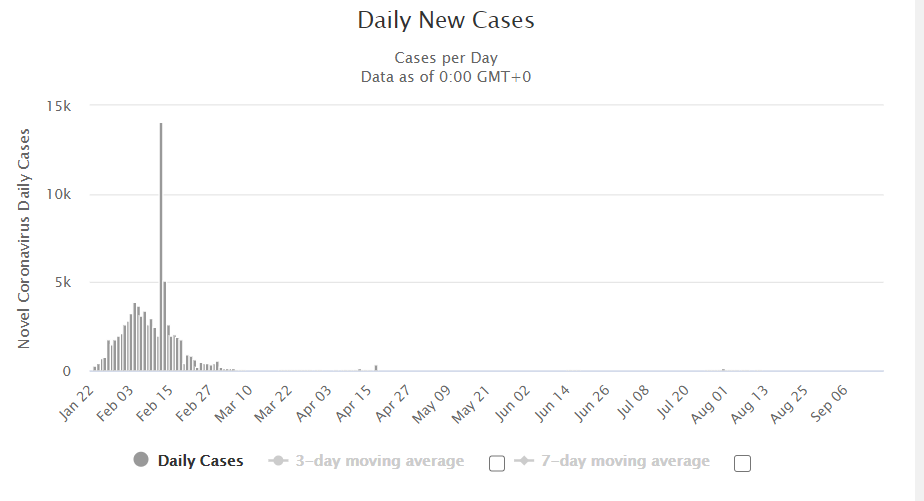
On February 12, there is a major outlier where they record 14,108 new cases of the disease. This daily rise is many times higher than the number of recorded cases on every other day.
在2月12日,有一个主要异常值,在那里他们记录了14108例新疾病。 每天的上升量是每隔一天记录的病例数的许多倍。
If you blindly constructed a model from this data, everything will be thrown away by that outlier. By comparison, if you believe that the outlier is a true case, you might be fooled into believing there is something unusual about February 12th that caused a rise in infections.
如果您从这些数据中盲目构建模型,那么所有异常值都将被丢弃。 相比之下,如果您认为离群值是真实的情况,则您可能会愚蠢地认为2月12日左右有某种异常情况导致感染上升。
The real explanation for the leap is that on 12th February China updated its reporting methodology. Before that date, China was merely documenting disease cases reported by a virus test based on RNA. But physicians were also screening patients for COVID using chest x-rays to check for tell-tale lung signs because of research bottlenecks. China announced back-reporting cases on February 12 that had already been confirmed by X-ray, causing a big jump in recorded cases. Not all of those events occurred on February 12 — that’s only when they were added to the count.
真正实现这一飞跃的原因是,中国于2月12日更新了报告方法。 在此之前,中国只是记录通过基于RNA的病毒测试报告的疾病病例。 但是由于研究的瓶颈,医生还使用胸部X光检查来检查患者的COVID,以检查肺部症状。 中国于2月12日宣布了X射线已经确认的回报病例,导致已记录病例大幅增加。 并非所有这些事件都在2月12日发生-只是在将它们添加到计数中时。
If you look for it, the reason is simple enough to discover. You can decide, armed with that knowledge, how to handle this outlier. But you would never know if you hadn’t looked closely at the data before modelling began.
如果您寻找它,原因很容易发现。 有了这些知识,您就可以决定如何处理该异常值。 但是您永远不会知道在建模开始之前是否没有仔细查看过数据。
第3课:标准化地理数据 (Lesson 3: Standardize Geographical Data)
One simple tip that people forget all the time is that when you normalise it by population or some other representative factor, data collected by geographic area almost always makes more sense. After all, in a village of 500 inhabitants, 300 cases of illness are a far bigger issue than in a city of 8 million.
人们一直忘记的一个简单提示是,当您通过人口或其他代表性因素对其进行归一化时,按地理区域收集的数据几乎总是更有意义。 毕竟,在一个有500个居民的村庄中,与800万人口的城市相比,300例疾病是一个更大的问题。
For instance, here is a map shaded by the number of cases of COVID in each London Borough as of 8 April 2020, using the statistics given by the government:
例如,以下地图使用政府提供的统计数据,以截至2020年4月8日每个伦敦自治市镇的COVID病例数为阴影:
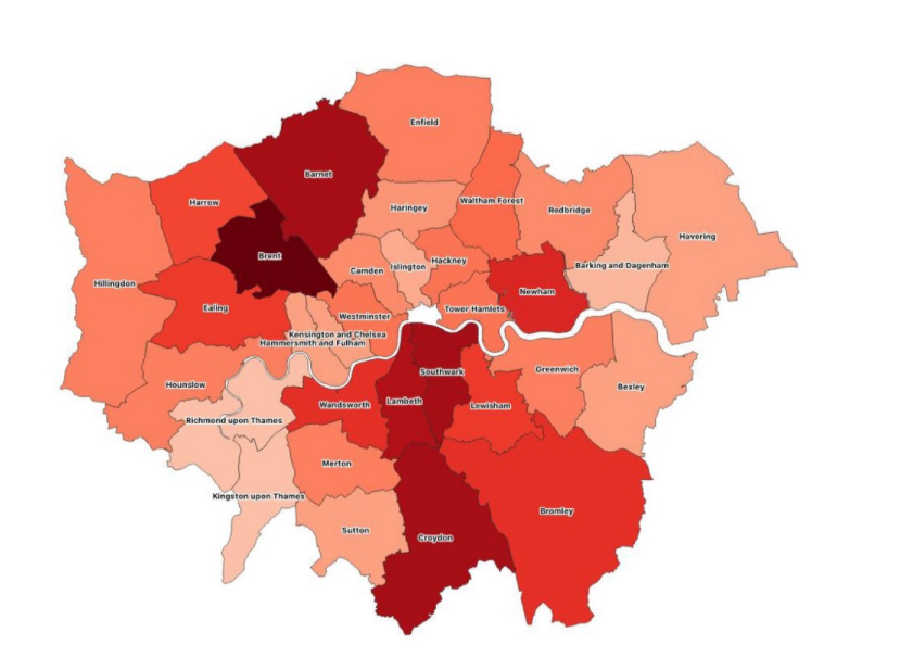
The question of separate boroughs having distinct populations. If you use just counts to paint the areas on a globe, you almost always end up recreating a globe of the population.
具有不同人口的自治市镇的问题。 如果仅使用计数来绘制地球上的区域,则几乎总是最终会重新创建一个人口地球。
Croydon at the very south end of the town is the same colour as Southwark in the middle of the town on this map. Yet Croydon has 20 per cent more residents and occupies a wider area than Southwark. It does not make sense to suggest that both areas are similarly affected if both areas have the same number of infections, as the incidence of infection in Croydon will be lower.
在地图的最南端的Croydon与该镇中间的Southwark具有相同的颜色。 但是,克罗伊登(Croydon)的居民比Southwark多20%,而且居住面积更大。 如果两个地区的感染次数相同,则认为两个地区都受到类似的影响是没有道理的,因为克罗伊登州的感染率会更低。
The solution is to standardise the map by a different element, including population. To get a rate of incidence, simply divide the number of cases in each borough by that borough‘s population. Using the incidence rate, you can get a more comprehensible map which estimates which areas are most affected:
解决方案是通过包括人口在内的其他元素来标准化地图。 要获得发病率,只需将每个行政区的病例数除以该行政区的人口即可。 使用发病率,您可以获得更易理解的地图,该地图估计受影响最大的区域:
第4课:可疑和四重审查您令人震惊的结果 (Lesson 4: Suspect and Quadruple Review Your Shocking Results)
No matter how hard you’re working on knowing your data and creating an effective model, there’s an infinite amount of ways your model can go wrong. So if you feed data into your model and get an impressive or surprising outcome, it’s worth it to be extra sceptical and walk through the case in-depth to see if you missed something.
无论您为了解数据和创建有效的模型付出了多大的努力,模型都会出错的方式有很多种。 因此,如果您将数据输入模型中并获得令人印象深刻或令人惊讶的结果,那么值得怀疑的是,值得深入研究并深入研究案例以了解您是否错过了某些事情。
The model produced by IHME is one of the models which informs the US COVID response. The COVID epidemic peak and its overall demand on the healthcare system are estimated by this model. They also estimated approximately 60,000 total deaths for the US:
IHME生产的模型是通知美国COVID响应的模型之一。 该模型估计了COVID流行高峰及其对医疗保健系统的总体需求。 他们还估计美国总共有60,000人死亡:
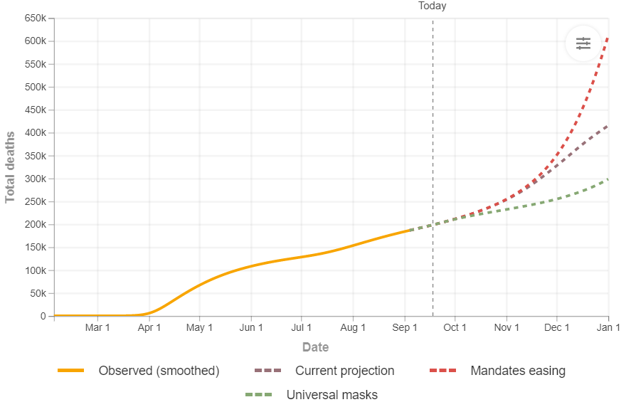
Recently, they have also incorporated forecasts for the UK, but they are more tentative. Initially, they predicted an even higher toll of 66,000 deaths for the UK:
最近,他们还纳入了对英国的预测,但它们更具暂定性。 最初,他们预测英国的死亡人数将达到66,000,甚至更高:
This is a prediction that is very exceptional. The model says that the United States would have fewer deaths with a population of about 330 million people than the United Kingdom with a population of around 66 million (1/5th!). It seems fair, with such a big difference, to be suspicious before we understand the logic.
这是一个非常例外的预测。 该模型表示,美国的死亡人数将比英国的大约6600万(英国的1/5!)要少,英国的人口大约为3.3亿。 在我们理解逻辑之前,有如此大的差别似乎值得怀疑。
This scepticism has little to do with the team’s ability to build the model or the quality of its work. It is extremely complicated to forecast unusual incidents with certainty. Models allow us to get our heads around how different variables will influence performance, but they are models. They’re not simulations that we trust blindly. So you should try to understand why it happened if you see an intense forecast.
这种怀疑与团队建立模型的能力或其工作质量无关。 确切地预测异常事件非常复杂。 模型使我们能够了解不同变量如何影响性能,但是它们是模型。 它们不是我们盲目信任的模拟。 因此,如果看到强烈的预测,您应该尝试了解发生这种情况的原因。
The actual numbers recorded by the UK were lower than the lowest expected range of the model in the first couple of days after this new model was released. And indeed, IHME refreshed this graph a few days later with a far broader confidence band reflecting a much more uncertain prediction:
在此新模型发布后的头几天,英国记录的实际数字低于该模型的最低预期范围。 确实,IHME几天后刷新了此图,其可信度范围更广,反映了更加不确定的预测:
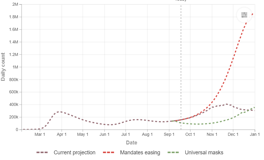
Even with the new confidence range, this model still predicts numbers above other similar models that other teams have developed. Imperial College London’s Prof. Neil Ferguson was quoted in the press as saying that this model is inaccurate for the UK because it is wrongly predicting hospital use and his model predicts lower figures. But now we have a situation where there are two distinct models with two entirely different sets of forecasts coming up.
即使有了新的置信度范围,该模型仍可以预测高于其他团队开发的其他类似模型的数字。 伦敦帝国理工学院的教授尼尔·弗格森(Neil Ferguson)在媒体上被引述说,这种模式在英国不准确,因为它错误地预测了医院的使用,而他的模型则预测了较低的数字。 但是现在,我们遇到了两种不同的模型,其中出现了两种完全不同的预测集。
With that, there is nothing wrong. Looking at other models is a good way to verify your assumptions to see if there are variables that you haven’t taken into account. The worst thing we can do is confide confidently in some particular model. No model will handle every case in the corner perfectly.
这样就没有错。 查看其他模型是验证您的假设以查看是否存在尚未考虑的变量的好方法。 我们能做的最坏的事情就是自信地相信某些特定的模型。 没有模型能够完美地处理每个角落的情况。
If you are shocked by the outcome, believe that you made a mistake before you understand why you got the surprising outcome. Approach your own models with the same scepticism. Don’t confide blindly in your model!
如果您对结果感到震惊,请相信您在理解为什么得到令人惊讶的结果之前犯了一个错误。 以同样的怀疑态度对待自己的模型。 不要盲目相信您的模型!
If you liked this article, check out my Linked-in website where you can read more of my articles
如果您喜欢这篇文章,请访问我的链接网站,在这里您可以阅读更多我的文章
Thank you for taking the time to read here. Please share your thoughts about this story or how your self-studying data science experience has been Also, feel free to connect with me via YouTube and Here at LinkedIn.
感谢您抽出宝贵的时间在这里阅读。 请分享您对这个故事的想法,或者您对数据科学的自学经历。此外,请随时通过YouTube和LinkedIn上的Here与我联系。
Bio: Shaik Sameeruddin I help businesses drive growth using Analytics & Data Science | Public speaker | Uplifting students in the field of tech and personal growth | Pursuing b-tech 3rd year in Computer Science and Engineering(Specialisation in Data Analytics) from “VELLORE INSTITUTE OF TECHNOLOGY(V.I.T)”
简历: Shaik Sameeruddin我使用分析和数据科学帮助企业推动增长| 公开演讲者| 提升技术和个人成长领域的学生| 从“ VELLORE INSTITUTE OF TECHNOLOGY(VIT)”获得计算机科学与工程专业(数据分析专业)三年级文凭
数据科学与人工智能以及国家和国际实习的职业指南和路线图,请参考:(Career Guide and roadmap for Data Science and Artificial Intelligence &and National & International Internship’s, please refer :)


 3978
3978


 被折叠的 条评论
为什么被折叠?
被折叠的 条评论
为什么被折叠?
 到【灌水乐园】发言


