


python初学者
项目背景 (Project Background)
Besides working to earn an income, investing is the best way to reach your financial goals in life, be it saving for a new car, starting a new business, or ensuring a comfortable retirement. The idea of passively increasing the value of my assets over time without doing anything (besides buying stocks and holding it) intrigued me as I pursued financial independence. However, I didn’t know where to start. How do I make a decision on what stocks to buy? How can I understand company’s performance by looking at the stock market? Can I pull historical stock market data to create buy/sell signals and automate alerts or even trades?
除了赚钱之外,投资是实现人生财务目标的最佳方法,既可以省钱买新车,开始新业务或确保退休后的生活。 在追求财务独立性的同时,不做任何事情(不买股票和持有股票)而被动地增加我的资产价值的想法引起了我的兴趣。 但是,我不知道从哪里开始。 我该如何决定要购买哪些股票? 通过查看股票市场如何了解公司的绩效? 我可以提取历史股票市场数据来创建买/卖信号并自动执行警报甚至交易吗?
Without getting too deep into the financial background of each tool, I will show you how I use Python to pull historical stock data, visualize growth and decay trends, understand returns, estimate risks using returns standard deviations, and identify undervalued stocks to buy.
在不深入了解每种工具的财务背景的情况下,我将向您展示如何使用Python提取历史股票数据,可视化增长和衰减趋势,了解收益,使用收益标准偏差估算风险以及确定被低估的股票。
Specifically, the topics covered in this article are:
具体来说,本文涵盖的主题是:
- Getting Stock Market Data/Data Preparation 获取股票市场数据/数据准备
- Exploratory Data Analysis 探索性数据分析
- Visualizing Prices over Time 随时间可视化价格
- Conducting Risk and Returns Analysis 进行风险与收益分析
- Seeing Trends with Simple Moving Averages 通过简单的移动平均线查看趋势
- Finding Under/Over-value Stocks with Bollinger Band Plots 使用布林带图查找低/高价值股票
In other words, this article will show you the skeleton “how the analysis is done” using Python, but the “interpretation” meat of the analysis will be discounted. For the interested reader, I dig deeper into real-world examples and interpretation in another 6-part series. The Python code is the exact same for the 6-part series as covered in this blog, but there is more context given to the analysis there. I highly encourage you to read that series if you have the time. For now, I’ll cover the distilled, Python-focused work in this article. Let’s begin!
换句话说,这篇文章将告诉你“的分析是怎么做的”使用Python的骨架 ,但分析的“解释” 肉就会打折扣。 对于感兴趣的读者,我将在另一个由6部分组成的系列文章中深入研究实际示例和解释。 Python代码与本博客中介绍的6部分系列完全相同,但是此处的分析提供了更多上下文。 如果有时间,我强烈建议您阅读该系列。 现在,我将在本文中介绍经过提炼,以Python为重点的工作。 让我们开始!
获取数据 (Getting the Data)
There are multiple ways to pull stock market data, each with their own advantages. Here, I will use the pandas-datareader package. Make sure you have this installed if you plan on following along with the coding. Using the pandas-datareader package, we’ll use Yahoo Finance as our source of information. All you need to provide is the start and end dates of your analysis period , as well as a list of ticker symbols of companies that you’re interested in.
提取股市数据有多种方法,每种方法都有自己的优势。 在这里,我将使用pandas-datareader包。 如果您打算跟随编码一起进行,请确保已安装此程序。 使用pandas-datareader程序包,我们将使用Yahoo Finance作为信息源。 您只需要提供分析期间的开始和结束日期,以及您感兴趣的公司的股票代号即可。
# Set the start and end dates for your analysis. The end date is set to current day by default
start_date = '2018-01-01'
end_date = datetime.date.today().strftime('%Y-%m-%d')# List the ticker symbols you are interested in (as strings)
tickers = ["SPY", "AAL", "ZM", "NFLX", "FB"]# I want to store each df separately to do Bollinger band plots later on
each_df = {}
for ticker in tickers:
    each_df[ticker] = data.DataReader(ticker, 'yahoo', start_date, end_date)# Concatenate dataframes for each ticker together to create a single dataframe called stocks
stocks = pd.concat(each_df, axis=1, keys = tickers)# Set names for the multi-index
stocks.columns.names = ['Ticker Symbol','Stock Info']
The stocks dataframe should look something like this.
股票数据框应如下所示。

探索性数据分析 (Exploratory Data Analysis)
In this step, I try to better understand what I am looking at. I try to discover patterns, detect anomalies, and answer questions like How many data points do I have? Does anything look strange? Am I missing any information?
在这一步中,我试图更好地了解我在看什么。 我尝试发现模式,检测异常并回答诸如“我有多少个数据点”之类的问题? 看起来有些奇怪吗? 我是否缺少任何信息?
There are a few standard operations I do when looking at any new data set. These include looking at the pandas.DataFrame.shape attribute, the .info() method to see the columns and their datatypes, the .describe() method to understand the descriptive statistics of the numerical data, and the .isnull() method to see missing data.
查看任何新数据集时,我需要执行一些标准操作。 其中包括查看pandas.DataFrame.shape属性,.info()方法以查看列及其数据类型,.describe()方法以了解数值数据的描述统计信息以及.isnull()方法以查看列及其数据类型。查看丢失的数据。
Here is the output of stocks.shape:
这是stocks.shape的输出:

Here is the output of stocks.info():
这是stocks.info()的输出:

Here is the output of stocks.describe():
这是stocks.describe()的输出:

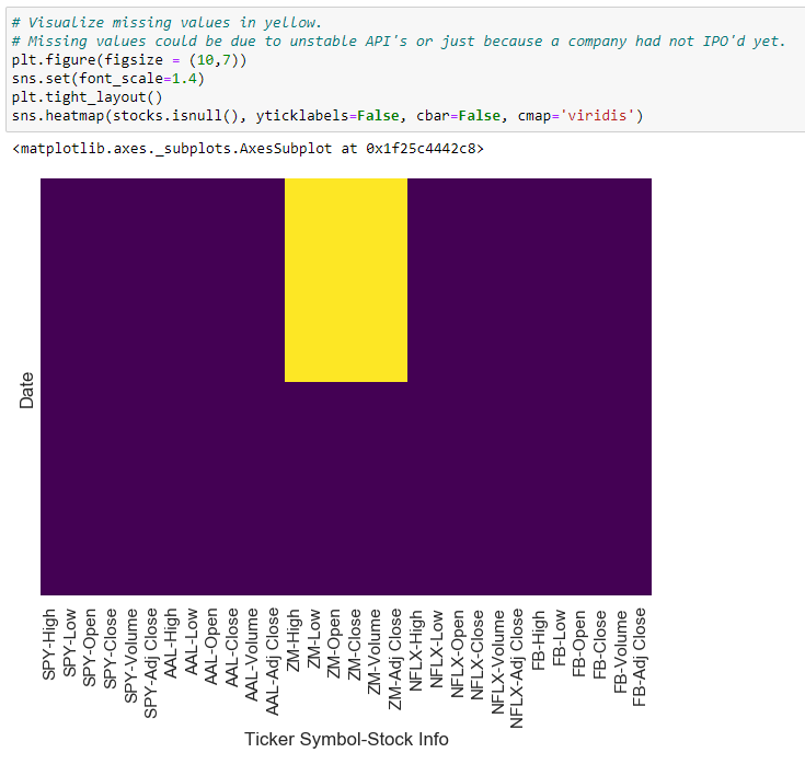
Here is the output of stock.isnull() visualized in a heatmap:
这是在热图中可视化显示的stock.isnull()的输出:
随时间可视化数据 (Visualization of Data over Time)
First, let’s create a dataframe called ‘closing_prices_df’ with only the adjusted closing prices of each stock. We can do this easily using the cross section method of pandas.DataFrame.xs().
首先,让我们创建一个名为“ closing_prices_df”的数据框,其中仅包含调整后的每只股票的收盘价。 我们可以使用pandas.DataFrame.xs()的横截面方法轻松地做到这一点。
# Create a dataframe for the closing_prices of the stocks
closing_prices_df = stocks.xs(key='Adj Close',axis=1,level=1)
Then, we can use the plotly package to plot closing prices over time.
然后,我们可以使用plotly包来绘制一段时间内的收盘价。
# Create a dataframe for the closing_prices of the stocks
closing_prices_df = stocks.xs(key='Adj Close',axis=1,level=1)# Using plotly to create line plot of stock closing prices over time.
# You can double click on the ticker symbols in the legend to isolate each tickerfig = px.line(closing_prices_df, x=closing_prices_df.index, y=closing_prices_df.columns, title=”Adjusted Closing Prices”)
fig.update_layout(hovermode=’x’,yaxis_title=”Price”)
fig.show()Besides looking at closing prices over time, it is helpful to summarize much more information within candlestick plots. Candlestick charts are a commonly used financial visual to show price movements in securities. They are densely packed with information, including single day open, close, high, and low prices.
除了查看一段时间内的收盘价外,总结烛台图中的更多信息也很有帮助。 烛台图是一种常用的财务图表,用于显示证券的价格走势。 它们充斥着信息,包括单日开盘价,收盘价,最高价和最低价。
Here, we create our own candlestick chart for our companies of interest using plotly.
在这里,我们使用plotly为感兴趣的公司创建自己的烛台图。
import plotly.graph_objects as go# User input ticker of interest
ticker = "NFLX"fig = go.Figure(data=[go.Candlestick(x=each_df[ticker].index,
                open=each_df[ticker]['Open'],
                high=each_df[ticker]['High'],
                low=each_df[ticker]['Low'],
                close=each_df[ticker]['Close'])])fig.update_layout(
    title='Candlestick Chart for ' + ticker,
    yaxis_title='Price',
    xaxis_title='Date',
    hovermode='x'
)
fig.show()
Here is what an example of what the candlestick plot looks like.
这是烛台图的示例。
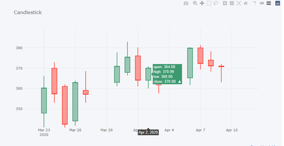
Again, candlestick charts are packed dense with information, so there are many traders who build trading strategies around them. I discuss them a little more in my other post here.
同样,烛台图上挤满了信息,因此有许多交易者围绕它们建立交易策略。 我在这里的其他文章中对它们进行了更多讨论。
风险与收益分析 (Risk and Returns Analysis)
To make well-informed trades, it is important to understand the risk and returns of each stock. First, let’s create a new dataframe to store the daily percent changes in closing prices. I call this the ‘returns’ dataframe.
为了进行明智的交易,了解每只股票的风险和回报很重要。 首先,让我们创建一个新的数据框来存储收盘价的每日百分比变化。 我称其为“返回”数据框。
# Create a new df called returns that calculates the return after each day.
returns = pd.DataFrame()# We can use pandas pct_change() method on the 'Adj Close' column to create a column representing this return value.
for ticker in tickers:
    returns[ticker]=closing_prices_df[ticker].pct_change()*100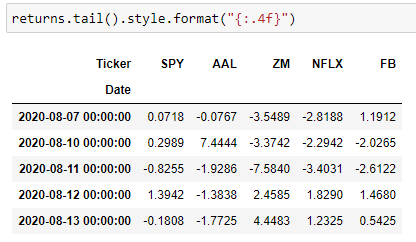
Using the dataframe in Figure 8, we can now see how much gain/loss a stock experienced day by day. However, it’s difficult to see the big picture when looking at all these numbers.
使用图8中的数据框,我们现在可以看到股票每天经历了多少损益。 但是,在查看所有这些数字时很难看到全局。
Let’s summarize the data and look at the average daily returns. We can do this simply by using the .mean() function.
让我们汇总数据并查看平均每日收益。 我们可以简单地通过使用.mean()函数来做到这一点。
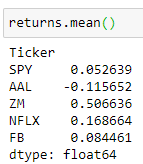
In Figure 9, we are looking at the average returns over ~2.5 years. In other words, if you invested in Facebook (FB) 2.5 years ago, you can expect the value of your investments to have grown 0.08% each day.
在图9中,我们查看了〜2.5年的平均回报。 换句话说,如果您在2.5年前投资了Facebook(FB),则可以预期投资价值每天增长0.08%。
I encourage you to play with the returns data as it is quite informational. Some examples of things to look at include best and worst single day returns, which I show in this blog.
我鼓励您使用退货数据,因为它具有参考价值。 我要在此博客中展示的一些例子包括最佳和最差的单日收益。
Next, let’s take a look at risks. One of the fundamental methods of understanding risk of each stock is through standard deviations on the rate of returns. Let’s calculate the standard deviations of the returns using the code below in Figure 10.
接下来,让我们看一下风险。 了解每种股票风险的基本方法之一是通过回报率的标准偏差。 让我们使用下面图10中的代码来计算收益率的标准差。

We can break down the standard deviation information using a distribution plot.
我们可以使用分布图分解标准差信息。
# User input ticker of interest
ticker = “AAL”a = returns[ticker].loc[‘2020–01–03’:’2020–07–01'].dropna()
b = returns[ticker].loc[‘2019–01–03’:’2019–07–01'].dropna()plt.figure(figsize = (10,7))
a.plot(kind=’hist’, label=’2020', bins=50, alpha=0.5)
b.plot(kind=’hist’, label=’2019', bins=12, alpha=0.5)
plt.title(‘Distribution of ‘ + ticker + ‘ returns’)
plt.xlabel(‘Daily Returns (%)’)
plt.legend()
plt.show()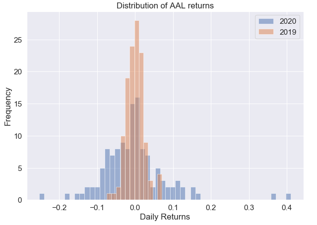
Now that we’ve looked at both risk and returns, let’s pull them together into one graph.
既然我们已经研究了风险和回报,那么让我们将它们汇总到一张图中。
fig = px.scatter(returns, x=returns.mean(), y=returns.std(), text=returns.columns, size_max=60, labels={
                     "x": "Daily Expected Returns (%)",
                     "y": "Risk",
                 },
                title="Stock Risk Vs Returns")
fig.update_xaxes(zeroline=True, zerolinewidth=2, zerolinecolor='Black')#, range=[-0.005, 0.01])
fig.update_yaxes(zeroline=True, zerolinewidth=2, zerolinecolor='Black')#, range=[-0.01, 0.1])
fig.update_traces(textposition='top center')fig.show()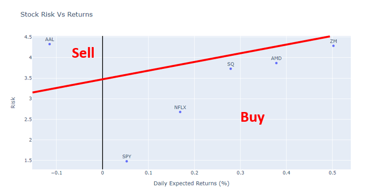
简单移动平均趋势 (Simple Moving Average Trends)
There are many ways to plot moving averages, but for simplicity, here I use the cufflinks package to do it for me.
有许多方法可以绘制移动平均线,但为简单起见,在这里,我使用袖扣程序包为我完成此操作。
# The cufflinks package has useful technical analysis functionality, and we can use .ta_plot(study=’sma’) to create a Simple Moving Averages plot# User input ticker of interest
ticker = “NFLX”each_df[ticker][‘Adj Close’].ta_plot(study=’sma’,periods=[10])
The moving average smooths out the day-to-day volatility and better displays the underlying trends in a stock price. The higher the time window for the moving average, the clearer the direction of the trend. However, it is also less sensitive to sudden shifts in market dynamics.
移动平均线可以消除日常波动,并更好地显示股价的潜在趋势。 移动平均线的时间窗口越高,趋势的方向越清晰。 但是,它对市场动态的突然变化也不太敏感。
You can do a lot with multiple moving averages and comparing them over time. In my other blog, I talk about two trading strategies called the death cross and golden cross.
您可以对多个移动平均值进行大量处理,并随时间进行比较。 在我的另一个博客中 ,我讨论了两种交易策略,称为死亡交叉和黄金交叉。
布林带图 (Bollinger Band Plots)
One of the simplest methods I found to plot Bollinger bands using Python is with the cufflinks package.
我发现使用Python绘制布林带的最简单方法之一是使用cufflinks软件包。
# User input ticker of interest
ticker = "SPY"
each_df[ticker]['Close'].ta_plot(study='boll', periods=20,boll_std=2)
As I write in my other post, “One major use case for Bollinger band plots is to help understand undersold vs. oversold stocks. As a stock’s market price moves closer to the upper band, the stock is perceived to be overbought, and as the price moves closer to the lower band, the stock is more oversold.”
正如我在另一篇文章中所写的那样,“布林带图的一个主要用例是帮助理解超卖与超卖的股票。 当股票的市场价格接近上限时,该股票被视为超买,而当价格接近下限时,该股票则被超卖。”
In my opinion, this is the most powerful analytical tool discussed in this article. I would definitely spend time understanding Bollinger bands and how to use them. For an introduction, please refer to this.
我认为,这是本文讨论的最强大的分析工具。 我一定会花时间了解Bollinger乐队以及如何使用它们。 有关介绍,请参见本 。
结论 (Conclusion)
And with those few lines of Python code, you should get a jumpstart in Python financial analysis! This blog was meant to showcase the bare-bones code behind my personal financial analysis project. However, as any data scientist knows, domain knowledge is just as critical to understanding data as the coding behind it. If you have time, I highly encourage you to supplement your understanding of this code with financial fundamentals in my 6-part series.
使用这几行Python代码,您应该可以快速开始进行Python财务分析! 该博客旨在展示我的个人财务分析项目背后的基本代码。 但是,正如任何数据科学家所知道的那样,领域知识对于理解数据和其背后的编码同样至关重要。 如果您有时间,我强烈建议您在我的6部分系列文章中以财务基础补充您对该代码的理解。
As I’m learning every day, the power of Python is vast and far-reaching. There are a lot of analyses that we can do in Python due to its ability to process large data quickly. What are some things you would be interested to do or see in Python? Let me know in the comments!
在我每天学习的过程中,Python的功能是广泛而深远的。 由于Python具有快速处理大数据的能力,因此我们可以进行很多分析。 您可能想在Python中做什么或看到什么? 在评论中让我知道!
翻译自: https://medium.com/@chan.keith.96/xx-minute-beginners-financial-analysis-in-python-366553b587ae
python初学者


 1万+
1万+


 被折叠的 条评论
为什么被折叠?
被折叠的 条评论
为什么被折叠?
 到【灌水乐园】发言


