


shields 徽标
重点 (Top highlight)
Currently, we are facing such a graphic design phase when a lot of brands use to have very similar logos. More exactly, a lot of brands switched from having proper logos to just having logotypes (logos without a symbol) and with no exception all use sans serif geometric fonts.
当前,当许多品牌使用具有非常相似的徽标时,我们正面临这样的图形设计阶段。 更准确地说,许多品牌从具有适当的徽标转换为仅具有徽标(没有符号的徽标),并且无一例外都使用无衬线几何字体。
I can understand the designers point of view on this matter. For them it is basically a win over that old marketing strategy where you should always design a very unique logo with a symbol in order to be recognizable. Sometimes this is just an impossible mission — all good basic shapes are already taken, even apples. That’s why logos such as Uber or the new rebranded Revolut one, are more than enough for a brand to be successful.
我可以理解设计师在此问题上的观点。 对于他们而言,这基本上是对旧营销策略的一次胜利,在该营销策略中,您应始终设计一个带有符号的非常独特的徽标,以使其易于识别。 有时这只是一个不可能完成的任务-所有好的基本形状都已经被采用,甚至是苹果。 这就是为什么诸如Uber或新的Revolut品牌这样的徽标足以使一个品牌成功。
在过去的广告时代,徽标并不是要一起出现 (In the old era of advertising logos weren’t meant to be featured together)
They were designed in the full complexity and used as a central element in the communication.
它们是完全复杂的设计,并用作通信中的核心元素。
However, let’s consider some examples of logos usage today.
但是,让我们考虑一些今天使用徽标的示例。
There are visuals which might contain more logos on them. These can be sponsors logos, event organizers, media partners and so on. It’s not about having a problem on how to place the main logo in the visual, its’ more likely about that situations when more that three logos should stay in a close proximity to each other and how they impact the overall look of this visual.
有些视觉效果上可能包含更多徽标。 这些可以是赞助商徽标,活动组织者,媒体合作伙伴等。 这与如何将主徽标放置在视觉对象中无关,而更多的情况是当三个以上的徽标应彼此靠近时,以及它们如何影响该视觉对象的整体外观。
Once I was in a situation when I had to add more that 10 logos on a visual for an event. All those being sponsors who payed for this event in order to be promoted. Some places where this visual should appear were really small and with limited space, like some 400x400 px web banners. The problem was that some logos being too complex had a limited visibly if shrieked. And I was in the situation to decide shall I keep the visual at all or just to make a banner full of sponsors logos, of all possible shapes and colors which looked grotesque together despite of the effort to align them nicely.
有一次,当我不得不为某个事件的视觉效果添加超过10个徽标时。 所有为这次促销活动付费的赞助商。 这些视觉效果应该出现的地方很小,而且空间有限,例如一些400x400 px的网络横幅。 问题在于,某些过于复杂的徽标在尖叫时明显受到限制。 我当时的情况是要决定是否保留视觉效果,或者只是制作横幅,上面贴满赞助商徽标,所有可能的形状和颜色看起来很怪异,尽管努力使它们对齐。
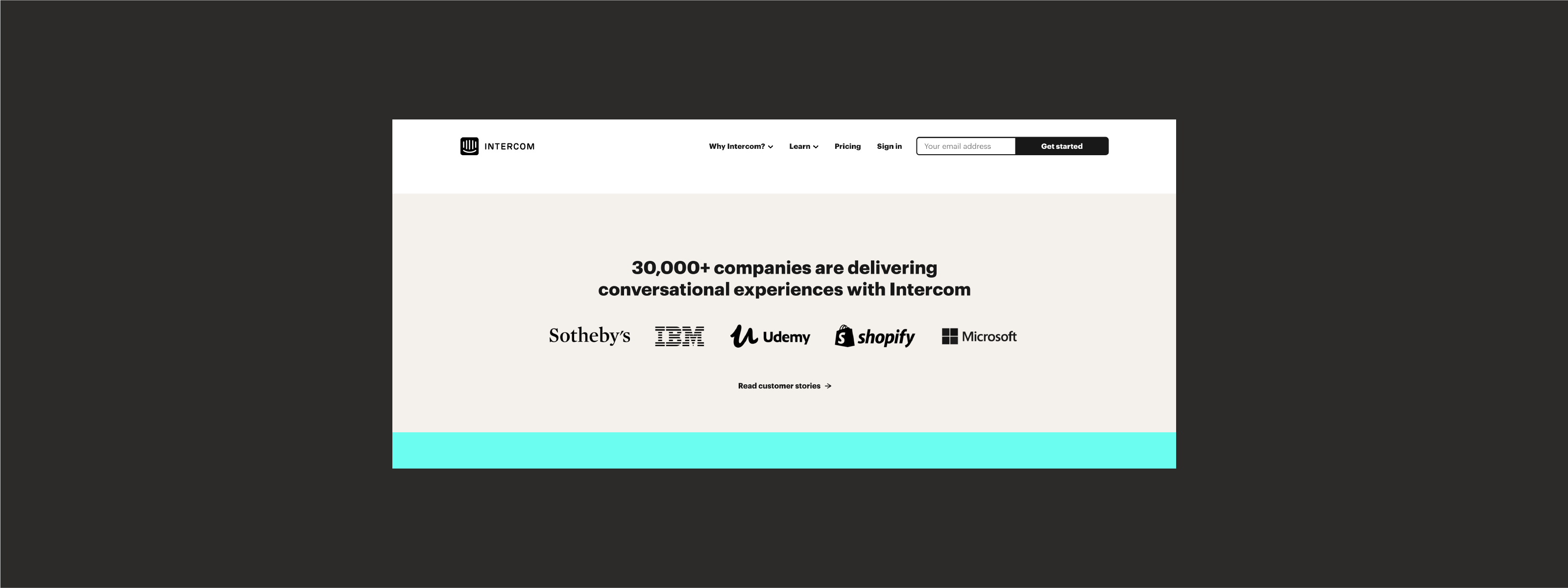
Another common practice for more logos being featured together is this section on each website which shows who is using their service, like in this example from Intercom:
每个网站上的此部分都显示将徽标一起使用的另一种常见做法,该部分显示谁在使用其服务,例如Intercom的示例:
独特也意味着成为局外人 (Being unique also means being an outsider)
So, what is the point I am trying to make with previously mentioned examples?
那么,我想用前面提到的例子来说明什么呢?
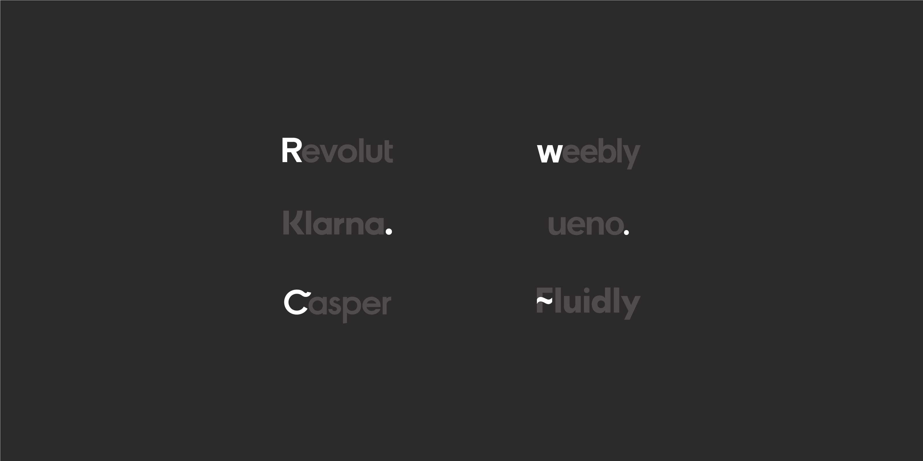
While arranging these logos string each designer is dreaming of an even pattern where the visual balance between all logos is easily achieved. The idea is that the more logos differ from each other, the more harder is to align them optically. There is no such an aligner tool to deal with that. The only good tool designers can count on is their eyes.
在排列这些徽标时,每个设计师都梦想着一种均匀的图案,在该图案中可以轻松实现所有徽标之间的视觉平衡。 想法是,徽标彼此之间的差异越多,则将它们光学对齐的难度就越大。 没有这样的对齐工具可以解决这个问题。 设计师唯一可以依靠的工具就是他们的眼睛。
Even harder — there were times when some logos did not support grayscale and should be used in full color — real nightmare for a designer who want to preserve a color palette of the visual.
更难的是-有时某些徽标不支持灰度并且应全彩色使用-对于想要保留视觉调色板的设计师来说,这真是一场噩梦。
Today being different for a logo is no more a strong point but rather a shame considering how often logos are paired together with other logos instead of having their own solo lives.
今天,徽标的区别不再是优点,而是考虑徽标与其他徽标配对的频率而不是拥有自己的独身生活是一种耻辱。
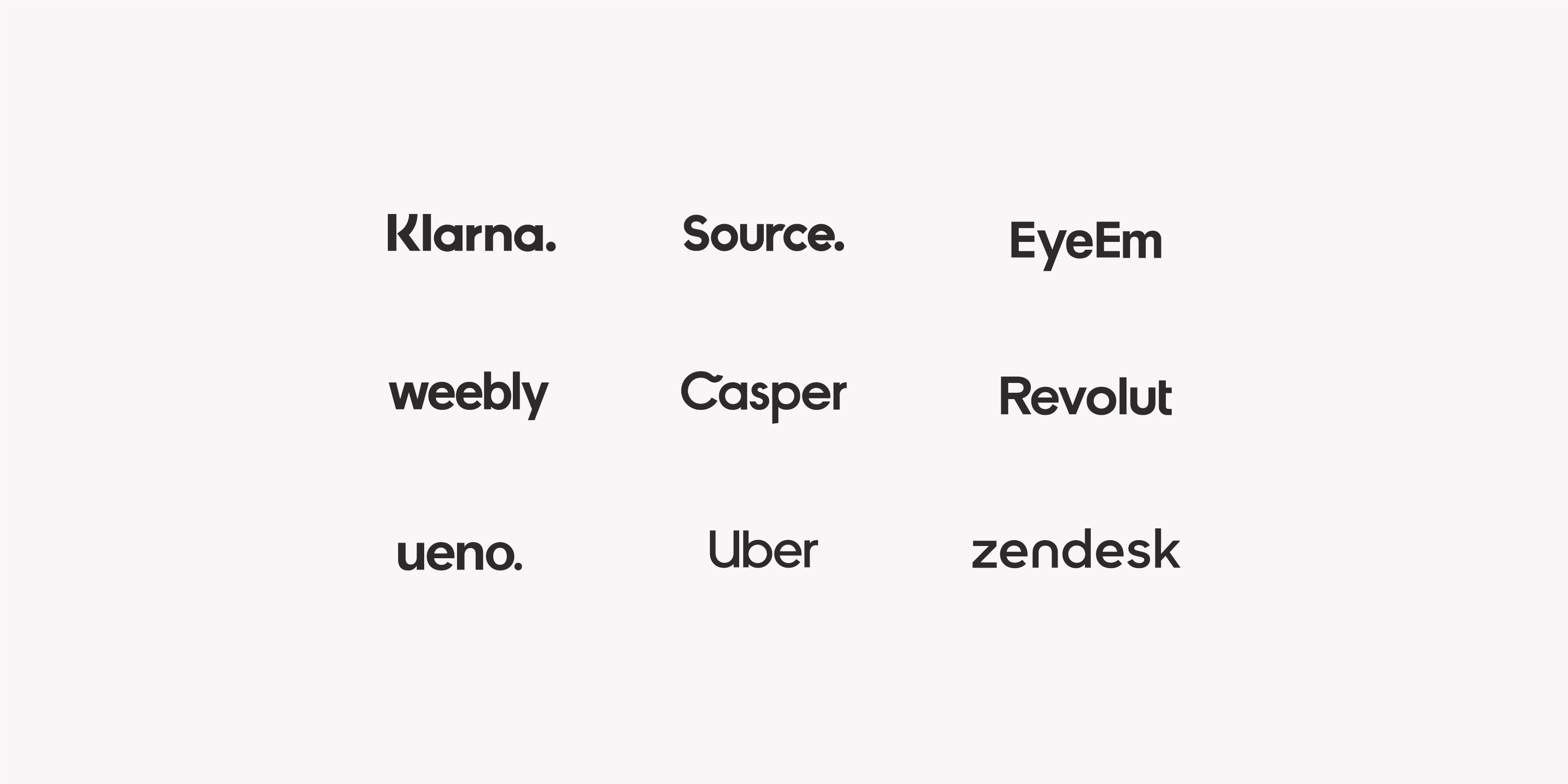
So, voila — problem solved: all logos nowadays are juts a word, in sans serif, probably made from a bold grotesque typeface. Easy to align, all black and white, looking great together, almost like a big family.
因此,瞧,问题解决了:如今,所有徽标都是用无衬线字体突出的一个单词,无衬线字体,可能是由大胆的怪诞字体制成的。 容易对齐,全都是黑色和白色,看起来很棒,几乎就像一个大家庭。
If I would go further, I would expect all brands to decide on capitalization or no of the first letter, because for now it is only thing they seems to not have an agreement about. Also those logotypes which have a dot at the end, what does this dot add to this characterless but well unified logos? The same thing with a small tweak in the main character like Casper or Fluidly have, is this really adding to uniqueness while maintaining similarity with other logos?
如果我走得更远,我希望所有品牌都能决定大写还是首字母大写,因为目前看来,他们似乎尚无共识。 还有那些在结尾处带有圆点的徽标,这个圆点会为无字符但统一的徽标增加什么? 像卡斯珀(Casper)或Fluidly一样,在主要角色上进行了一些细微调整,这是否真的增加了唯一性,同时又保持了与其他徽标的相似性?
徽标危机 (Logo crisis)
What are other reasons why all logos look similar today?
今天所有徽标看起来相似的其他原因是什么?
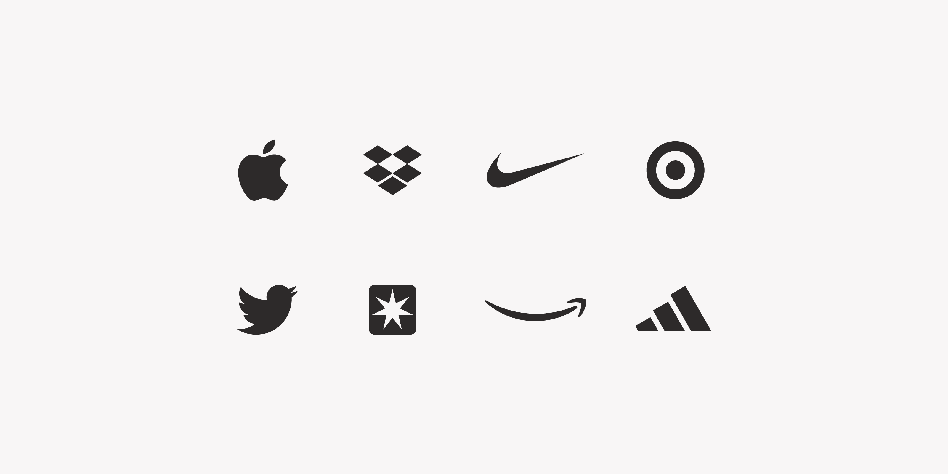
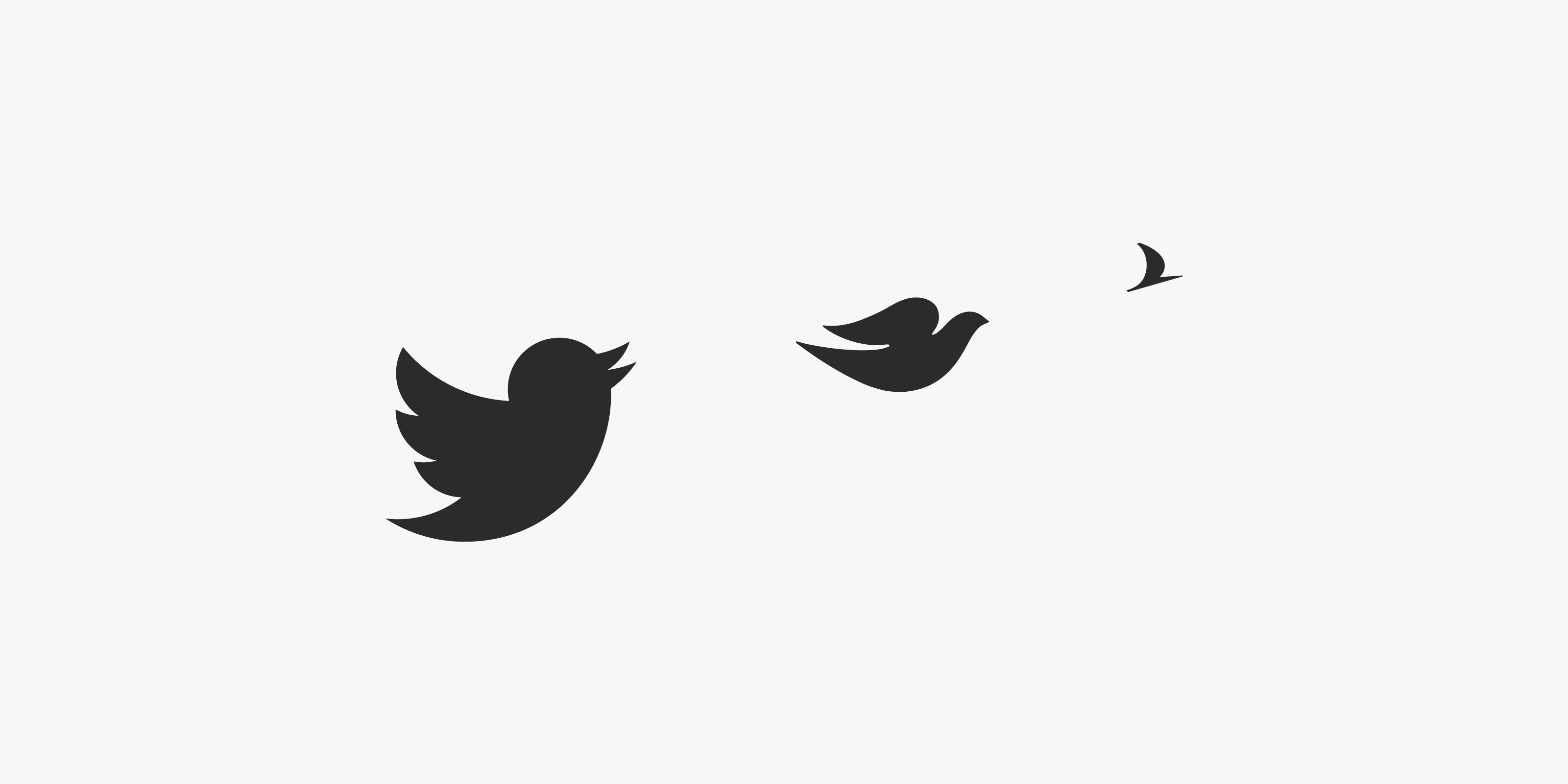
It is really hard to come up with a totally new visual element today. Like it was mentioned before all good, simple and recognizable shapes were taken. The apple is taken by Apple, the bird shape is taken by Twitter, a more specific bird bread shape such as dove is taken by..guess whom 😇 and so on.
今天很难提出一个全新的视觉元素。 就像在提到所有好的,简单且可识别的形状之前提到的那样。 苹果由Apple制成,鸟形由Twitter制成,更具体的鸟面包形如鸽子由..guess who taken制成,依此类推。
To fight this crisis designers even invented dynamical identities, to change the focus from logo as a main brand element to logo as a part of a visual system. In this case the logotype together with other elements such as type, color palette, and a predefined graphical rule will generate some visuals in a unique and recognizable manner — and all these will help a brand to stand out even if there are nothing more to say by the logo itself.
为了应对这种危机,设计师甚至发明了动态身份,将焦点从徽标作为主要品牌元素更改为徽标作为视觉系统的一部分。 在这种情况下,徽标以及其他元素(例如类型,调色板和预定义的图形规则)将以独特且可识别的方式生成一些视觉效果-即使没有其他要说的内容,所有这些都将帮助品牌脱颖而出徽标本身。
I think that the problem here is, actually, how much time you as a designer have to come up with a logo idea. Because if you’ll take a look at all famous logos with symbols there is always an a-ha moment, a history, a heritage, a something which you as a designer, or almost as a detective should find and reveal. Sometime it can take a few seconds and in other cases it can take much longer.
我认为实际上,这里的问题是,作为设计师,您需要花多少时间提出徽标创意。 因为如果您要查看所有带有符号的著名徽标,那么总会有一个ha-ha的时刻,历史,遗产,您作为设计师或几乎作为侦探应该发现并揭示的东西。 有时可能需要几秒钟,而在其他情况下则可能需要更长的时间。
今天,我们对数据比对想法更有信心 (Today we have confidence in data more than in ideas)
It’s almost a cliche but I have to say that we live in a fast developing society and each decision is money and data driven now. There is no company willing to wait for a perfectly unique logo and overpay for it. Because at the end of the day, even if it’s unique, it still might seem not good enough just because it can not be aligned well with other logos in a logo string and it might end up looking odd. The shift is toward collaborations of all kinds and logos aren’t an exception to this rule.
这几乎是陈词滥调,但我不得不说,我们生活在一个快速发展的社会中,每个决定现在都是金钱和数据驱动的。 没有公司愿意等待一个完美的独特徽标并为此多付钱。 因为在一天结束时,即使它是唯一的,它也可能看起来不够好,仅仅是因为它无法与徽标字符串中的其他徽标很好地对齐,并且最终看起来可能很奇怪。 转向各种协作,徽标也不是该规则的例外。
And there is definitely something interesting happening within marketing strategies now which allows brands to compete even without having a visual uniqueness. We leave in the era where we are not buying goods for their functions anyone. We are buying goods for their emotional and signed value more that ever. We are buying design more that ever. And even so, all designs, all brands, all logos look the same. Everything is pale pink, with palm leaves and sans serif.
现在,营销策略中肯定发生了一些有趣的事情,即使没有视觉独特性,品牌也可以竞争。 我们离开了一个时代,我们不为任何人购买具有其功能的商品。 我们购买商品的目的是为了获得他们的情感和签名价值。 我们正在购买更多的设计。 即便如此,所有设计,所有品牌,所有徽标看起来都相同。 一切都是 浅粉红色,有棕榈叶和无衬线。
Those paradoxical marketing strategies on how to make people to buy are linked to totally different approaches that's’ why in some way design doesn’t matter anymore even if its on the top of the funnel and we are delusively buying it more and more.
这些关于如何使人们购买的悖论性的营销策略与完全不同的方法相关联,这就是为什么在某种程度上设计不再重要,即使设计位于渠道的顶部也是如此,而我们也在不断地购买它。
The clear thing is that while designers were fighting for simplifying logos by creating these unified trends (in order to simplify their lives of course) they and especially brand studios shifted the focus from themselves. Now, design main value is to be able to adapt easily to the fast-changing environments. Unfortunate the solutions which are the most adaptive to the changes and easy to scale are those which tend to unify everything and to diminish design ideas which are harder to produce or to multiply.
显而易见的是,当设计师们通过创造这些统一的趋势(当然是为了简化他们的生活)而为简化徽标而奋斗时,他们,尤其是品牌工作室已经将重点从自己身上转移了出去。 现在,设计的主要价值是能够轻松适应快速变化的环境。 不幸的是,那些最能适应变化并且易于扩展的解决方案是那些趋于统一一切并减少难以产生或增加的设计思想的解决方案。
There is no more such a thing as a long-lasting purpose for advertising. Everything is reactive to something. Responses should come immediately. And that one thing which precisely added to this drama is all those logotypes in sans serif.
不再有持久的广告目的。 一切都对某事起React。 应立即做出回应。 恰好在这部戏中添加的一件事是无衬线字体中的所有那些标识。
翻译自: https://uxdesign.cc/all-logos-look-the-same-b776e5c77b6f
shields 徽标


 被折叠的 条评论
为什么被折叠?
被折叠的 条评论
为什么被折叠?
 到【灌水乐园】发言


