


视觉感知
The role of the UX designer has evolved immensely over time, but at its core, it remains the same-
UX设计人员的角色随着时间的流逝而发生了巨大的变化,但从本质上讲,它保持不变-
to deliver information to users in an effective manner. If we truly want to empathize with users, it’s essential to understand how humans receive information. 有效地向用户传递信息 。 如果我们真的想同情用户,那么必须了解人类如何接收信息。Visual perception is the complete process from light hitting our retina, to our brains processing and organizing what we’re looking at. However, our focus is limited to a small area in any given instance. This means it’s important to remove all visual clutter from our design. Minimalistic design is better design.
视觉感知是一个完整的过程,从光线照射到我们的视网膜,到大脑处理和组织我们所看的东西。 但是,在任何给定的情况下,我们的重点都限于一小块区域。 这意味着从我们的设计中消除所有视觉混乱非常重要。 简约设计是更好的设计。
Design is not just what it looks like and feels like. Design is how it works.
设计不仅是外观和感觉。 设计是它的工作方式。
If our focal vision is so limited, how do people scan an entire screen?
如果我们的视力如此有限,人们如何扫描整个屏幕?
Well, the answer is simple. They don’t.
好吧,答案很简单。 他们没有。
The mechanism of peripheral vision works by detecting contrasts between light and dark. We can’t pick up any detailed information in our peripheral vision. This is why our eyes rapidly jump around a page to pick up information, and this series of eye fixations is called saccades.
外围视觉的机制通过检测明暗之间的对比来起作用。 我们无法从外围视觉中获取任何详细信息。 这就是为什么我们的眼睛在页面上快速跳动以获取信息的原因,而这一系列的眼动注视称为扫视运动 。
It’s nearly impossible for users to analyze the whole screen. According to a study done by Jakob Nielsen, people follow an ‘F’ shaped reading pattern for webpages and phone screens.
用户几乎不可能分析整个屏幕。 根据雅各布·尼尔森(Jakob Nielsen)进行的一项研究,人们会在网页和电话屏幕上采用“ F”形阅读模式。
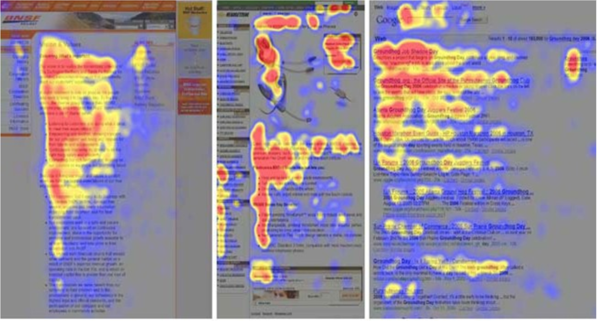
People tend to scan the first two rows, but after that, they scan down the left-hand side of the page for important info. We can leverage this information by placing the most important content in the top-left most red zone to ensure it’s processed by our user. From there we should format the rest of the content by following the natural ‘F’ shaped flow that our users will take.
人们倾向于扫描前两行,但是此后,他们会在页面的左侧向下扫描以获取重要信息。 我们可以通过将最重要的内容放在最左上角的红色区域中来确保这些信息由我们的用户处理。 从那里开始,我们应该遵循用户将采取的自然的“ F”形流程来格式化其余内容。
格式塔的模式识别原理 (Gestalt’s Principles of Pattern Recognition)
According to the Gestalt School of Psychologist, we identify visuals in a 3 step process.
根据格式塔心理学家学院,我们通过3个步骤确定视觉效果。
1.识别功能集 (1. Identifying sets of features)
Our eyes break things down into sets of features. Firstly, we recognize colors (shades from light to dark), motion, textures, and angles. Many ads have moving parts for this reason.
我们的眼睛将事物分解为一系列特征。 首先,我们识别颜色(从浅到深的阴影),运动,纹理和角度。 因此,许多广告都有移动的部分。
Primitive features pop out to users before anything else on a page. By using them in design, we can ensure our users notice important information. They’re especially useful when we want to guide the user in a certain direction, i.e draw attention to features that are less commonly used.
原始功能会在页面上的其他任何内容之前弹出给用户。 通过在设计中使用它们,我们可以确保我们的用户注意到重要信息。 当我们想引导用户朝某个方向(例如,将注意力吸引到不太常用的功能)时,它们特别有用。
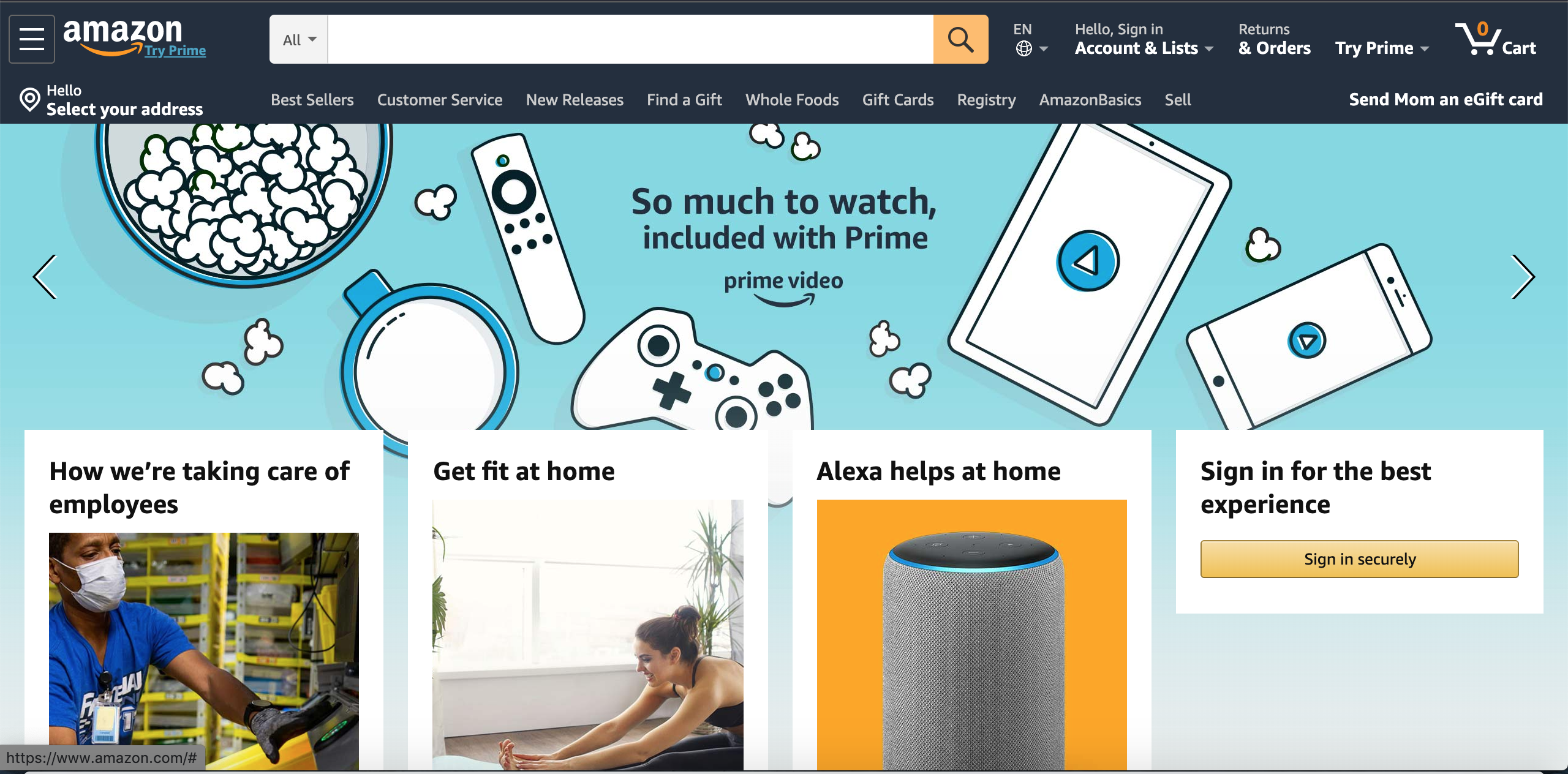
Amazon knows a majority of its user base will interact directly with the menu bar at the top of the page because users generally visit the site to purchase something specific. Therefore, they draw more attention to their ad for Prime Video in hopes that the user may subscribe, even though that wasn’t the user’s initial intention. The banner has color, images with texture and angles, and it is the first thing we see. Amazon can upsell us on a movie even if we only intended to order shoes.
亚马逊知道其大部分用户群将直接与页面顶部的菜单栏进行交互,因为用户通常会访问该站点以购买特定商品。 因此,他们吸引了更多关注他们Prime广告的广告,希望用户可以订阅,即使这并不是用户的初衷。 横幅具有颜色,带有纹理和角度的图像,这是我们看到的第一件事。 即使我们只打算订购鞋子,亚马逊也可以通过电影向我们加价销售。
2.模式识别 (2. Pattern identification)
From there, our brain uses techniques to create patterns based on the identified features.
从那里,我们的大脑使用技术根据所识别的特征创建模式。
Proximity- Objects that are closer in proximity on a page are more likely to be associated. Proximity is a great technique for associating similar items and organizing pages in general.
接近度 -页面上距离更近的对象更有可能关联。 接近度是一种将相似的项目关联在一起并组织页面的重要技术。
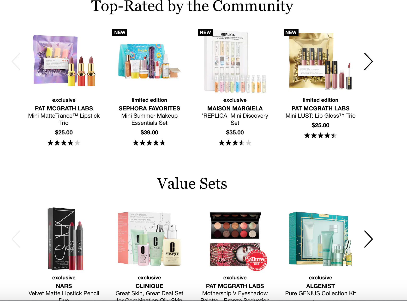
The fact that Sephora has such a vast product line on its site warrants a grouping element for its items. Sephora does a great job utilizing white space to employ proximity. Even if the texts “Top-Rated by the Community” and “Value Sets” were removed in the photo above, we would still be able to distinguish that there are two product types being represented.
丝芙兰在其网站上拥有如此庞大的产品线这一事实保证了其商品的分组元素。 丝芙兰(Sephora)在利用空白来应用邻近方面做得很好。 即使在上面的照片中删除了“社区最受好评”和“价值集”这两个文字,我们仍然能够区分所代表的两种产品类型。
Closure- Our brain will automatically “close” objects that we recognize without needing the full picture. In other words, if we leave out implicit information or visual context, our brain will automatically fill in missing pieces as if it’s completing a puzzle.
关闭 -我们的大脑将自动“关闭”我们识别的对象,而无需全貌。 换句话说,如果我们遗漏了隐含的信息或视觉环境,我们的大脑将自动填充缺失的部分,就像完成一个谜一样。
Continuation- When our eyes start to follow something, they will continue to travel in that direction until they encounter another object or obstruction.
继续-当我们的眼睛开始跟随某物时,它们将继续朝该方向行进,直到遇到另一个物体或障碍物为止。
Closure and continuation allow our perception to fill in the gaps. They allow for our users to use passive perception, which requires less brainpower while also leading to great design.
封闭和延续使我们的认知填补了空白。 它们允许我们的用户使用被动感知,这需要更少的脑力,同时还可以带来出色的设计。

Most companies nowadays use these principles in their logos and custom images to modernize and build their brand. Logos and custom images are often overlooked but key factors in product branding!
如今,大多数公司在徽标和自定义图片中使用这些原则来现代化和建立自己的品牌。 徽标和自定义图像通常被忽略,但是产品品牌塑造的关键因素!
Similarity- Grouping visuals with similar features together not only improves the overall page aesthetic but also helps users find relevant information and skip over things that aren’t relevant to them.
相似性 -将具有相似功能的视觉效果分组在一起,不仅可以提高整体页面的美观度,还可以帮助用户查找相关信息并跳过与它们无关的内容。
3.物体识别 (3. Object Recognition)
Finally, our brain uses the features and patterns it picked up to recognize objects on the page.
最终,我们的大脑使用它所拾取的特征和模式来识别页面上的对象。
召回识别 (Recognition Over Recall)
Users prefer to interact with things that are familiar to them. Consistency and standards are widely leveraged across different products with similar functions in UX design.
用户喜欢与他们熟悉的事物进行交互。 UX设计中具有相似功能的不同产品之间广泛使用一致性和标准。
Take Google Docs as an example.
以Google文档为例。
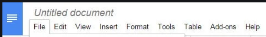
They modeled their menu bar based off of Microsoft Word’s- and with good reason.
他们基于Microsoft Word并有充分的理由对菜单栏进行建模。
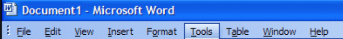
Word is a competing product that dominated the market. Creating a menu bar consistent with that of an already successful product will remove the uncertainty that comes with learning a new product.
Word是主导市场的竞争产品。 创建与已经成功的产品一致的菜单栏将消除学习新产品带来的不确定性。
Another powerful strategy to reduce the learning curve of our interfaces is to use metaphors. Common metaphors include recycling bins for deletion and shopping carts for item list views. When we see these symbols on a page, we instantly know what to expect by clicking them.
减少界面学习曲线的另一种有效策略是使用隐喻。 常见的隐喻包括用于删除的回收箱和用于项目列表视图的购物车。 当我们在页面上看到这些符号时,我们可以通过单击它们立即知道预期的结果。
架起执行与评估之湾 (Bridging the Gulfs of Execution and Evaluation)
Give visual cues to the user to help them discover what is and isn’t possible. The goal is to never leave the user confused about the system status.
向用户提供视觉提示,以帮助他们发现可能和不可能的事情。 目标是永远不要让用户对系统状态感到困惑。
Affordances:
客流量:
Outline- Highlight buttons and cards with shadows to give them spatial context and indicate that they can be interacted with.
轮廓线-用阴影突出显示按钮和卡片,以使它们具有空间背景并指示它们可以进行交互。
Progress bar and feedback- Progress bars, modals, error messages, and help links can help the user evaluate the current state of the system.
进度条和反馈 - 进度条, 模式 ,错误消息和帮助链接可以帮助用户评估系统的当前状态。

The modal above not only acknowledges that the user successfully created an account, but also makes clear what the user should do next to properly use the application.
上面的模态不仅确认用户成功创建了一个帐户,还明确了用户下一步应如何正确使用该应用程序。
Constraints- Grey out features or text that aren’t available or simply leave them out. Allow the user to focus on one element at a time. One simple use case of this principle can be to grey out the “sign up” button until both the username and password fields have been populated during a signup flow.
约束 -将无法使用的功能或文本灰显或将其忽略。 允许用户一次专注于一个元素。 此原理的一个简单用例是将“注册”按钮显示为灰色,直到在注册流程中同时填写了用户名和密码字段为止。
Using Gestalt’s principles can help in building a conceptual model for the user. Less is more when it comes to design, so avoid visual clutter and give the user familiar cues. By bridging principles of psychology and visual perception, we can create better user experiences.
使用格式塔的原理可以帮助为用户建立概念模型。 在设计时,少即是多,因此请避免视觉混乱,并为用户提供熟悉的提示。 通过将心理学和视觉感知的原则相结合,我们可以创造更好的用户体验。
翻译自: https://uxdesign.cc/visual-perception-in-product-design-c7352a92baed
视觉感知


 被折叠的 条评论
为什么被折叠?
被折叠的 条评论
为什么被折叠?
 到【灌水乐园】发言


