


 本文探讨了鲁道夫·莫德利(Rudolf Modley)在美国报纸上发表的同型图表(Telefact)系列,揭示了其在1938年至1945年间对信息可视化的影响。莫德利利用同型方法,通过简洁的视觉表达,使复杂的数据变得易于理解,尤其是在二战期间,这些图表成为了普及科学知识和统计信息的重要工具。
While Otto Neurath invented the Isotype in Vienna in 1925 and guided its evolution to international acclaim, he was not successful in the United States. Unfortunately, his method of pictorial statistics was not readily taught in schools and is not (yet) practiced today.
奥托·纽拉特(Otto Neurath)于1925年在维也纳发明了同型车,并将其演变为国际声誉,但他在美国却没有成功。 不幸的是,他的图像统计方法在学校还不容易教授,并且今天还没有被实践。
But it turns out that isotype charts were prevalent in US government documents in the 1930s and 1940s. If you look for them, you can find isotypes sprinkled all over the US during this time — they just weren’t made by Otto or Marie Neurath. No, the growth and popularity of pictorial statistics in the USA are thanks to a different under-recognized figure in design history: Dr. Rudolf Modley.
但是事实证明,同种型图表在1930年代和1940年代的美国政府文件中很普遍。 如果您要寻找它们,那么您会发现这段时间散布在美国各地的同种型-它们不是由Otto或Marie Neurath制造的。 不,在美国,图形统计的增长和普及是由于设计历史中一个未被充分认识的人物:Rudolf Modley博士。
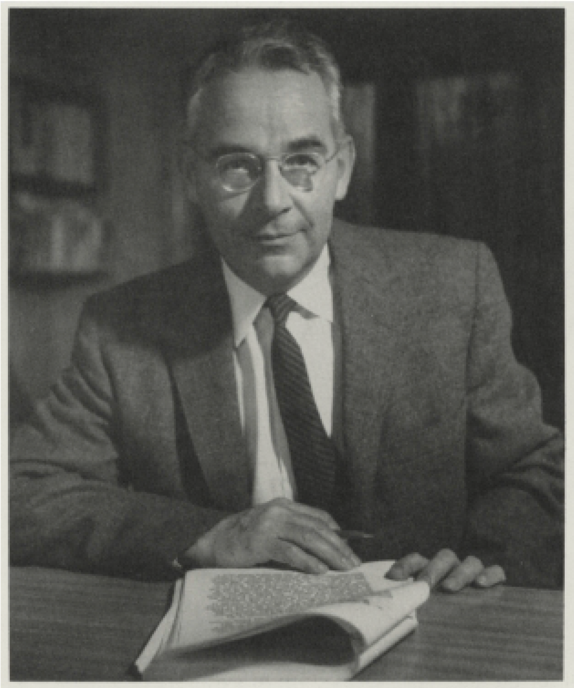
Born in Vienna, Rudolf Modley was involved as a student-volunteer in the earliest days of Neurath’s Museum of Society and Economy. After years of service, Modley eventually moved to the USA to serve as Neurath’s proxy at the Museum of Science and Industry in Chicago, but had ideas of his own and began designing isotype charts by himself.
鲁道夫·莫德利(Rudolf Modley)生于维也纳,最初是诺伊特(Neurath)社会经济博物馆的学生志愿者。 经过多年的服务,Modley最终移居美国,在芝加哥科学与工业博物馆担任Neurath的代理人,但他有自己的想法,并开始自己设计同型图。
A young man on his own in America, Modley’s life then follows the path of many first-generation immigrants — he saw an opportunity and worked hard to take advantage of it. The rise of the New Deal in the early 1930s saw many government agencies looking to pictorial statistics to visually communicate their plans to an eager American population. Of course, the officials in the US government looked to Rudolf Modley’s company conveniently named “Pictorial Statistics, Inc” to do so.
莫德里(Modley)是一个独自生活在美国的年轻人,此后的生活遵循许多第一代移民的道路-他看到了机会,并努力利用这一机会。 1930年代初期,新政的兴起使许多政府机构希望通过图形化的统计数字,将其计划视觉传达给渴望的美国人口。 当然,美国政府官员希望鲁道夫·莫德利(Rudolf Modley)的公司方便地命名为“ Pictorial Statistics,Inc”。
He worked tirelessly to bring pictorial statistics to the common American as a new method to understand the increasingly scientific world around them. It only makes sense that he took this new form of communication to the biggest mass media at the time: newspapers.
他孜孜不倦地将绘画统计资料带给普通美国人,以此作为了解周围日益科学的世界的新方法。 唯一有意义的是,他将这种新的通讯方式带入了当时最大的大众媒体:报纸。

“使阅读统计信息愉快” (“Makes The Reading of Statistical Information A Pleasure”)
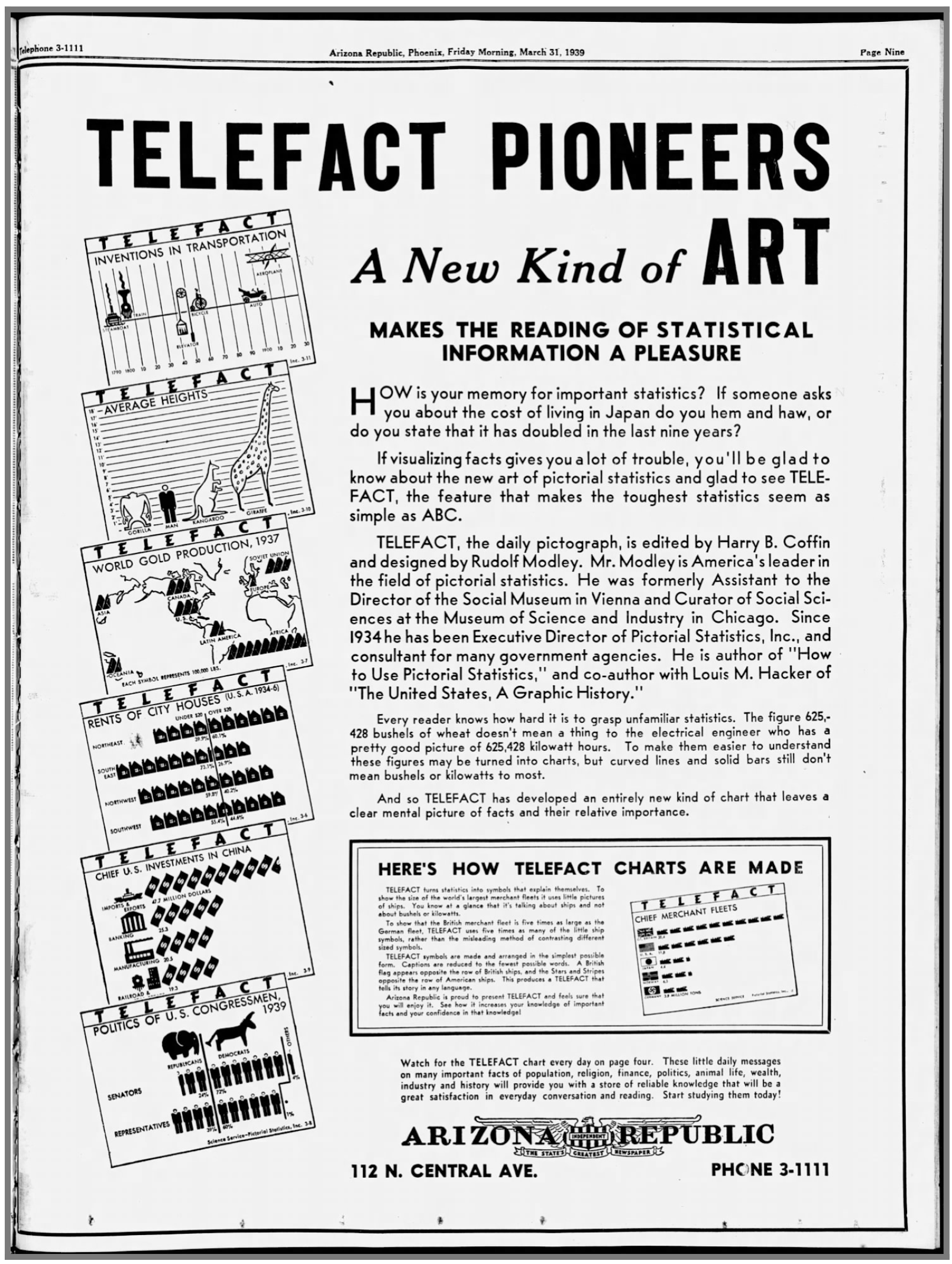
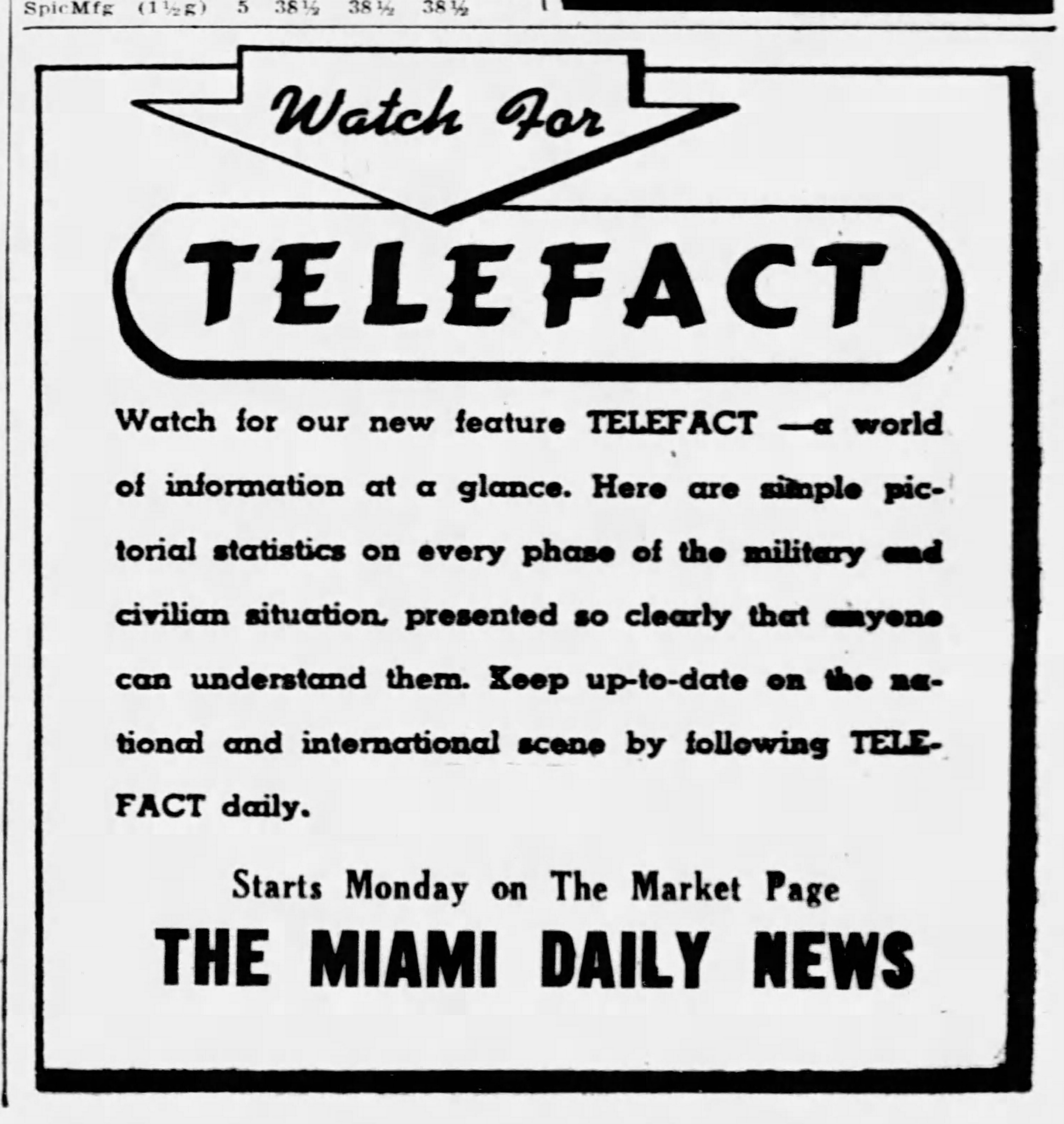
Modley’s star was on the rise as a result of his work with the US government. A February 1938 issue of The New Yorker indirectly announced Modley’s plans when they wrote: “He and his staff will take on any sort of research of graphs [with] Telefact, a feature which he is preparing for newspaper syndication.”
由于莫德利与美国政府的合作,他的明星正在崛起。 1938年2月出版的《纽约客》(The New Yorker)在写信时间接宣布了莫德利的计划:“他和他的员工将使用Telefact进行任何形式的图形研究,这是他为报纸联合组织做准备的功能。”
Later, in his 1952 book Pictographs and Graphs, Modley writes about charting in newspapers: “Another difficulty in charting for newspapers is the speed with which the charts must be prepared. The research and finished artwork must be done in a day or two, which puts tailor-made charts beyond the reach of many newspapers. For this reason, several methods for making timely charts available in syndicated form have been tried. As early as 1937, Telefact, a graphic syndicate, made its appearance. Its charts dealt with general social and economic subjects, and, during World War II, with information pertaining to the war. Designed to be used over a period of time, they were topical without following the latest news as a newspaper would.”
后来,在他的1952年的书象形文字和图表 ,Modley写的图表在报纸:“在图表报纸的另一个困难是与图表必须准备的速度。 研究和完成的艺术品必须在一两天内完成,这使量身定制的图表超出了许多报纸的范围。 因此,尝试了几种使及时的图表以联合形式提供的方法。 早在1937年,图形联合组织Telefact就出现了。 它的图表涉及一般的社会和经济主题,并且在第二次世界大战期间涉及与战争有关的信息。 设计使用一段时间后,它们成为热门话题,而没有像报纸那样关注最新消息。”
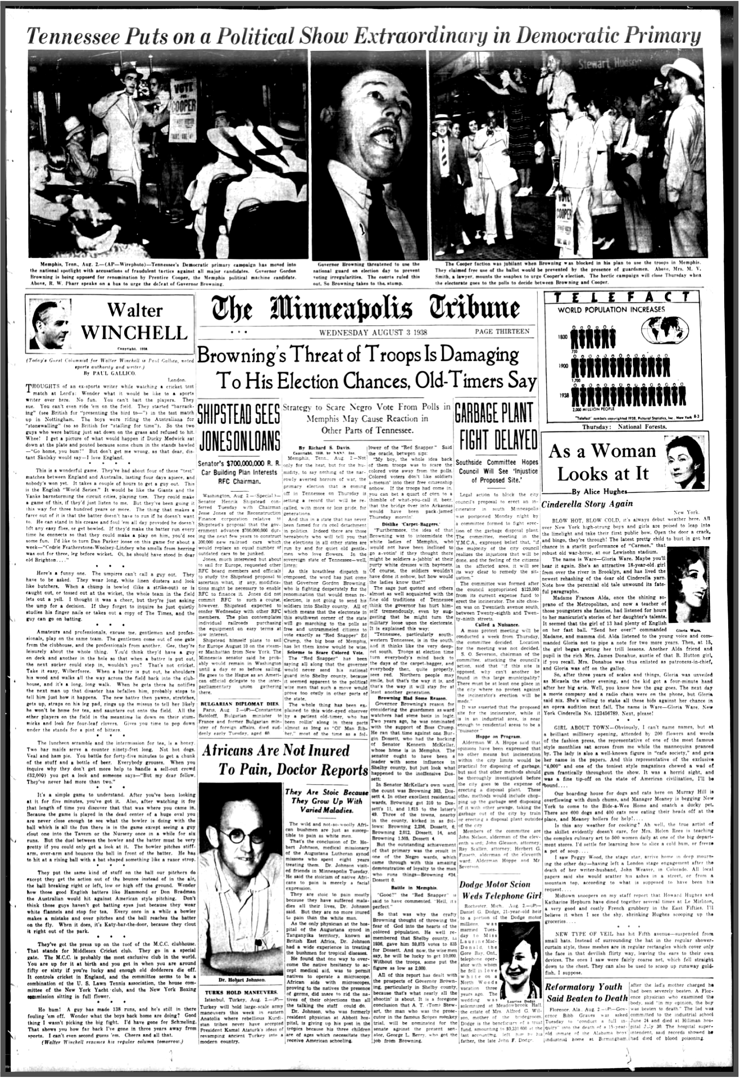
Telefact was syndicated widely across the USA, featured in newspapers in Minnesota, South Carolina, Virginia, Arizona, Utah, and many others. As you can see on the left, they were inserted wherever space allowed, and visually competed for the reader's attention with advertisements and headlines.
Telefact在美国各地广泛联合起来,在明尼苏达州,南卡罗来纳州,弗吉尼亚州,亚利桑那州,犹他州等许多报纸上都有报道。 如您在左侧看到的,它们被插入到空间允许的位置,并通过广告和标题在视觉上争夺读者的注意力。
In his 1938 article “Pictographs Today and Tomorrow”, Modley says: “… another effort has been made to have pictographs penetrate even into remote areas by means of a syndicated newspaper feature called Telefact, which presents a fact of social or economic importance each day… The pictograph technique opens up new possibilities of influencing and shaping public opinion. It makes possible the presentation of factual material in simple terms and to an audience which is much larger than any yet reached by factual information.”
莫德利(Modley)在其1938年的文章“ 今天和明天的象形文字 ”中说:“……人们又作了一项努力,通过名为Telefact的联合报纸特刊,使象形文字甚至渗透到偏远地区,每天都在呈现社会或经济重要性的事实。 ……象形文字技术为影响和塑造公众舆论开辟了新的可能性。 它使以简单的方式向观众展示事实材料成为可能,这比事实信息所能达到的范围要大得多。”
宝藏图 (A Treasure Trove of Charts)
There are quite a few Isotype practitioners that have been overlooked but Rudolf Modley is the most known among them with a surprisingly large body of work that is very poorly documented.
有很多同类型的从业者被忽视了,但鲁道夫·莫德利(Rudolf Modley)是其中最著名的,其工作量惊人地庞大,文献记载却很少。
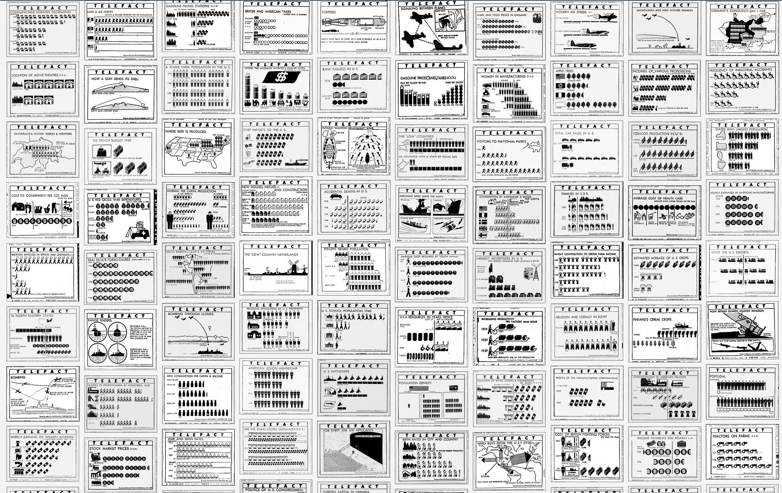
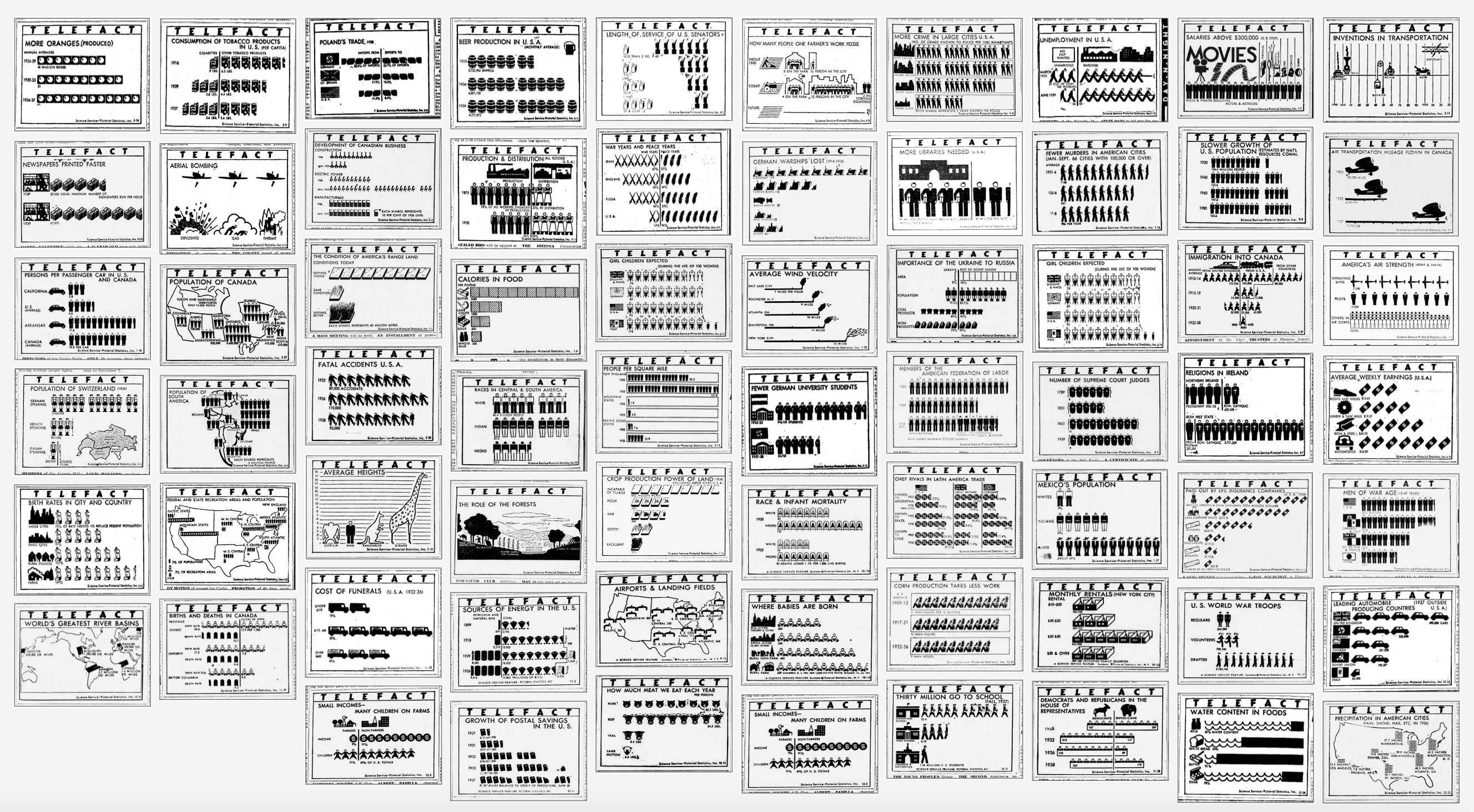
Imagine my surprise when searching newspapers.com to find not 2–3 mentions of Telefact, but over a thousand. So far I have manually collected more than 480 charts from daily newspapers with double this amount created from 1938–1945.
想象一下,当我在newspapers.com上发现不是2-3条提到Telefact时, 却发现超过一千条消息时,我感到惊讶。 到目前为止,我已经从日报中手动收集了480多个图表,这个数字是1938-1945年创造的数量的两倍。
The scale of the find is what is so surprising. With so many charts to scan through, we see so many design ideas explored by Modley and his staff. Not only can we see how different subjects are presented using this charting method, but we also can see how the design templates of Isotype have been applied to various types of data.
发现的规模真是令人惊讶。 扫描的图表如此之多,我们看到Modley及其工作人员探索了许多设计思想。 我们不仅可以看到使用这种制图方法如何呈现不同的主题,还可以看到Isotype的设计模板如何应用于各种类型的数据。
This laboratory of pictorial statistics feels different from most Isotype examples that we know from books and exhibitions. While many Isotypes are part of a broad study or education focus, Telefacts were designed to be immediate and independent. The concepts that are communicated in Telefacts are naturally interesting but independent of any larger story, acting like bite-sized snippets of economic trivia.
这个图片统计实验室与我们从书籍和展览中了解到的大多数同型打字机示例不同。 尽管许多同种型是广泛学习或教育重点的一部分,但Telefacts却被设计为即时且独立的。 Telefacts中传达的概念自然很有趣,但与任何较大的故事都没有关系,就像经济琐事的小片段一样。
This was exactly the point. It is easy to see Modley’s agenda in the marketing of Telefact as well as in the charts themselves. This project was designed to help people learn the facts — but more than that — to help common people leverage the world of science and statistics in their normal lives.
这正是重点。 在Telefact的营销以及图表本身中,很容易看到Modley的议程。 该项目旨在帮助人们了解事实,但不仅限于此,还可以帮助普通人在其正常生活中利用科学和统计领域。
Of course, Modley was also just as interested as exposing them to Pictorial Statistics as well. He writes in his 1937 book How to Use Pictorial Statistics:
当然,莫德里(Modley)同样也很感兴趣,就像将它们暴露在图片统计中一样。 他在1937年的著作《 如何使用图片统计》中写道:
“Numerous textbooks on subjects as varied as history, geography, and biology have been extensively illustrated by pictograph technique. While it is thus assured that the coming generation will be used to the method, another effort has been made to have pictographs penetrate even into remote areas by means of a syndicated newspaper feature called Telefact, which presents a fact of social or economic importance each day.”
“象形文字技术已广泛地说明了有关历史,地理和生物学的众多教科书。 这样可以确保下一代使用该方法,但人们又做出了另一种努力,通过称为Telefact的联合报纸功能,使象形文字甚至渗透到偏远地区,这每天都在体现着社会或经济的重要性。 。”
当我们几乎不能专注于一个时,该如何显示数百个电视广播图表? (How To Present Hundreds of Telefacts Charts When We Can Barely Focus On One?)
I found myself wondering what to do with all this content. While I find the charts compelling, I also find the act of scanning through them equally interesting. But I kept wondering how I could help other people have a similar experience? Our dwindling attention span is hard to navigate, so I kept asking myself what was the best way to get this work out into the public and allow them to learn more from it?
我发现自己想知道如何处理所有这些内容。 当我发现图表很吸引人时,我也发现扫描它们的行为同样有趣。 但是我一直想知道如何帮助其他人也有类似的经历? 我们的关注范围不断缩小,很难驾驭,所以我一直在问自己,将这项工作发布给公众并使他们从中学到更多的最佳方法是什么?
I decided to create a Tumblr to share my work for a few reasons. First, Tumblr allows for a very intuitive experience where the user can see the charts as a group and also as individuals. Each image is meta tagged, so these charts will now be searchable among the vast quantity of SEO optimized images on Tumblr. But most importantly, these images will now be indexed by Google, so they will be publically available and accessible.
由于一些原因,我决定创建一个Tumblr来分享我的作品。 首先,Tumblr提供了非常直观的体验,用户可以将图表作为一个组或一个人查看。 每个图像都是元标记的,因此现在可以在Tumblr上的大量SEO优化图像中搜索这些图表。 但最重要的是,这些图像现在将由Google索引,因此它们将公开可用。
请检查一下: https : //modley-telefact-1939-1945.tumblr.com (Please check it out: https://modley-telefact-1939-1945.tumblr.com)
看一些电视节目表 (Looking At A Few Telefact Charts)
There’s a lot to love in these charts. Not only do we see the progenitors of the everyday infographic that we see in our newspapers and magazines today, but also a snapshot of what life was like in the late 30s and into the WW2 era. Let’s take a look at a few interesting charts:
这些图表中有很多值得爱的地方。 我们不仅看到了今天在报纸和杂志上看到的日常信息图表的前身,而且还回顾了30年代末和二战时代的生活。 让我们看一些有趣的图表:
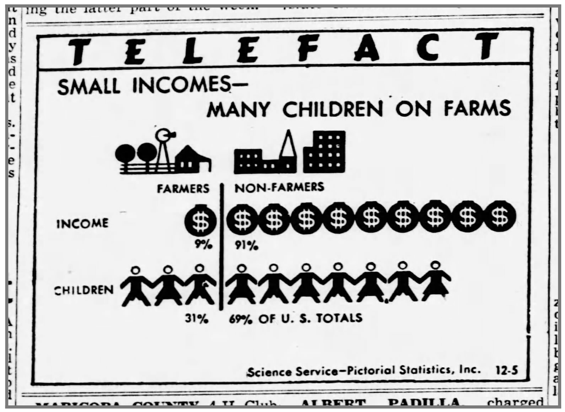
Many charts use standard isotype methods to visually display statistics but also reduce them to a more immediate understanding of the content. This chart uses simplified ‘guide pictures’ to indicate the split between farmers and non-farmers. The chart compares the urban and rural incomes with the corresponding number of children in each.
许多图表使用标准的同型方法来直观地显示统计信息,但也将它们简化为对内容的更直接了解。 该图表使用简化的“指南图片”来指示农民和非农民之间的差异。 该图表将城市和农村的收入与相应的子女数进行了比较。
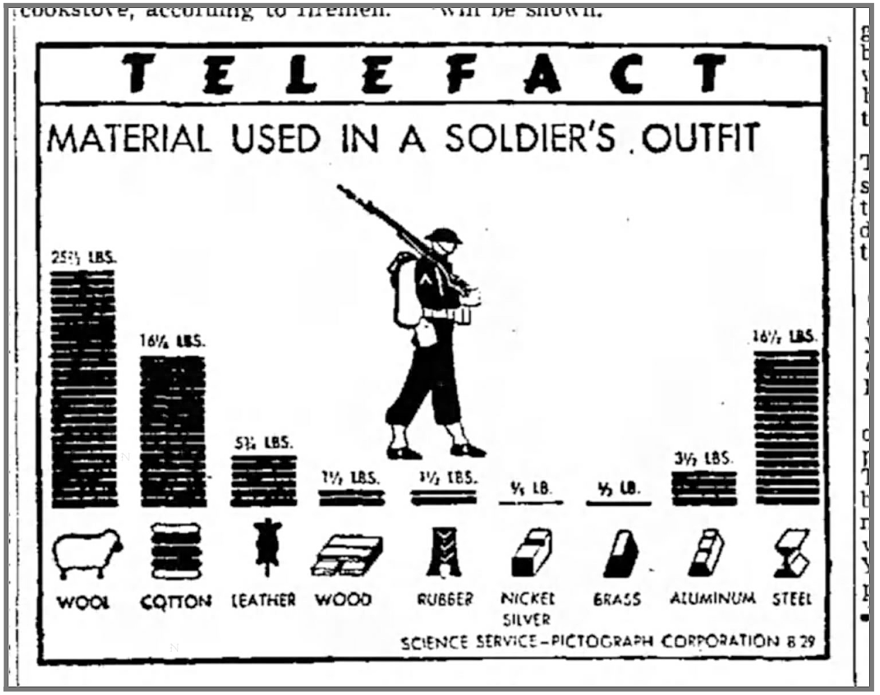
This telefact chart contains very little text but breaks one of Neurath’s main rules by including the numbers along with the pictorial representation of the number. This is a significant divergence from the Isotype practice, but at the same time adds a significant layer of meaning needed to communicate to a general audience. The basic numbers presented are simple and give substance to the charts.
该电视广播图表只包含很少的文字,但是通过将数字以及数字的图形表示包括在内,打破了Neurath的主要规则之一。 这与同型练习存在很大的差异,但同时又增加了与普通观众交流所需的意义。 所提供的基本数字很简单,可以使图表实质化。
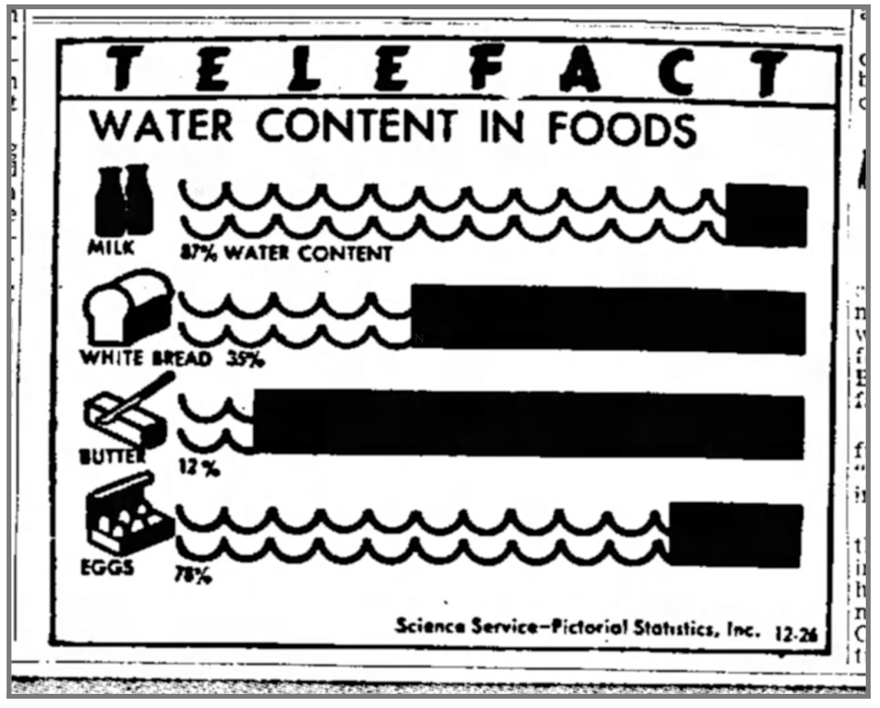
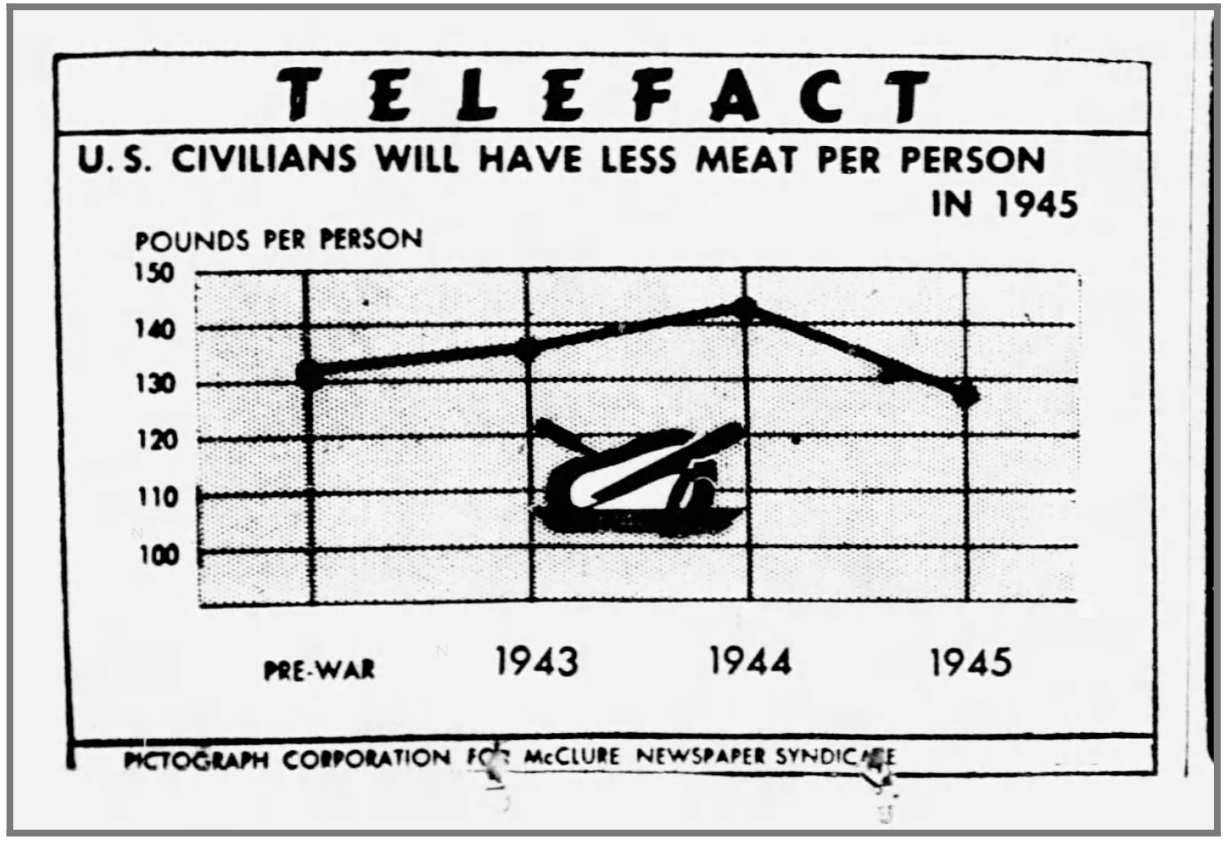
As for the chart, it is interesting to see just how much water there is in an average egg. The ‘waves’ of water are visually interesting as they are used in a sort of horizontal stacked bar-chart, with the solid, non-water segment showing the rest of the percentage. The use of the wave to denote water is an interesting exercise in symbol abstraction, as the quantity of water in a stick of butter does not map to our understanding of an ocean. Somehow it still works.
至于图表,有趣的是,平均鸡蛋中到底有多少水。 水的“波浪”在视觉上很有趣,因为它们被用在一种水平堆叠的条形图中,其中固体,非水部分显示了其余百分比。 在符号抽象中,使用波浪来表示水是一项有趣的练习,因为黄油棒中的水量并不符合我们对海洋的理解。 不知何故它仍然有效。
Of note is that each Telefact has the month and day included in the right corner to show exactly when it was to be published. Unfortunately, they do not include the year.
值得注意的是,每个Telefact的右上角都有月份和日期,以准确显示发布时间。 不幸的是,它们不包括年份。
The ‘unit arrow’ diagram on the left is another isotype chart type popularized by the Neurath's and was used throughout their careers. It’s clear that Modley regularly kept a close eye on their work and, for better or worse, continued to build on their ideas.
左边的“单位箭头”图是另一种同种型图,受到了Neurath的欢迎,并在他们的整个职业生涯中使用。 显然,莫德利定期密切关注他们的工作,无论好坏,他们都会继续建立自己的想法。
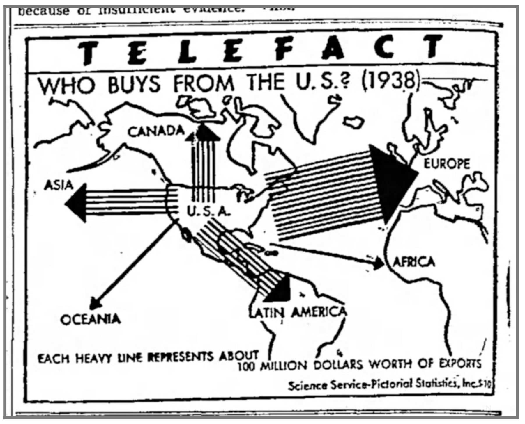
In the chart on the left, each arrow represents the millions of dollars in exports and easily shows exactly where the US sells its goods. In order to squeeze so much information into such a small area, Modley creates a massive simplification of the map shapes in a semi-geometric fashion. Modley experiments with this kind of geometric simplification throughout this period of his work.
在左侧的图表中,每个箭头代表了数百万美元的出口,并可以轻松地准确显示美国销售商品的位置。 为了将如此多的信息压缩到如此小的区域中,Modley以半几何方式极大地简化了地图形状。 在整个工作期间,莫德利都在尝试这种几何简化。
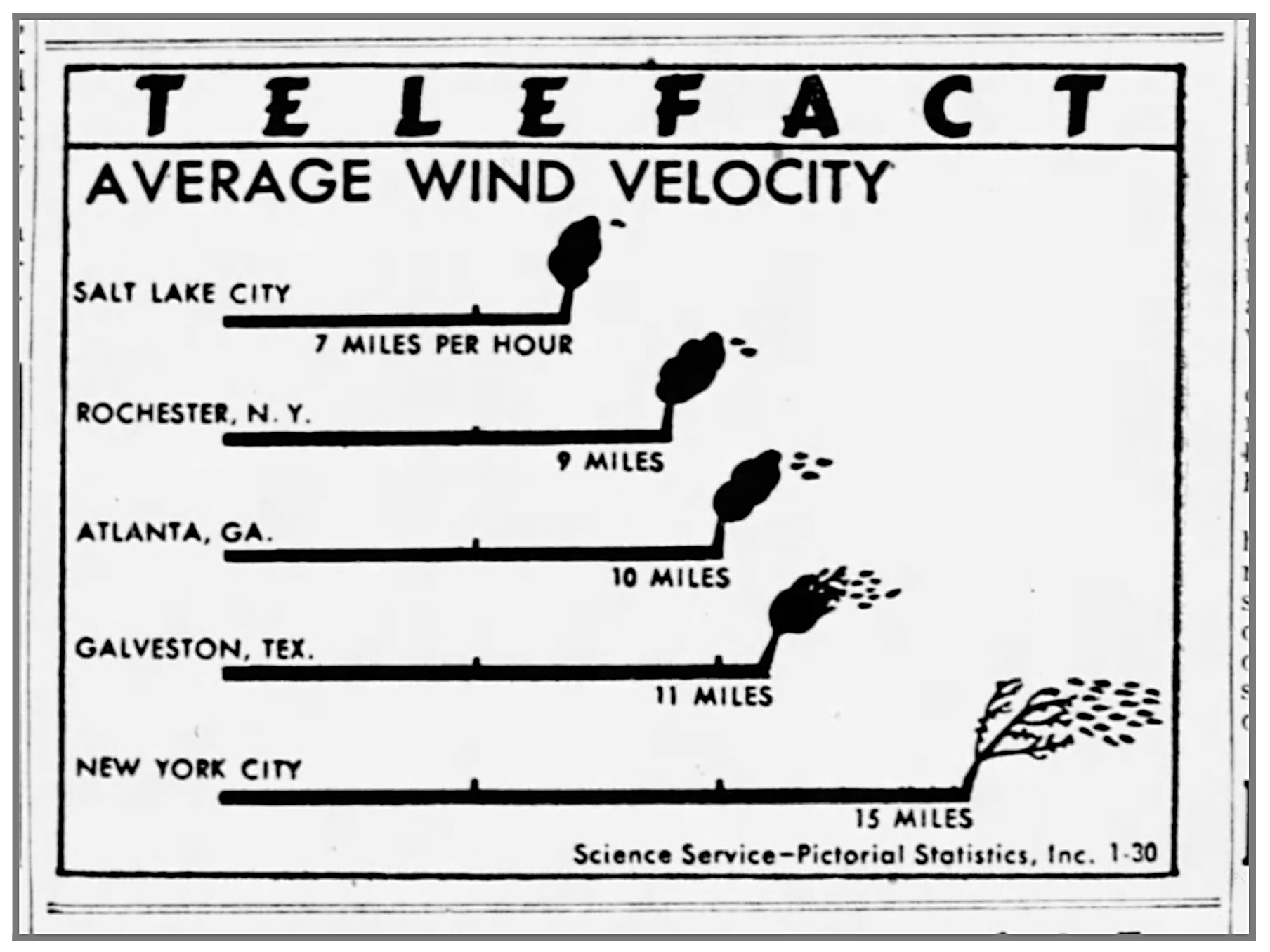
Otto and Marie Neurath occasionally used the power of analogy to focus the audience to consider data in a certain way as best used in the chart “Only an Ocean In Between”. In the chart on the upper right, however, Modley uses a similar idea to compare the wind velocity for five major cities as the distance it takes to blow the leaves off a tree. The power of analogy is particularly very strong, and while Modley didn't use this technique often, it is especially powerful in the right context.
奥托(Otto)和玛丽·纽拉(Marie Neurath)有时会利用类比的力量来吸引观众,以某种方式考虑数据,这是图表“ 仅介于两者之间的海洋 ”中使用得最好的。 但是,在右上方的图表中,莫德利采用了类似的想法,比较了五个主要城市的风速与吹树叶的距离。 类比的力量非常强大,虽然Modley并不经常使用这种技术,但在适当的情况下它特别强大。
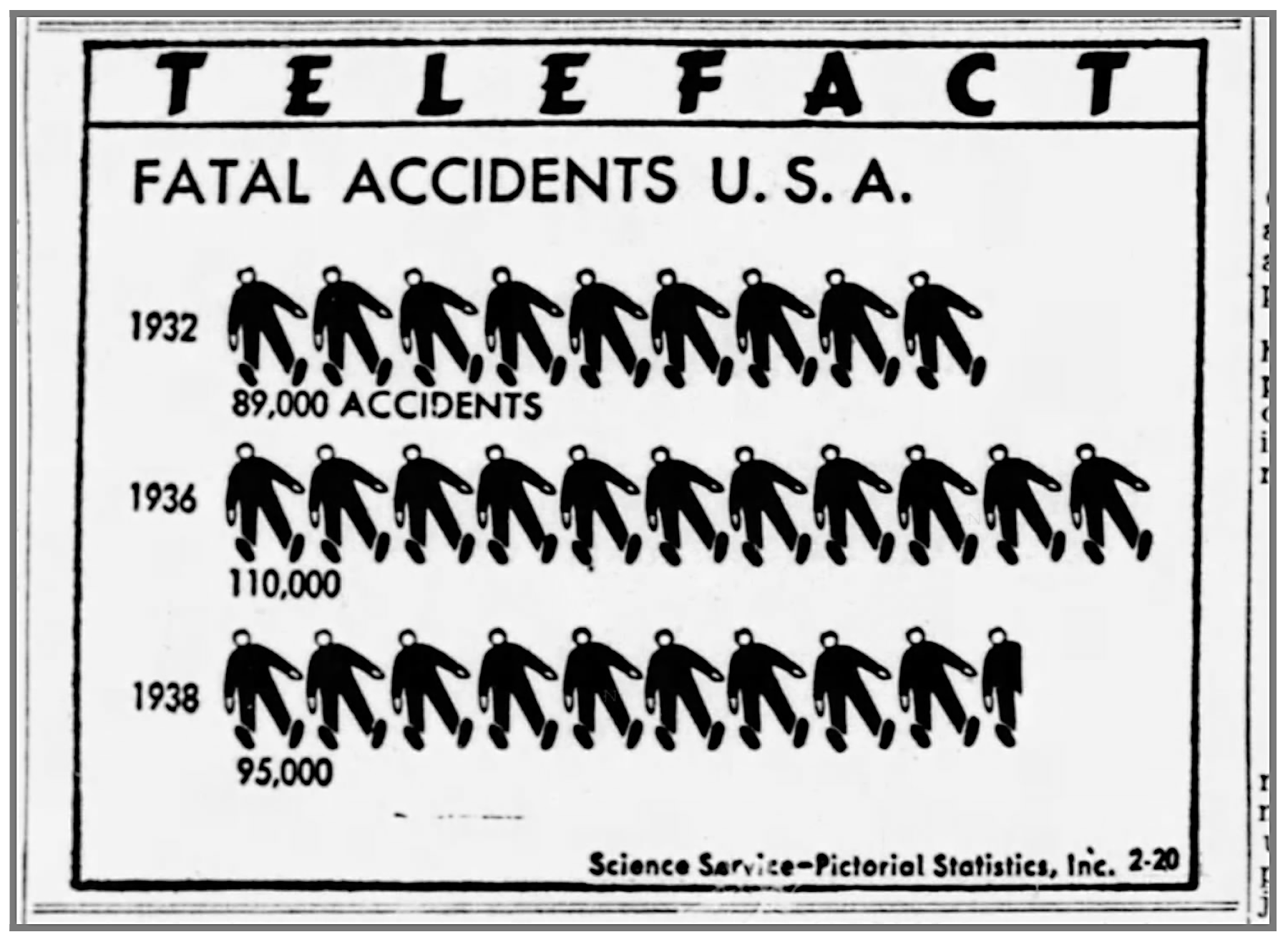
In terms of subject matter, Modley knew salacious subjects would help to attract attention. This chart of fatal accidents — complete with almost 30 little dead guys — used repetition to grab attention and a basic title to seal the deal.
在主题方面,莫德利知道淫荡的主题将有助于吸引注意力。 这张致命事故图表-几乎有30个小家伙-用重复来吸引注意力,并用一个基本头衔来达成协议。
In the end, this is ultimately a conventional pictograph, with little Isotype influence. That’s not inherently a bad thing, as an overview of the hundreds of Telefacts shows a huge quantity of these types of pictographs interspersed between more complex charts and diagrams.
最后,这最终是传统的象形文字,几乎没有同型影响。 这并不是一件坏事,因为对数百个Telefact的概述显示,大量此类象形文字散布在更复杂的图表之间。
Pictographs are easy to understand and require less visual sophistication by the audience. By using so many basic pictographs it shows a willingness by Modley and his team to focus on the data and not over-do it. Certainly creating these charts each week/day was a huge amount of work, so standardizing the process for creating the charts was just as important as knowing when to move on to the next one.
象形文字易于理解,观众所需要的视觉技巧也较少。 通过使用许多基本的象形文字,它表明Modley和他的团队愿意专注于数据而不是过度使用数据。 当然,每周/每天创建这些图表是一项艰巨的工作,因此标准化创建图表的过程与知道何时移至下一张图表一样重要。
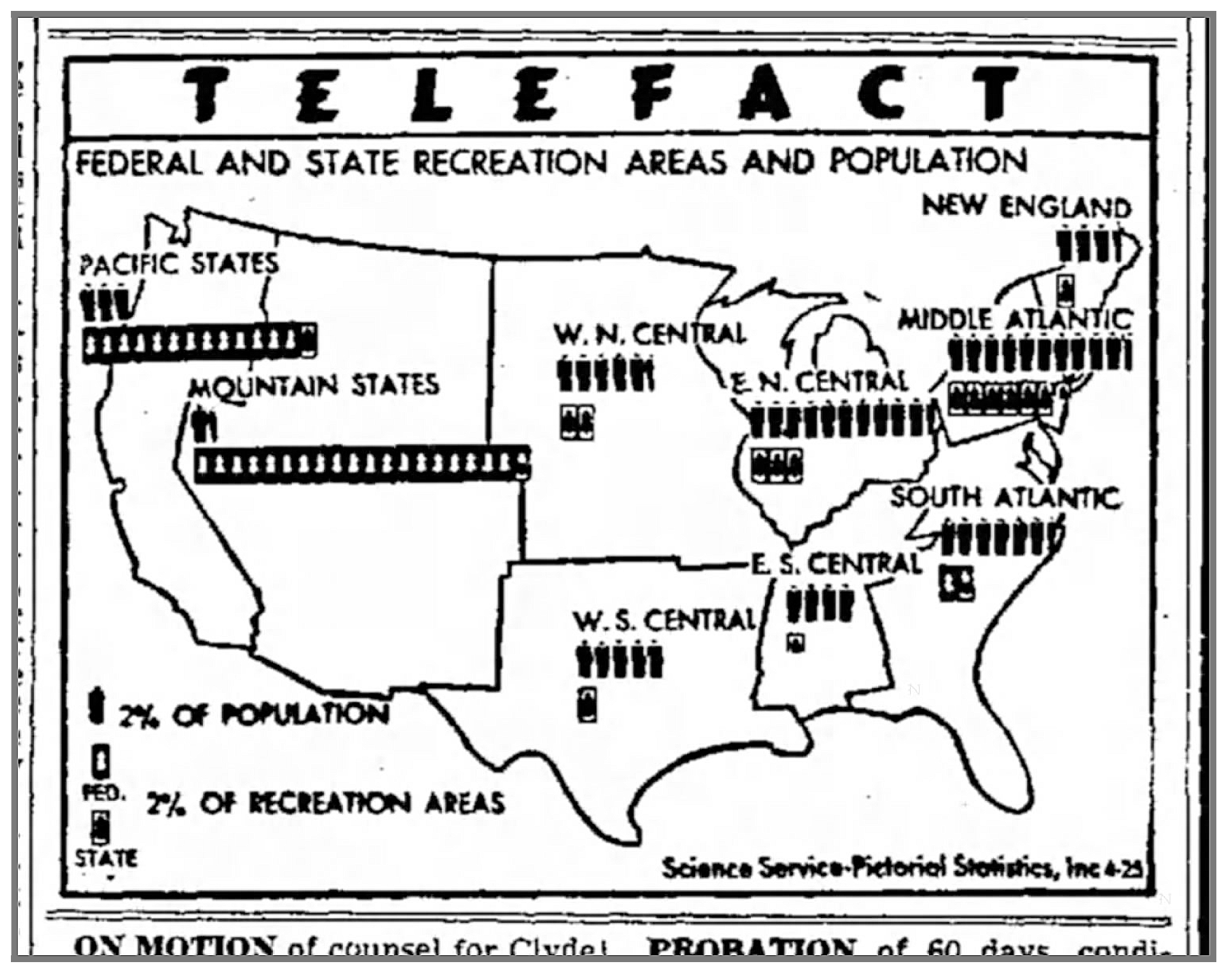
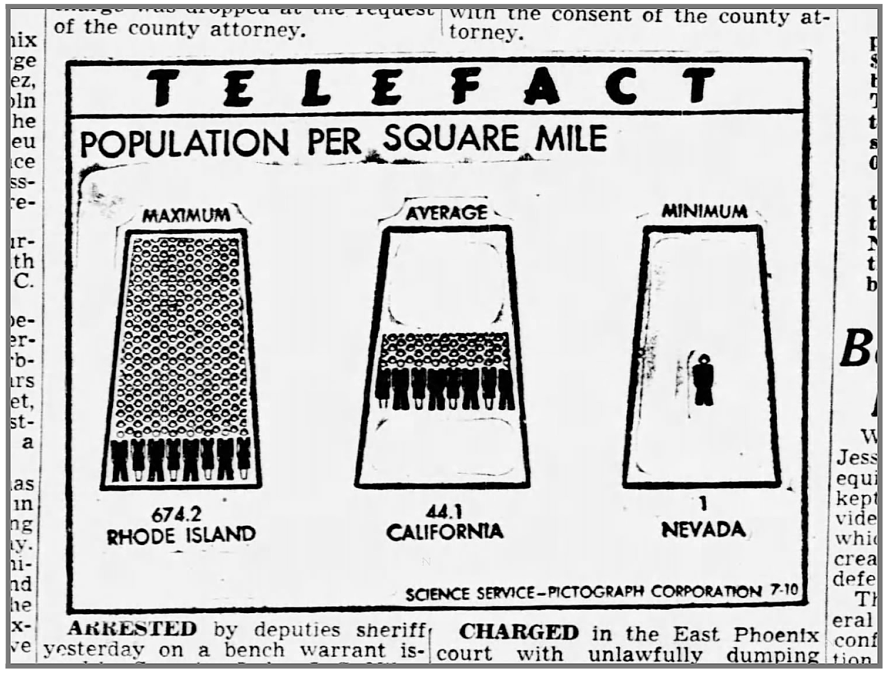
This map is again very much in the mode of what you’d see created by the Isotype team. The chart’s learning objective is to compare population density with recreational areas. While well-intentioned, it is unfortunately not a very successful chart as it is too crowded and not well labeled.
该地图再次非常类似于Isotype团队创建的模式。 图表的学习目标是将人口密度与休闲区进行比较。 虽然用心良苦,但不幸的是,它过于拥挤且标签不够好,因此它并不是一个非常成功的图表。
In collecting so many Telefact charts it also becomes an important opportunity to learn from Modley’s failures. Understanding when a chart is successful, and when it is not, helps us understand how to bring these ideas into our own practice. In the chart above, Modley tried to cram too much into too small an area creating a messy design that is hard to visually read.
在收集大量Telefact图表时,这也成为从Modley的失败中学习的重要机会。 了解图表何时成功,什么时候不成功,有助于我们理解如何将这些想法付诸实践。 在上面的图表中,Modley试图将太多的东西塞满到一个很小的区域,以创建一个难以看清的凌乱设计。
I’d invite everyone to interrogate the design of each of these charts for the same purpose of learning what works and what does not.
我将邀请每个人对每个图表的设计进行审问,以达到了解什么有效和什么无效的相同目的。
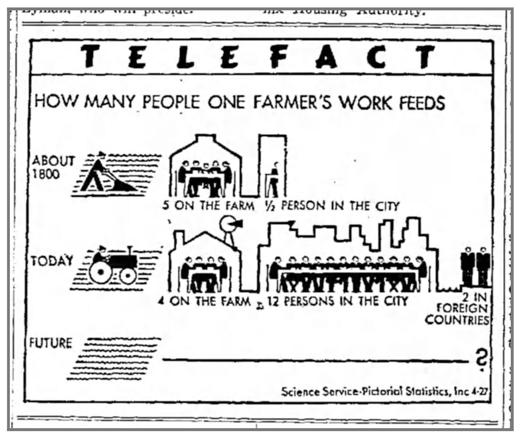
We can also study these charts to see exactly how Modley’s efforts began to diverge their Isotype origins. Both charts above are quite different from what the Neurath’s were designing yet are still sophisticated designs.
我们还可以研究这些图表,以准确了解Modley的工作如何开始区分其同种型起源。 上面的两个图表与Neurath的设计完全不同,但仍然是复杂的设计。
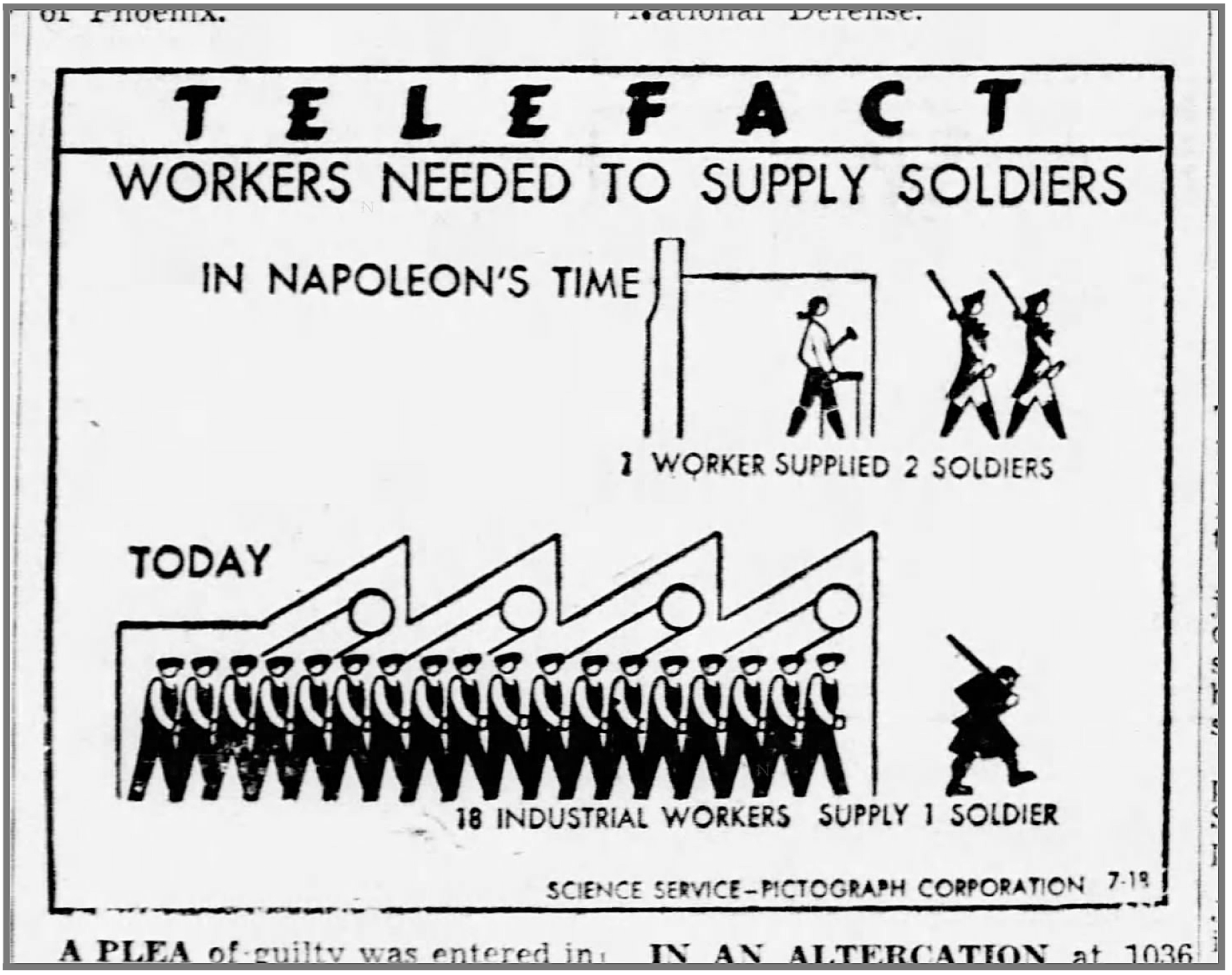
The chart on the left, “How Many People One Farmer’s Work Feeds”, speaks about the benefits of modernization and mechanization, the changes in American culture over a century, and hints at the role of agriculture in international trade. On the bottom row, Modley literally draws a blank as to what the future holds. This is a provocation; not a projection into the future, but a dare to the audience to learn more in order to shape it. By crafting a design that focuses on the possibilities, it departs from the normal isotype objective of illustrating the statistical ‘known’.
左边的图表“一个农民的工作养活了多少人”,谈到了现代化和机械化的好处,一个世纪以来美国文化的变化,并暗示了农业在国际贸易中的作用。 在最下面的一行中,Modley从字面上划出了未来的空白。 这是挑衅。 不是对未来的预测,而是敢于让观众学习更多以塑造未来的方法。 通过设计专注于可能性的设计,它偏离了说明统计“已知”的正常同型目标。
The “S” design of the chart on the right is typical to some other charts that Modley invented. It was created as a way to display a process happening over time but visually compressed into a small space. Modley uses a similar design in a book called the “New York Primer” which came out the year before, so it is a design concept he was exploring at the time.
右图的“ S”设计是Modley发明的其他一些图的典型代表。 创建它是为了显示一段时间内发生的过程,但在视觉上压缩到一个很小的空间。 Modley在一年前出版的《 纽约入门 》一书中使用了类似的设计,因此这是他当时正在探索的设计概念。
Exploring these design concepts are important as it shows that contemporary information designers can (and should!) continue to explore new design patterns based on Isotype to further their communication needs. Rudolf Modley’s team was constantly experimenting, just as his earlier text has said, by “open[ing] up new possibilities of influencing and shaping public opinion.” This also proves that Modley wasn’t “merely” an imitator, but a practitioner on his own merit.
探索这些设计概念非常重要,因为它表明当代信息设计人员可以(并且应该!)继续基于Isotype探索新的设计模式,以进一步满足他们的交流需求。 正如鲁道夫·莫德利(Rudolf Modley)的团队一样,正如他早先的文章所言,他正在“通过开辟影响和塑造舆论的新可能性 ”进行不断的尝试。 这也证明了莫德利不是“仅仅是”模仿者,而是凭自己的功劳。
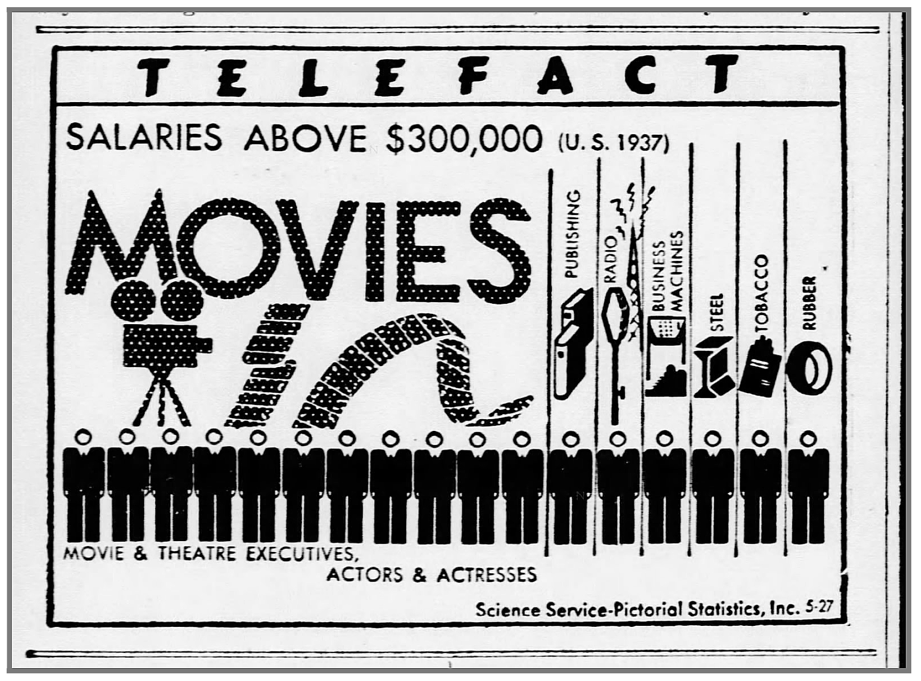
These two Telefacts also show how Modley was experimenting with graphic design concepts as well. The chart to the top left, “Salaries Above $300,000” rides the line between data visualization and design sloganeering. It shows another reoccurring subject of Telefact charts, the breakdown of jobs in Hollywood. The chart’s label assuming a graphic that drives the appeal of the whole design.
这两个Telefacts还显示了Modley也是如何尝试图形设计概念的。 左上方的图表“ 30万美元以上的薪水”介于数据可视化和设计标语之间。 它显示了Telefact图表的另一个重复出现的主题,即好莱坞工作的细分。 图表的标签采用图形来驱动整个设计的吸引力。
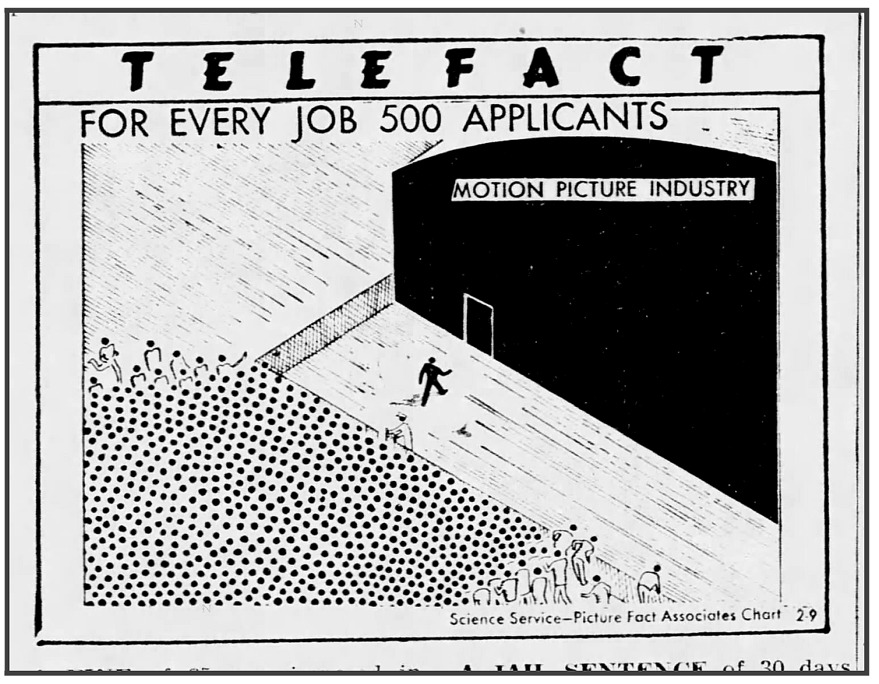
“For Every Job 500 Applicants” to the top right shows an entirely different illustration of a 1-out-of-500 statistic. Each dot is a person that is restrained behind a barrier while a solitary silhouette strolls up to the studio entrance. Black is used to grab the audience’s eye while a sort of isometric view provides the compositional structure.
右上角的“为每位求职者500个”显示了500分之一统计的完全不同的图示。 每个点都是一个人,被一个障碍物束缚着,而一个孤立的轮廓则漫步到工作室的入口。 黑色用于吸引观众的眼球,而等轴测视图则提供了构图结构。
Both of these Telefacts would easily attract attention in a crowded newspaper layout. By studying these works we see other ideas in exploring the aesthetic possibilities in Isotype designs, opening us to the possibilities beyond Neurath, Arntz, and Modley.
在拥挤的报纸版面中,这两种电视资料都很容易引起人们的注意。 通过研究这些作品,我们在探索同型设计的美学可能性时看到了其他想法,从而使我们了解了超越Neurath,Arntz和Modley的可能性。
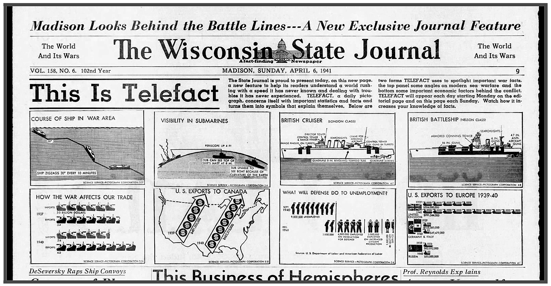
第二次世界大战对电视真相的重要性 (The Importance of World War II to Telefact)
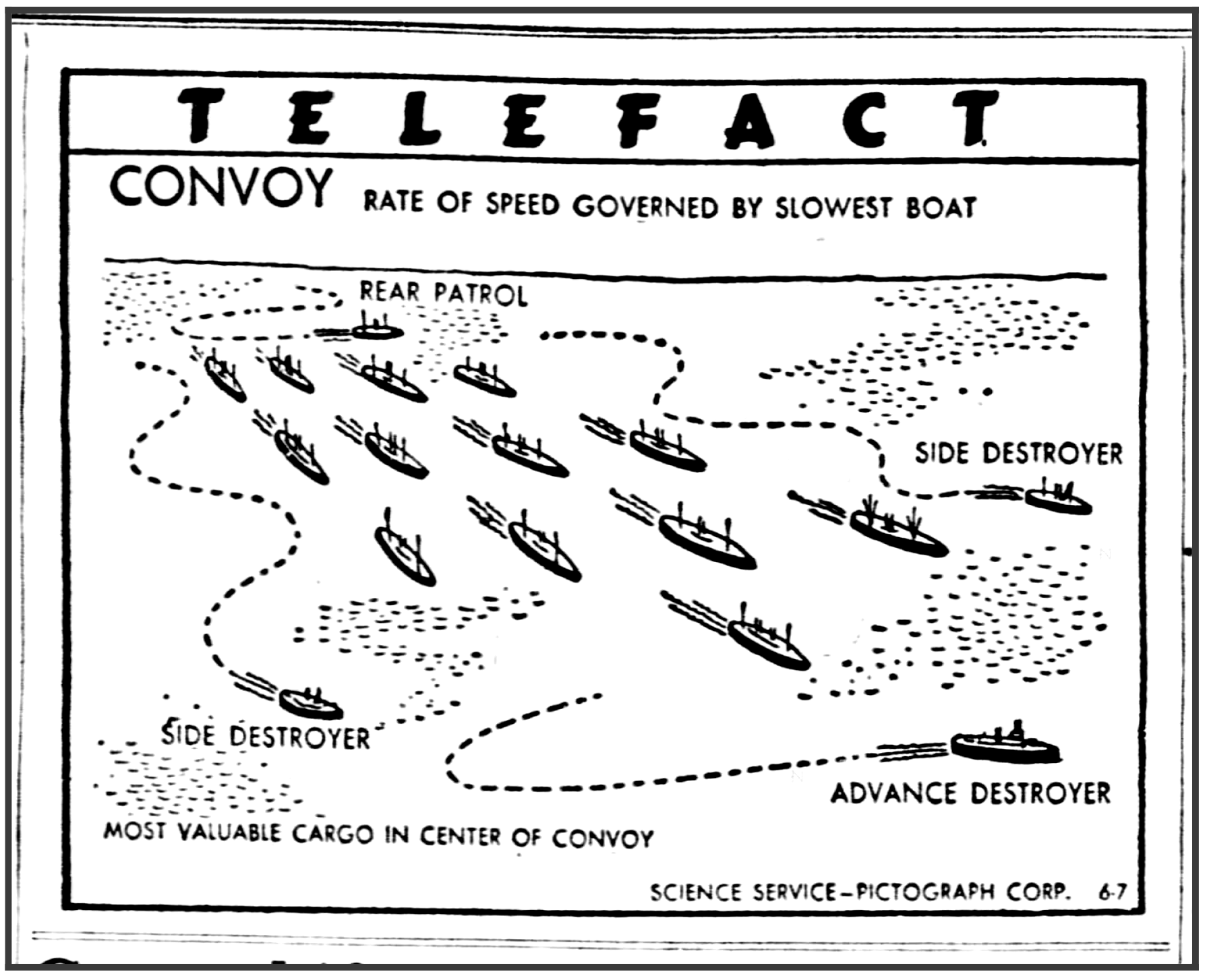
WWII was extremely important for the Telefact series as quoted by Modley at the beginning of this article. The war provided loads of information that would have been very interesting to Americans. Modley’s Telefact charts were there to explain details of the mechanisms and fighting techniques; feeding a public hungry for news of loved ones serving in the war.
第二次世界大战对于Modfise在本文开头引用的Telefact系列极为重要。 战争提供了大量的信息,这对美国人来说是非常有趣的。 Modley的Telefact图表在那里解释了机制和战斗技术的细节。 满足公众对战争中亲人的消息的渴望。
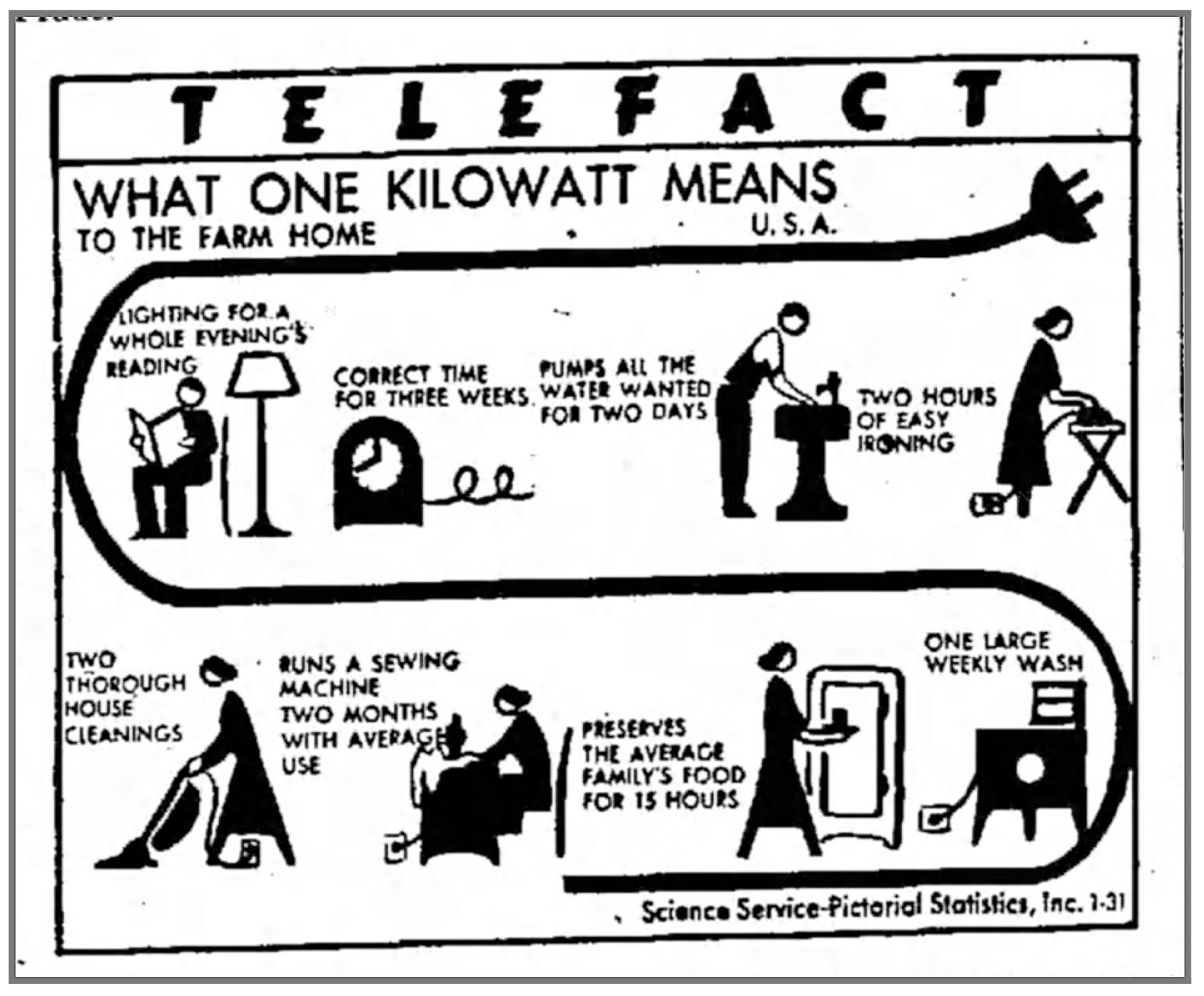
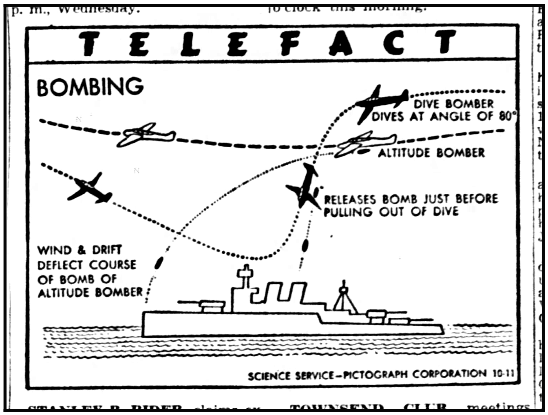
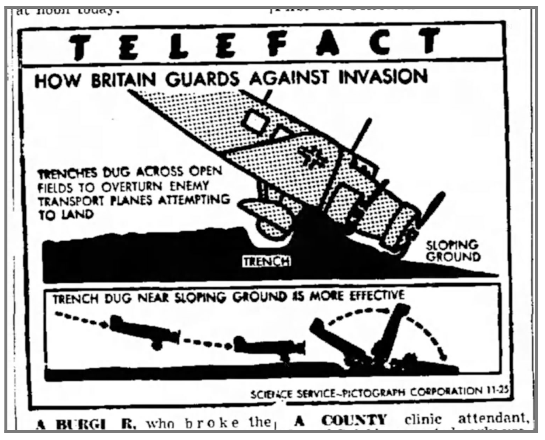
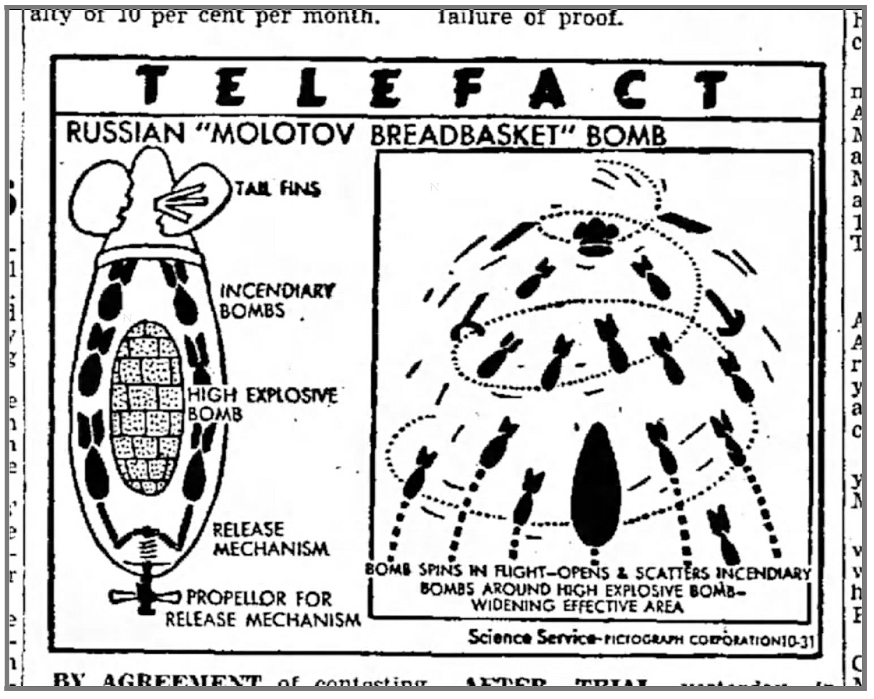
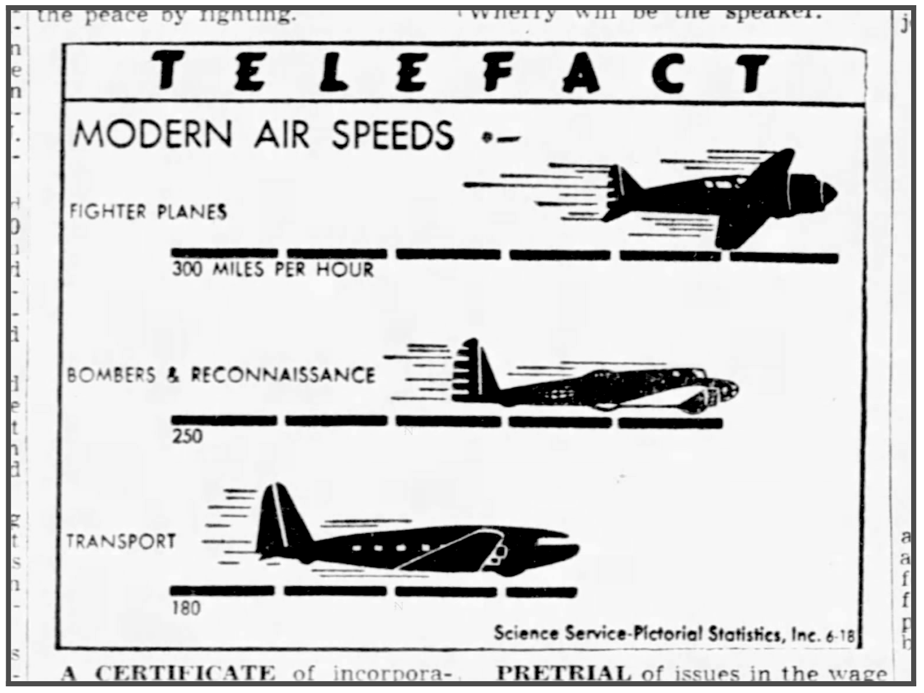
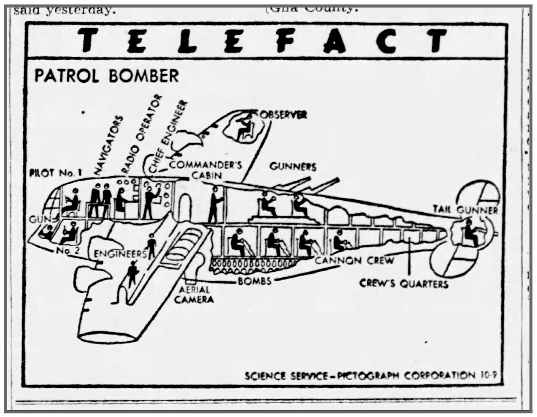
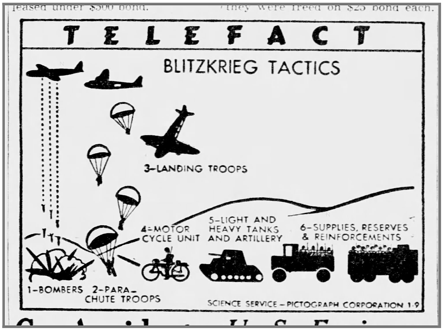
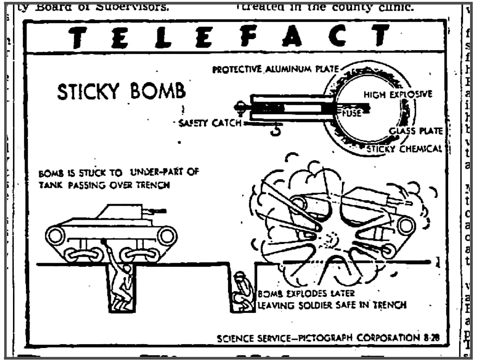
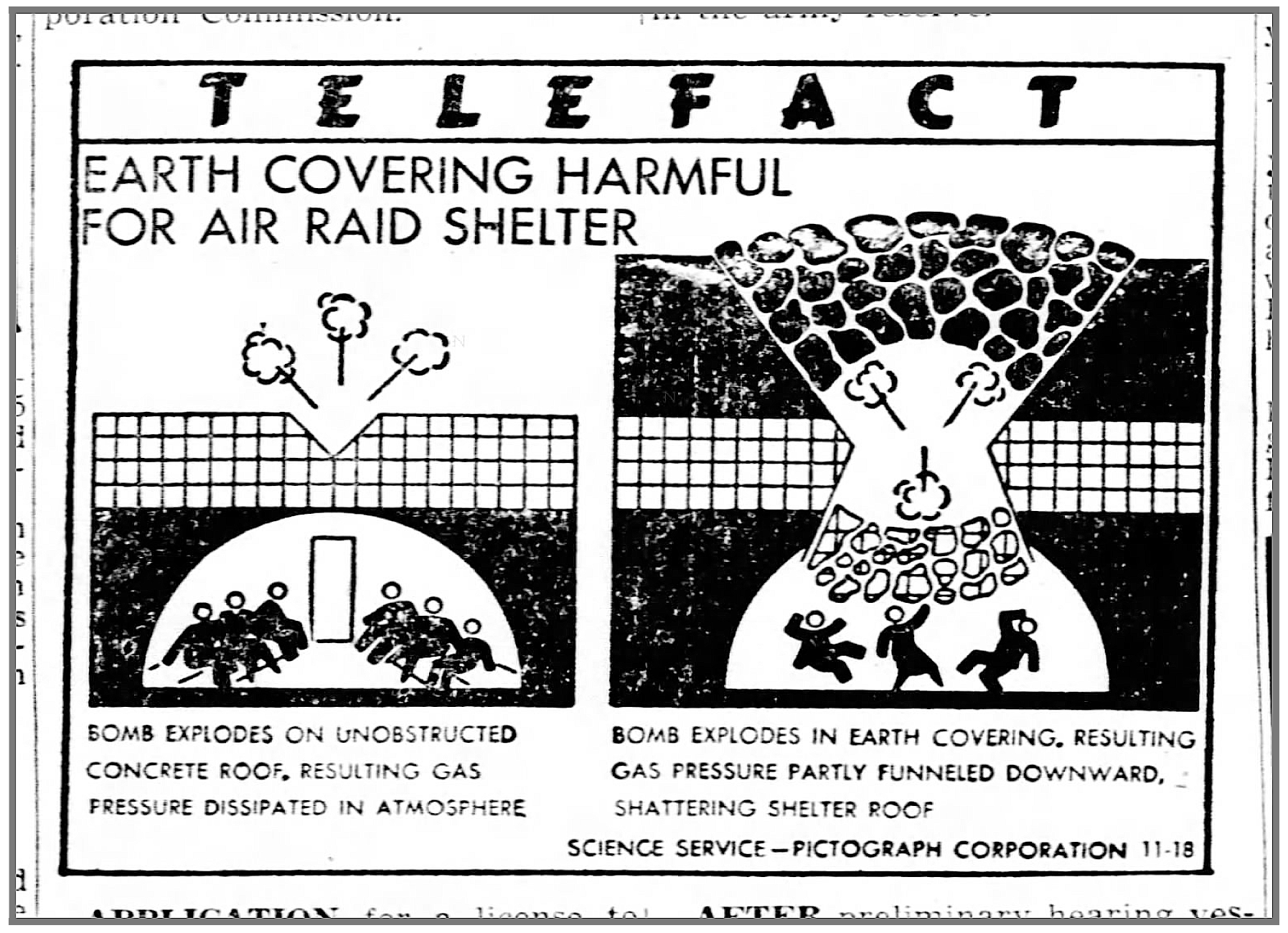
While many Telefacts were still providing pictorial statistics, diagrams helped to decode the complexity of the new technology of war as well as help explain how Americans could contribute in their own ways. Certainly, we see a rise of cross-section diagrams help explain the components of everything from bombs to bombers, houses to air-raid shelters. The diagrams spanned a variety of styles, likely created by different artists on Modley’s team.
尽管许多Telefacts仍在提供图片统计数据,但图表有助于解释战争新技术的复杂性,并有助于解释美国人如何以自己的方式做出贡献。 当然,我们看到横截面图的增加有助于解释从炸弹到轰炸机,房屋到防空洞的所有内容。 图表涵盖了多种样式,可能是Modley团队的不同艺术家创作的。

What’s interesting is that this move to diagrammatic information design occurs before Marrie Neurath’s books for children. It’s interesting to consider that both designers began a more illustrational-approach to designing information, rather than just statistics, after the war. While Marie Neurath certainly had much more of a focus in creating charts and illustrations for books after her emigration to England in 1941, the Isotype team had a split focus on exhibition design and institutional education during the 1930s. Otto Neurath’s focus on ‘learning through the eye’ was certainly a reality by the post-war period, with many primary books lavishly illustrated by the time. Perhaps the importance of statistical education took a more general back-seat to more qualitative information design as the world refocused on an optimistic future.
有趣的是,这种向图解信息设计的转变发生在Marrie Neurath的儿童书籍之前。 有趣的是,战后两位设计师都开始采用更具说明性的方法来设计信息,而不仅仅是统计信息。 在1941年移居英国后,玛丽·尼拉特(Marie Neurath)当然更着重于为书籍制作图表和插图,而Isotype团队则在1930年代集中精力于展览设计和机构教育。 在战后时期,奥托·尼拉特(Otto Neurath)专注于“通过眼神学习”无疑是一个现实,到那时,许多初级书籍都得到了丰富的阐释。 随着世界重新关注乐观的未来,也许统计教育的重要性在更定性的信息设计上倒退了。
新闻的垃圾:美学与商业 (The Grunge of News: Aesthetics & Business)

I also want to take a moment to celebrate the beauty of the grungy ‘realness’ of newsprint. Cheap paper, bad lithographs, ink slip, punctured and torn paper, and plain old dirt are all present in these reproductions.
我还想花一点时间来庆祝新闻纸又脏又臭的“真实”之美。 这些复制品中都存在廉价的纸张,劣质的平版印刷机,滑墨纸,打Kong和撕裂的纸张以及普通的旧污垢。
The process of creating a syndicated news graphics would have been purely physical at the time. Images would have been drawn by hand or reproduced photographically. The text might have been set by hand or optically produced likely about 4x larger than printed. The reproductions would have been mailed weekly to papers around the country allowing each to then prepare for local printing. It is all gloriously messy, made even more so by the digitization process of scanning, adjusting for contrast, and sharpening the rough-edges of the not so sharp image.
当时,创建联合新闻图形的过程纯粹是物理的。 图像可能是手工绘制的,也可能是照相复制的。 文本可能是手工设置的,也可能是光学印刷的,可能比打印的文本大4倍。 复制品本应每周邮寄到全国各地的报纸,以便每一份都可以为当地印刷做准备。 一切都是光怪陆离的,它通过扫描,调整对比度以及锐化不太清晰的图像的粗糙边缘的数字化过程而变得更加混乱。
We could also consider the Telefact a kind of “science comic” as the method of creation and distribution would have largely the same for both. Telefacts were distributed by Science Service, a newspaper syndicate began by two journalists dedicated to “pioneering the dissemination of accurate, accessible, and engaging news of science to the public primarily through the mainstream media through its syndicate service.” We can easily consider Telefact to be their version of the funny papers.
我们还可以将Telefact视为一种“科学漫画 ”,因为两者的创作和发行方法大致相同。 Telefacts由科学服务部分发, 该组织由两个新闻记者组成, 是一个报纸联合组织 ,致力于“主要通过其联合组织服务,通过主流媒体,向公众传播准确,易用且引人入胜的科学新闻。” 我们可以轻松地将Telefact视为他们搞笑论文的版本。
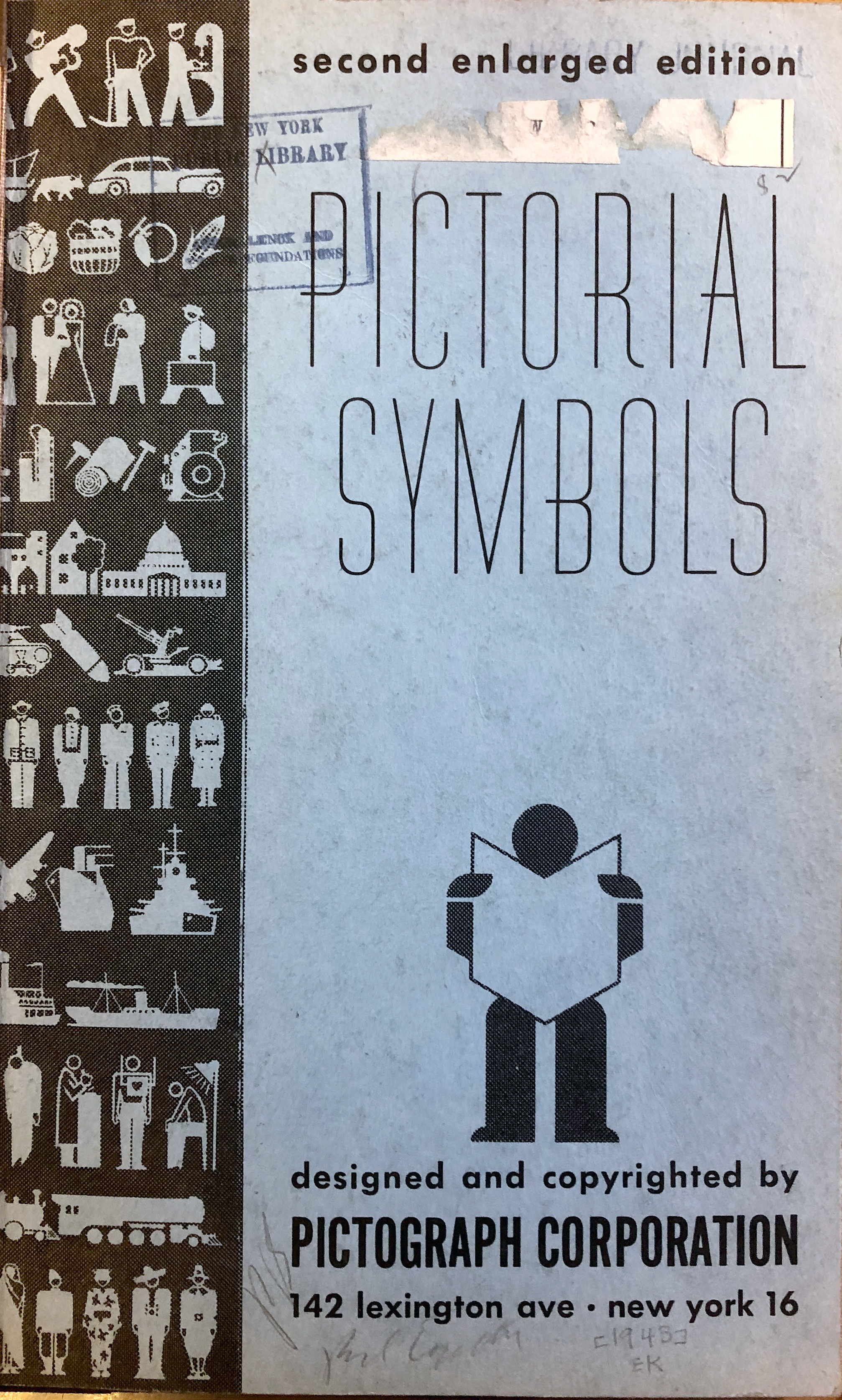
Modley was sincere in his quest to get pictorial statistics into modern practice, and in 1943 he published his first collection of over 1,000 icons. The book Pictorial Symbols collected his pre-made icons as seen throughout the Telefact series in order to equip those who wanted to make their own charts. Prices for charts, icons, and custom icons were very reasonable, with your custom selection of icons priced at $.05 cents for the first 50 icons, then $.01 cent each after that (50 icons would cost the equivalent of $30 USD today)
莫德利真诚地寻求将绘画统计数据引入现代实践,并于1943年出版了他的第一个超过1,000个图标的收藏。 《 画报符号 》( Pictorial Symbols)一书收集了他在整个Telefact系列中看到的预制图标,以装备那些想要制作自己的图表的人。 图表,图标和自定义图标的价格非常合理,您自定义的图标选择价格为前50个图标$ .05美分,其后每个价格为$ .01美分(50个图标今天的价值为$ 30 USD )
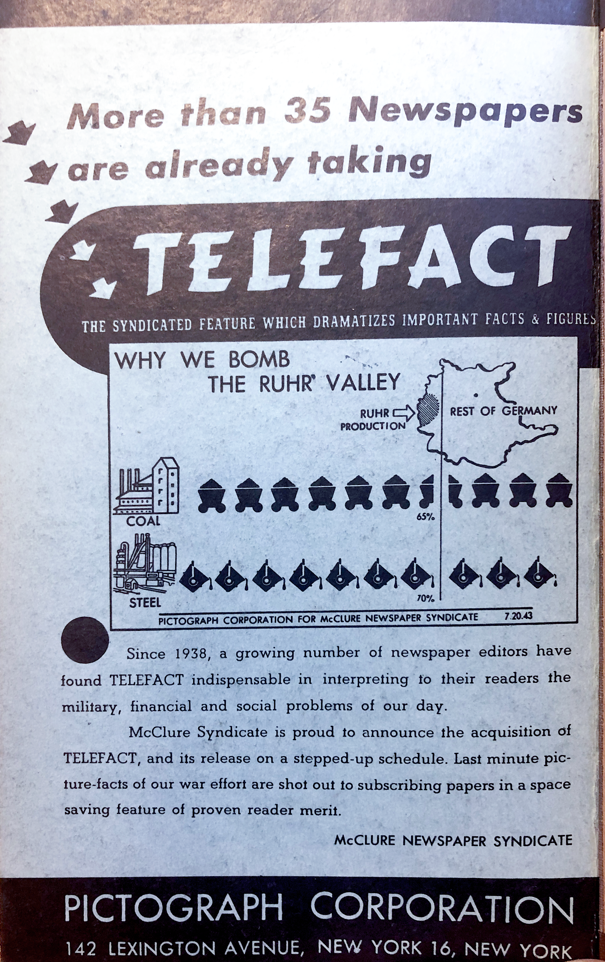
Turning the book Pictorial Symbols over reveals a full-page ad for Telefact on the back cover. Nested at the bottom is the announcement of the acquisition of the Telefact series by McClure Newspaper Syndicate, which ultimately spelled the beginning of the end.
将“ 图形符号 ”这本书翻过来,可以在封底显示整页的Telefact广告。 嵌套在底部的是McClure Newspaper Syndicate宣布收购Telefact系列的消息,这最终标志着结尾的开始。
McClure Newspaper Syndicate would have been one of the largest companies in the business, distributing 10,000 features with combined sales of $100 million a year. Lasting more than a century in business, McClure was one of the biggest distributors of comics, bringing everything from Rube Goldberg to Batman and Robin to thousands of papers every day. That kind of reach, with those kinds of resources, would have been attractive to Modely. While it is clear that Modley and his team continued their involvement with the series for at least two more years, we see less pictorial statistics and more traditional charts begin to appear in the series in 1945.
McClure Newspaper Syndicate将会是该行业最大的公司之一,发行10,000项功能,每年的合并销售额为1亿美元。 麦克卢尔(McClure)营业了一个多世纪,是最大的漫画发行商之一,每天从鲁布·戈德堡(Rube Goldberg)到蝙蝠侠(Batman)和罗宾(Robin)收集各种书籍。 有了这样的资源,这种影响力对于Modely将会很有吸引力。 很明显,莫德利和他的团队继续参与该系列至少两年了,但我们看到的图片统计数据较少,而更多传统图表则在1945年开始出现在该系列中。
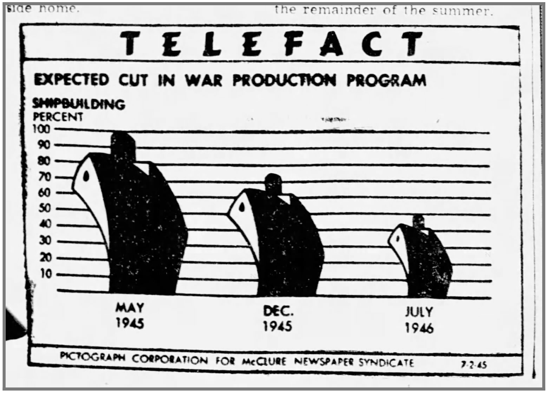
For those familiar with Isotype, the chart at the above right, “Expected Cut In War Production Program,” would have literally been the antithesis of Neurath’s teachings. The very invention of the Isotype concept was in opposition to the scaling of icons to show their quantity. It’s clear that by this point Modley was likely not present in the creation of the Telefact series as he would never have supported such a chart. That same chart also illustrates the end of the war, which ended up being a significant complication as well.
对于那些熟悉Isotype的人来说,右上方的图表“预期的削减战争量产计划”实际上就是Neurath教义的对立面。 Isotype概念的发明完全与图标缩放以显示其数量相反。 显然,到此为止,Modley可能不会出现在Telefact系列的创作中,因为他永远不会支持这种图表。 同一张图表也说明了战争的结束,最终也造成了巨大的麻烦。
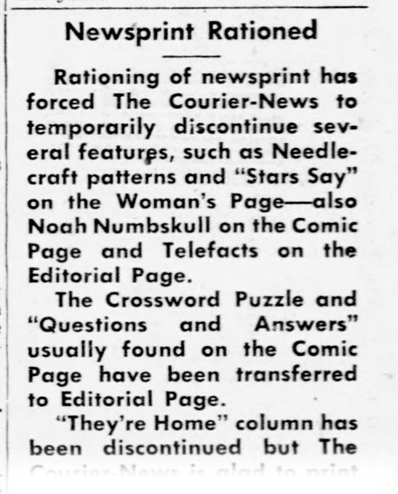
The syndication of newspaper content had been booming since the turn of the century, but as the war began its last year, many newspapers cut back their pages to contribute towards war rations. After the war, the rise of televisions provided a new challenge that reduced newspaper sales further. In my research, I could not find any Telefact charts after 1945.
自本世纪初以来,报纸内容的联合组织一直在蓬勃发展,但是随着战争开始于去年,许多报纸都削减了页数,以为战争配给做出贡献。 战后,电视的兴起带来了新的挑战,这进一步减少了报纸的销量。 在我的研究中,我找不到1945年以后的任何Telefact图表。
Rudolf Modley continued to work in pictorial statistics for many years afterward. He published a number of books about graphic communication and also collaborated with historians to explain American and European economic history.
此后,鲁道夫·莫德利(Rudolf Modley)继续从事图形统计工作。 他出版了许多有关图形交流的书籍,还与历史学家合作解释了美国和欧洲的经济历史。
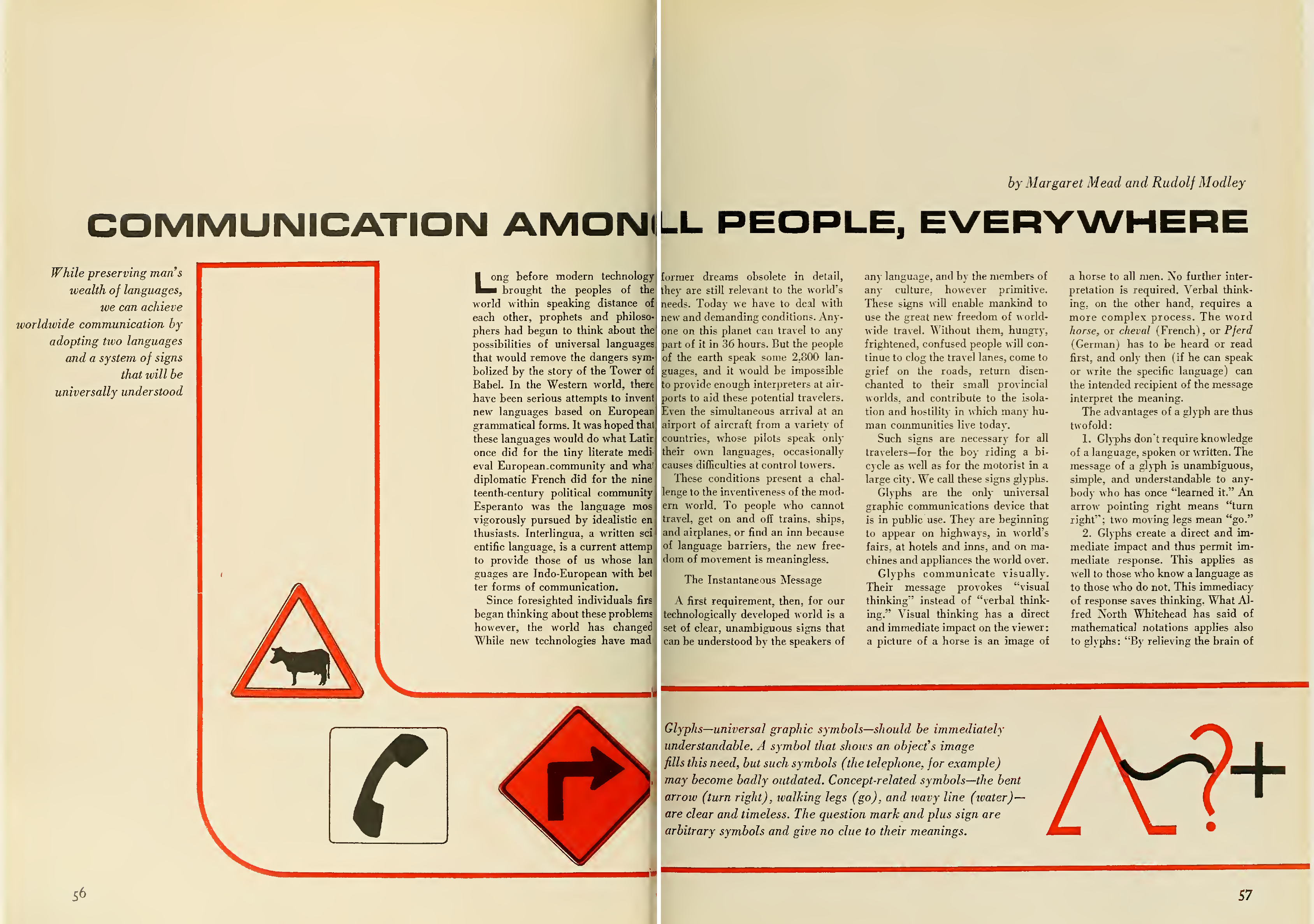
与世界各地的所有人交流 (Communication With All People Everywhere)
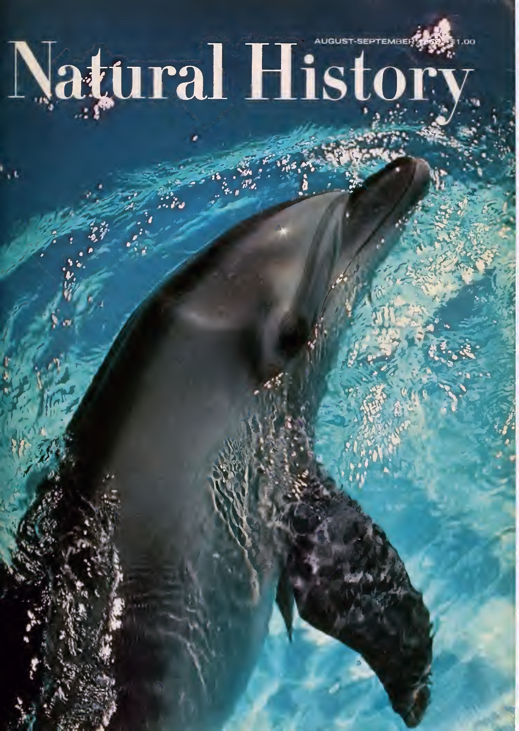
As the post-War world embraced multi-national collaboration and standardization, Modley found himself collaborating with celebrity cultural anthropologist Margaret Mead. Their 1968 essay Communication Among All People Everywhere in Natural History Magazine outlines their shared interest in cataloging all manner of icons and methods of visual communication as an emerging Lingua franca.
战后世界接受跨国合作和标准化后,莫德利发现自己与名人文化人类学家玛格丽特·米德 ( Margaret Mead)合作 。 他们在1968年的《自然历史杂志》中的《 在所有人之间交流 》一文概述了他们对将各种图标和视觉传达方法归类为新兴的林瓜(Lingua franca)的共同兴趣。
As Modley had been documenting icons for decades already, another famous designer, Henry Dreyfuss, also sought his assistance in compiling icons for a similar project. In an act of cosmic completeness, in the late 1950s, Modley enlisted Marie Neurath to help collect a wide survey of icons from many industries. The two collaborated for years sending icons and letters discussing their work. Dreyfuss published his Symbol Sourcebook: An Authoritative Guide to International Graphic Symbols in 1972 to widespread acclaim. It’s an incredible book, unique in many ways, and includes an introduction by Buckminster Fuller, as well as a 2-page spread introducing Isotype written by Marie Neurath.
由于莫德利(Modley)数十年来一直在记录图标,因此另一位著名设计师亨利·德雷福斯 ( Henry Dreyfuss )也寻求他的协助来为类似项目编译图标。 1950年代后期,为了实现宇宙的完整性,莫德利(Medley)邀请玛丽·纽拉特 ( Marie Neurath)帮助收集来自许多行业的图标的广泛调查。 两人合作多年,发送图标和信件讨论他们的工作。 Dreyfuss出版了他的《 符号资料手册:国际图形符号的权威指南》 1972年获得广泛好评。 这是一本令人难以置信的书,在许多方面都独一无二,其中包括Buckminster Fuller的介绍,以及由Marie Neurath撰写的长达2页的介绍Isotype的介绍。
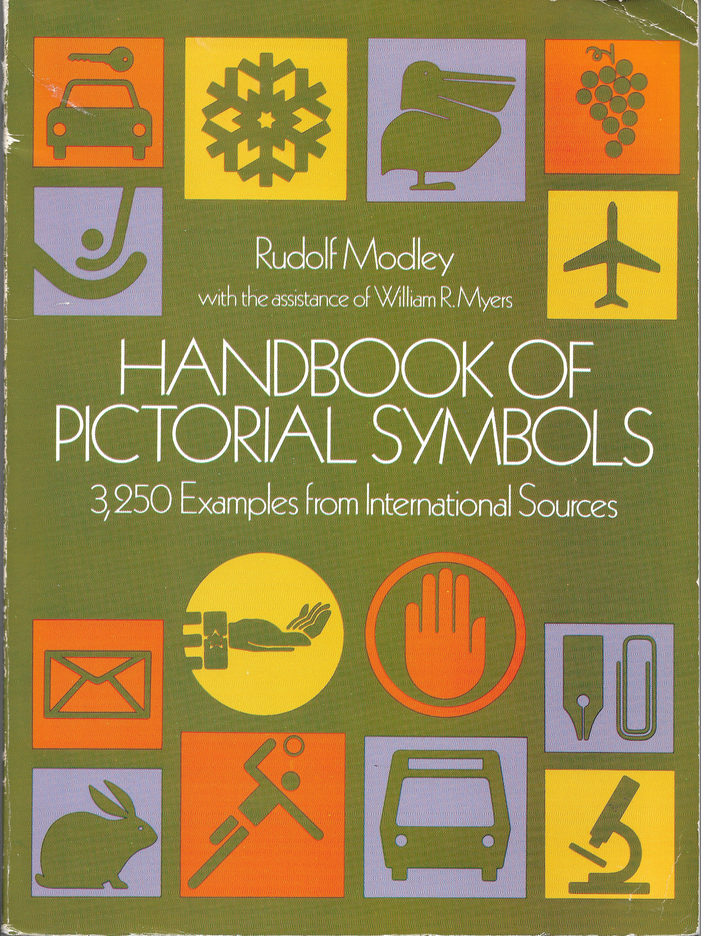
Collecting icons must have fulfilled Modley, who continued to work on his own Handbook of Pictorial Symbols right up until his death in 1976. The earlier collection in his Pictorial Symbols book from 1942 was expanded with the help of Gerd Arntz and extended to include over 3,250 wayfinding and Olympic icons. It’s an awesome resource issued by the low-cost Dover Publications (which is still readily available used for under $5).
收集图标一定能使Modley满意,直到Modley 于1976年去世 ,他才继续从事自己的绘画符号手册 。 在1942年出版的《绘画符号》一书中,较早的收藏在Gerd Arntz的帮助下得到了扩展,并扩展到包括3250多个寻路和奥林匹克图标。 这是由低成本Dover Publications发布的真棒资源(该价格仍然很便宜,不到5美元就可以使用 )。
The book begins with an essay by Modley called “Introduction to Graphic Symbols”. It seems only fitting to finish this essay by noting the reverence he held for Otto Neurath as evidenced in his writing. There it is, right on the first page, “The modern techniques of graphic presentation of facts and figures were developed by Otto Neurath in the early 1920s in Vienna. If you learn these techniques, you too can use graphic symbols to set forth complex facts in simplified, more easily understood and more easily remembered form.”
本书以莫德利的论文“ 图形符号简介 ”开头。 注意到他对奥托·尼拉特(Otto Neurath)的崇敬,似乎才是完成本文的合适之举。 在第一页上是“事实和人物的图形表示的现代技术,是奥托·尼拉特(Otto Neurath)在1920年代初期在维也纳开发的。 如果您学习了这些技术,那么您也可以使用图形符号以简化,更容易理解和更容易记住的形式阐述复杂的事实。”
Modley, at the end of his life, performs the ultimate pivot, from Otto Neurath to you. Practicing this kind of isotype/pictorial statistics was just as possible then as it is today. Rudolf Modley’s mission as pictorial statistics teacher and Neurath evangelist rings true to the very end.
莫德里(Modley)在生命的尽头,发挥了从奥托(Otto Neurath)到您的终极关键。 进行此类同型/图片统计与今天一样可能。 鲁道夫·莫德利(Rudolf Modley)作为图片统计老师和诺伊拉特(Neurath)传教士的使命一直到最后。
There are so many examples of isotype and pictorial statistics to take inspiration from. What better place to start your learning journey than by scanning through several hundred Telefact charts?
有很多同种型和图片统计的例子可以从中得到启发。 有比浏览数百个Telefact图表更好的起点来开始您的学习旅程?
Go find them at: https://modley-telefact-1939-1945.tumblr.com
请前往以下网址找到它们: https : //modley-telefact-1939-1945.tumblr.com
Thanks as always to Georges Hattab, Alyssa Bell, and RJ Andrews for their editorial help and support.
一如既往地感谢Georges Hattab , Alyssa Bell和RJ Andrews的编辑帮助和支持。
Several of the essays cited in the above article have also been recovered from original sources:
上一篇文章中引用的几篇文章也已从原始来源中获得:
Pictographs Today and Tomorrow, Rudolf Modley, Public Opinion Quarterly, 1938
今天和明天的象形文字 ,鲁道夫·莫德利,《民意季刊》,1938年
Communication Among All People Everywhere, Margaret Meade and Rudolf Modley, Nature Magazine, 1968
《 人与人之间的 交流》 ,玛格丽特·米德和鲁道夫·莫德利,《自然》杂志,1968年
Handbook of Pictorial Symbols introduction, Rudolf Modley, 1976
绘画符号手册手册 ,鲁道夫·莫德利,1976年
The author is especially indebted to the work of Hisayasu Ihara for their pioneering research on Rudolf Modley. If you are interested, I’d urge you to read more:
作者特别感谢Hisayasu Ihara在Rudolf Modley方面的开创性研究。 如果您有兴趣,请您阅读更多内容:
Rigor and Relevance in the International Picture Language, Rudolf Modley’s Criticism against Otto Neurath and his Activity in the Context of the Rise of the “Americanization of Neurath method”, Hisayasu Ihara, 2009
《国际图画语言的严谨性和相关性》,鲁道夫·莫德利(Rudolf Modley)对“奥托·诺拉特(Otto Neurath)”的批评及其在“纽拉特方法的美国化”兴起的背景下的活动 ,久原安彦,2009年
This article comes as part of a series on Isotype and derives mainly from research on the Isotype design process created by Otto and Marie Neurath with Gerd Arntz. My goal is to teach people about the techniques and mindset of this data-driven design team, in order to inspire new information design concepts today.
本文是有关Isotype的系列文章的一部分,主要来源于对Otto和Marie Neurath与Gerd Arntz进行的Isotype设计过程的研究。 我的目标是向人们介绍这个数据驱动设计团队的技术和思维方式,以激发当今的新信息设计概念。
玛丽·尼拉特(Marie Neurath)的失传 (The Missing Legacy of Marie Neurath)
Focuses on the primary designer of Isotypes for 45 years.
专注于同型印刷的主要设计师长达45年。
同型的教训-第1部分 (Lessons of Isotype — PART 1)
同型的教训–第2部分 (Lessons of Isotype — PART 2)
同型的教训–第3部分 (Lessons of Isotype — PART 3)
探索苏联同类型:数字化“四五年的斗争” (Exploring Soviet Isotypes: Digitizing “The Struggle for Five Years in Four”)
解释同一个同种型:从复杂性创建简单性 (Explaining a Single Isotype: Creating Simplicity from Complexity)


 被折叠的 条评论
为什么被折叠?
被折叠的 条评论
为什么被折叠?
 到【灌水乐园】发言


