


 本文深入探讨了UI设计中卡片元素的阴影和模糊效果,详细介绍了如何运用这些视觉技巧提升用户体验,通过实例解析了阴影和模糊在界面设计中的应用。
ui设计卡片阴影
第三部分 (Part 3)
Welcome to the third part of the UI Design super-basics. This time we’ll cover two of the most commonly used effects — shadows and blurs.
欢迎使用UI设计超级基础的第三部分。 这次我们将介绍两种最常用的效果- 阴影和模糊 。
Undertow (Shadows)
落影 (Drop Shadow)
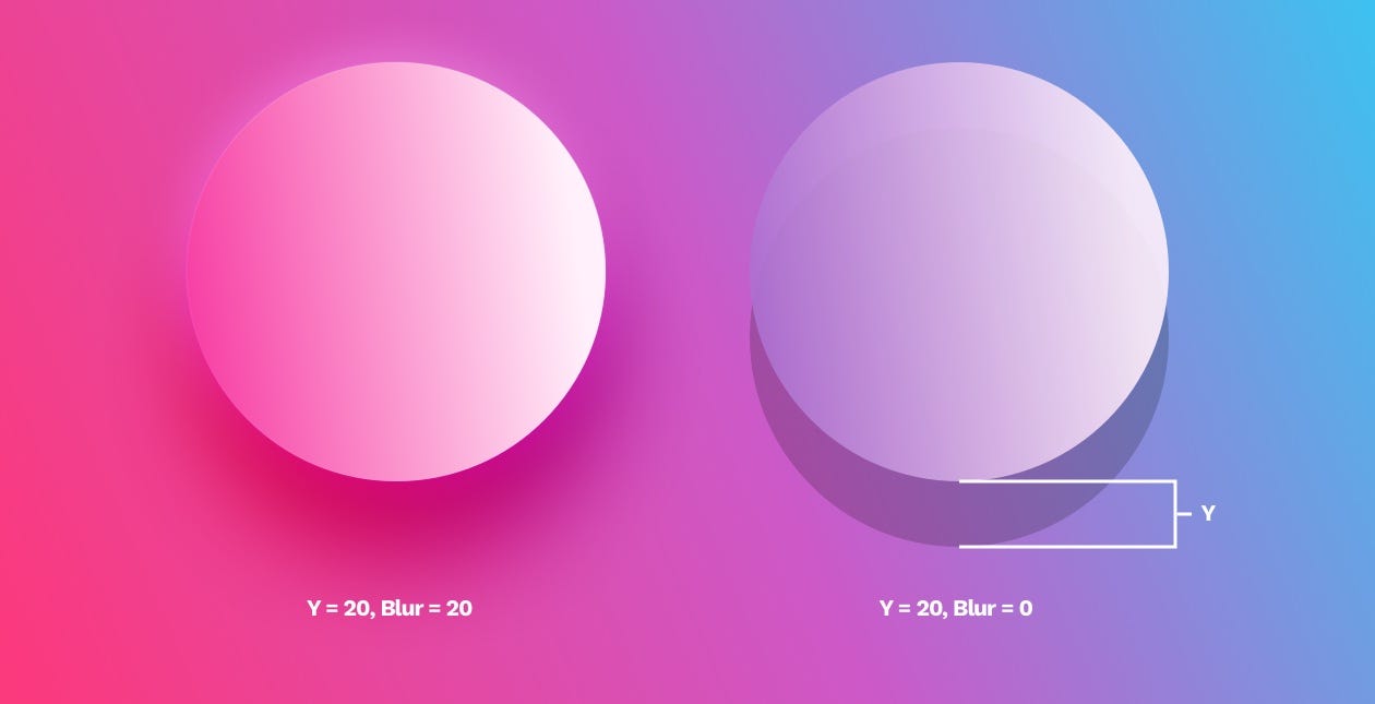
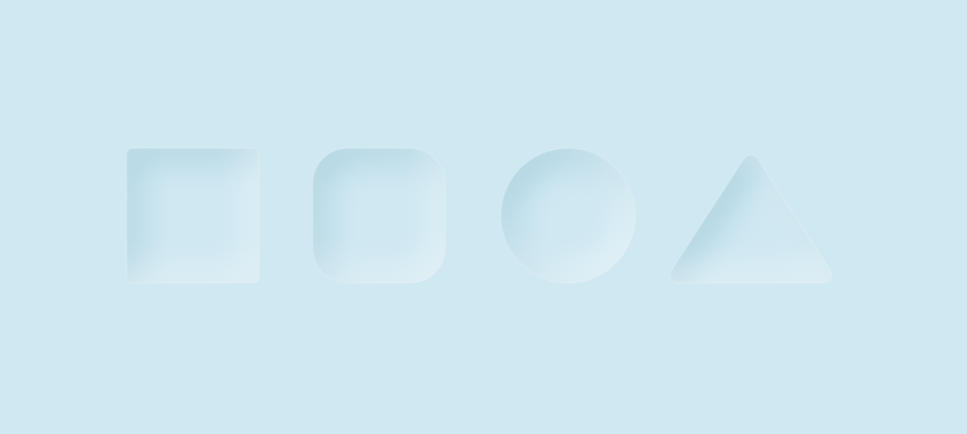
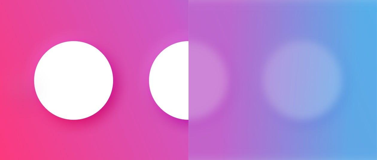
Outer shadows (or drop-shadows) are easily the most common effect used in UI. A typical shadow relies on an offset from center (x, y, or both) a blur and an opacity value. In the example above the shadow is moved 20 points down on the Y axis and then blurred on the left side, or left without the blur on the right.
外部阴影(或阴影)很容易在UI中使用。 典型的阴影依赖于距中心(x,y或两者)的偏移,即模糊和不透明度值。 在上面的示例中,阴影沿Y轴向下移动了20个点,然后在左侧模糊,或者向左移动而右侧没有模糊。
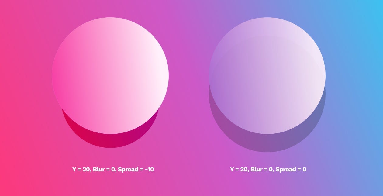
Some tools like Sketch also have a “spread” value, which makes the shadow look like a smaller element is casting it.
诸如Sketch之类的某些工具也具有“ spread”值,这使阴影看起来像是在投射较小的元素。
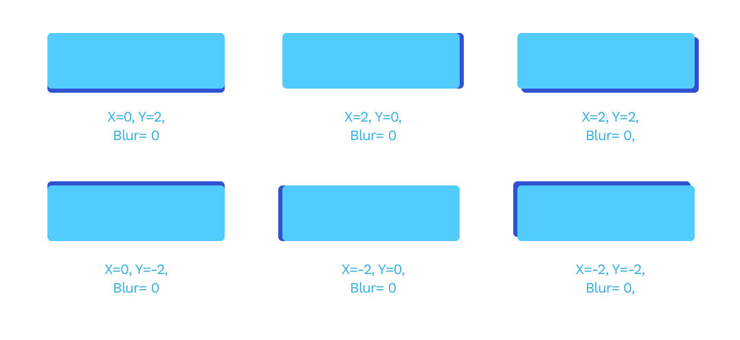
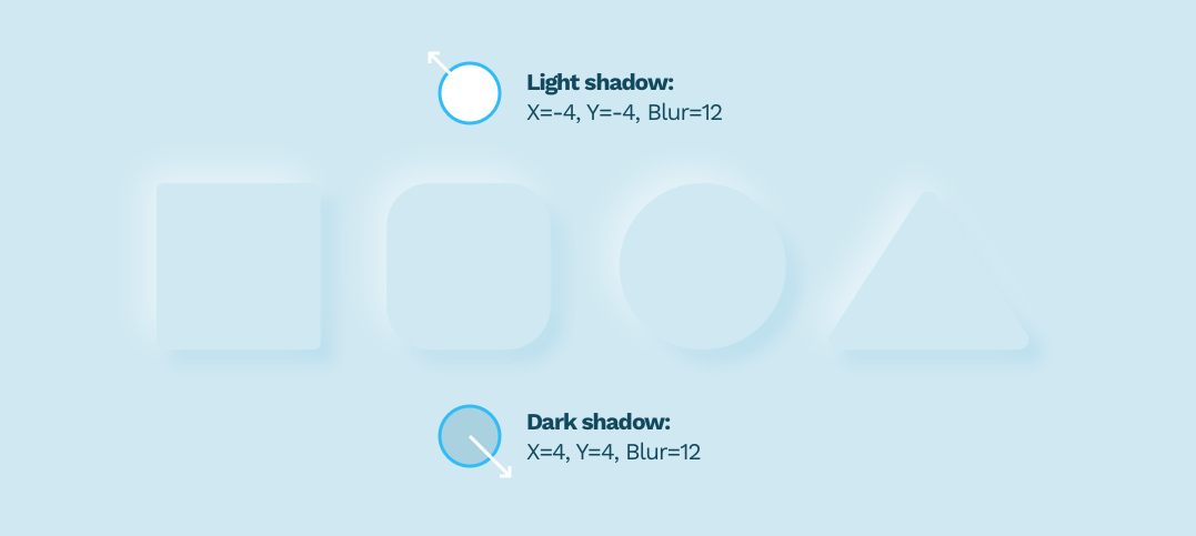
The most important parts of any shadows are the X, the Y and the Blur. The latter has to be a number larger than 0, while X and Y can also be negative numbers, moving the shadow in practically every direction.
任何阴影中最重要的部分是X,Y和模糊。 后者必须是大于0的数字,而X和Y也可以是负数,从而几乎在每个方向上移动阴影。
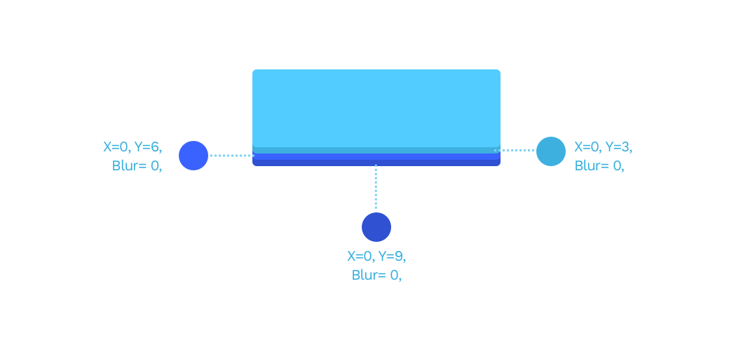
You can also stack shadows by adding more than one to the same object for pretty interesting results. The example below has three shadows in three darker shades of blue, each transposed by 3 points down.
您还可以通过向同一对象添加多个阴影来堆叠阴影,以获得非常有趣的结果。 下面的示例在三个深蓝色阴影中包含三个阴影,每个阴影向下移3个点。
同态 (Neumorphism)
Knowing that we simply have to mention Neumorphism again. This stacking of shadows and negative X and Y values are the core principles necessary for making Neumorphism work.
知道我们只需要再次提及神经同质。 阴影和负X和Y值的这种堆叠是使Neumorphism工作所需的核心原理。
看起来自然,阴影柔和 (Natural looking, soft shadows)
A natural-looking shadow is one of those elements that can make the biggest impact in a design. The most important part of looking natural is avoiding pure black shadows and using a shadow derived from our primary color instead. Pure black makes the contrast ratio too big to look natural. If you study real-life shadows, you’ll notice they often vary in shade and tone.
看起来自然的阴影是可以在设计中产生最大影响的元素之一。 看起来自然的最重要部分是避免纯黑色阴影,而是使用从我们的原色派生的阴影。 纯黑色会使对比度太大而看起来不自然。 如果您研究现实生活中的阴影,您会发现它们的阴影和色调通常会有所不同。
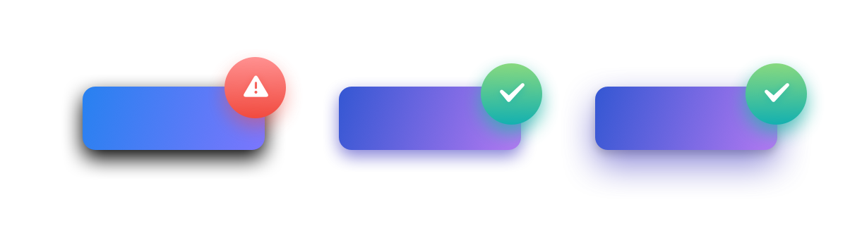
The best way to fix your shadows is to change them from black (default) to a darker shade of your primary color. In the example above the shadow is a dark purple with decreased opacity.
修复阴影的最佳方法是将其从黑色(默认)更改为原色的较深阴影。 在上面的示例中,阴影为深紫色,透明度降低。
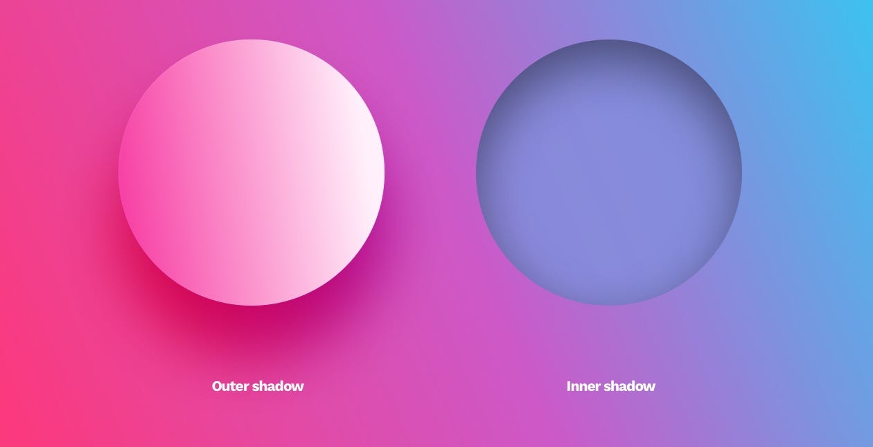
内在的阴影 (Inner shadows)
Inner shadows are relatively rare in UI. It has the same parameters as a drop shadow, but it appears inside of the object.
内部阴影在UI中相对较少。 它具有与阴影相同的参数,但它出现在对象内部。
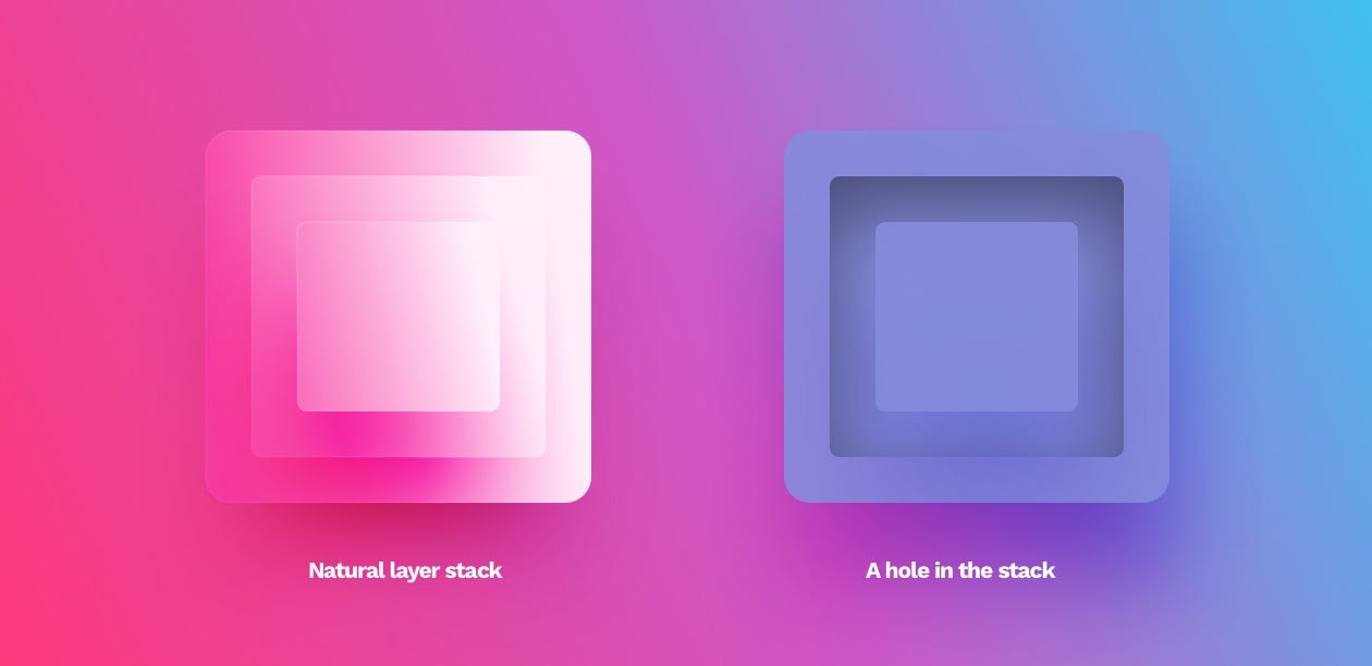
They are not as popular because most interfaces are a series of layers stacked on top of one another. In that case, an outer shadow makes sense as it provides the depth. An inner shadow would suggest the object has a hole in it.
它们之所以不受欢迎,是因为大多数接口是一系列堆叠在一起的层。 在这种情况下,外部阴影会提供深度,因此很有意义。 内部阴影会表明该对象中有Kong。
The only use-cases of this style are form inputs (both form fields and checkboxes or radio-buttons) and extruded shapes in the Neumorphism method. They can be used to make the objects appear more life-like in some instances but should only be used moderately.
这种风格的唯一用例是表单输入(表单字段和复选框或单选按钮)和Neumorphism方法中的拉伸形状。 在某些情况下,可以使用它们使对象看起来更逼真,但应适度使用。
The main issue with Neumorphism is the notion of using inner shadows and extruded shapes as a “selected” state. The perceivable difference between the standard and selected state is so small, that even non-visually impaired users can sometimes completely miss it. This in turn leads to one of the biggest accessibility flaws of Neumorphism.
Neumorphism的主要问题是使用内部阴影和拉伸形状作为“选定”状态的概念。 标准状态与选定状态之间的可感知差异很小,以至于即使是非视觉障碍的用户,有时也可能会完全错过它。 反过来,这导致了Neumorphism的最大可访问性缺陷之一。
模糊 (Blurs)
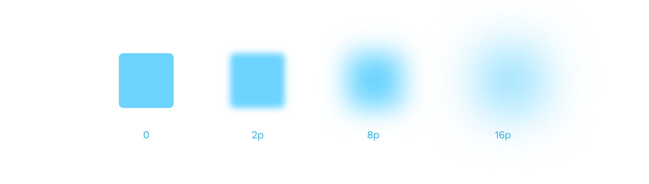
Most design tools nowadays have a Gaussian type blur that extends the effect in every direction evenly. Its primary value is the radius. The larger it gets, the more prominent the blur effect.
如今,大多数设计工具都具有高斯类型的模糊效果,可以在各个方向上均匀地扩展效果。 它的主要值是半径。 它越大,模糊效果越突出。
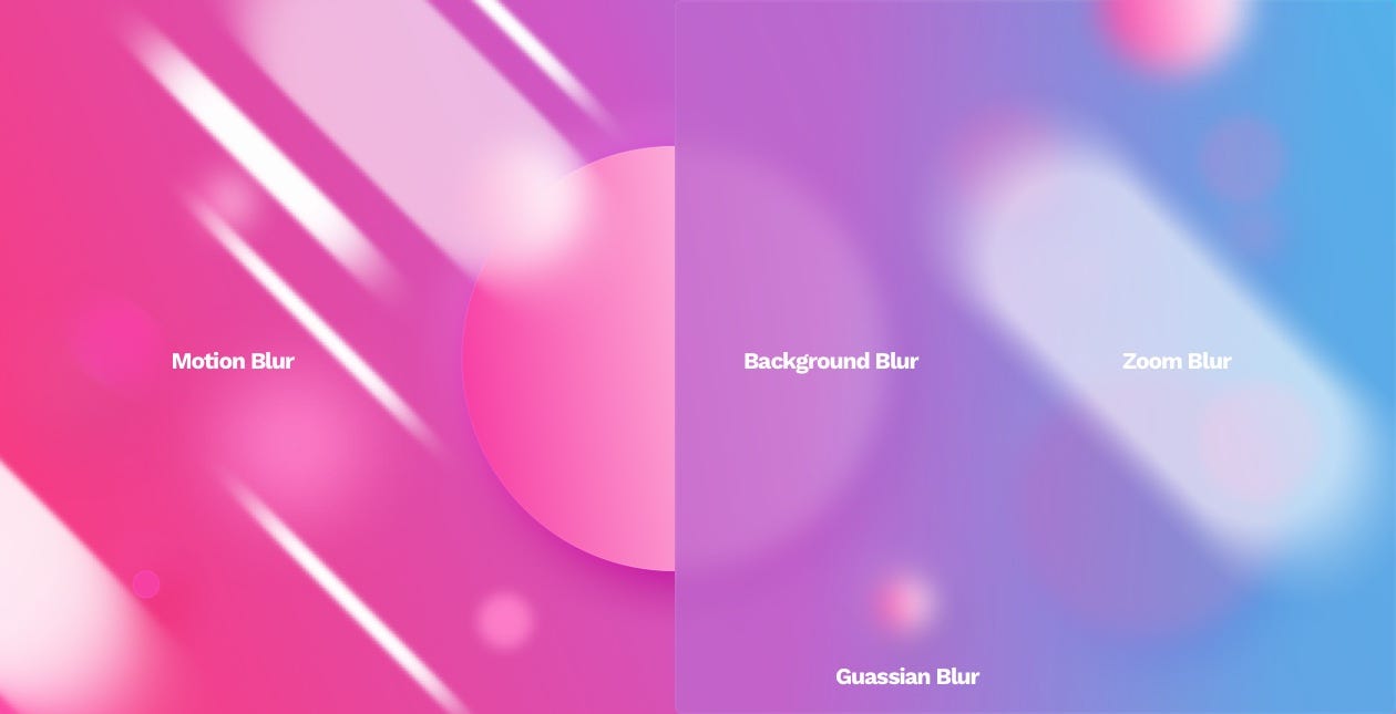
Gaussian blur is the most often used blur type. You can employ it into transitions between screens, or show a bit of realistic depth of field by selectively blurring the background.
高斯模糊是最常用的模糊类型。 您可以将其用于屏幕之间的过渡,也可以通过选择性地模糊背景来显示一些真实的景深。
高斯模糊为阴影 (Gaussian blur as a Shadow)
This type of blur can also help you generate non-standard, point-shadows under objects. Just blur an ellipse and place it under the object casting the shadow. You can either use it on its own or combine it with a standard drop shadow for an even more unique result.
这种类型的模糊还可以帮助您在对象下生成非标准的点阴影。 只需模糊椭圆并将其放置在投射阴影的对象下即可。 您既可以单独使用它,也可以将其与标准投影效果结合使用,以获得更加独特的效果。
背景模糊 (Background blur)
Background blur became popular when Apple started using it in their OS to achieve that behind smoked-glass effect in some screens. An object with this effect applied blurs everything under it.
当苹果开始在其操作系统中使用背景模糊以实现某些屏幕上的烟熏玻璃效果后,背景模糊变得很流行。 应用了此效果的对象会模糊其下的所有内容。
运动模糊 (Motion blur)
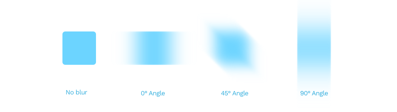
A motion blur simulates the movement of an object in a direction defined by the angle value. The blur value works the same as with Gaussian blur here.
运动模糊模拟对象在由角度值定义的方向上的运动。 模糊值的作用与此处的高斯模糊相同。
变焦模糊 (Zoom blur)
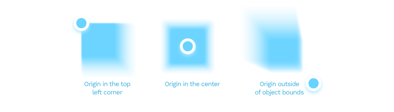
A zoom blur happens when the object becomes blurry from the inside out. It’s often used in photography, but not a great pick for interface design.
当物体从内到外变得模糊时,就会发生变焦模糊。 它常用于摄影中,但不是界面设计的理想选择。

In this particular blur type, you can also set the origin of the blur. By moving that point around, you can achieve some interesting effects.
在这种特定的模糊类型中,您还可以设置模糊的来源。 通过移动该点,可以实现一些有趣的效果。
UI设计的基础 (The basics of UI design)
This concludes our three part series on basics of shapes, objects and effects used in UI design. This has been a part of the free chapters of 📘 Designing User Interfaces Ebook, and you can download these chapters free 🍒 Learn the basics of design in this YouTube playlist:📺 Design Basics!
到此,我们结束了关于UI设计中使用的形状,对象和效果的基础知识的三部分系列文章。 这已经是📘Designing User Interfaces电子书的免费章节的一部分,您可以免费下载这些章节。 🍒在此YouTube播放列表中学习设计基础 :s 设计基础 !
You can find both the previous parts here:
您可以在这里找到前面的两个部分:
翻译自: https://uxdesign.cc/ui-design-shapes-objects-basics-shadows-and-blurs-e42bf2d32864
ui设计卡片阴影


 110
110

 被折叠的 条评论
为什么被折叠?
被折叠的 条评论
为什么被折叠?
 到【灌水乐园】发言


