


Flutter SDK provides developers with an inbuilt widget named AnimatedContainer . As the name suggests, it is a container which can be animated in some way. So its attributes are just like the usual Container widget except that whenever there is a change in any of its attributes, it provides a seamless way of transitioning to the changed value. I’ve been playing around with this widget for some time now and could experiment some animations which I’d like to share with you later in this article.
Flutter SDK为开发人员提供了一个名为AnimatedContainer的内置小部件。 顾名思义,它是可以以某种方式进行动画处理的容器。 因此,它的属性与通常的Container小部件一样,除了每当其任何属性发生更改时,它都提供了一种无缝的过渡到更改后的值的方法。 我已经使用这个小部件一段时间了,可以尝试一些动画,我希望在本文后面与您分享。
Before we actually start with AnimatedContainer, I’d like to show the behavior of a usual Container widget for change in values and then move to AnimatedContainer. By doing so, we’ll be able to understand better what AnimatedContainer brings to the table which Container doesn’t.
在实际开始使用AnimatedContainer之前,我想展示一个通常的Container小部件的行为,以更改值,然后移至AnimatedContainer 。 这样,我们将能够更好地了解AnimatedContainer带给表的内容,而Container不带给表。
更改高度和宽度的容器行为: (Container Behavior for change in height and width:)
We are going to change the height and width attributes of the Container on some event like click and see how the transition appears.
我们将在某些事件(例如,单击并更改过渡)上更改Container的height和width属性。
In this example we are going to change the height and width of our Container on clicking the Container itself. So the widget tree is going to be simply a Container in the center of the screen wrapped with a GestureDetector to detect the click on the Container using onTap callback. Following is the code for that:
在此示例中,我们将通过单击Container本身来更改Container的height和width 。 因此,小部件树将只是屏幕中心的一个Container ,并用GestureDetector包裹起来,以使用onTap回调检测对Container的点击。 以下是该代码:
So what we are doing here is changing the values of the variables containerHeight and containerWidth on the tap of Container . Let’s run and see the behavior
因此,我们在这里要做的是在Container的水龙头上更改变量containerHeight和containerWidth的值。 让我们运行并查看行为
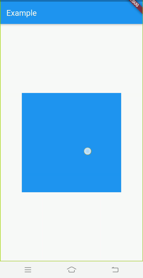
You see the transition is abrupt in nature and not lucid at all!
您会发现过渡本质上是突然的,一点也不清晰!
Now let’s try the same thing with AnimatedContainer and then move on to trying more cool animations with the same.
现在让我们使用AnimatedContainer尝试相同的事情,然后继续尝试使用相同的更酷的动画。
动画容器行为 (Animated Container behavior)
1. height和width变化: (1. Change in height and width:)
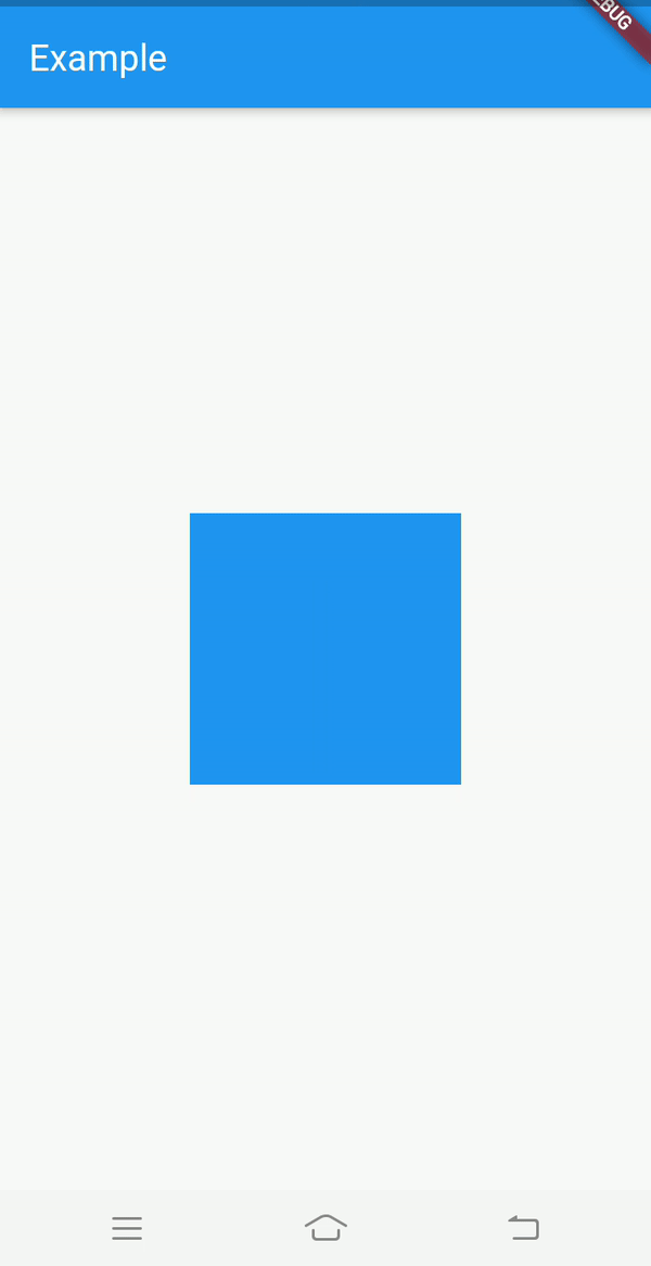
The code for this is pretty much the same as previous except that we need to change the widget from Container to AnimatedContainer. After changing the widget to AnimatedContainer, you need to pass the Duration attribute for the AnimatedContainer. This specifies the time period or the duration over which you want the animating behavior to complete. So set the Duration property just like below:
除了需要将小部件从Container更改为AnimatedContainer之外,此代码与之前的代码几乎相同。 将小部件更改为AnimatedContainer ,您需要传递AnimatedContainer的Duration属性。 这指定了您希望动画行为完成的时间段或持续时间。 因此,如下所示设置Duration属性:
child: AnimatedContainer(
duration: Duration(
milliseconds: 400,
),
color: Colors.blue,
height: containerHeight,
width: containerWidth,
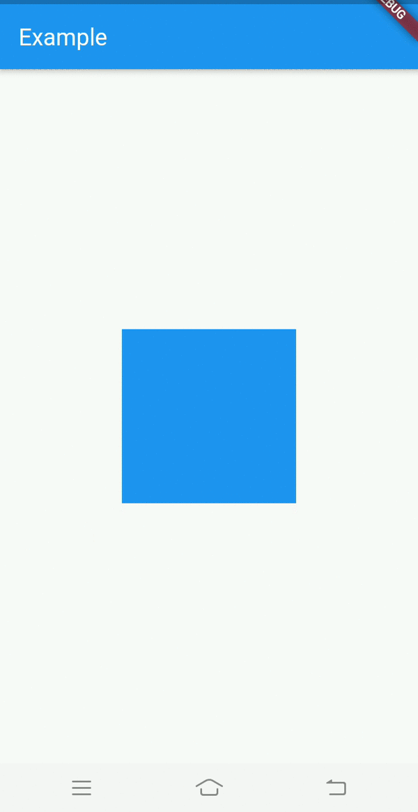
),Let’s run the updated code and observe the behavior this time
让我们运行更新的代码并观察这次的行为
Voilà !!!
哎呀!
That is so much more better to see. Let’s try experimenting with more attributes.
那就更好了。 让我们尝试使用更多属性。
2. color变化: (2. Change in color:)
As the number of attributes we are animating are increasing , it is better to use a boolean to know what state the container is at the moment. Whether it is expanded or not. The benefit of doing so is that inside setState() we’ll have less attributes to deal with. We’ll just toggle the boolean and that will be it.
随着我们要设置动画的属性数量的增加,最好使用布尔值来了解容器当前处于什么状态。 是否扩展。 这样做的好处是,在setState()内部,我们需要处理的属性更少。 我们只需要切换布尔值就可以了。
So go ahead and add a boolean variable:
因此,继续添加一个布尔变量:
bool isExpanded = false;Also update the AnimatedContainer widget in the widget tree as follows:
还如下更新小部件树中的AnimatedContainer小部件:
child: AnimatedContainer(
  duration: Duration(
    milliseconds: 400,
  ),
  color: isExpanded ? Colors.green : Colors.blue,
  height: isExpanded ? 250 : 150,
  width: isExpanded ? 250 : 150,
),
The change over here is that we’ve added a color attribute to the AnimatedContainer and the other two attributes height and width are assigned values based on whether the AnimatedContainer is expanded or not.
此处的更改是,我们已向AnimatedContainer添加了color属性,另外两个属性height和width是根据AnimatedContainer是否扩展而分配的值。
One final change needs to be done i.e. updating the setState() as follows:
需要做一个最后的更改,即如下更新setState() :
setState((){
  isExpanded = !isExpanded;
});
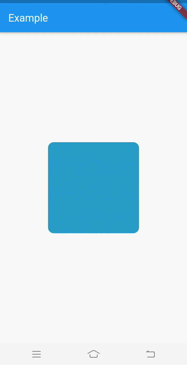
3.更改borderRadius : (3. Change in borderRadius:)
Just like other attributes we can also animate the border radius of the AnimatedContainer at runtime. For adding the borderRadius property, we’ll need to pass BoxDecoration first to the decoration attribute and then inside which we’ll pass the borderRadius to it. Just like how you’d set borderRadius for usual Container.
就像其他属性一样,我们还可以在运行时为AnimatedContainer的边框半径设置AnimatedContainer 。 为了添加borderRadius属性,我们需要BoxDecoration传递给decoration属性,然后再在其中将borderRadius传递给它。 就像您为通常的Container设置borderRadius一样。
child: AnimatedContainer(
  duration: Duration(
    milliseconds: 400,
  ),
  decoration: BoxDecoration(
    borderRadius: BorderRadius.all(
      Radius.circular(isExpanded ? 32 : 4),
    ),
    color: isExpanded ? Colors.green : Colors.blue,
  ),
  height: isExpanded ? 250 : 150,
  width: isExpanded ? 250 : 150,
),
Notice that I’ve moved the color attribute inside BoxDecoration because we can’t specify color and decoration at the same time, just like Container.
请注意,由于我们无法同时指定color和decoration ,因此已在BoxDecoration内部移动了color属性,就像Container一样。
This looks great so far. But right now the animation is pretty ‘vanilla’, meaning it just animates linearly between the two values. How about playing with the curve or rhythm of the animation.
到目前为止看起来不错。 但是现在,动画是非常“香草”的,这意味着它只是在两个值之间线性地进行动画处理。 如何播放动画的曲线或节奏。
4.添加curve属性: (4. Adding curve attribute:)
My favourite curve is Curves.bounceOut. Let’s try that. Also let’s increase the duration a bit.
我最喜欢的曲线是Curves. bounceOut Curves. bounceOut 。 让我们尝试一下。 另外,让我们增加duration 。
duration: Duration(
  milliseconds: 1000,
),curve: Curves.bounceOut,
As an excercise, I suggest you to also try out other curves.
作为练习,我建议您也尝试其他曲线。
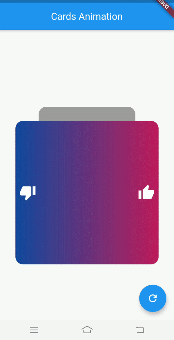
Similarly, you can also experiment with other parameters of AnimatedContainer like transform , margin , padding etc. You can create complex animations when you combine multiple attributes together. I won’t be explaining these animations in this article for brevity but this is what I was able to achieve :
同样,您还可以尝试使用AnimatedContainer其他参数,例如transform , margin , padding等。将多个属性组合在一起时,可以创建复杂的动画。 为了简洁起见,我不会在本文中解释这些动画,但这是我能够实现的:
Github仓库: (Github repo:)
Github仓库: (Github repo:)
使用动画容器从头开始进行动画切换: (Animated switch from scratch using Animated Container:)
与动画容器一起游荡: (Goofing around with Animated Container:)
So that is all from this article. Thank you for reading my article. If you enjoyed reading it, please make sure to give some claps. Follow me for more articles on Flutter.
这就是本文的全部内容。 感谢您阅读我的文章。 如果您喜欢阅读,请确保鼓掌。 跟随我以获取有关Flutter的更多文章。
Checkout my previous article on AnimatedPadding and AnimatedOpacity :
查阅我以前关于AnimatedPadding和AnimatedOpacity文章:
Below are my other profiles:
以下是我的其他个人资料:
翻译自: https://uxdesign.cc/exploring-animated-containers-in-flutter-3b6ebb779cea


 552
552

 被折叠的 条评论
为什么被折叠?
被折叠的 条评论
为什么被折叠?
 到【灌水乐园】发言


