


指针和指针的指针
a week ago I saw a new IPad Pointer presentation and was very excited about what they did. It was very interesting to see how they design different pointer modes and attention to details. Here is the presentation:
一周前,我看到了一个新的IPad Pointer演示文稿,并对他们的工作感到非常兴奋。 看到他们如何设计不同的指针模式并关注细节非常有趣。 这是演示:
Some of their approaches were very interesting, and I immediately start to think if I can recreate the same cursor effects on the web.
他们的一些方法非常有趣,我立即开始考虑是否可以在网络上重新创建相同的光标效果。
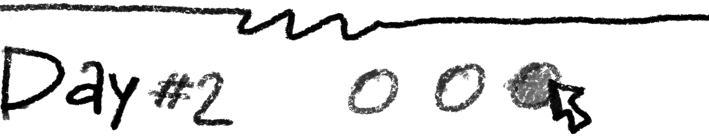
Today, the article will be written as a diary — separated into days, it will be easier to track the progress and fallow the story.
今天,该文章将以日记形式写成-分成几天,可以更轻松地跟踪进度并了解故事。

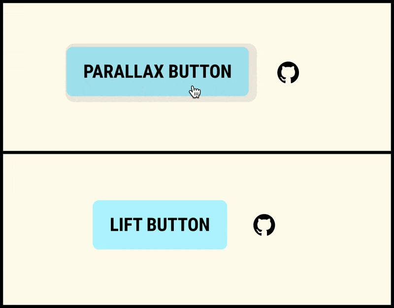
But before let me share my “contextCursor” module, so, you will know what I’m talking about👇🏽
但是在让我分享我的“ contextCursor”模块之前,您将了解我在说什么👇🏽
重现效果 (Effects to recreate)
There was a very interesting feature like custom cursor — when we can morph the standard cursor into any shape/image we want, but today I’ll try to recreate these effects:
有一个非常有趣的功能,例如自定义光标-当我们可以将标准光标变形为所需的任何形状/图像时,但是今天我将尝试重新创建以下效果:
The general challenges here will be:
这里的一般挑战将是:
- Morphing/transitions smoothness. 变形/过渡平滑度。
- Parallax for the cursor and the target element on hover. 光标和悬停目标元素的视差。
- Cursor morphing in the “Lift” mode. “提升”模式下的光标变形。
The rest of the day I spend on my thoughts and research.
余下的时间,我会全神贯注于思想和研究。
I knew that perhaps I use GSAP library. I used it before and can say that it’s a problem solver for interactive animation. But I decided to start on my own, just to check how easy it will be and fill all layers of pain when something doesn't work.
我知道也许我使用了GSAP库 。 我以前使用过它,可以说它是交互式动画的问题解决者。 但是我决定独自一人开始,只是检查它会变得多么容易,并在某些不起作用的情况下弥补所有的痛苦。
The first shot was based on the collision tracking of an object with another object and the hover animation was solved with CSS transitions.
第一个镜头基于一个对象与另一个对象的碰撞跟踪,并且悬停动画通过CSS过渡解决。
I had some trouble with collisions. For some reason, the collision fired only for the last element.
我在碰撞时遇到了麻烦。 由于某种原因,碰撞仅针对最后一个元素触发。
The rest of the day I spend torture myself mentally. I fell asleep thinking about waking up and solve this question.
剩下的一天,我会在精神上折磨自己。 我睡着了,想着醒来解决这个问题。
Gees what? I gave up. I ask Gods on the StackOverflow. It solved my issue.
什么? 我放弃。 我在StackOverflow上问诸神。 它解决了我的问题。
The reason was in the wrong understanding of how forEach works. It doesn’t wait when a function returns. And instead of this:
原因是对forEach工作方式的错误理解。 当函数返回时,它不会等待。 而不是这样:
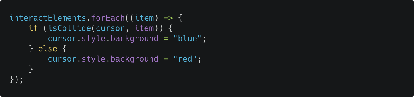
I should use this:
我应该使用这个:
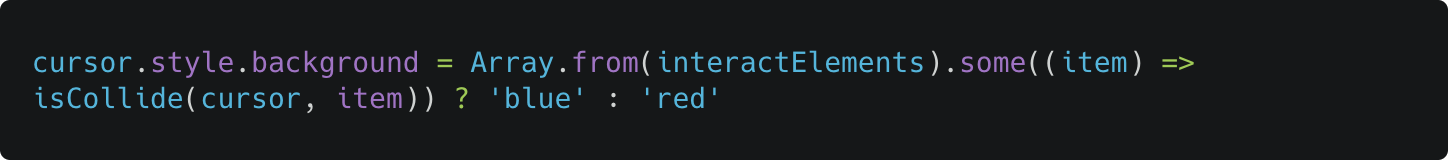
Not so elegant, but works! I mean with forEach we can use one loop function for all props.
不太优雅,但是有效! 我的意思是,对于forEach我们可以对所有道具使用一个循环函数。
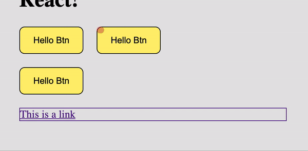
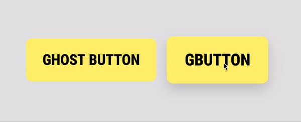
Here is the first implementation. Simple and… twitchy. Always start the cursor transformation from the top-left position.
这是第一个实现。 简单而又抽搐。 始终从左上角开始光标转换。
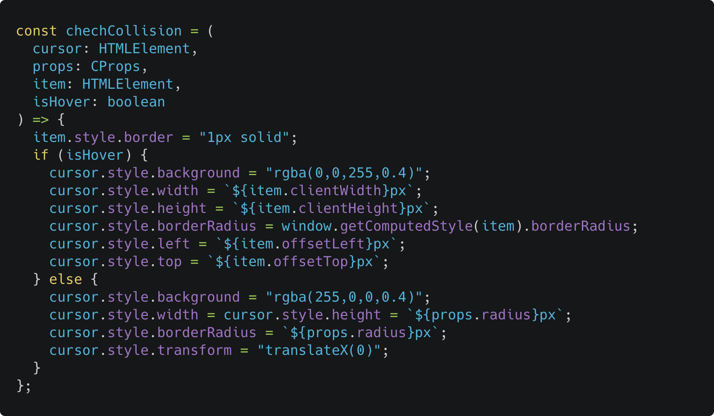
To be able to click through the overlay cursor I added pointer-events: none; to the fake cursor and added transition property for border-radius, width, height and background-color. The collision function:
为了能够通过覆盖光标单击,我添加了pointer-events: none; 到伪造的光标,并为border-radius , width, height和background-color添加了transition属性。 碰撞功能:
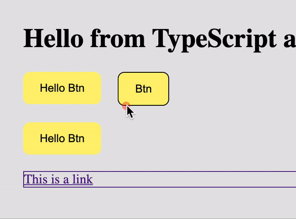
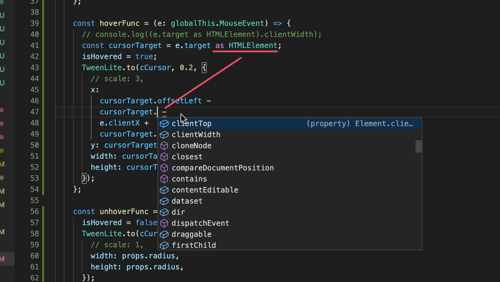
The issue — cursor morphing start not from the cursor center but from the top/left position of the target element.
问题-光标变形不是从光标中心开始,而是从目标元素的顶部/左侧位置开始。
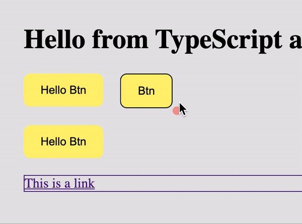
So, I tried another approach — I tried to correct the start position with transform property.
因此,我尝试了另一种方法-我尝试使用transform属性纠正起始位置。
But it was a bad idea to move the cursor with top and left positioning and use transform at the same time to correct the point of transformation. This only worked only on the “input” but not the “output”.
但是,将光标移动到顶部和左侧位置并同时使用transform来校正transforming point是一个坏主意。 这仅对“输入”有效,而对“输出”无效。
And to make a proper output animation I had to calculate a cursor position inside the target element and correct top/left and transform y, x in parallel. And I did it but the result was too glitchy.
为了制作适当的输出动画,我必须计算目标元素内的光标位置,并校正顶部/左侧并并行转换y,x。 我做到了,但是结果太小故障了。
I wrote this module with Typescript. Because it helped me to keep my code clean and helped me to handle errors + very convenient tips.
我用Typescript编写了这个模块。 因为它可以帮助我保持代码干净,并帮助我处理错误和非常方便的提示。
Body styles
体型
I added a property that will reset margin and padding for the body, due to this the mouse can be positioned wrong.
我添加了一个属性,该属性将重置主体的边距和填充,因此,鼠标可能定位错误。
I fell asleep with a thought that the next day I’ll try GSAP.
我睡着了,想到第二天我将尝试GSAP 。
The GreenSock Animation Platform (GSAP for short) is a powerful JavaScript library that enables front-end developers and designers to create robust timeline based animations. This allows for precise control for more involved animation sequences rather than the sometimes constraining
keyframeandanimationproperties that CSS offers.GreenSock动画平台(简称GSAP )是一个功能强大JavaScript库,使前端开发人员和设计人员可以创建基于时间轴的强大动画。 这允许对更多涉及的动画序列进行精确控制,而不是CSS有时提供的约束
keyframe和animation属性。
So, GSAP. GSAP forums it’s a powerful thing. But many examples you can find on Codepen as well. A simple and small example that I found as a reference.
因此,GSAP。 GSAP论坛是一项强大的功能。 但是,您也可以在Codepen上找到许多示例。 我找到一个简单的小例子作为参考。
And I tried the same approach. With GSAP it works like a charm
我尝试了相同的方法。 借助GSAP,它就像魅力一样运作
I also learned the difference between mouseleave / mouseenter and mouseout / mouseover 👇🏽
我也学会之间的区别mouseleave / mouseenter和mouseout / mouseover 👇🏽
̶T̶h̶e̶ ̶n̶e̶x̶t̶ ̶t̶h̶i̶n̶g̶ ̶I̶ ̶d̶i̶d̶ ̶i̶s̶ ̶s̶e̶p̶a̶r̶a̶t̶e̶d̶ ̶e̶x̶e̶c̶u̶t̶e̶ ̶f̶u̶n̶c̶t̶i̶o̶n̶s̶ ̶b̶y̶ ̶t̶y̶p̶e̶s̶.̶ ̶B̶e̶c̶a̶u̶s̶e̶ ̶I̶ ̶p̶l̶a̶n̶n̶e̶d̶ ̶t̶o̶ ̶m̶a̶k̶e̶ ̶s̶e̶v̶e̶r̶a̶l̶ ̶m̶o̶d̶e̶s̶ ̶o̶f̶ ̶t̶h̶e̶ ̶c̶u̶r̶s̶o̶r̶.̶ ̶T̶h̶e̶ ̶f̶i̶r̶s̶t̶ ̶a̶n̶d̶ ̶t̶h̶e̶ ̶d̶e̶f̶a̶u̶l̶t̶ ̶o̶n̶e̶ ̶w̶i̶l̶l̶ ̶b̶e̶ ̶c̶o̶n̶t̶e̶x̶t̶ ̶c̶u̶r̶s̶o̶r̶.̶ UPD: I leave only one mode — context-cursor
接下来的事情我所做的是分开执行的功能由̶t̶y̶p̶e̶s̶.̶因为我计划做几种模式的̶c̶u̶r̶s̶o̶r̶.̶第一和一个默认将上下文̶c̶u̶r̶s̶o̶r̶.̶UPD:我只留下一个模式-上下文光标
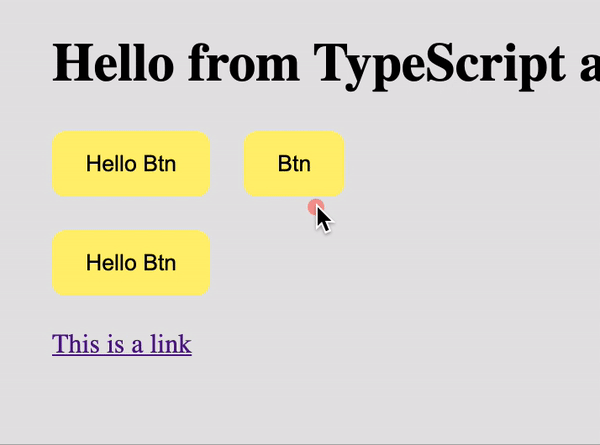
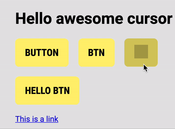
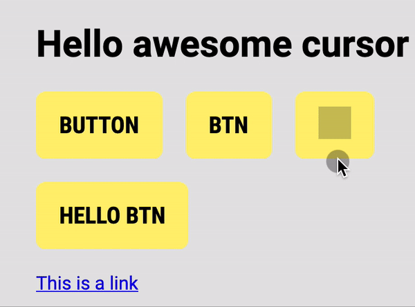
I also separated cursor effects. You can add specify these types in the data attribute data-cursor.
我还分离了光标效果。 您可以在data属性data-cursor添加指定这些类型。
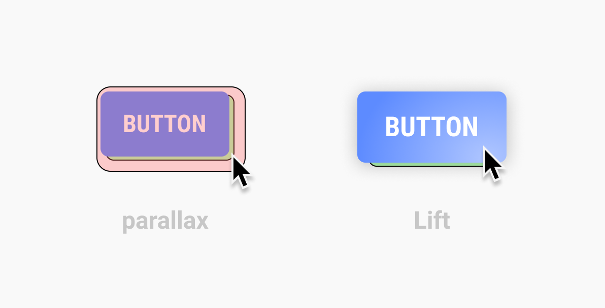
因此,我们有以下效果: (So we have these effects:)
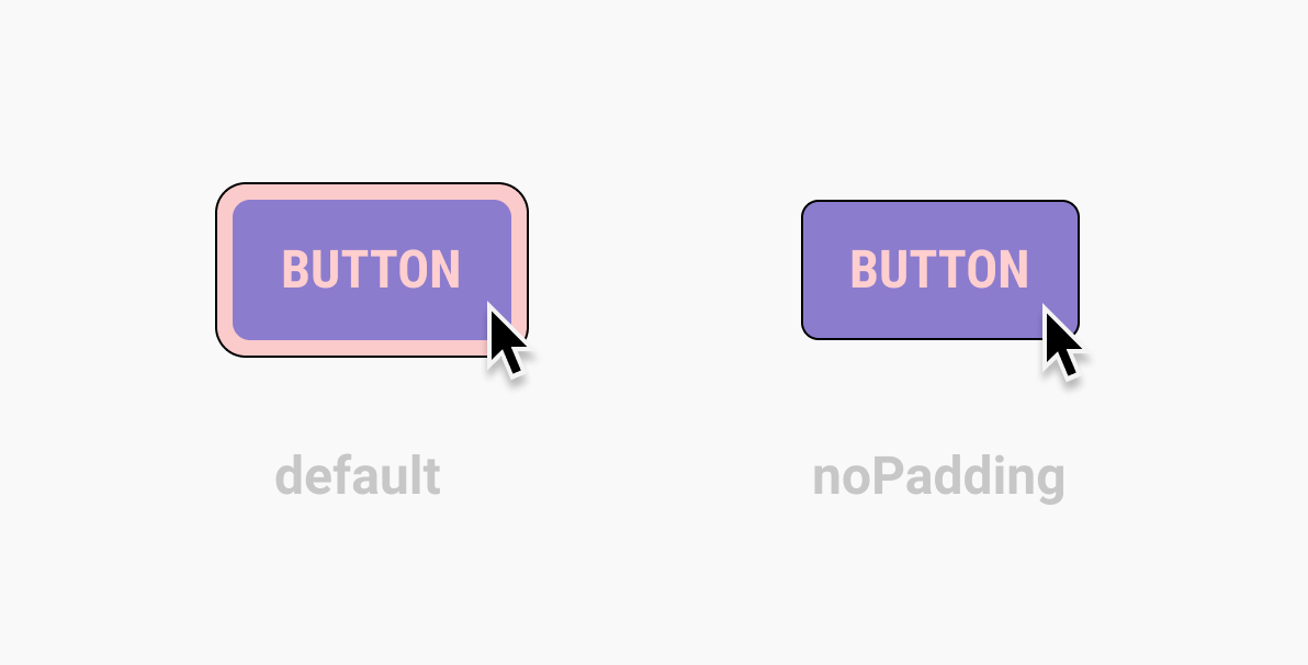
— noPadding. By default will add small padding to the cursor.
— noPadding。 默认情况下会向光标添加小填充。
— noParallax. Will switch off the parallax effect.
— noParallax。 将关闭视差效果。
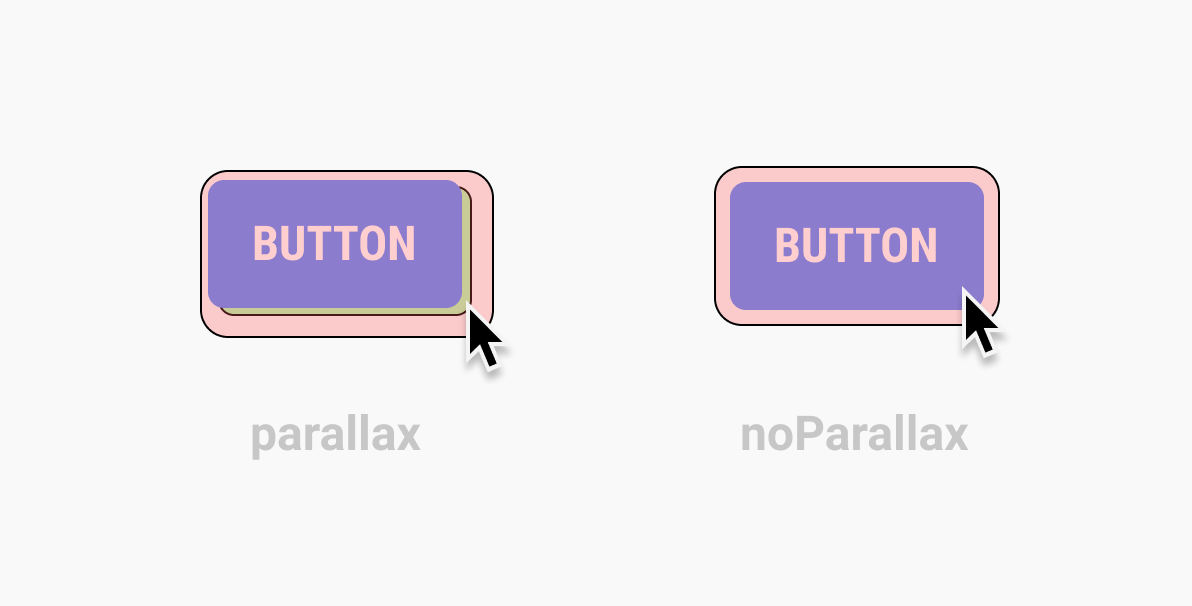
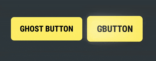
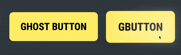
— Lift effect. The cursor will be dissolved in the button. Reincarnating the cursor into a button — we will lift the button a little and add a shadow to it.
—提升效果。 光标将是 溶解在按钮上。 将光标重新变成按钮-我们将按钮稍微抬起并为其添加阴影。
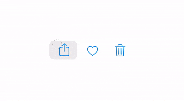
视差效果 (Parallax effect)
First, we need to do is detect when the mouse moves right and left when it is on a hovered element mouseenter. To do so we need to take the relative mouse position:
首先,我们要做的是检测鼠标在悬停元素mouseenter上时何时左右移动。 为此,我们需要采用鼠标的相对位置:

and then we need to subtract half the width of the element from the relative position:
然后我们需要从相对位置减去元素的一半宽度:

And the last thing we have to do to make it work is to add the speed variable. This variable will slow down the movement. We will add this variable to the module as a changeable argument.
为了使它起作用,我们要做的最后一件事是添加speed变量 。 此变量将减慢运动速度。 我们将此变量作为可变参数添加到模块中。

Let’s make a function that will count the parallax.
让我们做一个计算视差的函数。
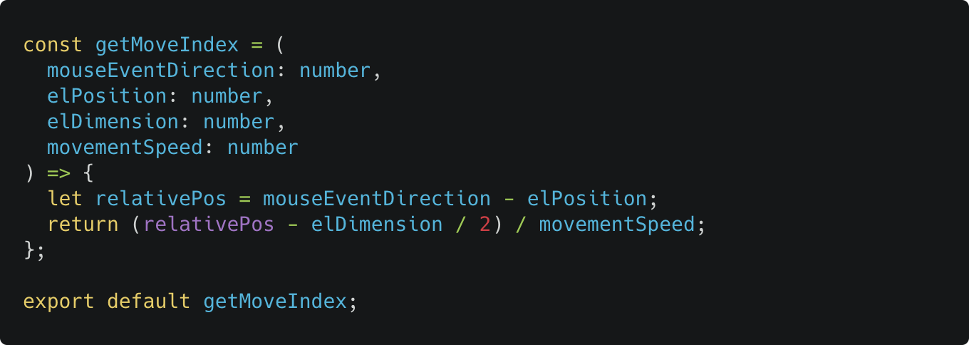
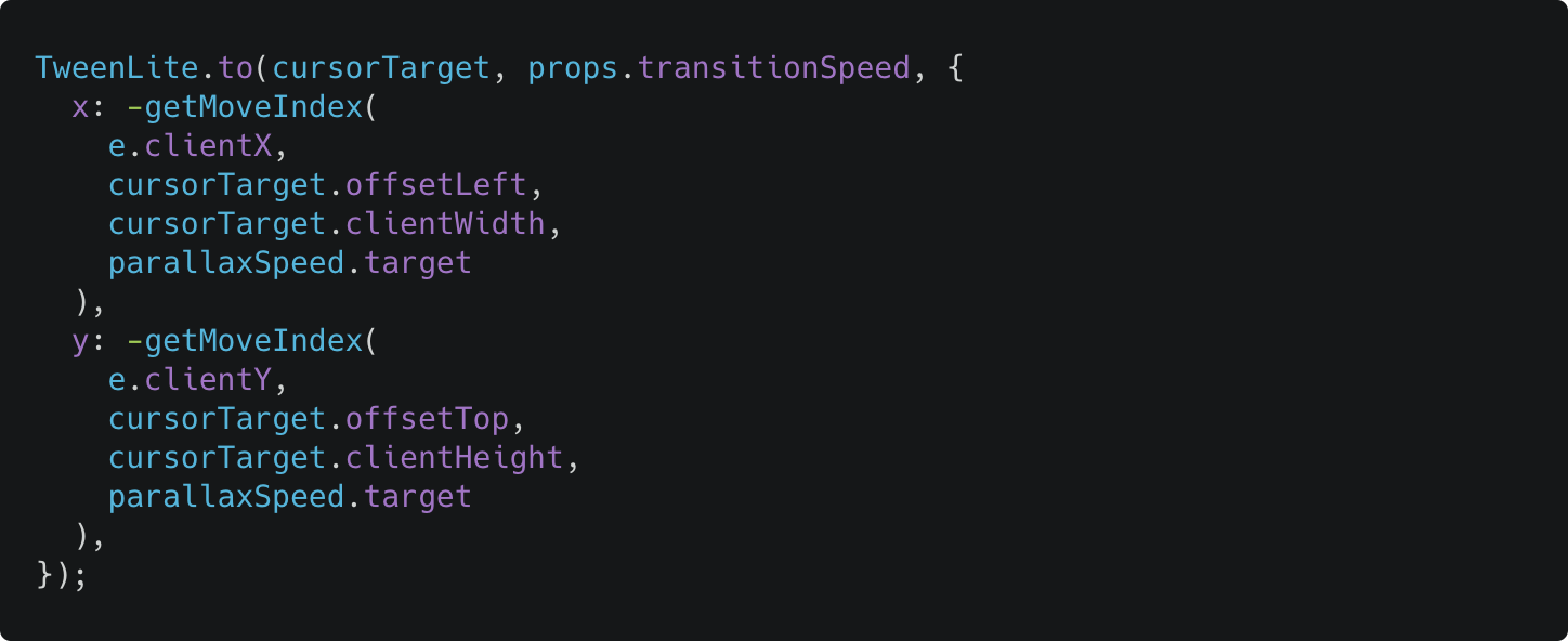
Now we need to implement the same effect to the hovered element but with the negative sign:
现在,我们需要对悬停的元素实现相同的效果,但带有负号:
I added an active class
c-cursor_activewhen the cursor is hovering an element. That you can add your custom active styles without involving JS.当光标悬停在元素上时,我添加了一个活动类
c-cursor_active。 您可以在不涉及JS的情况下添加自定义活动样式。
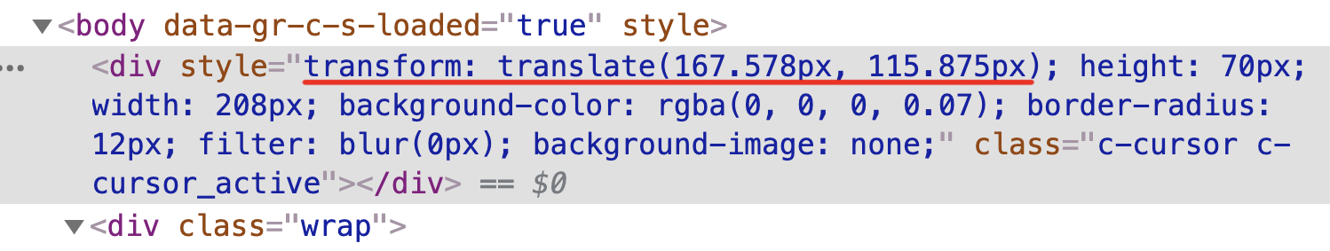
But there is a problem. X and Y props go as subpixels in CSS transform but left and right props go as rounded numbers and because of that, the animation was to “steppy” like there is 10 fps instead of 60.
但有一个问题。 X和Y道具在CSS transform以子像素的形式出现,而左,右道具以四舍五入的形式出现,因此,动画就像是10帧/秒而不是60帧/秒的“步进式”。
Compare to the back icon which we animated with X and Y property which GSAP translates to the transform prop. Translate animation is much smoother.
与我们使用X和Y属性动画化的后退图标进行比较,GSAP将其转换为transform道具。 翻译动画要流畅得多。
It took me some time, but I wrote an operation for the cursor using X and Y transform.
我花了一些时间,但是我使用X和Y transform为光标编写了一个操作。
It’s a dirty code, but works. I’m planning to make it up after I’ll do all that I planned to achieve.
这是一个肮脏的代码,但是有效。 我打算完成我打算实现的所有任务后,再进行弥补。
Here is the result before (with the left and top props) and after (with the x and y props):
这是之前 (带有左侧和顶部道具)和之后 (带有x和y道具)的结果:
Also if you want more about difference betweeen transform and pos:top/left check this article that explains Translate() and absolute position movement:
另外,如果您想进一步了解betweeen transform与pos:top/left差异,请查看这篇介绍Translate()和绝对位置移动的文章:
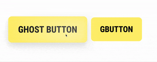
The last day to add the final effect. I added the “Shift” effect. It was easy to do because all you need to do here is add a shadow and scale to the target element.
最后一天添加最终效果。 我添加了“ Shift”效果。 这样做很容易,因为您要做的就是在目标元素上添加阴影和缩放比例。
Here are some tips how you can use CSS variables, but I used
c-cursor_activeclass to set the active CSS color.这里有一些技巧,您可以使用CSS变量,但是我使用了
c-cursor_active类来设置活动CSS的颜色。https://greensock.com/forums/topic/21422-how-to-animate-using-css-variables-as-target-values
https://greensock.com/forums/topic/21422-how-to-animate-using-css-variables-as-target-values
The first version looks like this:
第一个版本如下所示:
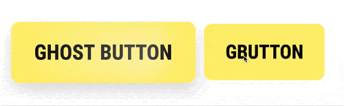
Now let’s make the effect prettier. Move the box-shadow property from the cursor to the target element to make the transitions smooth. And add a “flare” on the button that will fallow the cursor. I also added a little blur to cursor on the hover to smooth the morphing and this gave an interesting side effect — as is a lens-flare that blurs objects` edge a little.
现在让效果更漂亮。 将box-shadow属性从光标移动到目标元素,以使过渡平滑。 并在按钮上添加一个“ flare”,它将使光标消失。 我还在悬停时在光标上添加了一些模糊以平滑变形,这产生了一个有趣的副作用-镜头光晕使对象的边缘稍微模糊了。
In addition, I added a few adjustments — you can switch off paddings for the cursor when it hovered and switch off the parallax effect on hovering.
另外,我添加了一些调整-您可以在光标悬停时关闭其填充,并在悬停时关闭视差效果。
{Writing this article and unsuccessful attempts to make an NPM module}
{撰写本文,但未成功制作NPM模块}
I wanted to upload this module as an NPM package but the adjustment for this will take too much time, so I publish it as is, and you still can copy it and use it in your projects or modify it any way you want.
我想将此模块作为NPM软件包上载,但是对此的调整将花费太多时间,因此我按原样发布,您仍然可以复制它并在项目中使用它,也可以根据需要进行任何修改。
Next three days I spend to write the documentation and made the demo, and to finish this article as well :-)
接下来的三天,我将花时间编写文档并进行演示,并同时完成本文:-)
In general, I achieved and tested things that I wanted and could say that it looks interesting on the web. But here is my reasons why such cursors won't be implemented as a unified pointer:
总的来说,我实现并测试了我想要的东西,并且可以说它在网络上看起来很有趣。 但是,这就是为什么我不能将这些游标实现为统一指针的原因:
The web already has their cursors, there are some many of them. The web cursor is a solid pattern. We associate the web with the arrow cursor.
网络已经有了他们的光标,其中有很多 。 Web光标是实心图案。 我们将网络与箭头光标关联。
- Using this type of cursor as a default one could be a CPU consuming task. 将这种类型的游标用作默认游标可能是一项占用CPU的任务。
- The web doesn’t need to change patterns and look. The web is a pure constructor with which you can build whatever you want — it only gives you a simple boilerplate, you can use it or you can write your own. 网络不需要更改样式和外观。 Web是一个纯粹的构造函数,您可以用它构建所需的任何内容–它只为您提供一个简单的样板,您可以使用它,也可以编写自己的模型。
- We have many different interfaces on the web — tense and opposite, with a lot of white space, controls, buttons with different functions, etc. So the implementation of such pointer will ruin UX half of them. It will force to redesign websites to make them fit for a new pattern. 我们在Web上有许多不同的界面-紧张而相对,具有许多空白,控件,具有不同功能的按钮等。因此,此类指针的实现将破坏UX中的一半。 它将迫使重新设计网站,使它们适应新的模式。
But… at the same time, I do not reject that in the future we will see a new “fancy” cursor, because:
但是……同时,我不拒绝在将来我们会看到一个新的“花式”光标,因为:
- Our computers are getting more powerful, which means that we’ll be able to implement more complex features, without reducing efficiency. 我们的计算机变得越来越强大,这意味着我们将能够实现更复杂的功能,而不会降低效率。
- Major, big companies that have a monopoly on the market could implement and force new features in their products. Exactly like apple did with iPad pointer. And developers will be free to choose between the old and the new. 在市场上具有垄断地位的大型公司可以在其产品中实施并强制采用新功能。 就像苹果使用iPad指针一样。 开发人员可以在新旧之间自由选择。
Just before I publish this article I saw a new article on codrops by Mary Lou, it calls magnetic buttons. Very similar to what I wanted to achieve here and so different solutions. Realy liked it. You can also check it and view the source code.
在我发表这篇文章之前,我看到了Mary Lou撰写的有关codrop的新文章,它称为磁性按钮。 与我要在此处实现的目标非常相似,因此有不同的解决方案。 Realy喜欢它。 您也可以检查它并查看源代码。
Another cool feature by Mary Lou and iPad pointer also has it is — non-standart hit area, a bigger hit area. Which is pretty cool when you can choose when to trigger the cursor morphing. I’ll implement it if someone asks me to include it in the code. But here are two ways how I think we can achieve it:
Mary Lou和iPad指针的另一个很酷的功能是-非标准击中区域,更大的击中区域。 当您可以选择何时触发光标变形时,这非常酷。 如果有人要我将其包含在代码中,我将实现它 。 但是我认为我们可以通过两种方式实现这一目标:
The cheap and simple way — just add
:pseudo-elementto the cursor and make it bigger. Then we track when pseudo-element cross the target element.便宜而简单的方法-只需在光标上添加
:pseudo-element并将其增大。 然后我们跟踪伪元素何时穿过目标元素。The second way — we track everything in
mousemovelistener and use a special collider function.第二种方法-我们跟踪
mousemove侦听器中的所有内容,并使用特殊的对撞机功能。
I found an interesting bug when I started to make a demo page — the cursor is not moving during the scroll (like on the example below). The solution is very simple — just add position: fixed to the cursor.
当我开始制作演示页面时,我发现了一个有趣的错误-滚动过程中光标没有移动(如以下示例所示)。 解决方案非常简单-只需添加position: fixed在光标上。
And another fix that I made — I changed the method to get an element position. When you have scroll on your page — use el.getBoundingClientRect().top or left instead of el.offsetTop or el.offsetLeft.
我所做的另一项修复-我更改了获取元素位置的方法。 在页面上滚动后,请使用el.getBoundingClientRect().top或left代替el.offsetTop或el.offsetLeft 。
DEMO PAGE 👇🏽
演示页👇🏽
GITHUB PAGE 👇🏽
GITHUB页面👇🏽

Thank you for reading!
感谢您的阅读!
翻译自: https://blog.prototypr.io/ipad-pointer-on-the-web-f3aaf48d515c
指针和指针的指针


 被折叠的 条评论
为什么被折叠?
被折叠的 条评论
为什么被折叠?
 到【灌水乐园】发言


