


灰色边框阴影
If you’re an avid dark mode user like me, you’ll know that dark mode isn’t just about white text on black backgrounds. In a single app, a handful of shades of gray give the app some depth. And across various apps, the spectrum of gray becomes even wider.
如果您是像我这样的狂热暗模式用户,您会知道暗模式不只是黑底白字。 在单个应用程序中,少量的灰色阴影为应用程序提供了一定的深度。 在各种应用程序中,灰度范围变得更广。
I was curious about the dark mode apps and sites I use. Through inspecting elements and getting the hex codes of colors from a screenshot, I analyzed the dark mode palettes of 6 popular apps.
我对我使用的暗模式应用程序和网站感到好奇。 通过检查元素并从屏幕快照中获取颜色的十六进制代码,我分析了6种流行应用程序的暗模式调色板。
RGB色彩空间 (RGB Color Space)
RGB (RGB)
To talk about colors, we should start with how colors can be represented digitally.
要谈论颜色,我们应该从如何以数字表示颜色开始。
The RGB color space is one of the most popular models. Each color is a combined weight of the three colors red, green, and blue. The weight ranges from 0 (least) to 255 (most) and is usually displayed in a triplet: (red weight, green weight, blue weight). For example, red would be (255, 0, 0) since pure red has no traces of green or blue. A deep eggplant purple is (128, 0, 128) with equal parts red and blue. We also have black which is a lack of color: (0, 0, 0) and white, all the colors: (255, 255, 255).
RGB颜色空间是最受欢迎的模型之一。 每种颜色是红色,绿色和蓝色三种颜色的总和。 权重的范围从0(最小)到255(最大),通常以三元组显示:( (red weight, green weight, blue weight) 。 例如,红色将为(255, 0, 0)因为纯红色没有绿色或蓝色的痕迹。 茄子深紫色是(128, 0, 128) ,红色和蓝色相等。 我们也有黑色,缺少颜色: (0, 0, 0)和白色,所有颜色: (255, 255, 255) 。
We can also visualize the RGB color space as a cube with red, green, and blue as the axis. Every color can be “plotted” in this cube.
我们还可以将RGB颜色空间可视化为以红色,绿色和蓝色为轴的立方体。 每种颜色都可以在此多维数据集中“绘制”。
What we’re interested in are the colors along and around the grayscale line. In this RGB cube, the grayscale line extends from black to white. Every color on this line has the same value for red, green, and blue. For example, medium gray is (127, 127, 127) and is the midpoint of the grayscale line. The closer to 0 the values are, the darker the shade of gray since black is (0, 0, 0).
我们感兴趣的是沿着灰度线及其周围的颜色。 在此RGB立方体中,灰度线从黑色延伸到白色。 该行上的每种颜色的红色,绿色和蓝色具有相同的值。 例如,中等灰度是(127, 127, 127) ,它是灰度线的中点。 值越接近0,因为黑色是(0, 0, 0)所以灰色阴影越深。
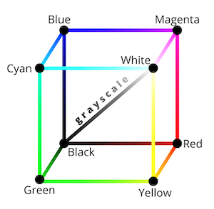
Colors that surround the grayscale line are not pure gray, but rather slightly tinted. For example, Twitter uses (25, 39, 52). Notice how even though the values are close to each other, the blue value is the largest. Thus, this shade of gray is a bit blue.
围绕灰度线的颜色不是纯灰色,而是略带色。 例如,Twitter使用(25, 39, 52) 。 请注意,即使两个值彼此接近,蓝色值也是最大的。 因此,这种灰色阴影有点蓝色。
十六进制代码 (HEX Codes)
To digitize this RGB triplet, we have HTML (Hex) color codes. HTML, CSS, SVGs, and more use hex codes to represent colors. The name comes from how Hex codes are just the concatenation of RGB values in hexadecimal. Sometimes we precede a Hex code with a pound sign. If we convert the aforementioned colors to Hex, we have:
为了数字化此RGB三元组,我们有HTML(十六进制)颜色代码。 HTML,CSS,SVG等使用十六进制代码表示颜色。 该名称来自十六进制代码如何只是十六进制十进制数的RGB值的串联。 有时,我们在十六进制代码前加井号。 如果将上述颜色转换为十六进制,我们将:
Red:
(255, 0, 0) → #ff0000红色:
(255, 0, 0) → #ff0000Eggplant purple:
(128, 0, 128) → #800080茄子紫色:
(128, 0, 128) → #800080Black:
(0, 0, 0) → #000000黑色:
(0, 0, 0) → #000000Medium gray:
(127, 127, 127) → #7f7f7f中灰:
(127, 127, 127) → #7f7f7fWhite:
(255, 255, 255) → #ffffff白:
(255, 255, 255) → #ffffffTwitter blue-gray:
(25, 39, 52) → #192734Twitter蓝灰色:
(25, 39, 52) → #192734
Now that we know a bit about RGB and Hex representations, we can explore the world of dark mode.
现在我们对RGB和十六进制表示有所了解,我们可以探索黑暗模式的世界。
暗模式应用程序剖析 (Anatomy of a Dark Mode App)
Across my analysis of various apps and sites, I’ve noticed a some general patterns that most dark mode apps follow.
在对各种应用程序和网站的分析中,我注意到大多数暗模式应用程序遵循的一些常规模式。
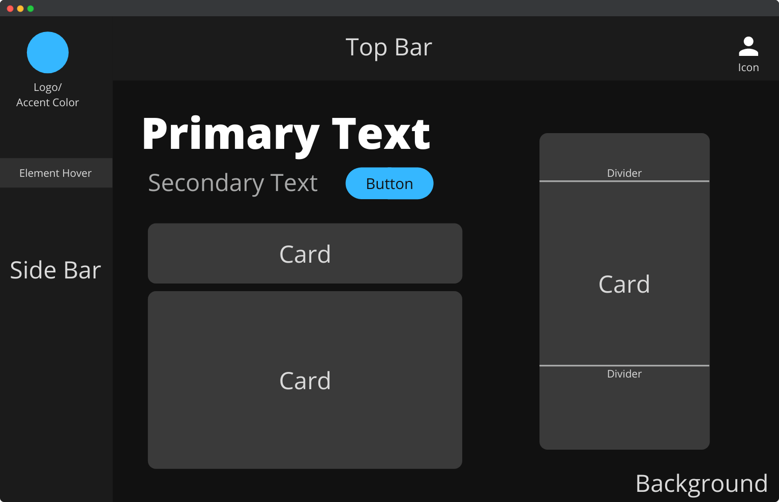
背景 (Background)
As the most dominant color, the background is almost always the darkest. It’s never pure black — usually a couple of shades lighter.
作为最主要的颜色,背景几乎总是最暗。 它永远不会是纯黑色的-通常会变浅一些阴影。
菜单栏 (Menu Bar)
These can be found on the side (usually left) or at the top of the app. Menu bars help with app navigation and are lighter than the background color.
这些可以在应用程序的侧面(通常是左侧)或顶部找到。 菜单栏有助于应用程序导航,并且比背景色浅。
卡 (Card)
With the rise of Material Design, comes the concept of cards. These elements compartmentalize the site content and are lighter gray as well.
随着Material Design的兴起,出现了卡片的概念。 这些元素将站点内容分隔开,并且也呈浅灰色。
分频器 (Divider)
Some cards have dividers to break up the content. Dividers are even lighter still.
某些卡具有分隔符以分解内容。 分频器甚至更轻。
纽扣 (Button)
Buttons invoke actions and can be gray or the app’s accent color.
按钮可以调用操作,可以是灰色或应用的配色。
主要文字 (Primary Text)
The titles and headers. Primary texts are the lightest color on the site, usually very close to white.
标题和标题。 主要文字是网站上最浅的颜色,通常非常接近白色。
次要文字 (Secondary Text)
Secondary texts are smaller in font size and a bit darker than their primary counterparts.
次要文本的字体较小,但比主要文本要暗一些。
图标 (Icon)
Representing ideas without words, icons are light as well and sometimes are accompanied by secondary text.
代表想法但不带文字,图标也很亮,有时还带有辅助文字。
These are some characteristics many modern dark mode apps share! Now we’ll examine how these elements apply to popular apps.
这些是许多现代黑暗模式应用程序共享的一些特征! 现在,我们将研究这些元素如何应用于流行的应用程序。
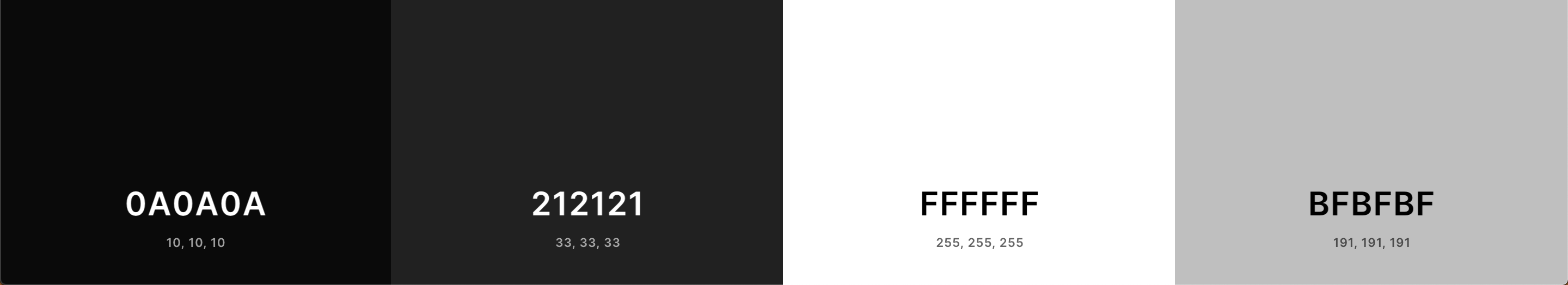
Spotify(macOS应用) (Spotify (macOS App))
Spotify is the earliest app I remember that only had dark mode. It didn’t start out this way. After undergoing a major redesign in 2014, the streaming service forced the dark theme on all its users. The argument for the switch was as such: the dark background allows for colorful album art to pop, akin to theaters dimming their lights for shows.
我记得Spotify是最早的应用, 只有暗模式。 它不是以这种方式开始的。 在2014年进行了重大的重新设计之后,流媒体服务对所有用户施加了黑暗的主题。 切换的理由是这样的 :黑暗的背景允许弹出多彩的专辑封面,类似于剧院调暗灯光进行演出。
Indeed, the colorful album covers contrast with the dark app, and make them appear brighter than they would on a white background:
实际上,彩色专辑涵盖了与深色应用程序的对比,并使它们显得比白色背景明亮:

Spotify is also the only app I’ve noticed that uses a gradient for the main background. Referencing the palette, the background ranges from #404040, a much lighter gray, to #181818, almost black. My theory is also that users spend the most time looking at playlist pages:
Spotify也是我注意到的唯一使用渐变作为主要背景的应用程序。 参考调色板,背景的范围是从#404040 (浅得多的灰色)到#181818 (几乎是黑色)。 我的理论还在于,用户花费最多的时间在播放列表页面上:
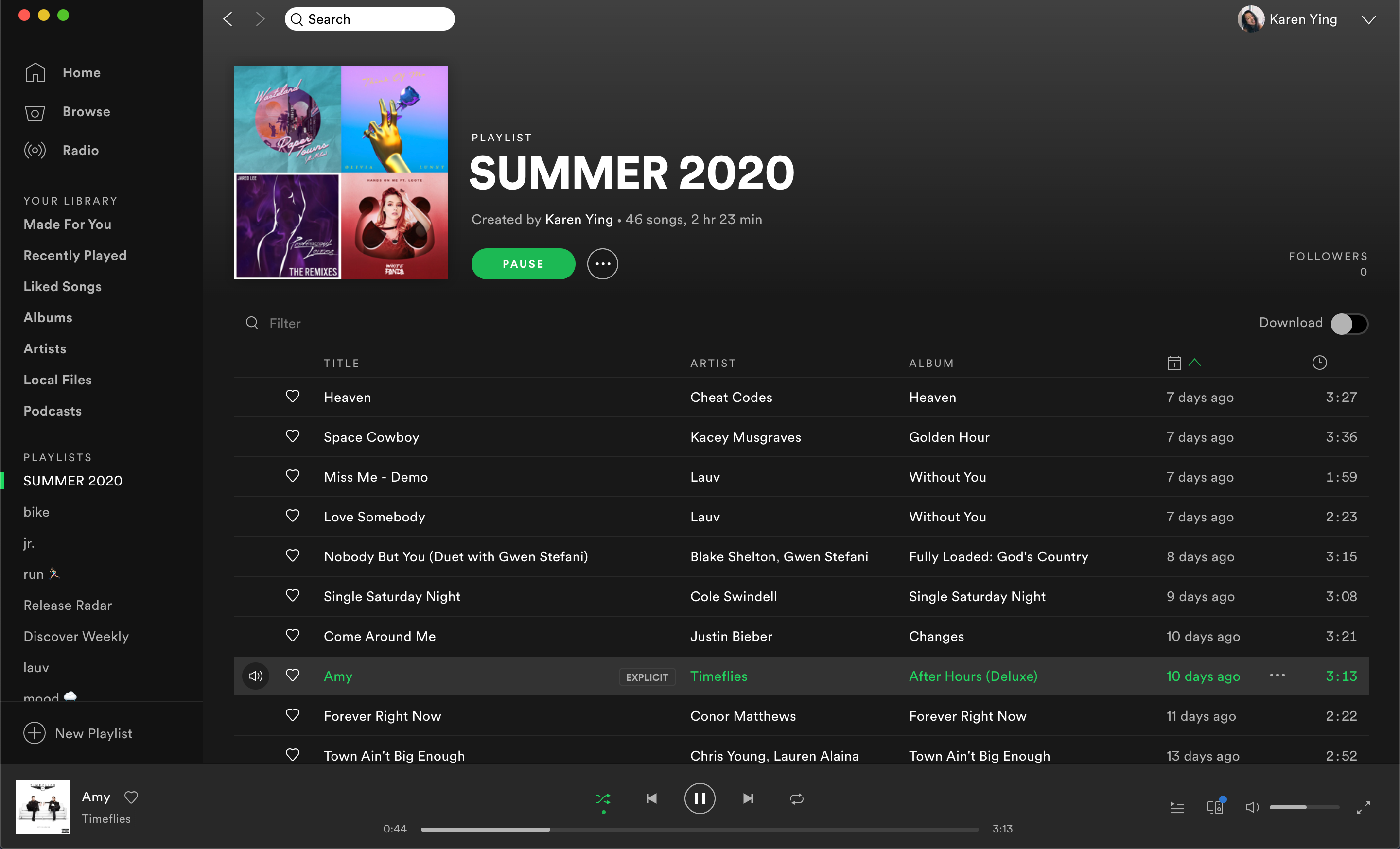
Here, the gradient makes sense for a long list of items, almost imitating motion. On non-playlist pages, the gradient also provides some depth.
在这里,渐变适用于一长串项目,几乎可以模仿运动。 在非播放列表页面上,渐变也会提供一定的深度。
Additional comments:
补充说明 :
- The primary text is pure white, and the secondary text is a light gray — pretty standard 主要文字为纯白色,次要文字为浅灰色-非常标准
- Every color is a pure shade of gray, no tints 每种颜色都是纯灰色阴影,没有色彩
- The accent color (green) is subtly used to break up the shades of gray 强调色(绿色)巧妙地用于分解灰色阴影
Twitter(网络) (Twitter (Web))
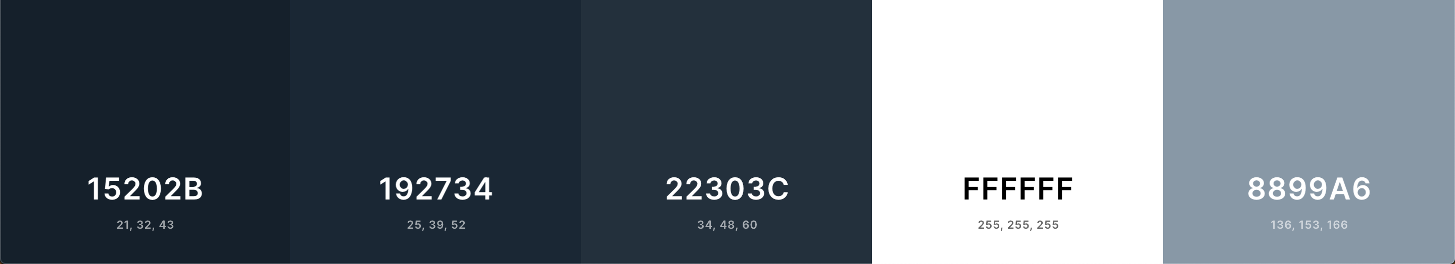
Right off the bat, just by looking at the RGB values, Twitter heavily favors blue for its dark mode. For each of the shades, the blue value is the highest.
马上,仅通过查看RGB值,Twitter就非常喜欢蓝色作为其黑暗模式。 对于每种阴影,蓝色值为最高。

Since its logo/accent color is blue, the blue-ness of the dark mode isn’t surprising and goes well together. As with any app that uses blue as its identifying color, Twitter hopes that this color choice conveys trust and tranquility.
由于其徽标/重点颜色是蓝色,因此暗模式的蓝色不足为奇,并且可以很好地搭配使用。 与使用蓝色作为其识别颜色的任何应用程序一样,Twitter希望这种颜色选择能够传达信任和宁静。
Additional comments:
补充说明 :
- Twitter utilizes cards with dividers. The cards are lighter than the background to appear closer, giving a perception of depth. Twitter利用带分隔符的卡片。 卡片比背景更轻,看起来更近,给人以深度感。
- The dividers on the cards are a lighter shade of blue 卡上的分隔线为浅蓝色
- Primary text is pure white and secondary text is light blue 主要文字为纯白色,次要文字为浅蓝色
- Blue accent color used throughout 贯穿始终使用的蓝色配色
- Logo is icon-like and is white 徽标像图标,是白色的
脸书(网页) (Facebook (Web))
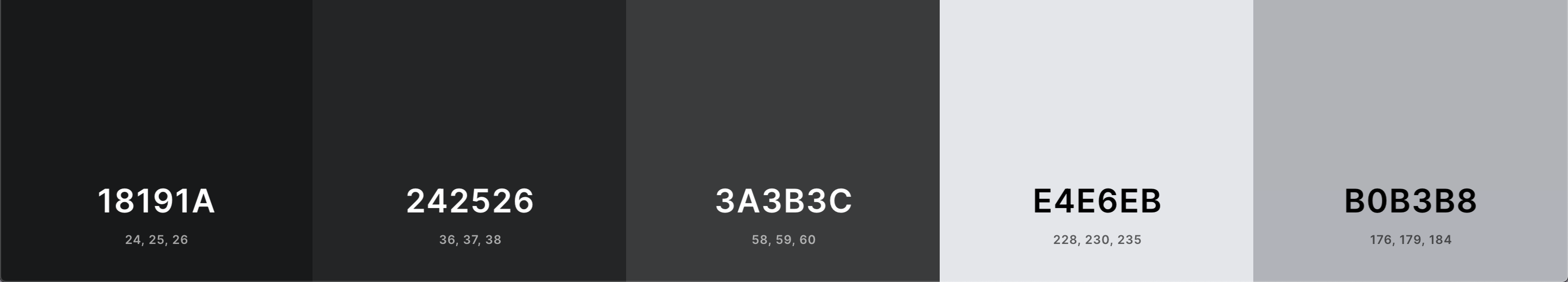
Facebook’s dark mode color decisions are interesting. If you look at the Hex codes, none of the colors are on the grayscale line. Instead, each RGB value is close to each other, slightly increasing from red to green to blue. It’s so subtle that it’s virtually unnoticeable when using the app:
Facebook的深色模式色彩决定很有趣。 如果您查看十六进制代码,则没有任何颜色在灰度线上。 相反,每个RGB值彼此接近,从红色到绿色再到蓝色略有增加。 它是如此的微妙,以至于在使用该应用程序时几乎看不到它:

The colors might as well be grayscale colors.
颜色也可以是灰度颜色。
Additional comments:
补充说明 :
- Facebook also uses lighter cards Facebook还使用打火机卡
- Lighter dividers are used on left and right menu bars 左右菜单栏上使用了较轻的分隔线
- The primary text is not white, instead of a shade of very light gray 主要文字不是白色,而是非常浅的灰色阴影
- The icons on the top right are this off-white as well, encased by gray button circles while the icons on the top are a darker shade of gray. The icons on the left menu are colorful instead 右上方的图标也是灰白色,由灰色按钮圆圈包围,而顶部的图标则是较深的灰色阴影。 左侧菜单上的图标改为彩色的
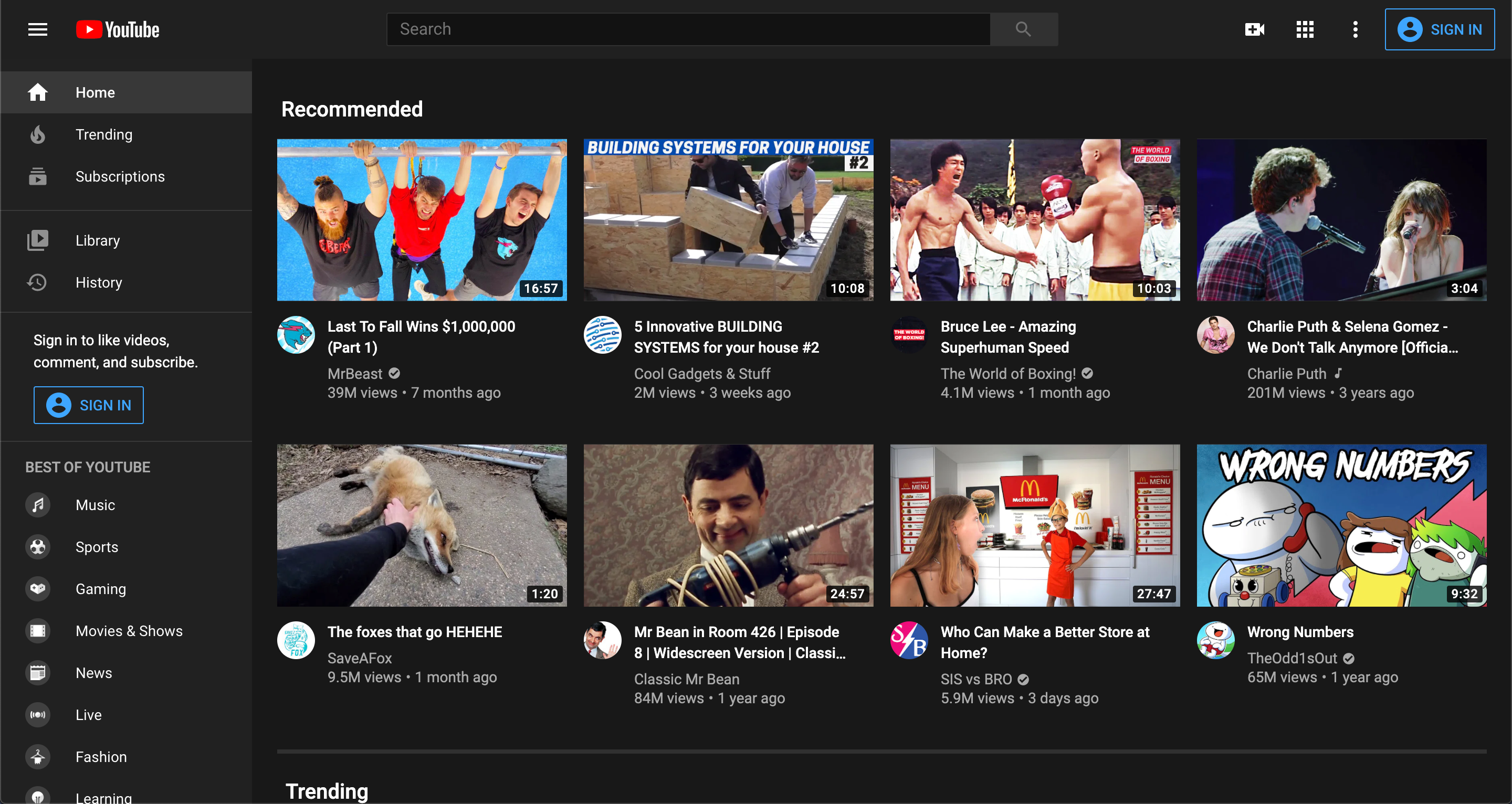
YouTube(网页) (Youtube (Web))
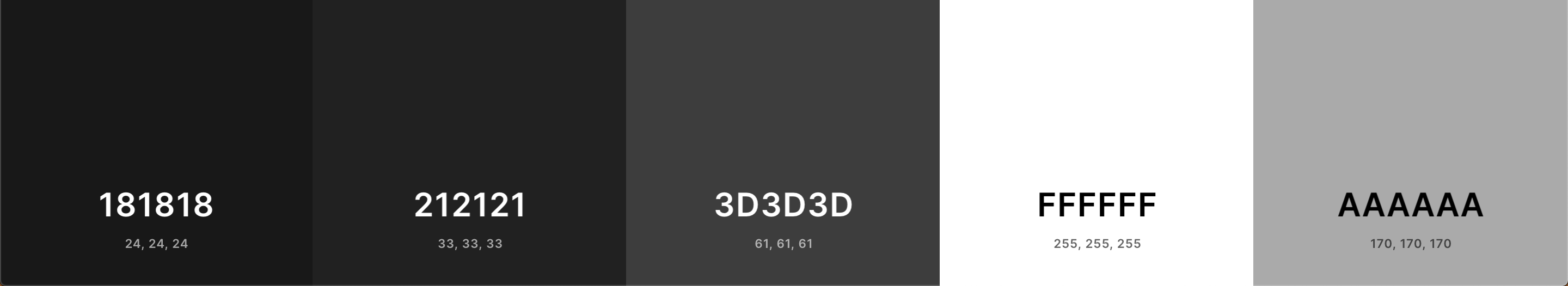
The dark mode palette used by YouTube is almost uninteresting. Each shade of gray is exactly on the grayscale lines. Unlike the apps above, there doesn’t seem to be an accent color. You don’t see the YouTube red anywhere in the app except the logo in the top left.
YouTube使用的深色模式调色板几乎没有意思。 每个灰色阴影正好位于灰度线上。 与上面的应用程序不同,似乎没有强调色。 除了左上方的徽标,您在应用中的任何地方都看不到YouTube红色。
中(iOS应用) (Medium (iOS App))
If Medium didn’t have dark mode, I most definitely wouldn’t use the app every night before bed 😅 Much like its plain logo of black and white, Medium’s iOS app’s dark mode colors are super simple. In my opinion, this simplicity works well for a publishing platform — it’s reminiscent of old-fashioned newspapers.
如果Medium没有深色模式,那么我绝对不会每天晚上睡前使用该应用程序Medium非常类似于其黑白徽标,Medium的iOS应用程序的深色模式颜色非常简单。 我认为,这种简单性对于发布平台非常有效-让人联想到老式报纸。
Additional comments:
补充说明 :
- The background color is the darkest we’ve seen so far, almost pure black 背景颜色是迄今为止我们所见过的最暗的颜色,几乎是纯黑色
- Medium uses its green accent color throughout the app as well 在整个应用程序中,Medium也会使用其绿色的配色
苹果 (Apple)
苹果手机 (iPhone)
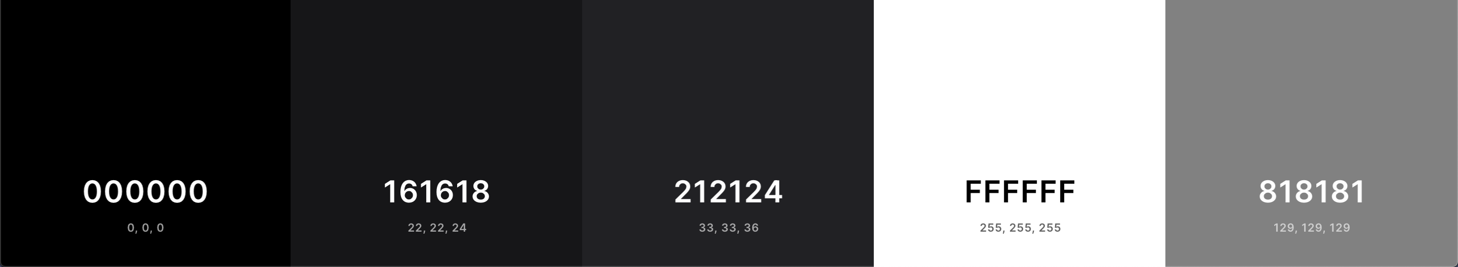
Dark mode for the iPhone can be seen in the native Apple apps such as Settings, iMessage, Notes, Photos, etc. Apps that you download can also recognize that you’ve set your iPhone to dark mode and adjust their theme automatically.
在本机Apple应用程序(例如“设置”,“ iMessage”,“便笺”,“照片”等)中可以看到iPhone的暗模式。您下载的应用程序还可以识别出您已将iPhone设置为暗模式并自动调整其主题。
Additional comments:
补充说明 :
- Unlike all the apps before, the iPhone dark mode uses pure black for the background 与以前的所有应用程序不同,iPhone暗模式将纯黑色用作背景
- The card colors favor blue. Like Facebook, the blue tint is pretty much unnoticeable 卡的颜色偏爱蓝色。 像Facebook一样,蓝色色调几乎不引人注目
苹果电脑 (Mac)
Now, this is where it gets interesting. Apple actually makes the backgrounds of native Mac apps transparent — but transparent relative to your desktop wallpaper, not whatever is currently open under the app. Thus, there is no decisive palette of colors since wallpapers vary.
现在,这才变得有趣。 苹果实际上使本机Mac应用程序的背景透明-但相对于您的桌面墙纸是透明的,而不是该应用程序下当前打开的任何内容。 因此,由于墙纸不同,因此没有决定性的调色板。
However, MacOS does have elements of a typical dark mode app: menu bars, cards, primary/secondary text, etc. Besides the transparent background (which is a really cool touch; I encourage you to explore this for yourself), the MacOS dark mode is predictable.
但是,MacOS确实具有典型的黑暗模式应用程序的元素:菜单栏,卡片,主要/次要文本等。除了透明背景(这确实很酷;我鼓励您亲自研究一下)之外,MacOS Dark模式是可预测的。
结论 (Conclusion)
If you ever thought that all dark mode apps are starting to look the same, you’re not wrong. They share the common elements we learned about: Usually a dark, almost black, background color, with lighter menu bars lining the top and/or sides; even lighter, rounded-corner cards section content, and seem to appear closer because of the color contrast; accent color jellybean buttons, a bright white primary text, and smaller slightly darker secondary text… All the apps blend together.
如果您曾经以为所有暗模式应用程序看起来都一样,那您就没错。 它们具有我们了解到的共同要素:通常是深色,近乎黑色的背景色,顶部和/或侧面衬有较浅的菜单栏; 甚至更浅,更圆角的卡片部分内容,并且由于颜色对比而显得更近; 带有彩色软糖按钮,明亮的白色主文本和较小的较暗的辅助文本……所有应用程序融合在一起。
That being said, there are still ways to slightly deviate from this template. We saw Spotify’s gradient, Twitter’s blue-hued shades, and MacOS’s opaque background. If you’re designing a dark mode app, I encourage you to find ways to subtly stand out. After all, we could use some variety…and more shades of gray.
话虽如此,仍然有一些方法可以稍微偏离此模板。 我们看到了Spotify的渐变色,Twitter的蓝色阴影和MacOS的不透明背景。 如果您要设计黑暗模式的应用程序,我鼓励您找到巧妙地脱颖而出的方法。 毕竟,我们可以使用各种颜色……以及更多的灰色阴影。
Thanks for reading!
谢谢阅读!
翻译自: https://codeburst.io/50-shades-of-dark-mode-gray-d3e9907b1194
灰色边框阴影


 1592
1592

 被折叠的 条评论
为什么被折叠?
被折叠的 条评论
为什么被折叠?
 到【灌水乐园】发言


