


web表单设计:点石成金
It’s been a few years that I’ve been taking interest in designing complex user forms, where a lot of information is requested from users. Here are a few industries where you regularly find such flows:
几年来,我一直对设计复杂的用户表单感兴趣,其中需要用户提供大量信息。 以下是一些您经常会发现此类流量的行业:
- 🏡 Real estate / Accommodation (e.g. publishing a listing on Airbnb) 🏡房地产/住宿(例如在Airbnb上发布清单)
- 💰 FinTech (e.g. sending money with TransferWise) Tech金融科技(例如通过TransferWise汇款)
- 👩💼 LegalTech (claiming a compensation with AirHelp) 💼LegalTech(通过AirHelp索赔)
- ☂️ InsurTech (e.g. getting a quote on Lemonade) ☂️InsurTech(例如获得柠檬水的报价)
- 🛠 Any kind of repair / home improvement services (e.g. booking an appointment with Puls) 🛠任何类型的维修/家庭装修服务(例如与Puls预约)
Designing such flows is tricky but important, because while asking a very extensive set of data to the user, the experience must look like it’s effortless. Here are a few principles that are worth following in order to design the right flow:
设计这样的流程非常棘手,但很重要,因为在向用户询问大量数据时,体验必须看起来很轻松。 以下是设计正确流程时应遵循的一些原则:
- 🏎️ Reassure users on the duration of the flow 🏎️让用户放心流动的持续时间
- ️🍹 Make users feel like they’re not working ️🍹让用户觉得自己没有工作
- 👌 Present all steps in a clear and understandable way in以清晰易懂的方式介绍所有步骤
- 🤝 Explain why you’re asking for each piece of information 🤝解释为什么要询问每条信息
- 🕹 Remove distractions 🕹消除干扰
- 💾 Reassure users that their information can be saved 💾向用户保证可以保存他们的信息
- ⚡️ Show the real-time impact of the user’s action ⚡️显示用户操作的实时影响
- 💡 Give some hints 💡给一些提示
- 👩 Add some human touch 👩增添一些人情味
- 👮♂️ Bring in some credentials ing带来一些凭据
- 🛣 Make it clear where users are and where they’re going 🛣弄清楚用户的位置和去向
- 📝 Enable users to review their information 📝使用户能够查看其信息
Alright, let’s deep dive into each of those principles!
好吧,让我们深入探讨其中的每个原则!
🏎向用户保证流程的持续时间 (🏎 Reassure users on the duration of the flow)
Before they engage in a form, users must feel like this is going to be fast. One of the best examples is the online bank N26, who claims that opening an account with them only takes 8 minutes.
在使用表单之前,用户必须感觉这很快。 最好的例子之一是网上银行N26 ,后者声称在他们的银行开户仅需8分钟。

Opening a bank account in 8 minutes? That sounds pretty futuristic, and yet it’s true.
在8分钟内开设银行帐户? 听起来很有前途,但这是事实。
The same goes for Lemonade, an insurance startup, who promises you to get a quote “in seconds”:
保险初创公司Lemonade的情况也是如此,他向您保证会在“ 几秒钟内 ”获得报价:

The Zebra, an American car and home insurance comparison website, goes even further. Even though their flow takes a few minutes to complete, their selling point is for you to “Compare insurance quotes instantly”.
美国汽车和房屋保险比较网站Zebra的使用范围更广 。 即使他们的流程需要几分钟才能完成,但他们的卖点是让您“ 立即比较保险报价”。

🍹让用户感觉自己不在工作 (🍹 Make users feel like they’re not working)
This is probably the most critical part. Users are lazy and don’t want to feel like you’re asking them to work too hard. Hence a few ideas that you can apply to make them feel like you’re doing the work for them:
这可能是最关键的部分。 用户很懒惰,不想让您觉得他们要求他们太努力。 因此,您可以应用一些想法使他们感到自己正在为他们做工作:
Offer them a list of pre-defined choices, instead of asking them to manually research what they’re looking for
向他们提供预定义选择的列表,而不是要求他们手动研究他们要寻找的内容
That’s why offering a list of pre-defined choices, like Puls (an American home maintenance startup) does, makes it more likely that users are going to complete a complex form.
这就是为什么提供诸如Puls (一家美国家庭维护初创公司)之类的预定义选项的列表,使用户更有可能填写复杂表格的原因。

This follow a psychological principle, “Recognition over Recall” (source: Mental Notes card deck). This principle states the following: “It’s easier to recognize things we have previously experienced than it is to recall them from memory.”
这遵循一种心理原则,即“ 对召回的认可 ”(来源: 心理笔记卡片组)。 该原则规定如下:“ 识别我们以前经历过的事情要比从记忆中回忆起来容易。 ”
Illustrate each choice to give more context about what you’re asking
说明每种选择,以提供有关您所要询问的更多背景信息
The Zebra’s fire hydrant illustration is a good example. Images and pictures speak louder than words. With this illustration below, I immediately understand what is asked from me.
斑马的消火栓插图就是一个很好的例子。 图像和图片胜于文字 。 通过下面的插图,我立即了解我的要求。

It can also be illustrated in a fun/creative way, like Lemonade does with its toothbrushes to ask who’s living in your home:
也可以通过有趣/创意的方式来说明,例如Lemonade用牙刷来询问谁住在您的房屋中:

in以清晰易懂的方式介绍所有步骤 (👌 Present all steps in a clear and understandable way)
A long form with several pieces of information asked on one page can be visually exhausting for the user.
在一页上询问多条信息的长格式可能会给用户造成视觉疲劳。
That’s where “Sequencing”, a psychological principle, comes into play: “We are more likely to take action when complex activities are broken down into smaller tasks” (source: Mental Notes).
这就是“排序”(一种心理学原理)开始发挥作用的地方:“ 当复杂的活动分解成较小的任务时,我们更有可能采取行动 ”(来源: 心理笔记 )。
Sequencing is applied on many digital products, by cutting down complex forms into smaller sub steps. It’s what we also sometimes call a “One screen, one action” experience.
通过将复杂形式分解为较小的子步骤,序列化可应用于许多数字产品。 这就是我们有时也称为“一个屏幕,一个动作”的体验。
For instance, Robinhood, the investment app, breaks down its sign up flow into 3 steps instead of one:
例如,投资应用程序Robinhood将注册流程分为三个步骤,而不是三个步骤:
The same goes for Lemonade, which asks information about your home screen by screen, which makes the flow feel smoother and the user more serene.
Lemonade也是如此,它逐个屏幕询问有关您的主屏幕的信息,这使流程更顺畅,用户也更安静。

This “one screen, one action” experience is now a common practice that has been widely adopted by lots of digital products.
这种“一个屏幕,一个动作”的体验现在已经成为许多数字产品广泛采用的惯例。
🤝解释为什么要询问每条信息 (🤝 Explain why you’re asking for each piece of information)
Since the Cambridge Analytica case and a few other user data breaches (Adobe, LinkedIn, Canva, eBay, etc.), users don’t give away all their data as easily as before. You have to be transparent why and how you will be using their personal information.
由于Cambridge Analytica案和其他一些用户数据泄露事件(Adobe,LinkedIn,Canva,eBay等),用户不会像以前那样轻易地泄露所有数据。 您必须保持透明,为什么以及如何使用他们的个人信息。
It’s good to give some reassurance about data privacy, like The Zebra does (“We take your privacy seriously and your information is always secure with us”).
最好给数据放心一些保证,就像Zebra所做的那样(“我们认真对待您的隐私,并且您的信息始终对我们安全”)。

It’s even better to explain why each piece of information is required…
更好地解释为什么需要每条信息…
…When you ask for personal information
…当您要求提供个人信息时
The best example I’ve found to date is N26’s sign up flow from 2018. In this flow, each and every piece of personal information was justified with a very convincing description.
迄今为止,我发现的最好的例子是N26从2018年开始的注册流程。在此流程中,每条个人信息都用非常令人信服的描述来说明。

…When you ask for information that’s tricky to get
…当您索取难以获取的信息时
For instance, when tricky information is asked for, like “How much would it cost to rebuild your home”, it’s key to explain why this is important. Otherwise, users can get quickly discouraged by such questions.
例如,当要求提供棘手的信息时,例如“重建房屋要花费多少”,关键是要解释为什么这很重要。 否则,用户可能会很快被此类问题所困扰。

Luko, a French insurtech startup, justifies asking detailed information about your home in order because they want to “offer you the best rates”.
法国保险技术创业公司Luko合理地询问有关您房屋的详细信息,因为他们想“为您提供最优惠的价格”。

This makes users even more motivated, as a large part of them probably came here to make some savings and to get a quote in a quick and efficient way.
这使用户更有动力,因为其中很大一部分人可能是来这里节省一些钱并以快速有效的方式获得报价的。
🕹消除干扰 (🕹 Remove distractions)
In a complex user form, it’s important to provide a clean interface where users aren’t distracted too much by banners and navigation links.
在复杂的用户形式中,重要的是要提供一个干净的界面,以使用户不会被标语和导航链接所吸引。
For instance, in the Airbnb publication flow, the only link you’ll find is “Save and Exit”. There is no possibility to access your user profile or make a search. This maximizes the chances that users will stay focused and complete the funnel.
例如,在Airbnb发布流程中,您将找到的唯一链接是“保存并退出”。 无法访问您的用户个人资料或进行搜索。 这样可以最大程度地使用户保持专注并完成渠道。

Lemonade went for a compromise: they’re still giving users the possibility to access navigation links, but those are hidden behind a hamburger menu in the top left section of the screen.
Lemonade做出了让步:他们仍然为用户提供访问导航链接的可能性,但是这些链接隐藏在屏幕左上方的汉堡菜单后面。
💾向用户保证可以保存他们的信息 (💾 Reassure users that their information can be saved)
Complex user forms can sometimes require users to complete them over the course of several sessions. Indeed, they can require some information, documents or pictures that users can’t immediately access.
复杂的用户表单有时可能需要用户在多个会话过程中完成它们。 实际上,它们可能需要一些用户无法立即访问的信息,文档或图片。
That’s why it’s important to make it clear that all the efforts that users have made so far aren’t in vain. That all their information has been saved or can be saved easily.
因此,重要的是要弄清楚用户到目前为止所做的所有努力都没有白费。 他们的所有信息已保存或可以轻松保存。
Publishing a listing on Airbnb can take some time, because you need to upload the right pictures. That’s why the interface lets its users know that their progress has been automatically saved, and also displays a link that enables them to “Save and Exit”.
在Airbnb上发布列表可能需要一些时间,因为您需要上传正确的图片。 因此,该界面让其用户知道其进度已自动保存,并显示一个链接,使他们能够“保存并退出”。
⚡️显示用户操作的实时影响 (⚡️ Show the real-time impact of the user’s action)
In forms where user actions have an impact on a major piece of information (e.g. price), showing the real-time impact adds a lot of serenity.
在用户行为会对主要信息(例如价格)产生影响的表格中,显示实时影响会增加很多宁静。
For instance, when you’re booking a flight on Transavia, a European low-cost airlines, any extra service you’re opting for is immediately shown in the sticky footer. You see a new icon for the extra service you’ve selected, but you also see the price being instantly updated.
例如,当您预订欧洲低成本航空公司Transavia上的航班时,所选择的任何额外服务都会立即显示在粘性页脚中。 您会看到一个新图标,显示所选的额外服务,但价格也会即时更新。

Same idea in the B2B space. When you upgrade your FullStory account, there’s a fixed block dedicated to the details of your offer on the right side of the screen. This shows the content of your offer as well as the monthly price instantly updated when you make changes in the left part of the screen.
B2B空间中的想法相同。 升级FullStory帐户时,屏幕右侧会出现一个固定的框,专门用于显示商品的详细信息。 当您在屏幕左侧进行更改时,这将显示报价的内容以及每月更新的即时价格。

This sort of “real-time update” experience adds a lot of transparency to the pricing of a service.
这种“实时更新”体验为服务的定价增加了很多透明度。
💡给一些提示 (💡 Give some hints)
When a flow requires very specific information where users can easily get mistaken, it’s relevant to add some hints.
当流程需要非常具体的信息以使用户容易出错时,添加一些提示就很重要。
Photos are the most important asset of an Airbnb listing. If you upload ugly photos, chances are very limited that you will be able to host guests. That’s why Airbnb gives some hints on its right side panel on how to take quality photos.
照片是Airbnb列表中最重要的资产。 如果您上传丑陋的照片,则能够接待客人的机会非常有限。 这就是为什么Airbnb在其右侧面板上会提示如何拍摄高质量照片的原因。

But hints can also be inspirations from other users. When you start creating an experience on Airbnb, they display similar experiences on the right side panel, which enables you to benchmark other experiences in order to find inspiration in terms of name, branding, photos, description, price, etc.
但是提示也可能是其他用户的灵感 。 当您开始在Airbnb上创建体验时,它们会在右侧面板上显示类似的体验,使您可以对其他体验进行基准测试,以便从名称,品牌,照片,描述,价格等方面寻找灵感。

The same goes for pricing. When you post an offer for a project on Upwork, they show you a range of hourly rates for similar projects. This enables you to increase chances that you’ll find a relevant freelancer for your job.
定价也是如此 。 当您在Upwork上发布项目报价时 ,它们会为您显示类似项目的每小时收费范围。 这使您增加找到适合您工作的自由职业者的机会。

👩增添一些人情味 (👩 Add some human touch)
In verticals where users are usually cautious (e.g. insurance or legal expertise), adding a human presence in the flow can feel reassuring. It looks like there’s someone personally taking care of your case, even though it’s just a computer-generated form.
在用户通常都很谨慎的垂直行业(例如,保险或法律专业知识),在流程中增加人员的存在会让人感到放心。 看起来好像有人亲自照顾您的案件,即使这只是计算机生成的表格。

Crème de la crème, a freelance community platform, combines bringing some human touch with giving some hints. Throughout the signup flow, their head of community is giving some tips on how to best fill in the required information.
一个自由的社区平台Crèmede lacrème ,结合了一些人性化和暗示性。 在整个注册流程中,他们的社区负责人将为您提供一些有关如何最好地填写所需信息的提示。

ing带来一些凭据 (👮♂️ Bring in some credentials)
In verticals depending on an official regulation, it’s important to show that you have the appropriate credentials. That’s why AirHelp shows an informational banner proving that it’s enforcing the “EU regulation EC261”. This plays on authority — thanks to this, users are better convinced of AirHelp’s legitimacy regarding flight compensations.
根据官方规定,在垂直行业中,重要的是要证明您具有适当的凭据。 这就是为什么AirHelp会显示一条信息性标语,证明其正在执行“ EU法规EC261”。 这发挥了权威作用 -从而,使用户更好地相信了AirHelp在航班补偿方面的合法性。

In highly competitive verticals, credentials can also be emphasized with social proof. Using customer testimonials and third-party ratings, this reinforces AirHelp’s legitimacy.
在竞争激烈的垂直行业中,也可以通过社会证明来强调证书。 使用客户推荐和第三方评级,可以增强AirHelp的合法性。
🛣弄清楚用户的位置和去向 (🛣 Make it clear where users are and where they’re going)
In a long user form with many steps, it’s important to give users some peace of mind by clearly showing their progress. This can be done through 3 interface elements:
在具有许多步骤的长用户形式中,重要的是通过清楚地显示其进度来使用户放心。 这可以通过3个界面元素来完成:
Showing a progress bar
显示进度条
This is the most frequently used UI component to show progress. It works easily both on desktop and mobile.
这是显示进度的最常用的UI组件。 它在台式机和移动设备上均可轻松运行。
Showing the main steps of the flow
显示流程的主要步骤
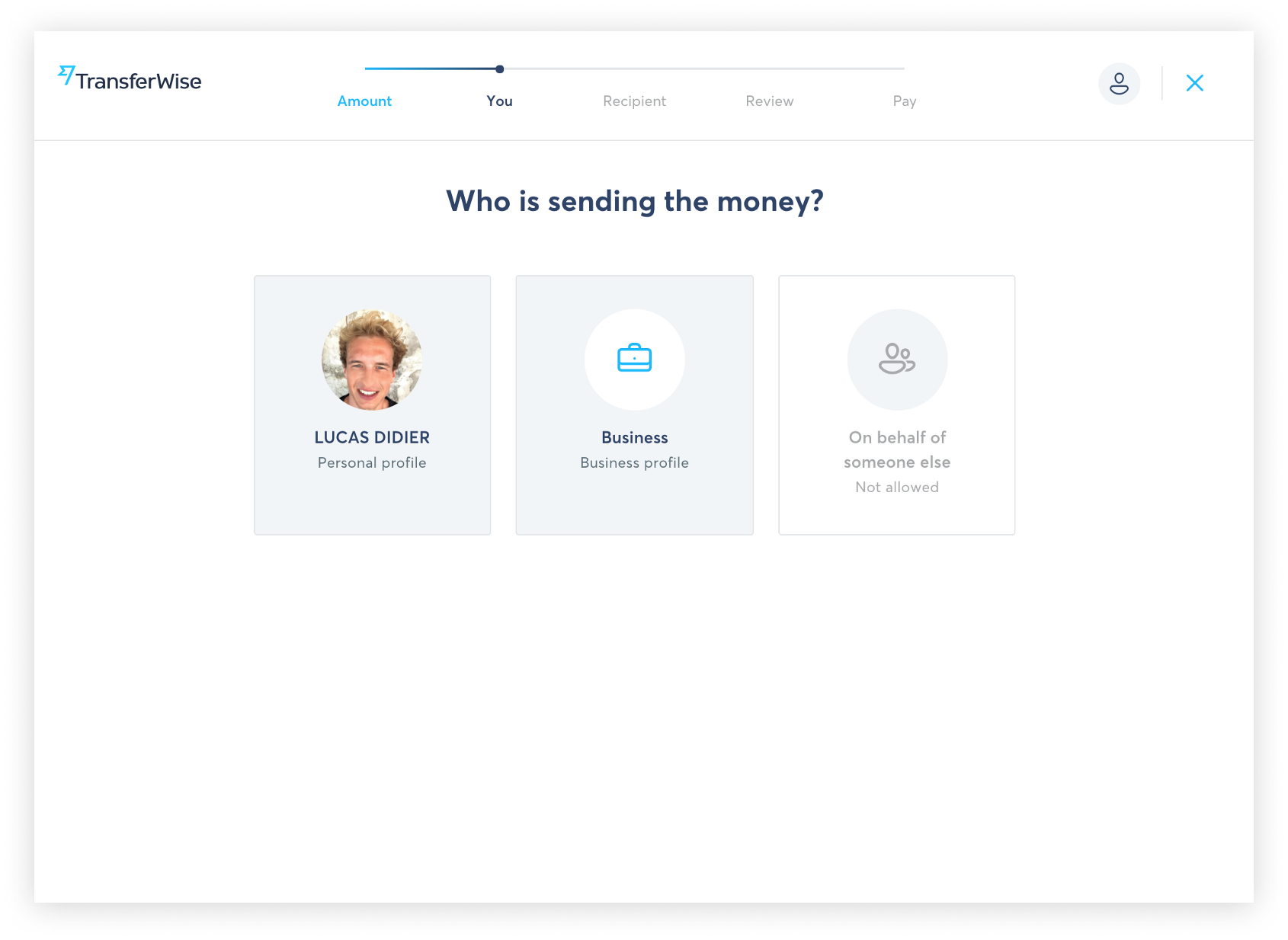
This can be either displayed horizontally, through breadcrumbs, like on TransferWise’s money transfer flow…
它可以通过面包屑水平显示,例如在TransferWise的汇款流程上…
… Or vertically, through a side panel, like on Airbnb’s experience publication flow:
…或垂直通过侧面面板,如Airbnb的体验发布流程:
Using “checkpoints” screens
使用“检查点”屏幕
A “checkpoint” screen is a screen that you see after completing each step of a flow. If you have a flow that can take several user sessions to complete, it can be relevant to implement such an interface. That’s what Airbnb does in its publication flow.
“检查点”屏幕是您完成流程的每个步骤之后看到的屏幕。 如果您的流程需要花费多个用户会话才能完成,则实现这样的接口可能很重要。 这就是Airbnb在其发布流程中所做的。

📝使用户能够查看其信息 (📝 Enable users to review their information)
In flows where the last step includes a very committing action (e.g. transferring money or making a payment), users can easily drop off if they’re not sure that all of their information is correct.
在流程中,最后一步包括非常有承诺的操作(例如,转账或付款),如果不确定不确定所有信息的正确性,用户可以轻松地退出。
That’s why you need to provide them with an easy way to review all of the information they’ve completed throughout the flow, as well as a way to easily edit any piece of information that might be incorrect.
因此,您需要为他们提供一种简便的方法来查看他们在整个流程中完成的所有信息,以及轻松地编辑任何可能不正确的信息的方法。
A good example is TransferWise’s “Review” page, just before sending a money transfer.
发送汇款之前,TransferWise的“审核”页面就是一个很好的例子。
That’s it for this post. I hope you enjoyed those best practices! Feel free to share some of your own examples of how to make complex user forms look simpler.
就是这个帖子。 希望您喜欢这些最佳做法! 随意分享一些自己的示例,以使复杂的用户表单看起来更简单。
Want to get more product tips? Sign up for my monthly newsletter to stay in touch! 👉 http://eepurl.com/gYTX2b
想获得更多产品提示吗? 订阅我的每月时事通讯以保持联系! 👉 http://eepurl.com/gYTX2b
Need product/UX consulting on your own product? Check out my services! 👉 http://www.lucdid.com
需要您自己的产品的产品/ UX咨询吗? 查看我的服务! 👉 http://www.lucdid.com
翻译自: https://uxdesign.cc/designing-complex-user-forms-12-ux-best-practices-f9ffdbd7b67c
web表单设计:点石成金


 1548
1548


 被折叠的 条评论
为什么被折叠?
被折叠的 条评论
为什么被折叠?
 到【灌水乐园】发言


