


 本文探讨了智能家居领域的数据库设计,聚焦于创建更高效、智能的数据表结构,旨在优化数据管理和提升用户体验。
智能家居数据库设计
重点 (Top highlight)
Data tables are hard. There are many different ways to think about them. So, naturally, the first step would be to figure out what your users need.
数据表很难。 有许多不同的方式来考虑它们。 因此,自然地,第一步就是弄清楚用户的需求。
- Do they want to see as much information as possible? 他们想看到尽可能多的信息吗?
- Do they want to compare the information? 他们是否想比较信息?
- Do they want to execute actions quickly? 他们想快速执行动作吗?
- Do they want to view only and export the table to Excel? 他们是否只想查看并将表格导出到Excel?
Depending on that you should think, what functionality and design choices make these tasks easiest to do.
根据您的想法,什么功能和设计选择会使这些任务最容易完成。
视觉效果 (Visuals)
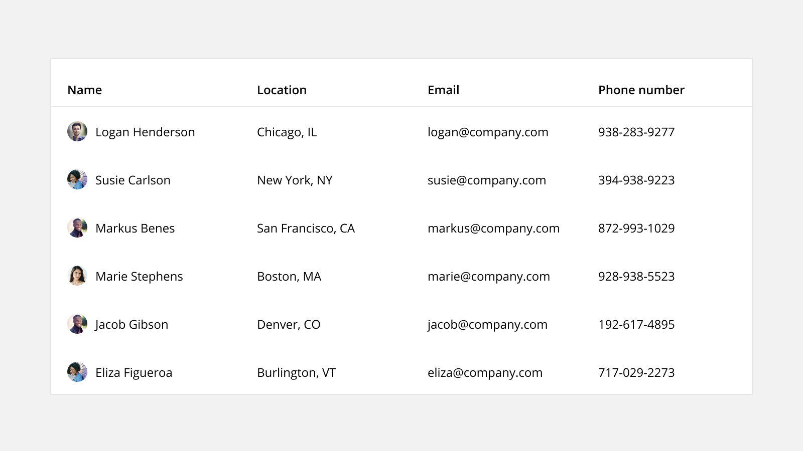
Table design should be as minimalistic as possible. Adding elements without reason will increase eye strain and reduce readability. After all, we are designing a tool.
表设计应尽可能简化。 无故添加元素会增加眼睛疲劳并降低可读性。 毕竟,我们正在设计工具。
色彩 (Colors)
Data tables should have as few colors as possible. You can specify one for negative and positive trends and the header. This way elements that need to be seen can be seen, but they won’t add excessive clutter.
数据表应具有尽可能少的颜色。 您可以为负趋势和正趋势以及页眉指定一个。 这样就可以看到需要查看的元素,但不会增加过多的混乱。
Font and border colors should not be black. Opt for dark grays for fonts and light grays for borders as they reduce eye strain and won’t make the table look as daunting.
字体和边框颜色不能为黑色。 为字体选择深灰色,为边框选择浅灰色,因为它们可以减少眼睛疲劳,并且不会使桌子看起来令人生畏。
分频器 (Dividers)
Having dividers is not always necessary. Add them if extra clarity is required.
不一定总是需要分隔线。 如果需要额外的说明,请添加它们。
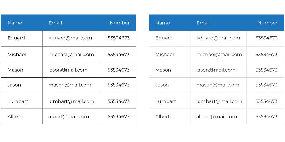
It’s very popular to have only horizontal dividers. It leaves a clean, relatively spacious look. Opt for vertical dividers, when you have many columns and they get too close together.
只有水平分隔线非常流行。 留下干净,相对宽敞的外观。 当您有很多列并且它们之间的距离太近时,请选择垂直分隔线。
With smaller, less dynamic tables, you can leave out all dividers and get a striking look. This, of course, is more for beauty projects rather than tools.
对于较小的,动态性较小的表,您可以省去所有分隔线,并获得醒目的外观。 当然,这更多是针对美容项目而非工具。
If it becomes hard to follow rows (or following them is what users do a lot) you can always separate them with either borders or alternating colors. Making your borders gray will reduce eye strain significantly. Also, if your tables don’t have many rows, alternating colors might make people think that highlighted rows have special meaning.
如果很难跟随行(或者跟随行是用户经常做的事情),则始终可以使用边框或交替的颜色来分隔行。 使边框变灰会大大减少眼睛疲劳。 另外,如果表中没有很多行,则交替显示的颜色可能会使人们认为突出显示的行具有特殊含义。
 最低0.47元/天 解锁文章


 675
675

 被折叠的 条评论
为什么被折叠?
被折叠的 条评论
为什么被折叠?
 到【灌水乐园】发言


