


标记图标
Not labeling your icons is the same as assuming that we are all fluent in ancient hieroglyphics. Are you? Can you just walk up to Cleopatra's needle and read it like you could read a children's book? Even emojis, our modern hieroglyphics don't mean the same thing to each person. If I send you an eggplant am I talking about my garden or something else? How about a goat? Am I talking about my trip to the farm or an athlete that I feel is the “greatest of all time?” How about a snake? or fire? But a smiley face is a smiley face, right? I urge you to overthink and debate that.
不标记您的图标与假设我们都精通古代象形文字一样。 你是? 您能走到克里奥帕特拉的针头并像阅读儿童读物一样阅读吗? 即使是表情符号,我们现代的象形文字对每个人也意味着不同的意思。 如果我给您送茄子,我是在谈论我的花园还是其他? 山羊呢? 我是在谈论我的农场之旅或我认为是“有史以来最伟大的运动员”吗? 蛇呢? 还是火? 但是笑脸就是笑脸,对吗? 我敦促您多考虑和辩论。
挣扎是真的。 (The Struggle Is Real.)
As a designer, I feel like we are all victims to the struggle of thinking there are conventional icons that everyone knows. But after lots of user testing over the years, I have found that this cannot be further from the truth. There is no convention for icons, there's no set of icons everyone knows. there's no standard. There are no “laws” per se when it comes to what icons anyone can use for anything. Due to this, people can use whatever they want for any meaning. That's right, no one is stopping you! Go make a cat on a horse your home icon!
作为一名设计师,我觉得我们所有人都在努力思考那些众所周知的传统图标的斗争。 但是经过多年的用户测试,我发现事实并非如此。 图标没有约定,没有众所周知的图标集。 没有标准。 对于任何人都可以使用的图标,本身就没有“法律” 。 因此,人们可以将任何想要的东西用于任何意义。 没错,没有人阻止您! 去把马上的猫当做您的主页图标!
But that's just the tip of the ice burg when it comes to our icon struggles.
但这只是冰山一角,当涉及到我们的标志之争时。
Another issue we run into is, as we design things, we tend to think about our brand when we think about icons. We try to match our brand’s look, giving us creative freedom to make icons that match the brand and look similar to some “commonly used icons.” (Which again, don’t really exist. They are just common to you.) We assume that people can understand that because we took the door off and made the outlines thinner of a house icon we found on google, that people will understand that it means ‘home’ or ‘menu’. But because Icons are not road signs that have standards, there is no real indicator that means that your icon means what you think it does. And there's also a good chance that your design style that matches your brand, has blurred any sort of familiarity a user might have with it, making it hard to understand or figure out.
我们遇到的另一个问题是,在设计事物时,我们在考虑图标时往往会考虑品牌。 我们尝试匹配品牌的外观,从而赋予我们创造自由,以制作与品牌相匹配并看起来类似于某些“常用图标”的图标。 (再说一次,实际上并不存在。它们只是您的共同点。)我们假设人们可以理解,因为我们把门关上了,并且使在Google上找到的房屋图标的轮廓变细了,所以人们会理解它的意思是“家”或“菜单”。 但是因为图标不是具有标准的路标,所以没有真正的指示符意味着您的图标代表您的想法。 而且,与您的品牌相匹配的设计风格也很可能模糊了用户对其的任何熟悉程度,从而使其难以理解或弄清楚。
How about the argument about space? As designers, our jobs revolve around solving problems. The most common one I have come across is wanting to fit as many things as possible in small amounts of space. Usually, this happens when a website or web app needs to be on a mobile platform. On a website, you have all this room to have full words. But *GASP* on phones we do not! The horror! So our first thought? Oh, make that title an icon. Problem solved. Don’t worry, everyone has said this same thing. I myself am a victim of the “just make it an icon” phrase. On some mobile apps, for example, Instagram, where they only have a few actions, this solution sorta works. (see example below) But what about apps with more than 5 things in their navigation menu? Or they have unique actions in their menu? Suddenly your icons do not translate.
关于空间的争论怎么样? 作为设计师,我们的工作围绕解决问题展开。 我遇到的最常见的情况是希望在尽可能少的空间中容纳尽可能多的东西。 通常,当网站或Web应用程序需要在移动平台上时会发生这种情况。 在网站上,您需要所有这些房间来填写完整的单词。 但是手机上的* GASP *却没有! 惊恐的事件! 那么我们的第一个想法? 哦,把那个标题变成一个图标。 问题解决了。 别担心,每个人都说过同样的话。 我本人是“只是使其成为一个图标”短语的受害者。 在一些移动应用程序,例如Instagram,他们只有几个动作,这种解决方案八九不离十作品。 (请参见下面的示例)但是导航菜单中包含超过5种内容的应用程序呢? 还是菜单中有独特的动作? 突然,您的图标无法翻译。
To illustrate this issue, I have attached an example below. The images are of the bottom navigation menu for Instagram vs the bottom navigation menu of an app I worked on for Discount Tire. In the first example, there are no labels. See how many you can guess correctly before looking at the second image with the labels.
为了说明这个问题,我在下面附加了一个示例。 这些图像分别是Instagram底部导航菜单和我为Discount Tire开发的应用程序底部导航菜单。 在第一个示例中,没有标签。 在查看带有标签的第二张图像之前,请先查看可以正确猜到的数量。

知道每个图标代表什么? 让我们看看你的表现如何。 (Have a good idea of what each icon represents? Let’s see how you did.)

You might think, well this example is really obscure. How would I ever know that the car meant ‘new car’? And my question to you would be, well if you can't understand it, what makes you think someone who works at Discount Tire would? This is the first time they have ever seen this app. It's new. You could have worked there for 20 years and you still wouldn't know that the car meant ‘new car’. And so you might say, well then it needs labels, but Instagram is super easy to understand, that's why they don’t have labels. And I would again say no, because, how many of you thought the heart meant ‘favorites’? For people that do not use the app often or ever, they didn't know that icon meant notifications. And if you showed these icons to people outside the context of knowing where they are located in the app, most Instagram users would not know that the heart meant notifications either. Even if I told the users that it was an icon used by Instagram, they would still get it wrong most of the time. The users are more likely to say the icon means ‘like’ or ‘favorite’ than they are to say it would be ‘notifications’.
您可能会认为, 这个示例确实很晦涩。 我怎么会知道这辆车的意思是“新车”? 我对您的问题是,如果您不理解,那会让您觉得在Discount Tire工作的人会怎样? 这是他们第一次看到这个应用程序。 是新的 您可能在那里工作了20年,但您仍然不知道这辆车的意思是“新车”。 因此,您可能会说, 那么就需要标签了,但是Instagram非常易于理解,这就是为什么它们没有标签的原因 。 我会再次拒绝,因为你们当中有多少人认为心脏意味着“最爱” ? 对于不经常使用该应用程序的人,他们不知道该图标表示通知。 而且,如果您向知道他们在应用程序中位置的上下文之外的人显示这些图标,则大多数Instagram用户也不知道心脏也意味着通知。 即使我告诉用户这是Instagram使用的图标,他们在大多数情况下还是会把它弄错。 用户更倾向于说图标的意思是“ 喜欢 ”还是“ 喜欢 ”,而不是说“ 通知 ”。
Finally, one of the biggest things I hear is from the business side.
最后,我听到的最大的一件事是在业务方面。
“The users have seen this icon everywhere. They will know what it means.”
“ 用户到处都可以看到此图标。 他们会知道这意味着什么。”
We have all heard this before. We might have even said it ourselves. But saying that the users will know what it is because they have seen it everywhere is like saying that anyone can identify any kind of tree because they have seen a tree before. Just because I have seen a tree doesn't mean I can identify a maple tree. And for icons, this can be compared to seeing a hamburger icon and a house icon and they both mean “menu”. This “ they will know what it means” logic does not work. Not only does it not make sense, but following that logic is literally making an assumption for the user. We are not the users. What we assume they have seen is probably not what they have actually seen. We should never assume the users will understand things because we think its basic knowledge.
我们以前都听说过。 我们甚至可能自己说过。 但是说用户会因为在任何地方都看到它而知道它是什么,就像说任何人都可以识别任何种类的树一样,因为他们以前看过树。 仅仅因为我看过一棵树并不意味着我可以识别出一棵枫树。 对于图标,这可以与看到一个汉堡图标和一个房屋图标相比较,它们都表示“菜单” 。 这种“他们将知道含义”的逻辑不起作用。 不仅没有意义,而且遵循该逻辑实际上是为用户做出假设。 我们不是用户。 我们认为他们所看到的可能不是他们实际所看到的。 我们永远不要以为用户会理解事物,因为我们认为它是基础知识。
为什么标签很重要 (Why Labels Are Important)
A good user experience can be defined in many ways. One measure is the ability to reduce the user’s cognitive load. In other words, reduce the user’s need to think. The Nielson Norman Group defines this as the interaction cost.
可以通过多种方式定义良好的用户体验。 一种措施是减轻用户认知负担的能力。 换句话说,减少了用户的思考需求。 Nielson Norman Group将其定义为交互成本 。
The interaction cost is the sum of efforts — mental and physical — that the users must deploy in interacting with a site in order to reach their goals.
交互成本是用户在与站点进行交互以实现其目标时必须进行的所有工作(无论是精神还是物理)。
An important factor that contributes to the mental effort or cognitive load, is the ability to determine the meaning of something quickly and efficiently. This is called a sign. A ‘sign’ is made up of two parts: the Signifier and the Signified.
导致精神努力或认知负担的重要因素是快速有效地确定事物含义的能力。 这称为标志 。 “标志”由两部分组成:指示符和指示符。

A signifier illustrates or describes what an object is and what it can do. A signifier can be made of multiple things or just one simple thing, like a label. Colors and context are also often used to elevate the meaning of a signifier faster.
指示符说明或描述对象是什么以及对象可以做什么。 指示符可以由多个事物组成,也可以由一个简单的事物(如标签)组成。 颜色和上下文也经常用于更快地提高指称符的含义。
For example, stop signs. You see the word “STOP” in upper case text on a big red sign. The signifiers are; the color red, the uppercase text, and the word “stop.” You can also say that the location of the stop sign gives background context to the meaning of the sign as well. If you saw a stop sign while driving you would know to stop at the line. As if you saw a stop sign on a door, you might think, “Oh, I can't go in there.”
例如,停车标志。 您会在大写红色标记的大写字母中看到单词“ STOP” 。 指示符是; 颜色为红色,大写文本和单词“停止”。 您还可以说,停车标志的位置也为标志的含义提供了背景信息。 如果您在开车时看到停车标志,您将知道在该行停车。 好像您在门上看到停车标志一样,您可能会想: “哦,我不能进去。”
All those things clearly define what you are supposed to do in this situation using color psychology (in western cultures, red means stop. Studies done on the color read have shown that it grabs your attention faster than any other color and elevates your heart rate upon viewing), typography psychology (uppercase text is often seen as more authoritative, loud and demanding), and of course, the word is giving you the direct meaning through written communication. A strong Signifier will make use of as many components as possible if it hopes to reduce the interaction cost and create an effortless user experience.
所有这些事情都使用颜色心理学清楚地定义了您在这种情况下应该做的事情(在西方文化中,红色表示停止。对颜色读数的研究表明,它比其他任何颜色都能更快地吸引您的注意力,并提高您的心率。查看),版式心理学(大写文字通常被认为更权威,响亮且苛刻),当然,该词通过书面交流为您提供直接含义。 一个强大的Signifier如果希望减少交互成本并创造轻松的用户体验,则将使用尽可能多的组件。
A signified is the meaning or idea expressed by a sign, as distinct from the physical form in which it is expressed. A signified is often called an affordance in user experience. An affordance is what an object can do. What an object can do can be revealed by the user interacting with the thing, or by the user’s prior knowledge in using something that they see as similar. This is called “empirical knowledge” or “a posteriori knowledge” which both refer to knowledge based on experience. In the stop sign example, the signified would be an abstract conceptual thought of stopping at the place where the stop sign is located. It may also be the octagon shape of the sign. We would know that we need to stop because of our previous knowledge on what this sign does.
符号是指符号所表达的含义或概念,与符号所表达的物理形式不同。 表示通常被称为用户体验中的可承受性。 承受能力是对象可以做什么。 可以通过用户与事物进行交互来揭示对象可以做什么,或者可以通过用户使用他们认为相似的事物的先验知识来揭示。 这就是所谓的“ 经验知识 ”或“ 后验知识 ”,它们都是指基于经验的知识。 在停车标志示例中,标志是停止在停车标志所在的地方停车的抽象概念思想。 它也可以是符号的八边形形状。 我们会知道我们需要停下来,因为我们先前对该标志的作用有所了解。
This concept comes into play in user interfaces when you see a red octagon icon next to something. We understand based on prior knowledge that this icon is a stop sign. But we don’t know why it is there or what we need to do without the signifier. The user would also not know this if they had no prior knowledge of stop signs. The icon would mean nothing to the user.
当您在某物旁边看到一个红色的八角形图标时,该概念就会在用户界面中发挥作用。 根据先前的知识,我们知道此图标是一个停车标志。 但是我们不知道为什么会出现它,或者在没有指示符的情况下我们需要做什么。 如果用户没有停车标志的先验知识,用户也不会知道这一点。 该图标对用户没有任何意义。
Both the signifier and the signified elements make up the ‘sign’ and together they create meaning that can be interpreted by the user. By removing either the signifier or the signified, the other remaining elements are weakened and the meaning becomes blurred.
指示符和被指示元素都构成“符号”,它们共同创建了可以由用户解释的含义。 通过删除一个或多个指示符,其余的其他元素将被削弱并且含义变得模糊。
So in other words, adding a label to your icon greatly decreases the cognitive load a user has to take on to determine what they need to do and how to do it. As a rule, the lower the cognitive load, the better experience a user will have with your product. This is important.
因此,换句话说,在您的图标上添加标签可以大大减少用户确定他们需要做什么以及如何做的认知负担。 通常,认知负担越低,用户使用产品的体验就越好。 这个很重要。
Users are not trying to understand your site, they are trying to use it.
用户不是在试图了解您的网站, 而是在尝试使用它。
Users are not looking for puzzles or guessing games. They are looking to easily complete a task.
用户不是在寻找谜题或猜谜游戏。 他们希望轻松完成任务。
Adding labels to your icons will immensely help your users use and complete tasks. Again, this is important.
在图标上添加标签将极大地帮助用户使用和完成任务。 同样,这很重要。
测试您的图标知识 (Test Your Icon Knowledge)
I can write all I want about how labeling icons improves the user experience and decreases cognitive load. But for some, that might not be enough. The easiest way to prove my point is to try it yourself. Below I have compiled icons. The goal is to go through each set of icons and determine which icon represents the word. Try to do this as quickly as possible. If it helps, time yourself for 5 seconds per set. Make sure you write down your answers as you go so you do not forget your initial assumption.
我可以写所有我想写的关于标签图标如何改善用户体验并减少认知负担的内容。 但是对于某些人来说,这可能还不够。 证明我观点的最简单方法是自己尝试。 下面我已编译图标。 目标是浏览每组图标并确定哪个图标代表单词。 尝试尽快执行此操作。 如果有帮助,请每套计时5秒钟。 确保随手写下答案,以免忘记最初的假设。
Group One: Which icon means: Lists
第一组:哪个图标表示: 列表

Group Two: Which icon means: Discover / Explore
第二组:哪个图标表示: 发现/探索

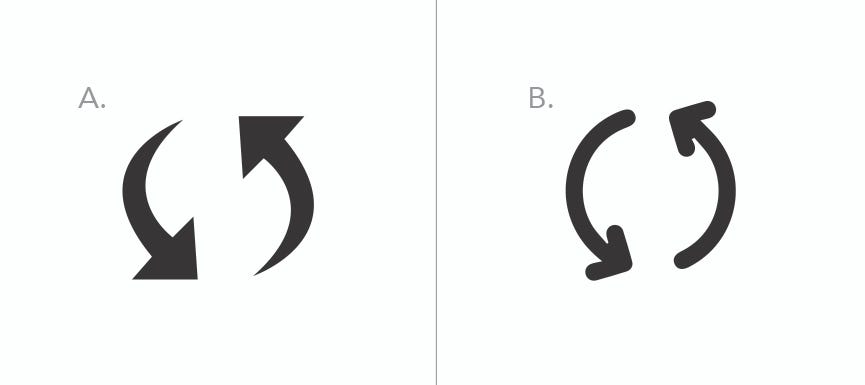
Group Three: Which icon means: Refresh
第三组:哪个图标表示: 刷新

Extra Credit: Which icon means: Rotate
额外信用:该图标表示: 旋转
Notice, a lot of these icons look similar or could maybe both mean the same thing.
请注意,这些图标中的许多看起来很相似,或者可能含义相同。
Was choosing which icon represented the word easy or hard?
选择哪个图标代表单词easy还是hard?
Did it take you longer than 5 seconds to decide?
您是否花了超过5秒钟的时间做出决定?
If it did this is important to note because most users won't even try to figure it out for a full 5 seconds. They will glance at something and either read the label and determine its meaning, or assume the icon means something, or do nothing at all. They may even leave the site or page if they cannot figure out the tool they need to complete their task. If you couldn't figure out what these icons meant in 5 seconds without context, think about how your user is feeling.
如果这样做了,那么要注意这一点很重要,因为大多数用户甚至都不会尝试整整5秒钟。 他们会看一眼,然后阅读标签并确定其含义,或者假设该图标意味着某件事,或者什么也不做。 如果他们无法弄清完成任务所需的工具,他们甚至可能会离开网站或页面。 如果您在没有上下文的情况下无法在5秒内弄清楚这些图标的含义,请考虑一下用户的感受。
您认为其中有多少对? 多少让你难过? 让我们回顾一下每个图标的含义。 (How many of those do you think you got right? How many stumped you? Let’s review what each icon means.)
Group One: A. The heart icon is the ‘lists’ icon for Wayfair. The three-line icon is the ‘menu’ icon for CNN.
第一组:答:心脏图标是Wayfair的“ 列表”图标。 三行图标是CNN的“ 菜单”图标。

Group Two: B. The compass icon is used as the ‘explore’ or ‘discover’ icon for the Instagram web page. This icon is not used on their mobile app. The globe icon is used by Amazon for their language setting.
第二组:B .指南针图标用作Instagram网页的“ 浏览”或“ 发现”图标。 他们的移动应用程序上未使用此图标。 地球图标由亚马逊用于其语言设置。

Group Three: B. The arrow looping towards the right or forward, in a circle is the ‘refresh’ icon for Google Chrome. The looping arrow going towards the left, or backward, in a circle around a clock, is the ‘recent’ icon in Confluence.
第三组: B .箭头向右或向前循环成一个圆圈,是Google Chrome浏览器的“ 刷新”图标。 环绕箭头向左或向后绕一圈的循环箭头是Confluence中的“ 最近”图标。

Extra Credit: A. The first set of arrows moving in a circle is the ‘rotate’ icon in the design program, Sketch. The second set of arrows is also in the Sketch program, in the same menu bar in fact but, that icon means ‘create symbol’.
额外的功劳: A .在圆周上移动的第一组箭头是设计程序“草图”中的“ 旋转”图标。 第二组箭头也位于Sketch程序中,实际上在同一菜单栏中,但该图标表示“ 创建符号”。

Note how many of these icons you did not guess correctly. Again think about the users, trying to make the same choices. For example, the last bonus questions about ‘rotate’ and ‘create symbol’ seems crazy confusing. But, the system offers labels that make finding what the user needs easier and clearer. The icons are more of a nod to other design programs like Adobe Photoshop and Adobe Illustrator than actual identifiers. The labels are what make the program usable.
请注意您没有正确猜到的这些图标有多少。 再次考虑用户,尝试做出相同的选择。 例如,关于“旋转”和“创建符号”的最后一个奖励问题似乎令人困惑。 但是,该系统提供的标签使查找用户所需的内容更加容易和清楚。 这些图标更像是其他设计程序,例如Adobe Photoshop和Adobe Illustrator,而不是实际的标识符。 标签是使程序可用的要素。
现在让我们升级到更大的分组。 本轮规则有所不同。 (Let’s level up to bigger groupings now. The rules are a little different for this round.)
Rules: All the icons below all represent the same action. The goal is to go through the group of icons and determine what that icon group means. Try to do this as quickly as possible. If it helps, time yourself for 10 seconds per set. Make sure you write down your answers as you go so you do not forget your initial assumption.
规则: 所有下面的所有图标都表示相同的操作。 目的是浏览图标组并确定该图标组的含义。 尝试尽快执行此操作。 如果有帮助,请每套计时10秒钟。 确保随手写下答案,以免忘记最初的假设。
Group One:
第一组:

Group Two:
第二组:

Group Three:
第三组:

Group Four:
第四组:

您认为其中有多少对? 多少让你难过? 让我们回顾一下这些分组所代表的动作。 (How many of those do you think you got right? How many stumped you? Let’s review the action that these groupings represent.)
Group One: Save
第一组: 保存
Group Two: Menu
第二组: 菜单
Group Three: Edit
第三组: 编辑
Group Four: Download
第四组: 下载
Kinda crazy to see how many different icons mean the same thing, right?
Kinda疯狂地看到有多少不同的图标表示同一件事,对不对?
How did you do? Did you find it super easy to figure out these icons? Or did you find it difficult?
你是怎么做的? 您发现找出这些图标超级容易吗? 还是觉得困难?
Did you think you had an answer and then as you looked through the other icons you realized that you might not be right? If you felt that sense of confusion or second-guessing, think about how your user feels when you use similar icons. Especially since you are now armed with the knowledge that all of these icons are commonly used for these actions across the web. There is no standard. So your user might be used to seeing one icon on another site they frequent, but your new site does not have that same icon. And now the user is questioning what that icon means and where to go to complete the task they want to do.
您是否认为自己有答案,然后浏览其他图标时就意识到自己可能不对? 如果您感到困惑或困惑,请考虑使用类似图标时用户的感受。 尤其是因为您现在已经掌握了所有这些图标在网络上通常用于这些操作的知识。 没有标准。 因此,您的用户可能习惯于在他们经常光顾的另一个站点上看到一个图标,但是您的新站点没有相同的图标。 现在,用户正在质疑该图标的含义以及在何处完成他们想要完成的任务。
Did you find a few you recognized and used context clues to determine which grouping meant what? If you did use context clues, are you going to put all these icons next to each other on your app too? Or maybe we can use the best context clue of all: a label.
您是否发现了一些您已识别并使用上下文线索来确定哪个分组意味着什么? 如果您确实使用了上下文线索,是否还会在应用程序中将所有这些图标并排放置? 或者,也许我们可以使用最好的上下文线索:标签。
I hope these exercises helped illuminate the issues users are facing with icons. I sincerely hope that you try this exercise with your peers and coworkers to see why labeling icons is so important. You can also do this exercise with your users to determine which icons you should and should not use in your app to go along with your label.
我希望这些练习有助于阐明用户使用图标时面临的问题。 我衷心希望您与同事和同事一起尝试此练习,以了解为什么标记图标如此重要。 您还可以与用户一起进行此练习,以确定您应该和不应该在应用程序中使用哪些图标来与标签一起使用。
流行的例外-没有优点。 (Popular Exceptions — That Don’t Have Merit.)
I have heard arguments about progressive reduction, but as much as it makes the pages look cleaner, it does not help new users. Progressive reduction assumes that all the users on the platform have been using the product since the icons introduced with labels were released. This theory also assumes that this person might be using this app multiple times a day or a week so that they become familiar with the icons. However, this theory does not account for a good share of the use case of new users. How are they supposed to know what those icons mean without the background knowledge that all the power users know?
我听说过有关逐步减少的争论,但是尽管它使页面看起来更整洁,但对新用户没有帮助。 逐步减少假定自发布带有标签的图标以来,平台上的所有用户都在使用该产品。 该理论还假设此人每天或每周可能多次使用此应用程序,以便他们熟悉图标。 但是,这种理论不能说明新用户使用情况的良好份额。 没有所有高级用户的背景知识,他们应该如何知道这些图标的含义?
I have also heard arguments for the click and explore methods of finding out what things do. This is specific to particular age groups, and technology use, making it a big assumption about large user bases. I have personally found in user studies that people that are younger millennials to toddlers are more likely to click around sites and apps and discover what things do without fear of repercussions. They will tap and click things until they figure out what they need. That is if they are interested enough to try to find what they want before leaving the site completely to run a google search for it.
我也听到了有关单击的争论,并探讨了找出问题所在的方法。 这是特定于特定年龄段和技术使用的,这使它成为有关庞大用户群的重要假设。 在用户研究中,我个人发现,千禧一代到学步年龄较小的人更有可能点击网站和应用程序,发现事情在做什么而不必担心会受到影响。 他们将点击并单击事物,直到他们确定需要什么为止。 就是说,如果他们有足够的兴趣尝试在完全离开网站之前对其进行搜索,然后找到他们想要的东西,则对它进行Google搜索。
Older millennials and older generations are less likely to click around sites due to what I call “CLICK HERE! PTSD.” In the age of the internet in the 90s and early 2000s, it was so easy to click something that seemed like it must be the correct button, only to download a crazy virus and lose all your files in moments. Buttons that seemed harmless and like the right thing to do, started feeling like huge decisions. Users started second-guessing every click. On top of getting computer wiping viruses, computers would also end up on webpages that would lock the users on a page so that they could not go back. It seemed like there was no safety net for users. So why when most clickbait only lives on Facebook and bad news blogs, would users still not trust the click here buttons? I mean common. If you had to keep replacing your virus-induced computers, would you trust buttons easily? No.
由于我称之为“点击此处! PTSD。” 在90年代和2000年代初期的互联网时代,单击似乎必须正确的按钮是如此简单,只是下载了疯狂的病毒并瞬间丢失了所有文件。 看起来无害且喜欢正确的事情的按钮开始感觉像是一个巨大的决定。 用户开始猜测每次点击。 除了获得清除计算机病毒的能力之外,计算机还将最终出现在将用户锁定在页面上的网页上,从而使他们无法返回。 用户似乎没有安全网。 那么,为什么当大多数clickbait只生活在Facebook和坏消息博客上时,用户仍会不信任click here按钮吗? 我的意思是普通。 如果您必须继续更换病毒引起的计算机,您会轻易相信按钮吗? 没有。
If the user doesn't fall into the “Click Here! PTSD” boat, they might just not be that tech-savvy and are afraid of getting lost or stuck without any clear breadcrumbs to follow. I have plenty of non-tech-savvy younger millennial friends in this boat. They will often open multiple tabs of the same webpage to keep their spots just in case they cannot figure out how to navigate back to that place. These people are also hesitant about clicking around. They do not want to lose any of the things they had just worked on or, any of the things they had found. They are afraid that one click will lose all their hard work. This fear of losing what they have will prevent them from exploring. This is most common in online school portals, workspace pages like Confluence or Jira, or other work apps like Google docs, Service Titan, slides, or even email apps. Because these apps are work or school-related, users navigate with an abundance of cautiousness to make sure they do not click the wrong thing and break the whole system for the whole class, school, company, office, etc. Why would you click a bunch of buttons in your email to try to figure out how to write a new email, if you were afraid you would delete all email addresses in the companies system? You wouldn’t. And although to someone more tech-savvy that concept may seem irrational, just like the “Click-Here! PTSD”, but for some users, it’s a real fear that prevents them from trying to understand what your icons mean.
如果用户不属于“单击此处! PTSD”船,他们可能不是那么精通技术,并且害怕迷路或卡死而没有任何明显的面包屑。 我在这条船上有很多不懂技术的年轻千禧一代朋友。 他们经常会打开同一网页的多个标签,以保留自己的位置,以防万一他们无法弄清楚如何导航回该位置。 这些人也对点击周围的内容不满意。 他们不想丢失他们刚刚从事的工作或发现的任何事情。 他们担心单击一次会失去所有的辛苦工作。 害怕失去他们拥有的东西会阻止他们进行探索。 这在在线学校门户网站,Confluence或Jira等工作区页面或Google文档,Service Titan,幻灯片甚至电子邮件应用程序等其他工作应用程序中最常见。 由于这些应用程序是与工作或学校相关的,因此用户在导航时要格外小心,以确保他们不会单击错误的内容并破坏整个班级,学校,公司,办公室等的整个系统。为什么要单击如果您担心会删除公司系统中的所有电子邮件地址,则在电子邮件中使用一堆按钮来尝试找出如何编写新电子邮件? 你不会的 而且,尽管对于精通技术的人来说,这个概念似乎不合理,就像“点击此处! PTSD”,但对于某些用户而言,这确实是一种恐惧,使他们无法尝试理解您的图标的含义。
In conclusion, please label your icons. Your users will thank you.
最后,请标记您的图标。 您的用户将感谢您。
标记图标


 扫一扫
扫一扫


 被折叠的 条评论
为什么被折叠?
被折叠的 条评论
为什么被折叠?
 到【灌水乐园】发言


