


 本文介绍了如何在layui框架下实现选项卡的嵌套功能,并探讨了在ProtoPie交互设计工具中使用嵌套组件来构建灵活的选项卡栏,为用户提供更丰富的交互体验。
layui选项卡嵌套选项卡
One of the powerful features of ProtoPie is the ability to build fully portable and interactive UI components. We are going to make use of nested components, SVG icons, and layout constraints to build a tab bar UI component that is self-contained and flexible enough to reuse in any future project.
ProtoPie的强大功能之一是能够构建完全可移植的交互式UI组件。 我们将利用嵌套的组件,SVG图标和布局约束来构建选项卡式UI组件,该组件是独立的并且足够灵活,可以在以后的任何项目中重复使用。
01.导入SVG图标 (01. Importing the SVG icons)
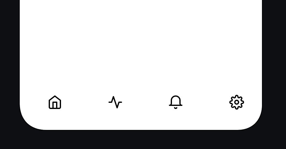
I’m using the following icons downloaded from Feather icons. To follow along download Home, Activity, Bell, and Settings.
我正在使用从Feather图标下载的以下图标 。 要继续下载家庭,活动,铃声和设置。
Import your icons via Image import. You can shift-select and import them all in one go if you like
通过Image import导入图标。 如果愿意,您可以一次选择并导入所有内容
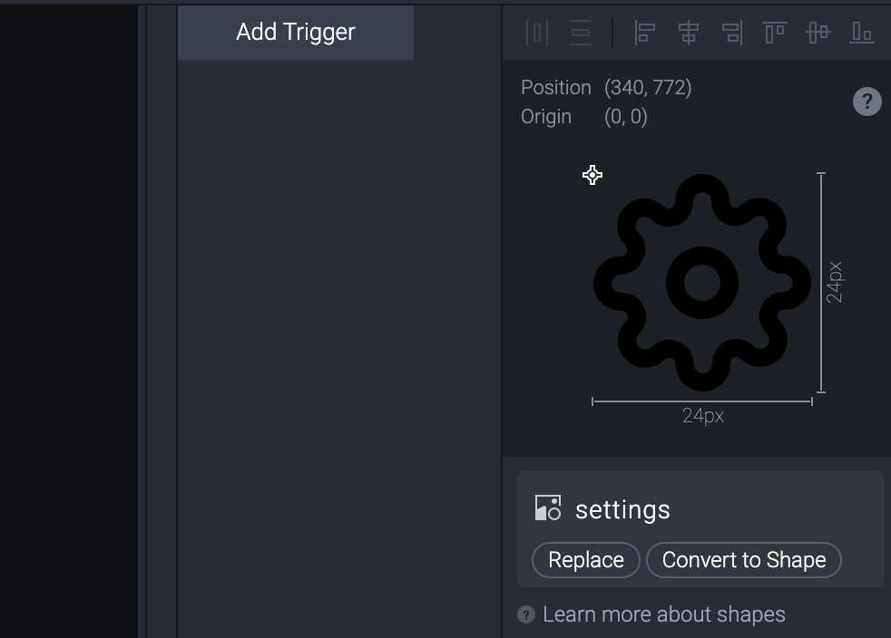
Currently, There’s a bug in ProtoPie which causes the icons to import at a smaller size so let’s fix that (not the bug obviously!). Taking each icon, in turn, make them 24 px (check that the padlock icon is locked to preserve the aspect ratio)
当前,ProtoPie中存在一个错误,该错误会导致图标以较小的尺寸导入,因此让我们对其进行修复(显然不是该错误!)。 依次将每个图标设为24像素 (检查挂锁图标是否已锁定以保持宽高比)
Select the first icon and tap Convert to Shape (you’ll find this under the image preview in the top right)
选择第一个图标,然后点击“ 转换为形状” (您会在右上角的图像预览下找到它)
Choose a border color for your icon (I chose #228BE6)
为图标选择边框颜色(我选择了#228BE6 )
- Repeat for 3 more icons 重复3个以上的图标
- Organize the icons in the layer panel with your left most icon being at the top and the right-most icon at the bottom. The order I’m using is Home, Activity, Bell, Settings 在图层面板中组织图标,最左边的图标在顶部,最右边的图标在底部。 我使用的顺序是家庭,活动,响铃,设置
- Position the icons roughly in the tab bar location across the bottom of the screen 将图标大致放置在屏幕底部的标签栏位置
02.创建选项卡 (02. Creating the tabs)
We are going to have 4 tab items that will link to 4 separate scenes. Let’s create the Home tab first.
我们将有4个选项卡项目,它们将链接到4个单独的场景。 首先创建“ 主页”选项卡。
Use the Shape menu to create a rectangle (or press R on your keyboard) and make it 56 px high. Type 25% in the width field to get a width exactly one-quarter of the width of your prototype; The value will be converted to pixels for you.
使用“形状”菜单创建一个矩形(或按键盘上的R)并将其设为56 px高。 在width字段中输入25% ,以获得正好等于原型宽度四分之一的宽度; 该值将为您转换为像素。
- Move the rectangle into the bottom left of your screen until it snaps into place and positions it under the home icon layer. 将矩形移到屏幕的左下方,直到其固定到位并将其放置在主图标层下。
- Move the Home icon into the center of the rectangle so it is both vertically and horizontally centered. You will know when it’s in the center when you see the red alignment lines or you could use the alignment tools located in the top right of the screen above the image preview window; to do this select both the rectangle and the Home icon and select the center horizontal and vertical 将主屏幕图标移到矩形的中心,使其在垂直和水平方向上居中。 当您看到红色的对齐线时,您将知道它何时位于中心,或者您可以使用图像预览窗口上方屏幕右上方的对齐工具; 为此,选择矩形和“主页”图标,然后
 最低0.47元/天 解锁文章


 619
619

 被折叠的 条评论
为什么被折叠?
被折叠的 条评论
为什么被折叠?
 到【灌水乐园】发言


