


css网格
The case for using one CSS grid for your entire website
在整个网站上使用一个CSS网格的情况
CSS网格与Flexbox (CSS Grid vs Flexbox)
In the dark ages, we used table, a few years ago we used float and before today most of us used flex . Of course, these older technologies still serve a purpose but when it comes to good old fashioned layout, CSS grid is where it’s at.
在黑暗时代,我们使用table ,几年前我们使用float而在今天之前,我们大多数人都使用flex 。 当然,这些较旧的技术仍然可以达到目的,但是当涉及到良好的老式布局时,CSS grid就是它的用武之地。
范例(JSX) (Examples (JSX))
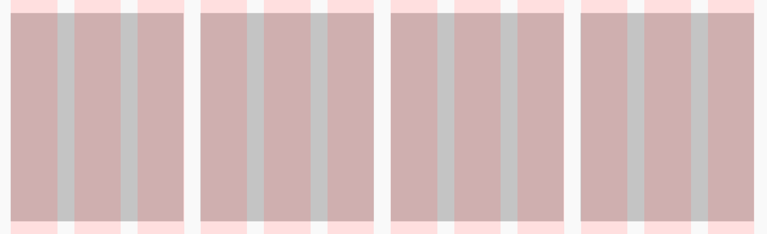
A simple three-column grid in flexbox with 20px gap and 30px of gutter on the left and right:
flexbox一个简单的三列网格, flexbox有20px间距和30px的装订线:
There are a few annoying things that we have to do to accomplish this. Do you see them?
为此,我们需要做一些烦人的事情。 你看到他们了吗?
- Negative margins on the parent to account for the padding on the left/right of the first/last columns. 父级上的负边距用于说明第一列/最后一列的左侧/右侧的填充。
- Half padding on left/right of each column to form the column gutters. 在每列的左侧/右侧填充一半以形成列装订线。
Let’s do the same thing with CSS Grid:
让我们对CSS Grid做同样的事情:
Easy peasy! Just define the number of columns (three, filling an equal amount of space) and the gap size and then sit back and relax. The benefits of CSS grid over the other layout techniques become even more apparent as grids get more complex but hopefully, you get the picture.
十分简单! 只需定义列数(三列,填充相等的空间)和gap大小,然后坐下来放松即可。 随着网格变得越来越复杂,CSS网格相对于其他布局技术的优势变得更加明显,但希望您能理解。
多个网格与单个网格 (Multiple Grids vs a Single Grid)
多个网格可能是个好主意,但这就是为什么它们不是这样的原因 (Multiple grids may feel like a good idea, but here’s why they aren’t)
Once you start using CSS grids, I can almost guarantee that you’ll want to create a new grid for each component. At least I did! However, it turns out this could easily result in inconsistencies all over the place, causing your code to never match up with the designer’s intention (assuming they designed on a grid). A designer typically creates a single grid and lays out the entire site on that grid. Sure, a component might be a 2 column component, but it still fits on their 12 column grid. Here’s an example of the wrong way to do things:
一旦开始使用CSS网格,我几乎可以保证您将要为每个组件创建一个新的网格。 至少我做到了! 但是,事实证明,这很容易导致整个地方的不一致,从而导致您的代码永远不会与设计者的意图相符(假设他们是在网格上进行设计的)。 设计人员通常创建单个网格,然后在该网格上布置整个站点。 当然,一个组件可能是2列的组件,但仍适合其12列的网格。 这是做事方法错误的一个示例:

While coding the component above, you may be tempted to create a very simple grid:
在对上面的组件进行编码时,您可能会想创建一个非常简单的网格:
<div style={{ display: 'grid', gridTemplateColumns: 'repeat(2, 1fr)', gap: 30 }} />Intuitively, this makes sense! After all, this is just a 2 column grid with each column spanning half of the parent. This is actually not the right approach but let's look at one more example before going on.
凭直觉,这是有道理的! 毕竟,这只是一个2列网格,每列跨越父对象的一半。 这实际上不是正确的方法,但在继续之前让我们再看一个示例。
In this example from the same project, we might be tempted to create the following 4 column grid:
在同一项目的此示例中,我们可能很想创建以下4列网格:
<div style={{ display: 'grid', gridTemplateColumns: 'repeat(4, 1fr)', gap: 30 }} />Wrong again!
又错了!
单格图案 (The single grid pattern)
I advise that we follow the designer’s workflow and use a single grid for the entire webpage, and follow that same grid for every component. In the case of the examples above, both grids would be a 12 column grid:
我建议我们遵循设计者的工作流程,对整个网页使用单个网格,并对每个组件使用相同的网格。 在上面的示例中,两个网格均为12列网格:
<div style={{ display: 'grid', gridTemplateColumns: 'repeat(12, 1fr)', gap: 30 }} />Now let’s take a look at the components above built for the 12 column grid:
现在,让我们看一下上面为12列网格构建的组件:
And here’s the 4 column layout:
这是4列的布局:
By sharing a single 12 column grid between both components and simply spanning the appropriate amount of columns, we ensure that both of these components actually line up with each other on the global grid as the designer intended. If you choose to use different grids for each component, your components will no longer fit on the global grid and the designer will let you know about it.
通过在两个组件之间共享单个12列网格并简单地跨适当数量的列,我们可以确保这两个组件确实按照设计者的意图在全局网格上彼此对齐。 如果您为每个组件选择使用不同的网格,则您的组件将不再适合全局网格,设计人员将让您知道。
React全球网格 (React Global Grid)
To aid with this, I’ve created a very simple collection of components for React called react-global-grid.
为了帮助这一点,我为React创建了一个非常简单的组件集合,称为react-global-grid 。
安装 (Installation)
npm i react-global-grid用法 (Usage)
At the moment, this library requires the following peer dependencies:
目前,该库需要以下对等依赖项:
- React React
If you’re already using those then you’re set. If not, don’t fret! Just create a Grid component and define some global styles for it. Then make sure to use that component all over the place and just span the number of columns necessary for each module.
如果您已经在使用这些功能,则可以开始使用。 如果没有,请不要担心! 只需创建一个Grid组件并为其定义一些全局样式即可。 然后,请确保在各处使用该组件,并且仅跨每个模块所需的列数。
翻译自: https://medium.com/swlh/one-css-grid-to-rule-them-all-3e3386ad6155
css网格


 1081
1081

 被折叠的 条评论
为什么被折叠?
被折叠的 条评论
为什么被折叠?
 到【灌水乐园】发言


