


 本文介绍了如何在iOS应用中使用SwiftUI实现一个自定义的导航抽屉。作者分享了创建菜单模型、使用SF Symbols库以及通过设置offset和animation属性来实现抽屉效果的过程。最终,通过修改ContentView的Body,实现在点击菜单项时切换屏幕。
Most iOS developers out there would absolutely dread it when the design demands of a Navigation Drawer in their iOS app. Simply put, there is no direct way to implement it from iOS. I am not a fan of this design, because it is so un-iOS like. Having said that, when the need arises, we must put aside our differences and get the job done.
当iOS应用程序中对导航抽屉的设计要求很高时,大多数iOS开发人员绝对会感到恐惧。 简而言之,没有直接的方法可以从iOS实施它。 我不喜欢这种设计,因为它非常不像iOS。 话虽如此,当需要出现时,我们必须抛开分歧,完成工作。
Until now, I have been dependent on libraries like SWRevealViewController for this. I tried subclassing Segues to make this work without being dependant on CocoaPods too much, but it was too hard. That changed recently, with me starting to learn SwiftUI.
到目前为止,我一直依赖于诸如SWRevealViewController库。 我尝试对Segues进行子类Segues以在不过多依赖CocoaPods情况下完成此工作,但这太难了。 随着我开始学习SwiftUI ,这种情况最近发生了变化。
So here is my code, implementing a Custom Navigation Drawer, using SwiftUI -
这是我的代码,使用SwiftUI实现自定义导航抽屉-
Let’s start with creating a Model for Menu Items
让我们从为菜单项创建模型开始
class MenuContent: Identifiable, ObservableObject {    var id = UUID()    var name: String = ""
    var image: String = ""    init(name: String, image: String) {        self.name = name
        self.image = image
    }}
This is a pretty straightforward definition of a Model. We give the menu a Title(name)and an Icon(image).
这是一个非常简单的模型定义。 我们给菜单一个标题( name )和一个图标( image )。
We conform our Class
MenuContenttoIdentifiableandObservableObjectso that the list created from this class remains distinct(unique elements with Identifier represented byUUID) and we can observe changes made on the class object, respectively.我们使Class
MenuContent与Identifiable和ObservableObject以便从此类创建的列表保持不同(具有UUID表示的Identifier的唯一元素),并且我们可以分别观察对类对象所做的更改。
Next we can create a list of menuContents as a testData.
接下来,我们可以创建一个menuContents列表作为testData。
let menuHome = MenuContent(name: "Home", image: "house.fill")let menuProfile = MenuContent(name: "Profile", image: "person.fill")let menuChat = MenuContent(name: "Chat", image: "message.fill")let menuLogout = MenuContent(name: "Logout", image: "power")let menuContents = [menuHome, menuProfile, menuChat, menuLogout]In WWDC 2019, Apple introduced SF Symbols and it has been gorgeous. A library of Vector images that we can use in our apps. Since they are Vector images, they are scalable and easily customisable. The image variable is accepting String names that match the title of Images available in SF Symbols.
在WWDC 2019中,Apple推出了SF Symbols ,它非常漂亮。 我们可以在应用程序中使用的矢量图像库。 由于它们是矢量图像,因此它们是可伸缩的并且易于自定义。 image变量接受与SF Symbols中可用的Image标题匹配的字符串名称。
For more information on SF Symbols, check out the official documentation below-
有关SF符号的更多信息,请查看以下官方文档-
Now, let’s design our Home Screen-
现在,让我们设计主屏幕-
struct ContentView: View {
    var menu: [MenuContent] = menuContents
    var body: some View {List(menu) { menuItem in
            MenuCell(menuItem: menuItem).onTapGesture {}
        }
    }
}struct MenuCell: View {    var menuItem: MenuContent = menuContents[0]
    var body: some View {HStack {Image(systemName: menuItem.image)
                .foregroundColor(
                    .orange)Text(menuItem.name)
                .foregroundColor(
                    .orange)
        }
    }
 }
HomeScreen (ContentView) is now rendering a single List on the array menu . We have also created a separate View to render MenuCell(old habits from UITableView).
HomeScreen( ContentView )现在在数组menu上呈现单个List 。 我们还创建了一个单独的View来呈现MenuCell( UITableView旧习惯)。
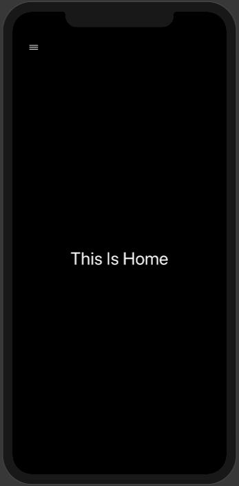
This code will give us the following output
此代码将为我们提供以下输出
Now let’s add a Target View for the menu item-
现在,我们为菜单项添加目标视图-
struct HomeView: View {
    var body: some View {ZStack {
            Color.black.edgesIgnoringSafeArea(
                .all)VStack(alignment: .leading) {Button(action: {}) {
                    Image(systemName: "line.horizontal.3")
                        .foregroundColor(.white)
                }
                .frame(width: 50.0, height: 50.0)Spacer()Text("This Is Home")
                    .font(
                        .largeTitle)
                    .foregroundColor(
                        .white)
                    .frame(maxWidth: .infinity)Spacer()
            }.padding(.horizontal) .frame(maxWidth: .infinity)
        }
    }
}
We can add this View to our ContentView on top of its existing Menu List as the next element on an ZStack
我们可以将此视图添加到我们现有菜单列表顶部的ContentView ,作为ZStack的下一个元素
struct ContentView: View {
    var menu: [MenuContent] = menuContents
    var body: some View {
        ZStack {List(menu) { menuItem in
                MenuCell(menuItem: menuItem).onTapGesture {
                    self.menuItemSelected = menuItem
                }
            }HomeView()
        }
    }
}
After adding HomeView() we won’t be able to see our existing Menu List, because the HomeView draws itself on top of the Menu.
添加HomeView()我们将无法看到现有的菜单列表,因为HomeView会在菜单顶部绘制自己。
What might happen if we add an offset property to our HomeView ?
如果我们向HomeView添加offset属性会发生什么?
struct HomeView: View {
    var body: some View {
        ZStack {
            Color.black.edgesIgnoringSafeArea(
                .all)
            VStack(alignment: .leading) {
                Button(action: {}) {
                    Image(systemName: "line.horizontal.3")
                        .foregroundColor(.white)
                }
                .frame(width: 50.0, height: 50.0)
                Spacer()
                Text("This Is Home")
                    .font(
                        .largeTitle)
                    .foregroundColor(
                        .white)
                    .frame(maxWidth: .infinity)
                Spacer()
            }.padding(.horizontal) .frame(maxWidth: .infinity)
        }.offset(x: 200.0, y: 0)
    }
}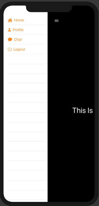
Isn’t this interesting? Now, the View rendered on the ZStack is pushed away. This gives it the appearance of a Navigation Drawer. Let’s now add an @State var property inside the HomeView on which we can dynamically switch the MenuShowing Property-
这不是很有趣吗? 现在,在ZStack上渲染的View被推开了。 这使其具有导航抽屉的外观。 现在让我们在HomeView内添加一个@State var属性,我们可以在该属性上动态切换MenuShowing属性-
struct HomeView: View {@State private var showingMenu = false
    var body: some View {
        ZStack {
            Color.black.edgesIgnoringSafeArea(
                .all)
            VStack(alignment: .leading) {
                Button(action: {self.showingMenu.toggle()}) {
                    Image(systemName: "line.horizontal.3")
                        .foregroundColor(.white)
                }
                .frame(width: 50.0, height: 50.0)
                Spacer()
                Text("This Is Home")
                    .font(
                        .largeTitle)
                    .foregroundColor(
                        .white)
                    .frame(maxWidth: .infinity)
                Spacer()
            }.padding(.horizontal) .frame(maxWidth: .infinity)
        }
        .offset(x: showingMenu ? 200.0 : 0.0, y: 0)
    }
}
showingMenu is a Boolean on which, the offset is depending upon. As you can see, when the user clicks the Menu Button, this value is toggled and it can present and hide the menu.
showingMenu是一个布尔值,其偏移量取决于该布尔值。 如您所见,当用户单击“菜单按钮”时,将切换此值,并且可以显示和隐藏菜单。
I’m just gonna go ahead and add a small snippet of code to give an animation to this transition-
我将继续并添加一小段代码,以为该过渡制作动画-
.animation(.easeOut)
.animation(.easeOut)
Let’s just add the rest of the Views to connect the Menus to.
让我们仅添加其余视图以将菜单连接到。
struct HomeView: View {@State private var showingMenu = true
    var body: some View {
        ZStack {
            Color.black.edgesIgnoringSafeArea(
                .all)
            VStack(alignment: .leading) {
                Button(action: {self.showingMenu.toggle()}) {
                    Image(systemName: "line.horizontal.3")
                        .foregroundColor(.white)
                }
                .frame(width: 50.0, height: 50.0)
                Spacer()
                Text("This Is Home")
                    .font(
                        .largeTitle)
                    .foregroundColor(
                        .white)
                    .frame(maxWidth: .infinity)
                Spacer()
            }.padding(.horizontal) .frame(maxWidth: .infinity)
        }
        .offset(x: showingMenu ? 200.0 : 0.0, y: 0).animation(.easeOut)
    }
}struct ProfileView: View {@State private var showingMenu = false
    var body: some View {
        ZStack {
            Color.red.edgesIgnoringSafeArea(
                .all)
            VStack(alignment: .leading) {
                Button(action: {self.showingMenu.toggle()}) {
                    Image(systemName: "line.horizontal.3")
                        .foregroundColor(.white)
                }
                .frame(width: 50.0, height: 50.0)
                Spacer()
                Text("This Is Profile")
                    .font(
                        .largeTitle)
                    .foregroundColor(
                        .white)
                    .frame(maxWidth: .infinity)
                Spacer()
            }.padding(.horizontal) .frame(maxWidth: .infinity)
        }
        .offset(x: showingMenu ? 200.0 : 0.0, y: 0).animation(.easeOut)
    }
}struct ChatView: View {@State private var showingMenu = false
    var body: some View {
        ZStack {
            Color.blue.edgesIgnoringSafeArea(
                .all)
            VStack(alignment: .leading) {
                Button(action: {self.showingMenu.toggle()}) {
                    Image(systemName: "line.horizontal.3")
                        .foregroundColor(.white)
                }
                .frame(width: 50.0, height: 50.0)
                Spacer()
                Text("This Is Chat")
                    .font(
                        .largeTitle)
                    .foregroundColor(
                        .white)
                    .frame(maxWidth: .infinity)
                Spacer()
            }.padding(.horizontal) .frame(maxWidth: .infinity)
        }
        .offset(x: showingMenu ? 200.0 : 0.0, y: 0).animation(.easeOut)
    }
}struct LogoutView: View {@State private var showingMenu = false
        var body: some View {
            ZStack {
                Color.green.edgesIgnoringSafeArea(
                    .all)
                VStack(alignment: .leading) {
                    Button(action: {self.showingMenu.toggle()}) {
                        Image(systemName: "line.horizontal.3")
                            .foregroundColor(.white)
                    }
                    .frame(width: 50.0, height: 50.0)
                    Spacer()
                    Text("This Is Logout")
                        .font(
                            .largeTitle)
                        .foregroundColor(
                            .white)
                        .frame(maxWidth: .infinity)
                    Spacer()
                }.padding(.horizontal) .frame(maxWidth: .infinity)
            }
            .offset(x: showingMenu ? 200.0 : 0.0, y: 0).animation(.easeOut)
        }
}
In the ContentView we shall create a function to return a View needed based on Menu item selected.
在ContentView我们将创建一个函数,以根据选定的Menu项目返回所需的View 。
func selected(Menu: MenuContent) -> some View {
    switch Menu.name {
    case "Home":
        return AnyView(HomeView())
    case "Profile":
        return AnyView(ProfileView())
    case "Chat":
        return AnyView(ChatView())
    case "Logout":
        return AnyView(LogoutView())
    default:
        return AnyView(HomeView())
    }
}
Finally, we should modify the Body of the ContentView to change screens on click of MenuCell.
˚Finally,我们应该修改的内容查看的身体改变屏幕上MenuCell的点击。
struct ContentView: View {
    var menu: [MenuContent] = menuContents@State var menuItemSelected: MenuContent = menuContents[0]
    var body: some View {
        ZStack {
            List(menu) { menuItem in
                MenuCell(menuItem: menuItem).onTapGesture {self.menuItemSelected = menuItem
                }
            }
            self.selected(Menu: menuItemSelected)
        }
    }
}
With menuItemSelected being an @State var , everytime value in it changes, the ContentView will re-render itself and change the top view of the ZStack .
在menuItemSelected为@State var ,每次更改其中的值时, ContentView都会重新呈现自己并更改ZStack的顶视图。
Final output will look something like this-
最终输出看起来像这样-

This is one of the many ways that one can implement a Navigation Drawer in iOS, using SwiftUI. It has never been easier.
这是可以使用SwiftUI在iOS中实现导航抽屉的多种方式之一。 从未如此简单。
If anybody is interested, they can check out the full code at-
如果有人感兴趣,他们可以在以下位置查看完整代码:
Cheers!
干杯!
翻译自: https://levelup.gitconnected.com/creating-navigation-drawer-with-swiftui-891663dd32d2


 扫一扫
扫一扫


 被折叠的 条评论
为什么被折叠?
被折叠的 条评论
为什么被折叠?
 到【灌水乐园】发言


