


A behind the scenes look at how we designed and developed our latest project looking at NYC subway ridership and how it changed during the first few months of the Coronavirus pandemic. We are excited to share our process and project with you.
幕后花絮介绍了我们如何设计和开发我们最新的项目,以研究纽约市地铁的乘车情况以及在冠状病毒大流行的最初几个月中它如何发生变化。 我们很高兴与您分享我们的流程和项目。
项目动机 (Project Motivation)
“Most countries treat subway systems as national assets. They understand that their cities are their great wealth creators and equality enablers and that cities don’t work without subways.”
“大多数国家将地铁系统视为国家资产。 他们了解自己的城市是他们伟大的财富创造者和平等的推动者,而且城市没有地铁就无法运作。”
— Jonathan Mahler, The Case for the Subway
—乔纳森·马勒(Jonathan Mahler), 《地铁案例》
I have always been fascinated by the subway system in New York City. Yes, it may be falling apart currently and in dire financial troubles, but I genuinely think it is a wonder of the modern world. One of the older subway systems, it is also (during non-pandemic times) one of the most used, connecting the city and making it what it is.
我一直对纽约市的地铁系统着迷。 是的,它目前可能正在崩溃,并面临着严重的财务困难,但是我真正地认为这是现代世界的奇迹。 它是较旧的地铁系统之一,在非大流行时期,它也是最常用的地铁系统之一,它连接城市并使其成为真实的城市。
Public transportation in a city like New York can serve as a significant equalizer — students, finance professionals, doctors, caretakers, tourists, and first responders all ride together to get where they need to go. In bringing together the population of all five boroughs, the subway allows the city to thrive and facilitates the vibrant density that draws so many of us to the city.
在纽约这样的城市,公共交通可以起到重要的平衡作用—学生,金融专业人员,医生,看护者,游客和急救人员齐心协力,到达需要去的地方。 通过将所有五个行政区的人口聚集在一起,地铁使这座城市得以蓬勃发展,并促进了生机勃勃的人口密度,吸引了我们许多人来到这座城市。
In ‘The Case for the Subway’, a New York Times Magazine piece from 2018, Jonathan Mahler beautifully writes “The subway may no longer be a technological marvel, but it continues to perform a daily magic trick: It brings people together, but it also spreads people out. It is this paradox — these constant expansions and contractions, like a beating heart — that keep the human capital flowing and the city growing.”
在2018年《纽约时报》杂志的《地铁案例 》中, 乔纳森·马勒 ( Jonathan Mahler)优美地写道:“地铁可能不再是技术奇迹,但它仍然每天都在发挥魔术作用:它将人们聚集在一起,但是也将人们分散开来。 正是这种悖论-这些不断的扩张和收缩,就像一颗跳动的心 -使人力资本不断流动,城市不断发展。”
This metaphor of the subway as a beating heart feels especially salient as we begin grapple with the realities of this Coronavirus pandemic. The subway is, in many respects, the city’s bloodline, pumping essential nutrients (read: workers) throughout the city, connecting vital organs with extremities. A natural question then follows, what happens when this body gets sick?
当我们开始研究这种冠状病毒大流行的现实时,这种像跳动的心脏这样的比喻显得尤为突出。 在许多方面,地铁都是城市的血统,在整个城市中泵送必需的营养素(阅读:工人),将重要器官与四肢相连。 一个自然的问题随之而来,当这个身体生病了怎么办?
As we transitioned to working from home, my fascination with the subway took on a new tone. We stopped riding the subway and suddenly felt disconnected from the pulse of the city. That’s when the opportunity to pursue this project arose in our studio. To us, this project was a way to feel what was happening to the city while we were working from the cramped corners of our shoebox apartments. Visualization allowed us to reconnect to the city, to understand what was changing, even while we were sequestered at home.
当我们过渡到在家工作时,对地铁的迷恋使我焕然一新。 我们停止乘坐地铁,突然感到与城市脉搏脱节。 那时,在我们的工作室中就有机会进行这个项目。 对我们来说,这个项目是一种感觉,当我们从鞋盒式公寓的狭窄角落工作时,可以感受到这座城市正在发生的一切。 可视化使我们能够重新连接到城市,了解正在发生的变化,即使我们被隔离在家里也是如此。
In digging into the ridership data, we quickly realized something that should have been obvious — namely, that the ability to stay home and to avoid riding the subway was, in itself, a privilege that we had taken for granted.
在研究乘车人数数据时,我们很快意识到应该有一个明显的东西,那就是,留在家中和避免乘地铁的能力本身就是我们理所当然的特权。
We developed this project to share our observations with a broader audience, and to help us all begin to unravel what happened to the city in the first half of 2020.
我们开发了这个项目,以与更多的读者分享我们的观察结果,并帮助我们所有人了解2020年上半年发生在这座城市的事情。
研究和早期设计迭代 (Research and Early Design Iterations)
We started by looking at MTA ridership datasets (turnstile and MetroCard swipes) and socioeconomic measures (from the American Community Survey) to try and get a better grasp of what story we wanted to tell.
我们首先查看MTA乘客数据集( 旋转门和MetroCard刷卡 )和社会经济指标(来自《 美国社区调查》 ),以期更好地理解我们想讲的故事。
Below you can find some of the many design iterations we went through as we tried to best understand the data. Most of these were developed using Observable Notebooks, our favorite tool for exploring quick prototypes.
在下面,您可以找到我们在试图最好地理解数据时所经历的许多设计迭代中的一些。 其中大多数是使用Observable Notebooks开发的, Observable Notebooks是我们探索快速原型的最喜欢的工具。
As you can see these sketches range greatly from more analytical to more visual and experimental. In our early stages of project development we aim to try out as many visual representations and iterations as possible until we find ones that most effectively convey our findings.
如您所见,这些草图的范围从分析性到视觉和实验性都很大。 在项目开发的早期阶段,我们旨在尝试尽可能多的视觉表示和迭代,直到找到最能有效传达我们的发现的视觉表示和迭代。
For this project, we wanted to find an intuitive representation that would be easily graspable for a viewer new to this data, but also one that allowed for deeper engagement for those who were interested in learning more. We also wanted to find a way to evoke the more visceral embodiment of a subway’s movement, to convey the dramatic scope and sudden change of this system.
对于此项目,我们希望找到一种直观的表示形式,对于刚接触此数据的查看者来说将很容易理解,但同时也可以让有兴趣学习更多信息的人更深入地参与其中。 我们还想找到一种方法来唤起地铁运动的内在体现,传达这种系统的巨大范围和突然变化。

调查结果和项目目标 (Findings and Project Goals)
The main takeaway from this project was this: changes in ridership were intricately connected with the deep racial and economic inequalities of our city.
该项目的主要收获是:乘车率的变化与我们城市深远的种族和经济不平等现象紧密相连。
During this processes of exploration we uncovered trends that were perhaps obvious yet nonetheless shocking. This wasn’t because they necessarily contradicted our expectations (there are many, important, articles written about the unequal toll of COVID-related casualties in this country). Rather, we were struck by how clearly things we knew implicitly about inequities in the city were laid bare when viewed visually.
在探索的过程中,我们发现了可能显而易见但仍令人震惊的趋势。 这并不是因为它们必然与我们的期望相矛盾(有很多 重要的 文章写了关于该国COVID相关人员伤亡人数不平等的报道)。 相反,当我们从视觉上观察时,对我们对城市不平等的隐性了解清楚地暴露出来时,我们感到震惊。
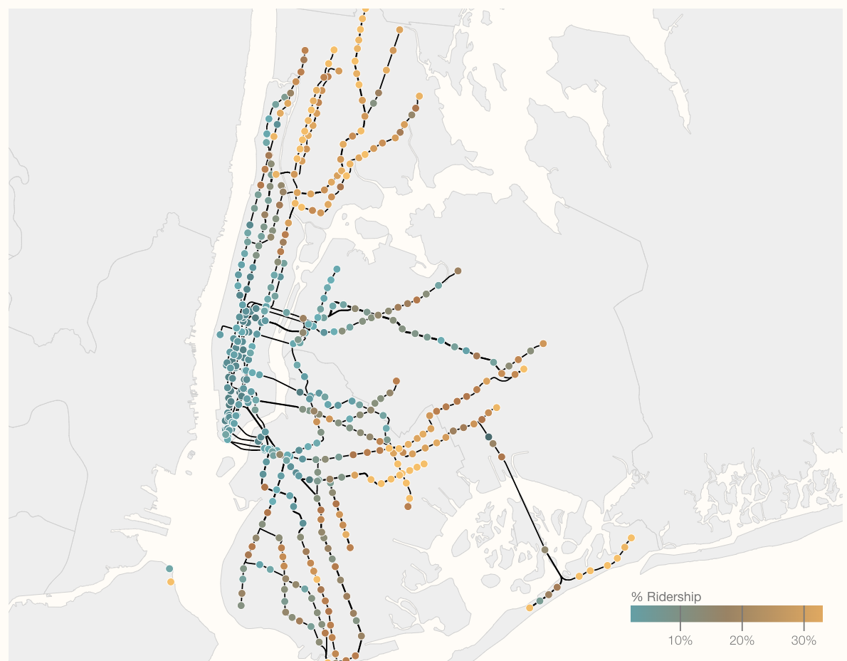
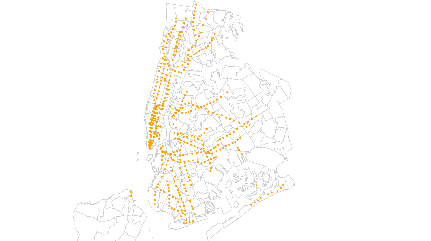
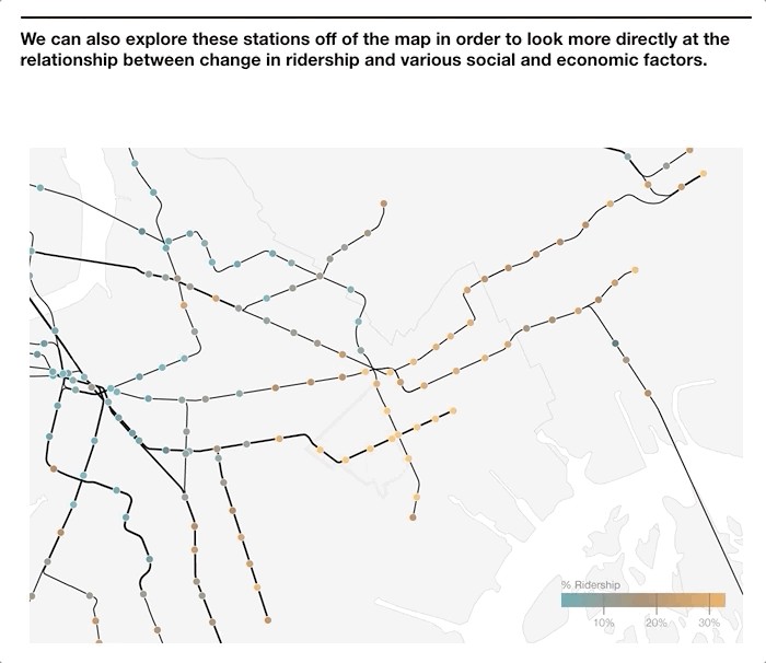
By simply viewing relative ridership on a map, we immediately noticed that there was a very clear trend. Stations in Manhattan had significantly lower relative ridership rates then stations further in the periphery. Furthermore, there appeared to be very clear ‘pockets’ of high relative ridership (shown in orange in the image to the left).
通过简单地在地图上查看相对的乘车率,我们立即注意到有一个非常明显的趋势。 曼哈顿车站的相对乘客率明显低于周边车站。 此外,似乎有非常明显的“相对较高的乘客量”(在左侧图像中以橙色显示)。
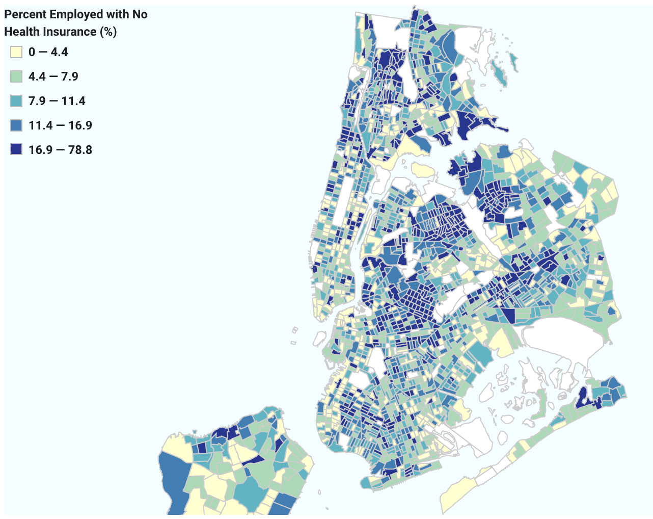
Layering in census data allowed us to ask deeper questions about what these patterns meant and how different communities were affected during this period. By bringing in economic and demographic data, were were able to compare neighborhoods to each other.
人口普查数据的分层使我们能够对这些模式的含义以及在此期间如何影响不同社区提出更深层次的问题。 通过引入经济和人口统计数据,他们能够相互比较邻里。
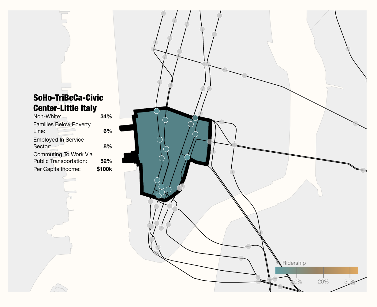
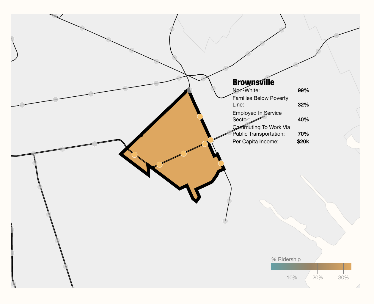
For example, the images below reveal a stark contrast between two socioeconomically distinct neighborhoods. The first, a predominantly white neighborhood in Lower Manhattan, saw a ridership decrease of about 88%-97% during the peak of the pandemic, while the second, the predominantly Black neighborhood of Brownsville, saw a decrease of only about 70%. This means that over 30% of riders in Brownsville were still riding the subway during the height of the pandemic.
例如,下面的图像显示了两个在社会经济上不同的社区之间的鲜明对比。 第一个主要是曼哈顿下城的白人社区,在大流行高峰期间的乘客量下降了约88%-97%,而第二个主要是布朗斯维尔的黑人社区,乘客量仅下降了约70%。 这意味着在大流行期间,布朗斯维尔(Brownsville)超过30%的乘客仍在乘坐地铁。
On top of this, the per capita income in Brownsville (the neighborhood on the right) is one fifth of that in Lower Manhattan (on the left), while we see that that the average relative ridership there was nearly six times higher.
最重要的是,布朗斯维尔(右邻)的人均收入是曼哈顿下城(左)的人均收入的五分之一,而我们看到那里的平均相对乘客率高出近六倍。
This was a trend we saw across the city, namely the lower the neighborhood’s per capita income, the more people were still riding the subway. By looking closer at these neighborhoods, we also see that many contain higher percentages of individuals employed in ‘educational, health and social services’ (as categorized by the American Community Survey) —presumably many of our frontline workers.
这是我们在整个城市看到的趋势,即该地区的人均收入越低,乘坐地铁的人就越多。 通过仔细观察这些街区,我们还发现,很多人受雇于“教育,卫生和社会服务”(按美国社区调查分类)的人员所占的比例更高—大概是我们的一线工人。
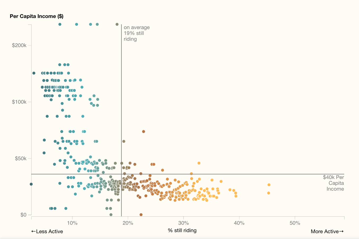
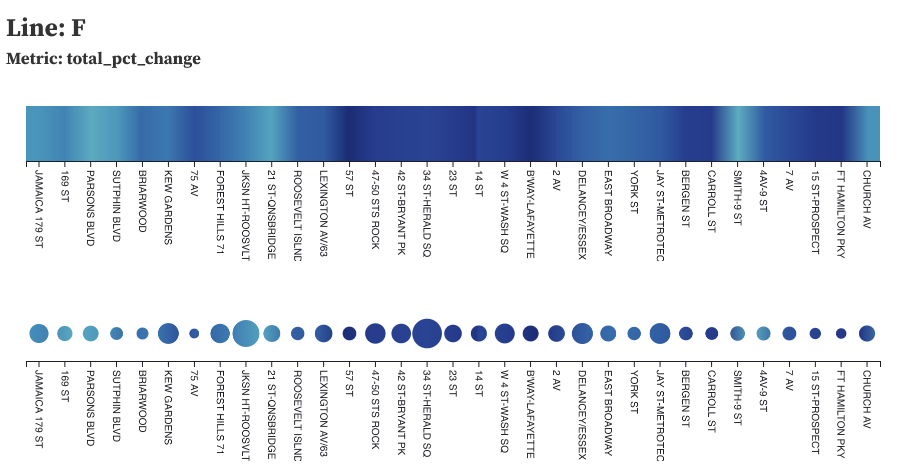
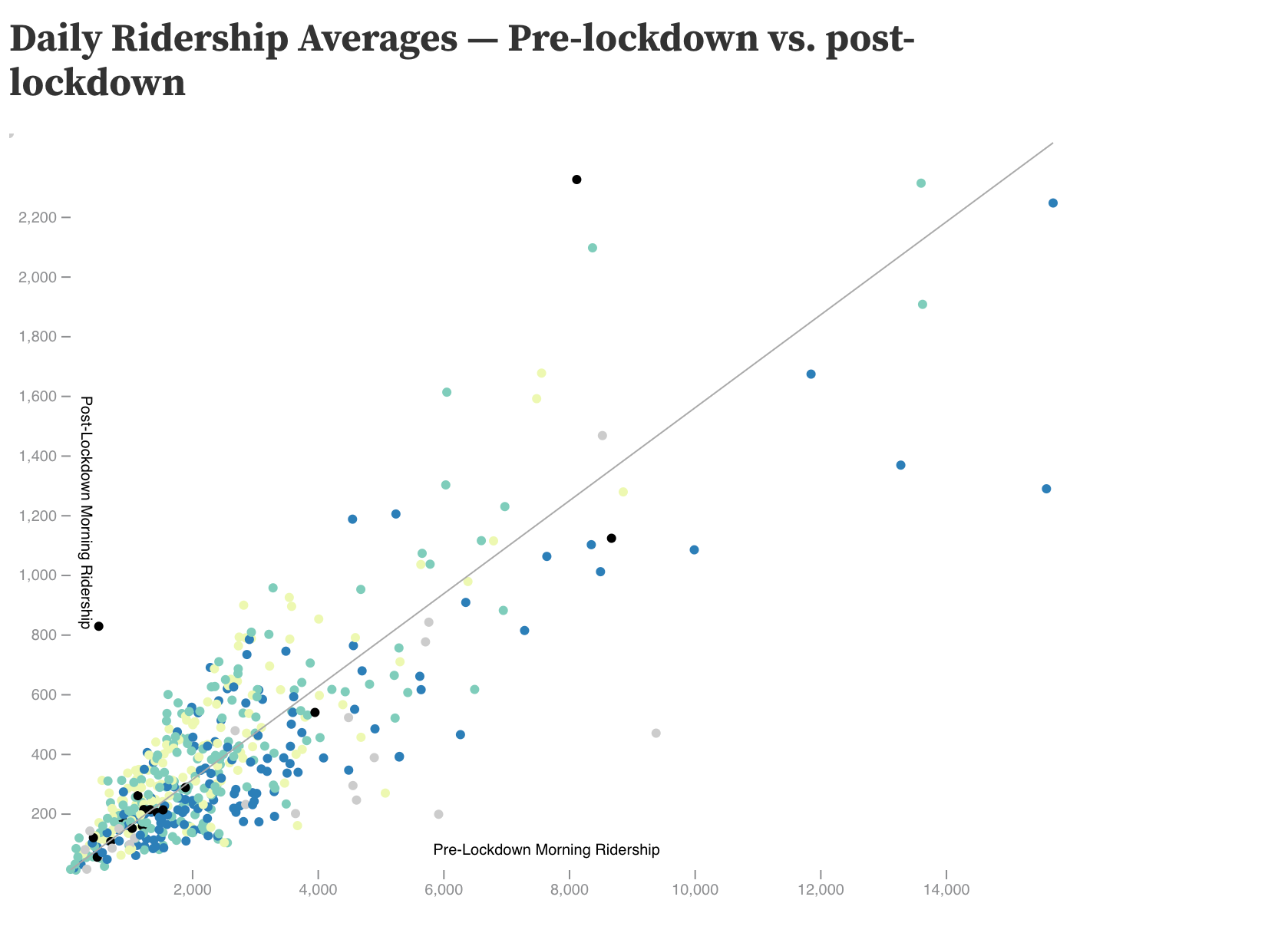
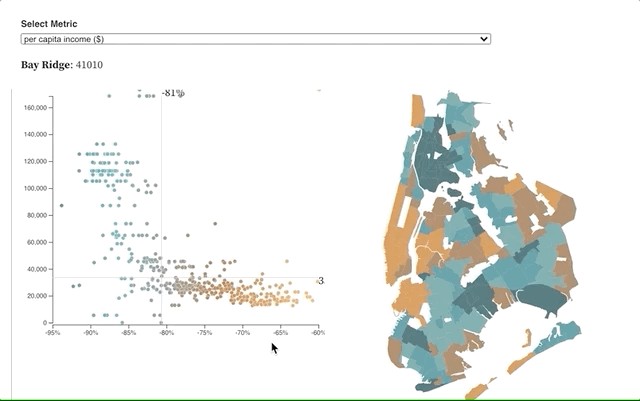
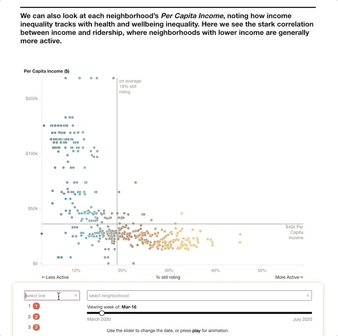
We wanted to highlight these relationships between socioeconomics and pandemic-level ridership so we moved to a view that shows all of the subway station simultaneously across these two perspectives of ridership and demographics. Using a series of scatterplots, we were able to show changes in ridership on the x-axis, and critical social and economic metrics along the y-axis. On the left you can see one of the most striking graphs, focusing on per capita income. Here we can see clearly how wealthier communities were far more able to avoid riding the subway during this period.
我们想强调社会经济学和大流行水平乘车者之间的这些关系,因此我们转到了一个视图,该视图同时从乘车者和人口统计这两个角度显示了所有地铁站。 使用一系列散点图,我们能够在x轴上显示出行率的变化,并在y轴上显示出关键的社会和经济指标。 在左侧,您可以看到最引人注目的图表之一,重点关注人均收入。 在这里,我们可以清楚地看到,在此期间,较富裕的社区更有能力避免乘坐地铁。
最终设计决策 (Final Design Decisions)
As visual communicators at Two-N, we spend much of our time thinking about the best way to convey insights so that viewers new to the subject domain are able to understand and engage with the data on their own. Below you can find some of the design decisions that we made for this project.
作为Two-N的视觉传达者,我们花费了大量时间来思考传达见解的最佳方法,以便使刚接触主题领域的观众能够自己理解和使用数据。 您可以在下面找到我们为该项目做出的一些设计决策。
寻找最佳数据集 (Finding the Best Dataset)
Our goal in this project was to find data that could tell a story about subway ridership and demographics. Below we will discuss how we went about finding and deciding on the most effective datasets.
我们在该项目中的目标是找到可以讲述地铁乘车人数和人口统计数据的数据。 下面我们将讨论如何寻找和决定最有效的数据集。
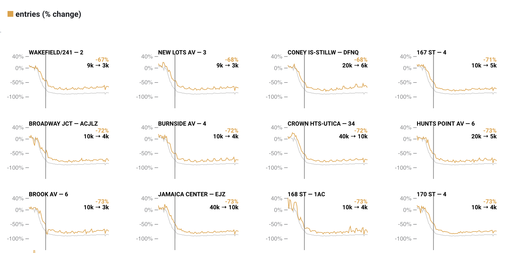
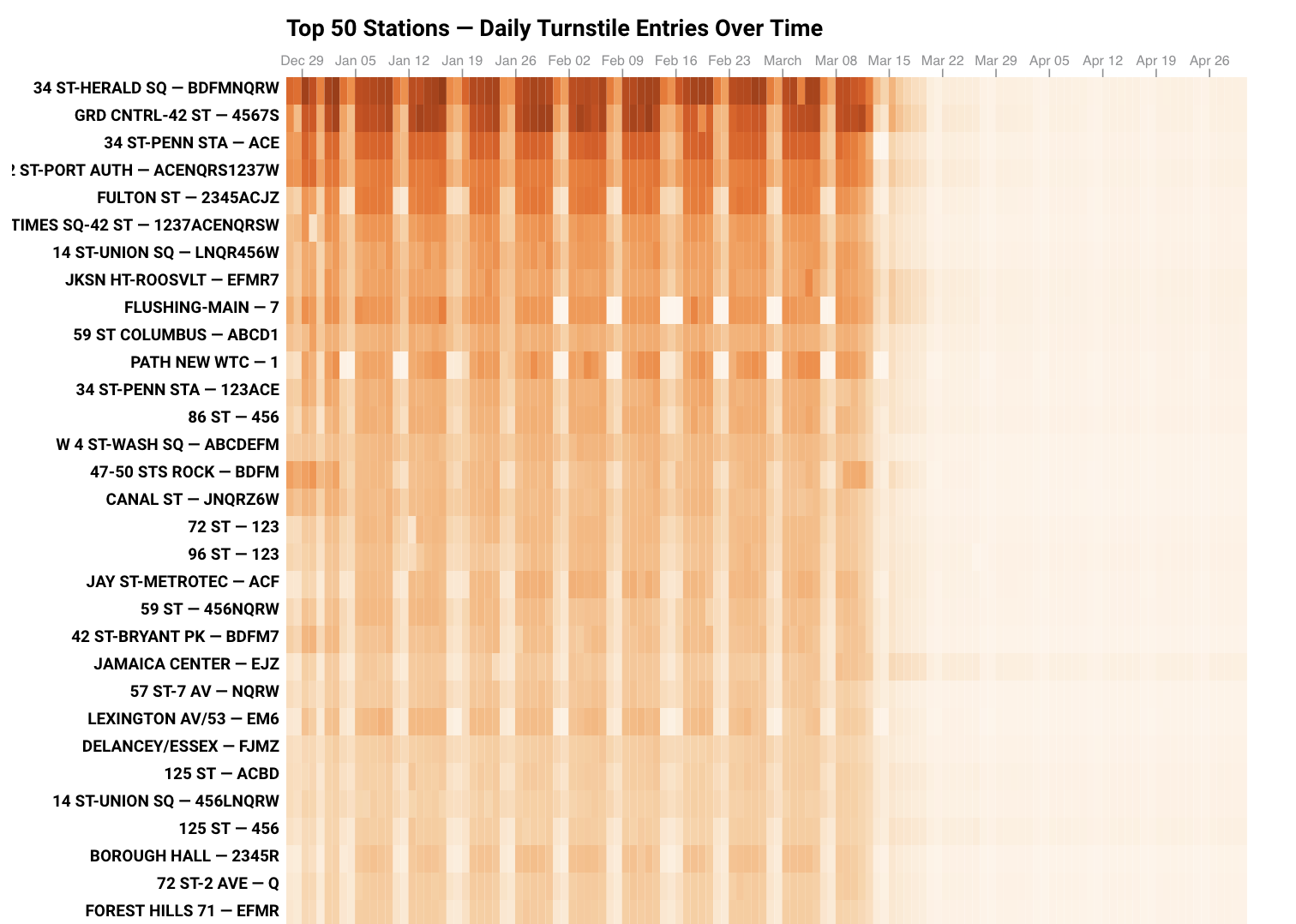
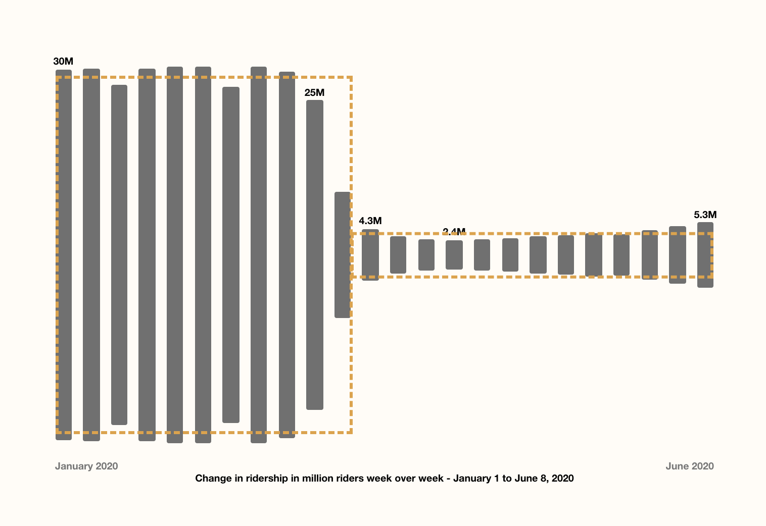
When we first started looking at subway ridership data, we used the publicly available MTA turnstile data. This provided data in roughly 4 hour intervals for every turnstile device in each subway station. Initially we were really excited by the level of granularity this dataset allowed, but ultimately decided that it added too much noise and inconsistencies to accurately tell our story. While we loved the ability to see the intra-day ebbs and flows of commuter traffic (peaks in the morning/afternoon, drops at night/over weekends), we felt that these fluctuations may detract from the primary narrative, namely a dramatic and sudden shift from the system’s baseline ridership.
刚开始查看地铁乘客数据时,我们使用了公开提供的MTA转闸数据 。 这为每个地铁站中的每个旋转门设备提供了大约4小时间隔的数据。 最初,我们对该数据集允许的粒度级别感到非常兴奋,但最终决定,它添加了太多的噪声和不一致之处,无法准确地讲述我们的故事。 虽然我们喜欢看到通勤者一天之中的潮起潮落的能力(早上/下午高峰,晚上/周末下降),但我们认为这些波动可能会损害主要叙述,即戏剧性和突然性从系统的基准乘员率转变。
We are also grateful to have had the opportunity to consult with representatives from the NYC Department of City Planning who suggested that we instead utilize the MetroSwipe Fare data (reported weekly for each station) as a cleaner and more reliable data source.
我们也很高兴有机会与纽约市城市规划局的代表进行磋商,他们建议我们改用MetroSwipe票价数据 (每个车站每周报告)作为更清洁,更可靠的数据源。

Another data granularity decision we had to make regarded the level at which we were matching subway stations to census data. The high-level idea was to look at the geographic region surrounding each MTA station, and then pull the census metrics for that region. Below you can see a chart illustrating the different levels at which census data is reported.
我们必须做出的另一个数据粒度决定是考虑将地铁站与人口普查数据进行匹配的级别。 高层次的想法是查看每个MTA站周围的地理区域,然后提取该区域的普查指标。 在下面,您可以看到一个图表,说明了报告普查数据的不同级别。
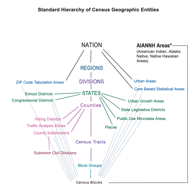
Our initial thought was that we wanted to be as precise as possible in doing this and to find the smallest meaningful geographic area for each station. So we started by looking at the level of census tract.
我们最初的想法是,我们希望做到这一点尽可能精确,并为每个站点找到最小的有意义的地理区域。 因此,我们从查看普查区域的水平开始。
However we quickly realized that this was the wrong approach. By looking at these maps we discovered that census tracts were too small and arbitrarily-shaped to tie back to subway stations reliably. Furthermore we recognized from our experiences, that often people will walk further than the boundaries of their census tract in order to access the nearest subway station.
但是,我们很快意识到这是错误的方法。 通过查看这些地图,我们发现人口普查区域太小且形状任意,无法可靠地绑定到地铁站。 此外,从我们的经验中我们认识到,为了到达最近的地铁站,人们通常会走得比人口普查范围更远。
Ultimately we decided to match stations to the neighborhood in which they were located. New York City maintains a series of Neighborhood Tabulation Areas (NTAs) which, although not perfect, align more closely to our mental model of the city’s distinct regions. This allowed us to tie socioeconomic metrics more meaningfully to individual stations.
最终,我们决定将车站与其所在的社区进行匹配。 纽约市维持着一系列的邻里制表地区(NTA) ,尽管这并不完美,但与我们对城市不同地区的思维模式更加接近。 这使我们能够更有意义地将社会经济指标与各个站点联系起来。

选择主要指标 (Choosing a Primary Metric)
In order to tell this story properly, we needed to find a metric that effectively answered our main question — how many people were still riding the subway at the peak of the pandemic.
为了正确地讲这个故事,我们需要找到一个能够有效回答我们主要问题的指标-在大流行高峰时仍有多少人乘坐地铁。
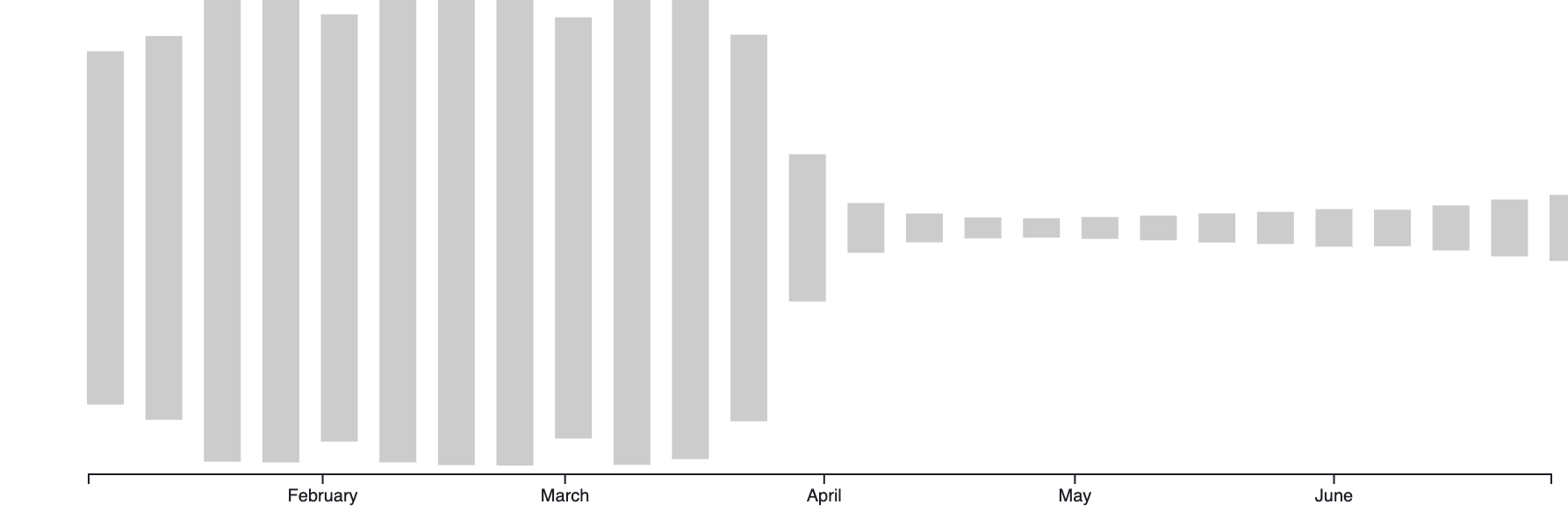
Initially we looked at the absolute numbers of riders overtime. As a metric, this choice restricted our ability to compare between stations in a meaningful way as the number of riders varied greatly between stations (imagine a small single-line station in Brooklyn vs. the Times Square hub).
最初,我们研究了加班的绝对人数。 作为一种度量标准,这种选择限制了我们以有意义的方式比较车站之间的能力,因为车站之间的骑手数量差异很大(想象一下布鲁克林区与时代广场枢纽之间的小型单线车站)。
We decided instead to focus on percent change, looking at how a station’s ridership changed relative to its own ‘normal’, or baseline, ridership. To calculate this baseline, we took the period from the beginning of 2020 up until New York State declared a state of emergency (March 7th). Then for each subsequent week we were able to compare it to that station’s average ridership value.
相反,我们决定专注于百分比变化,研究车站的乘客量相对于其自身“正常”或基准乘客量的变化。 为了计算此基准,我们使用了从2020年初到纽约州宣布进入紧急状态(3月7日)的时间段。 然后,在接下来的每个星期中,我们都可以将其与该车站的平均乘车率进行比较。
Our first intuition was to frame this metric as a station’s ‘percent drop in ridership,’ but we slowly realized that what we were focusing on in our story wasn’t the ‘drop’ per se, but the inverse of it — those people who were still riding the subway.
我们的第一个直觉是将该指标定义为车站的“乘车人数下降百分比”,但我们逐渐意识到,我们故事中关注的并不是本身的“下降” ,而是与之相反的- 还在坐地铁。
This may seem like a small or insignificant change (going from a ‘70% drop’ to ‘30% still riding’), but it is an important one. By focusing on the positive rate (those ‘still riding’) we were able to put the individuals, the actual human beings, at the forefront of the story, instead of reasoning about an abstracted negation (with a ‘percent drop’).
这似乎是一个很小或微不足道的变化(从“ 70%下降 ”变为“ 30%仍在骑行 ”),但这是一个重要的变化。 通过关注积极的比率(那些“仍在继续”),我们能够将个人,实际的人放在故事的最前列,而不是推理抽象的否定(“下降百分比”)。
对象恒定性和有意动画 (Object Constancy and Intentional Animations)
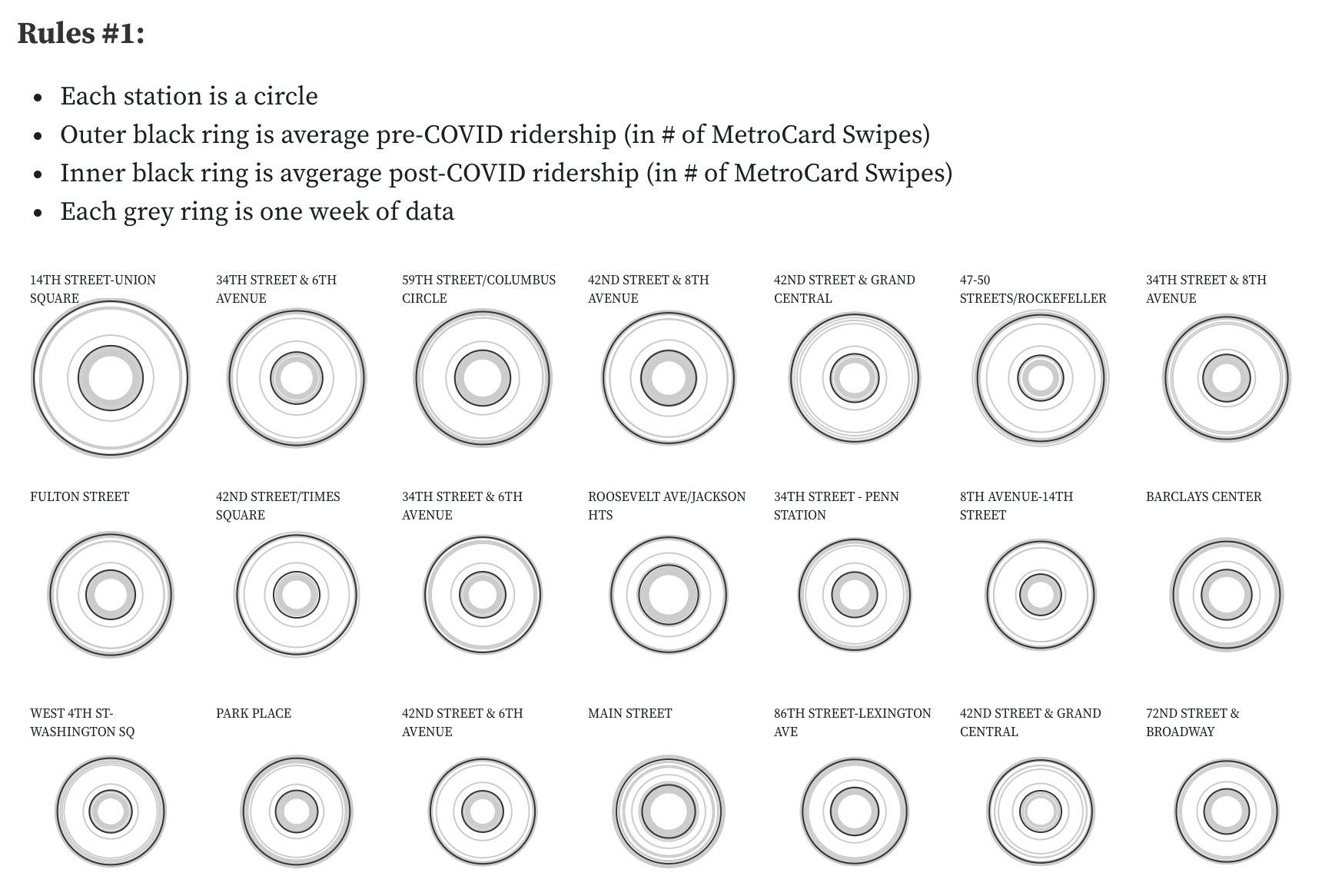
This piece was designed to visually and verbally guide viewers through the narrative in a clear and intuitive fashion. An essential part of being able to do that is by ensuring that the viewer is able to follow the story as it progresses. We can support this by maintaining the object constancy of our data elements throughout the project, or in other words, by ensuring that a data entity (a subway station in our case) can be tracked visually through an animation or transition.
该作品旨在以清晰直观的方式在视觉和言语上引导观众进行叙述。 能够做到这一点的重要部分是通过确保观看者能够随着故事的进行而追踪故事。 我们可以通过在整个项目中保持数据元素的对象一致性来支持这一点,或者换句话说,通过确保可以通过动画或过渡在视觉上跟踪数据实体(在我们的情况下是地铁站)来支持这一点。
By maintaining a connection between the graphical element (the circle) and the data element (the subway station), we are able create sophisticated (and even surprising) animations, such as moving from a geographic map to a scatterplot, all the while ensuring that our audience is able to follow what is happening.
通过保持图形元素(圆圈)和数据元素(地铁站)之间的连接,我们能够创建复杂的(甚至令人惊讶的)动画,例如从地理地图移动到散布图,同时确保我们的听众能够了解正在发生的事情。
The way I see it, the power of data visualization lies in its ability to help people reason about abstract concepts by making these concepts more immediate and interactive. By creating visual ‘objects of reasoning’ that we can manipulate and engage with (like our station circles), we are able to ground and embody our understanding of complex ideas. This visual continuity is critical for supporting our cognitive processes as we reason about abstracted representations.
从我的角度来看,数据可视化的力量在于它能够通过使这些概念更加直接和互动来帮助人们推理抽象概念。 通过创建视觉化的“推理对象”,我们可以进行操作和参与(例如站台圈子),我们便能够扎根并体现我们对复杂思想的理解。 当我们推理抽象表示时,这种视觉连续性对于支持我们的认知过程至关重要。
深入探索的机会 (Opportunities For Deeper Exploration)
This project was build primarily as a ‘scrolly-telling’ piece, meaning that viewers are led through a data experience simply by scrolling through the page. Often, this can be a fairly passive form of engagement. To counter that, we added some controls for individuals who wanted to engage more deeply with the data.
该项目主要是作为“讲故事”的部分构建的,这意味着浏览者只需滚动页面即可获得数据体验。 通常,这可能是一种相当被动的参与形式。 为了解决这个问题,我们为想要更深入地使用数据的个人添加了一些控件。
Going through the project you’ll notice that once you get about halfway through, a little control bar floats up from the bottom. This panel allows users to interrogate the data as it is most relevant for them. For example, by clicking the play button, one can see how ridership shifts week by week. Additionally, readers can filter for their subway line or neighborhood to get a view that is more salient to them.
完成该项目时,您会注意到,一旦完成一半,就会从底部浮起一个小的控制栏。 该面板允许用户查询与他们最相关的数据。 例如,通过单击“播放”按钮,人们可以看到乘车人数每周如何变化。 此外,读者可以过滤他们的地铁线路或附近地区,以获取对他们更重要的视图。
实施说明 (Implementation Notes)
This project was build using TypeScript and bundled with Webpack. For the data visualization elements and many of the transitions, we used D3js. We also utilized scrollama for help with the scroll observer and triggers.
该项目是使用TypeScript构建的,并与Webpack捆绑在一起。 对于数据可视化元素和许多转换,我们使用了D3js 。 我们还利用了scrollama来帮助滚动观察器和触发器。
You can see the live project here and explore the code here.
最后的想法 (Final Thoughts)
At the time of writing this, subway ridership is beginning to pick up again, but the MTA system faces one of the worst financial crises it has ever seen. I’ll wrap up this post by reiterating what a critical infrastructural feat the New York City subway is. It is essential for creating and maintaining the vibrant and economically thriving city that we have come to expect. It is also currently at risk and very much worth saving!
在撰写本文时,地铁的乘车人数又开始上升 ,但是MTA系统面临着前所未有的最严重的金融危机之一。 我将通过重申纽约地铁的关键基础设施壮举来结束这篇文章。 这对于创建和维护我们所期望的充满活力且经济繁荣的城市至关重要。 它目前也处于危险之中,非常值得保存!
We hope you enjoyed our process overview and would love to hear your thoughts, questions, suggestions, and experiences.
我们希望您喜欢我们的过程概述,并希望能听到您的想法,问题,建议和经验。
翻译自: https://medium.com/two-n/checking-the-pulse-of-the-city-a0c06a08638a


 2111
2111

 被折叠的 条评论
为什么被折叠?
被折叠的 条评论
为什么被折叠?
 到【灌水乐园】发言


