


 本文是React Data Grids的完整指南,专注于数据过滤功能。内容涵盖了如何在React应用中实现数据过滤,帮助开发者更有效地管理和展示数据。
react data过滤
Most front-end developers are familiar with this scenario: a new project for a data-driven application starts. Everyone is convinced that the design must be as simple and straightforward as possible. At its heart, a simple table — a couple of columns and many rows. But even before the minimum viable application ships, it becomes clear that a simple table is not enough. The stakeholders want pagination and filtering. The designers demand personalization and flexibility. This is the moment when we (the developers) look for help in the form of an existing data grid.
大多数前端开发人员都熟悉这种情况:用于数据驱动的应用程序的新项目开始。 每个人都相信设计必须尽可能简单明了。 它的核心是一个简单的表-几列多行。 但是,即使在最低限度可行的应用程序发布之前,也很清楚简单的表是不够的。 涉众想要分页和过滤。 设计师要求个性化和灵活性。 这是我们(开发人员)以现有数据网格形式寻求帮助的时刻。
In this article, we’ll learn how to integrate a data grid into React applications and look at a few best practices for integrating data into the grid, from importing files to connecting with APIs and databases.
在本文中,我们将学习如何将数据网格集成到React应用程序中,并查看一些将数据集成到网格中的最佳实践,从导入文件到与API和数据库连接。
数据网格功能 (Data Grid Features)
Data Grids vs. Tables
数据网格与表
In its most basic form, a data grid could be seen as a table — data represented in rows and columns. Differences start already at basic functionality, like scrolling. While a table would not offer much more than a sticky header, usually showing the column definitions, the data grid can be much more sophisticated. The same pattern continues to sort (multi-column with precedence) and data selection. The latter is now cell-based instead of row-based.
在最基本的形式中,数据网格可以看作是一个表-数据以行和列表示。 差异已经从基本功能开始,例如滚动。 尽管表格仅提供粘性标题(通常会显示列定义),但其功能却要复杂得多。 相同的模式继续排序(具有优先级的多列)和数据选择。 后者现在基于单元而不是基于行。
Another feature we’ll find in many data grids is a data export function. In the simplest case, this is equivalent to a clipboard copy. However, exports into a CSV file and even printed reports are not that different today.
我们将在许多数据网格中找到的另一个功能是数据导出功能。 在最简单的情况下,这等效于剪贴板副本。 但是,今天,导出到CSV文件甚至打印的报告也没有什么不同。
In general, data grids support interoperability with standard spreadsheet applications such as Excel that can boost productivity. Bundled together with real-time updates and backend-supported collaboration techniques, this makes data grids real data manipulation beasts. It is no coincidence that Microsoft uses the Excel 365 engine in almost all other online data editing tools, such as Power BI.
通常,数据网格支持与标准电子表格应用程序(如Excel)的互操作性,从而可以提高生产率。 与实时更新和后端支持的协作技术捆绑在一起,这使数据网格成为真正的数据处理野兽。 Microsoft在几乎所有其他在线数据编辑工具(例如Power BI)中使用Excel 365引擎并非偶然。
Features that truly distinguish data grids from tables are, for instance, custom cell renderings and format capabilities. Here we could think of charts or other rich visualizations shown in specific cells. Another example would be quick visual hints, such as sparklines.
真正将数据网格与表格区分开的功能包括自定义单元格渲染和格式功能。 在这里,我们可以想到特定单元格中显示的图表或其他丰富的可视化效果。 另一个示例是快速的视觉提示,例如迷你图。
Last, but certainly not least, there is a strong demand for accessibility features. Data grids offer support for cell highlighting, touch support, overlay icons, and keyboard navigation that comes close to or exceeds the capabilities of native spreadsheet applications.
最后但并非最不重要的一点是,人们对可访问性功能有强烈的需求。 数据网格提供了对单元格突出显示,触摸支持,覆盖图标和键盘导航的支持,这些功能接近或超过了本机电子表格应用程序的功能。
在React中滚动自己的数据网格 (Rolling Your Own Data Grid in React)
The React ecosystem includes dozens of viable data grid components. These enable you to access all the prepackaged functionality with just a few lines of code. Before we dive into using the available solutions, let’s see how we could implement a proper data grid from scratch.
React生态系统包括数十个可行的数据网格组件。 这些使您仅需几行代码即可访问所有预打包的功能。 在深入研究可用解决方案之前,让我们看看如何从头开始实现适当的数据网格。
Since every data grid has a table at its heart, we’ll start with that. There are two essential ways to design a table in React:
由于每个数据网格的核心都是表格,因此我们将从此开始。 在React中设计表有两种基本方法:
- Following the typical HTML abstraction layer and creating components such as TableContainer using children: TableHeader, TableFooter, TableRow, and TableCell. 遵循典型HTML抽象层并使用子代创建组件,例如TableContainer:TableHeader,TableFooter,TableRow和TableCell。
- Having a single Table component using render props and other specialized props, for adjusting the target rendering. 使用渲染道具和其他专用道具的单个Table组件用于调整目标渲染。
While the first option is an exceptional approach for having a simplistically yet consistently styled table, the second option — a Table component with render props — is capable of much more by transitioning much of the representation logic into an abstraction layer. Therefore, it is the path usually taken in the existing solutions.
尽管第一种选择是一种具有简单但始终如一的样式表的特殊方法,但是第二种选择-具有渲染道具的Table组件-可以通过将很多表示逻辑转换为抽象层来实现更多功能。 因此,这是现有解决方案中通常采用的路径。
Let’s see a simple implementation of the first approach, without error handling and other exciting features:
让我们看一下第一种方法的简单实现,没有错误处理和其他令人兴奋的功能:
import * as React from "react";const TableContainer = ({ striped, children }) => (
  <table className={striped ? "table-striped" : ""}>{children}</table>
);const TableHeader = ({ children }) => <thead>{children}</thead>;const TableBody = ({ children }) => <tbody>{children}</tbody>;const TableRow = ({ children }) => <tr>{children}</tr>;const TableCell = ({ children }) => <td>{children}</td>;const MyTable = () => (
  <TableContainer striped>
    <TableHeader>
      <TableRow>
        <TableCell>ID</TableCell>
        <TableCell>Name</TableCell>
        <TableCell>Age</TableCell>
      </TableRow>
    </TableHeader>
    <TableBody>
      <TableRow>
        <TableCell>1</TableCell>
        <TableCell>Foo</TableCell>
        <TableCell>21</TableCell>
      </TableRow>
      <TableRow>
        <TableCell>2</TableCell>
        <TableCell>Bar</TableCell>
        <TableCell>29</TableCell>
      </TableRow>
    </TableBody>
  </TableContainer>
);
The idea is that the individual components, such as TableContainer, could expose all the different options via their props. As such, the MyTable component could use these props directly instead of via cryptic class names or weird attributes.
这个想法是,单个组件(例如TableContainer)可以通过其道具公开所有不同的选项。 这样,MyTable组件可以直接使用这些道具,而不是通过隐秘的类名或奇怪的属性来使用。
Now, following the second approach, the previous example looks a bit different:
现在,按照第二种方法,前面的示例看起来有些不同:
import * as React from "react";const Table = ({ striped, columns, data, keyProp }) => (
  <table className={striped ? "table-striped" : ""}>
    <thead>
      <tr>
        {columns.map((column) => (
          <th key={column.prop}>{column.label}</th>
        ))}
      </tr>
    </thead>
    <tbody>
      {data.map((row) => (
        <tr key={row[keyProp]}>
          {columns.map((column) => (
            <td key={column.prop}>{row[column.prop]}</td>
          ))}
        </tr>
      ))}
    </tbody>
  </table>
);const MyTable = () => (
  <Table
    striped
    keyProp="id"
    columns={[
      { label: "ID", prop: "id" },
      { label: "Name", prop: "name" },
      { label: "Age", prop: "age" },
    ]}
    data={[
      { id: 1, name: "Foo", city: "", age: 21 },
      { id: 2, name: "Bar", city: "", age: 29 },
    ]}
  />
);
As you can see, the logic in the Table component is much more abstracted. The rendering cost is also higher. However, this could be controlled and optimized quite nicely, for example, by caching parts using techniques such as useMemo.
如您所见,Table组件中的逻辑更加抽象。 渲染成本也更高。 但是,这可以很好地控制和优化,例如,通过使用诸如useMemo的技术来缓存部件。
The most significant advantage of this approach is undoubtedly the data-driven aspect. Instead of constructing the table entirely on your own, you can just insert some data and get a rendered table back.
这种方法的最大优势无疑是数据驱动方面。 您可以只插入一些数据并取回渲染的表,而不必完全自己构造表。
You can go from this version to a full data grid component leveraging the same principles. However, today, there’s very little reason to roll your own data grid.
您可以使用相同的原理从该版本升级到完整的数据网格组件。 但是,今天,没有什么理由可以滚动自己的数据网格。
数据网格控件处理艰苦的工作 (Data Grid Controls Handle the Hard Work)
Rather than reinventing the wheel to build a table programmatically — and still be stuck with the limitations of an HTML table — the best choice is to incorporate a data grid control. There are some excellent open-source choices, including:
最好的选择是合并一个数据网格控件,而不是重新设计轮子来以编程的方式构建表(并且仍然受制于HTML表的局限性),而不是重新设计轮子。 有一些出色的开源选择,包括:
- React Virtualized 虚拟化React
- React Data Grid React数据网格
- React Table React表
There are many others, each usually appealing to its creators’ specific needs — as is often the case with open source projects.
还有许多其他方面,每种通常都可以满足其创建者的特定需求-就像开源项目一样。
While open-source options are appealing, commercial offerings like Wijmo offer distinct advantages for React data grid components. The FlexGrid included with GrapeCity’s Wijmo is the best plug-and-play data grid for React.
尽管开放源代码选项很吸引人,但Wijmo之类的商业产品为React数据网格组件提供了明显的优势。 GrapeCity的Wijmo随附的FlexGrid是React最好的即插即用数据网格。
One advantage is the broad feature set included by default with the data grid. Another is the promise of support and ongoing development.
优点之一是数据网格默认包含的广泛功能集。 另一个是支持和持续发展的承诺。
运行中的基本React数据网格控件 (A Basic React Data Grid Control in Action)
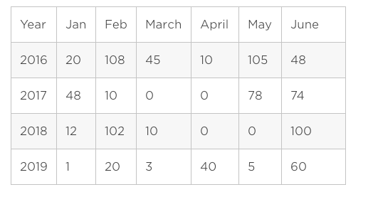
Let’s start by looking at a simple data grid visualization representing some data, including a visual hint. I’m going to use some arbitrary dates-and-counts data representing the kind of dataset we’re all familiar with, as shown in the following table:
让我们先看一下表示某些数据(包括视觉提示)的简单数据网格可视化。 我将使用一些任意的日期和计数数据来表示我们都熟悉的数据集的类型,如下表所示:
With a React Data Grid, the page code looks something like this:
使用React Data Grid,页面代码看起来像这样:
import React from "react";import ReactDataGrid from "react-data-grid";import { Sparklines, SparklinesLine, SparklinesSpots } from "react-sparklines";const Sparkline = ({ row }) => (
<Sparklines
data={[row.jan, row.feb, row.mar, row.apr, row.may, row.jun]}
margin={6}
height={40}
width={200}
>
<SparklinesLine
style={{ strokeWidth: 3, stroke: "#336aff", fill: "none" }}
/>
<SparklinesSpots
size={4}
style={{ stroke: "#336aff", strokeWidth: 3, fill: "white" }}
/>
</Sparklines>
);const columns = [
{ key: "year", name: "Year" },
{ key: "jan", name: "January" },
{ key: "feb", name: "February" },
{ key: "mar", name: "March" },
{ key: "apr", name: "April" },
{ key: "may", name: "May" },
{ key: "jun", name: "June" },
{ name: "Info", formatter: Sparkline },
];const rows = [
{ year: 2016, jan: 20, feb: 108, mar: 45, apr: 10, may: 105, jun: 48 },
{ year: 2017, jan: 48, feb: 10, mar: 0, apr: 0, may: 78, jun: 74 },
{ year: 2018, jan: 12, feb: 102, mar: 10, apr: 0, may: 0, jun: 100 },
{ year: 2019, jan: 1, feb: 20, mar: 3, apr: 40, may: 5, jun: 60 },
];export default function ReactDataGridPage() {
return (
<ReactDataGrid
columns={columns}
rowGetter={(i) => rows[i]}
rowsCount={rows.length}
/>
);
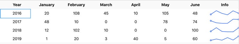
}For displaying charts and other graphics, I need to rely on third-party libraries. In the above case, I installed react-sparklines to demonstrate a sparkline. The columns are defined using an object. For the sparkline, I fall back to a custom formatter without a backing field.
为了显示图表和其他图形,我需要依赖第三方库。 在上述情况下,我安装了react-sparklines来演示迷你图。 列是使用对象定义的。 对于迷你图,我会回到没有后备字段的自定义格式化程序。
The result shows up like this:
结果显示如下:
创建一个高级React数据网格 (Creating an Advanced React Data Grid)
Now let’s display the same data with FlexGrid. For about the same amount of code, you get a much better looking and more flexible display of data. The page code now looks like this:
现在,让我们使用FlexGrid显示相同的数据。 对于大约相同数量的代码,您将获得更好的外观和更灵活的数据显示。 页面代码现在看起来像这样:
import "@grapecity/wijmo.styles/wijmo.css";import React from "react";import { CollectionView } from "@grapecity/wijmo";import { FlexGrid, FlexGridColumn } from "@grapecity/wijmo.react.grid";import { CellMaker, SparklineMarkers } from "@grapecity/wijmo.grid.cellmaker";import { SortDescription } from "@grapecity/wijmo";const data = [
  { year: 2016, jan: 20, feb: 108, mar: 45, apr: 10, may: 105, jun: 48 },
  { year: 2017, jan: 48, feb: 10, mar: 0, apr: 0, may: 78, jun: 74 },
  { year: 2018, jan: 12, feb: 102, mar: 10, apr: 0, may: 0, jun: 100 },
  { year: 2019, jan: 1, feb: 20, mar: 3, apr: 40, may: 5, jun: 60 },
];export default function WijmoPage() {
  const [view] = React.useState(() => {
    const view = new CollectionView(
      data.map((item) => ({
        ...item,
        info: [item.jan, item.feb, item.mar, item.apr, item.may, item.jun],
      }))
    );
    return view;
  });  const [infoCellTemplate] = React.useState(() =>
    CellMaker.makeSparkline({
      markers: SparklineMarkers.High | SparklineMarkers.Low,
      maxPoints: 25,
      label: "Info",
    })
  );  return (
    <FlexGrid itemsSource={view}>
      <FlexGridColumn header="Year" binding="year" width="*" />
      <FlexGridColumn header="January" binding="jan" width="*" />
      <FlexGridColumn header="February" binding="feb" width="*" />
      <FlexGridColumn header="March" binding="mar" width="*" />
      <FlexGridColumn header="April" binding="apr" width="*" />
      <FlexGridColumn header="May" binding="may" width="*" />
      <FlexGridColumn header="June" binding="jun" width="*" />
      <FlexGridColumn
        header="Info"
        binding="info"
        align="center"
        width={180}
        allowSorting={false}
        cellTemplate={infoCellTemplate}
      />
    </FlexGrid>
  );
}
Most notably, the Wijmo data grid defines the columns declaratively in React. For the sparkline cell, a CollectionView is used. Using useState, I can cache the data and keep it alive between re-renderings — no expensive computation required.
最值得注意的是,Wijmo数据网格在React中以声明方式定义列。 对于迷你图单元格,使用CollectionView。 使用useState,我可以缓存数据并使它们在重新渲染之间保持活动状态-无需昂贵的计算。
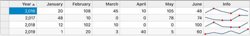
Here, the default result has a look that resembles a real spreadsheet app:
在这里,默认结果的外观类似于真实的电子表格应用程序:
Since the data grid is the largest component in the application, it’s good practice to lazy-load it. If you’ll only use the data grid on a single page, it’s sufficient to lazy-load that particular page and avoid additional complexity:
由于数据网格是应用程序中最大的组件,因此最好是延迟加载它。 如果只在单个页面上使用数据网格,那么懒惰加载该特定页面就足够了,避免了额外的复杂性:
import * as React from "react";import { Switch, Route } from "react-router-dom";const PageWithDatagrid = React.lazy(() => import("./pages/DatagridPage"));export const Routes = () => (
  <Switch>
    {/* ... */}
    <Route path="/datagrid" component={PageWithDatagrid} />
  </Switch>
);
The only requirement is that the lazy-loaded module has a proper default export:
唯一的要求是延迟加载的模块具有正确的默认导出:
export default function PageWithDatagrid() {
  return /* ... */;
}
All unique dependencies (for instance, the data grid component) should be contained in the side-bundle. This side-bundle will have a significant impact on startup performance.
所有唯一的依存关系(例如,数据网格组件)都应包含在边束中。 此捆绑包将对启动性能产生重大影响。
加载数据的最佳做法 (Best Practices for Loading Data)
In these examples, I just loaded some hard-coded data. In real applications, you’re most likely going to grab dynamic data from an external source like a file, a database, or an API.
在这些示例中,我仅加载了一些硬编码数据。 在实际的应用程序中,您很可能会从文件,数据库或API等外部来源获取动态数据。
While loading data is usually considered a mostly back-end topic, there are some front-end considerations that need to be discussed. Most importantly, having an API that delivers non-bounded amounts of data would be problematic. One common issue is that the rendering of the entire dataset is either really slow or only happening in chunks, leaving parts of the data unused.
虽然加载数据通常被认为是一个主要的后端主题,但仍需要讨论一些前端注意事项。 最重要的是,拥有一个可传递无限制数据量的API会带来问题。 一个普遍的问题是,整个数据集的渲染实际上是很慢的,或者只是分块进行,而使部分数据未使用。
To circumvent the above issues, some APIs allow pagination. In the most simple form, you communicate a page number to the API, which then calculates the offset in the dataset. For reliable pagination and maximum flexibility, the pagination mechanism actually should use a pointer — a marker for the last emitted data item.
为了避免上述问题,某些API允许分页。 以最简单的形式,您将页码传达给API,然后API计算出数据集中的偏移量。 为了获得可靠的分页和最大的灵活性,分页机制实际上应使用一个指针-最后发射的数据项的标记。
To include a paginated API in the Wijmo data grid, use an ICollectionView instance. If your API supports OData, then you can simply use the ODataCollectionView for this task.
若要在Wijmo数据网格中包含分页的API,请使用ICollectionView实例。 如果您的API支持OData,则只需使用ODataCollectionView即可完成此任务。
For instance, the following view serves six items per page:
例如,以下视图每页提供六个项目:
const view = new ODataCollectionView(url, 'Customers', {
  pageSize: 6,
  pageOnServer: true,
  sortOnServer: true,
});
In general, standard CollectionView can be used for asynchronous data loading, too:
通常,标准CollectionView也可以用于异步数据加载:
const [view, setView] = React.useState(() => new CollectionView());React.useEffect(() => {
  fetch('https://jsonplaceholder.typicode.com/posts')
    .then(res => res.json())
    .then(posts => setView(view => {
      view.sourceCollection = data;
      return view;
    }));
}, []);// render datagrid
The code above is not perfect: asynchronous operations should be appropriately cleaned up with a disposer. A better version of useEffect would be:
上面的代码并不完美:异步操作应使用处置程序进行适当清理。 更好的useEffect版本是:
React.useEffect(() => {
  const controller = new AbortController();
  const { signal } = controller;  fetch('https://jsonplaceholder.typicode.com/posts', { signal })
    .then(res => res.json())
    .then(/* ... */);  return () => controller.abort();
}, []);
Besides calling the API directly, you may be concerned with cross-origin resource sharing (CORS). CORS is a security mechanism in the browser that affects performing requests to domains other than the current one.
除了直接调用API外,您可能还会担心跨域资源共享(CORS) 。 CORS是浏览器中的一种安全机制,会影响对当前域以外的域的执行请求。
One crucial aspect besides the implicit CORS request and response pattern, including the so-called preflight requests, is the delivery of credentials by, for example, a cookie. By default, the credentials are only sent to same-origin requests.
除了隐式CORS请求和响应模式(包括所谓的飞行前请求)以外,一个关键方面是通过cookie传递凭据。 默认情况下,凭据仅发送给同源来源的请求。
The following will also deliver the credentials to other services — if the service responded correctly to the preflight (OPTIONS) request:
如果服务正确响应预检(OPTIONS)请求,则以下内容还将凭据传递给其他服务:
fetch('https://jsonplaceholder.typicode.com/posts', { credentials: 'include' })So far, data calling has been done on mounting the component. This method is not ideal. It not only implies always needing to wait for the data but also makes cancellations and other flows harder to implement.
到目前为止,已在安装组件时完成了数据调用。 此方法不理想。 这不仅意味着始终需要等待数据,而且还使得取消和其他流程难以实施。
What you want is some global data state, which could be easily (and independently of a particular component’s lifecycle) accessed and changed. While state container solutions, such as Redux, are the most popular choices, there are simpler alternatives.
您想要的是一些全局数据状态,可以轻松地(独立于特定组件的生命周期)对其进行访问和更改。 虽然状态容器解决方案(例如Redux)是最受欢迎的选择,但还有其他更简单的选择。
One possibility here is to use Zustand (“state” in German). You can model all data-related activities as manipulations on the globally defined state object. Changes to this object are reported via React hooks.
一种可能是使用Zustand (德语为“ state”)。 您可以将所有与数据相关的活动建模为对全局定义的状态对象的操作。 通过React钩子报告对该对象的更改。
// state.jsimport create from 'zustand';const [useStore] = create(set => ({
  data: undefined,
  load: () =>
    fetch('https://jsonplaceholder.typicode.com/posts')
      .then(res => res.json())
      .then(posts => set({ data: posts })),
}));export { useStore };// datagrid.jsimport { useStore } from './state';
// ...export default function MyDataGridPage() {
  const data = useStore(state => state.data);
  const load = useStore(state => state.load);
  const view = new CollectionView(data);  React.useEffect(() => {
    if (!data) {
      load();
    }
  }, [data]);  return (
    <FlexGrid itemsSource={view} />
  );
}
下一步 (Next Steps)
Data grids have become incredibly popular and flexible tools for displaying, organizing, and even editing data in all kinds of applications. Using FlexGrid you can build Angular, React, and Vue data grids quickly and easily — in under five minutes.
数据网格已成为非常流行和灵活的工具,可以在各种应用程序中显示,组织甚至编辑数据。 使用FlexGrid,您可以在五分钟之内快速轻松地构建Angular , React和Vue数据网格。
Originally published at https://www.grapecity.com on August 19, 2020.
最初于 2020年8月19日 发布在 https://www.grapecity.com 上。
翻译自: https://medium.com/grapecity/react-data-grids-a-complete-guide-c7e2c23ff678
react data过滤


 扫一扫
扫一扫


 1742
1742

 被折叠的 条评论
为什么被折叠?
被折叠的 条评论
为什么被折叠?
 到【灌水乐园】发言


