


react 入门
React Spectrum is a collection of libraries authored by Adobe Team to help developers build a feature-rich application with React. It has three main libraries that you can use together or separately as you see fit:
React Spectrum是Adobe Team创作的一组库,可帮助开发人员使用React构建功能丰富的应用程序。 它具有三个主要库,您可以根据需要将它们一起使用或分别使用:
React Spectrum is an implementation of Spectrum, Adobe’s design system.
React Spectrum是Adobe设计系统Spectrum的实现。
React Aria is a collection of hooks to provide accessible UI primitives such as internationalization and consistent interaction across all devices
React Aria是一个钩子集合,用于提供可访问的UI原语,例如国际化和跨所有设备的一致交互
React Stately is another collection of hooks, but focused on enabling cross-platform state management
React Stately是钩子的另一个集合,但专注于启用跨平台状态管理
Combined together, React Spectrum gives you a head start in developing a web application that goes beyond the bare minimum and delivers a superior user experience.
结合在一起,React Spectrum为您提供了开发Web应用程序的领先优势,该应用程序超出了最低要求,并提供了卓越的用户体验。
This post will help you learn what problem React Spectrum is trying to solve and how to get started using it.
这篇文章将帮助您了解React Spectrum正在尝试解决什么问题以及如何开始使用它。
You’re also invited to review/install my demo components shared on Bit:

设计系统的问题 (The problem with design systems)
Even with the help of modern front-end libraries like React, Vue, and Angular, it’s still pretty difficult to create a web application that meets the high standard of UI consistency, accessibility, internationalization, and usability. This is why a design system is so popular today.
即使借助React,Vue和Angular等现代前端库,创建满足UI一致性,可访问性,国际化和可用性的高标准的Web应用程序仍然非常困难。 这就是为什么设计系统如此流行的原因 。
But creating a design system that meets the UI standard is both time and money consuming. From my experience, I always see developers and designers putting too much focus on the component style while leaving accessibility and internationalization out of the foundation. No one has time to think about these when the company is just starting out!
但是创建符合UI标准的设计系统既费时又费钱。 根据我的经验,我总是看到开发人员和设计师将过多的精力放在组件样式上,而将可访问性和国际化置于基础之外。 当公司刚起步时,没有人有时间考虑这些!
This is understandable when you consider how hard it is to make localization works. You need to think about string translations, localize date and number formats, enable right-to-left interactions, and many more.
当您考虑使本地化工作非常困难时,这是可以理解的。 您需要考虑字符串翻译,本地化日期和数字格式,启用从右到左的交互等等 。
That’s why React Spectrum is so valuable. It leverages Adobe’s experience in designing and developing a feature-rich UI to give you a head start in implementing all these nitty-gritty details that make great UX for all devices.
这就是为什么React Spectrum如此有价值的原因。 它利用Adobe在设计和开发功能丰富的UI方面的经验,使您在实施所有这些细微的细节方面处于领先地位,这些细节为所有设备提供了出色的UX。
React Spectrum如何帮助您 (How React Spectrum helps you)
React Spectrum provides you with components that are adaptive to interactions and different screen sizes. It includes full-screen reader and keyboard navigation support for accessibility.
React Spectrum为您提供了适合交互和不同屏幕尺寸的组件。 它包括全屏阅读器和键盘导航支持以实现可访问性。
Components provided by the library follow Spectrum’s design guidelines as props, so you won’t use regular HTML attributes like “class” and “aria-label”. It also has theming implemented so you can switch your application’s theme easily
该库提供的组件作为道具遵循Spectrum的设计指南,因此您将不会使用常规HTML属性,例如“ class”和“ aria-label”。 它还实现了主题设置,因此您可以轻松切换应用程序的主题
To use React Spectrum, you need to install the library package:
要使用React Spectrum,您需要安装库软件包:
npm install And then use its Provider container to define its theme, locale, and other application settings:
然后使用其提供程序容器定义其主题,区域设置和其他应用程序设置:
import {Provider, defaultTheme, Button} from '@adobe/react-spectrum';function App() {
  return (
    <Provider theme={defaultTheme}>
      <Button variant="cta">Hello React Spectrum!</Button>
    </Provider>
  );
}
You can see a working demo of the code above here:
您可以在此处查看上面代码的工作演示:
React Spectrum also provides you with both Flex and Grid layout system, so you can choose which layout your team is going to go with:
React Spectrum还为您提供Flex和Grid布局系统,因此您可以选择团队要使用的布局:
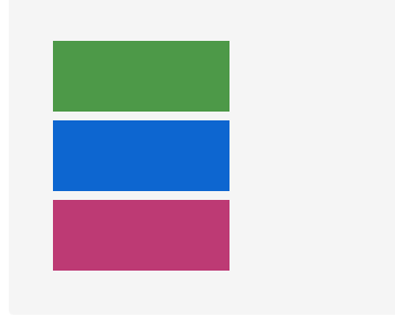
import {Flex} from '@adobe/react-spectrum'// the component<Flex direction="column" width="size-2000" gap="size-100">
  <View backgroundColor="celery-600" height="size-800" />
  <View backgroundColor="blue-600" height="size-800" />
  <View backgroundColor="magenta-600" height="size-800" />
</Flex>
Will be rendered as:
将呈现为:
While Grid component:
而网格组件:
import {Grid} from '@adobe/react-spectrum'// the component
<Grid
  areas={['header  header', 'sidebar content', 'footer  footer']}
  columns={['1fr', '3fr']}
  rows={['size-1000', 'auto', 'size-1000']}
  height="size-6000"
  gap="size-100">
  <View backgroundColor="celery-600" gridArea="header" />
  <View backgroundColor="blue-600" gridArea="sidebar" />
  <View backgroundColor="purple-600" gridArea="content" />
  <View backgroundColor="magenta-600" gridArea="footer" />
</Grid>
Will be rendered as:
将呈现为:

Aside from all the good component-based UI, React Spectrum also includes a guide on how to test the application you build with it, so if you’re interested in building your React application following Adobe’s design for its UI elements, you’re not going to regret using it.
除了所有良好的基于组件的UI外,React Spectrum还包括有关如何测试使用它构建的应用程序的指南,因此,如果您有兴趣按照Adobe针对其UI元素的设计来构建React应用程序,会后悔使用它。
React Aria如何运作 (How React Aria works)
The main purpose of React Aria is to help you implement accessibility across all devices for everyone. This includes people with all types of disabilities: vision, auditory, motor, and cognitive disabilities.
React Aria的主要目的是帮助您实现所有人在所有设备上的可访问性。 这包括各种类型的残疾人:视觉,听觉,运动和认知障碍。
What’s great about React Aria is that each hook is grouped together under one particular package that you can install separately. This will allow you to incrementally adopt the hooks into your component one by one.
React Aria的优点在于,每个挂钩都归为一个特定的软件包,您可以单独安装。 这将使您可以将钩子逐步地逐步引入到组件中。
React Aria has component hooks that allow you to build consistent non-styled components across different devices, which of course you can style them if you want.
React Aria具有组件挂钩,可让您在不同设备上构建一致的非样式化组件,当然您也可以根据需要对其进行样式设置。
For example, there’s the useButton hook that renders a button with the following features:
例如,有一个 useButton 钩子呈现具有以下功能的按钮:
Native HTML
<button>support原生HTML
<button>支持<a>and custom element type support via ARIA<a>和通过ARIA支持的自定义元素类型- Mouse and touch event handling, and press state management 鼠标和触摸事件处理以及按状态管理
- Keyboard focus management and cross-browser normalization 键盘焦点管理和跨浏览器标准化
- Keyboard event support for Space and Enter keys 键盘事件支持空格键和Enter键
Here is how you implement the hook:
这是实现钩子的方法:
function Button(props) {
  let ref = useRef();
  let {buttonProps} = useButton(props, ref);
  let {children} = props;return (
    <button {...buttonProps} ref={ref}>
      {children}
    </button>
  );
}<Button onPress={() => alert('Button pressed!')}>Test</Button>
Another unique feature of React Aria is its focus hooks. FocusRing helps keyboard users determine which element on a page has keyboard focus by giving specific styling into the element, usually a blue border:
React Aria的另一个独特功能是它的焦点挂钩。 FocusRing通过为元素提供特定样式(通常是蓝色边框) 来帮助键盘用户确定页面上哪个元素具有键盘焦点。
// style.button {
  -webkit-appearance: none;
  appearance: none;
  background: green;
  border: none;
  color: white;
  font-size: 14px;
  padding: 4px 8px;
}.button.focus-ring {
  outline: 2px solid dodgerblue;
  outline-offset: 2px;
}// component<FocusRing focusRingClass="focus-ring">
  <button className="button">Test</button></FocusRing>
Here is a working demo of the FocusRing hook:
这是FocusRing挂钩的工作演示:
When you’re not using CSS classes for styling such as styled-components, you can use the useFocusRing hook:
当您不使用CSS类(例如样式组件)进行样式设置时,可以使用useFocusRing挂钩:
function Example() {
  let {isFocusVisible, focusProps} = useFocusRing();return (
    <button
      {...focusProps}
      style={{
        WebkitAppearance: 'none',
        appearance: 'none',
        background: 'green',
        border: 'none',
        color: 'white',
        fontSize: 14,
        padding: '4px 8px',
        outline: isFocusVisible ? '2px solid dodgerblue' : 'none',
        outlineOffset: 2
      }}>
      Test
    </button>
  );
}
Finally, React Aria also provides support for internationalization to help your application adapt to a particular language or region. The i18nProvider component allows you to override the default locale from the browser with a locale defined by your application:
最后,React Aria还为国际化提供支持,以帮助您的应用程序适应特定的语言或地区。 i18nProvider组件允许您使用应用程序定义的语言环境覆盖浏览器中的默认语言环境:
import {I18nProvider} from '@react-aria/i18n';<I18nProvider locale="fr-FR">
  <YourApp />
</I18nProvider>
如何React庄严的工作 (How React Stately works)
React Stately is a library of hooks that provides cross-platform state management for your design system. It could run on the web, react-native, or any other platform.
React Stately是一个挂钩库,可为您的设计系统提供跨平台状态管理。 它可以在Web,react-native或任何其他平台上运行。
For example, you can implement useRadioGroupState to help store the state of a Radio button group without the need to define your own onChange function:
例如,您可以实现useRadioGroupState来帮助存储单选按钮组的状态,而无需定义自己的onChange函数:
import {useRadioGroupState} from '@react-stately/radio';function RadioGroup(props) {
  let state = useRadioGroupState(props);return (
    <>
      <label>
        <input
          type="radio"
          name={state.name}
          checked={state.selectedValue === 'dogs'}
          onChange={() => state.setSelectedValue('dogs')}
        />
        Dogs
      </label>
      <label>
        <input
          type="radio"
          name={state.name}
          checked={state.selectedValue === 'cats'}
          onChange={() => state.setSelectedValue('cats')}
        />
        Cats
      </label>
    </>
  );
}<RadioGroup
  defaultValue="dogs"
  onChange={(value) => alert(`Selected ${value}`)}
/>
Here is a working useRadioGroupState example:
这是一个有效的useRadioGroupState示例:
Most hooks from React Stately is like a regular useState hook with immutability baked in. When using it for the web, you can pair it with React Aria to provide accessibility and user interactions for the components. Just like React Aria, React Stately can be implemented incrementally.
React Stately的大多数钩子就像带有不可变性的常规useState钩子一样。当将其用于Web时,可以将其与React Aria配对以提供组件的可访问性和用户交互。 就像React Aria一样,React Stately可以逐步实现。
结论 (Conclusion)
Many companies and teams just don’t have the resources to prioritize features like accessibility, internationalization, full keyboard navigation, and touch interactions. Most of us are busy enough with shipping the core application feature.
许多公司和团队只是没有资源来优先考虑诸如可访问性,国际化,完整的键盘导航和触摸交互之类的功能。 我们大多数人都忙于交付核心应用程序功能。
This is why React Spectrum is so valuable for many teams. These libraries are designed so that you can share the logic of your application to many components across different devices incrementally. With React Spectrum, you don’t have to invest time and money to create a design system that supports accessibility and internationalization anymore.
这就是为什么React Spectrum对许多团队如此有价值的原因。 设计这些库是为了使您可以逐步将应用程序的逻辑共享给不同设备上的许多组件。 使用React Spectrum ,您不必花费时间和金钱来创建一个支持可访问性和国际化的设计系统。
相关故事 (Related Stories)
翻译自: https://blog.bitsrc.io/getting-started-with-adobes-react-spectrum-15322be00c12
react 入门


 1048
1048

 被折叠的 条评论
为什么被折叠?
被折叠的 条评论
为什么被折叠?
 到【灌水乐园】发言


