


jetpack
Jetpack撰写 (Jetpack Compose)
Hello everyone, there’s been a lot going on in the android community, a lot of changes are coming up and one of them is Jetpack Compose.
大家好,android社区发生了很多事情,即将进行很多更改,其中之一就是Jetpack Compose。
Those who know what Jetpack Compose is can skip this part.
那些知道什么是Jetpack Compose的人可以跳过这一部分。
介绍 (Introduction)
Jetpack Compose simplifies and accelerates UI development on Android. Quickly bring your app to life with less code, powerful tools, and intuitive Kotlin APIs. — Android Developers
Jetpack Compose简化并加速了Android上的UI开发。 使用更少的代码,强大的工具和直观的Kotlin API,快速使您的应用程序栩栩如生。 -Android开发人员
Or you can understand it by the following points :
或者您可以通过以下几点来理解它:
A new to develop Android Apps UI:
开发Android Apps用户界面的新功能:
Less Code: No more Recycler view Adapters and XML files.
更少的代码:没有更多的Recycler视图适配器和XML文件。
Intuitive: As app state changes, your UI automatically updates.
直观:随着应用状态的变化,您的用户界面会自动更新。
Faster App development: Lesser lines of code, live preview, UI and functionality in a single function.
更快的应用程序开发:单个功能中的代码行,实时预览,UI和功能更少。
Powerful: In built support for most of the things like (Material design, dark theme, animations and more). No external library needed.
强大:内置支持大多数功能,例如(材料设计,深色主题,动画等)。 无需外部库。
我现在应该使用它吗? (Should I use it now ?)
Right now, it is in development which means a lot of changes will occur before it will be in the production. So, to answer your question I will say that if you are an enthusiast and want to learn something which can benefit you in the near future then you should definitely start using it for your own projects.
目前,它正在开发中,这意味着在将其投入生产之前,将会发生许多变化。 因此,要回答您的问题,我会说,如果您是一个发烧友,并且想学习一些可以在不久的将来使您受益的东西,那么您绝对应该开始将其用于自己的项目。
我从哪说起呢 ? (Where do I start ?)
- Start with the simple design. 从简单的设计开始。
- Move to the complex UI. 移至复杂的UI。
- Integrate functionality to it. 集成功能。
依存关系 (Dependencies)
These configuration are for compose version : 0.1.0-dev13
这些配置适用于撰写版本: 0.1.0-dev13
Download Android Studio in which compose is available. Right now, it is available in Canary version.
下载可在其中进行撰写的Android Studio 。 目前,它具有Canary版本。
android {
    ...
    buildFeatures {
        compose true
    }
    compileOptions {
        sourceCompatibility JavaVersion.VERSION_1_8
        targetCompatibility JavaVersion.VERSION_1_8
    }
    kotlinOptions {
        jvmTarget = '1.8'
    }
    composeOptions {
        kotlinCompilerExtensionVersion "0.1.0-dev13"
    }
}dependencies {...        implementation 'androidx.ui:ui-core:0.1.0-dev13'
    implementation 'androidx.ui:ui-tooling:0.1.0-dev13'
    implementation 'androidx.ui:ui-layout:0.1.0-dev13'
    implementation 'androidx.ui:ui-material:0.1.0-dev13'}
In this blog, we will design a simple UI which will cover the use of different components available in the Jetpack Compose.
在此博客中,我们将设计一个简单的UI,其中将涵盖Jetpack Compose中可用的不同组件的使用。
我们要建立什么? (What we are going to build ?)
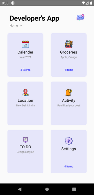
We will build this UI in two parts:
我们将分两部分构建此UI:
- Header: It includes heading and sub heading at the top and one image on the top left. 页眉:它的标题和子标题位于顶部,而一幅图像位于左上方。
- Body: It includes all the six blocks. 身体:它包括所有六个块。
Before starting to code, import all the icons which you will need in the design from here.
在开始编码之前,请从 此处 导入设计中需要的所有图标 。
标头 (Header)
@Composable
fun header() {
    Row(horizontalArrangement = Arrangement.SpaceBetween,
            modifier = Modifier.fillMaxWidth(),
            verticalGravity = Alignment.CenterVertically) {
        Column {
            Text(text = "Developer's App", color = Color.Black, fontSize = TextUnit.Sp(29),
                    fontFamily = FontFamily.SansSerif,
                    style = TextStyle(fontWeight = FontWeight.Bold),
                    modifier = Modifier.padding(top = 30.dp, start = 40.dp))
            Row {
                Text(text = "Home", color = Color.Gray, fontSize = TextUnit.Sp(13),
                        fontFamily = FontFamily.SansSerif,
                        modifier = Modifier.padding(start = 40.dp, top = 3.dp))
                Image(vectorResource(id =  R.drawable.down))
            }
        }
        Image(imageResource(id =  R.drawable.message),
                modifier = Modifier.padding(end = 40.dp).width(35.dp).height(35.dp))
    }}
Here 4 components of Jetpack compose are used:
这里使用了Jetpack compose的4个组件:
- Text a.k.a TextView 文字又称为TextView
- Column a.k.a Vertical LinearLayout 列又称垂直LinearLayout
- Row a.k.a Horizontal LinearLayout 行又称水平LinearLayout
- Image a.k.a ImageView 图像又名ImageView
Inside the column of these components are their properties which you can get by their names.
这些组件的列内是它们的属性,您可以通过它们的名称获得它们。
fillMaxWidth() -> match_parentSome important things which you need to keep in mind :
您需要记住一些重要的事情:
If you are using a drawable image which is in .xml format. Then, you will have to use vectorResource. Otherwise, you can use imageResource for any other format.
如果您使用的是.xml格式的可绘制图像。 然后,您将不得不使用vectorResource。 否则,您可以将imageResource用于任何其他格式。
Arrangement in Row is space between its component. If I am using Arrangement.SpaceBetween it means that both the component will aligned at their respective side ends and space will be in between. There are two more types of Arrangement which I will not tell. Do your hands dirty in them😁
行中的排列是其组件之间的空间。 如果我使用的是Arrangement.SpaceBetween,则意味着这两个组件将在其各自的侧端对齐,并且两者之间将有间隔。 我不会讲另外两种安排。 你的手弄脏了吗?
Properties like padding, width, height, etc. are available in Modifier.
修改器中提供了诸如填充,宽度,高度等属性。
Important Note:
重要的提示:
Every function that you will access with the Modifier instance returns the instance of modifier only. So with this you can call multiple functions in the same line.
每一个功能,您将与修改实例访问返回的只是修改实例。 因此,您可以在同一行中调用多个函数。
For example :
例如 :
Modifier.fillMaxHeight().fillMaxWidth()
        .gravity(Alignment.CenterHorizontally).padding(top = 15.dp)
身体 (Body)
First, we will have to design the item layout and that layout will be resused in all the six blocks.
首先,我们将必须设计项目布局,并且该布局将在所有六个块中重新使用。
@Composable
fun itemLayout(title: String, subTitle: String, description: String, image: Int) {
    Box(backgroundColor = Color(red = 230, green = 230, blue = 250),
            modifier = Modifier
                    .clip(shape = RoundedCornerShape(8.dp))
                    .width(150.dp).height(180.dp)) {
        ConstraintLayout(modifier = Modifier.fillMaxHeight().fillMaxWidth()
                .gravity(Alignment.CenterHorizontally).padding(top = 15.dp),
                constraintSet = ConstraintSet {
                    val imageComponent = tag("image")
                    val titleComponent = tag("title")
                    val subTitleComponent = tag("subTitle")
                    val descriptionComponent = tag("description")
                    imageComponent.apply {
                        top constrainTo parent.top
                        left constrainTo parent.left
                        right constrainTo parent.right
                    }
                    titleComponent.apply {
                        top constrainTo imageComponent.bottom
                        left constrainTo parent.left
                        right constrainTo parent.right
                    }
                    subTitleComponent.apply {
                        top constrainTo titleComponent.bottom
                        left constrainTo parent.left
                        right constrainTo parent.right
                    }
                    descriptionComponent.apply {
                        bottom constrainTo parent.bottom
                        left constrainTo parent.left
                        right constrainTo parent.right
                        top constrainTo subTitleComponent.bottom
                    }
                }) {
            val typography = MaterialTheme.typography
            Image(imageResource(id = image),
                    modifier = Modifier.tag("image").padding(top = 15.dp))
            Text(text = title,
                    style = typography.body1,
                    modifier = Modifier.tag("title").padding(top = 5.dp))
            Text(text = subTitle,
                    color = Color.Gray,
                    fontSize = TextUnit.Sp(11),
                    modifier = Modifier.tag("subTitle").padding(top = 3.dp))
            Text(text = description,
                    color = Color.Blue,
                    fontSize = TextUnit.Sp(11),
                    modifier = Modifier.tag("description").padding(top = 16.dp))
        }
    }}
Before understanding it, copy and paste it in your file, have a preview of it. Change some properties and understand their result.
在理解它之前,请将其复制并粘贴到您的文件中,并对其进行预览。 更改一些属性并了解其结果。
New components :
新组件:
- Box — something like CardView. 框-类似于CardView。
- ConstraintLayout is same. ConstraintLayout相同。
- ConstraintSet is same. ConstraintSet是相同的。
- Modifier.tag is the id of the component. Modifier.tag是组件的ID。
What are we are doing in the above code ?
上面的代码中我们在做什么?
- There is a box with round corners, a colored background and particular width and height. 有一个带有圆角,彩色背景和特定宽度和高度的盒子。
- In that, there is a constraint layout, which have two parts. On for the constraint set where constraints are defined and another is the body where components are defined. 在这种情况下,存在一个约束布局,它有两个部分。 在定义约束的约束集上打开,在定义组件的主体上打开另一个约束。
- In the constraint set, first we are getting the component by their tag and then setting their constraints with respect to other. 在约束集中,我们首先通过组件的标签获取组件,然后相对于其他组件设置约束。
- With typography, we define the style the text : How it will look? 使用排版,我们定义文本的样式:其外观如何?
@Composable
fun rowWithTwoItem(tabs: List<TabModel>) {
    Row(modifier = Modifier.padding(top = 20.dp).fillMaxWidth(),
            horizontalArrangement = Arrangement.SpaceEvenly) {
        itemLayout(title = tabs[0].title, subTitle = tabs[0].subTitle,
                description = tabs[0].description, image = tabs[0].image)
        itemLayout(title = tabs[1].title, subTitle = tabs[1].subTitle,
                description = tabs[1].description, image = tabs[1].image)
    }}
@Composable
fun columnOfThree() {
    val tabList = AdapterData.getTabsData()
    Column {
        rowWithTwoItem(listOf(tabList[0], tabList[1]))
        rowWithTwoItem(listOf(tabList[2], tabList[3]))
        rowWithTwoItem(listOf(tabList[4], tabList[5]))
    }}@Preview
@Composable
fun main() {
    VerticalScroller {
        header()
        columnOfThree()
    }}
In this code :
在此代码中:
First, we are making a row of two items.
首先,我们要制作两个项目。
Then a column of these three rows
然后是这三行的一列
Which leads to completion of our UI.
这导致我们的用户界面完成。
We are passing data with the use of a model.
我们正在使用模型传递数据。
data class TabModel (
        val title:String = "",
        val subTitle:String = "",
        val description:String = "",
        val image:Int = 0
)
In this article we learned about the various components of Jetpack Compose and made a simple design by using them.
在本文中,我们了解了Jetpack Compose的各个组件,并通过使用它们进行了简单的设计。
I hope this article would have helped you. If you have any suggestions, queries or anything, write it in the comment section.
希望本文对您有所帮助。 如果您有任何建议,疑问或其他任何内容,请在评论部分中编写。
Happy Coding!
编码愉快!
翻译自: https://medium.com/swlh/jetpack-compose-part-1-design-7d49b313afd0
jetpack


 842
842


 被折叠的 条评论
为什么被折叠?
被折叠的 条评论
为什么被折叠?
 到【灌水乐园】发言


