


The Design Tools Suite in Android Studio is a collection of tools that aims to support developers in effectively designing, prototyping, building, and debugging their apps. These tools include but are not limited to a Layout Editor, Navigation Editor, Motion Editor, Resource Manager, and Layout Inspector. With Android Studio 4.1, we’ve focused our efforts on the backlog of users’ (your) feedback to enhance these existing tools — as a result, we’ve refined interactions and created missing features. Here’s a round-up of what we’ve done — a closer look at the UX refinements mentioned in the What’s new in Design Tools Talk!
Android Studio中的设计工具套件是一组工具的集合,旨在支持开发人员有效地设计,制作原型,构建和调试其应用。 这些工具包括但不限于布局编辑器,导航编辑器,运动编辑器,资源管理器和布局检查器。 借助Android Studio 4.1,我们将工作重点放在了积压的用户(您的)反馈上,以增强这些现有工具-结果,我们改进了交互并创建了缺少的功能。 这是我们所做工作的摘要-仔细研究“ 设计工具新功能”中提到的UX改进!
布局编辑器 (Layout editor)
ConstraintHelpers支持 (ConstraintHelpers support)
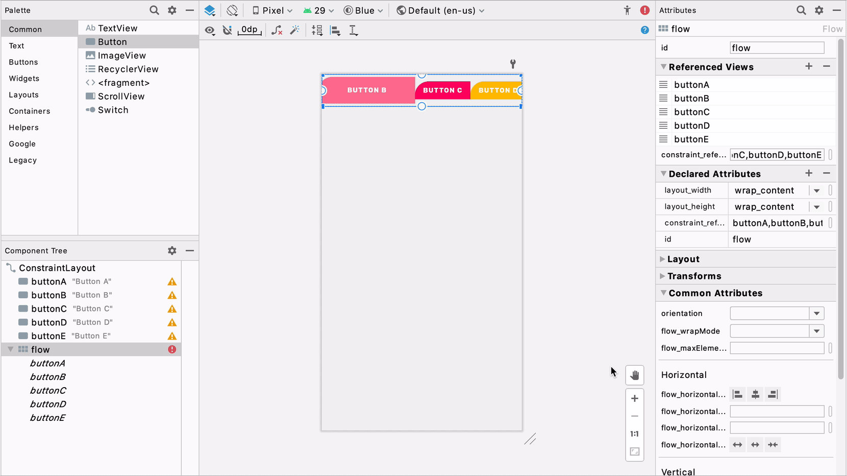
ConstraintHelpers such as Barriers and Guidelines were first introduced in ConstraintLayout 1.1 to allow multiple widgets to be referenced as input of an invisible view, and group-align them without code duplication. In 2.0, the helpers concept was extended: VirtualLayouts such as Flow and Groups were added to allow for simultaneously applying behaviors to all referenced widgets. For example, with Flow, views can be easily laid out horizontally or vertically with global adjustments of gaps and wrap styles.
ConstraintLayout 1.1中首次引入了诸如Barriers和Guidelines的ConstraintHelper,以允许多个小部件被引用为不可见视图的输入,并在不进行代码重复的情况下对它们进行分组对齐。 在2.0中,扩展了辅助程序概念:添加了诸如Flow和Groups之类的VirtualLayouts ,以允许将行为同时应用于所有引用的窗口小部件。 例如,使用Flow,可以通过全局调整间隙和环绕样式轻松地水平或垂直放置视图。
In Android Studio 4.1, we wanted to make sure our tools support and optimize the experience and interaction of using these helpers in the IDE. Thus, we first mapped out the user journey from discovery to creation to manipulation, and then we set out to increase efficiency for every step of the journey. For discovery, we added a helpers section in Palette so that it’s easy to find and use available helpers.
在Android Studio 4.1中,我们希望确保我们的工具支持并优化在IDE中使用这些帮助程序的体验和交互。 因此,我们首先规划了从发现到创建再到操纵的用户旅程,然后着手提高旅程的每一步的效率。 为了发现,我们在Palette中添加了一个帮助器部分,以便轻松查找和使用可用的帮助器。

For creation, you can now also select multiple views, and right-click to select a helper — we then automatically add the referenced id’s corresponding to what was selected.
对于创建,您现在还可以选择多个视图,然后单击鼠标右键以选择一个助手-然后,我们将自动添加与所选内容对应的引用ID。
For manipulation, we wanted to make Flow’s functionality more accessible, so we expanded the property panel with commonly used attributes specific to Flow, such as icons for quick alignment and a section for rearranging the order of referenced id’s.
为了进行操作,我们希望使Flow的功能更易于访问,因此我们使用了特定于Flow的常用属性扩展了属性面板,例如用于快速对齐的图标和用于重新排列引用ID顺序的部分。
设计时属性切换 (Design-time attributes toggle)
Android Studio offers a variety of tools attributes, which are XML attributes in the android:tools namespace that enable design-time features (i.e., showing the layout of a fragment). These attributes are removed when you build your app and have no effect on APK size or runtime behavior — they are merely to aid in the design / development process.
Android Studio提供了各种工具属性 ,它们是android:tools命名空间中的XML属性,用于启用设计时功能(即,显示片段的布局)。 当您构建应用程序时,这些属性将被删除,并且对APK的大小或运行时行为没有影响-它们仅用于帮助设计/开发过程。
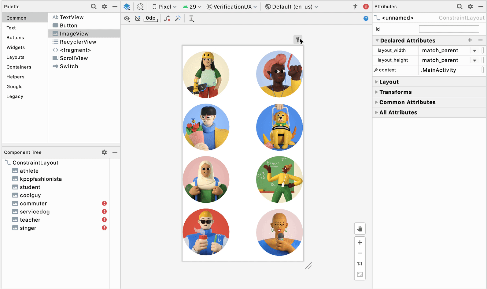
For building UI, we know that tools:visibility and absolute positioning (tools:layout_editor_absoluteX and tools:layout_editor_absoluteY) are two widely used tools attributes because they allow designers to temporarily show/hide UI as well as to position views precisely in the Layout Editor before setting constraints on them. However, we observed in user studies that it is difficult to know when and if views are set with tools attributes, such that users were surprised by discrepancies between the Layout Editor’s preview and the app’s rendering on an emulator or physical device. For example, in the screenshot below, the images in the right column have absolute positioning, and even though they look nicely laid out in the Layout Editor preview, in the emulator they’re all superimposed on one another in the top left corner.
对于构建UI,我们知道tools:可见性和绝对定位( tools:layout_editor_absoluteX和tools:layout_editor_absoluteY )是两个广泛使用的工具属性,因为它们允许设计人员临时显示/隐藏UI以及在布局编辑器中精确定位视图之前,设置约束。 但是,我们在用户研究中观察到,很难知道何时以及是否使用工具属性设置了视图,从而使用户对布局编辑器的预览与应用程序在模拟器或物理设备上的渲染之间的差异感到惊讶。 例如,在下面的屏幕截图中,右列中的图像具有绝对的位置,即使它们在“布局编辑器”预览中看起来很好地布局,在模拟器中,它们也都彼此重叠在左上角。
To resolve this, we decided to add a toggle near the design surface in the Layout Editor to allow users to easily turn on/off tools:visibility and absolute positioning.
为了解决这个问题,我们决定在“布局编辑器”中的设计图面附近添加一个切换开关,以允许用户轻松打开/关闭工具:可见性和绝对定位。
With the toggle, our goal is to provide users with a more accurate / non-design-time rendering and increased awareness about when they’re using these tools attributes.
通过切换,我们的目标是为用户提供更准确的/非设计时的渲染,并提高他们何时使用这些工具属性的意识。
组件树上的可见性控制 (Visibility control on component tree)
Visibility, as stated in the last section, is a very common and important attribute for a view. It’s particularly useful when you need to show/hide certain UIs based on different conditions or certain logic. For example, you may only want authenticated users to be able to see their user data. Thus, we wanted to optimize the visibility attribute by providing a quick way to easily set show/hide/gone visibility in the Layout Editor.
如上一节所述,可见性是视图的非常常见且重要的属性。 当您需要根据不同的条件或特定的逻辑显示/隐藏特定的UI时,此功能特别有用。 例如,您可能只希望经过身份验证的用户能够查看其用户数据。 因此,我们希望通过提供一种快速的方法来优化可见性属性,以便在布局编辑器中轻松设置显示/隐藏/消失的可见性。
Starting in 4.1, you will be able to use the visibility control picker in the component tree next to any view to quickly change it. This allows you to take one look at the tree and know how the views are shown based on visibility and change them according to whichever parts of the UI you would like to work on.
从4.1开始,您将能够使用任何视图旁边的组件树中的可见性控件选择器来快速对其进行更改。 这样一来,您可以查看树并了解如何基于可见性显示视图,并根据您要处理的UI的任何部分进行更改。

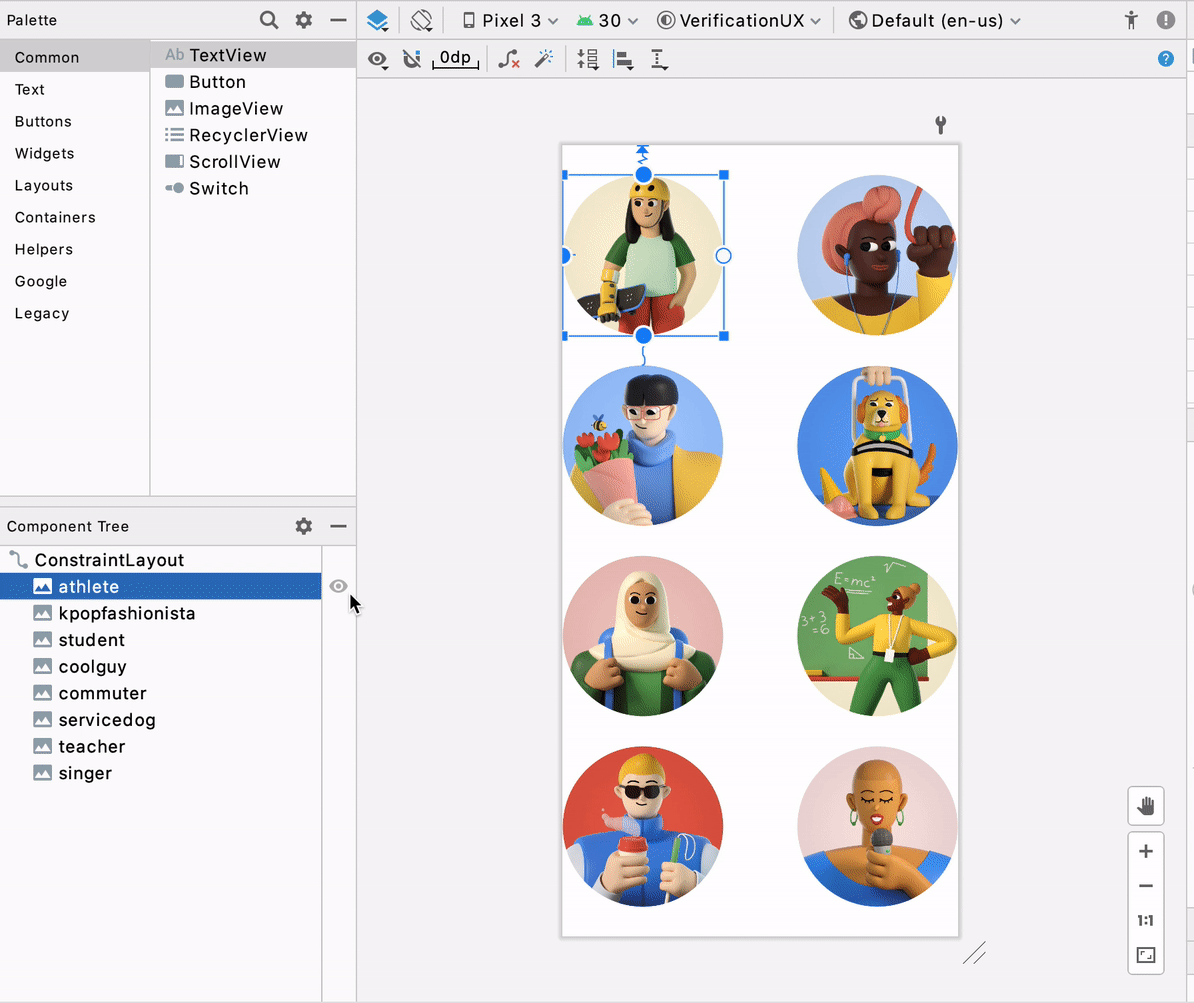
We included both the tools and android namespaces to accommodate different user needs. One thing to note here is that, during design-time, tools overrides android visibility, and thus this is reflected on the visibility controls as well — if you have a tools:visibility set, it will take precedence on the UI. For instance, in the screenshot below, the student image has an android:visibility = visible and tools:visibility = gone, and you can see that the tools visibility takes precedence.
我们同时包含了工具和android名称空间,以适应不同的用户需求。 这里要注意的一件事是,在设计时, 工具会覆盖android的可见性,因此这也反映在可见性控件上-如果您设置了tools:visibility ,它将在UI上优先。 例如,在下面的屏幕截图中,学生图像具有android:visibility = visible和tools:visibility = Goed ,您可以看到工具的可见性优先。

键盘快捷键+键盘映射设置 (Keyboard shortcuts + keymap settings)
We all recognize the power of keyboard shortcuts in boosting productivity and efficiency for development. In Studio 4.1, we performed an audit of all the keyboard shortcuts in the Design Tools Suite and registered them in Preferences > Keymap, allowing you to discover, change, and edit the shortcuts to best fit your work style.
我们都认识到键盘快捷键在提高开发效率和开发效率方面的作用。 在Studio 4.1中,我们对Design Tools Suite中的所有键盘快捷方式进行了审核,并将它们注册在Preferences> Keymap中,使您可以发现,更改和编辑最适合您的工作方式的快捷方式。
转换面板 (Transform panel)
We’ve heard feedback from developers asking for more precision when manipulating transform attributes on a view. To make it easier to fine tune your view’s transformation, we added a visualizer and sliders to help with 3D rotation of views. On the attribute panel, once you’ve selected a view, you can use the controls under “Transform” to make adjustments.
我们已经听取了开发人员的反馈,要求在操作视图上的变换属性时提高精度。 为了更轻松地微调视图的变换,我们添加了可视化器和滑块以帮助视图进行3D旋转。 在属性面板上,选择视图后,可以使用“变换”下的控件进行调整。
资源经理 (Resource manager)
天沟可拉取捡拾器 (Gutter drawable picker)
Back in Android studio 3.6, we introduced the Color picker resource tab, which helps you quickly update color resource values in your app. The picker pattern was very well received since the interaction here provided a seamless transition from something textual (code) to something visual (colors) — users can stay in context within their code editor while using this graphical user interface (GUI) accelerator at the same time. Thus, in 4.1, we applied the same concept to Drawables — now when you have a drawable resource in your file, you will find a gutter icon that allows you to quickly change drawable resources. Moreover, clicking on “browse” will open the resource dialog allowing for more extensive search.
早在Android Studio 3.6中,我们引入了“ 颜色选择器”资源标签 ,该标签可帮助您快速更新应用中的颜色资源值。 由于此处的交互提供了从文本(代码)到视觉(颜色)的无缝过渡,因此选择器模式非常受欢迎-用户可以同时在其代码编辑器中停留上下文,而同时使用此图形用户界面(GUI)加速器时间。 因此,在4.1中,我们将相同的概念应用于Drawables-现在,当文件中包含可绘制资源时,您将发现一个装订线图标,可用于快速更改可绘制资源。 此外,单击“浏览”将打开资源对话框,以便进行更广泛的搜索。
矢量资产图标自动下载 (Vector asset icon auto-download)
This update is perhaps not noticeable visually but is nevertheless significant. We received complaints about discrepancies between the Material icons on Material.io and those in our Vector Asset wizard. This was due to misalignment between Studio’s release cadence and updates to Material. To tackle this, we streamlined the process so that now every time Material updates their icon library, the Vector Asset wizard will also automatically update the library in the background. You can now expect we will always have the latest Material icons in the wizard! 🎉
此更新在视觉上可能不明显,但意义重大。 我们收到了有关材质的图标之间的差异投诉Material.io和那些在我们的矢量资源向导。 这是由于Studio的发布节奏与Material更新之间的不一致。 为了解决这个问题,我们简化了流程,以便现在每次Material更新其图标库时,Vector Asset向导也将在后台自动更新该库。 您现在可以期望我们在向导中将始终具有最新的Material图标! 🎉
导航编辑器 (Navigation editor)
新目的地树 (New destinations tree)
Split View was introduced as a new way of switching editing modes for design files in Android Studio 3.6, and this created opportunities for us to optimize the side-by-side view for navigation files and the Navigation Editor. One of those optimizations is to use the component tree structure to represent the destination graph in the Navigation Editor. This way, users can see all their destinations (including nested ones) and actions at a glance, and they map 1:1 to the code in split mode.
引入拆分视图作为在Android Studio 3.6中切换设计文件编辑模式的新方法,这为我们创造了优化导航文件和导航编辑器并排视图的机会。 这些优化之一是在导航编辑器中使用组件树结构表示目标图。 这样,用户可以一目了然地看到所有目的地(包括嵌套目的地)和操作,并且在拆分模式下将1:1映射到代码。
As a side note, this was beneficial for the health of our code base as it reuses common components across all our design tools.
顺便说一句,这对我们代码库的健康很有帮助,因为它在所有设计工具中重复使用了通用组件。
深度链接对话框的新属性+自动完成 (Deeplink dialog new attributes + autocomplete)
Navigation 2.3.0 introduces two new attribute types for deeplinks: MIME and Action. To align the tools functionalities with that of the library, we added them to the creation dialog for deeplinks in the Navigation Editor, with autocomplete and validation support.
导航2.3.0为深层链接引入了两种新的属性类型:MIME和Action。 为了使工具的功能与库的功能保持一致,我们将它们添加到了导航编辑器中用于深层链接的创建对话框中,并具有自动完成和验证支持。
运动编辑器 (Motion editor)
运动关键帧路径图 (Motion keyframe path graph)
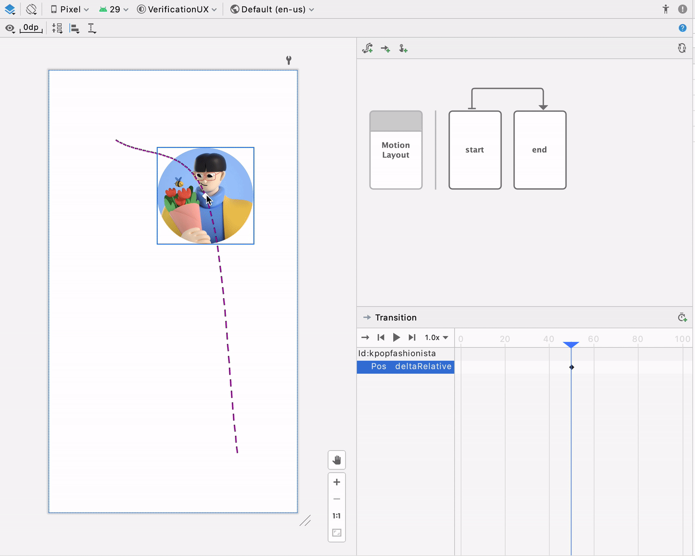
MotionLayout supports different types of keyframes, and one of most commonly used types is Position keyframes (<KeyPosition …/>), which allows developers to modify the path of a widget at a given time during the animation. With the Motion Editor, introduced in 4.0, users can directly manipulate these keyframes by dragging them directly on the surface. However, a problem with this workflow is that, depending on how the keyframe is set up, the attributes applied to the keyframe can mean different things. For example, dragging the keyframe 20% to the left, there is no context of whether this is 20% relative to the path or 20% relative to the parent. To solve this, in 4.1 we added an overlay of the coordinate system as well as axis ghost objects on the design surface during drag, so that every time developers want to manually edit the keyframes, they can better understand their bounding, axis, and direction.
MotionLayout支持不同类型的关键帧 ,最常用的类型之一是位置关键帧( <KeyPosition…/> ),它允许开发人员在动画期间的给定时间修改小部件的路径。 使用4.0版中引入的Motion编辑器,用户可以通过直接在表面上拖动它们来直接操纵这些关键帧。 但是,此工作流程的问题在于,取决于关键帧的设置方式,应用于关键帧的属性可能具有不同的含义。 例如,将关键帧向左拖动20%,就没有上下文可以确定这是相对于路径是20%还是相对于父对象是20%。 为了解决这个问题,在4.1中,我们在拖动过程中在设计图面上添加了坐标系以及轴幻影对象的叠加,以便每次开发人员想要手动编辑关键帧时,他们都可以更好地了解其边界,轴和方向。
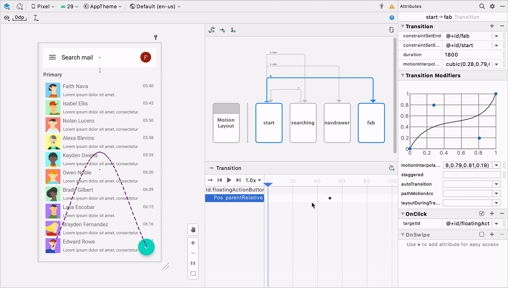
过渡曲线编辑器 (Transition curve editor)
Similar to the Transform panel in the Layout Editor mentioned above, we have heard feedback from developers about how it’s difficult to specify Transition curves with pure numbers. Thus, in 4.1, we added support for a GUI curve editor in the Motion Editor, allowing developers to perfect the curves with visualization and control handles.
与上面提到的“布局编辑器”中的“变换”面板类似,我们已经听到了开发人员的反馈,其中涉及到很难用纯数字指定过渡曲线。 因此,在4.1中,我们在Motion编辑器中添加了对GUI曲线编辑器的支持,从而使开发人员可以通过可视化和控制手柄完善曲线。
We hope that you are excited to try out these new improvements! We are constantly gathering feedback and applying them to improve our tools. The goal of the Design Tools Suite is to support, supplement, and boost your coding experience — to find areas where it makes sense to provide visual or GUI support. The learnings we uncovered here will also be applied to tools we build for Jetpack Compose. For instance, these pickers experiences (i.e., visibility toggle, gutter drawable pickers) are a form factor that we can further explore, since they are context-based, non-distracting, and provide a unique way to apply design tooling to the app development process.
我们希望您很高兴尝试这些新的改进! 我们不断收集反馈,并将其应用于改进我们的工具。 Design Tools Suite的目标是支持,补充和增强您的编码体验-找出可以提供视觉或GUI支持的领域。 我们在这里发现的知识也将应用于为Jetpack Compose构建的工具。 例如,这些选择器体验(即可见性切换,可绘制装订线的选择器)是我们可以进一步探索的一种形式,因为它们是基于上下文的,无干扰的,并且提供了将设计工具应用于应用程序开发的独特方法处理。
As always, if you encounter any issues while using these tools, or have an idea for new features that can improve your productivity, please file a bug. We will continue to optimize the editors’ performance, fix bugs, and incorporate your suggestions and feedback.
与往常一样,如果您在使用这些工具时遇到任何问题,或者对可以提高工作效率的新功能有任何想法,请提交错误 。 我们将继续优化编辑器的性能,修复错误,并结合您的建议和反馈。


 1400
1400

 被折叠的 条评论
为什么被折叠?
被折叠的 条评论
为什么被折叠?
 到【灌水乐园】发言


