


 本文介绍如何利用Earthpy库在卫星图像上执行探索性数据分析(EDA),探讨了这一过程对于理解和解析遥感数据的重要性。
eda 数据分析
中级指南(Intermediate Guide)
目录(Table of Contents)
Introduction to Satellite Imagery
卫星影像导论
Installation
安装
How to Download Satellite Images
如何下载卫星图像
Exploratory Data Analysis(EDA) on Satellite Images
卫星图像探索性数据分析(EDA)
Final Thoughts
最后的想法
Let’s Get Started ✨
让我们开始吧✨
卫星影像导论 (Introduction to Satellite Imagery)
Satellite imagery has a wide range of applications which is incorporated in every aspect of human life. Especially remote sensing has evolved over the years to solve a lot of problems in different areas. In Remote Sensing, Hyperspectral remote sensors are widely used for monitoring the earth’s surface with the high spectral resolution.
卫星图像具有广泛的应用范围,已融入人类生活的各个方面。 多年来,尤其是遥感技术已发展为解决不同领域的许多问题。 在遥感中,高光谱遥感器广泛用于以高光谱分辨率监视地球表面。
Hyperspectral Image(HSI) data often contains hundreds of spectral bands over the same spatial area which provide valuable information to identify the various materials. In HSI, each pixel can be regarded as a high dimensional vector whose entries correspond to the spectral reflectance from visible to infrared.
高光谱图像(HSI)数据通常包含同一空间区域上的数百个光谱带,这些光谱带提供了识别各种材料的有价值的信息。 在HSI中,每个像素都可以视为一个高维向量,其条目对应于从可见光到红外的光谱反射率。
Some of the best applications of remote sensing are Mineral Exploration, Defense Research, Bio-Chemical Composition, Forest Heath Status, Agriculture e.t.c. Use the below research paper to get better intuition on applications of Hyperspectral remote sensing.
遥感的一些最佳应用是矿物勘探,国防研究,生物化学组成,森林健康状况,农业等。使用以下研究论文可以更好地了解高光谱遥感的应用。
Use the below article for the hands-on experience in the basic analysis of Hyperspectral Image Analysis using python.
将以下文章用于使用python进行高光谱图像分析的基础分析中的动手经验。
安装 (Installation)
Let’s look at the EarthPy, It is an open-source python package that makes it easier to plot and work with spatial raster and vector data using open source tools. Earthpy depends upon geopandas which has a focus on vector data and rasterio with facilitates input and output of raster data files. It also requires matplotlib for plotting operations. Use the below command to install EarthPy.
让我们看一下EarthPy ,这是一个开源python 软件包,使用开源工具可以更轻松地绘制和处理空间栅格和矢量数据。 Earthpy依赖于Geopandas,后者着重于矢量数据和rasterio,并有利于栅格数据文件的输入和输出。 它还需要matplotlib进行绘图操作。 使用以下命令安装EarthPy。
pip install earthpy如何下载卫星图像(How to Download Satellite Images)
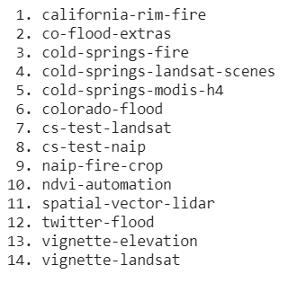
There are 14 datasets available in the EarthpPy Package, let us see the datasets available to download.
EarthpPy包中有14个数据集,让我们看一下可供下载的数据集。
Let’s see how to download the available datasets. The method ‘get_data’ is used to download the data using the name of the dataset.
让我们看看如何下载可用的数据集。 方法“ get_data”用于使用数据集的名称下载数据。
import earthpy as ep


# Specify custom directory to download the dataset


ep.data.path = "."


# Specify the dataset name to download


ep.data.get_data('colorado-flood')
The output will be:
输出将是:

卫星图像上的EDA(EDA on Satellite Images)
In this article, we use the ‘vignette Landsat’ dataset. This dataset contains Landsat 8 data for February 21, 2017, for an area surrounding the Cold Springs Fire boundary near Nederland, Colorado. It also contains the Cold Springs Fire boundary provided by GeoMAC. The Landsat bands have been cropped to both cover the Cold Springs Fire Boundary and include no data values at the southeast edge of the original image as well as cloud cover.
在本文中,我们使用“小插图Landsat”数据集。 该数据集包含2017年2月21日针对科罗拉多州Nederland附近冷泉火边界的区域的Landsat 8数据。 它还包含由GeoMAC提供的冷泉火灾边界。 Landsat波段已被裁剪为覆盖了Cold Springs Fire Boundary,并且在原始图像的东南边缘和云层均未包含任何数据值。
Let’s take a look at reading the dataset:
让我们看一下读取数据集:
data = ep.data.get_data('vignette-landsat')


landsat_path = glob("vignette-landsat/LC08_L1TP_034032_20160621_20170221_01_T1_sr_band*_crop.tif")


landsat_path.sort()


# Stacking Bands
arr_st, meta = es.stack(landsat_path, nodata=-9999)


# Prints meta data
for i,j in meta.items():
  print("%10s : %s"%(i, str(j)))
The bands are selected and stacked using the ‘stack’ method from the spatial module of EarthPy. The above code reads the data and prints the metadata. The output is shown below.
从EarthPy的空间模块中使用“堆栈”方法选择并堆栈波段。 上面的代码读取数据并打印元数据。 输出如下所示。

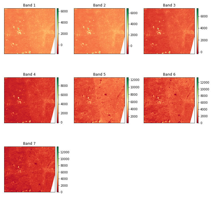
The dataset has the shape (2158, 1941), 7 bands and contains 41,88,678 pixels.
数据集具有形状(2158,1941),7个带并包含41,88,678像素。
绘图带 (Plot Bands)
As we discussed, the Landsat8 dataset has 7 bands. Let’s plot the bands using the inbuilt method ‘plot_bands’ from the earthpy package. The plot_bands method takes the stack of the bands and plots along with custom titles which can be done by passing unique titles for each image as a list of titles using the title= parameter.
正如我们所讨论的,Landsat8数据集有7个波段。 让我们使用来自Earthpy包的内置方法“ plot_bands ”来绘制频段。 plot_bands方法采用带和图的堆栈以及自定义标题,可以通过使用title=参数将每个图像的唯一标题作为标题列表传递来完成。
Let’s see the code to plot the bands of the Landsat8 dataset.
让我们看一下绘制Landsat8数据集条带的代码。
import earthpy.plot as epp


im = epp.plot_bands(arr_st, cmap='RdYlGn', figsize=(12, 12))


plt.show()
The resulted plot is shown below:
结果图如下所示:
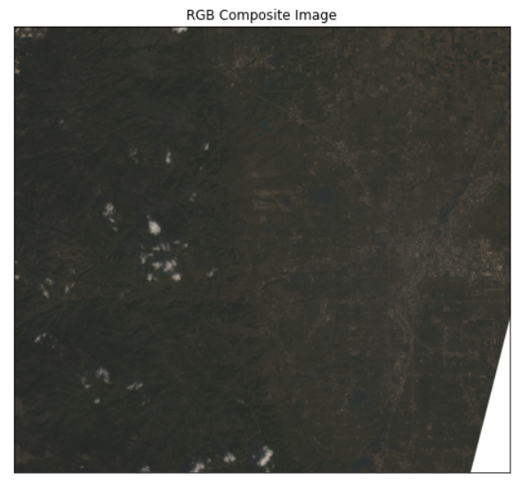
RGB复合图像(RGB Composite Image)
These hyperspectral images have multiple numbers of bands that contain the data ranging from visible to infrared. So it is hard to visualize the data for humans. So the creating an RGB Composite Image makes it easier to understand the data effectively. To plot RGB composite images, you will plot the red, green, and blue bands, which are bands 4, 3, and 2, respectively, in the image stack we created from the Landsat8 data. Python uses a zero-based index system, so you need to subtract a value of 1 from each index. Therefore, the index for the red band is 3, green is 2, and blue is 1. Let’s see the code to plot the RGB composite image.
这些高光谱图像具有多个波段,其中包含从可见到红外的数据。 因此,很难将数据可视化。 因此,创建RGB复合图像使更容易有效地理解数据。 要绘制RGB复合图像,您将绘制红色,绿色和蓝色带,分别是从Landsat8数据创建的图像堆栈中的带4、3和2。 Python使用从零开始的索引系统,因此您需要从每个索引中减去1的值。 因此,红色带的索引是3,绿色是2,蓝色是1。让我们看一下绘制RGB复合图像的代码。
rgb = epp.plot_rgb(arr_st, rgb=(3,2,1), figsize=(8, 8), title='RGB Composite Image')


plt.show()
The generated RGB composite image is shown below.
生成的RGB复合图像如下所示。
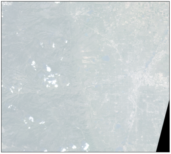
拉伸合成图像(Stretching the Composite Image)
The Composite images that we created can sometimes be dark if the pixel brightness values are skewed toward the value of zero. This type of problem can be solved by stretching the pixel brightness values in an image using the argument stretch=True to extend the values to the full 0-255 range of potential values to increase the visual contrast of the image. Also, the str_clip argument allows you to specify how much of the tails of the data that you want to clip off. The larger the number, the more the data will be stretched or brightened.
如果像素亮度值偏向零值,我们创建的合成图像有时可能会很暗。 可以通过使用参数stretch=True图像中的像素亮度值以将这些值扩展到电位值的整个0-255范围以增加图像的视觉对比度来解决此类问题。 另外, str_clip参数允许您指定要裁剪的数据尾部的数量。 数字越大,数据将被拉伸或变亮的越多。
Let’s see how this can be done suing earthpy.
让我们看看如何通过诉诸尘土来解决这一问题。
import earthpy.plot as epp


# arr_st -> Image Stack


epp.plot_rgb(
    arr_st,
    rgb=(3, 2, 1),
    stretch=True,
    str_clip=0.5,
    figsize=(8,8),
    title="RGB Image with Stretch Applied",
)


plt.show()
The RGB composite image after applying stretch is shown below:
拉伸后的RGB复合图像如下所示:
绘制光谱 (Plotting Spectra)
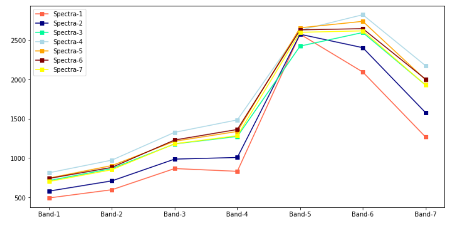
Let’s see how to plot spectra which helps us to understand the nature of the pixels. The below code to used to plot the 7 spectra of the first row of the Landsast8 dataset.
让我们看看如何绘制光谱图,这有助于我们了解像素的性质。 以下代码用于绘制Landsast8数据集第一行的7个光谱。
plt.figure(figsize=(12, 6))


for i, c in enumerate(colors):

  plt.plot(np.asarray(arr_st[:, 0, i]), '-s', color = c, label= f'Spectra-{i+1}')

plt.xticks(range(7),[f'Band-{i}' for i in range(1, 8)])


plt.legend()


plt.show()
The output is shown below:
输出如下所示:
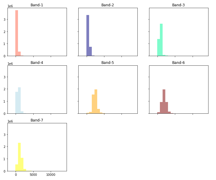
直方图(Histograms)
Visualizing the bands of the hyperspectral image dataset helps us to understand the distribution of values of the bands. The hist method from the ‘eathpy.plot’ does the work by plotting the histograms for the bands of the dataset/stack that we created previously. We can also modify the column size, titles, colors of the individual histograms. Let’s see the code to plot the histograms.
可视化高光谱图像数据集的条带有助于我们了解条带值的分布。 “ eathpy.plot”中的hist方法通过绘制我们先前创建的数据集/堆栈带的直方图来完成工作。 我们还可以修改各个直方图的列大小,标题,颜色。 让我们看一下绘制直方图的代码。
colors = ['tomato', 'navy', 'MediumSpringGreen', 'lightblue', 'orange', 'maroon', 'yellow']


epp.hist(arr_st, colors = colors, title=[f'Band-{i}' for i in range(1, 8)], cols=3, alpha=0.5, figsize = (12, 10), )


plt.show()
The resulted plot is
结果图是
归一化植被指数(NDVI)(Normalized Difference Vegetation Index (NDVI))
To determine the density of green on a patch of land, researchers must observe the distinct colors (wavelengths) of visible(VIS) and near-infrared (NIR)sunlight reflected by the plants. The Normalized Difference Vegetation Index (NDVI) quantifies vegetation by measuring the difference between near-infrared which vegetation strongly reflects and red light (which vegetation absorbs). NDVI always ranges from -1 to +1.
为了确定一块土地上的绿色密度,研究人员必须观察植物反射的可见光(VIS)和近红外光(NIR)的不同颜色(波长)。 归一化植被指数(NDVI)通过测量植被强烈反射的近红外与红光(植被吸收)之间的差异来量化植被。 NDVI的范围始终为-1至+1。
NDVI = (NIR — VIS)/(NIR + VIS)
NDVI =(NIR-VIS)/(NIR + VIS)
For example, when you have negative values, it’s highly likely that it’s water. On the other hand, if you have an NDVI value close to +1, there’s a high possibility that it’s dense green leaves. But when NDVI is close to zero, there aren’t green leaves and it could even be an urbanized area.
例如,当您具有负值时,很可能是水。 另一方面,如果您的NDVI值接近+1,则很有可能是茂密的绿叶。 但是,当NDVI接近于零时,就没有绿叶,甚至可能是城市化区域。
# Landsat 8 red band is band 4 at [3]
# Landsat 8 near-infrared band is band 5 at [4]


ndvi = es.normalized_diff(arr_st[4], arr_st[3])


titles = ["Landsat 8 - Normalized Difference Vegetation Index (NDVI)"]


epp.plot_bands(ndvi, cmap="RdYlGn", cols=1, title=titles, vmin=-1, vmax=1, figsize=(10, 10))


plt.show()
The above code is used to calculate the Normalized Difference Vegetation Index(NDVI) and also display the generated image.
上面的代码用于计算归一化植被指数(NDVI)并显示生成的图像。

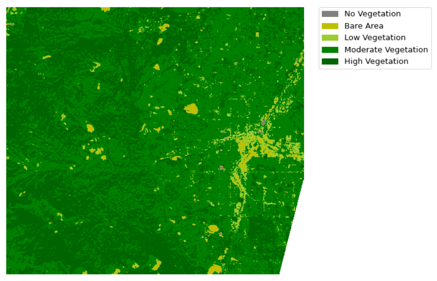
NDVI的分类(Classification of NDVI)
The Normalized Difference Vegetation Index(NDVI) results are categorized into useful classes based on the Hyperspectral Image data. The values under 0 will be classified together as no vegetation. Additional classes will be created for the bare area and low, moderate, and high vegetation areas. Let’s look at the code:
归一化植被指数(NDVI)结果基于高光谱图像数据分类为有用的类别。 0以下的值将被归类为无植被。 将为裸露区域以及低,中和高植被区创建其他类别。 让我们看一下代码:
# Create classes and apply to NDVI results
ndvi_class_bins = [-np.inf, 0, 0.15, 0.23, 0.6, np.inf]


ndvi_landsat_class = np.digitize(ndvi, ndvi_class_bins)


# Apply the nodata mask to the newly classified NDVI data
ndvi_landsat_class = np.ma.masked_where(np.ma.getmask(ndvi), ndvi_landsat_class)


np.unique(ndvi_landsat_class)


nbr_colors = ["gray", "y", "yellowgreen", "g", "darkgreen"]
nbr_cmap = ListedColormap(nbr_colors)


# Define class names
ndvi_cat_names = [
    "No Vegetation",
    "Bare Area",
    "Low Vegetation",
    "Moderate Vegetation",
    "High Vegetation",
]


# Get list of classes
classes = np.unique(ndvi_landsat_class)


classes = classes.tolist()


# The mask returns a value of none in the classes. remove that
classes = classes[0:5]


# Plot the data
fig, ax = plt.subplots(figsize=(10, 10))


im = ax.imshow(ndvi_landsat_class, cmap=nbr_cmap)


epp.draw_legend(im_ax=im, classes=classes, titles=ndvi_cat_names)


ax.set_title(
    "Landsat 8 - Normalized Difference Vegetation Index (NDVI) Classes",
    fontsize=14,
)


ax.set_axis_off()


# Auto adjust subplot to fit figure size


plt.tight_layout()
The above code classifies the NDVI and also plots the resulted data. The resulted image after classification is shown below.
上面的代码对NDVI进行了分类,还绘制了结果数据。 分类后的结果图像如下所示。
Not but not the least, The code that I have written during the blog can be accessed from the below GitHub link or use the google collaboratory notebook.
同样重要的是,我在博客中编写的代码可以从下面的GitHub链接中访问,也可以使用google合作笔记本。
最后的想法 (Final Thoughts)
This article covers the different ways to analyze the satellite/Hyperspectral Imagery using EarthPy but there is a lot more such as Dimensionality Reduction(DR) and Classification e.t.c. Use the below articles for detailed explanation and hands-on using python.
本文介绍了使用EarthPy分析卫星/高光谱图像的不同方法,但还有更多诸如降维(DR)和分类等功能。请使用以下文章进行详细说明和使用python进行动手实践。
eda 数据分析


 被折叠的 条评论
为什么被折叠?
被折叠的 条评论
为什么被折叠?
 到【灌水乐园】发言


