


 本文详细介绍了Python中的探索性数据分析(EDA),包括数据采购、数据清理、单变量、双变量和多元分析。数据采购涉及私有数据和公开数据来源;数据清理着重于处理缺失值、格式错误等问题;接着探讨了单变量、双变量和多元分析方法,通过散点图、对图、相关矩阵、箱形图等可视化工具进行深入分析。最后,文章强调了EDA在机器学习模型构建中的重要性,并提供了实际操作示例。
什么是探索性数据分析(EDA)? (What is Exploratory Data Analysis(EDA)?)
If we want to explain EDA in simple terms, it means trying to understand the given data much better, so that we can make some sense out of it.
如果我们想用简单的术语来解释EDA,则意味着试图更好地理解给定的数据,以便我们可以从中获得一些意义。
We can find a more formal definition in Wikipedia.
我们可以在Wikipedia中找到更正式的定义。
In statistics, exploratory data analysis is an approach to analyzing data sets to summarize their main characteristics, often with visual methods. A statistical model can be used or not, but primarily EDA is for seeing what the data can tell us beyond the formal modeling or hypothesis testing task.
在统计学中, 探索性数据分析是一种分析数据集以总结其主要特征的方法,通常使用视觉方法。 可以使用统计模型,也可以不使用统计模型,但是EDA主要用于查看数据可以在形式建模或假设检验任务之外告诉我们的内容。
EDA in Python uses data visualization to draw meaningful patterns and insights. It also involves the preparation of data sets for analysis by removing irregularities in the data.
Python中的EDA使用数据可视化来绘制有意义的模式和见解。 它还涉及通过消除数据中的不规则性来准备用于分析的数据集。
Based on the results of EDA, companies also make business decisions, which can have repercussions later.
根据EDA的结果,公司还制定业务决策,这可能会在以后产生影响。
- If EDA is not done properly then it can hamper the further steps in the machine learning model building process. 如果EDA处理不当,则可能会妨碍机器学习模型构建过程中的其他步骤。
- If done well, it may improve the efficacy of everything we do next. 如果做得好,它可能会提高我们接下来做的每件事的功效。
In this article we’ll see about the following topics:
在本文中,我们将看到以下主题:
- Data Sourcing 资料采购
- Data Cleaning 数据清理
- Univariate analysis 单变量分析
- Bivariate analysis 双变量分析
- Multivariate analysis 多元分析
1.数据采购 (1. Data Sourcing)
Data Sourcing is the process of finding and loading the data into our system. Broadly there are two ways in which we can find data.
数据采购是查找数据并将其加载到我们的系统中的过程。 大致而言,我们可以通过两种方式查找数据。
- Private Data 私人数据
- Public Data 公开资料
Private Data
私人数据
As the name suggests, private data is given by private organizations. There are some security and privacy concerns attached to it. This type of data is used for mainly organizations internal analysis.
顾名思义,私有数据是由私有组织提供的。 附加了一些安全和隐私问题。 这类数据主要用于组织内部分析。
Public Data
公开资料
This type of Data is available to everyone. We can find this in government websites and public organizations etc. Anyone can access this data, we do not need any special permissions or approval.
此类数据适用于所有人。 我们可以在政府网站和公共组织等中找到此文件。任何人都可以访问此数据,我们不需要任何特殊权限或批准。
We can get public data on the following sites.
我们可以在以下站点上获取公共数据。
The very first step of EDA is Data Sourcing, we have seen how we can access data and load into our system. Now, the next step is how to clean the data.
EDA的第一步是数据采购,我们已经看到了如何访问数据并将其加载到系统中。 现在,下一步是如何清除数据。
2.数据清理 (2. Data Cleaning)
After completing the Data Sourcing, the next step in the process of EDA is Data Cleaning. It is very important to get rid of the irregularities and clean the data after sourcing it into our system.
完成数据采购后,EDA过程的下一步是数据清理 。 将数据来源到我们的系统中之后,消除不规则并清理数据非常重要。
Irregularities are of different types of data.
不规则性是不同类型的数据。
- Missing Values 缺失值
- Incorrect Format 格式错误
- Incorrect Headers 标头不正确
- Anomalies/Outliers 异常/异常值
To perform the data cleaning we are using a sample data set, which can be found here.
为了执行数据清理,我们使用样本数据集,可在此处找到。
We are using Jupyter Notebook for analysis.
我们正在使用Jupyter Notebook进行分析。
First, let’s import the necessary libraries and store the data in our system for analysis.
首先,让我们导入必要的库并将数据存储在系统中进行分析。
#import the useful libraries.
import numpy as np
import pandas as pd
import seaborn as sns
import matplotlib.pyplot as plt
%matplotlib inline
# Read the data set of "Marketing Analysis" in data.
data= pd.read_csv("marketing_analysis.csv")
# Printing the data
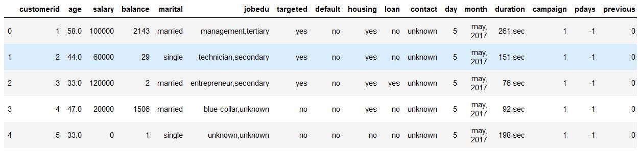
dataNow, the data set looks like this,
现在,数据集看起来像这样,

If we observe the above dataset, there are some discrepancies in the Column header for the first 2 rows. The correct data is from the index number 1. So, we have to fix the first two rows.
如果我们观察上述数据集,则前两行的“列”标题中会有一些差异。 正确的数据来自索引号1。因此,我们必须修复前两行。
This is called Fixing the Rows and Columns. Let’s ignore the first two rows and load the data again.
这称为修复行和列。 让我们忽略前两行,然后再次加载数据。
#import the useful libraries.
import numpy as np
import pandas as pd
import seaborn as sns
import matplotlib.pyplot as plt
%matplotlib inline


# Read the file in data without first two rows as it is of no use.
data = pd.read_csv("marketing_analysis.csv",skiprows = 2)


#print the head of the data frame.
data.head()
Now, the dataset looks like this, and it makes more sense.
现在,数据集看起来像这样,并且更有意义。
Following are the steps to be taken while Fixing Rows and Columns:
以下是修复行和列时要采取的步骤:
- Delete Summary Rows and Columns in the Dataset. 删除数据集中的摘要行和列。
- Delete Header and Footer Rows on every page. 在每个页面上删除页眉和页脚行。
- Delete Extra Rows like blank rows, page numbers, etc. 删除多余的行,例如空白行,页码等。
- We can merge different columns if it makes for better understanding of the data 如果可以更好地理解数据,我们可以合并不同的列
- Similarly, we can also split one column into multiple columns based on our requirements or understanding. 同样,我们也可以根据我们的要求或理解将一列分为多列。
- Add Column names, it is very important to have column names to the dataset. 添加列名称,将列名称添加到数据集非常重要。
Now if we observe the above dataset, the customerid column has of no importance to our analysis, and also the jobedu column has both the information of job and education in it.
现在,如果我们观察以上数据集, customerid列对我们的分析就不重要了,而jobedu列中也包含job和education的信息。
So, what we’ll do is, we’ll drop the customerid column and we’ll split the jobedu column into two other columns job and education and after that, we’ll drop the jobedu column as well.
因此,我们要做的是,删除customerid列,并将jobedu列拆分为job和education另外两个列,然后,我们也删除jobedu列。
# Drop the customer id as it is of no use.
data.drop('customerid', axis = 1, inplace = True)


#Extract job  & Education in newly from "jobedu" column.
data['job']= data["jobedu"].apply(lambda x: x.split(",")[0])
data['education']= data["jobedu"].apply(lambda x: x.split(",")[1])


# Drop the "jobedu" column from the dataframe.
data.drop('jobedu', axis = 1, inplace = True)


# Printing the Dataset
data
Now, the dataset looks like this,
现在,数据集看起来像这样,
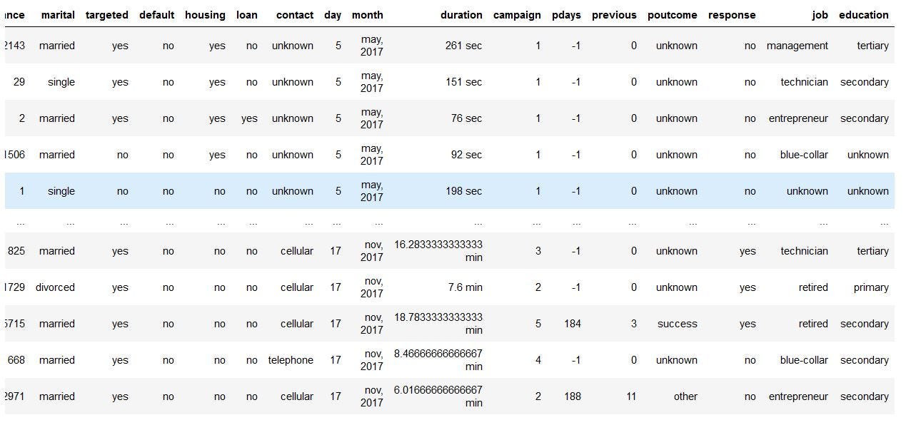
Customerid and jobedu columns and adding job and education columns
Customerid和Jobedu列,并添加Job和Education列
Missing Values
缺失值
If there are missing values in the Dataset before doing any statistical analysis, we need to handle those missing values.
如果在进行任何统计分析之前数据集中有缺失值,我们需要处理这些缺失值。
There are mainly three types of missing values.
缺失值主要有三种类型。
- MCAR(Missing completely at random): These values do not depend on any other features. MCAR(完全随机消失):这些值不依赖于任何其他功能。
- MAR(Missing at random): These values may be dependent on some other features. MAR(随机丢失):这些值可能取决于某些其他功能。
- MNAR(Missing not at random): These missing values have some reason for why they are missing. MNAR(不随机遗漏):这些遗漏值有其遗失的某些原因。
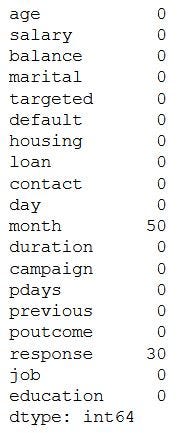
Let’s see which columns have missing values in the dataset.
让我们看看数据集中哪些列缺少值。
# Checking the missing values
data.isnull().sum()
The output will be,
输出将是

As we can see three columns contain missing values. Let’s see how to handle the missing values. We can handle missing values by dropping the missing records or by imputing the values.
如我们所见,三列包含缺失值。 让我们看看如何处理缺失的值。 我们可以通过删除丢失的记录或估算值来处理丢失的值。
Drop the missing Values
删除缺失的值
Let’s handle missing values in the age column.
让我们处理age列中的缺失值。
# Dropping the records with age missing in data dataframe.
data = data[~data.age.isnull()].copy()


# Checking the missing values in the dataset.
data.isnull().sum()
Let’s check the missing values in the dataset now.
让我们现在检查数据集中的缺失值。
Let’s impute values to the missing values for the month column.
让我们将值估算为月份列的缺失值。
Since the month column is of an object type, let’s calculate the mode of that column and impute those values to the missing values.
由于month列是对象类型,让我们计算该列的模式并将这些值归为缺失值。
# Find the mode of month in data
month_mode = data.month.mode()[0]


# Fill the missing values with mode value of month in data.
data.month.fillna(month_mode, inplace = True)


# Let's see the null values in the month column.
data.month.isnull().sum()
Now output is,
现在的输出是
# Mode of month is'may, 2017'# Null values in month column after imputing with mode0Handling the missing values in the Response column. Since, our target column is Response Column, if we impute the values to this column it’ll affect our analysis. So, it is better to drop the missing values from Response Column.
处理“ 响应”列中的缺失值。 由于我们的目标列是“响应列”,因此,如果将值估算给该列,则会影响我们的分析。 因此,最好从“响应列”中删除丢失的值。
#drop the records with response missing in data.data = data[~data.response.isnull()].copy()# Calculate the missing values in each column of data framedata.isnull().sum()Let’s check whether the missing values in the dataset have been handled or not,
让我们检查一下数据集中的缺失值是否已得到处理,

We can also, fill the missing values as ‘NaN’ so that while doing any statistical analysis, it won’t affect the outcome.
我们还可以将缺失值填充为“ NaN”,以便在进行任何统计分析时都不会影响结果。
Handling Outliers
处理异常值
We have seen how to fix missing values, now let’s see how to handle outliers in the dataset.
我们已经看到了如何纠正缺失值,现在让我们看看如何处理数据集中的异常值。
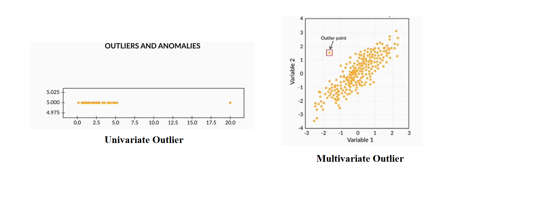
Outliers are the values that are far beyond the next nearest data points.
离群值是远远超出下一个最近数据点的值。
There are two types of outliers:
有两种异常值:
Univariate outliers: Univariate outliers are the data points whose values lie beyond the range of expected values based on one variable.
单变量离群值:单变量离群值是数据点,其值超出基于一个变量的期望值的范围。
Multivariate outliers: While plotting data, some values of one variable may not lie beyond the expected range, but when you plot the data with some other variable, these values may lie far from the expected value.
多变量离群值:在绘制数据时,一个变量的某些值可能不会超出预期范围,但是在使用其他变量绘制数据时,这些值可能与预期值相差很远。
So, after understanding the causes of these outliers, we can handle them by dropping those records or imputing with the values or leaving them as is, if it makes more sense.
因此,在理解了这些异常值的原因之后,我们可以通过删除这些记录或使用值进行插值或按原样保留它们(如果更有意义)来处理它们。
Standardizing Values
标准化价值
To perform data analysis on a set of values, we have to make sure the values in the same column should be on the same scale. For example, if the data contains the values of the top speed of different companies’ cars, then the whole column should be either in meters/sec scale or miles/sec scale.
要对一组值进行数据分析,我们必须确保同一列中的值应在同一范围内。 例如,如果数据包含不同公司汽车最高速度的值,则整列应以米/秒为单位或英里/秒为单位。
Now, that we are clear on how to source and clean the data, let’s see how we can analyze the data.
现在,我们很清楚如何获取和清除数据,让我们看看如何分析数据。
3.单变量分析 (3. Univariate Analysis)
If we analyze data over a single variable/column from a dataset, it is known as Univariate Analysis.
如果我们通过数据集中的单个变量/列来分析数据,则称为单变量分析。
Categorical Unordered Univariate Analysis:
分类无序单变量分析:
An unordered variable is a categorical variable that has no defined order. If we take our data as an example, the job column in the dataset is divided into many sub-categories like technician, blue-collar, services, management, etc. There is no weight or measure given to any value in the ‘job’ column.
无序变量是没有定义顺序的分类变量。 以我们的数据为例,数据集中的job列分为许多子类别,例如技术员,蓝领,服务,管理等。“ job ”中的任何值都没有权重或度量柱。
Now, let’s analyze the job category by using plots. Since Job is a category, we will plot the bar plot.
现在,让我们使用绘图来分析工作类别。 由于Job是一个类别,因此我们将绘制条形图。
# Let's calculate the percentage of each job status category.
data.job.value_counts(normalize=True)


#plot the bar graph of percentage job categories
data.job.value_counts(normalize=True).plot.barh()
plt.show()
The output looks like this,
输出看起来像这样,
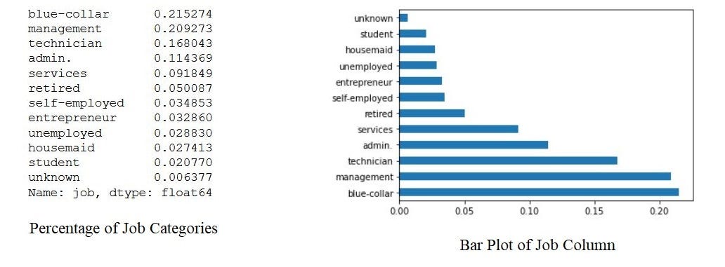
By the above bar plot, we can infer that the data set contains more number of blue-collar workers compared to other categories.
通过上面的条形图,我们可以推断出与其他类别相比,数据集包含更多的蓝领工人。
Categorical Ordered Univariate Analysis:
分类有序单变量分析:
Ordered variables are those variables that have a natural rank of order. Some examples of categorical ordered variables from our dataset are:
有序变量是具有自然顺序的那些变量。 我们的数据集中的分类有序变量的一些示例是:
- Month: Jan, Feb, March…… 月:一月,二月,三月……
- Education: Primary, Secondary,…… 教育程度:小学,中学,……
Now, let’s analyze the Education Variable from the dataset. Since we’ve already seen a bar plot, let’s see how a Pie Chart looks like.
现在,让我们从数据集中分析教育变量。 由于我们已经看过条形图,因此让我们看一下饼图的外观。
#calculate the percentage of each education category.
data.education.value_counts(normalize=True)


#plot the pie chart of education categories
data.education.value_counts(normalize=True).plot.pie()
plt.show()
The output will be,
输出将是
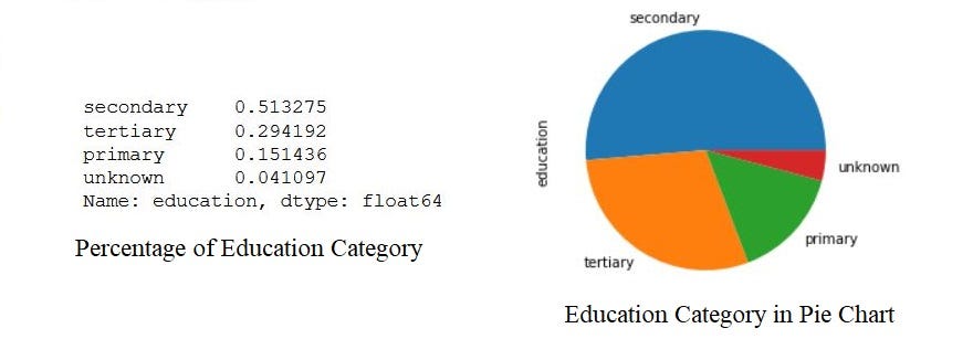
By the above analysis, we can infer that the data set has a large number of them belongs to secondary education after that tertiary and next primary. Also, a very small percentage of them have been unknown.
通过以上分析,我们可以推断出该数据集中有大量数据属于该高等教育之后的中学。 而且,其中很小的一部分是未知的。
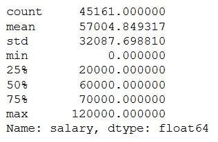
This is how we analyze univariate categorical analysis. If the column or variable is of numerical then we’ll analyze by calculating its mean, median, std, etc. We can get those values by using the describe function.
这就是我们分析单变量分类分析的方式。 如果列或变量是数字,那么我们将通过计算其平均值,中位数,std等进行分析。我们可以使用describe函数获得这些值。
data.salary.describe()The output will be,
输出将是
4.双变量分析 (4. Bivariate Analysis)
If we analyze data by taking two variables/columns into consideration from a dataset, it is known as Bivariate Analysis.
如果我们通过考虑数据集中的两个变量/列来分析数据,则称为双变量分析。
a) Numeric-Numeric Analysis:
a)数值分析:
Analyzing the two numeric variables from a dataset is known as numeric-numeric analysis. We can analyze it in three different ways.
分析数据集中的两个数字变量称为数字数值分析。 我们可以通过三种不同的方式对其进行分析。
- Scatter Plot 散点图
- Pair Plot 对图
- Correlation Matrix 相关矩阵
Scatter Plot
散点图
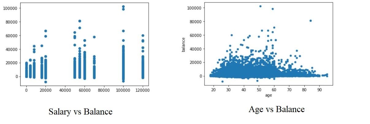
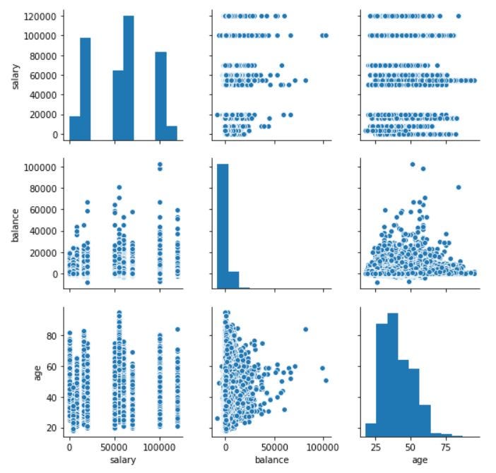
Let’s take three columns ‘Balance’, ‘Age’ and ‘Salary’ from our dataset and see what we can infer by plotting to scatter plot between salary balance and age balance
让我们从数据集中获取三列“ Balance”,“ Age”和“ Salary”列,看看通过绘制散布在salary balance和age balance之间的图可以推断出什么
#plot the scatter plot of balance and salary variable in data
plt.scatter(data.salary,data.balance)
plt.show()


#plot the scatter plot of balance and age variable in data
data.plot.scatter(x="age",y="balance")
plt.show()
Now, the scatter plots looks like,
现在,散点图看起来像
Pair Plot
对图
Now, let’s plot Pair Plots for the three columns we used in plotting Scatter plots. We’ll use the seaborn library for plotting Pair Plots.
现在,让我们为绘制散点图时使用的三列绘制成对图。 我们将使用seaborn库来绘制对图。
#plot the pair plot of salary, balance and age in data dataframe.
sns.pairplot(data = data, vars=['salary','balance','age'])
plt.show()
The Pair Plot looks like this,
配对图看起来像这样,
Correlation Matrix
相关矩阵
Since we cannot use more than two variables as x-axis and y-axis in Scatter and Pair Plots, it is difficult to see the relation between three numerical variables in a single graph. In those cases, we’ll use the correlation matrix.
由于在散点图和成对图中我们不能使用两个以上的变量作为x轴和y轴,因此很难在单个图中看到三个数值变量之间的关系。 在这种情况下,我们将使用相关矩阵。
# Creating a matrix using age, salry, balance as rows and columns
data[['age','salary','balance']].corr()


#plot the correlation matrix of salary, balance and age in data dataframe.
sns.heatmap(data[['age','salary','balance']].corr(), annot=True, cmap = 'Reds')
plt.show()
First, we created a matrix using age, salary, and balance. After that, we are plotting the heatmap using the seaborn library of the matrix.
首先,我们使用年龄,薪水和余额创建一个矩阵。 之后,我们使用矩阵的seaborn库绘制热图。

b) Numeric - Categorical Analysis
b)数值-分类分析
Analyzing the one numeric variable and one categorical variable from a dataset is known as numeric-categorical analysis. We analyze them mainly using mean, median, and box plots.
从数据集中分析一个数字变量和一个分类变量称为数字分类分析。 我们主要使用均值,中位数和箱形图来分析它们。
Let’s take salary and response columns from our dataset.
让我们从数据集中获取salary和response列。
First check for mean value using groupby
首先使用groupby检查平均值
#groupby the response to find the mean of the salary with response no & yes separately.data.groupby('response')['salary'].mean()The output will be,
输出将是
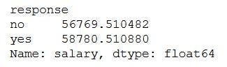
There is not much of a difference between the yes and no response based on the salary.
基于薪水,是与否之间的区别不大。
Let’s calculate the median,
让我们计算中位数
#groupby the response to find the median of the salary with response no & yes separately.data.groupby('response')['salary'].median()The output will be,
输出将是

By both mean and median we can say that the response of yes and no remains the same irrespective of the person’s salary. But, is it truly behaving like that, let’s plot the box plot for them and check the behavior.
通过均值和中位数,我们可以说是和否的响应保持不变,而与人的薪水无关。 但是,是否确实如此,让我们为它们绘制箱形图并检查行为。
#plot the box plot of salary for yes & no responses.sns.boxplot(inp1.response, inp1.salary)
plt.show()
The box plot looks like this,
箱形图看起来像这样,
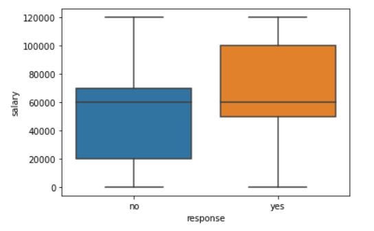
As we can see, when we plot the Box Plot, it paints a very different picture compared to mean and median. The IQR for customers who gave a positive response is on the higher salary side.
如我们所见,当绘制箱形图时,与均值和中位数相比,它绘制的图像非常不同。 给予积极回应的客户的IQR在较高的薪资方面。
This is how we analyze Numeric-Categorical variables, we use mean, median, and Box Plots to draw some sort of conclusions.
这就是我们分析数值分类变量的方式,我们使用均值,中位数和箱形图得出某种结论。
c) Categorical — Categorical Analysis
c)分类-分类分析
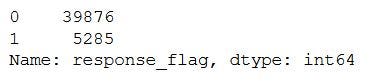
Since our target variable/column is the Response rate, we’ll see how the different categories like Education, Marital Status, etc., are associated with the Response column. So instead of ‘Yes’ and ‘No’ we will convert them into ‘1’ and ‘0’, by doing that we’ll get the “Response Rate”.
由于我们的目标变量/列是响应率,因此我们将看到“教育”,“婚姻状况”等不同类别如何与“响应”列相关联。 因此,通过将其转换为“ 1”和“ 0”,而不是“是”和“否”,我们将获得“响应率”。
#create response_rate of numerical data type where response "yes"= 1, "no"= 0
data['response_rate'] = np.where(data.response=='yes',1,0)
data.response_rate.value_counts()
The output looks like this,
输出看起来像这样,
Let’s see how the response rate varies for different categories in marital status.
让我们看看婚姻状况不同类别的回应率如何变化。
#plot the bar graph of marital status with average value of response_rate
data.groupby('marital')['response_rate'].mean().plot.bar()
plt.show()
The graph looks like this,
该图看起来像这样,
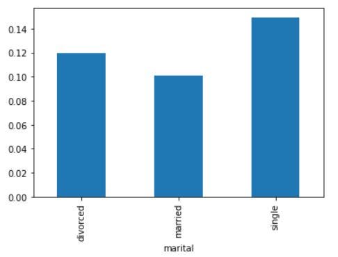
By the above graph, we can infer that the positive response is more for Single status members in the data set. Similarly, we can plot the graphs for Loan vs Response rate, Housing Loans vs Response rate, etc.
通过上图,我们可以推断出,对于数据集中的单个状态成员而言,肯定的响应更大。 同样,我们可以绘制贷款与响应率,住房贷款与响应率等图表。
5.多元分析 (5. Multivariate Analysis)
If we analyze data by taking more than two variables/columns into consideration from a dataset, it is known as Multivariate Analysis.
如果我们通过考虑数据集中两个以上的变量/列来分析数据,则称为多变量分析。
Let’s see how ‘Education’, ‘Marital’, and ‘Response_rate’ vary with each other.
让我们来看看“教育”,“婚姻”和“回应率”之间如何变化。
First, we’ll create a pivot table with the three columns and after that, we’ll create a heatmap.
首先,我们将创建一个包含三列的数据透视表,然后创建一个热图。
result = pd.pivot_table(data=data, index='education', columns='marital',values='response_rate')
print(result)


#create heat map of education vs marital vs response_rate
sns.heatmap(result, annot=True, cmap = 'RdYlGn', center=0.117)
plt.show()
The Pivot table and heatmap looks like this,
数据透视表和热图如下所示,
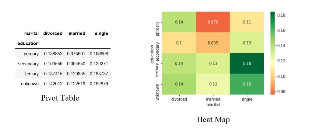
Based on the Heatmap we can infer that the married people with primary education are less likely to respond positively for the survey and single people with tertiary education are most likely to respond positively to the survey.
根据热图,我们可以推断出,受过初等教育的已婚人士对调查的正面React不太可能,而受过高等教育的单身人士对调查的正面回应的可能性最大。
Similarly, we can plot the graphs for Job vs marital vs response, Education vs poutcome vs response, etc.
同样,我们可以绘制工作,婚姻,回应,教育,结果与回应等图表。
结论 (Conclusion)
This is how we’ll do Exploratory Data Analysis. Exploratory Data Analysis (EDA) helps us to look beyond the data. The more we explore the data, the more the insights we draw from it. As a data analyst, almost 80% of our time will be spent understanding data and solving various business problems through EDA.
这就是我们进行探索性数据分析的方式。 探索性数据分析(EDA)可帮助我们超越数据范围。 我们越探索数据,就越能从中获得见识。 作为数据分析师,我们将有近80%的时间用于通过EDA了解数据和解决各种业务问题。
Thank you for reading and Happy Coding!!!
感谢您的阅读和快乐编码!!!
在这里查看我以前有关Python的文章 (Check out my previous articles about Python here)
翻译自: https://towardsdatascience.com/exploratory-data-analysis-eda-python-87178e35b14


 2万+
2万+

 被折叠的 条评论
为什么被折叠?
被折叠的 条评论
为什么被折叠?
 到【灌水乐园】发言


