


choropleth
Choropleth maps are one of the most interesting and useful visualizations. They are important because they can provide information for geographic location, they look beautiful and grab attention in a presentation. Several different libraries can be used to do that. In this tutorial, I will use folium.
Choropleth映射是最有趣和最有用的可视化之一。 它们之所以重要,是因为它们可以提供有关地理位置的信息,它们看起来很漂亮,并且可以在演示文稿中引起注意。 可以使用几个不同的库来执行此操作。 在本教程中,我将使用叶片。
什么是choropleth图? (What is a choropleth map?)
Here is the definition from Wikipedia:
这是维基百科的定义:
Choropleth maps provide an easy way to visualize how a measurement varies across a geographic area or show the level of variability within a region. A heat map or isarithmic map is similar but does not use a priori geographic areas. They are the most common type of thematic map because published statistical data (from government or other sources) is generally aggregated into well-known geographic units, such as countries, states, provinces, and counties, and thus they are relatively easy to create using GIS, spreadsheets, or other software tools.
Choropleth贴图提供了一种简便的方法来可视化度量值在整个地理区域内的变化或显示区域内的可变性水平。 热图或等距图相似,但是不使用先验地理区域。 它们是主题地图的最常见类型,因为已发布的统计数据(来自政府或其他来源)通常汇总到知名的地理单位中,例如国家,州,省和县,因此使用它们相对容易创建GIS , 电子表格或其他软件工具。
In simple and easy words, choropleth maps are the maps that show the information by geolocation using color on the map. See some of the pictures below to get more understanding.
用简单的话来说,综合Kong径图就是使用地理上的颜色通过地理位置显示信息的图。 请参阅下面的一些图片以获得更多的了解。
资料准备 (Data Preparation)
Data preparation is an important and common task for all data scientists. The dataset I used here is reasonably nice and clean. But for this visualization, I still need to work on it a bit. Let’s import the necessary libraries and the dataset.
对于所有数据科学家而言,数据准备是一项重要且共同的任务。 我在这里使用的数据集相当干净。 但是对于这种可视化,我仍然需要做一些工作。 让我们导入必要的库和数据集。
import pandas as pd
import numpy as npdf = pd.read_excel('https://s3-api.us-geo.objectstorage.softlayer.net/cf-courses-data/CognitiveClass/DV0101EN/labs/Data_Files/Canada.xlsx',
                     sheet_name='Canada by Citizenship',
                     skiprows=range(20),
                     skipfooter=2)
I cannot show a screenshot of the dataset here because it’s too big. I encourage you to run the code by yourself. That’s the only way to learn.
由于太大,我无法在此处显示该数据集的屏幕截图。 我鼓励您自己运行代码。 那是唯一的学习方式。
This dataset contains how many immigrants came to Canada from the different countries of the world from 1980 to 2013. Let’s see the column names of the dataset to get a sense of what this dataset contains:
该数据集包含1980年至2013年从世界不同国家来到加拿大的移民人数。让我们看一下数据集的列名,以了解该数据集包含的内容:
df.columns#Output:
Index(['Type', 'Coverage', 'OdName', 'AREA', 'AreaName', 'REG', 'RegName', 'DEV', 'DevName', 1980, 1981, 1982, 1983, 1984, 1985, 1986, 1987, 1988, 1989, 1990, 1991, 1992, 1993, 1994, 1995, 1996, 1997, 1998, 1999, 2000, 2001, 2002, 2003, 2004, 2005, 2006, 2007, 2008, 2009, 2010, 2011, 2012, 2013],
dtype='object')
We are going to plot the total number of immigrants from 1980 to 2013 in each country.
我们将绘制1980年至2013年每个国家的移民总数。
We need the name of the country and the years. Drop some unnecessary columns from the dataset.
我们需要国家的名称和年份。 从数据集中删除一些不必要的列。
df.drop(['AREA', 'REG', 'DEV', 'Type', 'Coverage', 'AreaName', 'RegName', 'DevName'], axis=1, inplace=True)The column ‘OdName’ is the name of the country. Rename it to ‘Country’ for making it understandable.
“ OdName”列是国家/地区的名称。 将其重命名为“国家”以使其易于理解。
df.rename(columns={'OdName':'Country'}, inplace=True)Now, make a column ‘Total’ that will be the sum of the immigrants from all the years for each country.
现在,在“总计”列中填写每个国家所有年份的移民总数。
df['Total'] = df.sum(axis=1)Look, we have the ‘Total’ column at the end. It gives the total number of immigrants for each country.
看,我们在末尾有“总计”列。 它给出了每个国家的移民总数。
Remember that setting this axis as 1 is important. It says that the sum operation should be across columns. Otherwise, it will do the sum across rows and we will end up getting the total number of immigrants per year instead of per country.
请记住,将此轴设置为1很重要。 它说求和运算应该跨列。 否则,它将跨行求和,最终我们将得出每年而不是每个国家的移民总数。
基本的Choropleth地图 (Basic Choropleth Map)
I am going to show, how to develop a choropleth map step by step here. Import folium. If you do not have folium, install it by running this command in your anaconda prompt:
我将在这里演示如何逐步创建一个Choropleth贴图。 进口大叶。 如果您没有叶子,请在anaconda提示符中运行以下命令来安装它:
conda install -c conda-forge foliumImport folium now and generate a world map.
立即导入大叶草并生成世界地图。
import folium
world = folium.Map(location=[0,0], zoom_start=2)
Now in this world map, we will set our data. But it also requires geo data that contains coordinates of each country. Download the geo data from this link. I already downloaded and put it in the same folder as the notebook I used for this tutorial. I just need to read that file now.
现在,在此世界地图中,我们将设置数据。 但它也需要包含每个国家/地区坐标的地理数据。 从此链接 下载地理数据 。 我已经下载了该文件,并将其放置在与本教程所用笔记本相同的文件夹中。 我现在只需要阅读该文件。
wc = r'world-countries.json'For this choropleth map, you need to pass on
对于此Choropleth地图,您需要继续
- the geo_data that we saved as ‘wc’ above, 我们在上方另存为'wc'的geo_data,
- dataset, 数据集
- columns we need to use from the dataset, 我们需要从数据集中使用的列
- ‘key_on’ parameter that comes from the geo_data. The value of the ‘key_on’ parameter always starts with ‘feature’. Then we need to add the key from the geo_data that we saved as ‘wc’. That JSON file is too big. So, I am showing a part of it to explain the key_on parameter: 来自geo_data的'key_on'参数。 “ key_on”参数的值始终以“ feature”开头。 然后,我们需要从保存为“ wc”的geo_data中添加密钥。 该JSON文件太大。 因此,我将展示其中一部分来解释key_on参数:
{"type":"Feature","properties":{"name":"Afghanistan"},"geometry":{"type":"Polygon","coordinates":[[[61.210817,35.650072],[62.230651,35.270664],[62.984662,35.404041],[63.193538,35.857166],[63.982896,36.007957],[64.546479,36.312073],[64.746105,37.111818],[65.588948,37.305217],[65.745631,37.661164],[66.217385,37.39379],[66.518607,37.362784],[67.075782,37.356144],[67.83,37.144994],[68.135562,37.023115],[68.859446,37.344336],[69.196273,37.151144],[69.518785,37.608997],[70.116578,37.588223],[70.270574,37.735165],[70.376304,38.138396],[70.806821,38.486282],[71.348131,38.258905],[71.239404,37.953265],[71.541918,37.905774],[71.448693,37.065645],[71.844638,36.738171],[72.193041,36.948288],[72.63689,37.047558],[73.260056,37.495257],[73.948696,37.421566],[74.980002,37.41999],[75.158028,37.133031],[74.575893,37.020841],[74.067552,36.836176],[72.920025,36.720007],[71.846292,36.509942],[71.262348,36.074388],[71.498768,35.650563],[71.613076,35.153203],[71.115019,34.733126],[71.156773,34.348911],[70.881803,33.988856],[69.930543,34.02012],[70.323594,33.358533],[69.687147,33.105499],[69.262522,32.501944],[69.317764,31.901412],[68.926677,31.620189],[68.556932,31.71331],[67.792689,31.58293],[67.683394,31.303154],[66.938891,31.304911],[66.381458,30.738899],[66.346473,29.887943],[65.046862,29.472181],[64.350419,29.560031],[64.148002,29.340819],[63.550261,29.468331],[62.549857,29.318572],[60.874248,29.829239],[61.781222,30.73585],[61.699314,31.379506],[60.941945,31.548075],[60.863655,32.18292],[60.536078,32.981269],[60.9637,33.528832],[60.52843,33.676446],[60.803193,34.404102],[61.210817,35.650072]]]},"id":"AFG"}In the properties key, we have the name of the country. That’s what we need to pass on. So, the value of the key_on parameter will be ‘feature.properties.name’.
在属性键中,我们具有国家/地区的名称。 这就是我们需要传递的。 因此,key_on参数的值将为“ feature.properties.name”。
5. I will also use some styling parameters: fill_color, fill_opacity, line_opacity, and legend_name. I think these are self-explanatory.
5.我还将使用一些样式参数:fill_color,fill_opacity,line_opacity和legend_name。 我认为这些是不言自明的。
Here is the code for our first choropleth map:
这是我们的第一个Choropleth映射的代码:
world.choropleth(geo_data=wc,
                data=df,
                columns=['Country', 'Total'],
                key_on='feature.properties.name',
                fill_color='YlOrRd',
                fill_opacity=0.8,
                line_opacity=0.2,
                legend_name='Immigration to Canada'
                )
world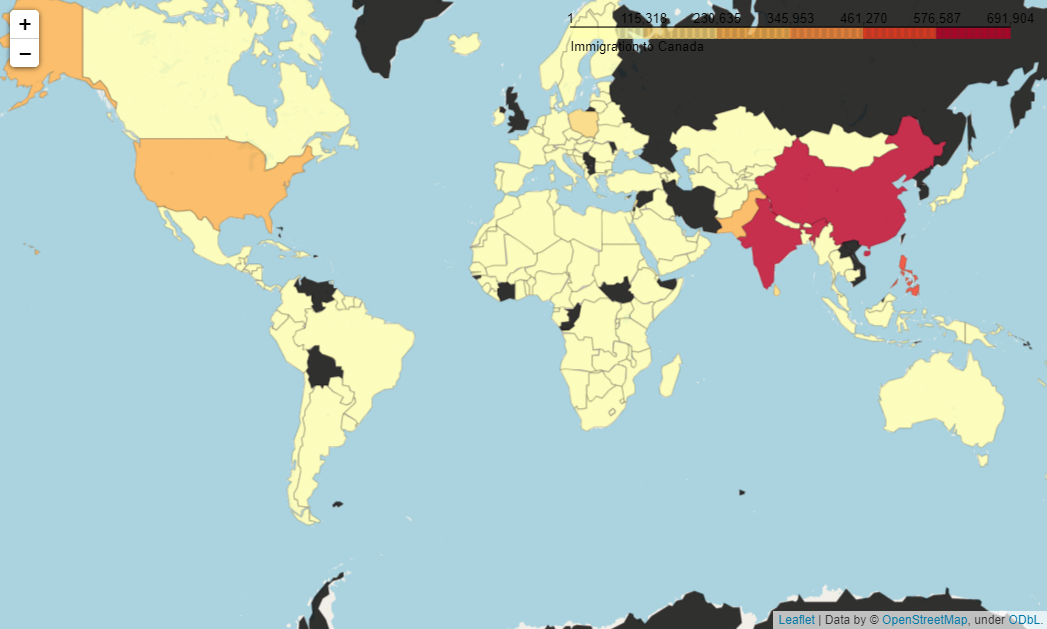
This map is interactive! You can navigate around using the mouse. Also, it changes the color with intensity. The darker the color, the more immigrants came from that country to Canada. But black means there is no data available or there were no immigrants.
该地图是交互式的! 您可以使用鼠标四处浏览。 同样,它会随着强度改变颜色。 颜色越深,从那个国家到加拿大的移民越多。 但是黑色意味着没有可用的数据或没有移民。
添加瓷砖 (Add Tiles)
This map may look a bit plane. We can use tiles to make it look more interesting:
该地图可能看起来有点平面。 我们可以使用图块使它看起来更有趣:
world_map = folium.Map(location=[0, 0], zoom_start=2, tiles='stamenwatercolor')
world_map.choropleth(geo_data=wc,
                     data=df,
                     columns=['Country', 'Total'],
                     threshold_scale=threshold_scale,
                     key_on='feature.properties.name',
                     fill_color='YlOrRd',
                     fill_opacity=0.7,
                     line_opacity=0.2,
                     legend_name='Immigration to Canada'
                    )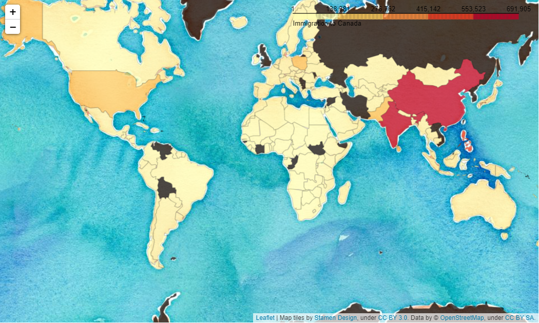
Isn’t it better looking! We can make it more interesting by using a few tiles which will give us options to change the tiles based on the requirement. We will use folium’s TileLayer method to add the different layers of tiles on the map. In the end, we will also include the LayerControl method to get the option of altering the layers.
是不是看起来更好! 通过使用一些图块,我们可以使其更有趣,这将为我们提供根据需求更改图块的选项。 我们将使用叶片的TileLayer方法在地图上添加不同的瓷砖图层。 最后,我们还将包括LayerControl方法,以获取更改图层的选项。
world = folium.Map(location=[0, 0], zoom_start=2, tiles='cartodbpositron')
tiles = ['stamenwatercolor', 'cartodbpositron', 'openstreetmap', 'stamenterrain']
for tile in tiles:
    folium.TileLayer(tile).add_to(world)

world.choropleth(
    geo_data=wc,
    data=df,
    columns=['Country', 'Total'],
    threshold_scale=threshold_scale,
    key_on='feature.properties.name',
    fill_color='YlOrRd',
    fill_opacity=0.7,
    line_opacity=0.2,
    legend_name='Immigration to Canada',
    smooth_factor=0
)folium.LayerControl().add_to(world)
world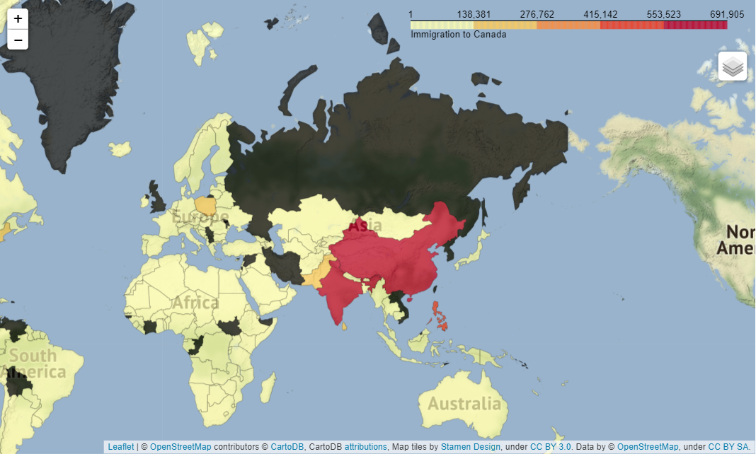
Look, underneath the right corner of legend, there is a stack of tiles. If you click on that you will get the list of tiles. You will be able to change the tiles style there. I find this option very cool!
您可以在图例的右下角看到一堆瓷砖。 如果单击它,您将获得瓷砖列表。 您将能够在那里更改图块样式。 我觉得这个选项很酷!
添加信息标签 (Add Informative Label)
Finally, I want to show you another useful and interesting option. That is to use an informative label. We cannot expect everyone to know the name of the country by looking at the map. It will be useful to have the label of the country on the map. We will make it interesting. Folium has a function called ‘GeoJsonTooltip’ that does that. First, we need to make the world map as usual. Add all the parameters to it and save in a variable. Then add this additional feature using ‘GeoJsonTooltip’ with an add_child method. Here is the complete code.
最后,我想向您展示另一个有用且有趣的选项。 那就是使用信息标签。 我们不能期望每个人都能通过查看地图知道这个国家的名称。 在地图上显示国家的标签会很有用。 我们将使其变得有趣。 Folium具有称为“ GeoJsonTooltip”的功能。 首先,我们需要照常制作世界地图。 将所有参数添加到其中并保存在变量中。 然后,使用“ GeoJsonTooltip”和add_child方法添加此附加功能。 这是完整的代码。
world = folium.Map(location=[0,0], zoom_start=2, tiles='cartodbpositron')
choropleth = folium.Choropleth(geo_data=wc,
    data=df,
    columns=['Country', 'Total'],
    threshold_scale=threshold_scale,
    key_on='feature.properties.name',
    fill_color='YlOrRd',
    fill_opacity=0.7,
    line_opacity=0.2,
    legend_name='Immigration to Canada',
).add_to(world)choropleth.geojson.add_child(
    folium.features.GeoJsonTooltip(['name'], labels=False))
world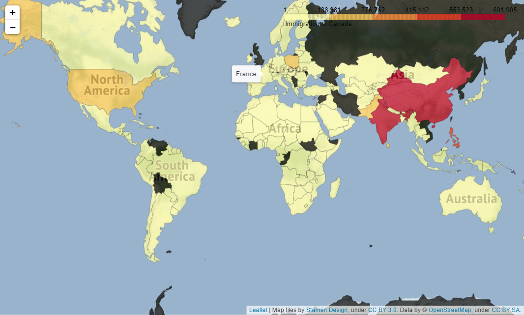
Notice, I put the cursor on France, it shows the name France. The same way you can put the cursor in any place of the map get the name of the place.
注意,我将光标放在France上,它显示了France名称。 您可以将光标放在地图的任何位置的方法相同,可以得到该位置的名称。
结论 (Conclusion)
I wanted to show how to develop an interactive choropleth map, style it, and add informative labels to it. I hope it was helpful.
我想展示如何开发交互式的弦谱图,对其进行样式设置以及为其添加信息标签。 希望对您有所帮助。
阅读推荐 (Reading Recommendation)
choropleth


 706
706

 被折叠的 条评论
为什么被折叠?
被折叠的 条评论
为什么被折叠?
 到【灌水乐园】发言


