


choropleth
using GeoPandas and Matplotlib
使用GeoPandas和Matplotlib
什么是Choropleth地图? (What is a Choropleth Map?)
A choropleth map is a map of a geographic area, in which different regions are represented by a color or pattern based on an aggregated attribute of that particular subregion. For example, you could map the world countries based on population density. The more dense a country is, the darker shade of red it will get. In this way, we can easily identify the densest countries at a glance.
区域图是地理区域的地图,其中基于该特定子区域的聚合属性,不同区域由颜色或图案表示。 例如,您可以根据人口密度绘制世界国家地图。 一个国家越密集,它将得到的红色阴影越深。 这样,我们可以一目了然地确定最密集的国家。
Choropleth map is one of the most effective methods to visualize geographic data. The most popular methods to construct such maps are sophisticated software like QGIS, ArcGIS, and so on. However, these types of visualizations are usually a small part of my entire workflow. Hence, I don’t like to switch to specialized software to render these maps.
Choropleth地图是可视化地理数据的最有效方法之一。 构造此类地图的最流行方法是复杂的软件,例如QGIS,ArcGIS等。 但是,这些类型的可视化通常只占我整个工作流程的一小部分。 因此,我不喜欢切换到专用软件来渲染这些地图。
In this article, I will explore how to make these maps using Python.
在本文中,我将探讨如何使用Python制作这些地图。
我们需要什么? (What do we need?)
We will need a couple of things to accomplish our goal.
我们需要做一些事情才能实现我们的目标。
Shapefiles: Shapefiles are data structures that contain information about different geographic regions. They contain the geometric representation of the regions, which we will need to map them. Besides, the shapefiles optionally contain some additional metadata like name of regions, regional hierarchies, and so on. There are many sources where you can find these shapefiles, for example, Humdata and GADM. In Figure 1, I have provided a screenshot showing how a shapefile looks like after being loaded by GeoPandas.
Shapefile :Shapefile是包含有关不同地理区域信息的数据结构。 它们包含区域的几何表示,我们将需要对其进行映射。 此外,shapefile可选地包含一些其他元数据,例如区域名称,区域层次结构等。 您可以从许多来源找到这些shapefile,例如Humdata和GADM 。 在图1中,我提供了一个屏幕截图,显示了形状文件由GeoPandas加载后的外观。
Libraries: Matplotlib and Geopandas
图书馆: Matplotlib和Geopandas
Without further ado, let’s begin by loading the data and creating a simple map.
事不宜迟,让我们开始加载数据并创建一个简单的地图。
如何加载数据? (How to Load the Data?)
We will use a dataset provided by the GeoPandas library. You can see the list of other datasets by using the following command.
我们将使用GeoPandas库提供的数据集。 您可以使用以下命令查看其他数据集的列表。
import geopandas as gpd
print(gpd.datasets.available)
To load this dataset, we will use the read_file function of GeoPandas. It will return a GeoDataFrame, which is an extension of the native Pandas DataFrame. The same function will also work for shapefiles stored as a file.
要加载此数据集,我们将使用GeoPandas的read_file函数。 它将返回GeoDataFrame,它是本地Pandas DataFrame的扩展。 对于存储为文件的shapefile,相同的功能也将起作用。
As we can see, there are 177 rows in the DataFrame, corresponding to 177 geographic regions of the world. The last column of the DataFrame contains the geometry of each region, which we will use to create the map. The other columns contain information about the districts, for example, name, continent, estimated GDP, and estimated population.
如我们所见,DataFrame中有177行,对应于世界177个地理区域。 DataFrame的最后一列包含每个区域的几何图形,我们将使用它们来创建地图。 其他列包含有关地区的信息,例如名称,大洲,估计的GDP和估计的人口。
Note: You can load the geometry from a shapefile while loading the attributes from another CSV file. Since GeoDataFrame is just an extension of the native Pandas DataFrame, you can easily merge the two Dataframes.
注意:您可以从shapefile加载几何,同时从另一个CSV文件加载属性。 由于GeoDataFrame只是本机Pandas DataFrame的扩展,因此您可以轻松地合并两个Dataframe。
We can now plot the map with the plot() function.
现在,我们可以使用plot()函数绘制地图。
 fig, ax = plt.subplots(dpi=300)
gdf.plot(ax=ax)
This will create a map that looks like Figure 2.
这将创建一个如图2所示的地图。
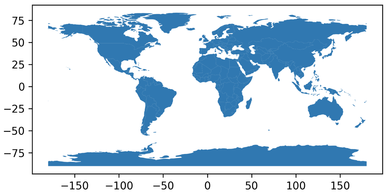
However, this map does not contain any information about the regions! Now we have to dig deeper into the plot function.
但是,此地图不包含有关区域的任何信息! 现在我们必须更深入地了解绘图功能。
如何制作热图? (How to Make a Heatmap?)
We can create a heatmap by specifying the “columns” argument of the plot function. Furthermore, we can use the “cmaps” argument to specify which colormap we want to use. A full list of colormaps is available on the official Matplotlib documentation. You can use the “_r” suffix to reverse any colormaps. It is also possible to construct custom colormaps using LinearSegmentedColormap.
我们可以通过指定plot函数的“ columns ”参数来创建热图。 此外,我们可以使用“ cmaps ”参数来指定我们要使用的颜色图。 Matplotlib官方文档中提供了颜色图的完整列表。 您可以使用“ _r”后缀来反转任何颜色图。 也可以使用LinearSegmentedColormap构造自定义颜色图。
For example, in the following code snippet, I have used the RdYlGn_r colormap. Consequently, regions with a far lower population than the mean will get a darker shade of green. Values closer to the mean will get a yellowish color. On the other hand, regions with a population far greater than the mean will get a darker shade of red.
例如,在以下代码片段中,我使用了RdYlGn_r颜色图。 因此,人口远低于平均值的区域将获得较深的绿色阴影。 接近平均值的值将变为淡黄色。 另一方面,人口远大于平均数的区域将获得较深的红色阴影。
 fig, ax = plt.subplots(dpi=300)
gdf.plot(ax=ax, column='pop_est', cmap='RdYlGn_r')
This will create a heatmap that looks like Figure 3.
这将创建一个如图3所示的热图。
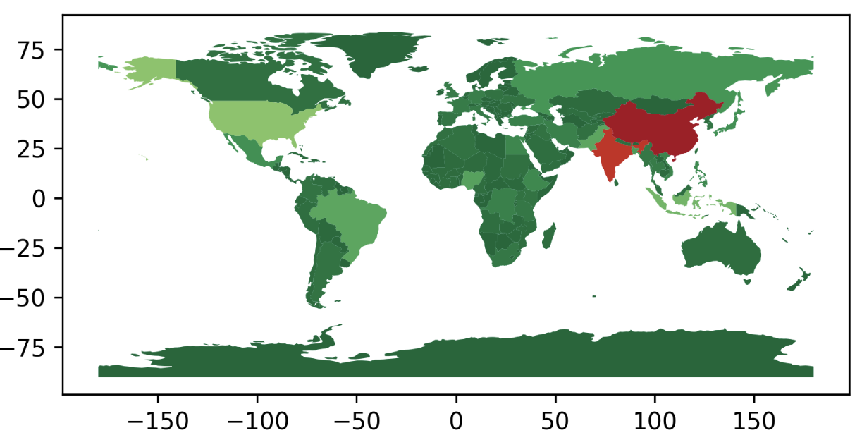
However, the map does not contain a legend. And…
但是,该地图不包含图例。 和…

如何将自定义颜色栏添加到热图? (How to Add a Custom Colorbar to the Heatmap?)
We can easily add a legend to our map using the “legend” argument.
我们可以使用“ legend ”参数轻松地将图例添加到地图中。
gdf.plot(ax=ax, column=’pop_est’, cmap=’RdYlGn_r’, legend=True)
However, in my experience, I often had to add custom Colorbars to my map. On one hand, I often needed better control over the size and placement of the legend. On the other, I sometimes use custom colormaps, and the custom legend becomes a necessity.
但是,根据我的经验,我经常不得不向地图添加自定义颜色条。 一方面,我经常需要更好地控制图例的大小和位置。 另一方面,有时我会使用自定义颜色图,并且自定义图例成为必需。
For example, let’s say, we will use both the Population and GDP values to represent a region in the map. We will use Blue to represent Population and red for GDP. The regions will get a composition of the two colors. To construct a legend for this map, we need two Colorbars! Let’s see how it can be done.
例如,假设我们将同时使用“人口”和“ GDP”值来代表地图中的一个区域。 我们将用蓝色代表人口,用红色代表GDP。 这些区域将由两种颜色组成。 要为该地图构建图例,我们需要两个颜色条! 让我们看看如何完成它。
First, we will need to define the color of each region. For this, we will use the plt.colors.to_hex() function to create composite colors.
首先,我们需要定义每个区域的颜色。 为此,我们将使用plt.colors.to_hex()函数创建复合颜色。
 # We will first normalize the population and GDP values into [0,1] range
# color.to_hex takes a (r, g, b) tuple as input and returns the hex value
# the r, g, b values are expected to be in the [0,1] range
# we will assign r to population and g to GDP
# we will keep b as 0 pop_values = gdf[‘pop_est’] / gdf[‘pop_est’].max()
gdp_values = gdf[‘gdp_md_est’] / gdf[‘gdp_md_est’].max() rgb_values = [(x,y,z) for x, y, z in zip(pop_values, gdp_values, [0]*len(pop_values))]
gdf[‘Color’] = [colors.to_hex(rgb) for rgb in rgb_values]
We will need to add two extra axes to accommodate the Colorbars. We need to set the width ratios of the axes.
我们将需要添加两个额外的轴以容纳颜色栏。 我们需要设置轴的宽度比例。
 fig, axes = plt.subplots(1, 3, dpi=300,  figsize=(15, 6), gridspec_kw={'width_ratios': [18, 1, 1]})
gdf.plot(ax=axes[0], color=gdf['Color'])
We can add the Red Colorbar in the following way.
我们可以通过以下方式添加红色彩条。
 from matplotlib import cm, colors cmap = 'Reds'
norm = colors.Normalize(vmin=gdf['pop_est'].min(), vmax=gdf['pop_est'].max())
axes[1].tick_params(labelsize=5) cb = fig.colorbar(cm.ScalarMappable(norm=norm, cmap=cmap),
             cax=axes[1], orientation='vertical') cb.set_label('POP',labelpad=-32, y=-.01, rotation=0)
Similarly, we can add the Green Colorbar in the same way. You can see the full code in the following gist.
同样,我们可以以相同的方式添加绿色彩条。 您可以在以下要点中查看完整的代码。
Notes:
注意事项:
- Using composite colors is a good way to visualize maps when you have more than one variable. You can combine the three channels to visualize up to three variables in a single map. 当您有多个变量时,使用复合颜色是一种可视化地图的好方法。 您可以组合三个通道,以在单个地图中可视化最多三个变量。
- You will notice a lot of positional parameters in the code. Unfortunately, I have found no single way to set these parameters automatically. I have to test different values and set these parameters manually each time. 您会在代码中注意到很多位置参数。 不幸的是,我发现没有一种自动设置这些参数的方法。 我必须测试不同的值,并每次手动设置这些参数。
如何用颜色制作分类图? (How to Make a Categorical Map with Colors?)
Sometimes it becomes difficult to make sense of heatmaps, especially when the data values are skewed. In such cases, we need to categorize the regions based on some criteria. Then we assign different colors to different categories and the map looks much more readable. In this section, we will discuss how that can be done.
有时很难理解热图,特别是当数据值偏斜时。 在这种情况下,我们需要根据一些标准对区域进行分类。 然后,我们将不同的颜色分配给不同的类别,并且地图看起来更具可读性。 在本节中,我们将讨论如何做到这一点。
Let’s first define our categories. We will simply categorize the regions into four groups based on their population and GDP, and assign them some arbitrary colors.
首先定义类别。 我们将简单地根据区域的人口和GDP将其分为四类,并为它们分配任意颜色。
- Population < Mean Population, GDP < Mean GDP [Black] 人口<平均人口,GDP <平均GDP [黑色]
- Population < Mean Population, GDP ≥Mean GDP [Green] 人口<平均人口,GDP≥平均GDP [绿色]
- Population ≥ Mean Population, GDP < Mean GDP [Red] 人口≥平均人口,GDP <平均GDP [红色]
- Population ≥ Mean Population, GDP ≥ Mean GDP [Blue] 人口≥平均人口,GDP≥平均GDP [蓝色]
First, let us define these groups in a Python dictionary. I have also added an additional legend, which will be used in the next subsection.
首先,让我们在Python字典中定义这些组。 我还添加了一个额外的图例,将在下一节中使用。
cat_dict = {
    0: {
        'color': 'black',
        'legend': r'$POP < \mu_{POP}, GDP < \mu_{GDP}$'
    },
    1: {
        'color': 'green',
        'legend': r'$POP < \mu_{POP}, GDP \geq \mu_{GDP}$'
    },
    2: {
        'color': 'red',
        'legend': r'$POP \geq \mu_{POP}, GDP < \mu_{GDP}$'
    },
    3: {
        'color': 'blue',
        'legend': r'$POP \geq \mu_{POP}, GDP \geq \mu_{GDP}$'
    }
}
Next, we will define a new column in our GeoDataFrame, which will contain the color of each region.
接下来,我们将在GeoDataFrame中定义一个新列,其中将包含每个区域的颜色。
gdf[‘Color’] = NoneNow, let’s set the color of each region based on our defined criteria.
现在,让我们根据定义的标准设置每个区域的颜色。
gdf.loc[(gdf[‘pop_est’] < gdf[‘pop_est’].mean()) & (gdf[‘gdp_md_est’] < gdf[‘gdp_md_est’].mean()), ‘Color’] = cat_dict[0][‘color’]gdf.loc[(gdf[‘pop_est’] < gdf[‘pop_est’].mean()) & (gdf[‘gdp_md_est’] >= gdf[‘gdp_md_est’].mean()), ‘Color’] = cat_dict[1][‘color’]gdf.loc[(gdf[‘pop_est’] >= gdf[‘pop_est’].mean()) & (gdf[‘gdp_md_est’] < gdf[‘gdp_md_est’].mean()), ‘Color’] = cat_dict[2][‘color’]gdf.loc[(gdf[‘pop_est’] >= gdf[‘pop_est’].mean()) & (gdf[‘gdp_md_est’] >= gdf[‘gdp_md_est’].mean()), ‘Color’] = cat_dict[3][‘color’]We are all set to construct our categorical map now, which can be done using the following snippet.
我们已经准备好构造我们的分类图,可以使用以下代码段完成此操作。
fig, ax = plt.subplots(dpi=350)
gdf.plot(ax=ax, color=gdf[‘Color’])
You can see the output in the following notebook.
您可以在以下笔记本中看到输出。
如何使用颜色将图例添加到分类图中? (How to Add Legends to the Categorical Map with Colors?)
Now that we have our categorical map, let’s add some legend to it! We have to construct the legend
现在我们有了分类地图,让我们为其添加一些图例! 我们必须构造传说
from matplotlib.lines import Line2Dmarkers = []
labels = []for cat in cat_dict.keys():
    markers.append(Line2D([0], [0], marker='o', color='w', markerfacecolor=cat_dict[cat]['color'], markersize=8))
    labels.append(cat_dict[cat]['legend'])

ax.legend(markers, labels, fontsize=8, loc='upper right', bbox_to_anchor=(1.38, 1.03))
You can see the final output in the following notebook.
您可以在以下笔记本中查看最终输出。
如何使用剖面线制作分类地图? (How to Make a Categorical Map with Hatches?)
But what if we wanted to use hatches instead of colors to demonstrate the categories?
但是,如果我们想使用阴影线代替颜色来显示类别呢?
In this case, we have to draw each of the groups separately as demonstrated in the following notebook.
在这种情况下,我们必须分别绘制每个组,如以下笔记本所示。
Notes:
注意事项:
You can control the density of the hatches using the HATCH_DENSITY variable. “/” is denser than “//”
您可以使用HATCH_DENSITY变量控制剖面线的密度。 “ / ”比“ // ”更密集
You can find a list of available hatches in this link.
您可以在此链接中找到可用的阴影线列表。
结论 (Conclusion)
I have discussed some of the common problems I have faced when working with Choropleth maps in my research. Please let me know if you would like to know about any other problems regarding Choropleth maps. I will try to cover them in the next iteration.
我已经讨论了在研究中使用Choropleth贴图时遇到的一些常见问题。 如果您想了解与Choropleth映射有关的任何其他问题,请告诉我。 我将在下一个迭代中介绍它们。
Thanks for reading. Have a good day!
谢谢阅读。 祝你有美好的一天!
翻译自: https://medium.com/@immuntasir/the-beginners-guide-to-choropleth-maps-in-python-ff1da28a8943
choropleth


 743
743

 被折叠的 条评论
为什么被折叠?
被折叠的 条评论
为什么被折叠?
 到【灌水乐园】发言


