


Adding a tooltip to a chart sounds like a small task, and indeed it is, but with some workarounds as even the most popular chart libraries in react-native don't directly mention it in their documentation.
向图表添加工具提示听起来像是一项艰巨的任务,的确如此,但是有一些解决方法,因为即使React-native中最流行的图表库也没有在其文档中直接提及它。
要求 (Requirements)
In this article, I am going to use react-native-chart-kit and I will show you how we can add tooltip to its LineChart.
在本文中,我将使用react-native-chart-kit,并向您展示如何向其LineChart添加工具提示。
First, install the libraries that we are going to need for your react-native project.
首先,安装您的本机项目所需的库。
npm install react-native-chart-kit --save
npm install react-native-svg --save
Library versions used in this article (so that if a future update makes some breaking changes you can switch to this combination).
本文中使用的库版本(以便将来的更新进行一些重大更改时,您可以切换到此组合)。
"react": "16.13.1",
"react-native": "0.63.2",
"react-native-chart-kit": "^6.4.1",
"react-native-svg": "^12.1.0"
实施折线图 (Implementing a Line Chart)
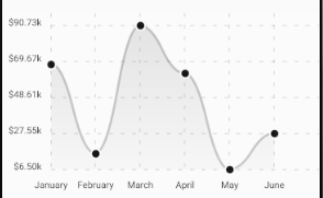
Lets first create a LineChart without a tooltip. The code is very simple as the LineChart props contain either the data to render or some styles for our chart.
首先让我们创建一个没有工具提示的LineChart。 该代码非常简单,因为LineChart道具包含要渲染的数据或图表的某些样式。
Since I have generated a random dataset using Math.random(), the output that you will see is going to be different from the below chart.
由于我已经使用Math.random()生成了一个随机数据集,因此您将看到的输出将与下表不同。
添加工具提示 (Adding tooltip)
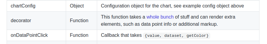
If we go to the GitHub page of react-native-chart-kit and if we scroll a little bit down in the documentation, we will find a list of properties available for the LineChart, we will see there isn’t any tooltip mentioned. There is one prop named decorator that mentions something about adding additional markup.
如果我们转到react-native-chart-kit的GitHub页面,并且在文档中向下滚动一点,我们将找到LineChart可用的属性列表,我们将看到没有提到任何工具提示。 有一个名为decorator的道具,其中提到了有关添加其他标记的内容。
Simplifying this for our usecase that extra element is our tooltip, which will show some extra information about the datapoint. Now, here is the confusing part, which is not mentioned is what type of element we should use?
在我们的用例中,我们将其简化为额外的元素,这是我们的工具提示,它将显示有关数据点的一些额外信息。 现在,这是令人困惑的部分,没有提到的是我们应该使用哪种类型的元素?
One common guess is a core react-native component like View but this alone will not work. The correct answer to the above question is a core react-native element wrapping a react-native-svg element. The reason being is react-native-chart-kit itself uses react-native-svg elements for rendering its chart elements and we will also use the SVG elements to render our tooltip.
一个常见的猜测是像View这样的核心React本机组件,但 仅此一项是行不通的。 对上述问题的正确答案是包装了react-native-svg元素的核心react-native元素。 原因是react-native-chart-kit本身使用react-native-svg元素来呈现其图表元素,我们还将使用SVG元素来呈现我们的工具提示。
Let's see one example of it given below.
让我们看下面的例子。
decorator={() => { return <View> <Svg> <Rect x={80} y={110} width="40" height="30" fill="black" /> <TextSVG x={100} y={130} fill="white" fontSize="16" fontWeight="bold" textAnchor="middle"> 0.0 </TextSVG> </Svg> </View>}}By seeing the tooltip below you can tell I haven’t invested much time in designing it. The react-native-svg library provides lots of shapes for e.g Circle, Rect, Polygon, etc. I have chosen the Rect for drawing the tooltip.
通过查看下面的工具提示,您可以知道我没有花太多时间来设计它。 react-native-svg库提供了很多形状,例如圆形,矩形,多边形等。我选择了矩形作为工具提示。
But you can learn to design your own, just visit react-native-svg.
但是您可以学习设计自己的方法,只需访问react-native-svg。
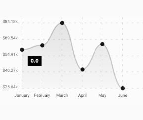
Add the above decorator prop to the LineChart and you will be able to see the tooltip on the chart now, but its position and value are hardcoded as x and y are some constant values. We obviously want this tooltip to be positioned dynamically and show value according to the data points rendered on the chart.
将上面的装饰器道具添加到LineChart,您现在可以在图表上看到工具提示,但是其位置和值被硬编码为x和y是一些恒定值。 我们显然希望此工具提示动态放置并根据图表上呈现的数据点显示值。
添加动态工具提示 (Adding Dynamic Tooltip)
Before starting the implementation, lets set some expectations. First, we will show tooltip only when the user clicks on the datapoint. Second, we will position the tooltip near to its datapoint. Third and the last is hiding tooltip when the user clicks the same datapoint for the second time.
在开始实施之前,让我们设定一些期望。 首先,仅当用户单击数据点时,我们才会显示工具提示。 其次,我们将工具提示放置在其数据点附近。 当用户第二次单击同一数据点时,第三个也是最后一个是隐藏工具提示。
Let's initialize a state for our tooltip which we can manipulate for positioning and controlling its visibility.
让我们为工具提示初始化一个状态,我们可以对其进行操作以定位和控制其可见性。
let [tooltipPos,setTooltipPos] = useState(
                              { x:0, y:0, visible:false, value:0 })
We will use x and y for positioning and for controlling visibility we will use the visible key.
我们将使用x和y进行定位并控制可见性,我们将使用可见键。
We will also use a LineChart property onDataPointClick. The onDataPointClick property takes a callback that is called whenever a user clicks a datapoint on the chart. It receives an argument that provides some data and an example of the data it receives is shown below.
我们还将在onDataPointClick上使用LineChart属性。 onDataPointClick属性接受一个回调,只要用户单击图表上的数据点,就会调用该回调。 它接收提供一些数据的参数,下面显示了所接收数据的示例。
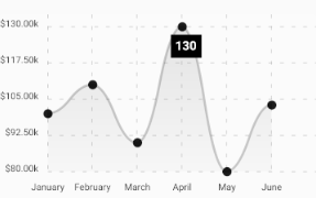
{"dataset": {"data": [100, 110, 90, 130, 80, 103]}, "getColor": [Function getColor], "index": 3, "value": 130, "x": 237.7142857142857, "y": 16}All keys are self-explanatory, x and y define the position of the datapoint clicked, value is the value of the datapoint it is representing from the dataset, index is the index of the value in the dataset, dataset is obviously the dataset used in the line chart. We can ignore getColor as it will only be useful if are dealing with multiple lines, which is not our case.
所有键都是不言自明的,x和y定义了单击的数据点的位置,值是它从数据集中表示的数据点的值,索引是数据集中值的索引,数据集显然是用于折线图。 我们可以忽略getColor,因为它仅在处理多行时才有用,而事实并非如此。
工具提示功能的实现 (Implementation for tooltip features)
Now let's write some logic for the expected features of our tooltip that we have defined above in this section.
现在,让我们为上面在本节中定义的工具提示的预期功能编写一些逻辑。
onDataPointClick={  (data) => {
     // check if we have clicked on the same point again
     let isSamePoint = (tooltipPos.x === data.x
                         && tooltipPos.y ===  data.y)

     // if clicked on the same point again toggle visibility
     // else,render tooltip to new position and update its value     isSamePoint ? setTooltipPos((previousState)=> {
                        return {
                             ...previousState,
                             value: data.value,
                             visible: !previousState.visible}
                        })
                  :
                setTooltipPos({x: data.x,
                   value: data.value, y: data.y,
                   visible: true
                });   } // end function
}
Making some changes in our <Rect> element to align the tooltip, so that it won’t overlap with the datapoint on the chart.
在<Rect>元素中进行一些更改以对齐工具提示,以使其不会与图表上的数据点重叠。
decorator={() => {   return tooltipPos.visible ? <View>    <Svg>       <Rect x={tooltipPos.x -15} y={tooltipPos.y + 10} width="40"
        height="30" fill="black" />       <TextSVG          x={tooltipPos.x + 5}          y={tooltipPos.y + 30}          fill="white"          fontSize="16"          fontWeight="bold"          textAnchor="middle">          {tooltipPos.value}       </TextSVG>    </Svg></View> : null}}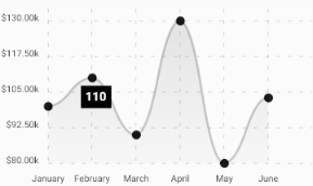
结合所有变化 (Combining all changes)
Congratulations! We have successfully added a tooltip to our chart. Let’s put all the changes together in one file.
恭喜你! 我们已经成功地向图表添加了工具提示。 让我们将所有更改放到一个文件中。
翻译自: https://levelup.gitconnected.com/adding-tooltip-to-react-native-charts-67606c5d3182


 466
466


 被折叠的 条评论
为什么被折叠?
被折叠的 条评论
为什么被折叠?
 到【灌水乐园】发言


