tableau使用
介绍 (Introduction)
Melbourne, being one of the most liveable cities in the world, has attracted a lot of individuals across the globe. Many of them dream of making this beautiful place as their home. My journey in the field of data science started with me moving to Melbourne hence I decided to do a comprehensive analysis of the city’s real estate market. I have always been fascinated by this industry. Hence in this article, I am going to take a comprehensive approach towards identifying drivers and helping potential buyers with data-driven decision making. Since this analysis was completed using Tableau, I will provide you with a few dashboarding tips as well.
墨尔本是世界上最宜居的城市之一,吸引了全球许多人。 他们中的许多人梦想着把这个美丽的地方当作自己的家。 我在数据科学领域的旅程始于我搬到墨尔本,因此我决定对这座城市的房地产市场进行全面分析。 我一直对这个行业着迷。 因此,在本文中,我将采用一种全面的方法来确定驱动因素,并帮助潜在买家进行数据驱动的决策。 由于此分析是使用Tableau完成的,因此我还将为您提供一些仪表板提示。
“Fun fact — I did use this analysis while renting out a place. Hence this might be useful if you are new to Melbourne or planning to buy a property here.”
“有趣的事实-我确实在租用场所时使用了此分析。 因此,如果您是墨尔本的新手或计划在这里购买物业,这可能会很有用。”
关于Tableau (About Tableau)
Tableau is a powerful and rapidly growing data visualisation tool used by most of the data-savvy organisations. Self-Intelligence and numerous features to transform data into surprising business insights make Tableau one of the best BI tool.
Tableau是功能强大且快速增长的数据可视化工具,大多数数据精明的组织都在使用它。 自我智能以及将数据转换为令人惊讶的业务洞察力的众多功能使Tableau成为最佳的BI工具之一。
资料说明 (Data Description)
The dataset used in this project is the data of the houses sold in Melbourne from the period January 2016 to October 2018 posted by Tony Pino on Kaggle scrapped from publicly available results posted every week from Domain.com.au. Some of the data fields include Date, Price, Suburb, Region name, Landsize, Building size, Distance from CBD and others. (Kaggle)
该项目中使用的数据集是Tony Pino在Kaggle上发布的2016年1月至2018年10月在墨尔本售出的房屋的数据,该数据来自Domain.com.au每周发布的公开结果。 一些数据字段包括日期,价格,郊区,地区名称,土地面积,建筑物尺寸,距CBD的距离等。 (笑嘻嘻)
假设和关键问题 (Hypothesis and key questions)
1. What is the effect of building size to land size ratio as we move closer to the CBD region? Does this ratio impact the price of the houses?
1.随着我们靠近中央商务区,建筑面积与土地面积之比的影响是什么? 这个比率会影响房屋价格吗?
2. What will be the average price of the houses in different metropolitan regions of Melbourne in the second quarter of 2018?
2. 2018年第二季度墨尔本不同城市地区的房屋平ASP格是多少?
3. In which month more houses are sold in Melbourne?
3.墨尔本哪个月售出更多房屋?
4. What are the top 10 suburbs of Melbourne by the price and the maximum number of houses sold?
4.按价格和可售房屋的最大数量,墨尔本排名前十的郊区是什么?
数据处理 (Data Processing)
To analyze the building to land size ratio and its relationship with the distance from the city, a dummy column (Ratio) was added to the data. Our exploration revolves around the Price, Distance from CBD, Suburb, Region type, and building to land size ratio. Null values in the Region column were imputed using the suburb information. Remaining records with null values were deleted using suitable filters in Excel. Quality checks on the data displayed properties with building size to land size ratio greater than one. Such records were dropped from the analysis.
为了分析建筑物与土地面积的比率及其与城市距离的关系,在数据中添加了一个虚拟列(比率)。 我们的探索围绕价格,离CBD的距离,郊区,区域类型以及建筑物与土地面积之比。 使用郊区信息估算“地区”列中的空值。 使用Excel中的适当过滤器删除了具有空值的其余记录。 对数据显示的属性进行质量检查,这些属性的建筑物大小与土地大小之比大于1。 此类记录已从分析中删除。
探索性分析 (Exploratory Analysis)
To start with the analysis, I first plotted a choropleth map showing the average price of houses in different regions of Melbourne.
首先从分析开始,我首先绘制了一个choropleth地图,显示了墨尔本不同地区房屋的平ASP格。
Choropleth Map:
霍罗珀斯地图:
A choropleth map is a thematic map in which different regions in the map shaded or patterned in proportion to a statistical variable that represents an aggregate summary of a geographic characteristic. (Wikipedia)
拟人地图是一种主题地图,其中地图中的不同区域与代表地理特征的汇总摘要的统计变量成比例地阴影或图案化。 (维基百科)
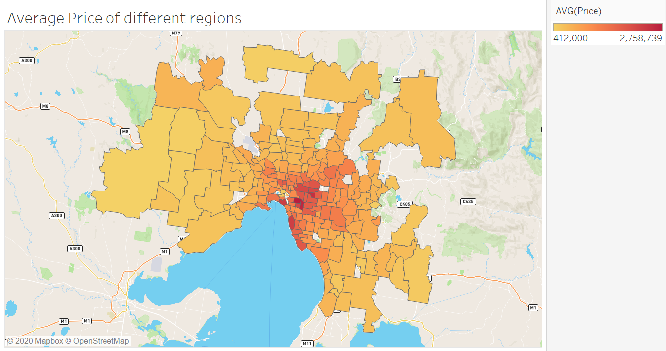
The above visualisation shows that the prices of the houses located in the CBD and the eastern coastal region are higher as compared to prices in other regions.
上面的图表显示,位于CBD和东部沿海地区的房屋价格比其他地区的价格更高。
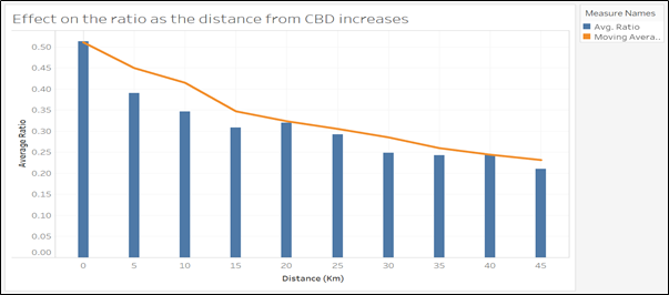
I was interested in analysing the effect of the location of the house on building size to land size ratio. The distance of the house from CBD was used as the dimension of the location. I plotted a dual combination graph which consists of a bar graph and a line graph between “distance from CBD” and “average ratio”. The line graph shows the moving average of the ratio, in order to smoothen the results. For better understanding, the distance is visualised as the range of 5 Kms.
我有兴趣分析房屋位置对建筑面积与土地面积之比的影响。 房屋与CBD的距离用作位置的尺寸。 我绘制了一个双重组合图,它由一个条形图和一个“离CBD的距离”和“平均比率”之间的折线图组成。 线形图显示了比率的移动平均值,以使结果平滑。 为了更好地理解,该距离可视化为5 Kms的范围。
To get a clear picture of the variation of ratio with respect to the location, I also created a choropleth map of Melbourne showing the average ratio in different suburbs as shown in the below figure.
为了清楚地了解比率随位置的变化,我还创建了墨尔本的Choropleth地图,显示了不同郊区的平均比率,如下图所示。
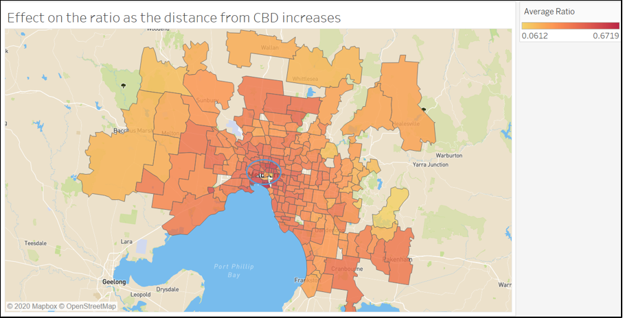
The above visualisations provide us with the insight that as we move closer to CBD and the coastal region, the building size to land size ratio increases. It can be inferred that the houses located far from the city have more unoccupied land space in the house for the front yard and backyard than the houses located in the city and near the coastal region. The major reason for this can be considered as lack of space and high prices of houses in the CBD region.
上面的可视化为我们提供了一个洞察力,即当我们靠近CBD和沿海地区时,建筑面积与土地面积之比会增加。 可以推断,与城市和沿海地区相比,远离城市的房屋在前院和后院的房屋中有更多的空置土地空间。 造成这种情况的主要原因可以认为是CBD地区空间不足和房屋价格居高不下。
Now let us look at the monthly trends of the house sales in Melbourne. I have plotted year-wise pie charts of the house sales to observe the monthly trends as shown in the below figure. Since the complete data for the year 2018 was not available, we will be visualising the results for the year 2016 and 2017.
现在让我们看看墨尔本房屋销售的月度趋势。 我绘制了房屋销售的年度饼图,以观察每月的趋势,如下图所示。 由于无法获得2018年的完整数据,因此我们将可视化2016年和2017年的结果。
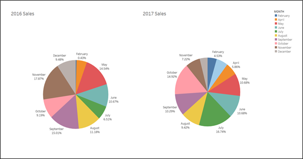
It can be observed that the maximum sale in 2016 is in the month of November whereas in the year 2017 the maximum sales are in the month of July. For both the years, it is observed the majorly the houses are sold in the period May to November. It can be inferred that houses are sold more in the winter season.
可以看出,2016年的最大销售额是在11月,而2017年的最大销售额是在7月。 在这两年中,观察到主要是房屋在5月至11月期间出售。 可以推断出冬季房屋销售量更大。
In order to find the top 10 suburbs by highest average price and the highest number of houses sold, I have plotted 2 bar graphs as shown in the below figure.
为了找到平ASP格最高和出售房屋数量最高的前十个郊区,我绘制了两个条形图,如下图所示。
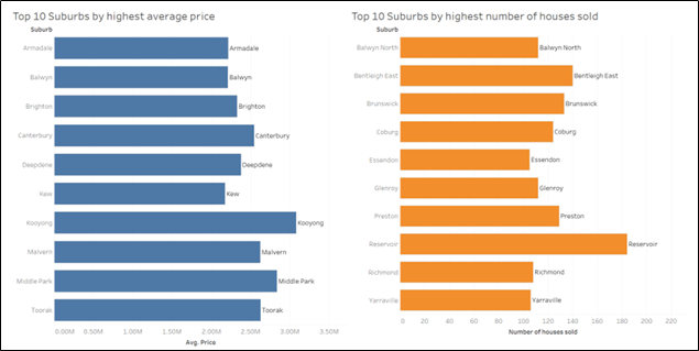
The above visualisation shows that Kooyong is the most expensive suburb and Reservoir is the most preferred suburb.
上面的图表显示,Kooyong是最昂贵的郊区,而Reservoir是最喜欢的郊区。
Predicting the future average prices using Tableau’s Forecasting Model:
使用Tableau的预测模型预测未来的平ASP格:
A bar graph showing the average price in the different months of the year has been plotted. The plot has been filtered for different regions. I have used Tableau’s Forecasting Model to predict the prices of houses in the second quarter of 2018. The model follows the trend of change in prices in quarters and months to determine the predicted price.
绘制了显示一年中不同月份平ASP格的条形图。 该图已针对不同区域进行了过滤。 我已经使用Tableau的“预测模型”来预测2018年第二季度的房屋价格。该模型根据季度和月份价格变化的趋势来确定预测价格。
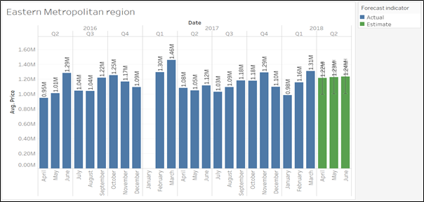
As per the above visualisation, the predicted average price in the Eastern region for the month April, May and June 2018 is $1.22M, $1.23M and $1.24M respectively. The prediction follows the trend of dropping of price as we jump from quarter 1 to quarter 2 in the year 2018. Furthermore, the model average outs the change from April to May and May to June in the year 2016 and 2017 and provides an upward increase in the prices of May and June.
根据上述可视化结果,东部地区2018年4月,5月和6月的预测平ASP格分别为122万美元,123万美元和124万美元。 该预测遵循价格下跌的趋势,即我们在2018年从第一季度跳至第二季度。此外,模型平均值超过了2016年和2017年4月至5月和5月至6月的变化,并提供了向上的增长在5月和6月的价格中。
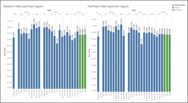
In the western metropolitan and northern metropolitan region, the model again follows the trend of dropping of price as we move from quarter 1 to quarter 2 in the year 2017. The change in the price from April to May and May to June is averaged out and a similar trend for all the three months of quarter 2 is predicted for both the regions.
在西部大都市和北部大都市地区,该模型再次遵循价格下降的趋势,即我们在2017年从第一季度移至第二季度。对4月至5月以及5月至6月的价格变化进行平均,预计两个地区在第二季度的所有三个月中都将出现类似的趋势。
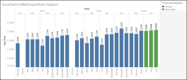
For the southern metropolitan region, the data for quarter 1 is missing for both years 2016 and 2017. Hence the system is unable to follow the quarter change trend and predicts the average price of April 2018 same as of March 2018. Furthermore, as per the average change in April to May and May to June in the previous year, an upward increase is seen in May and June 2018.
对于南部都市圈,2016年和2017年都缺少第一季度的数据。因此,该系统无法跟踪季度变化趋势,无法预测2018年4月的平ASP格与2018年3月相同。上一年4月至5月和5月至6月的平均变化,2018年5月和6月呈上升趋势。
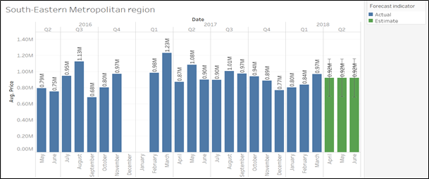
In the case of the south-eastern metropolitan region, the data for quarter 1 is missing for both the years 2016 and 2017. Moreover, the data of quarter 2 is also missing for the year 2016. Hence the model is unable to provide an accurate prediction and shows the flat value of $0.92M for all the three months of 2018 quarter 2.
在东南部大都市地区,2016年和2017年都缺少第一季度的数据。此外,2016年也缺少第二季度的数据。因此,该模型无法提供准确的数据。预测并显示2018年第2季度的所有三个月的固定价格为92万美元
结论 (Conclusion)
This data exploration and visualisation helped us to gather a few useful insights about the Melbourne real estate market for aspiring buyers.
数据探索和可视化帮助我们为有抱负的买家收集了一些有关墨尔本房地产市场的有用见解。
It was observed that the building size to land size ratio varies significantly as we move closer to the city area. The high prices and less space in the city encourage people to utilize the complete land in building the house.
观察到,随着我们靠近市区,建筑面积与土地面积之比变化很大。 城市中的高价格和较少的空间鼓励人们利用整个土地来建造房屋。
Apart from the Southern metropolitan region, forecasting model has shown a decrease in the house prices as we move from quarter 1 to quarter 2 of 2018. Moreover, the winters season has been observed as the most preferred season for the buyers to purchase a home.
除南部大都市地区外,预测模型显示,随着我们从2018年第一季度移至第二季度,房价下降。此外,冬季被认为是购房者最喜欢的季节。
翻译自: https://towardsdatascience.com/exploring-the-melbourne-real-estate-market-using-tableau-914d63659f8e
tableau使用


 本文通过Tableau的深入分析,揭示了墨尔本房地产市场的关键趋势,包括不同区域的房价变化、销售高峰期及热门郊区,为购房者提供数据驱动的决策依据。


 4714
4714

 被折叠的 条评论
为什么被折叠?


