


python 图形化
Lately, whenever I start analyzing data for a new project, I’ve gotten in the habit of making a new class to generate all of my figures to standardize formatting. The class will include things like colors, marker styles, font styles, figure sizes, etc., to ensure that each figure I make from a dataset has consistent formatting and is quick to generate.
最近,每当我开始为一个新项目分析数据时,我都会养成一个新类,以生成所有图形以标准化格式的习惯。 该类将包括颜色,标记样式,字体样式,图形大小等,以确保我从数据集中制作的每个图形都具有一致的格式并可以快速生成。
Here is a quick tutorial on how to set one up for yourself! This tutorial assumes you have Plotly and Anaconda installed on your PC.
First, I’ll start by creating a class, then demonstrate how to initialize objects from the class that will be used to generate different figures.
首先,我将从创建一个类开始,然后演示如何从该类中初始化将用于生成不同图形的对象。
Open up a new file and name it “plotter.py”. Here, we’ll write a simple class that takes a pandas data frame and a few optional parameters to initialize a Plotly figure. Note that for most of the method’s input arguments, I set a default value. If you think you’ll be making similar types of figures, this will make things easier down the road. In this example, we’ll be using a data frame that contains the following labels: apple, avocado, and blueberry.
打开一个新文件,并将其命名为“ plotter.py”。 在这里,我们将编写一个简单的类,该类采用一个pandas数据框和一些可选参数来初始化Plotly图形。 请注意,对于该方法的大多数输入参数,我都设置了默认值。 如果您认为自己将制作相似类型的数字,那么这将使事情变得更容易。 在此示例中,我们将使用包含以下标签的数据框: apple , avocado和blueberry 。
import plotly.graph_objects as go
from plotly.subplots import make_subplots
import pandas as pd
import numpy as npclass Plotter:    """
    The Plotter class produces Plotly figures that are correctly
    formatted for a certain data analysis for project
    """    def __init__(self,df,rows=1,cols=1,legend=dict(x=0.77,y=1)):        """
        initialize oject attributes and create figure
        rows = number of rows of plots
        cols = number of cols of plots
        the rows and cols default is 1, but can be changed to add
        subplots
        """        self.df = df
        self.foods = list(set(df['food']))
        self.mode = 'lines'        # colors for each item
        self.colors = {'apple': 'crimson',
                       'avocado': 'darkgreen',
                       'blueberry': 'royalblue'
                       }        # markers for each food
        self.marker_dict = {'apple': 'square',
                            'avocado': 'circle',
                            'blueberry': 'x'
                            }        # misc. figure parameters
        self.params = {'linewidth': 6,
                       'mrkrsize': 10,
                       'opacity': 0.8,
                       'width': 850,
                       'length': 700
                       }        # font for figure labels and legend
        self.lab_dict = dict(family='Arial',
                             size=26,
                             color='black'
                             )        # font for number labeling on axes
        self.tick_dict = dict(family='Arial',
                              size=24,
                              color='black'
                              )        # initialize figure as subplots
        self.fig = make_subplots(rows=rows,
                                 cols=cols
                                 )        # set font, borders, size, background color,
        # and legend  position for figure
        self.fig.update_layout(font=self.lab_dict,
                               margin=dict(r=20,t=20,b=10),
                               autosize=False,
                               width=850,
                               height=700,
                               plot_bgcolor='white',
                               legend=legend
                               )
Then, we add a method to our Plotter class that adds traces to the figure (i.e., plots the data) that we initialized:
然后,我们向Plotter类添加一个方法,该方法向我们初始化的图形添加迹线(即,绘制数据) :
    def plot(self,x_col,y_col,row=1,col=1,showlegend=True):        """
        plot data on Plotly figure for all foods
        x_col = column from dataframe to plot on x-xaxis
        y_col = column from dataframe to plot on y-xaxis
        row/col = which plot the trace should be added to
        showlegend = boolean; show legend on graph
        """        for food in self.foods:            x = self.df[x_col].loc[self.df['food']==food]
            y = self.df[y_col].loc[self.df['food']==food]            # add trace to figure
            self.fig.add_trace(go.Scatter(x=x,
                               y=y,
                               showlegend=showlegend,
                               mode=self.mode,
                               name=food,
                               line=dict(
                                    width=self.params['linewidth']
                                         ),
                               opacity=self.params['opacity'],
                               marker=dict(
                                      color=self.colors[food],
                                      symbol=self.marker_dict[food],
                                      size=self.params['mrkrsize'],
                                           )
                                          ),
                               row=row,
                               col=col
                               )
Next, we can add methods to the Plotter class that formats both the x and y-axes in a standardized way:
接下来,我们可以将方法添加到Plotter类中,以标准化方式格式化x和y轴 :
    def update_xaxis(self,xlabel='Time',xlim=[0,60],row=1,col=1):        """
        format x-axis by adding axis lines, ticks, etc.
        xlabel = label for x-axis (default is Time (s))
        xlim = range for x-axis (default is 0 to 60)
        row/col = which graph to format
        """        self.fig.update_xaxes(title_text=xlabel,
                              range=xlim,
                              showline=True,
                              linecolor= 'black',
                              linewidth=2.4,
                              showticklabels=True,
                              ticks= 'outside',
                              mirror='allticks',
                              tickwidth=2.4,
                              tickcolor='black',
                              tickfont=self.tick_dict,
                              row=row,
                              col=col
                              )    def update_yaxis(self,ylabel='',ylim=[-1,1],row=1,col=1):        """
        format y-axis by adding axis lines, ticks, etc.
        ylabel = label for y-axis (default is blank)
        ylim = range for y-axis  (default is -1 to 1)
        row/col = which graph to format
        """        self.fig.update_yaxes(title_text=ylabel,
                              range=ylim,
                              showline= True,
                              linecolor= 'black',
                              linewidth=2.4,
                              showticklabels=True,
                              ticks= 'outside',
                              mirror='allticks',
                              tickwidth=2.4,
                              tickcolor='black',
                              tickfont=self.tick_dict,
                              row=row,
                              col=col
                              )
现在我们的班级已经写好了,问题是“我们如何使用它?”。 我们需要从类中创建对象,向图形添加跟踪,然后显示图形。 (Now that our class is written, the question is “How do we use it?”. We need to create objects from the class, add traces to the figure, and then display the figure.)
This can be done in one of two ways:
这可以通过以下两种方式之一来完成:
- In-script by adding the following code to the end of the script containing your class: 在脚本中,通过将以下代码添加到包含您的类的脚本的末尾:
def main():    """
    generate an example dataframe,
    then initialize the Plotter object
    """    # generating dataframe
    foods=['apple','avocado','blueberry']
    df=pd.DataFrame()    for food in foods:
        time_s = np.linspace(0,60,200)
        sin = np.sin(time_s)*(foods.index(food)+1)/3
        cos = np.cos(time_s)*(foods.index(food)+1)/3
        temp_df = pd.DataFrame(dict(time_s=time_s,
                                    sin=sin,
                                    cos=cos
                                    )
                               )        temp_df['food'] = food
        df = pd.concat([df,temp_df],
                     ignore_index=True
                     )    # initialize Plotter object and format axes
    fig = Plotter(df)
    fig.update_xaxis()
    fig.update_yaxis()if __name__ == '__main__':
    main()
2. Adding the above code to a new file in the same directory as the plotter.py, and importing pandas, NumPy, and the Plotter class (from plotter import Plotter) at the beginning of the new file. We can then use an instance of the Plotter class in this new file, separating Plotter object initialization from the script containing the class; this is how I prefer to set-up my projects to help with organization.
2.将上述代码添加到与plotter.py相同目录中的新文件中,并在新文件的开头导入pandas,NumPy和Plotter类( from plotter import Plotter )。 然后,我们可以在这个新文件中使用Plotter类的实例,将Plotter对象的初始化与包含该类的脚本分开; 这就是我更喜欢设置项目以帮助组织的方式。
Regardless of where you add/execute the above code, we’ll end up with the data frame shown below which we can use to test out our Plotter class.
无论您在何处添加/执行以上代码,我们都将得到下面显示的数据框,我们可以使用该数据框来测试Plotter类。

Now that we’ve done all the heavy lifting by writing a class, we can easily make figures from our data with just a few lines of code at the end of the main() function.
现在,我们已经通过编写一个类完成了所有繁重的工作,我们可以在main()函数末尾仅需几行代码,就可以轻松地从数据中生成图形。
First well try the following code to plot the sine waves in our data frame:
首先,请尝试以下代码在我们的数据框中绘制正弦波:
    fig.plot('time_s','sin')
    fig.fig.show()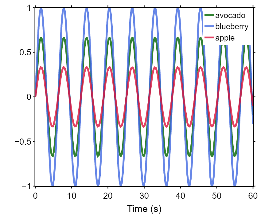
Now we can easily change one line of code and generate the same plot with cosine on the y-axis:
现在我们可以轻松地更改一行代码,并在y轴上使用余弦生成相同的图:
    fig.plot('time_s','cos')
    fig.fig.show()
Or, we can even plot both sine and cosine by writing:
或者,我们甚至可以通过编写以下图表来绘制正弦和余弦:
    fig.plot('time_s','sin')
    fig.plot('time_s','cos',showlegend=False)
    fig.fig.show()
As you can imagine, for more complex datasets this methodology can be expanded on to enable quick and standardized plotting of many different variables. Also, using classes can help reduce the amount of repeated code and give you further flexibility through the creation of derived child classes to extend upon functionalities present in the base class.
您可以想象,对于更复杂的数据集,可以扩展此方法,以实现许多不同变量的快速标准化绘图。 同样,使用类可以帮助减少重复代码的数量,并通过创建派生子类扩展基础类中存在的功能,从而为您提供更大的灵活性。
翻译自: https://medium.com/@beck.otoole/python-classes-to-standardize-plotly-figure-formatting-123fe35c8d2d
python 图形化


 542
542


 被折叠的 条评论
为什么被折叠?
被折叠的 条评论
为什么被折叠?
 到【灌水乐园】发言


